/Assets/base/Navigation%20Icons/TAYA.svg)
/Assets/base/Navigation%20Icons/Sales.svg)
/Assets/base/Navigation%20Icons/Web%20design.svg)
/Assets/base/Navigation%20Icons/HubSpot.svg)
/Assets/Icon%20Library/AI%20Mastery.svg)
/Assets/Icon%20Library/Learning%20Center%20Laptop.svg)

Jan 26, 2021
/Assets/Icon%20Library/x%20corp.svg)
/Assets/Icon%20Library/whatsapp%20logo.svg)
/Assets/Icon%20Library/Email.svg)

How much of your everyday life centers around using the internet?
Really think about it – How did you do your Christmas shopping? Your banking? How do you find recipes to cook for dinner? How do you stay in touch with family and friends? Personally, I wouldn’t even be able to do my job without the internet.
For many of us, the web has become an ever-present facet in our everyday lives, however, what many people don’t realize is that not everyone’s experience using this ever-present resource is an equal one.
If you’re one of the one billion people in the world who experiences some form of disability, then connectivity and ease of use on the web are not always guaranteed.
In fact, a report that analyzed the top one million websites found that only 1% of those websites met the most widely used accessibility standards.
To be frank, as someone who struggles with red-green color blindness, that really sucks, and from a business standpoint, it can also be a legal issue.
On a positive note, while there’s still a lot of progress to be made, we are starting to see companies put a stronger focus on accessibility and shine a spotlight on the importance of creating an equal (or as we’ll see in this article, an inclusive) web browsing experience.
🔎 Related Feature: Website accessibility: Is your company at risk for an ADA-compliance lawsuit?
Many companies have been slow to implement website accessibility and inclusive design tactics onto their own websites because they believe the misconception that it is a difficult and expensive process.
I’m here to tell you that’s not the case at all.
In fact, there are some really simple things that you can implement on your website to get the process going.
Below I’m going to walk you through 11 ways you can start making your website more accessible and lean into inclusive design.
What is inclusive design?
Accessible design and inclusive design are two areas that go hand in hand; similar to how people talk about UX and UI.
In the simplest terms, inclusive design is ensuring that no group’s needs or concerns are overlooked in your efforts, while accessibility is a tactic for accomplishing this.
A lot of companies make the mistake of creating websites and marketing campaigns as if they were their own end-user. However, that’s almost never the case.
You should expand your messaging, media, and design to account for an expanding audience made up of different backgrounds including age groups, educational backgrounds, sexual orientations, genders, socio-economic classes, and religions among other things.
With that background, let’s dive into some more specifics on how you can get started with inclusive design.
11 ways to make your website more accessible and inclusive
1. Rethink how you structure your content
Your website’s content is the most important asset on your website.
Duh, right?
Great content is what gets your website visitors engaged and helps educate them and eventually turns them into sales qualified leads, but what if your prospects couldn’t read your content?
For the 253 million people worldwide who suffer from some type of visual disability, that’s a very real scenario. That’s also a lot of potential prospects that you could be missing out on connecting with.
When it comes to your content, make sure that you’re structuring it in a way that’s easy for users with visual, language, and cognitive disabilities to read.
One of the easiest things you can do is make sure you’re breaking up longer blocks of content into smaller sections that are divided by headers and subheaders.
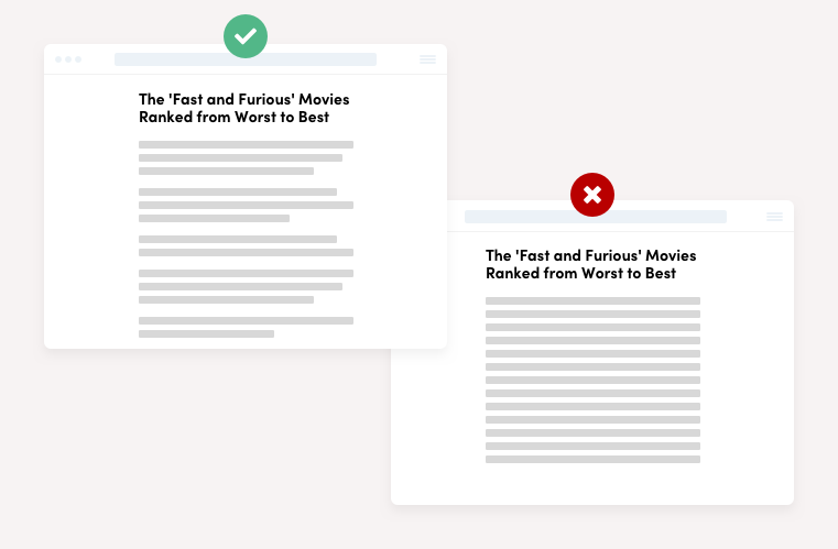
People with reading or vision disabilities may struggle with keeping their place and following the flow of text when blocks of content are too long.
In addition to breaking up your content, the W3C also suggests following these guidelines when it comes to structuring your content:
- Make sure there is an adequate amount of contrast between content and its background
- Try to keep the maximum width of your content to around 80 characters per line
- Make line-height at least 1.5x your font size
- Avoid fully justified text
These simple things can make a world of difference for those with vision or reading disabilities.
2. Use correct markup on your content
In addition to paying attention to how you structure your content on the front end, you also need to make sure you’re using the proper HTML markup to structure your content on the backend of your website.
🔎 Related: What Is Schema Markup & How to Add it to Boost SEO
This means using HTML elements such as the <button> tag to denote when there’s a button on a page and including what’s known as ARIA attributes within your code.
Equally important, is the use of heading tags (H1, H2, H3, etc) throughout your content.
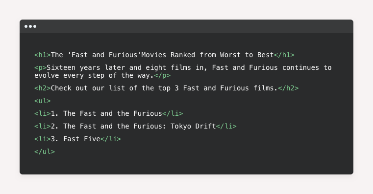
Heading tags not only create visual hierarchy on your website's front end making it easier for users with low-vision to understand the order of the content better; but also gives structure to your code in the backend.
Creating that structure and using those tags are crucial when it comes to accessibility because that’s what gives context to screen readers which many visually-impaired or blind users rely on for browsing the web.
BONUS: Search engines also use these heading tags when crawling your web pages so including these tags can help improve your search rankings.
3. Support keyboard navigation
Keyboard accessibility is a major piece of the bigger website accessibility picture.
For people with motor disabilities or those who are visually-impaired, a keyboard can be their primary means of navigating a website.
That means if your website isn’t optimized for keyboard navigation, it can present a very frustrating experience for those users. Imagine the feeling of not being able to easily click a play button or fill out a form to download an offer.
The main goal of keyboard navigation is to give users the ability to select every interactive element on a web page by using the tab key. The tab key is how keyboard-only users navigate through a website.
Example of navigating a web page with a keyboard
The easiest way to test this is by simply visiting one of your webpages and trying to navigate the page by using the tab key. Observe and note how easy or difficult the process is. Make sure you also test out going in the reverse direction using shift + tab and selecting elements using the enter key.
You might find that your website requires a little bit of work before it’s fully navigable by keyboard. If that’s the case, there are a number of resources available but I highly recommend checking this article to get better.
4. Design useable focus states
Have you ever scrolled through a page and noticed the blue outlines that occasionally appear around links or buttons?
Those outlines are known as focus states and they’re an incredibly helpful accessibility tool for people who use keyboards to navigate websites. Focus states highlight which element on a page is currently selected and lets the user know where exactly they are on a page.
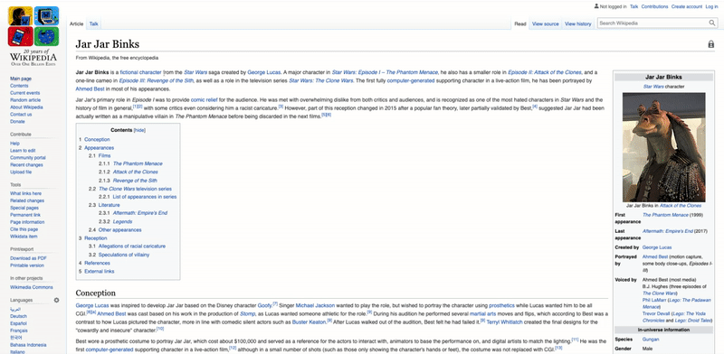
In the example from Wikipedia above, you can see the basic focus states that come built-in with all browsers, however, they’re not exactly visually appealing. That’s why some websites actually hide them, but whatever you do, do not hide the focus states on your website! Instead, use them as a design opportunity to enhance your brand.
With a little TLC, you can design focus states that work well with your brand and create a more inclusive, user-friendly experience.

Sample focus states | Source / Dockyard
As mentioned above, navigate through your website using the tab key and make sure your site's focus states are easily visible on all buttons, links, and form fields. The W3C suggests that all elements with a focus state have at least a 3:1 contrast ratio against the background color to help them be seen.
5. Write helpful alt text for your images
Writing helpful and descriptive alternative text (also known as alt text) for your images is probably one of the easiest to implement yet most overlooked areas of accessibility.
Earlier I mentioned how screen readers depend on the correct HTML tags for helping users with vision impairments understand and navigate a website. Similarly, screen readers also rely on alt text to properly describe to those users the images on a website.
Alt text can simply be added to an image using the <alt> attribute within an HTML image tag. When it comes to writing the alt text, try to describe what’s happening in the image and how it relates to the surrounding content. This makes it easy for users who depend on alt text for interpreting an image to understand what exactly the image is and how it relates to the rest of the content and page
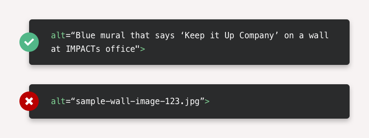
Conversely, there may also be times where an image is purely decorative or redundant in which case you can add an empty <alt> attribute to the image which tells the screen readers to skip that image.
6. Avoid creating images that include text
Back in the dark days of the internet, creating images that included text used to be a common practice.
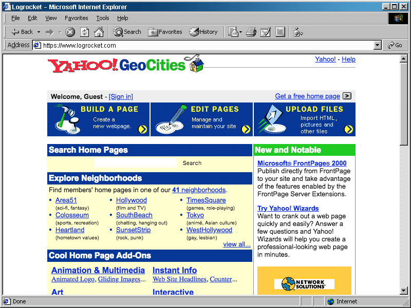
Example of a website built using images as text. The blue buttons at the top have text designed into the button itself; it can’t be highlighted or read separately from the image. | Source / Logrocket
Designers and developers were limited by a lack of coding standards and browser capabilities so they needed to come up with some “creative” workarounds to create visually appealing layouts.
Fortunately, web design has come a long way since then and we no longer need to resort to those types of design hacks. That doesn’t, however, mean that the internet is completely void of these types of images.
Many companies still use this approach on graphics such as maps, graphs, and charts and they can cause a few different issues when it comes to accessibility.
The main one is that screen readers can’t accurately read text that’s embedded into an image. Images also tend to resize based on whether a user is on a desktop, tablet, or mobile.
That means as a browser window gets smaller, the image with the text also gets smaller. That can make it extremely difficult if not impossible for any user to read, let alone users with hindered vision.
When it comes to content and images always try to make the content live text and, as mentioned above, also make sure you include alt text for the image describing its importance.
7. Use descriptive labels with form fields
One of the most effective places you can start your accessibility efforts is on your forms. For a lot of us, our marketing and sales livelihood depend on form fills, so it’s crucial that anyone can easily fill these out.
A common mistake brands make with their websites is using placeholder text as labels.
Usually, this is done to help save screen real estate, but it does come at the cost of usability.
Placeholder text is the light grey text with low contrast you might see in some forms that goes away once you start typing into the field. This can be tough for visually impaired users to read.
Since this text also disappears when information is entered, it can also be tough to remember what the field was initially for.
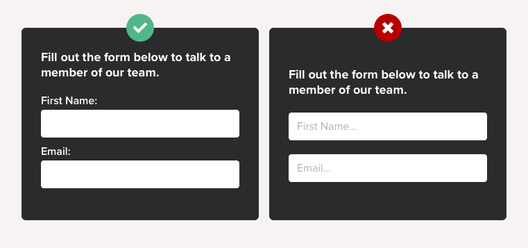
Also, for those users who use screen readers, a screen reader typically only reads the <label> elements for each field and placeholder text is skipped over.
Aside from using <label> tags to name your form fields, always make sure people understand what they should do and write in a form. You can do this in the form of a small helper text above the form field or a tool tip.
Keep in mind that this doesn’t mean that you need to clutter your forms with unnecessary information, but just make sure you're providing essential cues so users can avoid any guesswork.
8. Keep your copywriting simple
Clear and concise content is accessible content. Plain and simple.
Keeping your content clear, concise, and avoiding unnecessary jargon will open your content up to a larger audience. It’ll help people with cognitive disabilities, non- native speakers, or people with learning disabilities more easily read and comprehend your content.
In addition to keeping your content clear and concise, also try to keep the following guidelines in mind when writing:
- If you do need to use an acronym, jargon, or technical term, try provide users with a glossary of those terms and also provide a plain English alternative
- When using acronyms, use the expanded version of the acronym on first use
- Use lists whenever possible
- Consider using images or video to help clarify complex ideas
9. Check your website’s color contrast
Color contrast is a piece of website accessibility that’s often overlooked. Many of us might look at a block of text on a different color background and not give it a second thought, however, for the 285 million people living with vision impairments, text that doesn’t have enough contrast from its background can be a nightmare to read.
According to the W3C, the ideal contrast ratio between text and its background should be at least 4.5:1.
These contrast ratios do get more forgiving as your text gets bigger. For content that’s at least 18pt or 14pt bold, the minimum contrast ratio drops down to 3:1 which does up more color options for design.
Seeing all of these numbers and ratios you might be thinking “That sounds like a lot of math. How the heck am I supposed to figure that out?!”
Fear not, because the internet is a beautiful place, there’s a number of free tools out there that handle all of the math and guesswork for you. My favorite tool to use for this is the WebAIM Color Contrast Checker.
It’s a mouthful to say, but it’s the easiest tool to use. You simply enter in the color hexcode for your text and your background and it’ll tell you if the color combination passes.
Use this tool to test the color contrast on not only your main content but also on elements like your buttons, form fields, and even iconography.
10. Avoid relying on color to display critical information
As someone with color blindness, this one really hits close to home.
When you’re showing important information like data in a graph or an error on a form field, you should never use color as the only visual cue. People with low vision or color blindness can have a tough time seeing just color differences alone.
Personally, nothing drives me crazier than when I’m looking at a pie chart that only uses different shades of blue to distinguish the data and I end up having no idea what I’m looking at.
When showing people any type of data, use additional elements such as labels or patterns along with the color so the data is easier to differentiate.
Example of chart using both color and texture to display data | Source / NC State University
The same goes for selected options in an app or error states on a form field. Don’t rely just on color to show these elements, instead pair them with something more visual like an icon, an error message, or even something simple like bolding the text.
Spotify is a great example of how easy it can be to make elements like selected options in an app more accessible.
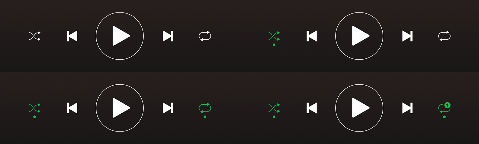
Source / We are Colorblind
The example above shows an image of Spotify’s control bar. Notice the shuffle and repeat icons.
When either of these icons are selected, they turn green. By itself, the icon turning green isn’t great for users with vision impairments. The icons are small and the green doesn’t contrast great on the black.
To solve for this, Spotify simply added a small dot beneath the icon to signal that an option is selected. This is such a simple yet effective solution. The dot doesn’t change how the app looks and won’t confuse users that aren’t colorblind yet it vastly improves the experiences for users who do need it.
Keep this in mind when presenting your users with similar information. A subtle detail like this can really go a long way.
11. Avoid flashing UI animations
I remember being in grade school and hearing kids on the playground talk about an episode of Pokémon that was giving kids seizures. At the time, it sounded like folklore more than anything, but years later I learned that there was some truth to the story.
Apparently, the episode “Electric Soldier Porygon” had a fight scene that used rapidly flashing red and blue lights that lasted for about six seconds. It was reported that the flashing lights from that scene caused thousands of kids to have seizures.
In the years since, the actual number of seizures caused by the episode has been questioned, but the incident, now known as “Pokémon Shock,” is one of the main reasons why today we see photosensitive seizure warnings on shows and video games that contain flashing lights.
The episode is a reminder of how careful we need to be with the animations and effects that we put on our websites and in our video content.
Epilepsy is a very serious condition that can cause seizures triggered by flashing lights. That’s why it’s so important to make sure we follow what’s known as the “Three Flash Rule.” The rule states that any animations or content that flashes more than three times per second is unsafe.
The best solution for this is to simply just avoid any flashing animations on your website to keep it safe for everyone.
Tools and resources to help with accessibility and inclusive design
In addition to these 11 tactics for making your website more accessible, there’s also a ton of valuable tools and resources out there to help you on your journey to accessibility and inclusive design.
W3C has done an amazing job of compiling a list of accessibility tools and resources. You can view the full list of resources here, but here are some of my favorites to get you started:
- W3C Web Accessibility Initiative Guidelines
The W3C Web Accessibility Initiative Guidelines that I’ve mentioned throughout this article is the Bible of web accessibility guidelines. I highly recommend bookmarking this site and regularly referring back to it as the information is always being updated.
The site includes a ton of useful tips, tools, information on existing legislation, court cases, presentations, and evaluations all to propel the accessible website movement. - WebAccessibility
WebAccessibility is a free tool that anyone can use to run a test on how accessible a website is. This is a great resource to kick off your accessibility journey. The tool will scan your website and generate a report showing errors, alerts, and functions that are performing well. - WebAIM Color Contrast Checker
We talked about this tool when discussing color contrast but I need to reiterate how useful it really is. Consistently checking that you have enough contrast between your background and foreground elements will ensure that all users can easily read your content and interact with your website ultimately delivering a better user experience. I’m constantly referring back to this tool and it’s simple yet detailed layout makes it really easy to use.
Inclusivity all comes down to empathy
If you do your research, you’ll find a ton of different resources that discuss the benefits of creating an accessible website and DEI in general. A lot of those benefits center around making a strong business case for accessibility.
You’ll read benefits such as:
- Accessibility can boost your SEO efforts because Google favors websites with better user experiences
- You’ll minimize your legal risk. We’ve seen a number of stories about high-profile companies being served with ADA compliance lawsuits. In 2019 alone, there were 2,256 website accessibility lawsuits filed.
- Creating an accessible website means more people can interact with your brand and use your website which will help grow your audience.
While those benefits are definitely important, at the end of the day, creating accessible products all comes down to having empathy. It’s about understanding and caring about the different needs and challenges of users and wanting to create an equal experience for everyone.
As designers and marketers, we have the power and responsibility to make sure that everyone can use what we create. In my opinion, that’s the best thing about accessibility. It creates a better experience for everyone.
Free: Assessment
/Assets/Icon%20Library/Arrows/Grey%20Arrow%20-%20Prev.svg)
/Assets/Icon%20Library/Arrows/Grey%20Arrow%20-%20Next.svg)