

 Website Strategy
Last updated on February 24, 2026
READY TO IMPLEMENT ENDLESS CUSTOMERS™ IN YOUR BUSINESS?
You’ve learned the philosophy. Now it’s time to put it into action. Our coaches will help you apply the Endless Customers System™ to your sales and marketing so you can build trust faster, close deals sooner, and create a steady flow of new customers.
In 2026, your website either closes deals in its sleep, or silently costs you millions. There’s no middle ground anymore.
Think about it. When was the last time you made a significant business purchase without visiting the company's website first?
Can't remember? Neither can your buyers.
Here's the reality that's keeping CEOs up at night: a majority of the buying process now happens before anyone contacts your sales team.
Your potential customers are out there right now, evaluating you against your competitors. They're forming opinions. Making decisions. And potentially crossing you off their list. All without speaking to a single person at your company.
Is your website equipped to be your most effective sales rep?

If you're not sure, you're not alone. Most business websites fail because they're built on outdated assumptions about how buyers actually buy.
But here's the good news: When you get your website strategy right, it transforms from a cost center into a revenue machine. We've seen companies double their qualified leads, slash their sales cycles by 30%, and turn their websites into their most productive team members.
This guide will show you exactly how to make that transformation happen for your business with a proven approach that aligns with how modern buyers actually make decisions.
Ready to turn your website into your competitive advantage? Let's dive in.
Why Do Websites Matter More Today?
In 2026, your website's importance has grown for three main reasons: ownership, trust, and conversion.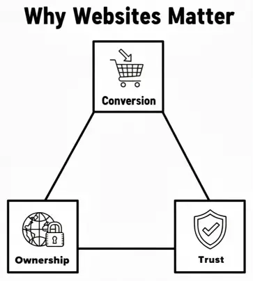
- First, your website is the only part of your digital presence that you own 100%. On social media platforms like YouTube, you work under their rules, subject to their algorithms and best practices. You don't have complete control. Your website, however, is completely within your control. You decide the exact look, content, images, and structure, setting the rules for how your brand is shown to the world. It is the true place for people to learn exactly who you are, the way you want them to.
- Second, true trust and authority still run through your website. While being on other platforms is important, search engines like Google, AI Overviews, and other Large Language Models (LLMs) look to your website as the main source of truth. To be cited as a trusted answer by AI, your website must be a high-authority engine. Without a high-authority site, you lack trust and won't be used as an expert. This also applies to how people see you; even great social media content can be hurt by a poor-quality website that makes a possible customer wonder if the business is a scam.
- Finally, while zero-click searches are growing, your website remains the main place where conversions happen. For businesses with complex sales cycles, zero-click might create attention for educational content, but the website is where trust is built and purchases are made. There are many products and services, such as parts for heavy machines like forklifts, that people simply aren't buying on Instagram. Even as more conversions start to happen on other platforms, websites will remain the main place for these complex business deals.
What Is Involved in Website Strategy?
Many people think of their website as their top salesperson. One who never takes a vacation and is always ready to convert leads. But for that salesperson to work well, they need a plan. Website strategy is the blueprint or roadmap that tells your "salesperson" what to do. It's the "how" behind building the best converting website you can.
A website without a strategy is flying blind. A true website strategy includes:
-
Looking at data: Studying analytics and heat mapping data to understand user behavior.
-
Creating hypotheses: Using that data to form educated guesses about what changes will improve performance.
-
Building a site structure: Carefully planning the structure and pages of the site.
-
Doing page strategy work: Defining the purpose and content for each individual page.
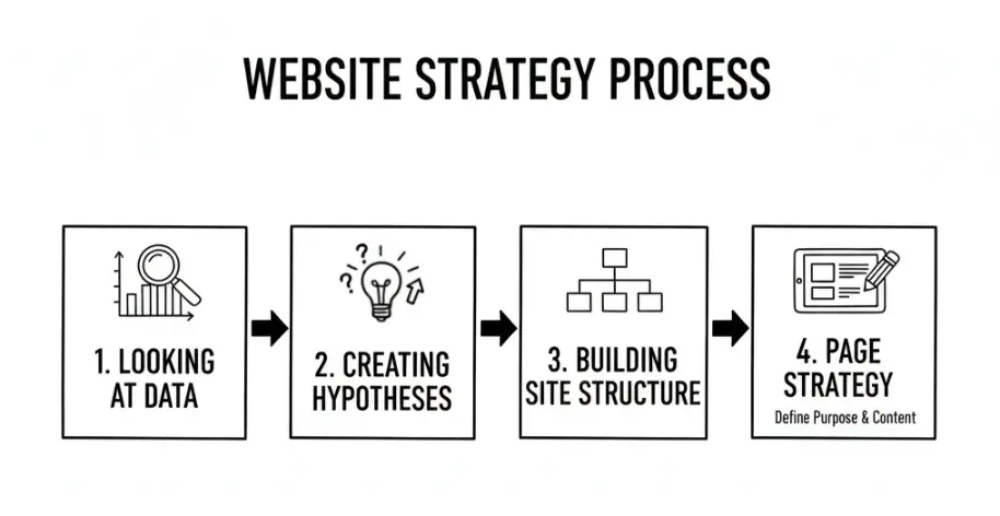
The strategy phase is about using as much data as possible to make well-informed decisions. While sometimes these first hypotheses might be wrong, they give you a strong starting point. From there, you can use live user data from the launched site to keep improving it.
A solid strategy makes sure that the decisions you make are as well-informed as they can be, which is critical for success.
What Makes a High-Converting Website?
In-House Ownership
An important part of a successful website strategy is having in-house ownership, which means your internal team has the control and ability to make needed changes quickly.
One of the most common reasons a company needs a complete website redesign is that they lack this control. If your marketing team needs to go through a developer or an outside agency just to update navigation, change button text, or edit copy, they are basically stuck.
When it takes an agency three weeks to make a simple update, it's a poor use of time and money, and it's time to bring that control in-house.
In 2026, a marketer can and should be able to own the website. Modern website platforms have become so user-friendly, with drag-and-drop interfaces and easy editing tools, that a developer is no longer needed for most day-to-day tasks.
As long as you're on the right framework, a marketer should be able to update the site, create content, and even run A/B tests.
While there are exceptions (such as complex e-commerce sites with thousands of products or complex configurator tools) for basic ownership and website optimization, a marketer is perfectly capable.
Platforms like HubSpot and WordPress are powerful and easy-to-use options that help with this in-house ownership. HubSpot is known for its ease of use, powerful hosting, and good security, while WordPress is a dominant content engine used by most websites worldwide.
If you’re building and managing your website in house and you’re wondering whether HubSpot or WordPress is the better fit, check out our resource, HubSpot vs WordPress: Which is Better for Your Business Website? You’ll learn the real tradeoffs (not the generic pros and cons), the questions you should ask before you choose, and how to decide based on your goals, budget, and the level of control your team actually needs.
Design & Messaging That Converts
To create a website that converts, your design and messaging must work together to build trust and guide the user to action. At the core of effective messaging is one simple rule from Donald Miller: "if you confuse, you lose".
Buyers don't choose the most cleverly communicated products; they choose the clearest.
Want to learn how to get your value across quickly and simply? Check out our resource: 14 Value Proposition Examples that Every Marketer Can Learn From. This article shows you how to craft a great value proposition and presents great examples from different industries.
Many businesses fall victim to the "curse of knowledge," dumping complex jargon on their audience, or they try to be funny like a massive brand like Wendy’s, which ends up pushing possible customers away. A basic website with clear messaging will always do better than a beautifully designed but confusing one because it will actually get results.
A powerful framework for reaching this clarity is StoryBrand, which uses storytelling rules to help buyers emotionally connect with your message.
This framework is perfectly suited for websites, which are naturally structured with headings, body copy, and calls to action that can guide users through a journey.
To use this on your site, follow these core rules:
- Make the Customer the Hero: Your website copy should never be about you. Far too many companies fall into the "we we we" trap, talking about how long they've been in business or their credentials. The truth is, customers don't care about your company; they only care about how you can help them solve their problems. Your messaging must flip the script to make the prospect the hero of the story.
- Position Your Company as the Guide: If the customer is the hero, your role is to be the trusted guide who can lead them to their desired outcome. This approach builds the trust that is needed for any business deal.
- Focus on Benefits, Not Features: Instead of just listing what your product does, your copy needs to paint a picture of how it makes the customer's life better. This is a key part of telling a good story and is important for an effective website.
- Set the Stakes: You must clearly share what is at stake if a possible customer doesn't work with you. This helps them understand the value and why they need your solution.
- Be Authentic and Transparent: Storytelling is not about emotional manipulation or selective storytelling. It's about being honest and transparent, even about the "messy parts" of the journey. This realness is what truly builds trust.
- Use Visuals to Enhance the Story: Visuals like photos and videos are excellent at creating emotion in ways that written words cannot. Use a mix of real photos of your team and high-quality stock photography to show that you are real people who help other real people. Smart buyers can spot fake stock photos, so genuine visuals help build trust.
Self-Service Tools
Self-service tools are website features that allow buyers to navigate key parts of the purchase journey on their own, without needing to speak to a person. These tools change interactions that traditionally required a human (like getting a price estimate or scheduling a call) into a smooth online experience, allowing prospects to get the information they need whenever and however they want it.
By offering these tools, you show a serious commitment to transparency, which builds huge trust and moves buyers closer to a purchase. This approach also leads to a more qualified sales pipeline, shorter sales cycles, and more confident prospects.
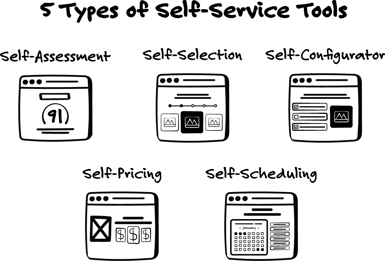
There are five main types of self-service tools that are most impactful for a high-converting site:
- Self-Assessment Tools: These tools, like quizzes or scorecards, help buyers evaluate their needs or challenges and receive personal recommendations. They are excellent for helping prospects understand their problems.
- Self-Selection Tools: These interactive tools ask targeted questions to guide overwhelmed buyers to their ideal solution among multiple options. They are perfect for helping buyers narrow down choices.
- Self-Configurator Tools: Configurators allow buyers to design or customize a product or service, turning abstract possibilities into a concrete vision. They are valuable as they deepen a buyer's commitment.
- Self-Scheduling Tools: By letting buyers book meetings or demos directly online, these tools get rid of back-and-forth friction and give buyers control over the next step.
- Self-Pricing Tools: Often the most important tool on the list, Pricing calculators and estimators give buyers the cost transparency they want. This is critical as it answers the main question of "how much does it cost?" and helps buyers assess affordability right away.
By using these tools, your website becomes a relief for your buyers who are frustrated by the companies that don't give them this information easily.
Content That Teaches
A modern website must be an educational hub where buyers can find answers to their most pressing questions. Demand Gen Report research shows that 44% of buyers consume three to five pieces of content before they are willing to talk with a vendor, which means your site must help with this self-education process effectively.
Many companies rely on a traditional blog for this, but a blog is often not enough.
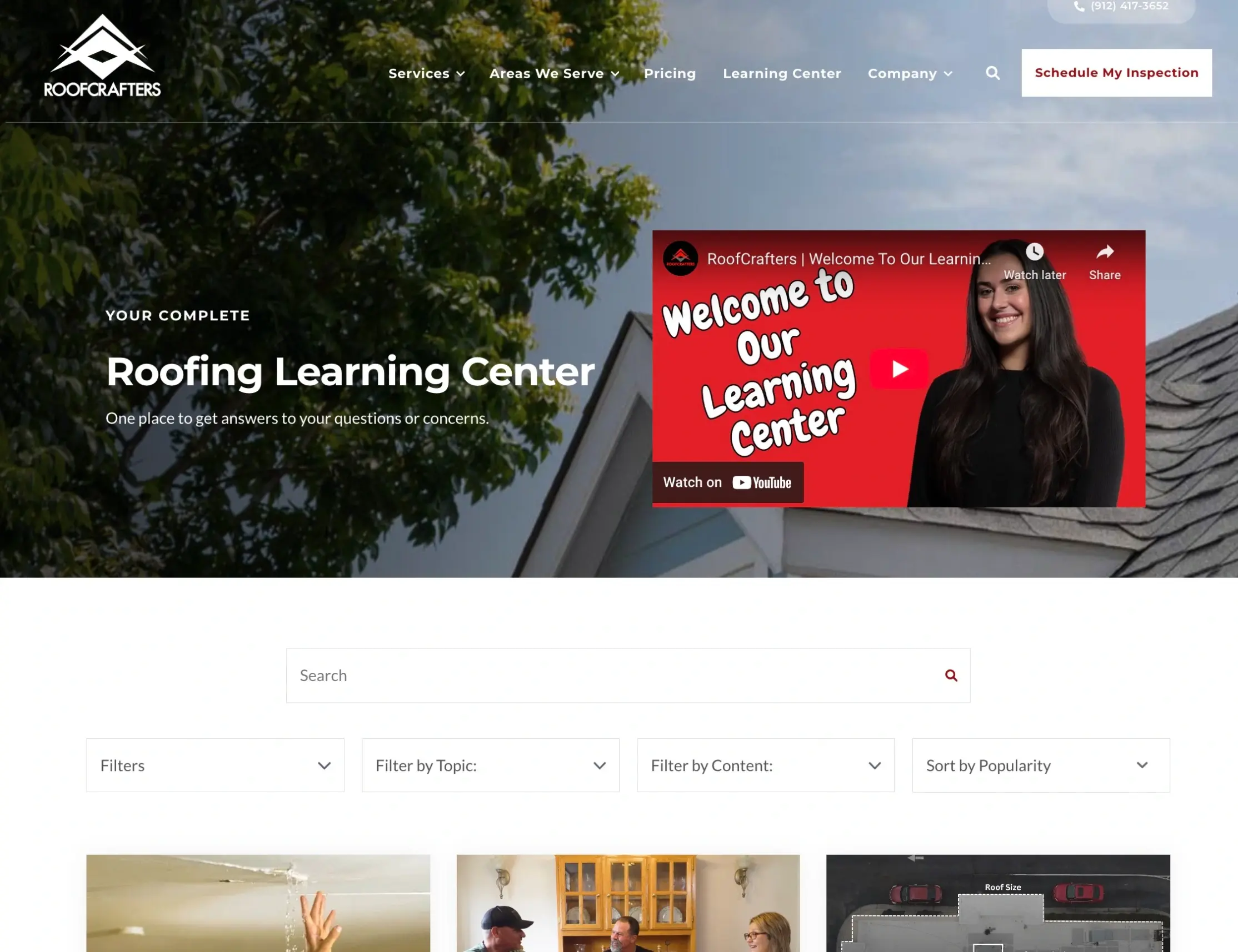
The solution is to build a Learning Center, which is a much more complete and organized educational hub than a traditional blog.
Learning Center vs. Blog
A Learning Center is basically different from a blog because it is designed specifically to organize all your educational content (articles, videos, webinars, ebooks, and guides) to be easily sorted and navigated.
-
A blog is often a disorganized "filing cabinet" of content shown in time order, mixing important educational articles with company news, press releases, and other items that are not relevant to a buyer's immediate problems.
-
A Learning Center is a curated educational hub that contains only the most important content for the buyer's journey, making it simple for prospects to find answers quickly.
By creating a user-friendly experience, a Learning Center helps buyers become more educated on your offerings. This not only builds trust but also allows them to better qualify themselves as a good fit for your sales team, leading to more productive sales conversations.
To work well, a Learning Center should have four key abilities:
-
Searchable
-
Easy to use
-
Able to be broken into segments
-
Allow users to filter content by audience
The segmentation is important, allowing users to filter content by topic (often centered around your products or services), content type (articles, videos, guides), and their specific industry or persona. This meets different learning styles and makes sure users only see the content that is most relevant to them.
What Content Should We Create For Our Learning Center?
The content within your Learning Center should be focused completely on answering your customers' questions and helping them solve their problems. You need to move away from "me content" and focus on what buyers are actually searching for.
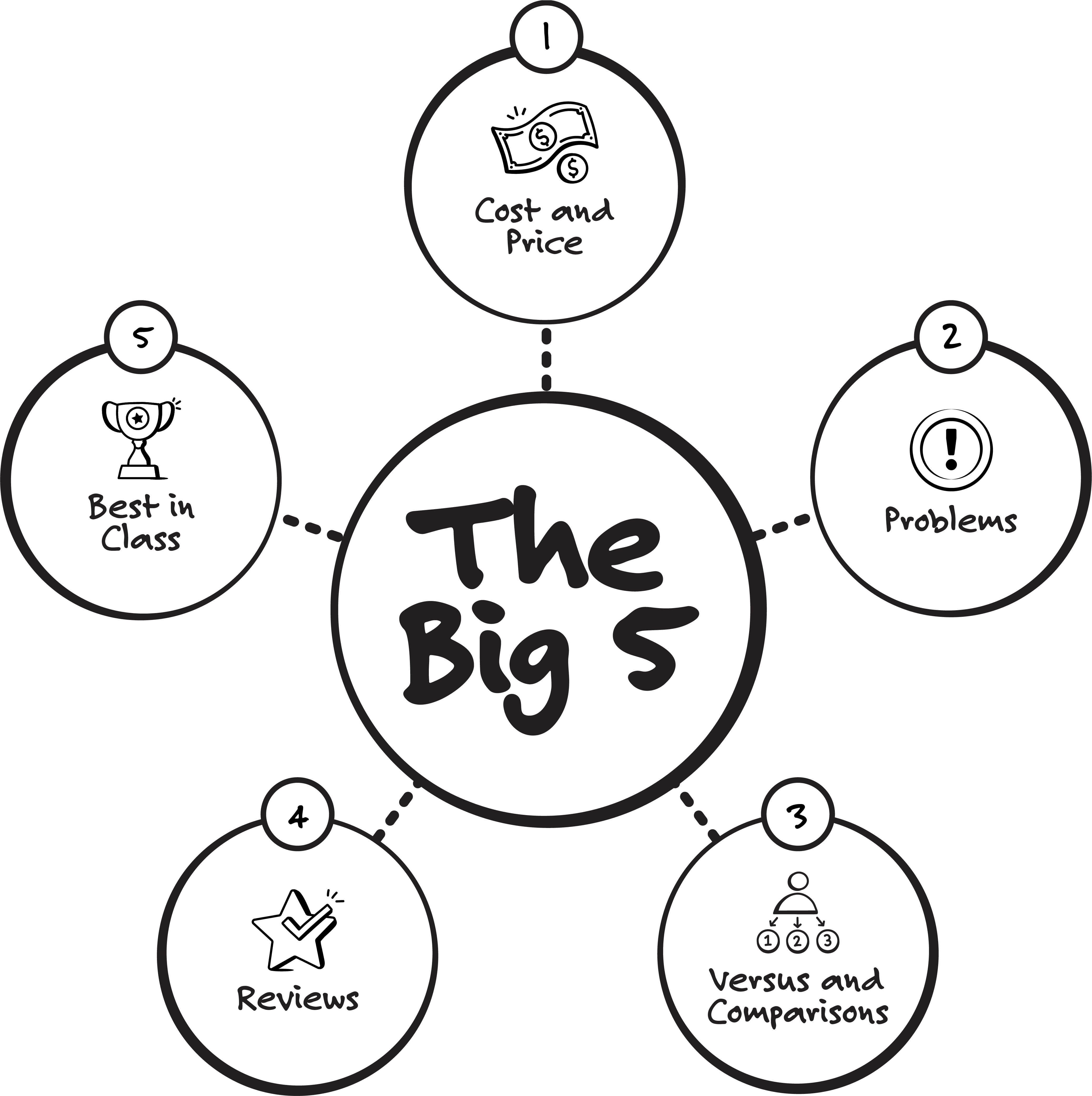
We call these topics The Big 5:
- Cost & Price: One of the first questions buyers have is, "How much is it going to cost me to fix this?". Answering this question directly is critical.
- Problems: Buyers start by searching for solutions to their problems. Your content must address these pain points directly.
- Comparisons: Prospects will want to compare different options or products against one another.
- Reviews: Buyers want the good, the bad, and the ugly. And importantly, they want to know who a product or service is and is not a good fit for.
- Best in Class: Buyers search for the “best”, “most”, “top”, or whatever extreme they can find. Even though someone might not end up buying “the best,” they at least want to be able to have a clear sense of the full suite of options.
RoofCrafters is a clear proof point: once they stopped publishing fluffy posts and started answering real buyer questions from The Big 5, their organic results took off. With an in-house team producing honest articles and video for sales to use, website sessions climbed 460% in a year, inbound leads jumped 400%, inbound revenue rose 700%, and the company now brings in about $270,000 per month from organic leads. As reps shared those Big 5 resources in the sales process, close rates rose from roughly 30% to as high as 60%. The strategy was simple: educate first, earn trust, and make it easy to decide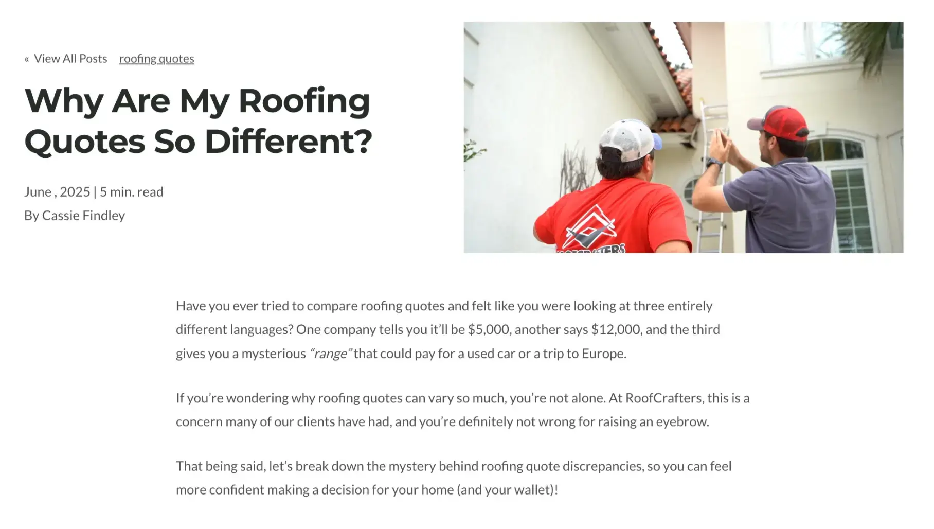
By focusing your content strategy on these core topics and organizing them within a dedicated Learning Center, you create a powerful tool that builds trust, educates your audience, and ultimately drives more qualified leads.
Mobile-First Isn't Optional
80% of B2B prospects use mobile devices during the buying process.
Yet most B2B websites still treat mobile as an afterthought. They shrink their desktop site and call it "responsive." That's like taking a billboard and calling it a business card.
Mobile-first design means:
- Touch-friendly buttons and navigation
- Readable text without zooming
- Fast-loading pages (under 3 seconds)
- Forms that don't make people want to throw their phone
- Click-to-call functionality that actually works
Test your site on mobile right now. If you need two hands and a magnifying glass to navigate, you're losing buyers.
How Should Website Navigation Be Structured?
Your website's navigation is the map that guides visitors toward a purchase. If it's confusing, you create friction and frustration, causing possible customers to leave and go to a competitor. A successful navigation structure is simple, clear, and based on the buyer's journey.
Simple, Journey-Based Navigation
Let’s do a little exercise. Go to your website’s main navigation.
How many items are in your main navigation right now? Does it look anything like this?

If it's more than seven, you're likely overwhelming visitors with decision fatigue.
Your navigation is not a space for you to add every page on your website. It’s prime real estate to help your visitors make sense of your website and easily find what they need.
Here's what actually belongs in your main navigation:
- Clear paths to services, pricing and your learning center
- Essential trust-builders (About, Meet the Team)
- Your most important conversion page
Everything else goes in the footer or is internally linked throughout your pages. Remember, your navigation's job is to guide, not to showcase every page on your site.
The most critical elements of the buyer's journey should be placed directly in your main navigation so they are easy to find at all times. This includes using a "sticky nav" that follows the user as they scroll, making sure these links are always easy to reach.
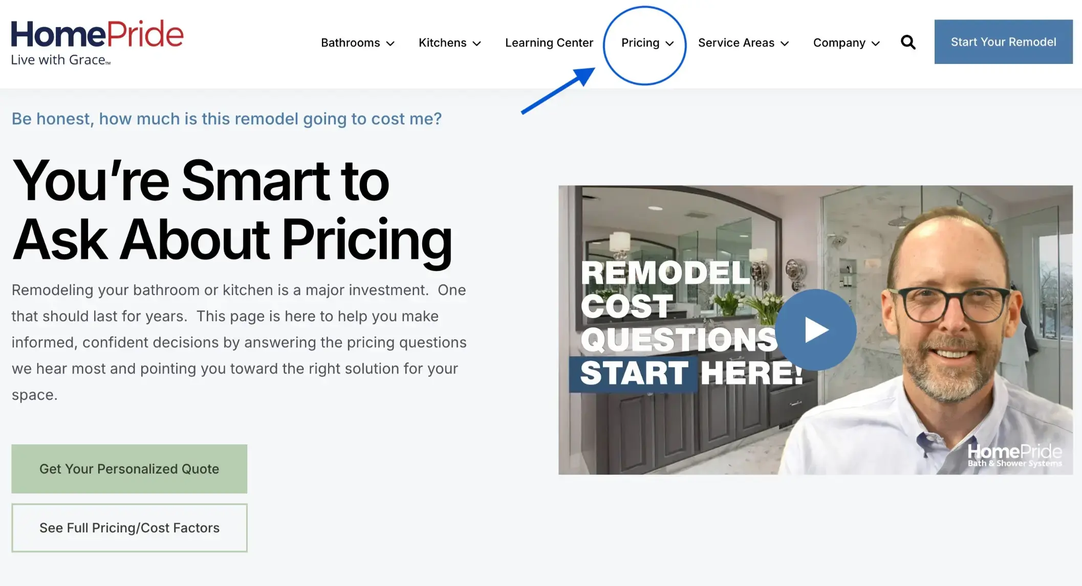
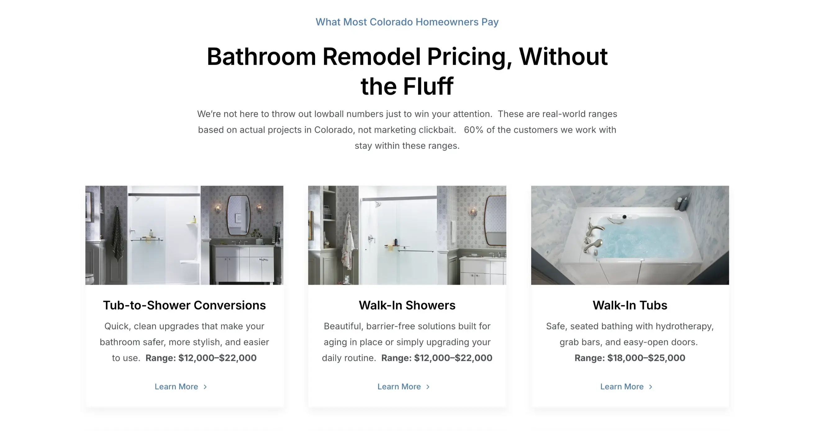
Make Pricing Easy to Find
Pricing is often the most clicked element on a website because it's the number one thing people are looking for. Placing a link to your Pricing page directly in the main navigation is important.
Hiding your price creates distrust and frustration. Being transparent about cost builds trust and helps rule out bad-fit leads, saving everyone's time.
Why a Pricing Page Matters: A dedicated Pricing page is a cornerstone of transparency. It allows you to explain the factors that affect your pricing, offer ranges, and show buyers you have nothing to hide. This proactively answers their biggest question and establishes you as a trustworthy guide.
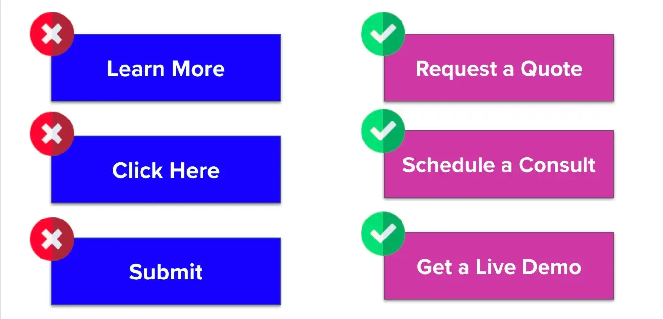
CTA Clarity
Your primary Call to Action (CTA) should also be in your main navigation. A CTA must be clear, compelling, and actionable.
- Be Specific: A vague CTA like "Talk to Us" is less effective than a specific one like "Talk to a Sales Expert" because the latter sets a clear expectation of what will happen next.
- Start with a Verb: CTAs must tell people what to do. Instead of a title like "10 Questions to Ask," it should be an action, such as "Download the Guide".
- Offer Different Options: Not everyone is ready for a direct sales conversation (the "marriage proposal"). Offer a secondary, transitional CTA (a "cup of coffee") like downloading a guide, which allows you to nurture leads who aren't ready to buy yet.
How Do You Know If Your Website Is Working?
Once you've spent time and money launching your website, the work isn't over. It's just beginning.
Far too many businesses (an estimated 80 to 90%) launch a new site and fall into a "set it and forget it" mindset, expecting results to just roll in. But your website is not a fixed asset; it is a living, breathing thing and should be treated as the most valuable member of your sales team. Just as you wouldn't hire a salesperson and leave them without management or coaching for months, you cannot afford to launch your site and simply walk away.
The key to knowing if your website is working is to shift from a launch-and-leave mindset to one of continuous website optimization, testing, and learning.
Success isn't measured by a one-time launch but by an ongoing commitment to improving the user's experience.
Look for Qualitative Signals
Rather than chasing specific ROI math, these are the signals to look for:
- More Educated Leads & Stronger First Conversations: A well-optimized website educates buyers before they ever speak to a salesperson. When prospects have already consumed your content and used self-service tools, the sales team can have much more productive first conversations.
- A More Efficient Sales Cycle: By using the website to rule out bad-fit prospects before they ever raise their hand, your sales team can stop wasting time on leads that will never close. This leads to a more efficient process and an improved close rate.
- Higher Engagement on Key Pages: Your website data will show you what's working with users. By studying what content they are and are not engaging with, you can gather a lot of information to make informed improvements.
Use Data and Testing to Get Answers
Internal opinions, no matter how experienced, are not proof of what works. Your personal opinion doesn't matter; it's all about what the user cares about. The only way to know for sure is to test your guesses with real user data.
- Establish Data Ownership: Your website needs a manager. Someone on your team must be responsible, either part-time or full-time, for looking at analytics, gathering information, and running tests to learn what is and isn't working.
- Run A/B Tests: Every element on your site (from messaging to calls to action) is an educated guess until it's proven with data. A/B testing allows you to test a guess against a control and see what your specific audience actually prefers. This data-driven approach removes internal bias from the conversation.
- Give Tests Enough Time: To get meaningful results, a test must run long enough to account for changes. A good rule of thumb is to let a test run for at least four weeks to gather enough data for statistical significance. While you should monitor results weekly to "stop the bleeding" if a test is doing poorly, don't make final decisions based on short-term signals.
- Learn from What Doesn't Work: A test that fails is not a failure; it's a critical learning opportunity. When a guess is proven wrong, you learn something valuable about your specific audience that you can apply across all your marketing and sales touchpoints. This mindset of curiosity and a willingness to be wrong is needed for continuous improvement.
When to Redesign vs. Optimize Your Website
The decision to redesign your website versus optimizing the one you have mainly comes down to control and technical performance.
You should pursue a redesign if:
- You cannot easily edit your website: This is the most common reason for a redesign. If your marketing team cannot update navigation, change copy, or change a button without a developer, you need a new site built on a more flexible framework that a marketer can manage directly.
- Your site is technically poor: If your website loads very slowly, has broken elements, or is built on an outdated CMS, it's a major problem. While some technical issues can be optimized, a basically outdated framework often requires a full redesign to improve the user experience.
On the other hand, you can optimize if you have control over the key elements of your site. If your team is able to:
- Update the navigation: You can work on improving the nav to reflect the ideal buyer's journey.
- Run A/B tests: You can use your existing platform to test hypotheses and improve conversion rates.
- Update copy: You can change messaging on key pages, like the homepage, to tell a clearer, more compelling story.
Many companies believe they need a redesign simply because they feel the design looks old. However, design is rarely the main driver of conversions.
Content clarity is far more important than a pretty design.
A beautiful website with the wrong content will not convert, whereas a site with the right buyer's journey and clear messaging will.
How Does AI Affect My Website?
Preparing your website for an AI-driven future doesn't require a complete overhaul of your strategy. Much of what is now being called "AI optimization" is basically good technical SEO that should have been used for years.
However, there are a few key areas to focus on now to make sure your website is AI-friendly:
- Structure Your Content for AI: The structure of your content is increasingly important. Use clear headings (H1, H2, etc.) to create a logical order that AI can easily read and understand.
- Integrate FAQs: Adding an FAQ section to almost every page is an important tactic. This directly answers common user questions in a format that AI is likely to pull for featured snippets and AI Overviews.
- Implement Schema Markup: Adding schema helps search engines and AI understand the context of your content, which is a big piece of future-proofing your site.
By focusing on these structural and technical elements, you position your website to be a trusted source for AI-powered search and discovery.
How Does This Website Strategy Work In Real Companies?
Berry Insurance shows how the right website changes outcomes. Before working with us, their site looked like a typical brochure with “schedule a consult” CTAs and no real education hub. Today, “Learning Center” and “Pricing” sit in the main navigation, the homepage promises an education-driven quoting process, and new articles are kept current so buyers can self-educate before they ever talk to sales. Backed by They Ask, You Answer (Now Endless Customers) and consistent in-house publishing, the shift paid off: Berry reports 183% business growth, 99% more leads, and a 69% higher close rate, with form submissions rising from 127 at a 16% close to 253 at 27%, and website-attributed revenue climbing from $66K to $185K in a year.
EW Motion Therapy is another great example. Even before working with IMPACT, they already had a Patient Resources section on their website, but they didn’t have the system and strategy for real growth. After adopting Endless Customers and publishing question-driven articles and videos, results followed: 9,900% growth in overall traffic, 90+ new leads per month, and a 200% increase in monthly website customers. This growth allowed them to open two new therapy centers within two years.

What Does Website Work With IMPACT Look Like?
We approach website projects along two broad paths: website optimization or redesign. The path we take is decided completely by your specific situation and needs.
Path 1: Optimization
If you already have control over your website and don't need a full rebuild, we take a website optimization route.
We work with you to identify the key focus areas for improvement. This could involve building out a Learning Center, creating a pricing page, developing new page strategies for your service pages, or improving technical elements like schema.
We establish benchmarks and track performance over time to measure the impact of these optimizations.
Path 2: Redesign (A New Website)
If you need a completely new website, we start from ground zero with a complete, multi-phase process.
- Strategy: We do a discovery process to understand your current website performance, marketing and sales processes, buyer's journey, and business goals. We then do a content inventory and build a sitemap structure, creating the blueprint for the new site.
- Content and Build: While our team handles design and development, your team works on writing the new content. We run these processes at the same time to be as efficient as possible. Once the framework is built, your team can begin entering content directly into the new CMS.
- Launch: After content is complete and the site is built, we launch it.
- Optimization: After launch, the redesign path merges with the website optimization path. We use the data from the newly launched site to identify the next priorities and keep working to make the site even better.
How Much Does Website Work Cost?
In general, the cost of a website can vary greatly, from $500 for a DIY site builder to over $150,000+ for a massive enterprise site with an "Apple-level" design.
IMPACT's full redesigns typically fall within a range from $45,000 to $85,000, depending on the size and complexity of the site. We focus on the 20% of the work that drives 80% of the conversions, which allows us to be quicker to launch. See our full pricing page here. 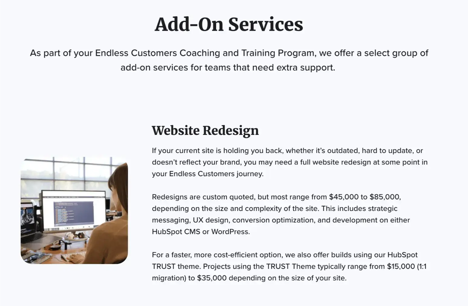
The main factors that increase the price are the level of customization and the scope of new content and tools. Custom design, custom development for special modules, and a large number of new pages will place a project at the higher end of the range.
A project on the lower end of our range would involve moving most existing content onto a new, flexible framework and updating only the most critical pages, with the plan to optimize heavily after launch.
Ready For a Site That Converts?
You've made it this far because you know your website could be doing more. The question now is how you want to move forward.
For Self-Starters: “I want to do this on my own, but tips and tricks never hurt”
If you're a self-starter with internal resources, check out the website design and optimization episodes of the Endless Customers Podcast for some expert advice.
For the Strategic Partner: "I want experts guiding us — but we'll own the outcome"
If you know transformation needs to happen fast and want experienced guidance while building your team's capabilities, let's talk about working together.
This isn't traditional agency work where we disappear after launch. We work alongside your team, transferring knowledge and building competencies so you own your success long-term. You'll get the benefit of our experience with hundreds of websites while maintaining complete control of your digital presence. Perfect for leaders who value expertise but refuse to be dependent on outsiders.
The worst option? Doing nothing and hoping your current website suddenly starts performing.
Your buyers are online right now, making decisions about your business. Make sure your website is working as hard as you are.
Because remember: Your website is either your best salesperson or your biggest liability.
Which one will you choose?
Website Strategy FAQs
- What makes a high-converting business website?
A high-converting site answers real buyer questions in plain language, loads fast on mobile, shows proof (case studies, short videos), and offers clear next steps. Turn key pages into self-service paths (pricing, comparisons, fit checks, instant scheduling) and connect every action to your CRM so you track qualified meetings and revenue—not just clicks. - How should I structure website navigation?
Use simple, buyer-journey navigation with no more than 5–7 top items. Keep Services/Products, Pricing, Learning Center, About/Team, and a clear Primary CTA visible (sticky nav helps). Everything else belongs in the footer or as internal links. Make sure pricing and scheduling are always one click away. - Where should pricing live on my site?
Put Pricing in the main navigation and create a dedicated pricing page. Explain cost factors, typical ranges, and what drives price up or down. Link to related content (comparisons, best options) and include a light CTA (calculator, “talk to an expert”) so buyers can move forward without friction. - When should I redesign vs. optimize my website?
Redesign if you lack control (can’t edit pages or nav) or the tech is broken (slow, insecure, outdated CMS). Optimize if you can edit content, run A/B tests, and improve performance. In most cases, clarity of content and self-service tools will move conversions more than a visual refresh. - How do I know if my website is working?
Look beyond traffic and clicks. Track the percentage of visitors who use self-service and then book a meeting, the qualified pipeline sourced by the website, time from first visit to first meeting, and revenue influenced by web activity. Qualitatively, you should see better first conversations, fewer bad-fit leads, and higher engagement on pricing, comparison, and case study pages. Review these monthly, run focused A/B tests, and keep shipping small improvements.
Additional Resources
Strategy & Planning Foundations
Redesign & Structural Decisions

This article was produced as a collective effort of the IMPACT Team and is regularly updated.
Table of Contents
Share
/Assets/Icon%20Library/social/x%20corp.svg)
/Assets/Icon%20Library/social/mail-to.svg)
/Assets/base/Learning%20Center%20Resource%20Category%20Icons/Website%20link.svg)
Additional Resources
Strategy & Planning Foundations
Redesign & Structural Decisions
Conversion, Messaging & Buyer Experience