
Oct 3, 2024

When people come to your website, oftentimes the first page they land on and see is your homepage.
With 63% of marketers saying generating leads is one of their top challenges, you most definitely want to capitalize on this, one of the highest viewed pages of your site.
Trying to determine what to include on the page can be overwhelming though. What should it say? What kind of features should it include?
There are so many lead generation opportunities often missed when it comes to homepage designs.
11 Examples of Lead Generation Website Designs
It's time to get inspired! Let’s take a look at 11 companies, some big, some small, that have awesome lead generating homepages to help drive their business.
1. Databox
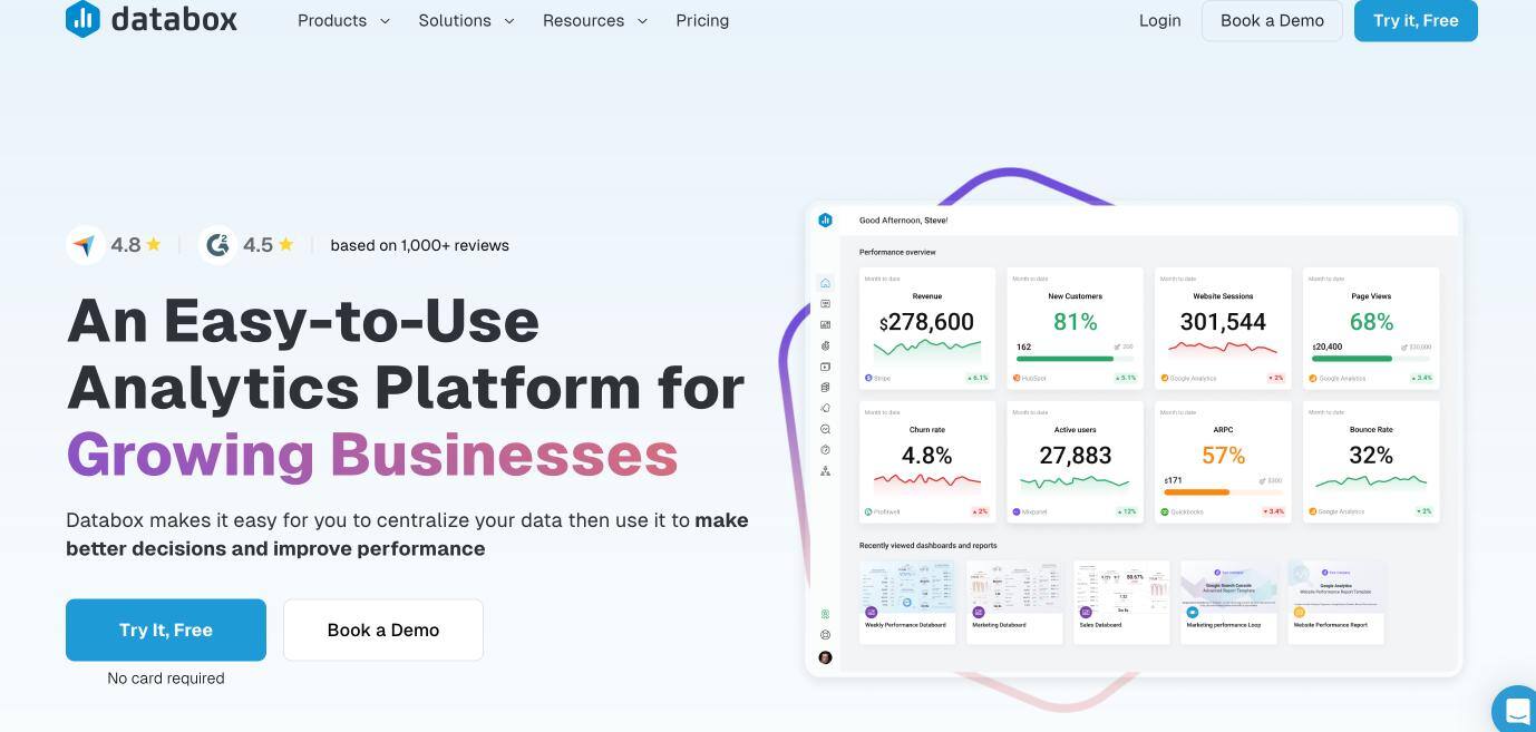
Starting off with one of my personal favorites, Databox is a key performance indicator (KPI) dashboard that pulls data in real-time for businesses.
Up until recently, however, the messaging on the homepage didn’t reflect who they were truly selling to.
Databox’s Director of Marketing, explains how “in the years prior, Databox had been positioned more toward executives and the analysts that work for them within enterprise companies, enabling them to understand how their business was performing at any time, on any device — but with a strong emphasis on mobile.”
Selling to enterprise companies proved difficult so the company pivoted to sell to mass market, by opting for a freemium model that allowed users to sign up and use the product for free.
Why their Homepage Works:
- Targeted messaging to their audience. As you continue to scroll down the page, you’ll see alternating sections that speak to some of the most common pain points their audience has. As business owners, marketers and sales leaders, we’re constantly crunched on time and Databox capitalizes on that feeling. We all know we need to analyze our data in order to make informed decisions that drive sales and marketing, but when can we fit it into the day?
- Subtle but effective social proof, like the user review scores from G2 and Capterra.
- An opt-in to get started right away, without a card required.
How to Improve:
- It's always hard to know just how in-depth you should go on a homepage, but I think the Databox page provides a little too much detail. It's a long scroll that can feel a little overwhelming.
2. RedShelf
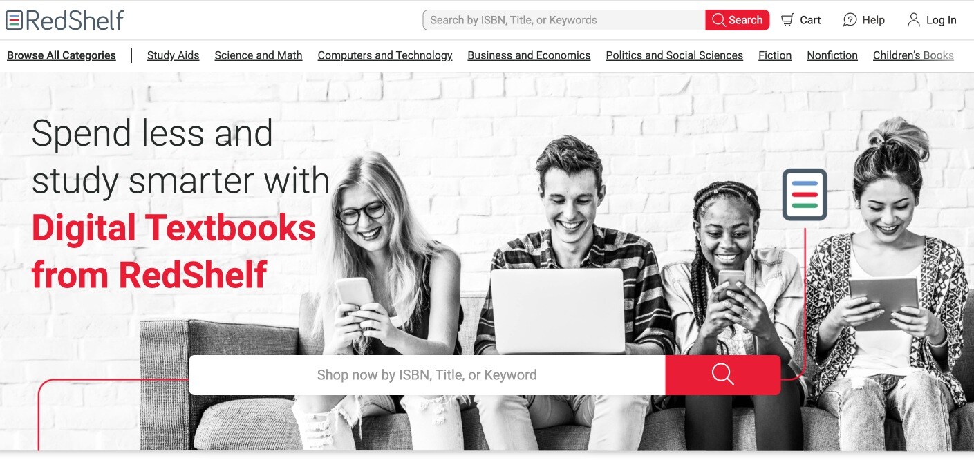
In the ever-expanding digital world, RedShelf provides eTextbooks for students and publishers. After hearing about RedShelf, I thought it was genius but couldn’t help but ask, why would a textbook publisher want to sell eBooks? They would see 60% less revenue per book sold.
However, RedShelf was able to use its model to help publishers see more money in the long run. Since eBooks cannot be resold or passed on to other students, “publishers make more moolah by selling books every year, rather than just when the books disintegrate from use or get yet another edition bump to encourage students to buy new books.”
Why their Homepage Works:
- Clear calls-to-action (CTA). I immediately know how to search for a title and am directed to a page where I can find and purchase the book.
- A clear focus on its core audience. This is all about helping students succeed, so you see features like study aids and flash card help. Also, notice the subtle reminder that their platform works across devices. The four students in the hero image use a phone, laptop, and tablet to access the material.
- Separate contact options for support and sales. Nothing is more frustrating than receiving a support question when you’re trying to navigate through sales prospects, and your customers also want answers to their issues quickly. Easily distinguishing how to contact support versus sales is crucial for both sides.
How to Improve:
- Draw more attention to range. There are links for fiction and children's books — things that fall outside of the core academic catalog. Those offerings could be explained better.
3. Lux Lights
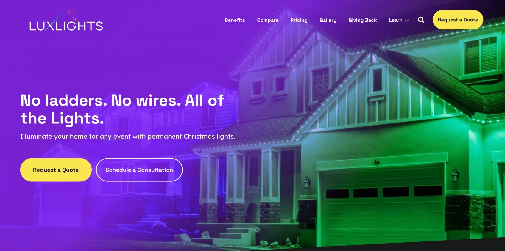
Lux Lights provides homeowners with an ever-classy way to light their homes at night, whether for holidays or just because.
The homepage speaks directly to their customers, with an eight-word header that manages to touch both of the core frustrations Lux Lights solves: The danger of installation and the messy look of DIY holiday decorating.
Why their Homepage Works:
- Simple, clear design with an effective headline and a full-scale image that's inviting. By showcasing a high-end home, Lux Lights associates their brand with high quality.
- It's easy to find price ranges, which can be hard to do for custom solutions. How does Lux Lights do it? With examples of different houses and roof lines to offer a sense of what you might expect to pay based on the size and style of your home.
- Beautiful visuals speak to the high quality of the product and craftsmanship.
How to Improve:
- More clearly differentiated CTAs. To a casual browser, "request a quote" and "schedule a consultation" sounds too similar. Both require potential buyers to take a step they may not be ready for.
4. Evernote
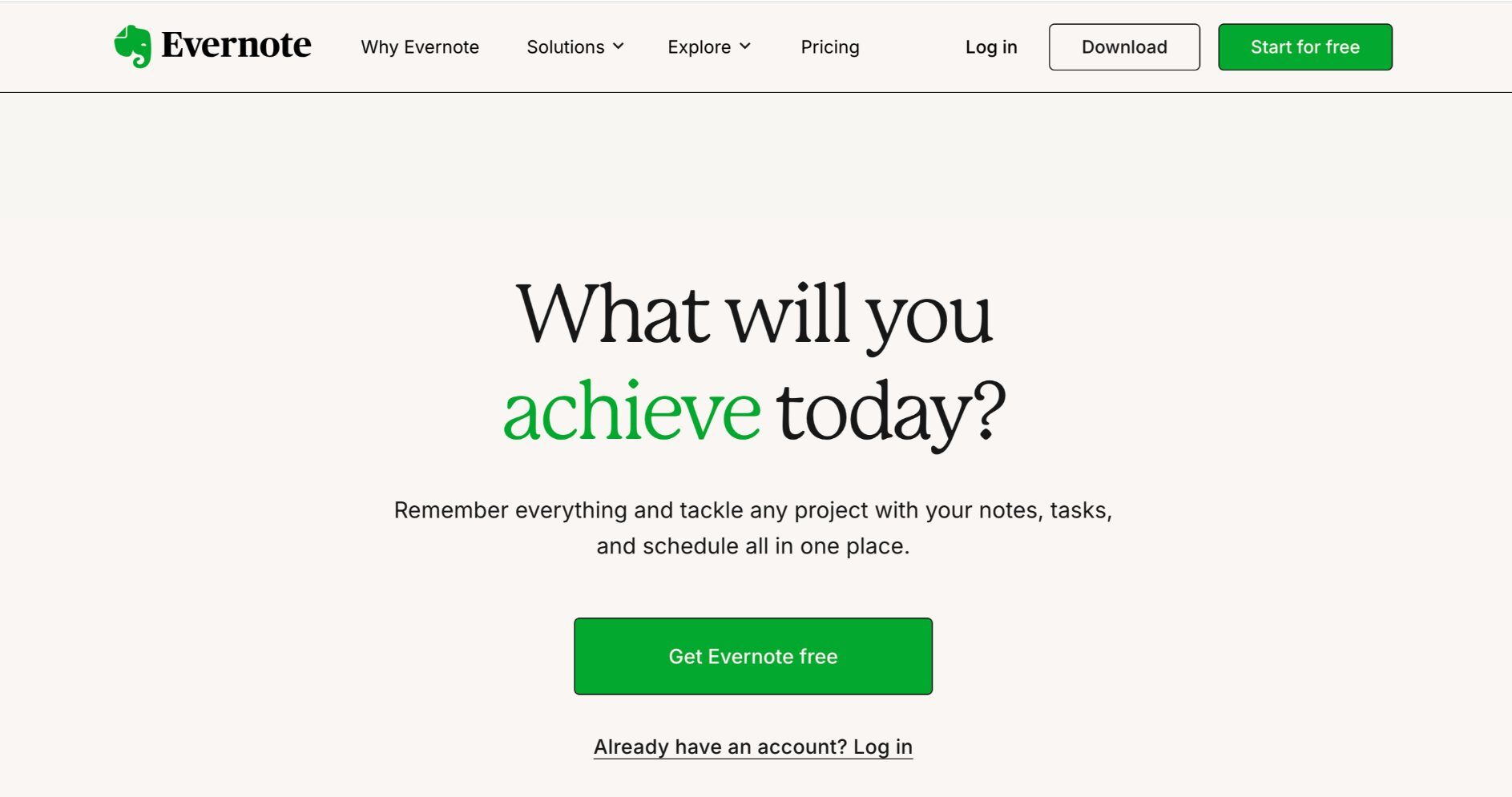
Evernote’s digital notepad allows you to sync your thoughts and notes across multiple devices, which is further enhanced by AI. I’ve used this product for some time now and love it. I’m able to take notes on a book I’m reading while traveling and pull them up on my desktop during our company’s book club meeting.
Why their Homepage Works:
- On-target messaging. Evernote is a tool to help you achieve. The hero of this story is the user, not the tool, and the headline makes this clear.
- Easy sign up. In addition to the traditional email and password registration, Evernote gives users the option to sign up with their Google account.
How to Improve:
- Incorporate videos and animations. Powerful tech solutions can sometimes come across as overwhelming. Simple animations could show that Evernote isn't just another tool to keep track of — but a helpful organizer that smoothly integrates with everything else you do.
5. Ellevest
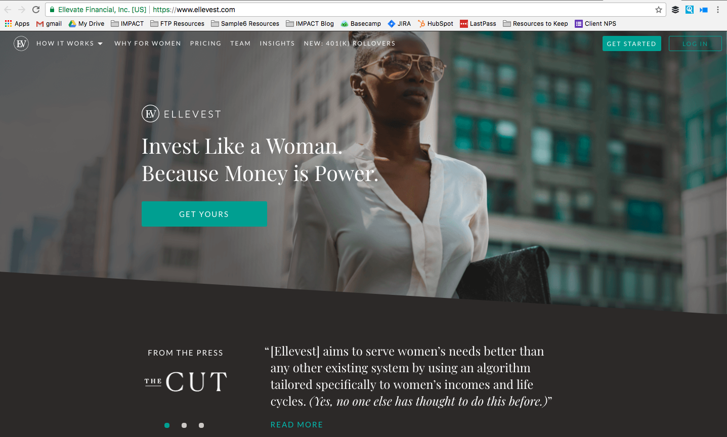
Ellevest is a digital investment platform specifically for women. CEO and co-founder Sallie Krawcheck describes having an “a-ha” moment when she realized the financial industry was built “by men, for men.”
Women face completely unique income life cycles that many investment companies and firms weren’t talking about. For instance, did you know women’s salaries peak at 40 while men’s peak at 55?
Ellevest’s messaging addresses women-centered financial issues head on and created a software to do the same so it can help women plan for a future where they may earn less money yet live longer than men.
Honestly, this is the only investment company I would sign up with thanks to their website.
Why their Homepage Works:
- Ellevest truly knows its audience. The messaging speaks directly to women, in a tone that is conversational and real, not stuffy and cliche like most financial advisor and investing websites.
- A simple call-to-action. The “Get Yours” message is powerful and immediately directs the user to create an account.
- Social Proof. I love that they include a few quotes directly beneath the header to showcase positive writeups about the company. Plus, two of the three publications have women as primary readers.
How to Improve:
- Change up the headline. Though the current message is strong and powerful, it doesn’t immediately make me take action. Further down the homepage is a message that speaks to women’s concerns in a more direct way -- “We live longer. We don't get equal pay. Shouldn't we use financial tools created for us?” Now if this was the headline, I would immediately click the “Get Yours” CTA.
6. Custom Built Design and Remodeling
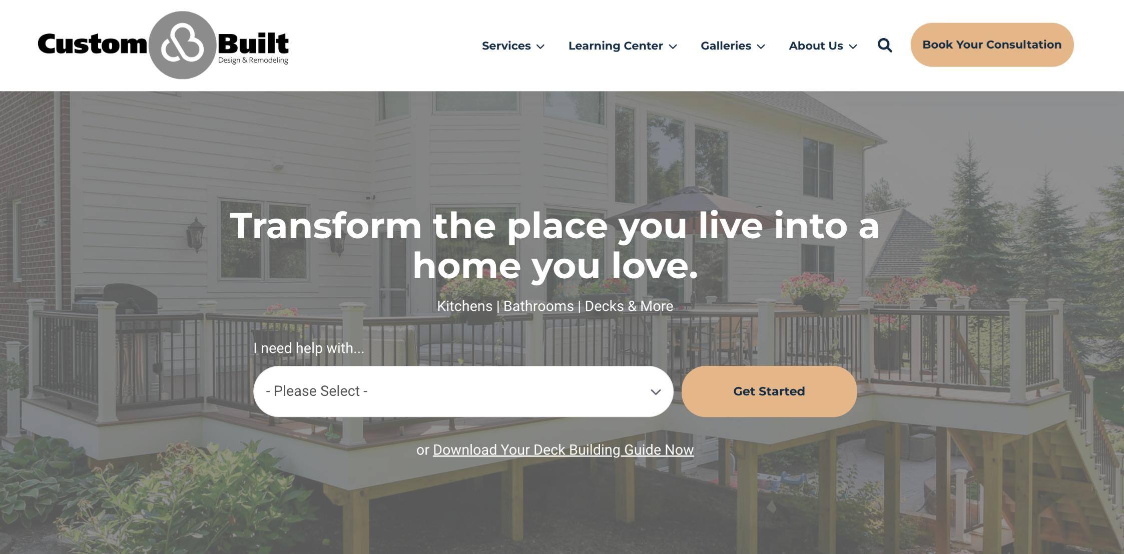
Contractors can feel pretty interchangeable. For homeowners, trying to distinguish one from another — let alone find one you would trust with your project — can feel daunting.
When a builder or remodeler leads with education instead of a sales pitch, buyers feel more informed and less guarded.
Michigan-based Custom Built does just that. Here's why their website works.
Why their Homepage Works:
- The focus here is on the user. There are educational guides so you know what to expect, what you're likely to spend, and what factors can make that number go up or down.
- Users can select from a series of project types (kitchen remodel, sunrooms, etc.), and you're taken to a specific service page that offers information, images, and galleries.
- A great headline reminds buyers what they're looking for in the first place: To transform a part of their home into a space they love.
How to Improve:
- The featured image is a bit too grayed out to really show quality or craftsmanship. Perhaps a sliding gallery of images could showcase more projects.
7. Basecamp
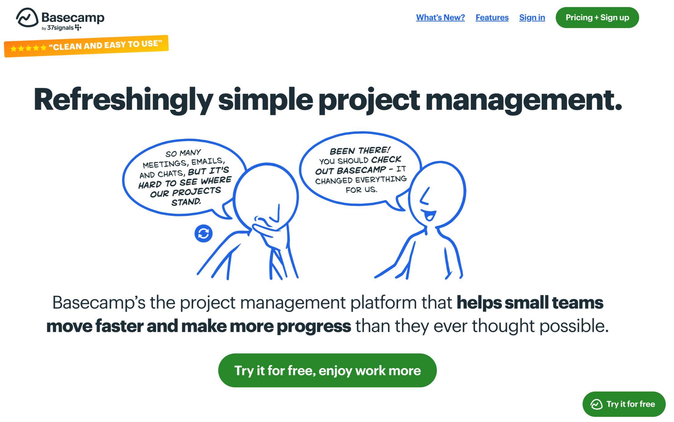
This project management system has grown exponentially over the years, with more than 75,000 organizations around the world.
Why their Homepage Works
- All too often, companies use stock photography or images that barely have anything to do with the product or audience — but Basecamp gets it perfectly. They capitalize on the ever-so-relatable feeling of being overwhelmed when managing projects.
- The free offer explains benefits in signing up. The simple call-to-action “Try it for free, enjoy work more” answer the unwritten question of why, enticing users to sign up.
- Evident customer support. The homepage showcases three statistics and supporting statements from customers, providing a validation component to visitors.
How to Improve:
- Make it less busy. The homepage feels too crowded with copy, which undermines the central message. A simpler design would feel less cluttered and, by extension, more compelling.
8. Charity: water
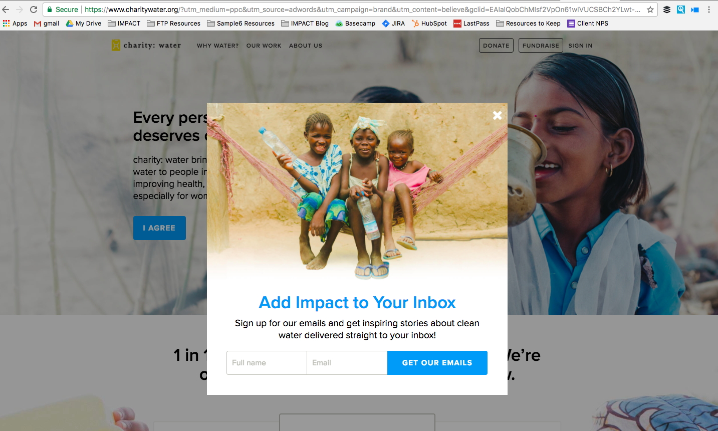
This non-profit organization aims to bring clean and safe drinking water to people in developing countries.
Why their Homepage Works:
- Direct messaging. The hero messaging on the homepage states “Every person on the planet deserves clean water” — something you can’t argue against. It also includes an easy CTA to literally say “I agree,” which leads to the donation page.
- Exit-intent pop-up. I personally hate pop-ups when they interrupt my user experience but the ones that work for me are exit-intents. With it, charity: water provides you with an opportunity to stay connected even if you chose not to donate.
- Opportunities to get involved. Further down the homepage, there is an entire section that shows you how you can get involved. Giving your users multiple options to take action will help increase your odds for conversions.
How to Improve:
- Highlight the impact. Calling out why clean water is so vital to communities would help visitors to get involved. Though there is a section on the homepage that charity: water has funded 24,537 water projects for 7 million people around the world, you have to dig to find out just how impactful the mission truly is. With 90% of all purchasing decisions not made consciously, it’s essential you provoke emotion.
9. Warby Parker
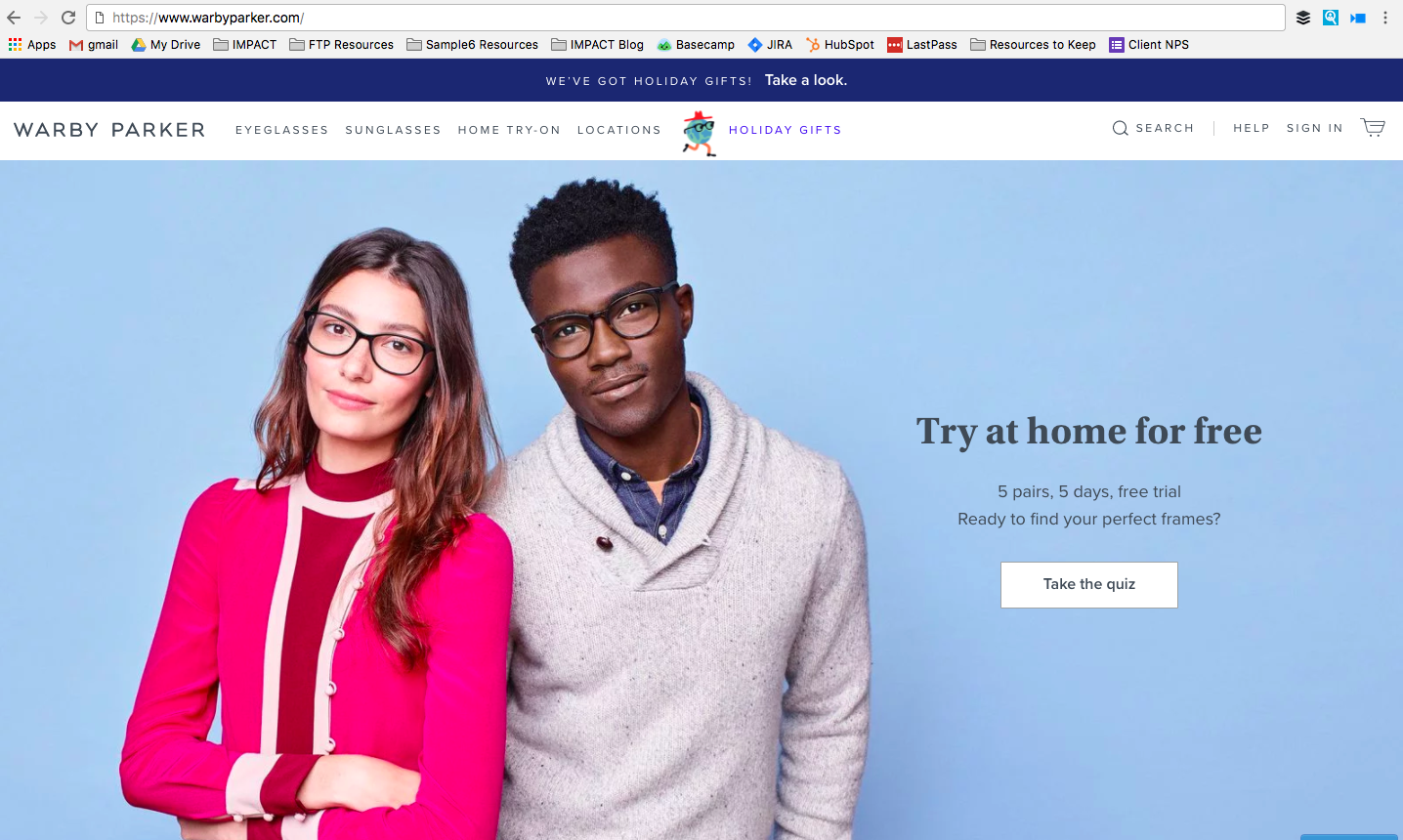
I’m obsessed with Warby Parker — and I don’t even need glasses.
Their business model enables people to choose five different eyeglass styles and have them shipped directly to their home, to try on in their own time. Once people choose the style they want, they can purchase the frames (typically way cheaper than what brick-and-mortar shops offer) and fill their prescription.
Since first starting, the company has expanded to offer try-at-home prescription sunglasses and now has physical stores for those who prefer to shop in-person and book an eye exam.
Why their Homepage Works:
- An interactive quiz. Warby Parker created an interactive quiz users can take to receive recommendations on eyeglasses they might want to try on at home, encouraging the free trial registration. This creates a fun, low-friction way to get visitors to convert and opt in to their marketing emails.
- Location finder. When online retailers also have store locations, it’s great to include a call-to-action for users to find a location near them.
How to Improve:
- Offer new style alerts. Since the entire company is built around getting stylish eyewear for less, Warby Parker should enable email alerts for those that want to know when new styles are added.
- Highlight email updates. The email opt-in on the homepage is all the way at the bottom, whereas a simple exit-intent pop-up would allow the company to capture contact information if someone intends to leave without browsing or purchasing.
10. Hootsuite
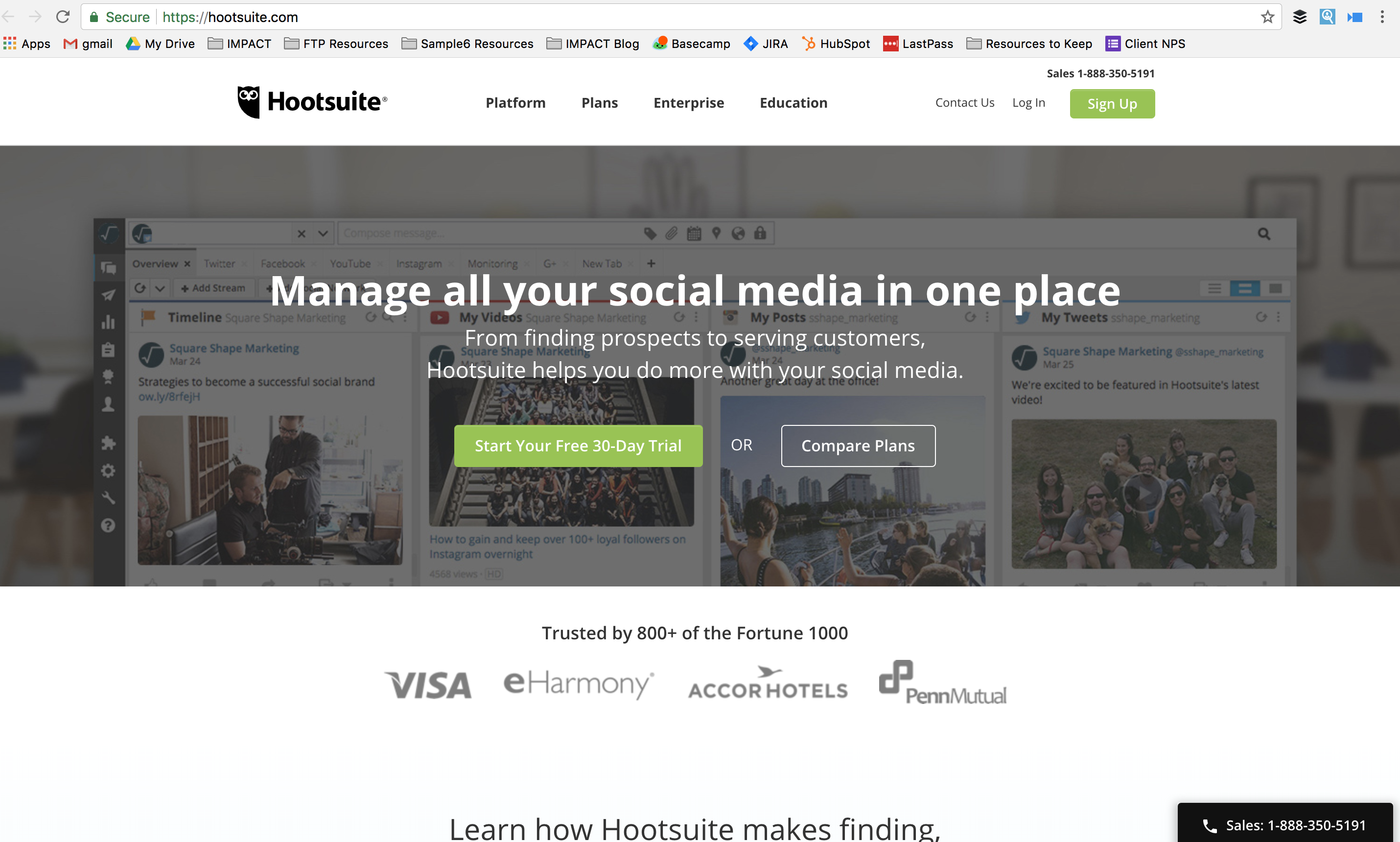
Hootsuite enables you to schedule your company’s social media posts in one consolidated place.
Why their Homepage Works
- Hero statement defines exactly what the company does. Even if you’ve never heard of Hootsuite, the hero statement clearly explains how you can leverage the platform -- “manage all your social media in one place.”
- Call-to-action options. Not everyone is immediately ready to sign up for a free trial. Providing the option to “Compare Plans” is a great way to drive users to a secondary step if they’re not ready to commit.
How to Improve:
- Limit the calls-to-action. It’s a tough balance when trying to determine how many calls-to-action to feature on your homepage. You don’t want to overwhelm the user by giving them too many options but you also don’t want to stunt their experience.
Giving the user the choice to “Learn More,” “Download the Full Report,” “Start Your 30-day Free Trial,” “Sign Up,” and “Compare Plans” is a little too much. Streamline their experience and limit the number of calls-to-action.
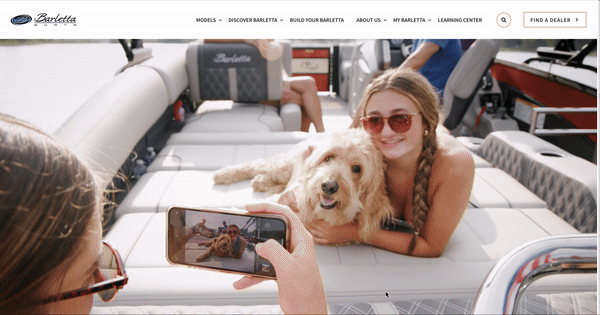
This boat manufacturer knows what you're looking for. It's not about specs and numbers. It's about enjoying the water with your friends and family. So, this auto-play video is a perfect fit: beautiful water, happy families, good times with friends.
Once you've soaked that in, you see this CTA:
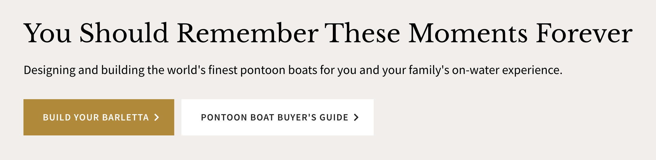
Why their Homepage Works:
- Beautiful images paired with no-nonsense copy and a host of educational materials.
- With a direct call to action ("Build Your Barletta") and an indirect call to action ("Pontoon Boat Buyer's Guide"), would-be buyers can move at their own pace to learn more — without getting rushed into a sales conversation.
How to Improve:
- While the video is effective for a first-time visitor, after you see it a few times, the loop feels repetitive. They could offer a longer loop or allow cookied contacts to opt out of the auto-play.
The website your customers want
The common takeaways are pretty easy to pick out if you’ve been following along.
First, always speak to your target audience in a clear and conversational way that will resonate well. Second, include action for the user to take on an offer to immediately capture them as a lead. And third, make sure your navigation — both down the homepage and throughout the menu — is easy to understand and follow.
Once you capture your lead, don’t forget to nurture them. The homepage is just the beginning. If a user converts, you can personalize messaging and offers to cater their experience to their interests or demographics throughout the rest of your site and through email marketing.
Want more inspiration? Check out our list of best business website designs!
Free: Assessment
/Assets/Icon%20Library/x%20corp.svg)
/Assets/Icon%20Library/whatsapp%20logo.svg)
/Assets/Icon%20Library/Email.svg)
/Assets/Icon%20Library/Arrows/Grey%20Arrow%20-%20Prev.svg)
/Assets/Icon%20Library/Arrows/Grey%20Arrow%20-%20Next.svg)