
Jun 16, 2021

You’ve been hard at work crafting article after article in an effort to create as much content as possible for your company's blog. You know that you're putting out relevant, original, and, above all, helpful pieces.
The only problem is that you feel your blog’s design doesn’t quite reflect the quality of your posts. The text is crowded and difficult to read. There’s no clear next step and very little visual hierarchy. Simply put, the design doesn’t make consuming your content easier and it certainly doesn’t captivate your readers to engage further.
🎓 IMPACT+ course: Investing in your business website's user experience
Well, if you’re looking for design inspiration to help spruce up your blog, you’ve come to the right place. In this article, I’ll share eight great business blog designs to inspire you and offer great tips for keeping your users engaged.
What does a good blog design look like?
Not all beautiful blogs have good design, and not all well-designed blogs are beautiful.
A truly well-designed blog offers a combination of intentional aesthetic, deliberate hierarchy, and original helpful content. Without these three features, a blog can never reach its full potential, and therefore won’t reach its audience.
A well-designed blog will put the user first. Sometimes that means keeping things simple. Other times it means using a more intricate layout.
For example, if you’re writing a how-to guide, it might be better to avoid a flashy design in favor of a layout that’s easy to scan and read. On the other hand, if you’re posting about something more long-form, it might be more effective to break up the layout with images and graphics to keep the reader engaged.
A great reading experience may mean making it easy to find related articles with a search field, organizing them into a learning center, or even calling them out in a sidebar.
🔎 Related: How to plan a learning center for your website
Regardless of the method, a great blog aims to meet its users where they are, providing the information they want in the easiest, most effective, and pleasing way possible. The best-designed blogs find a perfect balance of remaining credible and standing out, all while keeping users engaged with links to other posts and resources.
1. Berry Insurance*
*Editor's Note: Berry Insurance is an IMPACT client
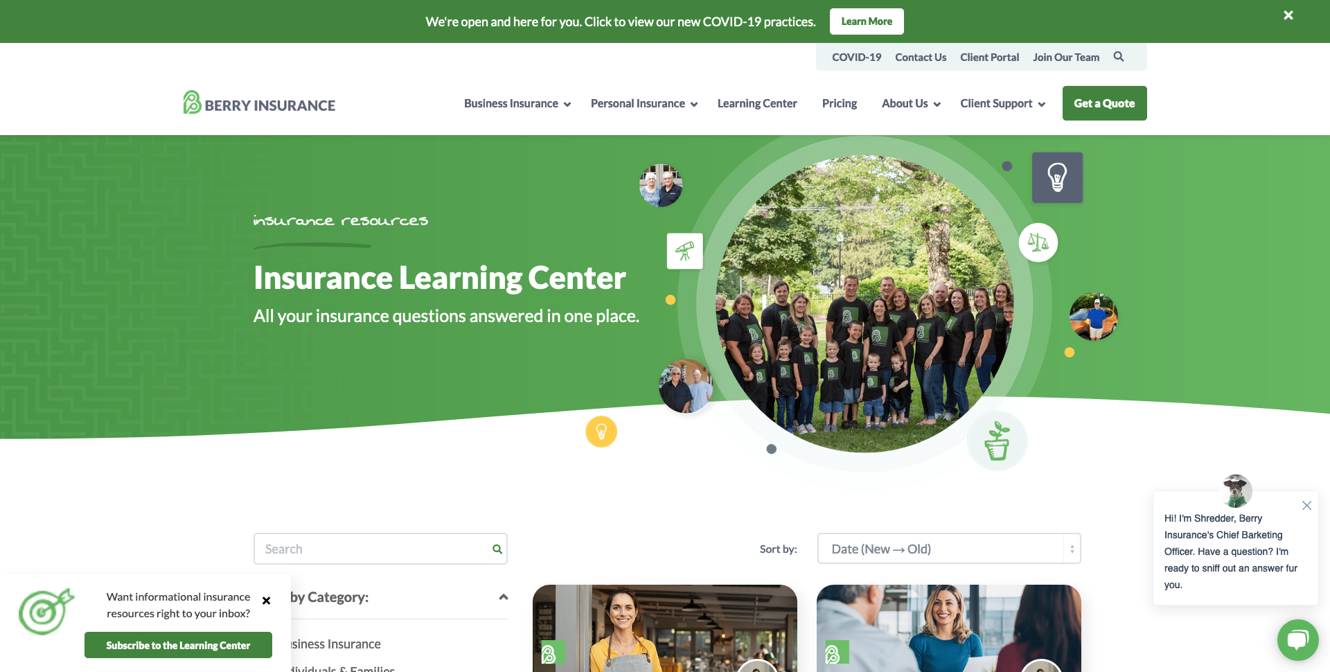
What makes their blog great?
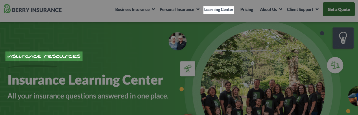
- They call their blog a “learning center.” This strategy is in alignment with They Ask, You Answer, which means it’s focused on educating, not selling.
- They use “insurance-resources” in the URL. This optimizes for a key phrase that qualified buyers are likely to search for on Google.
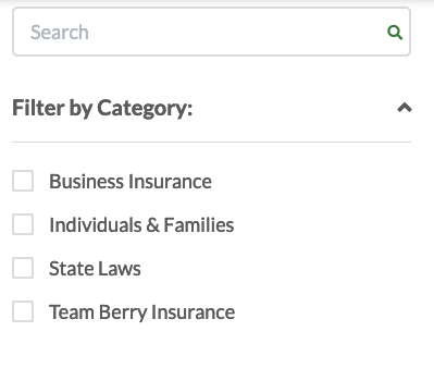
- Their search feature includes a list of categories users can use to filter content. This is helpful if a user doesn’t know where to start, and it encourages them to spend more time on your site.
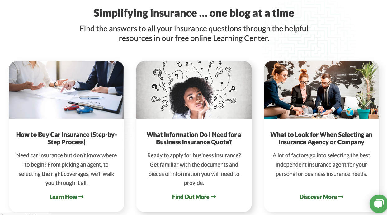
- Highlighting the most important posts on the homepage helps answer popular questions faster. This makes it easier for users to find what they need.
- Showing how long each article will take to read helps users know what they’re getting into.
- Good use of imagery grabs your user's eye and aids your messaging.
2. Tracksmith
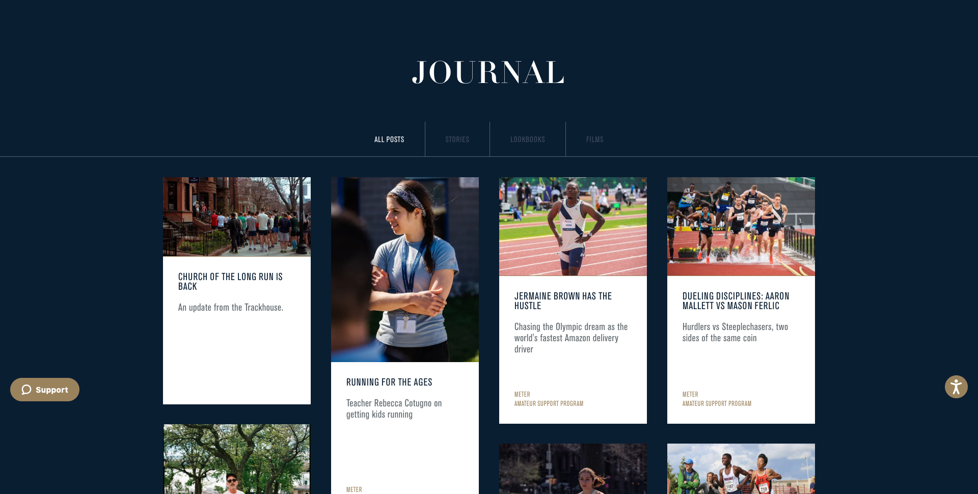
What makes their blog great?
- The use of beautiful imagery lures users in, creating a captivating experience.
- Each post is carefully laid out and illustrated, like this one. This makes the content more dynamic and engaging. It encourages a user to keep scrolling and spend more time on the page because they want to see what happens next.

- Their use of moving images, color palette, and photography creates an aesthetic rather than any particular call-to-action (CTA), making you want to be a part of that lifestyle and further helping Tracksmith establish their brand.
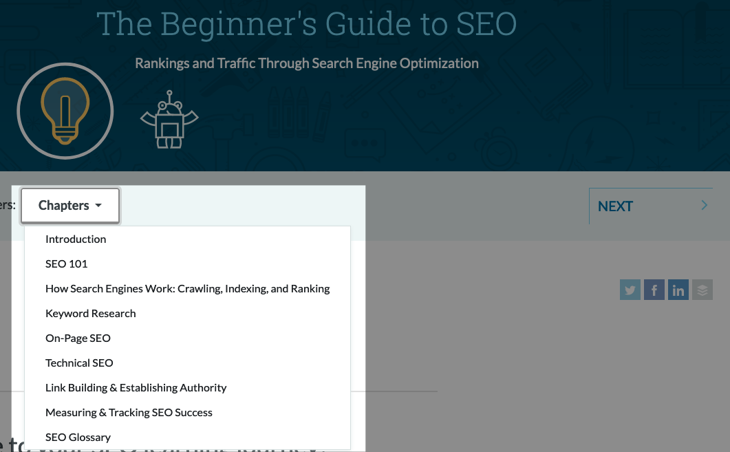
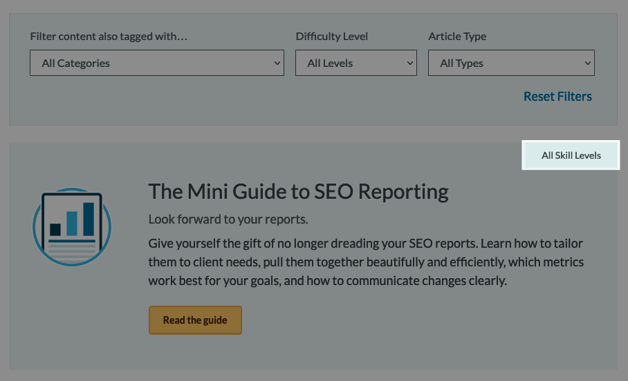
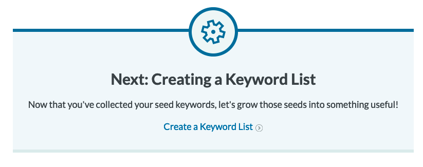
3. MOZ
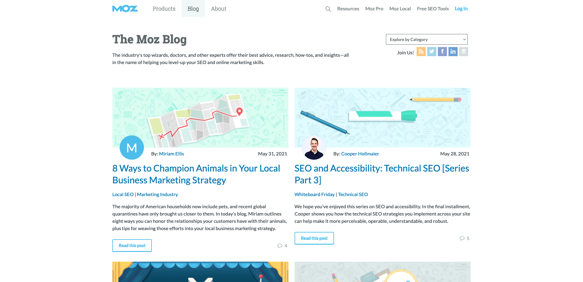
What makes their blog great?
- Each topic is laid out almost like a course, which creates a clear journey of what to do next for the user. This helps keep users focused while also breaking the page into sections, which is good for SEO.
- Their in-depth resources also help establish their credibility as an industry leader.
- Posts are tagged by skill level, which helps a user determine if a post is right for them before they spend too much time reading it.
- They do a good job of linking to their products in their posts in an organic manner. This makes a user feel as though the article wasn’t written strictly to sell the product, and that they can still gain a lot from the article without needing to buy something.
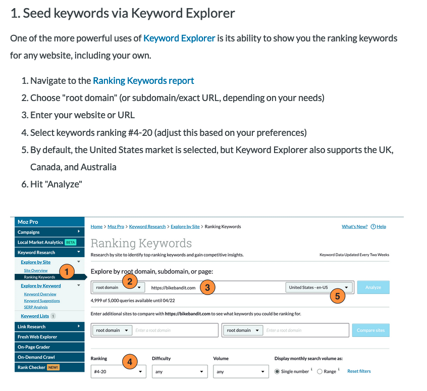
- They cross-promote their other articles and guides very effectively in every post, either through simple links or with a deliberate call to action.
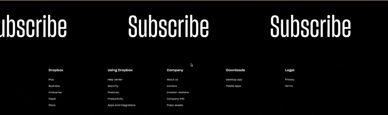
4. DropBox
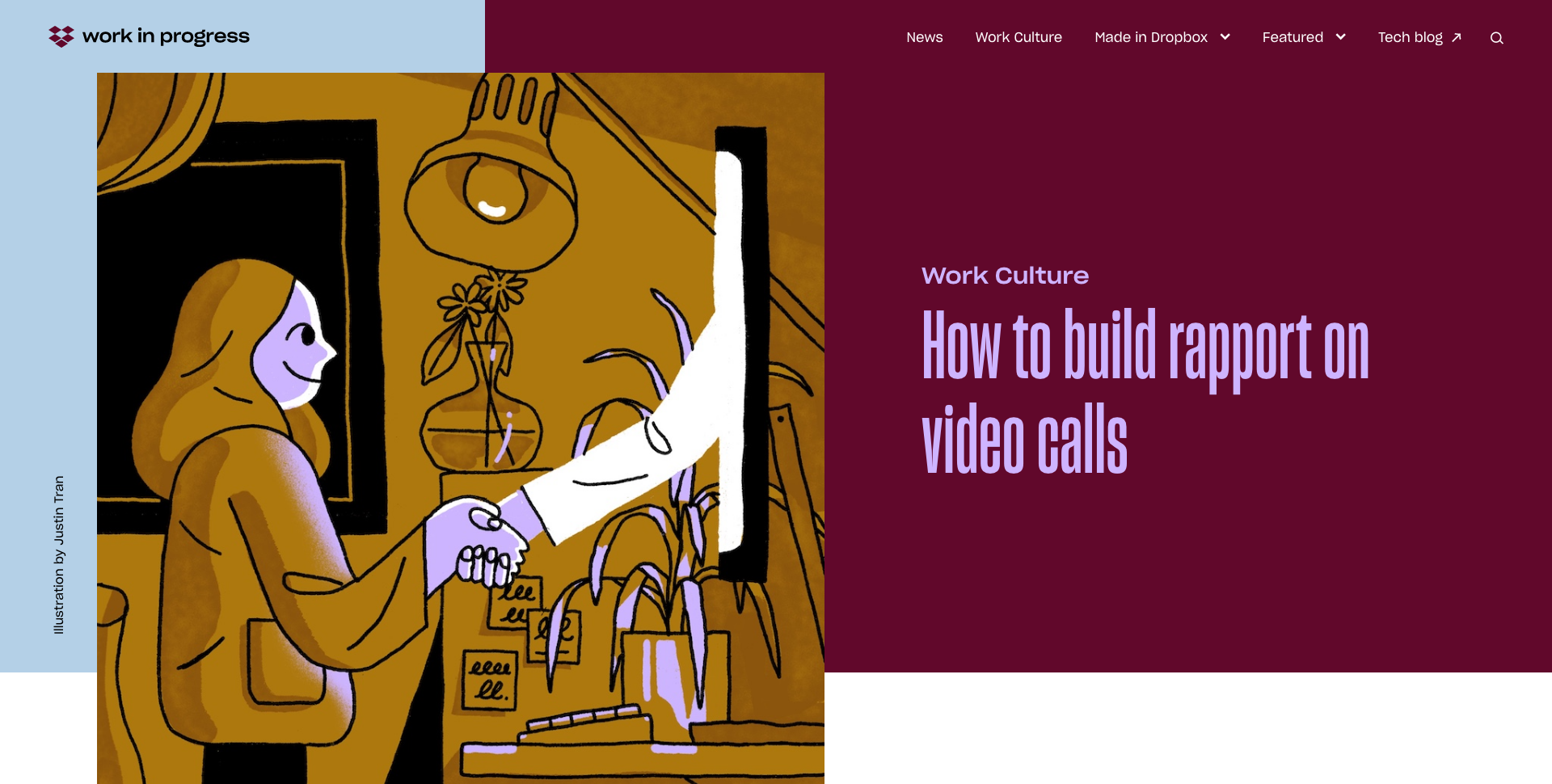
What makes their blog great?
- An unconventional color scheme makes them really stand out from other blogs. This makes them more memorable, and also speaks to their level of creativity. They’re not afraid to be different.
- The call-to-action to subscribe to their newsletter is visually unique and eye-catching. It’s not often that an old-school marquee is used in a modern website. I’m naturally drawn to it and genuinely want to subscribe because it feels like they’ll provide unique content.
- The custom cursor says “READ” when hovering over a post thumbnail, which is a fun and bold way to pique a user’s curiosity.
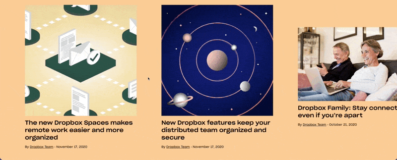
- They do a great job of addressing concerns about working from home during the pandemic with this featured collection. The design is unique and stands out, and their content fits perfectly with their product because DropBox already focuses on remote collaboration.
- Their use of illustration is really unique, but not over the top. They help keep the user engaged by encouraging users to explore each element on the page.
5. Honeybadger
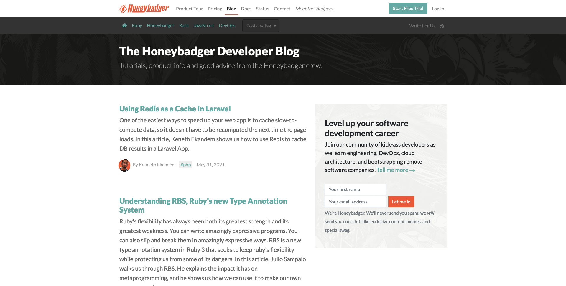
What makes their blog great?
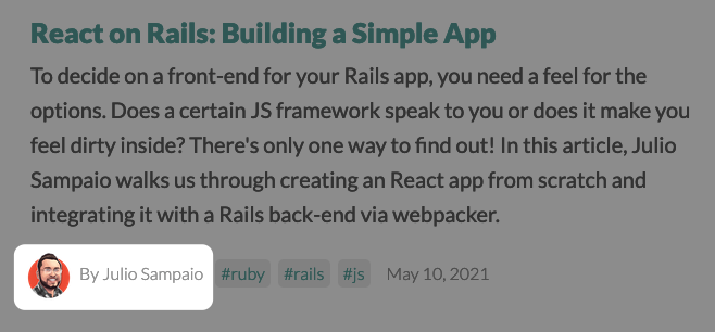
- Having custom illustrations for each of their authors is a subtle way to tie in their branding and draw your eye to their thought leaders while keeping the overall design simple.
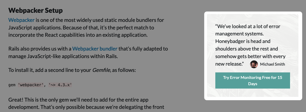
- They’re not pushy. Their design works to enhance the information, not necessarily selling their product. They simply place a small call-to-action in the sidebar of each post, but it’s clear they genuinely care most about creating great content and tutorials for developers.
- Their use of CTAs in the sidebar of each post is subtle but clear. The CTA is always there, ready to be clicked when the reader is ready.
- Their design eliminates distractions. Their design is focused on making it easy for a user to quickly scan a post to get a sense of whether or not it will answer their question. They do this through simple syntax highlighting and by keeping the design simple. They know their audience is there to learn something and doesn't need to be distracted. As a result, I find myself staying on their site longer and reading more posts. This means there’s a better chance I’ll end up engaging with a call-to-action.
- They effectively highlight the limited number of topics they post in their header. This helps them stand out as an industry leader in these niche markets.
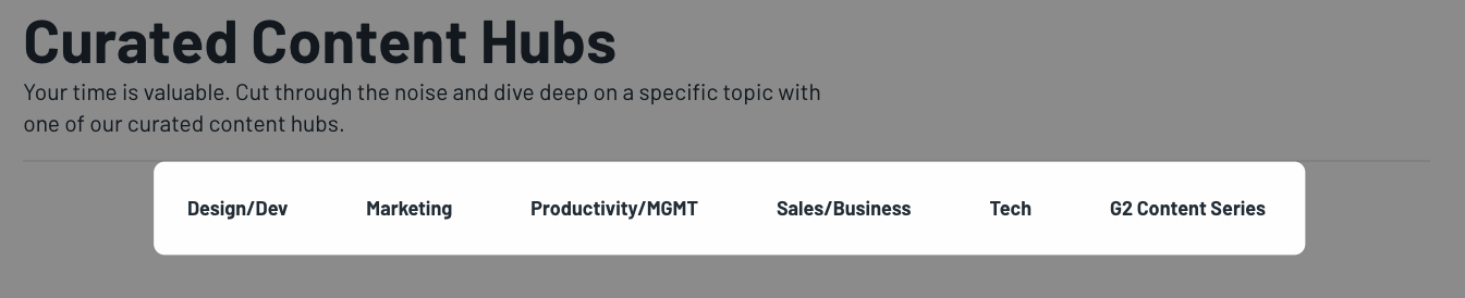
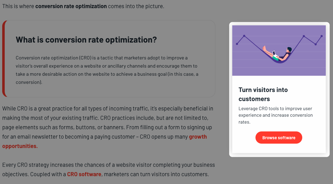
6. G2
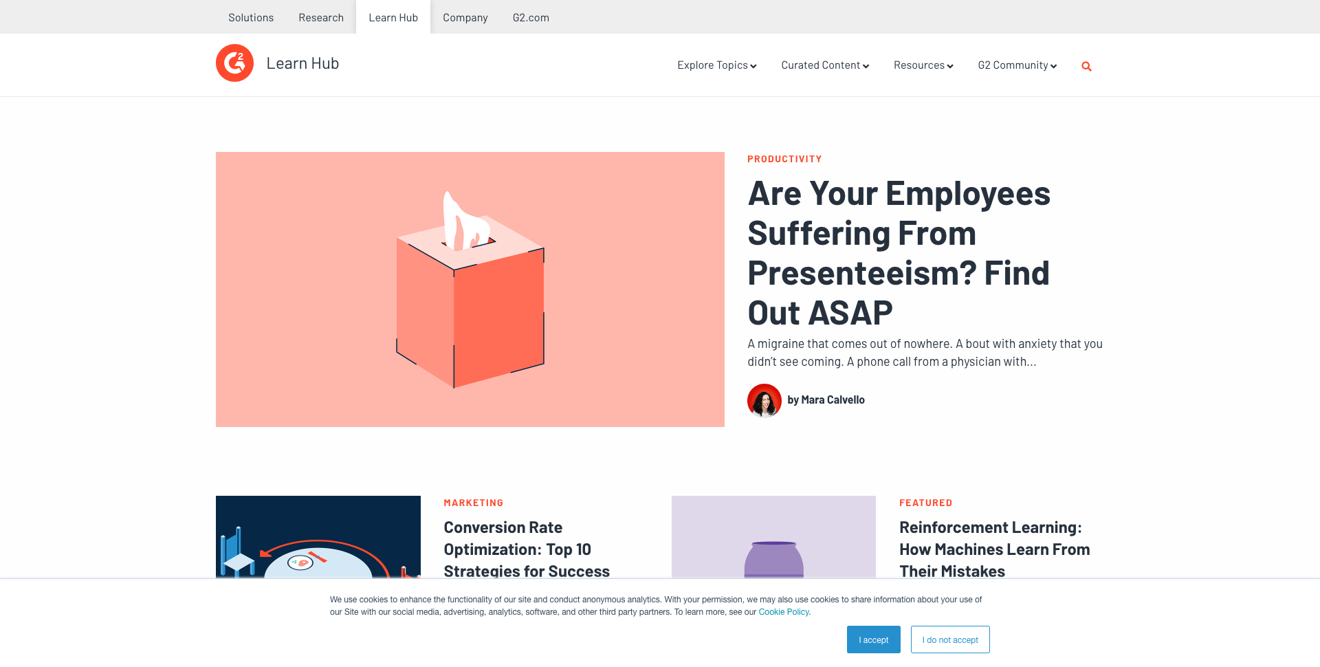
What makes their blog great?
- The design is clean and simple, which makes it easy to navigate and scan at a glance.
- Their Curated Content Hubs make it easy to search for specific topics and see what they write about.
- They do a great job of linking to their services using a sidebar. This is made even more powerful by the fact that they ensure the product they’re offering is a solution to questions in the related article.
7. thoughtbot
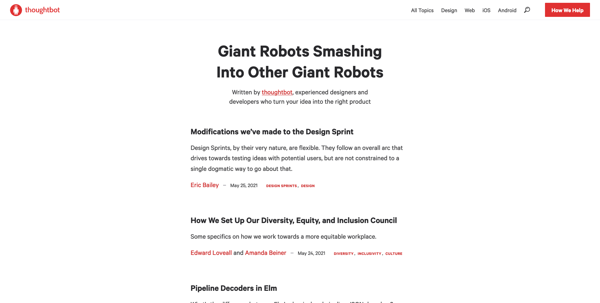
What makes their blog great?
- A simple, clean design.
- The design gives their posts so much room to breathe that I feel a sense of calm and clarity. This makes me want to stay on their site and read all day. The lack of distractions also makes the reading experience more pleasant.
- This clean, simple design allows the content found in the articles to do the heavy lifting. Most folks who stumble upon these posts will need help from thoughtbot, and their detailed tutorials make them stand out as industry leaders.
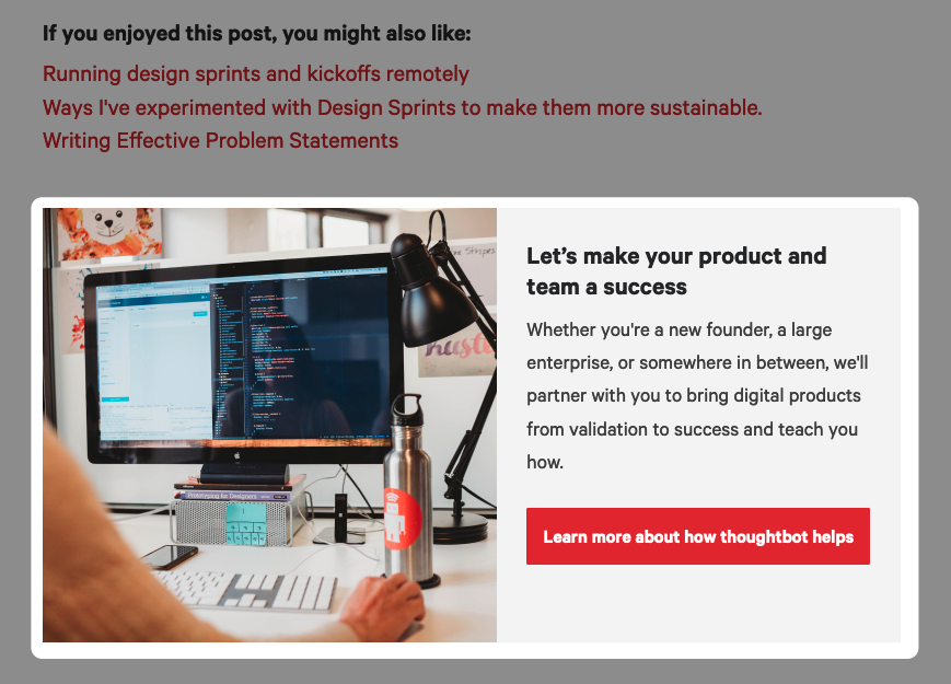
- They place a simple but effective CTA at the bottom of each post that reads, “Let’s make your product and team a success.” It’s a powerful reminder that they’re not only good at what they do but that they care about their customers.
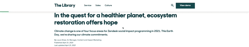
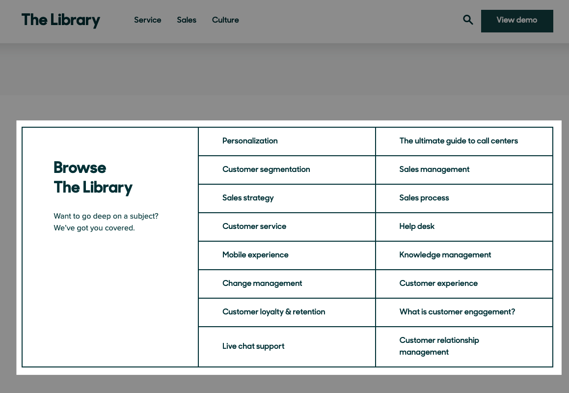
8. Zendesk
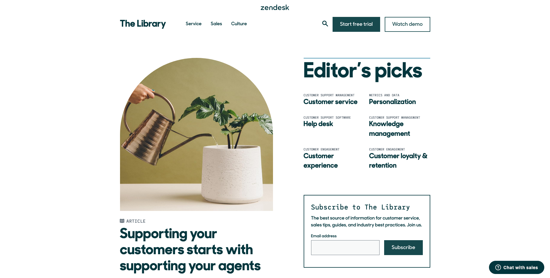
What makes their blog great?
- The use of uniquely shaped featured images stands out and draws the eye.
- The design of the editor’s picks is simple but effective. They rely on text and hierarchy rather than flashy visuals to grab the user's attention.
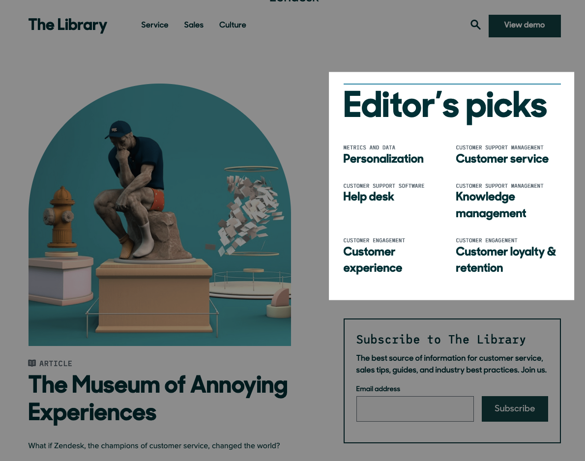
- You can see your progress as you scroll, which makes you feel like you’re accomplishing something as you read, breathing life into the design.
- The “Browse Library” section is simple but stands out, highlighting their guides and, in turn, the topics they’re experts in.
Now what?
OK, now that you’ve seen a variety of well-designed blogs, you might be asking, what’s next?
For starters, take a look at your organization’s blog and see how it stacks up to others in your industry. Chances are the best blogs in your industry will share similar patterns and style choices, and will effectively use these patterns to keep users engaged.
Organizing your content into a “Learning Center” or similar hubs will make it easier for buyers to navigate and find what they want. Are your posts feeling too long and wordy? Break them up with relevant imagery or even a call to action.
If, on the other hand, your posts are feeling too cluttered and busy, consider removing unnecessary elements from the layout to allow the page to breathe. Your goal is to keep users engaged, not bored or overwhelmed, and to aid your messages.
Your audience has questions and you want to make sure you’re answering them in the best way and with the best experience possible.
Free: Assessment
/Assets/Icon%20Library/x%20corp.svg)
/Assets/Icon%20Library/whatsapp%20logo.svg)
/Assets/Icon%20Library/Email.svg)
/Assets/Icon%20Library/Arrows/Grey%20Arrow%20-%20Prev.svg)
/Assets/Icon%20Library/Arrows/Grey%20Arrow%20-%20Next.svg)