
Mar 31, 2021

What is conversion rate optimization?
Conversion rate optimization (CRO) is the process of improving the percentage of users who fill out a form on your site and become a lead by means of any number of best practices and tactics.
I used to work at an ophthalmology magazine publishing company. As the content specialist, I wrote and published articles for the website, however, there was lots of pressure from the higher ups every month to hit certain page view goals.
Traffic. Traffic. Traffic. There was no concern about anything other than page views. Every now and then, they’d want to know about pages per session numbers, but that was the extent.
At the time, I’d come up with whatever I could to put together click-baity articles and slideshows galore to try to get more page views for a single article. I was even encouraged to paginate articles so that a single article would count for multiple page views.
The goal was always to get more traffic. Period. It didn’t matter whether it was qualified traffic or not, or what those users did once they landed on the site.
Looking back, the content was not focused on the readers, it was focused on page views. Page view metrics didn’t reflect the bottom line of the business, and they certainly didn’t show whether content was actually helping people make an educated buying decision.
And that company was not alone. Even today, many companies still struggle getting caught up with traffic numbers, social media likes and followers, or other "vanity metrics.”
Can you relate to having increased traffic from your content marketing efforts, but not seeing a direct correlation to sales? That’s why we’re going to peel one layer deeper in the onion in this article to hit on how conversion rate optimization is the next step for traffic to convert into leads and eventually customers.
🔎 Related: Vanity metrics: Why your team is celebrating the wrong numbers
Let’s dive into what conversion optimization rate is, why it’s important, and some tips and examples to keep in mind to improve the conversion rate on your site!
What is conversion rate optimization?
First off, a conversion rate is the percentage of users to your site or a specific page that “convert” on a desired action. This is just fancy language for, they fill out a form, subscribe, or somehow give you some of their personal information (like their email address),and then hit the submit button in exchange for something else.
It’s a type of digital currency. They give you some information then hopefully, they get what they wanted in return. Win win.
Conversion rate optimization (CRO), then, is the process of intentionally implementing tactics with the goal to increase the percentage of users who convert or fill out a form on your site and become a lead. This happens by means of any number of best practices including leveraging video, social proof, clear messaging, etc.
🔎 Related: Conversion Rate Optimization 101: How to Test Your Way to Greatness
Basically, you make it more engaging, seamless, and valuable to get people to want to exchange that currency with you.
CRO is the process of making it easier and more enticing for people to not only visit your site, but to actively raise their hand to express their desire to learn more from you.
It is looking through your site or a specific campaign or asset with a magnifying glass to find out what the things are that’s providing a rocky experience or just turning people off to your offer.
Why is it important?
CRO is important because conversion rates really are the middle man between traffic and sales—- it’s how you generate leads online that you can ultimately nurture to become marketing and sales qualified leads, and some of which to become customers.
Think about your own internet habits — there are plenty of “conversion opportunities” you probably come across every day that you don’t convert on — whether it be pop up ads, or subscriptions where you can’t think of a good reason why you’d want a single additional email in your inbox.
But then there are some that you do. You don’t always consciously think about these things as a user. When it works well, it’s smooth like butter, and you don’t question or even give a second thought about it.
(My client Adam Stahl from Kelser, a Connecticut based managed IT company, jokingly refers to instances like this as the tragedy of a football team’s offensive line — you only hear them called out when they do something wrong, not every time something goes right. He’s got a point.)
For this reason, increasing those conversion numbers through various optimization practices means more qualified leads, and more potential for new customers.
What is a good conversion rate?
Before we dive into ways to improve your conversion rates, you’re probably wondering, “Wait, how do I know what a good conversion rate is to begin with?”
Great question. Studies show that a good average landing page conversion rate is around 2.35-5%, but like the best things in life, there’s not a really direct, clear-cut answer.
Good conversion rates vary. They are not standard, and can depend on so many factors like industry, offer, and audience while also possibly being skewed by how many people actually view the page.
🔎 Related: What is a good average landing page conversion rate? (updated for 2021)
However, if you want to gauge whether low conversion rates are a problem for you, start by looking at your sales numbers. If you are looking for that number to grow, then chances are that you need to start with more leads. CRO is a key step in that path to those leads.
What causes low conversion rates?
Things that negatively affect conversion rates can run the gamut from poor messaging and an unclear/helpful conversion opportunity to more technical issues like load times, design elements, clunky conversion processes, distractions on page, and even broken links that were supposed to lead them to their offer.
Of course, this article won’t cover every single thing that could be going wrong that you need to address, however, it should give you a good framework of where to start in addressing the things that may be holding back your leads from hitting that “submit” button.
8 tips to improve your conversion rate (plus examples)
This list will by no means be exhaustive.
There’s so much when it comes to getting people to convert. It’s like trying to iron down a science between someone agreeing to go on a first date with you in real life — yes, there are some things off the bat that you should do (don’t be a jerk, do be polite and funny) — but sometimes, even when you do all that, it still might not work out.
For the sake of our time together, let’s focus on some basics first, and then I’ll link you to a resource for where you can dive in even deeper for more advanced things you can look for.
Some of these tips may apply for specific assets of a conversion funnel (like a landing page, call-to-action, or a form), so they may or may not all apply to the specific conversion focused asset you’re working to optimize.
These aren’t necessarily in any particular order of importance, as they are highly subjective to the actual offer that is being optimized.
Let’s get to the basics.
1. Have clear and consistent messaging
Having an offer with unclear messaging about what the visitor is submitting a form for — what they’ll get, and whether or not they know if it’ll actually be useful for them — is a huge reason to not convert.
Think of it like being asked on a first date by someone who you literally know nothing about, and to a place that hasn’t even been decided yet. You’d likely be uneasy, unsure of what you’re getting yourself into and more inclined to say no.
The right messaging can avoid this.
The right messaging often starts with copy or a call-to-action on another part of the website. This should align with the offer and the messaging on the actual landing page.
For instance, if your copy and call-to-action promise a free ebook, but then the landing page messaging focuses on your blog subscription with an ebook as a thank you, you’ll likely confuse the visitor or worse, be seen as a bait and switch.
Make sure the messaging around your offer is super consistent from the first touch to the last and that the following is crystal clear to the user before they submit the form:
- If they're the right person for this offer/if the offer if the right choice for them
- What the offer entails
- How they will receive the offer and what happens afterwards
By addressing these three concerns off the bat and never straying from your main message, you have a much higher chance of improving conversions on that page.
Here’s an example for a free trial from IMPACT client AES that illustrates this concept beautifully.
This button sits on the bottom of their homepage that leads to the free trial landing page.
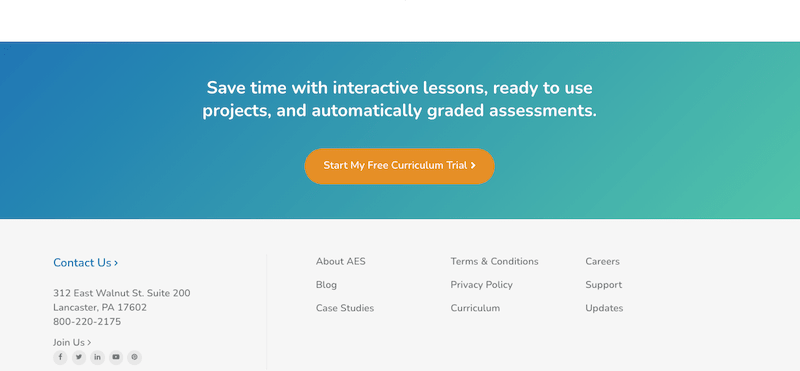
Notice the messaging is super clear and actionable about what clicking the button leads to. Also, as you can see when you click through, they don’t change the name of the offer (like from Trial, to Demo, for instance.) In other cases, this could be similar to a CTA saying “eBook” and then the landing page saying “Guide” or “whitepaper.”

By reading the text on the landing page, the reader gets a clear understanding of whether or not this offer for a 30-day digital curriculum is a good fit for them, and if so, what they can expect to benefit from it.
To optimize conversions for your right fit prospect, it’s important to be clear enough about who is not a good fit for it as well.
2. Build trust by adding video
These days more than ever, people are super reluctant to give out their private information. They don’t want to run the risk of being spammed or scammed. They need to trust that you won’t do that, and that you’ll deliver what you say you will.
When we’re talking about trust being a main factor here, it becomes even more crucial to focus on the best way to build it in a short period of time - and next to face to face contact, video is the second best option.
Video is a powerful medium because it allows the reader to really see and connect with you on a human (read: trusting!) way that can’t be done as quickly or impactfully via text or even still imagery.
By adding a video to your landing page or conversion journey, you can:
- Let them know that there is a real person behind this offer
- Really drive home the value you are offering
- Give the visitor insight into what will happen after they convert and even reassure they won’t be spammed
Don’t believe it? At IMPACT, we’ve found that clients adding a video to a landing page can increase conversion rates anywhere from 80% up to about 250%.
Check out this request a roofing quote example form from our client Bill Ragan Roofing Company. The video itself is only 46 seconds, and in the last month it’s averaging a 35% conversion rate, a 105% increase from what it was the month before the video was added.
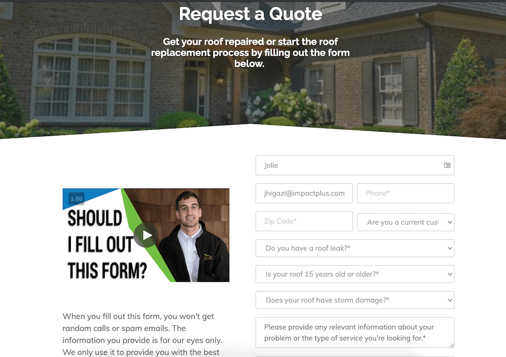
The more you can connect with your audience through video, the more trustworthy and human you make your brand, and at the end of the day, people want to do business with companies they can trust: hello increased conversion rates!
🔎 Related: The Selling 7: 5 best landing page video examples
Because of the insane impact video makes on landing pages, it’s no wonder why it’s one of the must-have videos Selling-7 videos that make the biggest impact for your business.
3. Address any site speed/load time issues
More than half of mobile website visitors will leave your site if it doesn’t load within three seconds. That means even if you have a beautiful video and well crafted messaging on that page, the user won’t stick around to check it out and convert if your site is too slow.
That spinning wheel can be seen as a countdown to someone’s patience. Make sure you don’t keep them waiting, or they’ll likely go somewhere else and you’ll lose their conversion.
Use free tools to test your site speed, like Google’s PageSpeed Insights to see if your site is loading in under three seconds. If it’s not, here are five ways to improve site speed with mobile-first indexing in mind.
And even if it is, make sure you’re always optimizing for the key F word: faster!
4. Add social proof
No one wants to be the first one to jump in the pool or hit the dance floor (remember those days?).
Adding social proof, or confirmation from real users, of what you’re claiming can help let visitors know that you’ll actually deliver on your promises and that they don’t have to worry about being tricked.
How many sites have you been to that you hear the same thing over and over (save time, save money” that you start to tune out and question whether it’s actually valuable because they haven’t backed it up? That’s why showing proof is necessary.
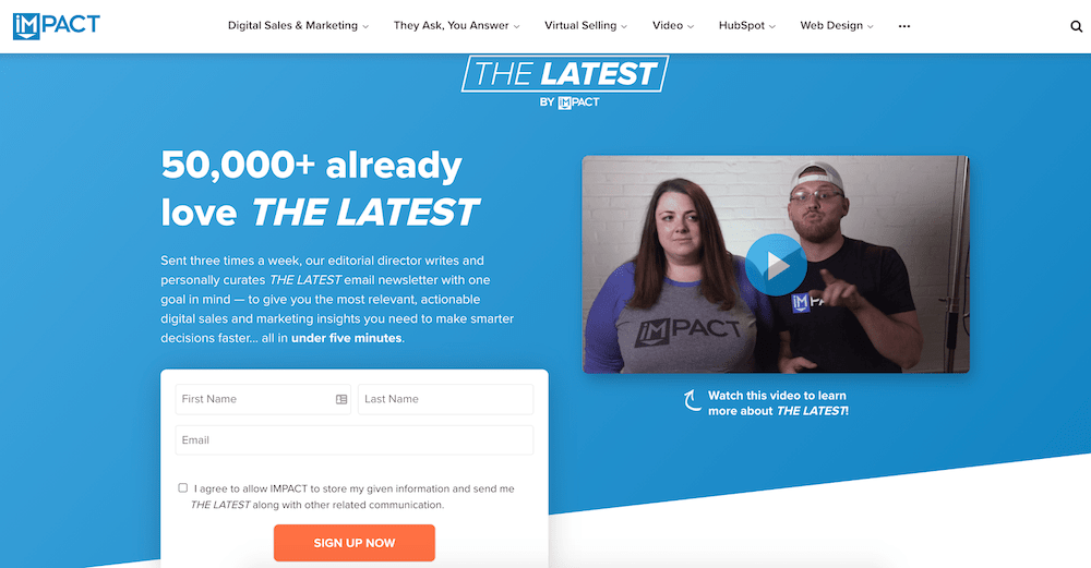
Check out this landing page to subscribe to THE LATEST, IMPACT’s newsletter. Social proof is added in two ways:
First, the invitation to join 50,000+ other readers actually makes you feel like everyone is on the dance floor, except for you, so head on in.
There’s also the social proof at the bottom with quotes from readers.
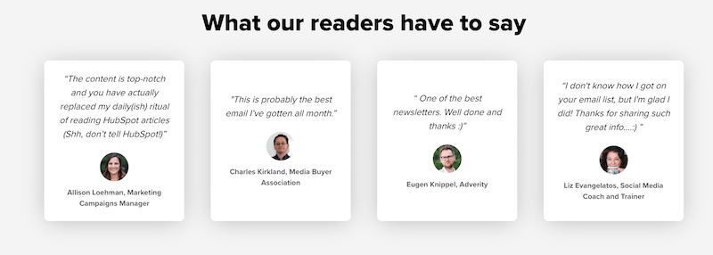
These each address the natural thought of “Is this actually valuable or am I being duped?”
5. Use actionable, value-focused language on your calls-to-action (CTAs)
We touched briefly on CTAs in the first point about clear messaging and making sure the reader knows what the offer is all about.
When it comes to CTAs, you also want to make sure you’re using strong, actionable language, as opposed to weak.
For example, if you have a CTA that leads to a landing page to download an ebook, weak language could include “Download” or “Submit.” These words are vague, impersonal, and a bit negative.
There’s so much missed opportunity here to really capture the heart of what “downloading” or “submitting” actually means for that reader; to highlight the actual value they’re receiving.
Replacing them with more specific, actionable, value-focused language could look like, “Learn The Best Practices” or “Get Your Training Guide.” These options keep the focus on the benefits of converting rather than making it sound like work.
Here’s a great example of an actionable CTA from our client AES once again. It is for a guide for teachers about 21st century skills to teach their students about.

Notice how the button is about the person getting the guide they’re looking for; not the action they have to complete (download, submit, etc.) in order to get it.
When it comes to this, A/B test your language. Some brands have seen much higher conversion rates from even changing a small word like “Get my guide” vs “Get your guide.”
6. Use color to make your buttons stand out
When it comes to buttons, design also plays a role in CRO.
You don’t want to use a color that blends in too much with the rest of the site, after all, it’s meant to be what you want your visitors to focus on. Sometimes you can do this by using secondary brand colors, or some designers suggest going for the opposite color wheel altogether.
Check out IMPACT client Berry Insurance with their button to request a quote in the top right hand corner. While it is their Berry Green, it contrasts well against the white of the navigation.
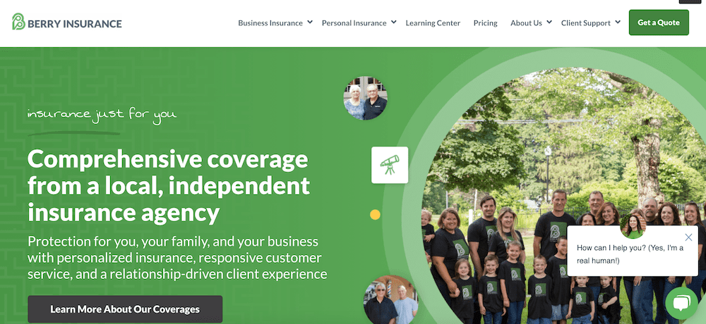
In addition, adding a design element like an image of the offer can help improve your conversion rates by drawing the eye and giving the reader the visual idea of what they’re submitting a form for.
7. Optimize your forms
When I think of forms, I think back to the exchange of currency I mentioned earlier. The price has to be equal and reasonable for what is being received. When it’s a balanced ask, you get a successful transaction, a purchase, or in this case, a conversion.
Think about it, you don’t buy things that you believe are unfairly overpriced (unless it’s midnight on a weekday and you’ve fallen into online shopping with no impulse control).
In the same way, why would someone want to give you tons of their personal information, just for a checklist? On the other hand, just asking for someone’s name probably doesn't set them up well for a conversation in a sales appointment.
Make sure the form asks matches the value of the offer or conversion step and if you need to ask for certain information, make sure you actually need and will use it, otherwise, it’s like asking for someone’s childhood address on a first date.
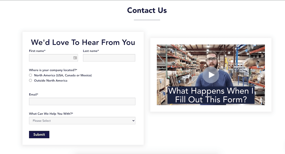
Check out this contact form from IMPACT client W.S. Tyler. The form is optimized so that the fields will automatically change depending on what they select for “What can we help you with?” With this personalization , the user has something to fill out that’s actually relevant and useful to their actual question.
Anchor Foundation Repair, another IMPACT client, on the other hand, found that their forms were much too simple for something as individual as a quote request.
They were getting tons of unqualified conversions, so they actually added more relevant fields (i.e. specific questions and even opportunities to upload pictures) to 1) really drill down into whether this prospect is serious about getting their home’s foundation repaired and 2) get all of the information needed to provide an accurate quote.

Note: As you can tell, there isn’t a one size fits all solution for forms. It all comes down to the context of the form and even who the visitor is.
Like your buttons, test out different options to see which optimizes your conversion rates while still delivering the information needed for the offer.
8. Address broken links, workflows, etc.
The form and the submit button are the bridge to your user crossing into the promised land and becoming a lead. For this reason, you need to make sure that path is solid and stable. This means everything goes where it’s supposed to do and accomplishes what the visitor expects.
If people are having a poor experience on your form where it doesn't actually redirect to the thank you page, or just won’t submit because the form fields are set up wonky, you may literally be missing out on people who are trying to convert and just aren’t able to.
Also, you might think that a poorly designed workflow does not affect conversions, but just post-conversion satisfaction by the user, but think about it— how likely would a reader be to come back on your site and download something or engage with you if they had a confusing or frustrating first experience? And what is the likelihood that person would feel good about referring you to a friend for additional conversion opportunities?
My suggestion is that whenever you think you’re done setting up a conversion funnel, go through each asset on the website and test them out like a prospect would.
Do the CTAs lead you to the right page? Is the landing page form optimized, or are you forced to enter in fields that don’t apply to you, perhaps? When you submit the form, does it take you to the thank you page? Do you actually get to the offer? Does the follow up email get sent to your inbox with the offer? Is it being registered in your CRM?
By putting yourself in the shoes of the reader and making sure the journey is as easy and natural as possible, you’ll be able to get ahead of issues that may impact your conversion rate down the line
Ready for an even deeper dive into CRO?
I know that was a mouthful. The truth is, it’s hard to give every detail of what to consider with conversion optimization in one article without it turning into a novel.
However, if you’re walking away from this article already with the perspective that focusing on improving your conversion rate is critical to improving your sales and bettering the bottom line of your business, you’re already miles ahead of where I was when I started my career in marketing years ago.
To truly optimize your conversions (and hence get more sales), you’ll not only need to take these eight pointers into account, but you’ll also need to take a holistic view at your entire conversion funnel.
Luckily for you, our HubSpot Trainer extraordinaire Carina Duffy created an entire online course to walk you through how to do just that with HubSpot.
Check out the free course in IMPACT+: Inbound Lead Generation & Conversion Optimization
Order Your Copy of Marcus Sheridan's New Book — Endless Customers!
/Assets/Icon%20Library/x%20corp.svg)
/Assets/Icon%20Library/whatsapp%20logo.svg)
/Assets/Icon%20Library/Email.svg)
/Assets/Icon%20Library/Arrows/Grey%20Arrow%20-%20Prev.svg)
/Assets/Icon%20Library/Arrows/Grey%20Arrow%20-%20Next.svg)