/Assets/base/Navigation%20Icons/TAYA.svg)
/Assets/base/Navigation%20Icons/Sales.svg)
/Assets/base/Navigation%20Icons/Web%20design.svg)
/Assets/base/Navigation%20Icons/HubSpot.svg)
/Assets/Icon%20Library/AI%20Mastery.svg)
/Assets/Icon%20Library/Learning%20Center%20Laptop.svg)

May 21, 2014

 Getting people to visit your page is only half the battle.
Prompting them to take action once you have them there is an entirely different story.
First you have to identify what it is that you want them to do. Do you want them to download an ebook? Make a purchase? Do a little song and dance number?
From here, you have to provide them with the direction they need in order to act upon this desired goal.
If you fail to do either, the whole thing could go up in smoke.
So before you grab an estinguisher, let's talk about what we can do to avoid getting to this point in the first place.
The following ten questions are designed to help you focus your approach to landing page creation in order to facilitate conversions, not crashes.
Copy:
Is it actionable?
Successful landing page copy must be designed to persuade the visitor to convert through the use of a few carefully crafted sentences. With no room for fluff, it is important that you spell out the specific actions that the reader will be able to carry out after downloading your offer.
Through the use of actionable verbs, it's much easier for the visitor to extract the value.
Here's an excerpt from our landing page for The Beginner's Guide to Inbound Marketing:
- How to execute a content strategy aimed at attracting the right kind of website visitors
- How to create a well-defined conversion path to close leads into customers
Words like execute and create make it easy for visitors to visualize the actions they will be able to improve upon after downloading the offer.
Is it benefit driven?
Aside from action-orientation, your content must focus specifically on the benefits it will provide. In order to make a decision to fill out the form or take their contact information elsewhere, they need to see how the content will directly impact them.
- How to execute a content strategy aimed at attracting the right kind of website visitors
- How to create a well-defined conversion path to close leads into customers
By highlighting exactly which benefits they can expect to receive, you're taking the guesswork out of the whole process. When you eliminate the guesswork, you eliminate the doubt, which ultimately increases the likelihood that visitors will feel comfortable converting.
Is there social proof?
Would you give your contact information out to a stranger? Probably not. But what if a ton of other people were doing it? You might feel more comfortable then, right?
Social proof is a concept that works to alleviate some of the doubt we have as consumers by highlighting the positive experience others have had.
Aware that trust plays a major roll in a website visitor's decision to convert, it's important that your business is finding a way to incorporate some form of social proof on your landing pages.
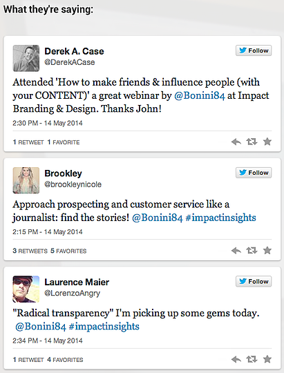
Following his webinar last week, our marketing director decided to embed some influential tweets on the landing page to download the recorded version in order to persuade others to take him up on his offer. Check it out:
Forms:
Is it an appropriate length?
The length of your landing page form should correlate with the goal in which you are being tasked with. While there is no set rule for how many form fields you should include, it all comes down to lead volume and quality.
If you're simply looking to generate new leads, the form that you employ can be fairly short. However, if you're tasked with the responsibility of generating some really high quality leads, you're going to want to ask for a bit more information.
Are you asking for the right stuff?
If you're feeling torn in regards to what information you should be asking for, consider having a conversation with someone on your sales team. Due to the fact that they are the ones who are qualifying and contacting your leads, it is important that the forms you put in place are providing them with enough information to facilitate productive conversations.
Additionally, if you're a HubSpot user, you'll want to be sure that you are taking advantage of smart fields. Essentially, smart fields adjust based off information that you have already collected from your leads. By removing forms that leads have previously completed, you can effectively shorten your forms, or gain new insights rather than overlapping information.
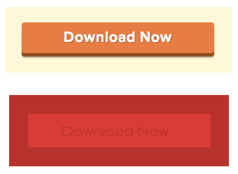
Is there a customized button?
While something as simple as the copy put forth on the button used at the end of a form seems trivial, it's actually super important. Much like the content on the page, the button that is responsible for form submissions should be explicit. If you're employing "submit" across the board, you're not helping your own cause.
Make a conscious effort to tailor your button copy to align with the offer being presented. If it's a webinar, try uses a button like this one from Unbounce:

If it's an ebook being offered, adjust the button so that it says something like this:

There's something uninviting about the word "submit", in fact, according to research from HubSpot, landing pages that contained the word submit saw significantly lower conversion rates than those without it.
Point being, every detail matters.
Design:
Are your headers eye catching?
We live in an age of content grazers. As a result of our shrinking attention spans, it's like we are conditioned to scan any content that is put in front of us in order to quickly identify if it's worth our time or not.
The unfortanate reality is that your landing pages are no exception to this habit, which is why it is crucial that when designing a landing page you place an emphasis on the visibility of your headers.
If they aren't clear and enticing, the smaller content beneath them won't be enough to make up for it, simply because it won't get read.
Use your headers, sub-headers, and any bullet points to explicitly highlight the value of what you are offering. If the scanable text attractive, it's likely that the visitor will feel prompted to keep reading and ultimately convert.
In fact, on average, 8 out of 10 people will read headline copy, but only 2 out of 10 will read the rest. (Source: Copyblogger)
Are you utilizing color and contrast?
Contrast and color work together to direct a visitors attention to exactly where you want and need it to be. So before you go picking your favorite colors as the color scheme on your next landing page, think again.
In order to encourage a visitor to complete a desired action, like submit a form, you have use color and contrast strategically to not only catch their attention, but draw their eye.
Check out the difference it makes:
When selecting a color scheme, make sure that it makes sense. Gmail once tested 50 shades of blue for their call to action color before they found the highest converting shade, so don't be afraid to conduct a few A/B tests to help you make smarter decisions. (Source: QuickSprout)
Is there a visual element?
By now, we're all aware of the power of visual content. I mean, a picture speaks a thousand words, right?
While we encourage you to include a high quality image on your landing page to accompany the written copy, it's important that you don't over do it.
Remember that when it comes to landing pages, less is more.
In fact, a one-second delay in page-load time results in 11% fewer page views, a 16% decrease in customer satisfaction, and a 7% loss in conversions. (Source: Aberdeen Group)
You want to be sure that the visual content you employ is supporting the rest of the content, not stifiling it.
Did you remember to remove the navigation?
You worked hard to get traffic to your landing pages, so why leave the door open for them to make a quick exit? By leaving the navigation bar on your landing pages, you're essentially doing just that.
Don't see why we're making such a fuss about it? Well, HubSpot recently conducted some research that might just sway your perspective. Check it out:
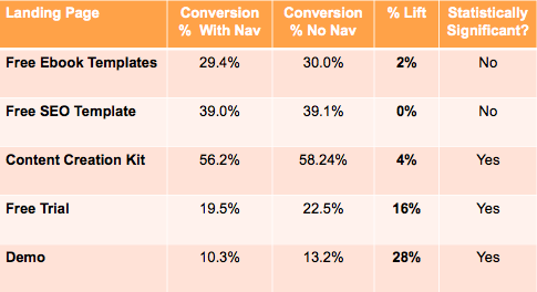
These results came from an A/B test they conducted in which they monitored the performance of a landing page with top navigation, footer navigation, and social media share link, and one in which they removed all external links, including the top navigation, footer navigation, and social media share links.
While the TOFU offers didn't see a major shift in conversion rates, the MOFU and BOFU landing pages had a 16% and 28% increase.
It looks like it's time to remove those navigation bars after all, huh?
Free Assessment:
/Assets/Icon%20Library/x%20corp.svg)
/Assets/Icon%20Library/whatsapp%20logo.svg)
/Assets/Icon%20Library/Email.svg)
/Assets/Icon%20Library/Arrows/Grey%20Arrow%20-%20Prev.svg)
/Assets/Icon%20Library/Arrows/Grey%20Arrow%20-%20Next.svg)