
![15 Golden Principles of Visual Hierarchy (& Why You Need it) [Infographic]](https://www.impactplus.com/hs-fs/hubfs/visual-hierarchy.jpg?width=768&height=400&name=visual-hierarchy.jpg)
Visual hierarchy is one of the most important principles behind an effective web design.
In design, it is important to establish a focal point on a page. This gives your visitor a place to start navigating your website and showing them where the most important information is. It offers guidance and helps communicate what you want them to do next (i.e. where to convert).
In Luke Wroblewski’s Communication with Visual Hierarchy, he states the end goal of visual hierarchy is to quickly communicate to the visitor the following:
What is this? (usefulness)- How do I use it? (usability)
- Why should I care? (desirability)
When we use visual hierarchy we make it easier for visitors to find what they’re looking for. It creates a clear path to conversion and helps highlight the actions we want the visitor to take.
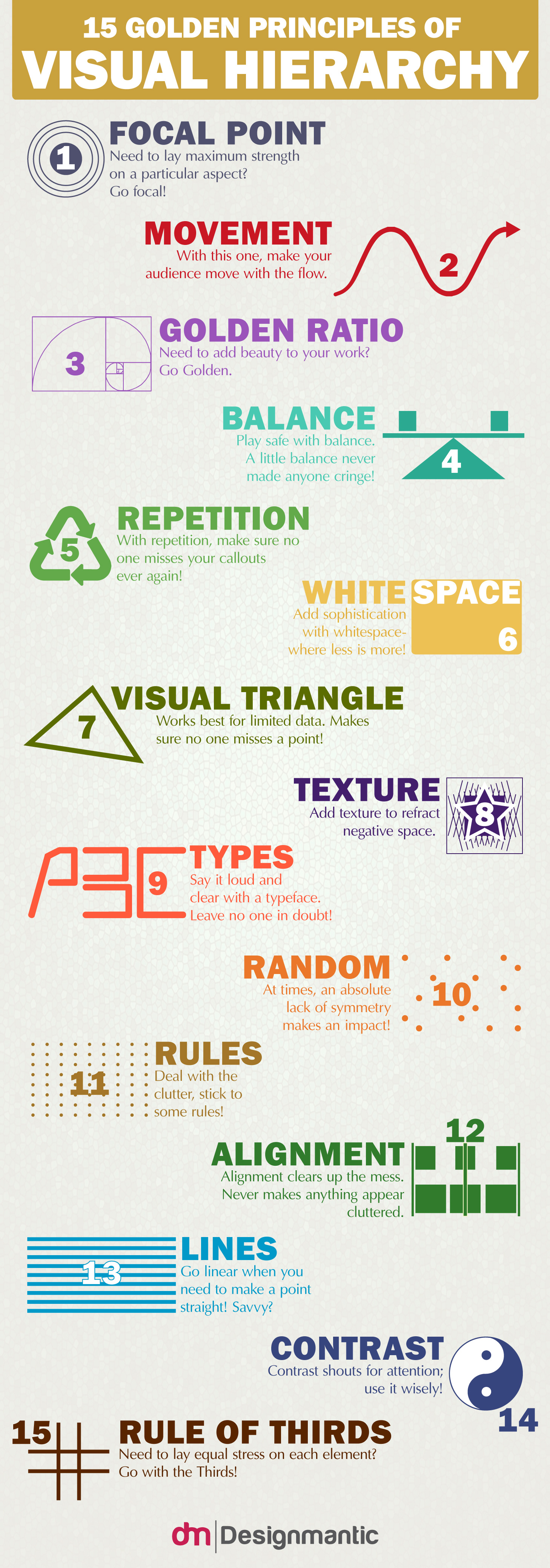
The infographic below from DesignMantic lists 15 golden principles of hierarchy, which, in the end, should help you reach your inbound marketing and web design goals. Let’s talk a little bit more about them:
1. Focal Point
The focal point is an area of interest within a composition that captures and holds the viewer’s attention. In web design, this is usually an important call-to-action or form.
2. Movement
The human eye is drawn automatically to certain points of interest. While this depends on the person, the majority of people tend to follow trends, including how they view a website.
There are two types of reading patterns for cultures that read left to right: the Z-Pattern and the F-Pattern. Aligning your design/text with these movement patterns can help your content be better received. If your visitor isn’t moving the way you want them to, A/B testing layouts that follow these patterns can be a huge plus.
3. Golden Ratio
TutsPlus defined it best, saying “the Golden Ratio is a mathematical ratio, commonly found in nature, and used in classical design theory to create balanced compositions.” Simply put, it’s layout reminiscent of a spiral. You can see it present in flowers and seashells here.
4. Balance
In terms of design, balance is when elements are symmetrical. It creates harmony, order, and cohesion. On the other hand, you can have asymmetry and that can lead to visually interesting results in return.
5. Repetition
Repetition is great to represent relative importance. For example, take if all your headings or subheadings are made a certain size and color. The user will likely see a pattern and give it meaning. Same goes for links within the text and calls-to-action.
6. White space
White space, in web design terms, is “the space between graphics, columns, images, text, margins and other elements.”
It’s one of the most important design tools because it dictates how a page flows and reads and helps with your visual hierarchy. It helps give your visitors time to breath so to speak and helps certain elements stand out.
7. Visual Triangle
A visual triangle is when you use three elements to create a “triangle” around content that you want to emphasize. It’s a common design technique used in scrapbooking. Learn more about it here.
8. Texture
Add some texture to help minimize negative space. Adding a texture to empty space can be used to strategically attract a visitor’s attention.
9. Types
Not only does the right typeface help with the typographic hierarchy and help organize your design, but stylistic choices help to contribute to the design’s overall mood and are a natural way to create emphasis. For example, pairing a decorative font with a simpler sans-serif is a great way to establish visual differences and importance between text.
10. Random
Sometimes going against the pattern and being random can work in your favor, but randomness has to be calculated. You cannot just start throwing elements on a design without any specific reason. Use it strategically. Breaking from your usual design or template is a very effective to draw attention to specific items and stand out.
11. Rules
Standard dimensions, templates, grids; these are all here to guide you, but you don’t always have to follow these “rules.” Breaking them is one of the easiest ways to create visual interest and attract attention.
12. Alignment
As mentioned above, using a grid to help keep your elements aligned helps keep things organized and also makes your website easier to develop and adapt to multiple devices.
13. Lines
As we know from heat maps, most western visitors follow the trend of reading left to right. Don’t make your visitor's eye jump all over the place, keep it in a straight line.
14. Contrast
Contrast can consist of the following elements; colors, textures, shapes, direction, or size. It is one of the easiest ways to create visual importance and tell people what to look at one a page. Think bright red or orange call-to-action.
15. Rule of Thirds
This is a simple technique where you divide up your design into three rows and three columns. The point where your vertical and horizontal lines meet is where your focal points should be.
Courtesy of: Designmantic.com
Free: Assessment
/Assets/Icon%20Library/x%20corp.svg)
/Assets/Icon%20Library/whatsapp%20logo.svg)
/Assets/Icon%20Library/Email.svg)
/Assets/Icon%20Library/Arrows/Grey%20Arrow%20-%20Prev.svg)
/Assets/Icon%20Library/Arrows/Grey%20Arrow%20-%20Next.svg)