Subscribe now and get the latest podcast releases delivered straight to your inbox.
23 of the Best Examples of Business Blog Design

May 30, 2022
Best Examples of Blog Design for Inspiration
- Wistia: Video marketing hosting tool's blog incorporates a valuable mix of video, articles, and exclusive reports.
- Sprout Social: Social media tool's blog makes great use of visual hierarchy and original imagery.
- Moz: Search Engine Optimization tool uses simplicity to make blog easy to navigate.
- REI: Outdoor lifestyle blog uses relevant and original imagery.
- In-Tec: Commercial cleaning company answers all of your essential questions.
- Campaign Monitor: Marketing automation tool blog makes filter content easy.
- Atlassian: Project management tool blog creates beautiful consistent branding experience.
- HubSpot: Marketing automation tool blog uses white space to make content easier to read.
- Buffer: Social media tool blog uses sub-blogs to organize content.
- Zendesk: Customer service blog creates visual interest with unique featured images and shapes.
- GitHub: Development blog makes great use of space and original imagery.
- Canva: Graphic design blog uses sidebar to keep content organized and easy to find.
- Mailchimp: Marketing tool uses typography to create hierarchy.
- AES: Education tool creates comprehensive learning hub and large hero section to guide the eye.
- PandaDoc: Digital document tool makes blogs easier to digest with spacing and table of content
- Wave Financial: Financial blog makes it easy to find what you need at a glance.
- Think with Google: Brings multiple content mediums into one central hub.
- ClickUp: Makes subscribing easy.
- Usherwood: Offers a variety of filter options
- Appian: Uses simplicity to keep focus on the content.
- Udemy: Cleverly pulls in calls-to-action and related courses.
- Nintex: Easy to use content type filtering and article search
- Birdeye: Tasteful use of custom imagery
Most marketers know by now that a stellar blog design can create a great user experience.
Despite this, however, it’s so easy to put design on the sidelines.
In some cases, it’s because you may not have someone dedicated to owning your website's design, or maybe you just don’t have the time. For others, it’s just not a priority.
Although your valuable, trust-building blog content is what is truly the most important when it comes to engaging with your audience, a great design is going to take these characteristics to the next level.
Don’t believe me?
Consider that 48% of users believe website design is the #1 factor when judging a business’s credibility.
I’m not saying your blog needs to be award-winning, but there are characteristics, features, and layouts that can help make your content easier to find, read, and remember through a better user experience.
As someone who's been designing and developing different iterations of IMPACT’s blog for nearly a decade, I’ve certainly learned a few things about what really appeals to users and helps boost leads and engagement.
By the end of this article, you can expect to learn:
- Why a well-designed blog is important to you and your users.
- The characteristics that make up a great blog design.
- Examples of different company blog designs and what they got right.
What makes for a great blog design?
Before we look at our examples, let’s dive into some of the key elements that should be incorporated into your blog design to improve your content experience. These key elements can be seen in many of the examples.
Simple design and color scheme
As you review some of the examples in this article, you’ll notice all of them follow a similar trend of making sure sections of the blog (especially on its homepage) have ample whitespace, deliberate font choices, and lean color palettes.
For example, for blog cards, you should typically make sure each card follows a similar design. And when you want to add sections with distinct offers you’re promoting, frame and design them in a way that gives a visual indication that they’re not just another blog article.
This helps keep the design simple to understand and also guides the eye to the most important things.
When it comes to colors, it’s good to remember that black and white are your friend and that colors should be used sparingly to draw attention and denote hierarchy.
Remember, your blog isn’t an artsy magazine spread. You’re optimizing for user experience, not for the most elaborate and complex blog design award.
Black and white also helps with…
Great readability
Readability is accomplished by combining a few different elements.
First, you need to select an easy-to-read font. I typically recommend one of the more common serif or sans-serif fonts, as they typically offer a wide range of font weights, and are more neutral in their styling.
Some popular serif fonts include Garamond, Merriweather, or Lora. A few san-serif font examples are Roboto, Lato, or Nunito.
Next, it’s important to have variants of font styles and sizes used throughout the article to denote headings, emphasized or bolded text, links, etc. These elements help organize the article, making it easier to skim for the user, and also making it easier for Google to read and understand what the page is talking about when indexing it.
Finally, it’s important to break up your content and avoid long and lengthy paragraphs. If the first thing a user sees when they hit an article is something like the image below, chances are they’re going to feel overwhelmed and not read anything.
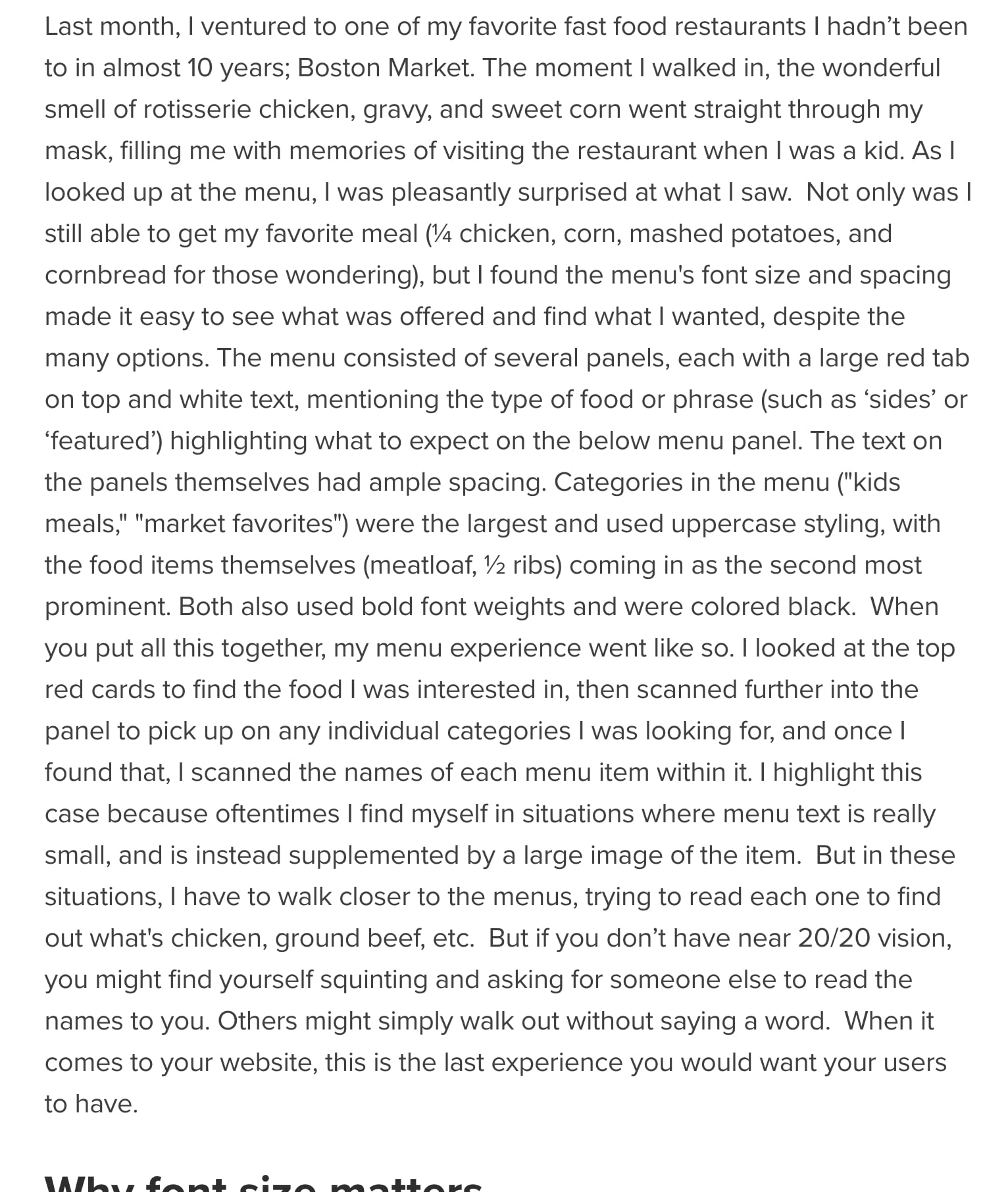
To avoid this and make sure your message doesn’t get completely overlooked, break your content up into smaller, bite-sized paragraphs that utilize ample whitespace.
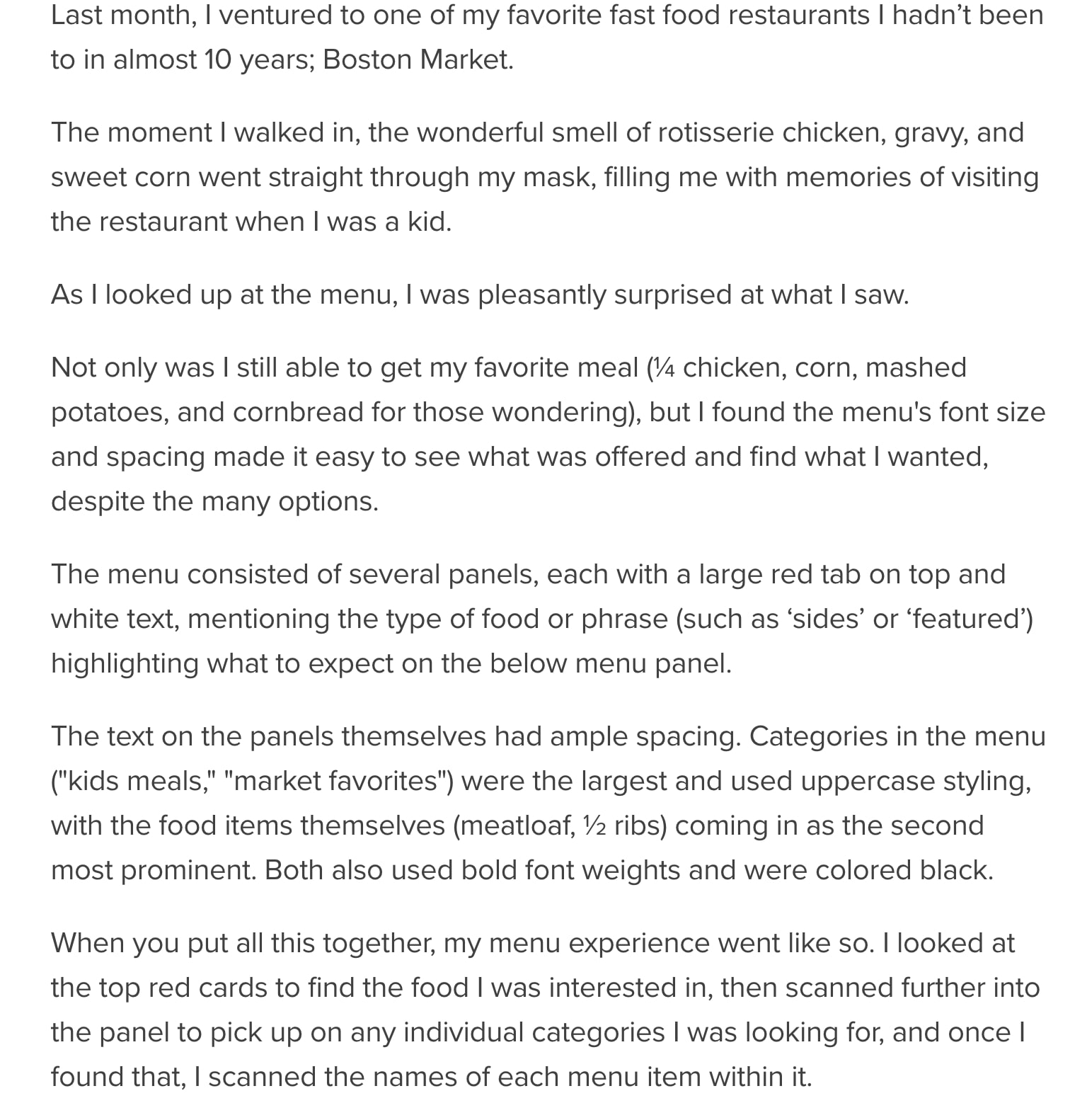
This gives the reader's eyes a visual break and also makes it easier to find a stopping point if need be.
Intuitive navigation and organization
Nothing is worse than looking on a website for the information you need, only to find that things are cluttered and disorganized. Even if what you need is there, there’s no easy way to find it.
When visiting a blog, users want to easily find the answers to the questions they’re asking and the topics they are interested in. This can be done by properly tagging your content with sets of topics and having those corresponding topic pages readily available in your blog navigation.
But it doesn't need to stop there.
Many of the blog design examples in this article take it a step further by creating category pages that segment into further subcategories, and incorporate other types of content, such as video, guides, pillar pages, checklists, etc.
Rather than having those types of things housed in a separate resource center, you end up combining your resources and blog articles to create what we call a Learning Center, a key component of the They Ask, You Answer strategy.
Original imagery (limited stock photos)
It’s crazy to see so many blogs that still use the same stock imagery over and over again.
I’m talking about photos of random people in suits clapping, close-ups of handshakes, groups of people pointing at a laptop, the list goes on.
And if you need a visual…

I’m not saying you have to have a designer creating custom imagery for each article (although, that certainly would be ideal), but you should aim to be as original as possible. This helps you and your content stand out among the sea of others using those photos.
If you must use stock photos, make sure you’re steering more toward realistic-looking imagery that avoids studios and cliche behaviors.
Best Business Blog Design Examples
1. Wistia
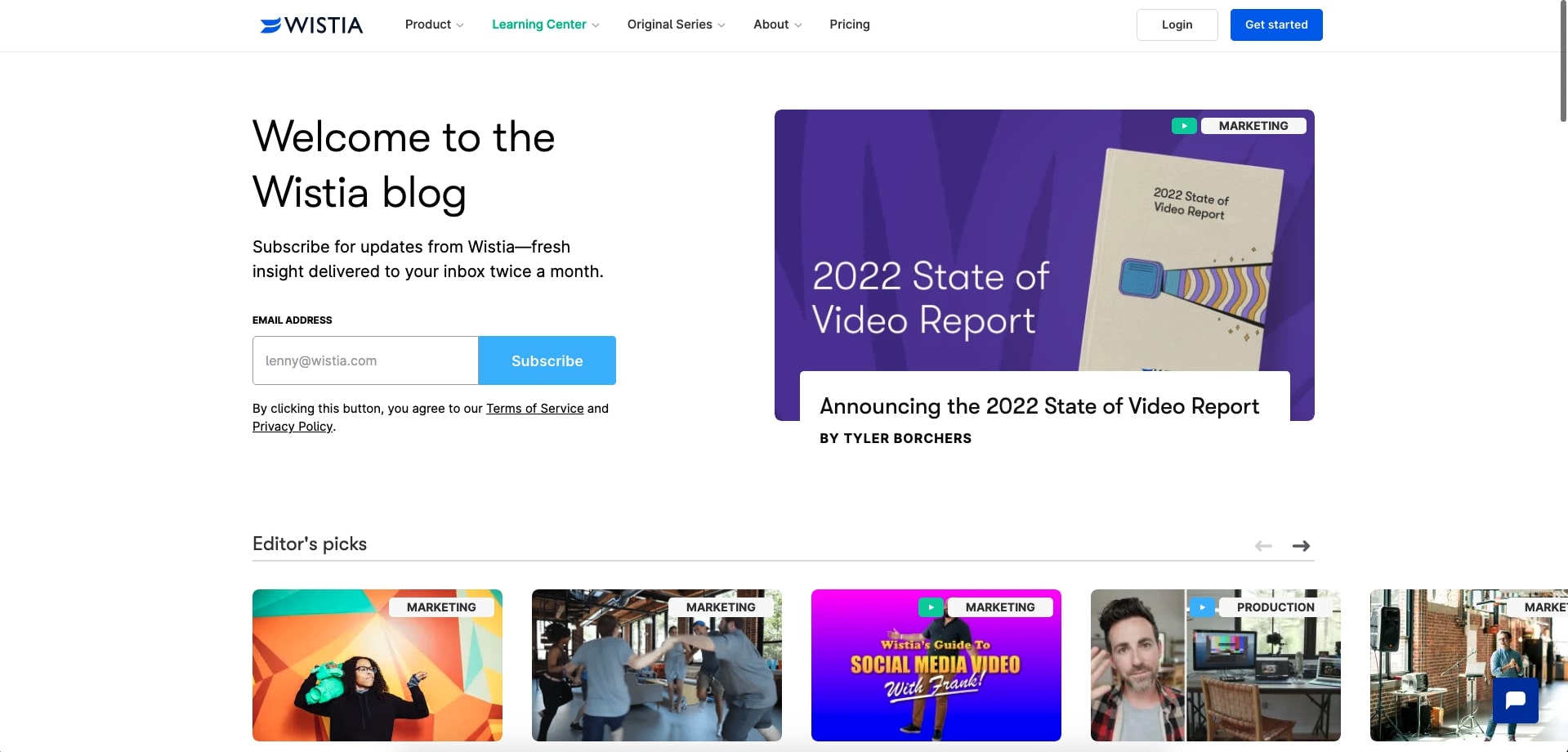
When it comes to learning about video marketing, Wistia has some of the best resources and articles out there. And their blog design only makes them better!
Wistia’s blog is structured so it delivers hand-selected, recommended resources first. (Though they don’t call it that, it’s most definitely a learning center!) These recommended resources are highlighted in the hero section of the page with a larger banner and then a section labeled “editor’s picks.”
The blog goes on to show a mixture of recent articles, reports, videos, and categories you can dive into. Clicking them brings you to separate category pages with additional filters so you can get specific with what you are looking for.
It’s no surprise that Wistia also promotes its top video content, which is a fantastic way to show their professional video production skills, and helps build trust that they are a great go-to resource.
2. SproutSocial
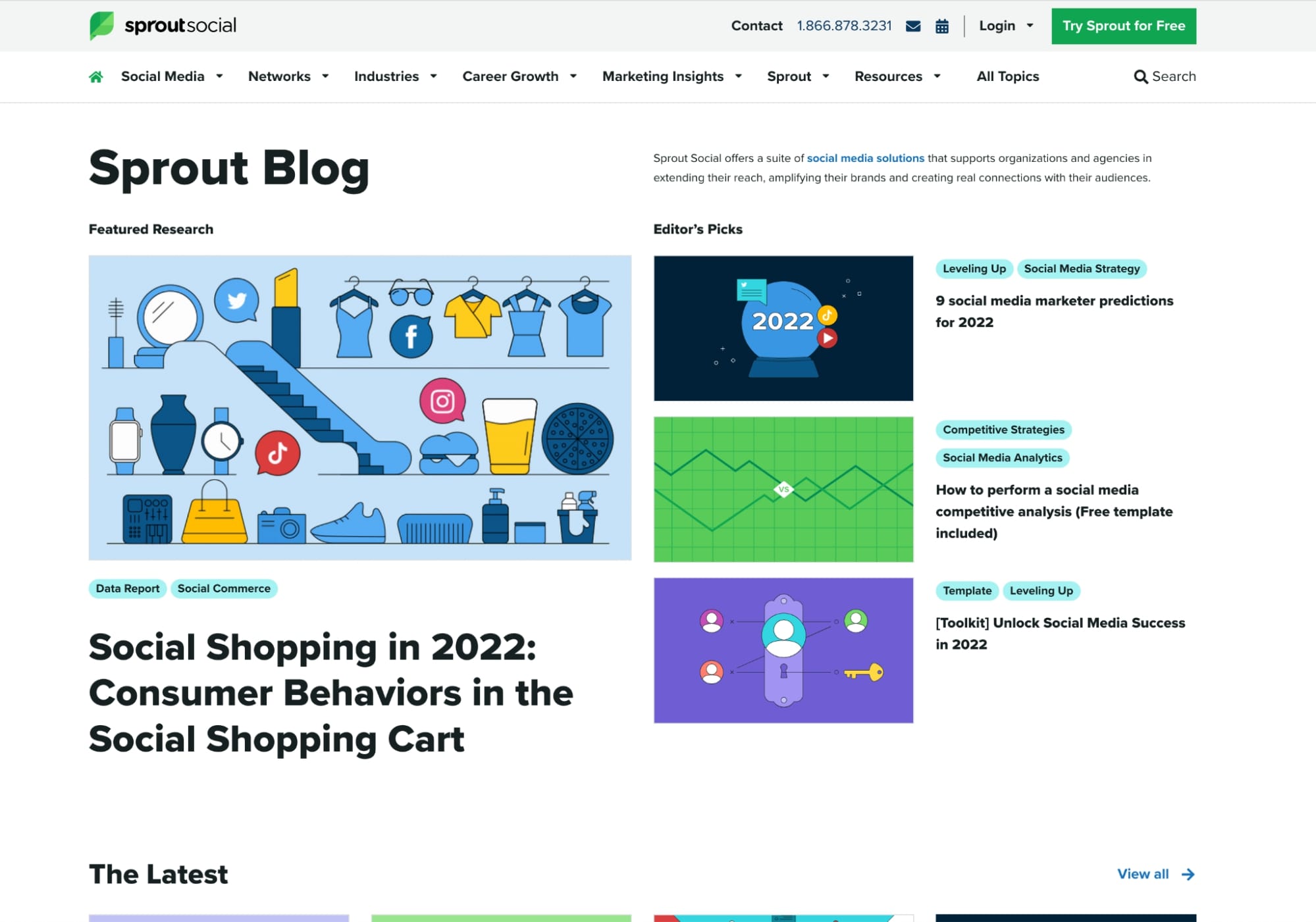
SproutSocial’s blog does a fantastic job at organizing their daily written content, guides, and featured research.
I particularly love their commitment to publishing research-based content, and they do a great job of highlighting it. Whenever they publish content like this they always give it a featured image highlighting the name of the report, which makes them stand out from the other blog articles on the page.
SproutSocial also has a refined category and filtering system, which can be found by clicking on any of their article topic tags.
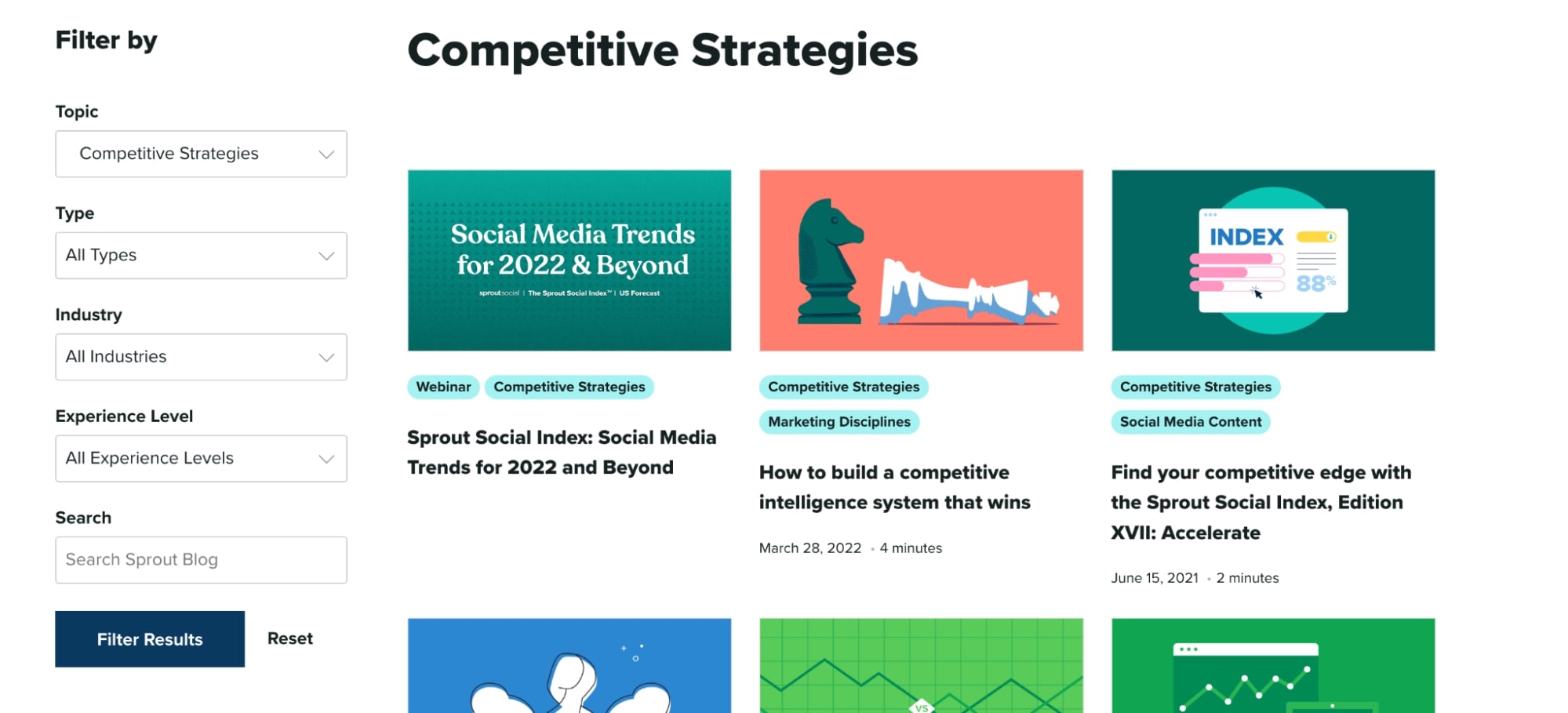
Incorporating a well-organized system like this allows their users to easily find what they're looking for, which makes it more likely that they’ll stick around.
3. Moz
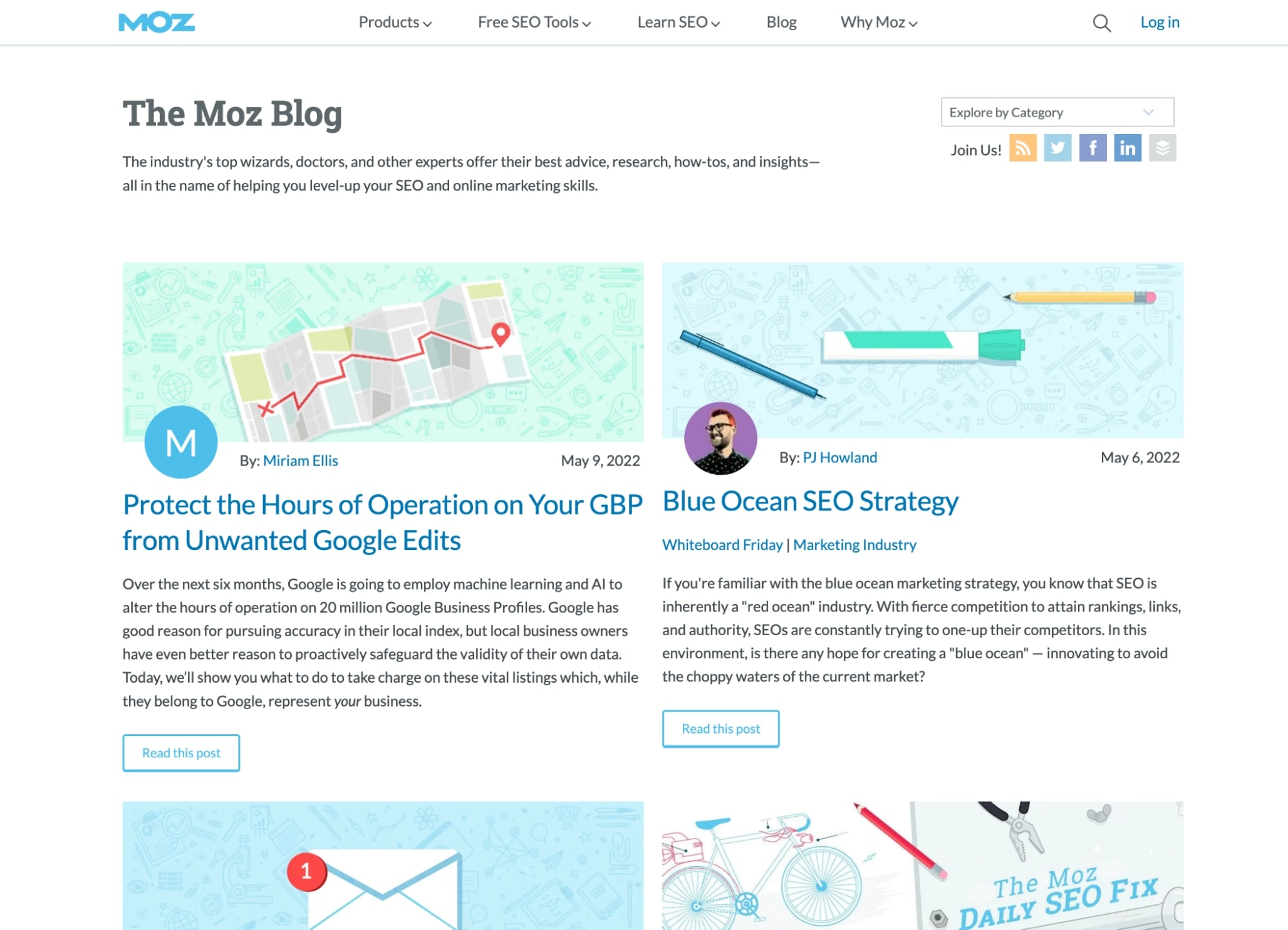
Compared to our last two blog designs, Moz takes a much simpler approach.
Moz’s blog layout primarily consists of a feed of their most recent articles, but they do manage to squeeze in a few sections of calls-to-action to promote their training and guides.
If you’re looking to dive into their category pages, you can click on the dropdown in the top right-hand side of the page. These pages consist of the same layout, but sometimes incorporate further information and promoted articles at the top.
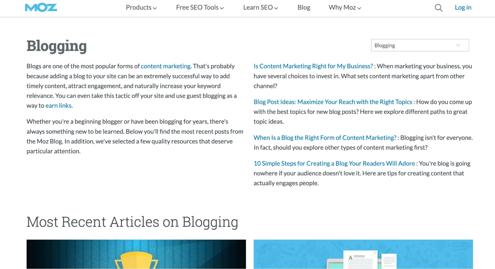
It might not be the most visually exciting, but it gets the job done in terms of delivering the right information.
4. REI
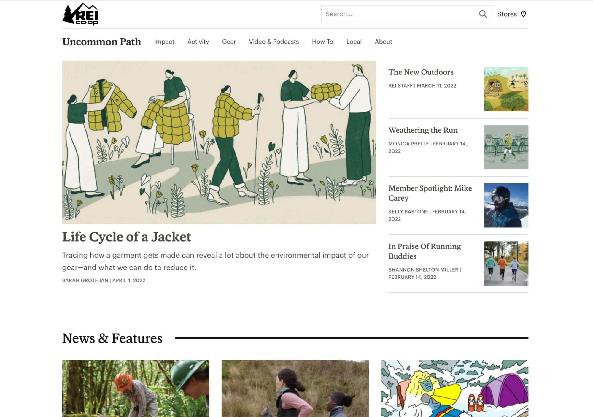
If the great outdoors are your second home, you’ve probably landed on REI’s blog once or twice — or you might even be a subscriber. Either way, if you think you’re only going to find articles about camping there, you’re wrong.
REI does an all-around great job utilizing their blog. As an outdoor clothing, gear, and footwear company, their blog provides tips, comparisons, and step-by-step guides for everything from hiking and cycling to traveling, gear, and even food.
Whether you’re a thrill-seeker or simply enjoy outdoor activities, REI is there to help you focus on your adventure. Their blog design really drives this home using high-quality, unique, and related imagery and illustrations that are sure to resonate with their audience and customers.
Their blog's sub-navigation also easily helps you jump to their different category pages so you can refine what you are looking for.
5. In-Tec
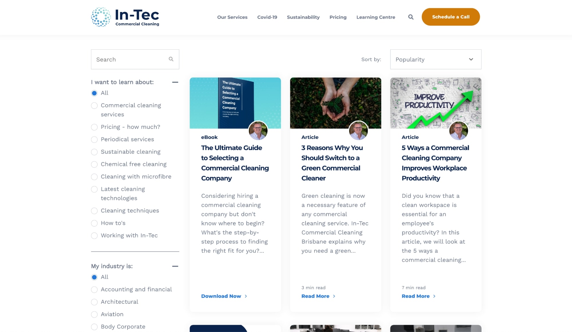
In-Tec, a commercial cleaning services company and one of IMPACT’s clients, utilizes a learning center that provides tips, comparisons, and step-by-step guides to help its readers make informed, educated decisions.
Their blog includes all of the key elements that a great business blog would consist of: search functionality, article sorting, and filtering by industry, topic, and content type. The content itself is a mix of articles, videos, ebooks, and other offers – all the necessary content types users are likely to look for.
Best of all, many of their articles revolve around the topics that are proven to drive the most traffic, leads, and sale
6. Campaign Monitor
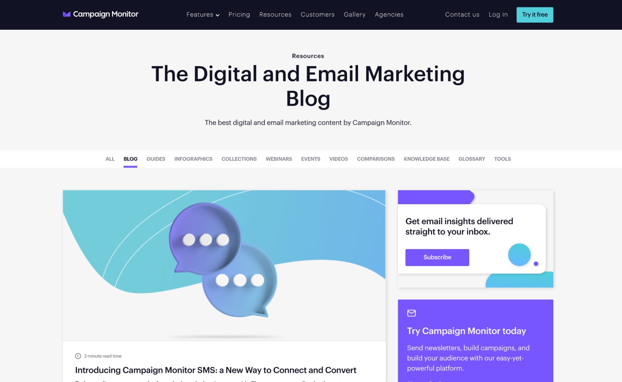
Campaign Monitor’s blog page, with its clear and minimal layout, is another example of great blog design.
Like REI, Campaign Monitor makes their blog easy to navigate by having topics serve as a sub-navigation. Their blog also prominently displays a featured article that is designed to match their company’s branding.
Then, below that is the real meat and potatoes. They list their latest blog posts and accompany the section with a search and “filter by topic” dropdown.
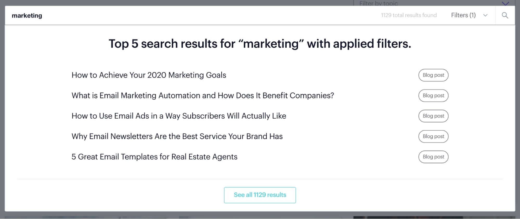
I’m most impressed with their search functionality. First of all, it has a built-in filtering system that lets you segment content by type and topic.
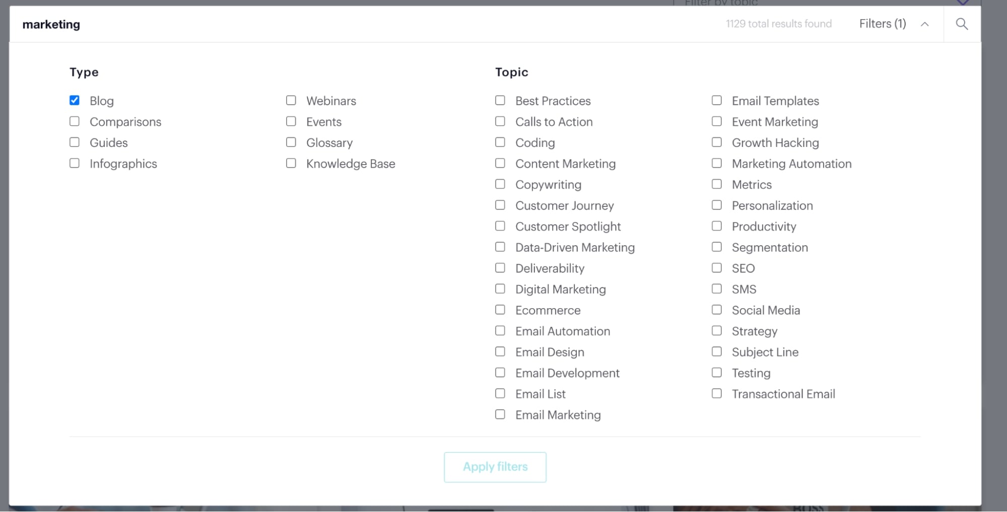
But, if you choose to forgo the filters and just enter a keyword, the search automatically recommends the top five searches without you having to click into the results page. This allows their users to get the information they may be looking for faster.
7. Atlassian
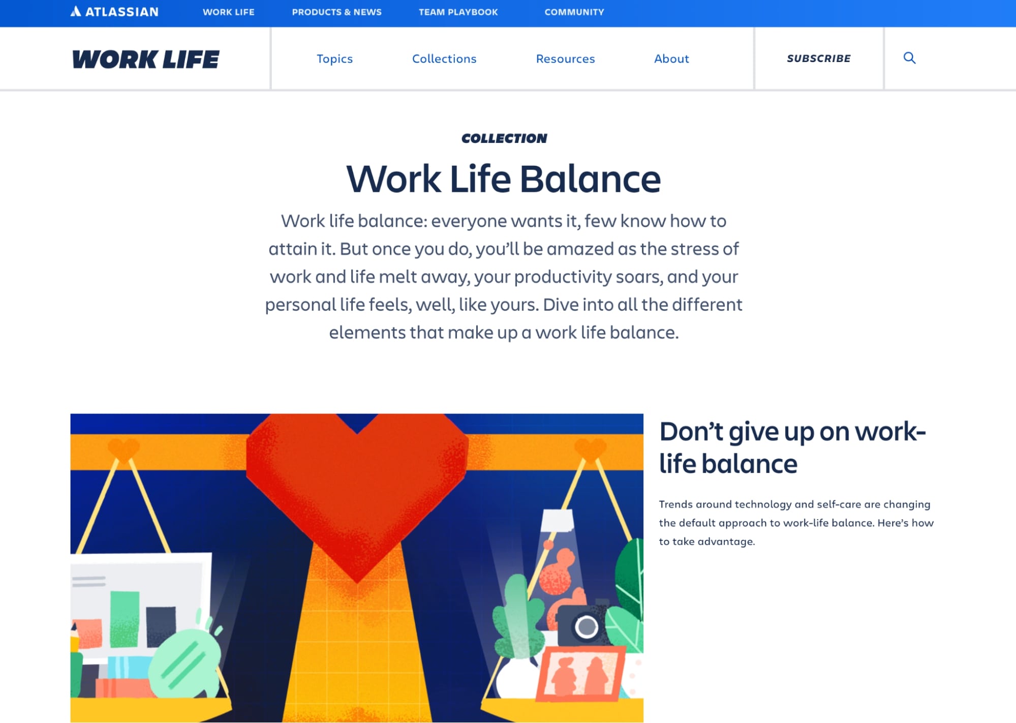
One of the first things that struck me about Atlassian’s blog design was its branded featured images used throughout every article. They do an excellent job of sticking to the color palette synonymous with their brand, and it makes the blog feel that much more put together and cohesive.
Like a few other examples in this article, Atlassian features popular blog posts/featured posts right above the fold to guide you to important information. But, if these articles don’t pique your interest, you can continue to their latest articles section right below.
What Atlassian does that’s different is that they have a content type called “Collections,” which features groups of articles across multiple categories that relate to work-related content (i.e., Work Life Balance). These content groups are also located on slightly customized blog sites.

This is a great way to group articles related to certain subtopics your users may also be looking for without having to add new blog category tags to your blog manager. This also allows for flexibility to expand or remove collections when they may no longer be relevant.
8. HubSpot
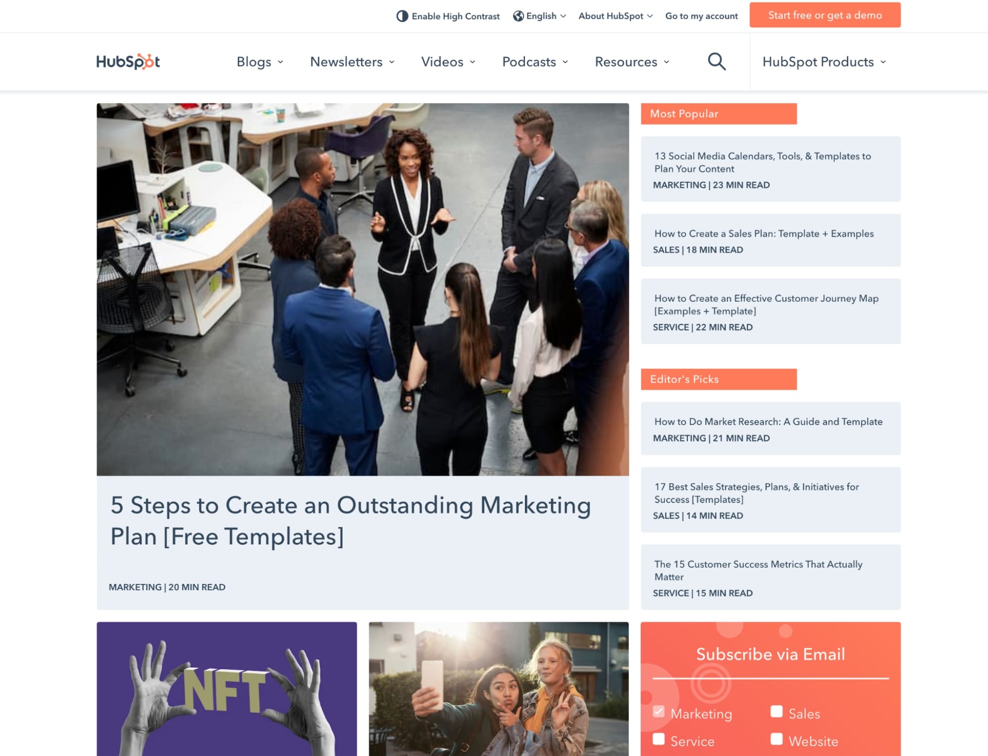
HubSpot has been running a successful blog for years and has always been a go-to for inspiration and information for many inbound marketers, so it’s no surprise that I have to mention them!
In HubSpot’s case, not all the listed articles on their main blog page lead to a blog post. Some lead to a pillar page or guide. Sprinkling these throughout their listing page is a great way to get high-value offers right in front of users.
When it comes to the blog articles themselves. HubSpot does a great job at utilizing a lot of white space on either side of the article, which helps with readability.
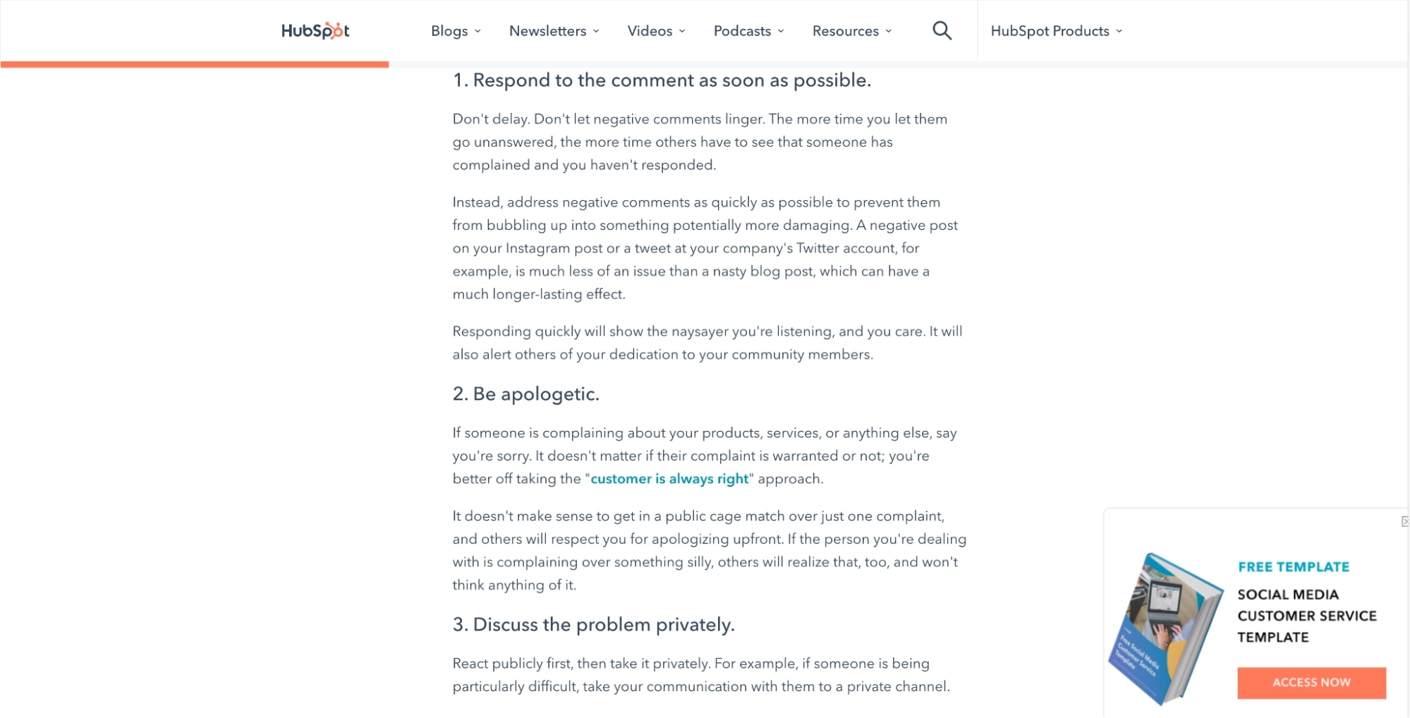
They also do a great job of incorporating multiple calls-to-action (CTAs) throughout the article, including one at the beginning, middle, end, and one that sticks with you as you scroll through the article. This maximizes the chances of users potentially clicking on one of them as they spend more time on the page.
9. Buffer
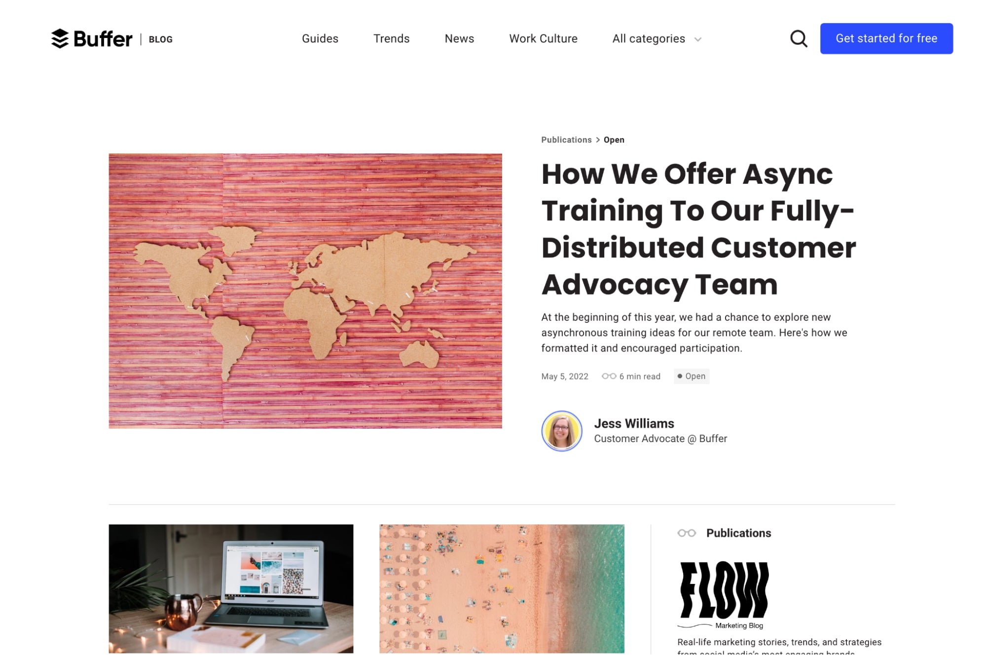
Buffer’s blog is a great example of one that needs to adapt itself to a few different types of publications they have. To accomplish this, they have kept their primary blog fairly simple as compared to the design adopted by their other blogs.
For example, they have a publication called <Overflow/>, a blog site for engineers. This, as well as the other publications, have a specific featured image and logo at the top, but the content uses the same styling as seen on the main page, just laid out horizontally.
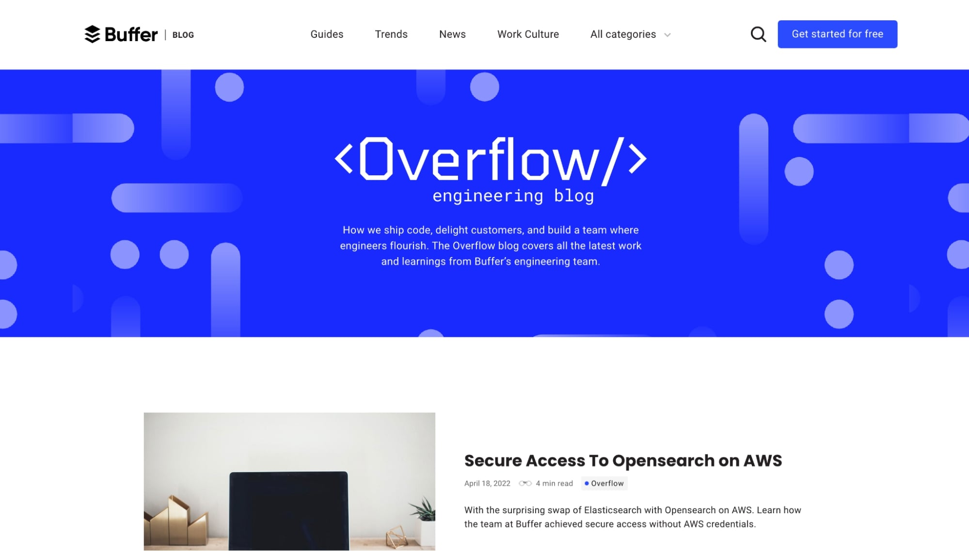
This gives users the feeling that these blogs are a part of the same brand while still allowing Buffer to segment blogs that may be better suited for a specific target audience.
10. Zendesk
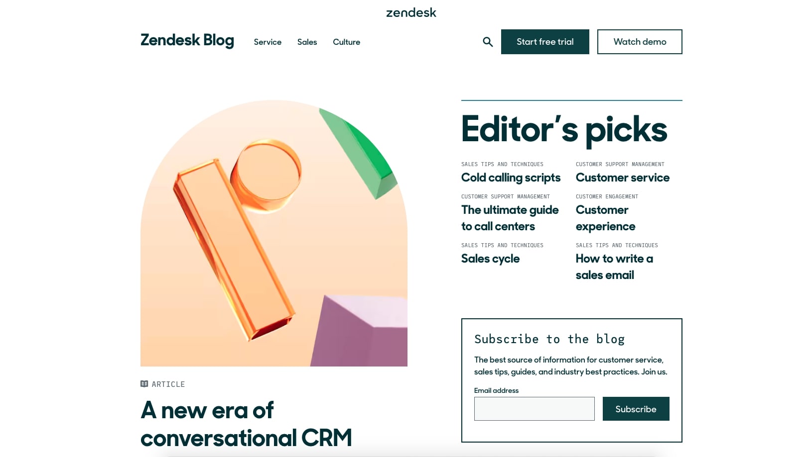
Zendesk has always been a personal favorite when it comes to their design. Their blog homepage adds immediate visual interest and grabs your eye with their half-oval featured image on the first article.
What I like most about Zendesk is how they’ve created a unique experience on their “Editor’s Picks.” These articles are much more detailed and feature a more robust design, called-out definitions, top-answered questions, and a sidebar to dive deeper into more related articles.
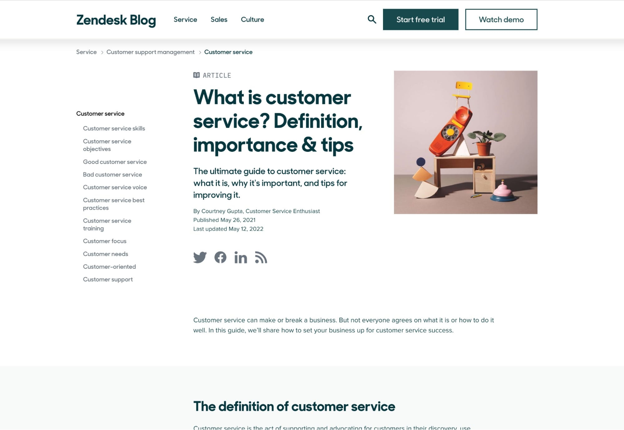
These articles do a great job of comprehensively explaining popular subjects while also encouraging the user to stay on the site.
11. GitHub
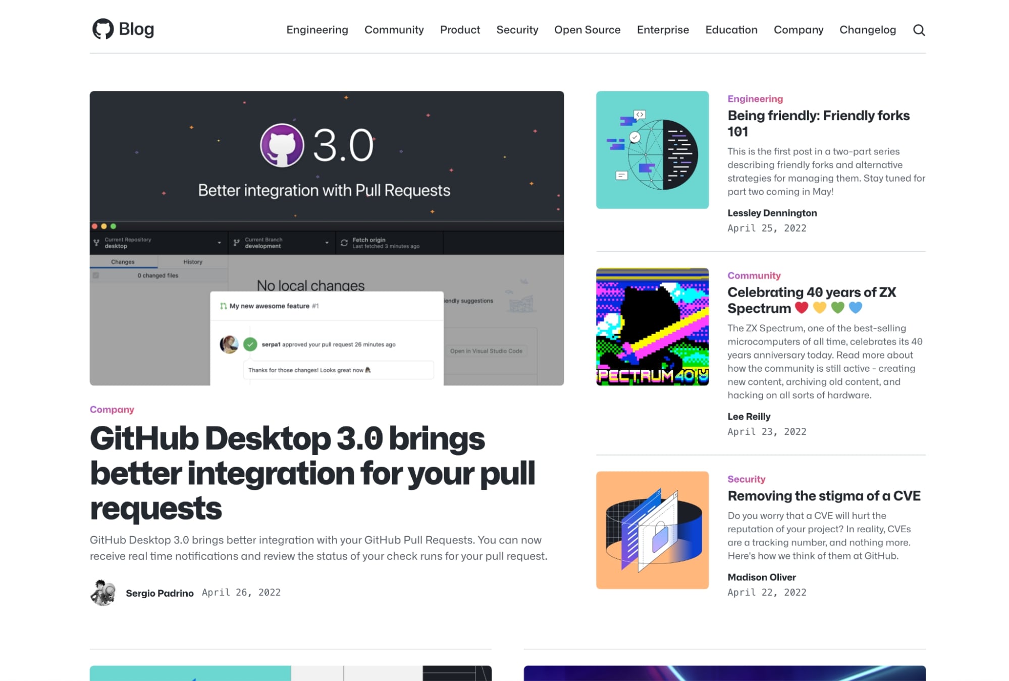
Github’s blog layout nicely organizes several of its primary topics into sections that feature associated articles. The design differences of each section make it easy to tell when you’ve hit a new section and help the user understand where they are.
This also allows them to remove the need for the category tag on the articles on the blog listing page, saving on space and eliminating redundancy.
Like other publications, GitHub is also a great example of a blog that uses custom imagery that visually aligns with their brand.
12. Canva
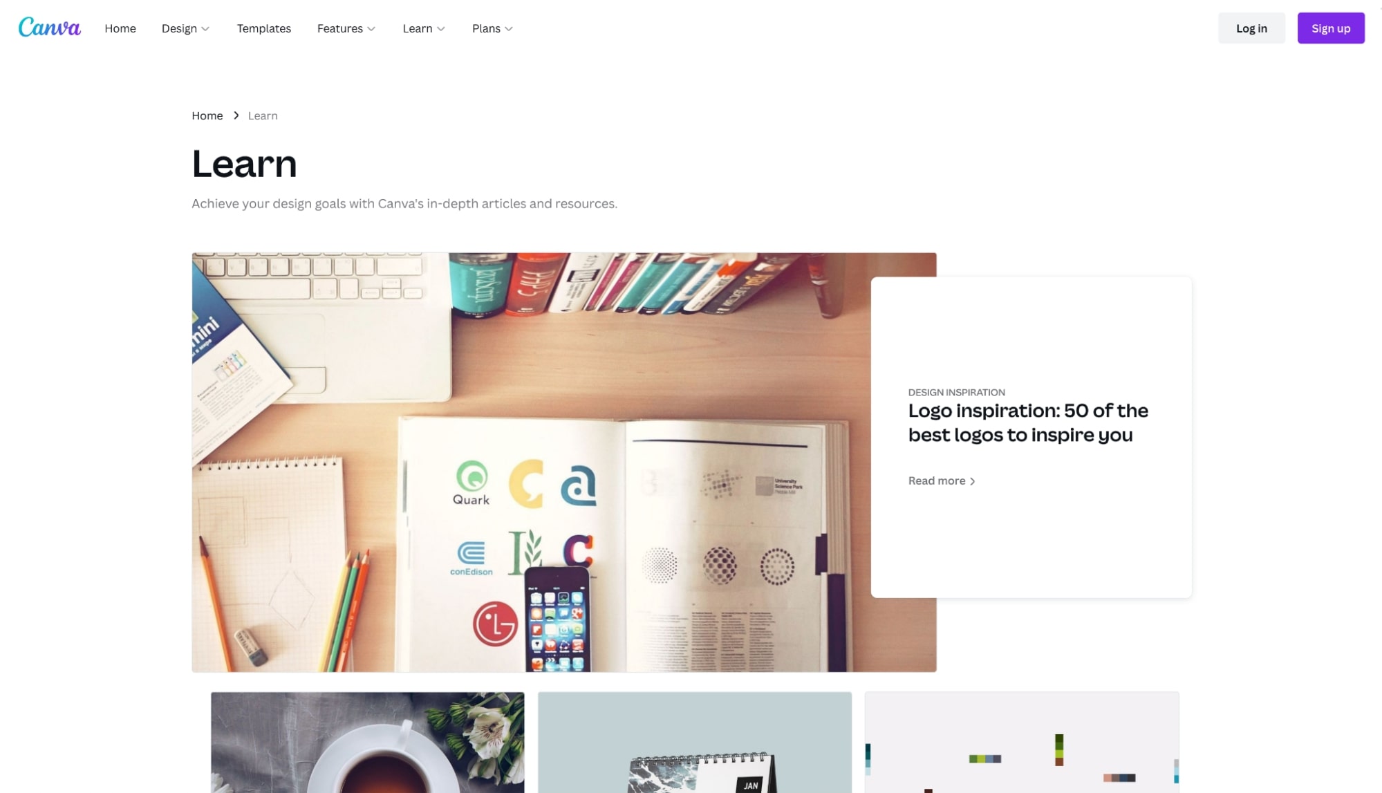
Similar to GitHub, Canva is another company that has specific blog sections for each of their primary categories on their blog homepage.
However, where Canva really does a stellar job is on their individual blog pages. Each of them contains a sidebar that is both nicely organized and well optimized.
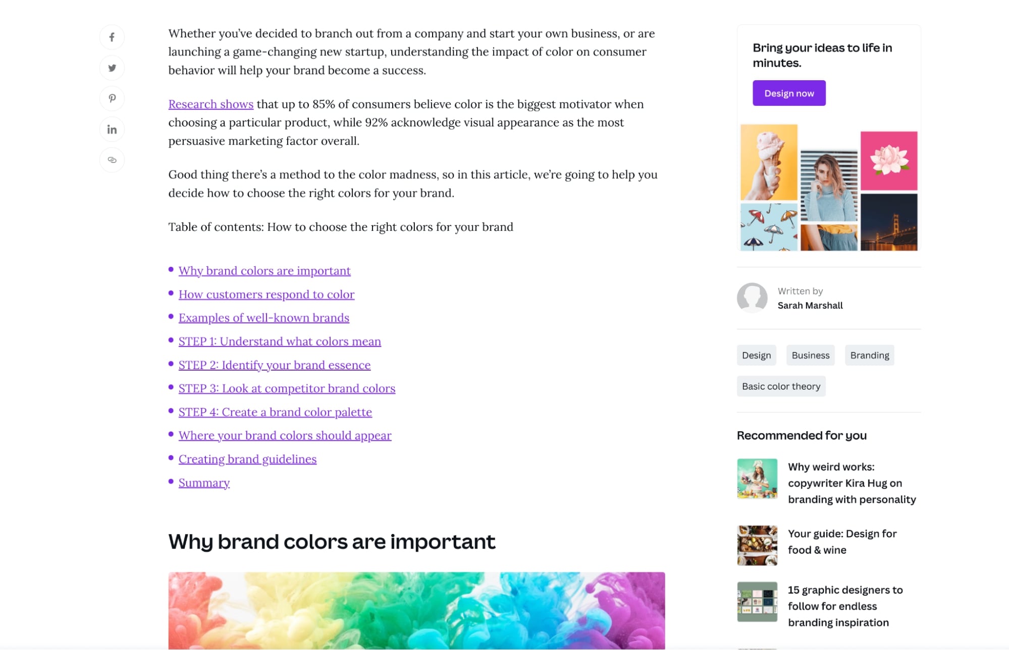
My two favorite parts of it are the CTA right at the top that directs people to try their product and the “related content” section, which makes it easier for users to continue their journey on the site with relevant pieces.
Like other examples in this article, sidebars like this are a great way to help direct your users further into your website and through your conversion funnel.
13. Mailchimp
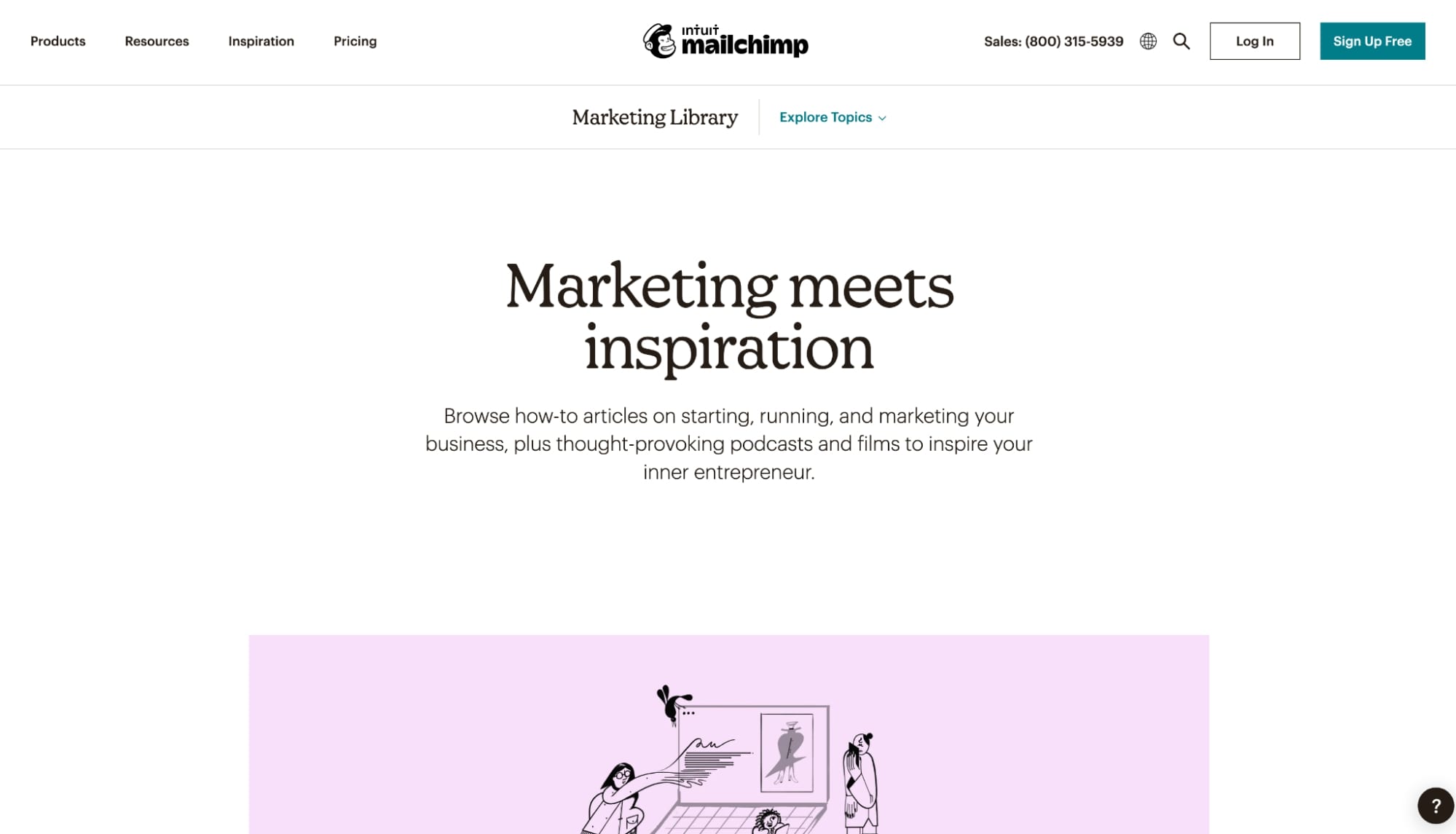
I’ve admired Mailchimp’s use of fonts and colors coupled with their minimal design. On their blog, these design choices make their imagery and typography stand out, which means their users are more likely to focus on titles and content.
Mailchimp also uses a great layout hierarchy on their category pages. Above the fold, they feature a primary resource for the topic, followed by sections of additional resources that cover related subtopics.
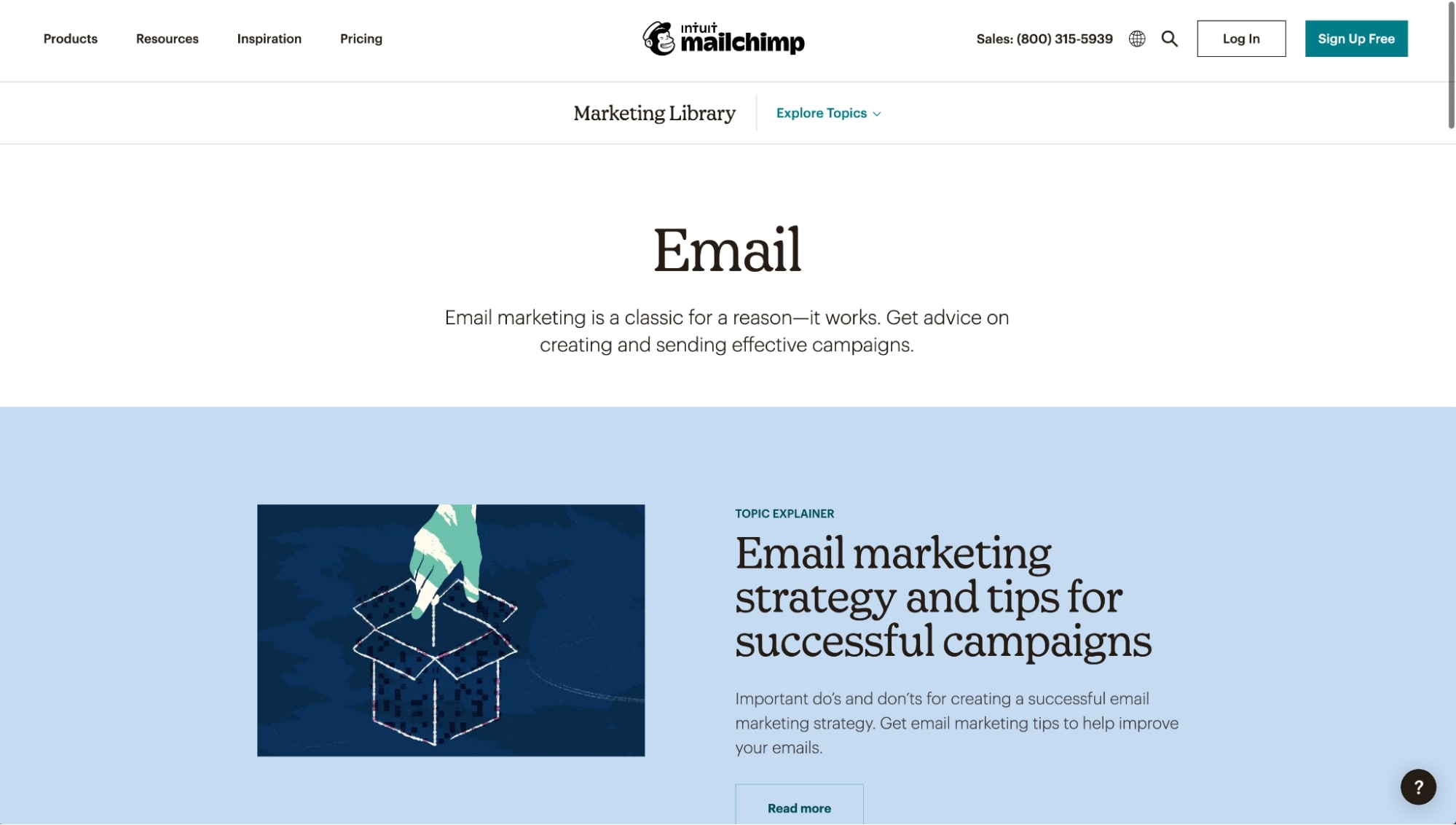
I love this because it organizes their content in a way that turns their blog categories into more robust resource sections that also have a better likelihood to rank in Google for its primary term.
14. AES Education
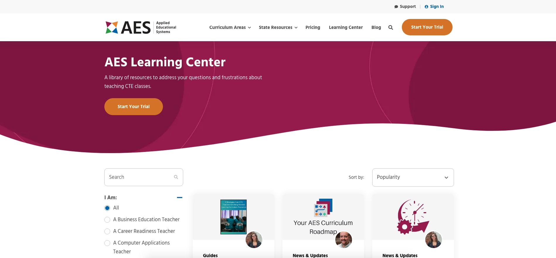
AES is another company that worked with IMPACT to redesign their learning center.
First, I really enjoy the unusual hero section. The organic shapes used in it are a nice refresh from the standard boxed-in design.
When it comes to the blog homepage, I like how they customized their “popularity” sorted view of the listing section with a wide variety of content, including articles, guides, and news/updates.
15. PandaDoc
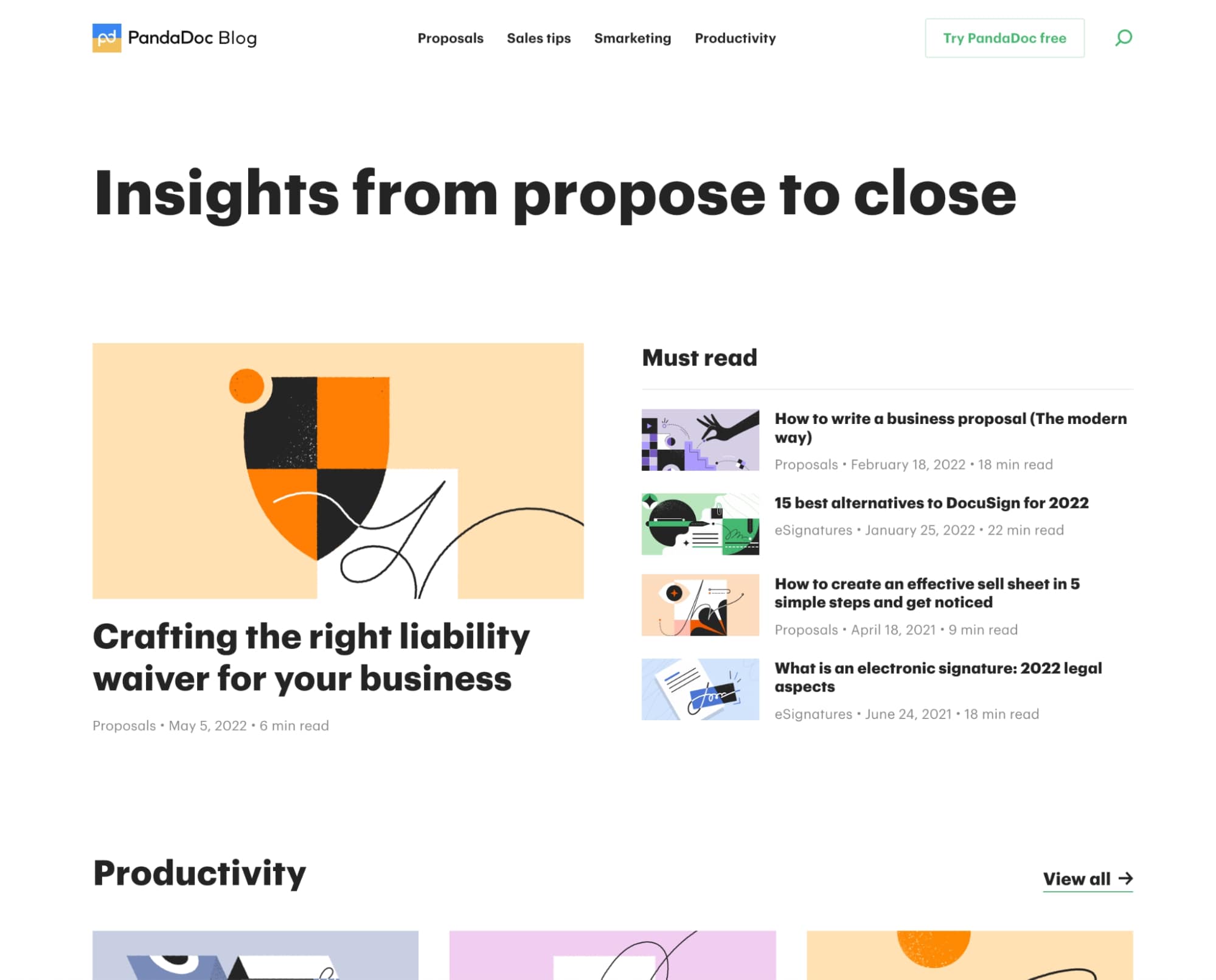
PandaDoc is another example of a blog that uses a clean and simple design with visually branded imagery.
As I was scrolling through their blog homepage, I was impressed to see they had some great articles discussing topics like product comparisons and cost (two of what we call The Big 5; content topics we’ve found to be the most sought-after when users begin purchasing research).
When it comes to their inner post blog layout, I liked the addition of the “table of contents,” which anchors you to different sections of the article.
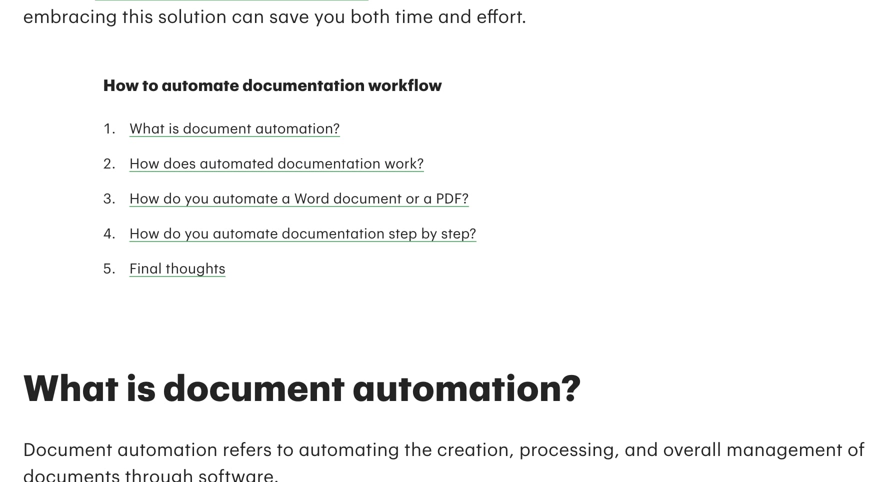
From a UX perspective, this is a great way to help people get to the information they want faster, without having to scroll up and down in an article before maybe finding it.
16. Wave Financial
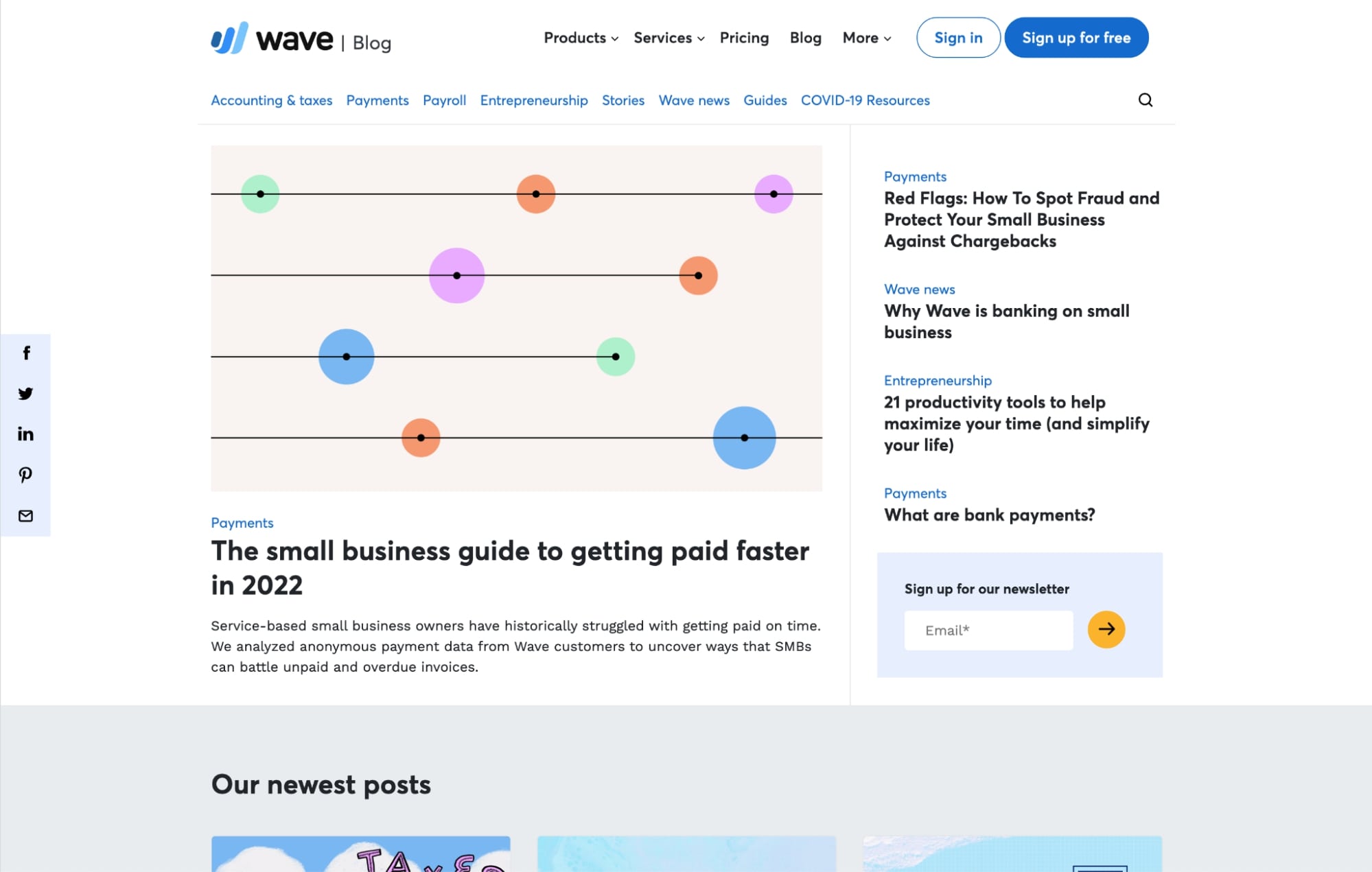
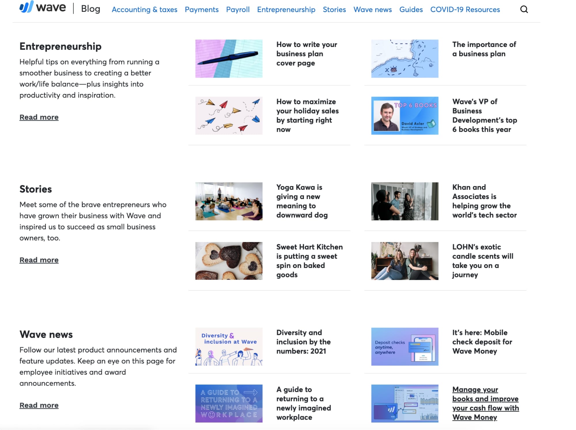
Wave Financial’s blog design is another stellar example of how you can show off your blog categories and make it easier for users to find what they need.
The fact that they decided to horizontally orient their blog articles with limited information allowed them to create some pretty concise sections. This means users can scan through these category sections a little quicker to get a glimpse of what Wave has to offer. On my screen, I can see at least three categories in view at the same time.
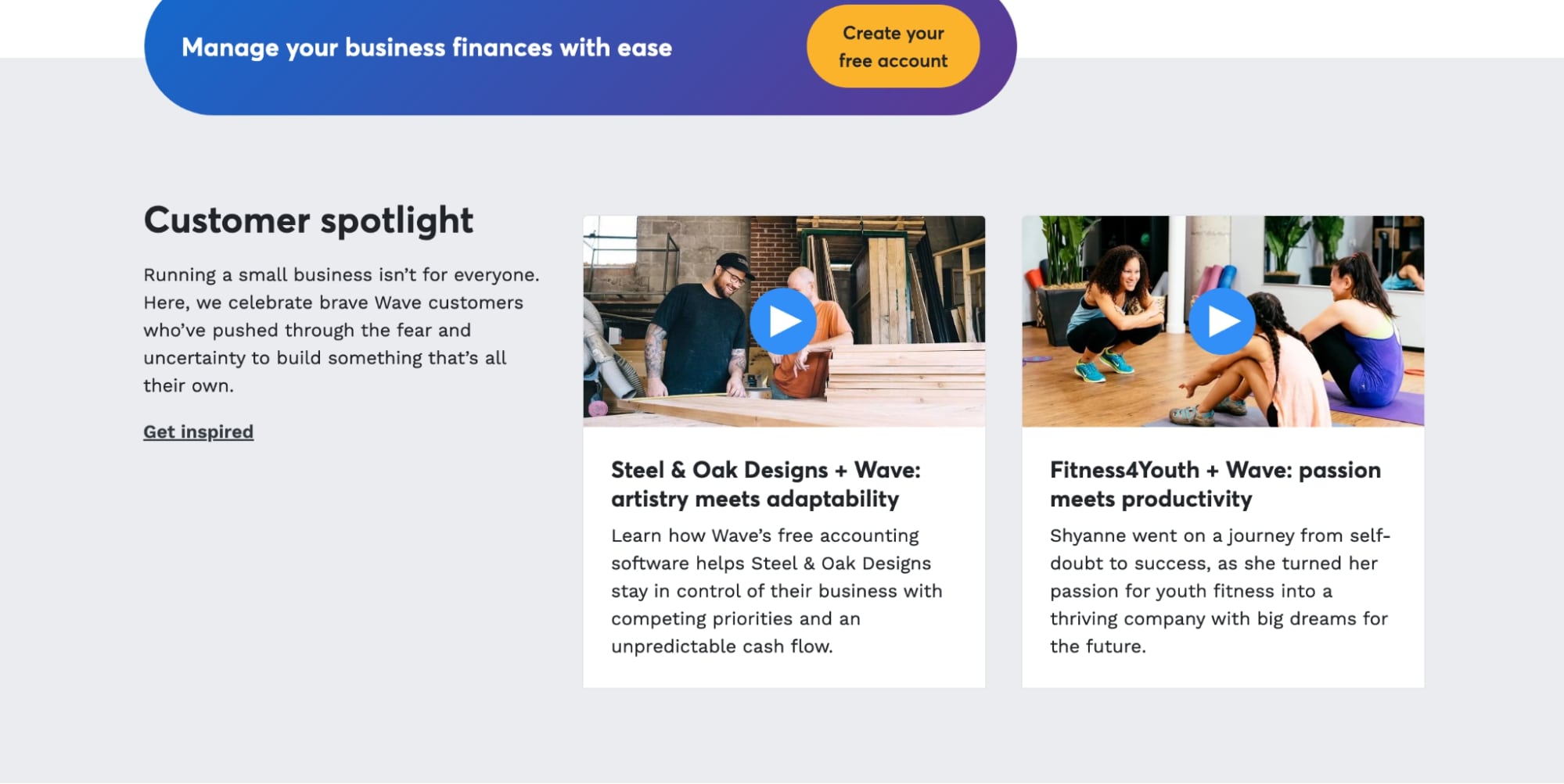
Finally, I like how they incorporated their customer success stories at the bottom of the page. These are great middle-of-the-funnel content pieces for those who are a bit further down the sales funnel, but they don’t distract from the articles on the blog.
17. Think with Google
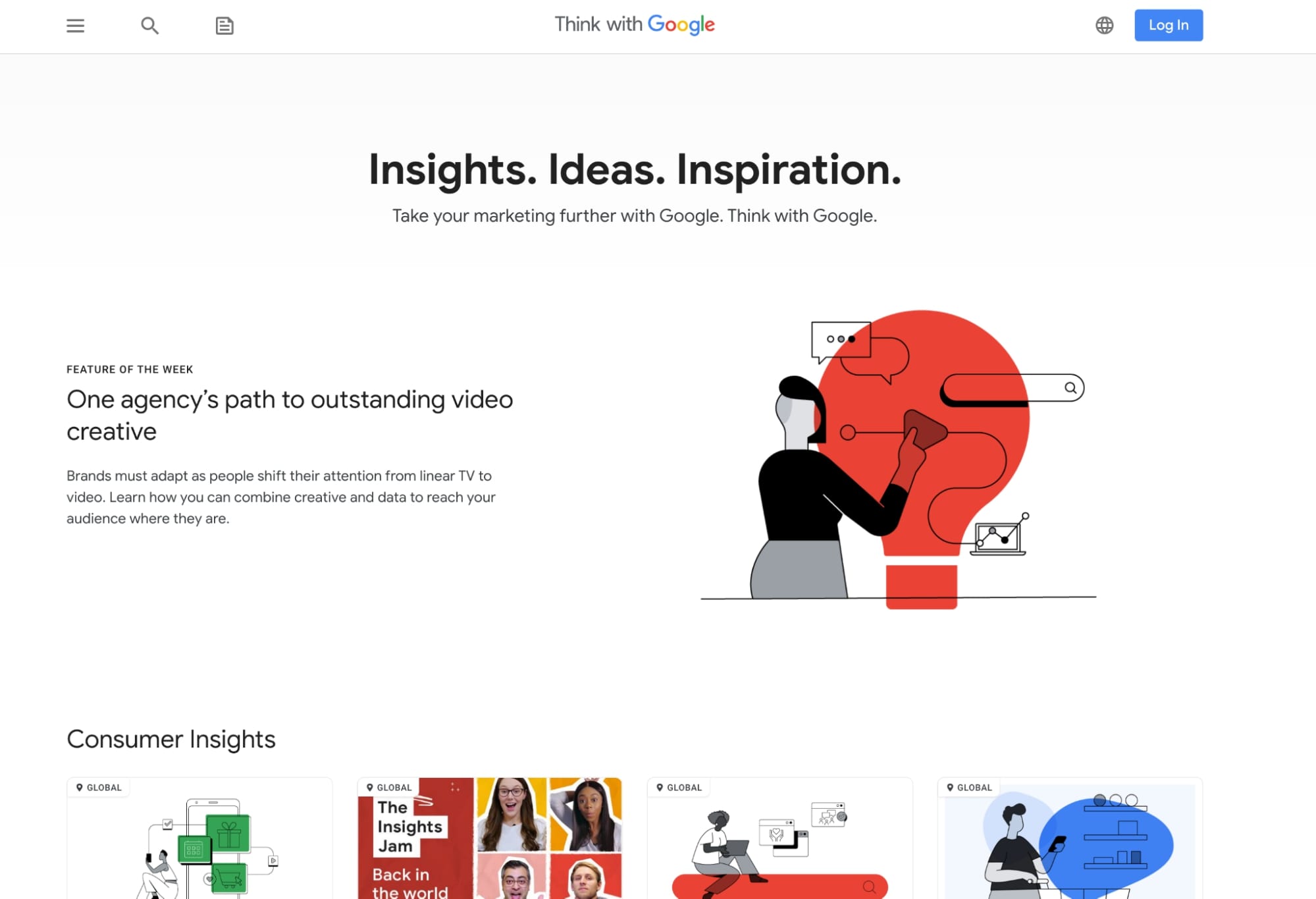
What makes Think with Google stand out is the variety of content mediums they offer. This blog not only houses articles, but also contains videos, Instagram-like stories, and tutorials, among other things.
When diving into their articles specifically, Google actually gives you the option to download the post to save for later. But if you’ve got time to read everything in one sitting, they have a visually unobtrusive progress bar that lets you know your progress as you go.
18. ClickUp
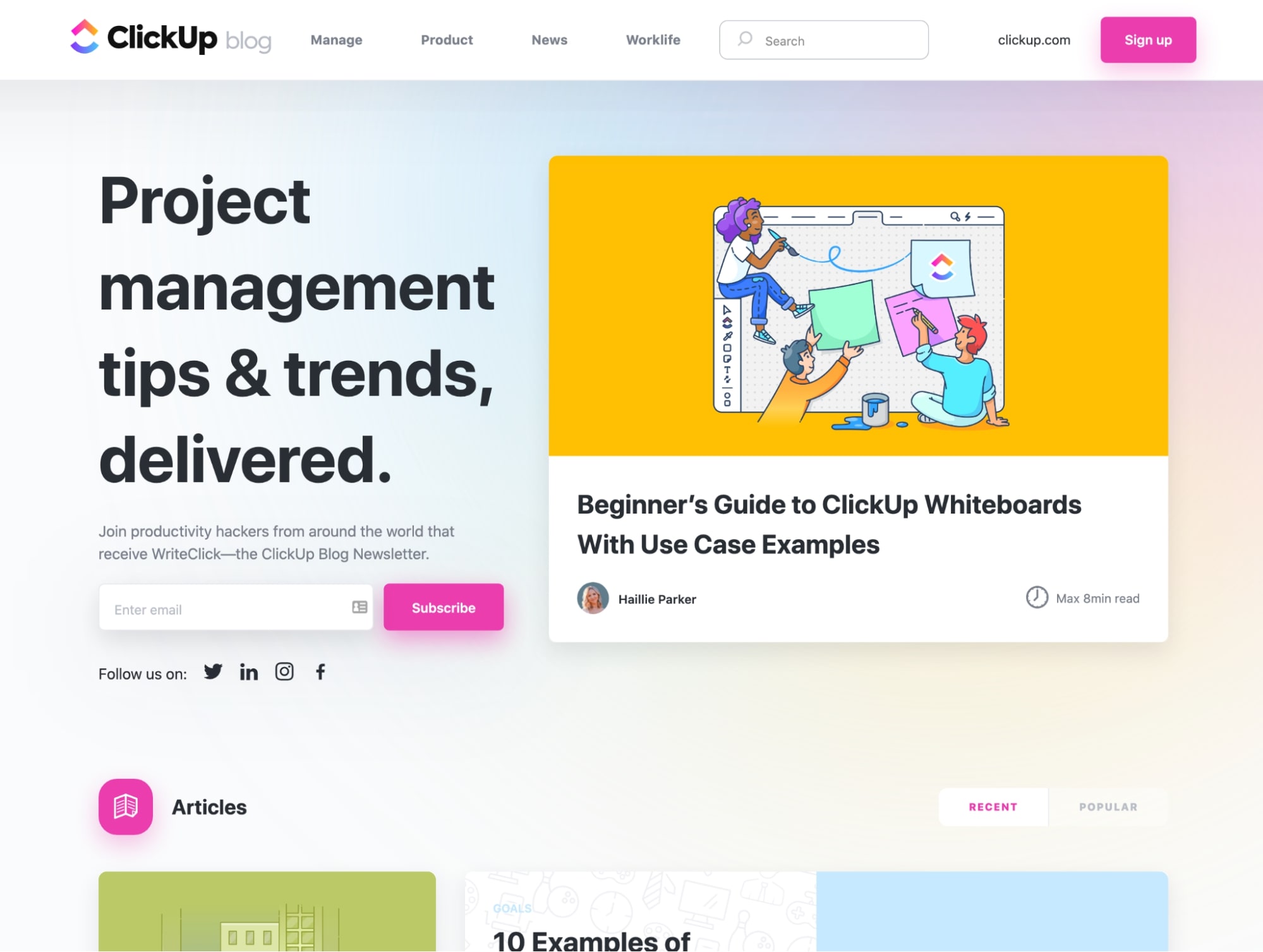
When looking at ClickUp’s blog design, the first thing you’ll notice is the array of bright colors used throughout the imagery. It makes the blog feel more playful than some of the more monotone designs we’re used to seeing and grabs your attention.
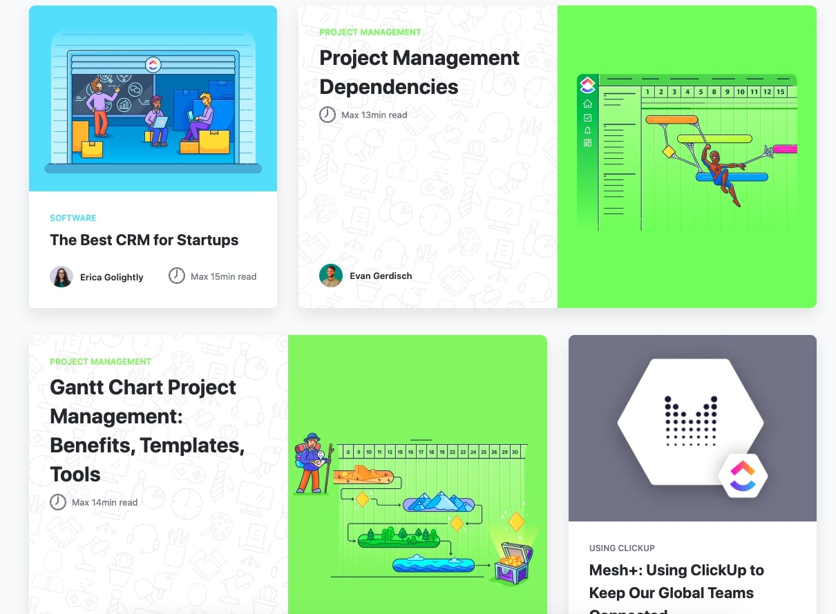
Another nice way they differentiate their blog is the use of varied blog card layouts used in their articles section.
Although the varied designs don’t seem to denote different content types, they still offer a great deal of intrigue and allow the blog cards to stand out from one another.
19. Usherwood
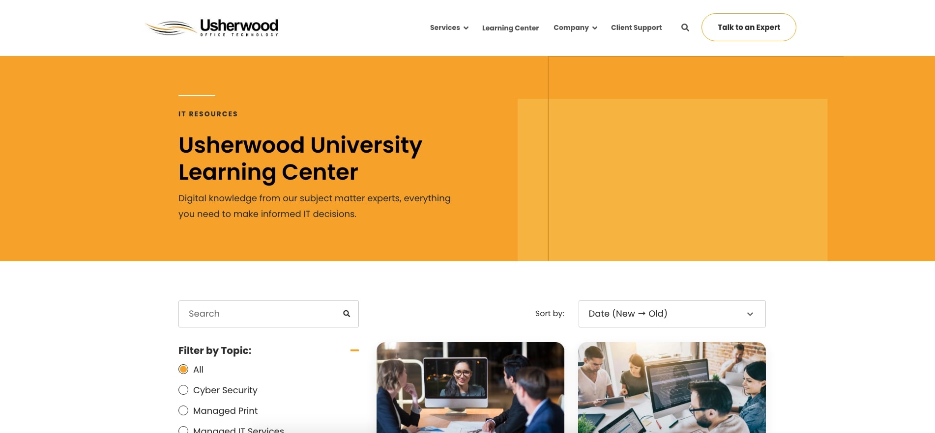
Userwood recently updated their learning center with IMPACT and now has a fresh new look and design.
One of the big advantages with this design is the proximity of the search, filter, and sort by elements. Oftentimes, these elements may be fairly separated from one another, or not exist at all.
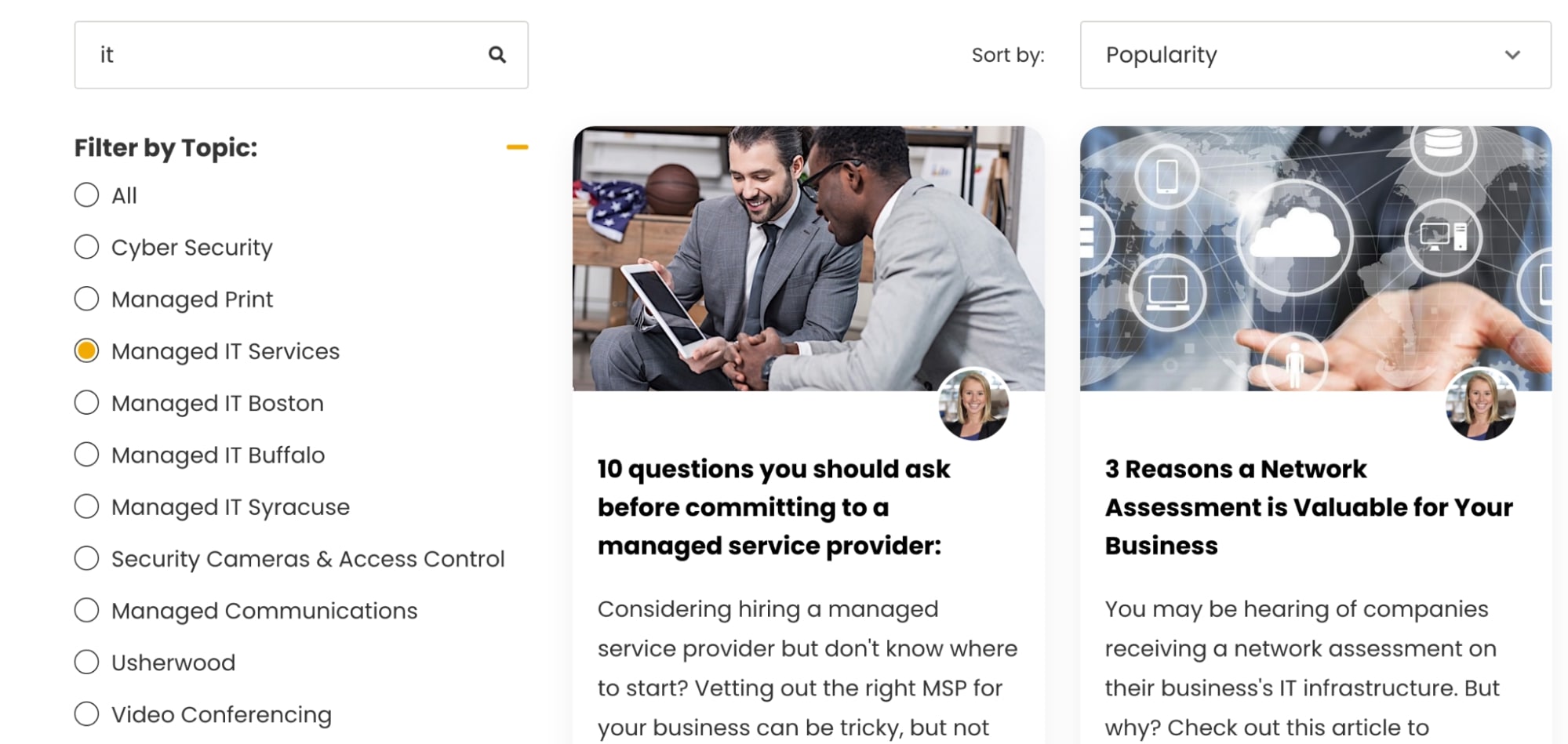
Now, if a user wants to drill down into specific content, or sort by new to old, they are able to keep their attention contained to the blog listing section.
20. Appian
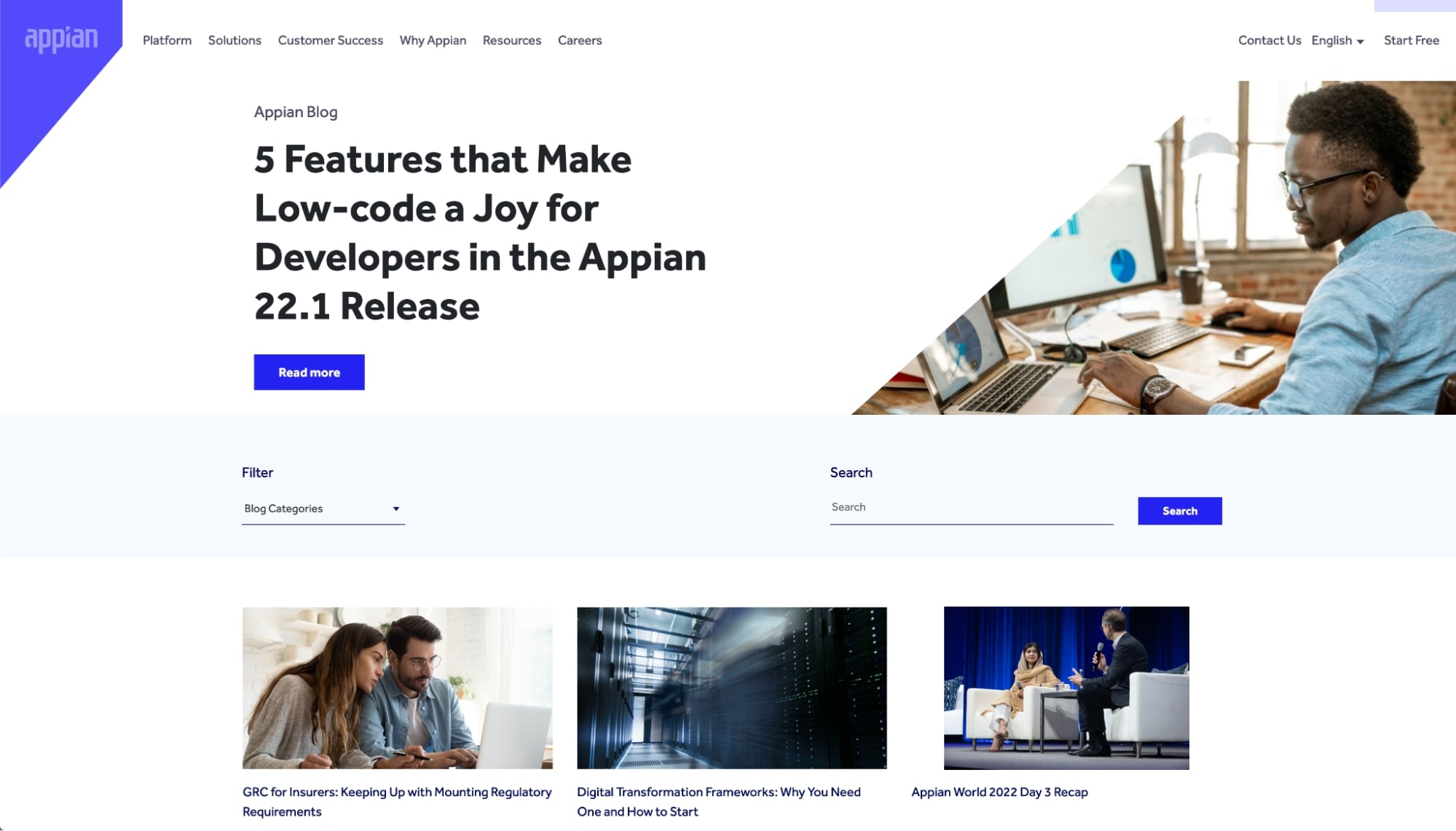
Appian is another great piece of inspiration for those looking for a more simplified blog layout that may be easier to build.
Their blog homepage showcases a specific article in the hero section while the remainder of the layout is your standard three-article column layout. The filtering has been simplified as well, in that it only uses blog categories.
I also like how their search is one of the few that doesn’t redirect you off of the blog homepage. It simply refreshes the content to show you articles related to what you searched.
21. Udemy
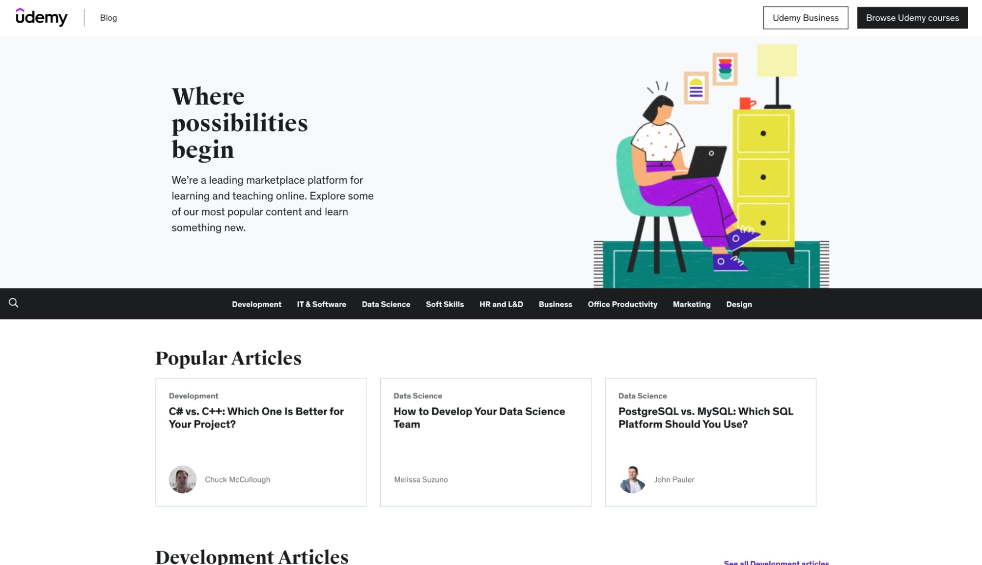
When visiting a blog like Udemy’s I would expect to see a slew of educational content, especially since they are an online platform. And Udemy did not disappoint.
When scrolling through their blog homepage, there are tons of sections featuring a multitude of topics across several different mediums. They also do a nice job of tying in their courses to these topics.
Whether you’re on their category pages or reading one of their articles, they make sure to feature popular courses related to the topic in the hope of you converting and buying a course.
22. Nintex
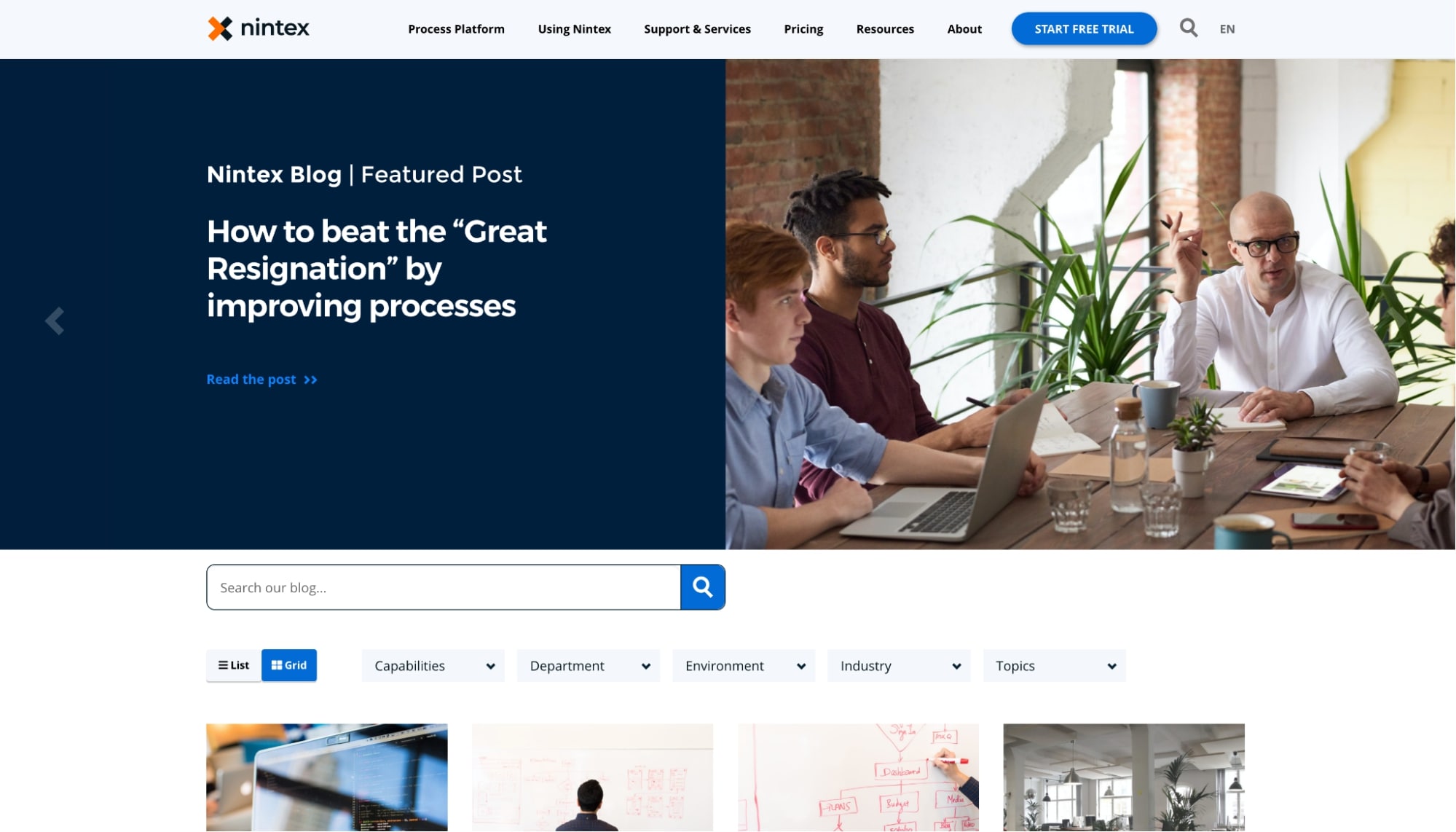
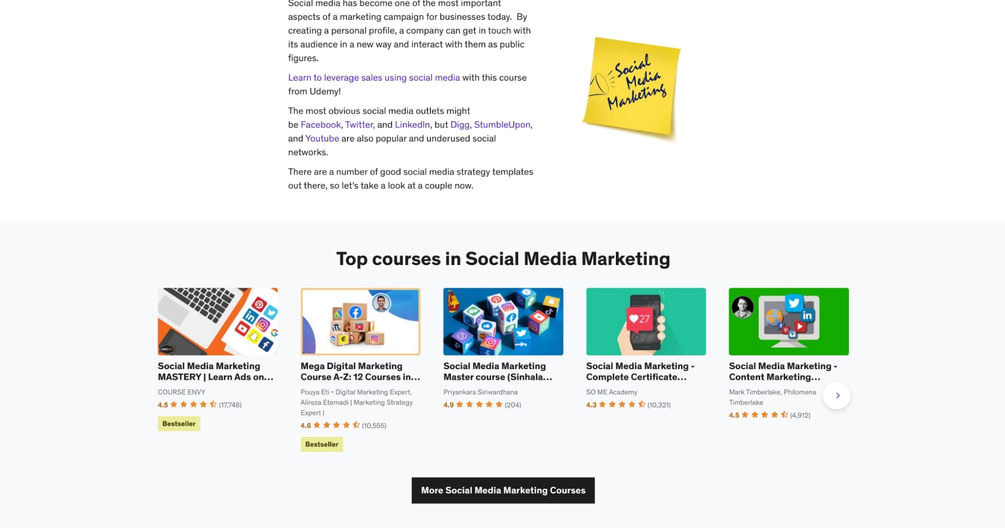
Nintex offers a super robust and ideal blog layout for those looking for another great example of what a successful blog design looks like.
First, I like the use of the slider in the hero section. Its functionality is very smooth and the layout is a great alternative for those looking to promote multiple articles.
Although slider hero sections do have their UX pitfalls (i.e., hiding a lot of content by default, or giving the user too many options), they are useful for those who would prefer a less busy alternative to showing multiple pieces of similar content.
I really have to give them props on their blog filtering setup. They have five different filtering groups that you can select from, with the ability to select multiple topics within each. You can even choose to view the articles in a list format, as opposed to the blog cards layout.
Their search also offers a different sidebar version of their filtering system, which would allow those using it to filter by categories like content type and platforms.
It seems they’ve really put time into tagging and organizing their content across a variety of different areas.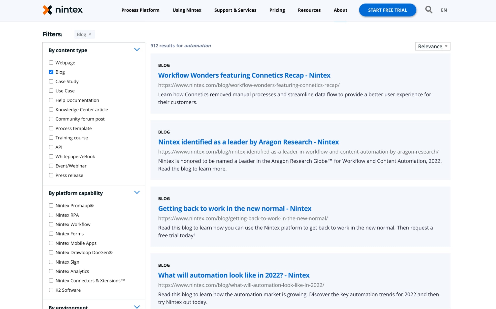
23. Birdeye
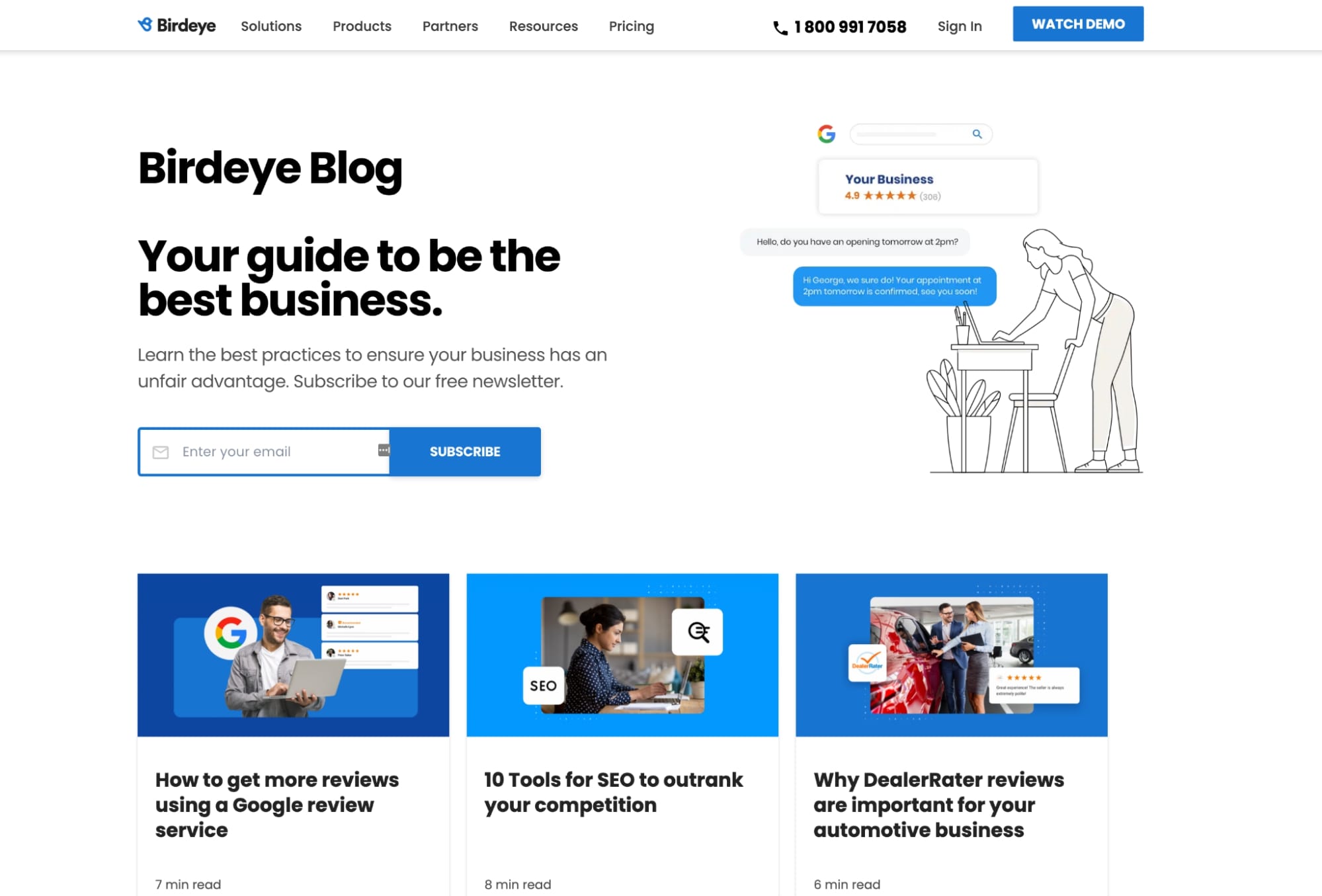
On its blog homepage, Birdeye starts off with a call-to-action to subscribe to their newsletter, which offers some compelling content as to what it has in store. This is a great way to get people to take action right off the bat.
When looking through some of their articles, I really enjoyed the aesthetic of their featured images and how they did a tasteful job of combining graphic elements and photography. I was also impressed to see them using this same style to create custom imagery within the articles themselves.
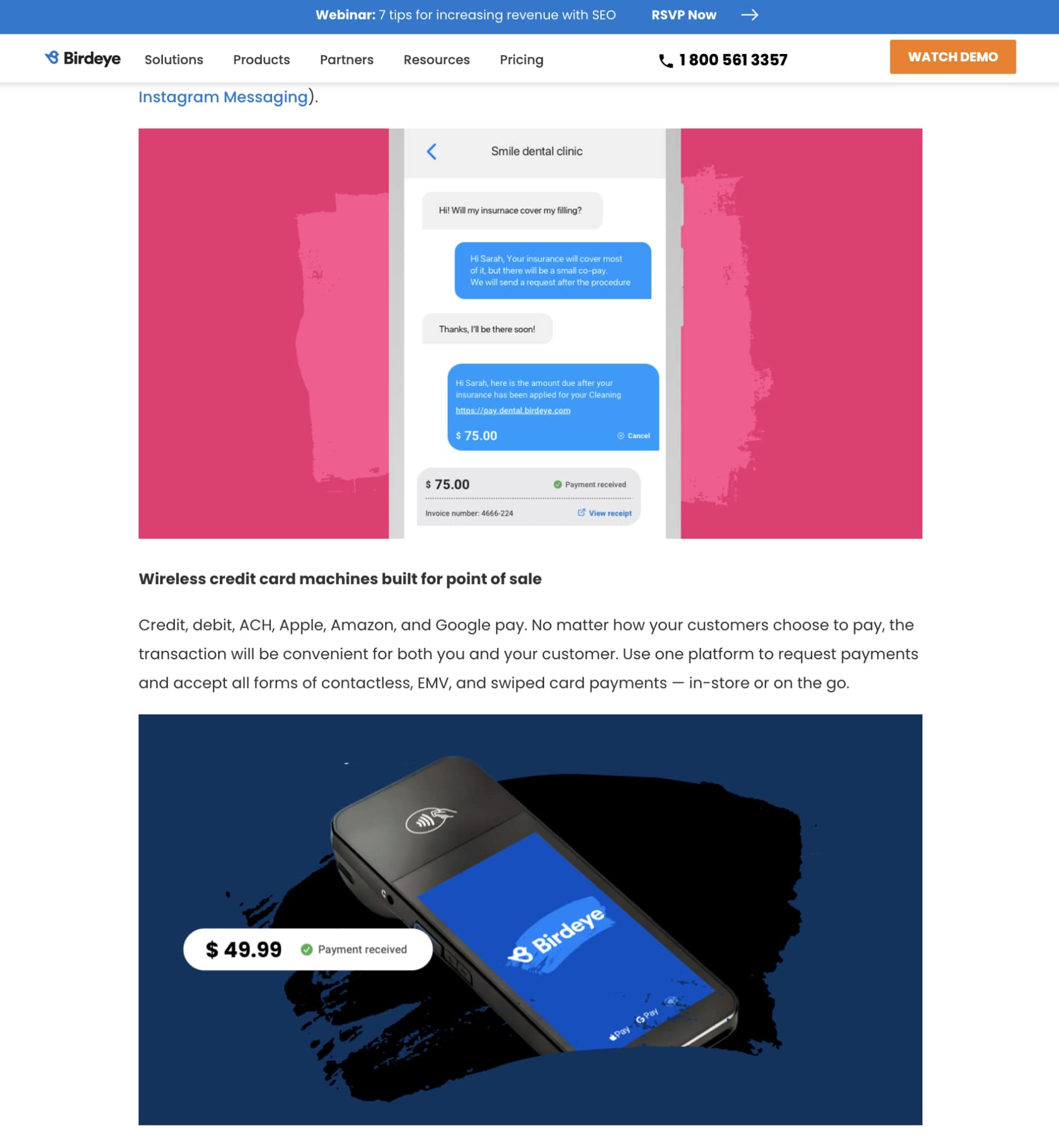
I also really liked the font choices and sizes used in their articles. Their use of the lightweight body font and heavy bold for headings makes it really easy to skim their articles.
Structuring your blog layout the right way can do wonders for your content marketing
It's important to remember that you’re in the business of trust, and there's no better way to build trust than to design a blog with your users in mind.
When you provide your users with a design that builds upon the great content you’ve written, making it easier to read and navigate, you're making it more likely that they’ll keep coming back and thereby become more qualified leads on their sales journey.
To learn how IMPACT can help you build your own blog for your website, book a time to talk to one of our advisors to learn more about the process.
Free: Assessment
