

Researchers have found that a whopping 90% of your prospects will buy from your competition if your website offers a poor user experience. That’s a lot of business lost to competitors by ignoring one of the most important tools for growing your organization.
But finding the inspiration for redesigning your website can get overwhelming. With so many approaches to content and websites to choose from, where the heck do you start?
The good news is, here at IMPACT, we love helping our clients create stunning websites that aren’t just nice to have, but serve as the driving force behind the growth of their business.
We use our They Ask, You Answer framework as the guide to help hundreds of businesses design websites that help them become the No. 1 teachers in their space and make millions in revenue.
To show you how the main principles of They Ask, You Answer are implemented on websites in different industries, we’ve assembled some of the best, award-winning websites that aren’t only beautiful, but are also model examples of how a high-converting, easy-to-navigate, customer-centric website should be structured.
Whether they’re designed to offer a touchless purchasing experience, simplified walk-through of the buying process, or impeccable message clarity, these websites show just how powerful your greatest sales tool can be.
1. Frank Lloyd Wright’s Martin House
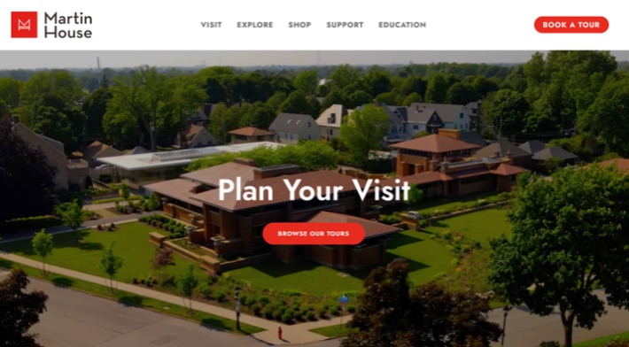
Buyers today want to navigate the sales process themselves before making a purchasing decision — long before talking to someone at your company. They also want to do so quickly and in a way that’s friction-free.
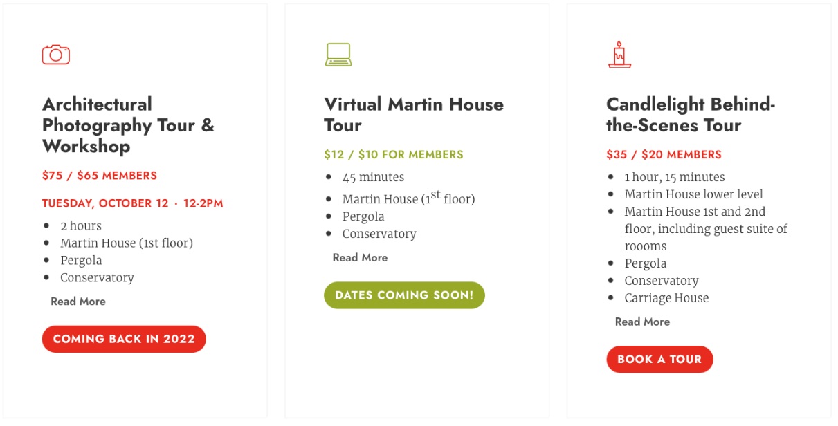
The Frank Lloyd Wright Martin House website features lots of self-guided purchasing options. This makes it easy for people to buy tickets and tour the home in person or virtually.
Why this website works:
- The site offers a touchless user experience, where visitors can learn about the house and take virtual tours from the comfort of home.
- Self-guided tour booking makes purchasing tickets for any tour easy to do. All the options are clearly listed.
- They provide easy access to purchasing options and clearly list pricing and availability.
The Martin House website makes it easy to learn about the different tour offerings and purchase tickets.
There’s no need to dig into heavy blocks of text or poke around the site to find the information you’re looking for. Once you land on the site, there’s a prominent “browse our tours” feature that leads you to the second page.
This website serves as an example of how businesses can make their websites more user-friendly and easier for customers to make a purchase — because today, “We’ll tell you more information when you speak to us” no longer works.
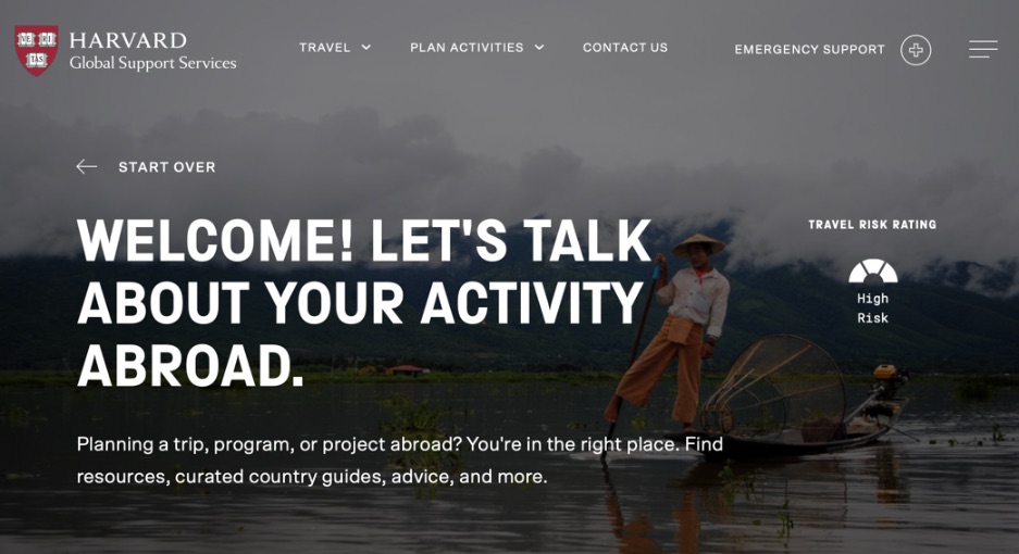
2. Harvard Global Support Services
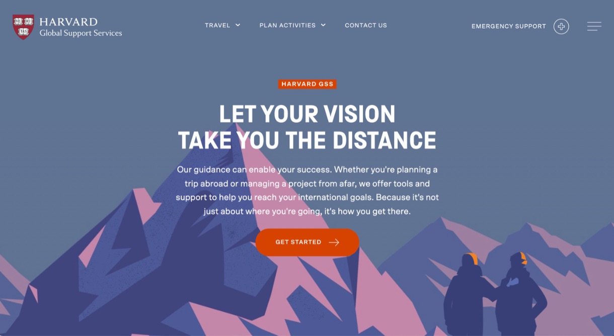 Another self-service example, this website features a “choose your own adventure” experience that replicates conversations you’d have with a salesperson.
Most people would rather lead their own sales process, even if it means interacting with artificial intelligence — as long as the technology helps them find what they’re looking for quickly and accurately.
Why this website works:
- It uses a self-service tool that is highly personalized and gets you to the right content at the right time.
- It helps prospects self-identify pain points and challenges. (For example, “I’m a student at Harvard who wants to study abroad, but I have no idea what I need to do or where to start.”)
- You can fill the form out over and over and get a new result each time. It doesn’t force you to commit or sign up for anything; it’s just there to help.
With their site, Harvard Global Support Services matches searchers with programs based on the user’s role (teacher, student, etc.), school, area of interest, and desired study/work abroad location.
I filled in the form to see what information it would present. I said I was a student from Harvard College looking to study in Burma:
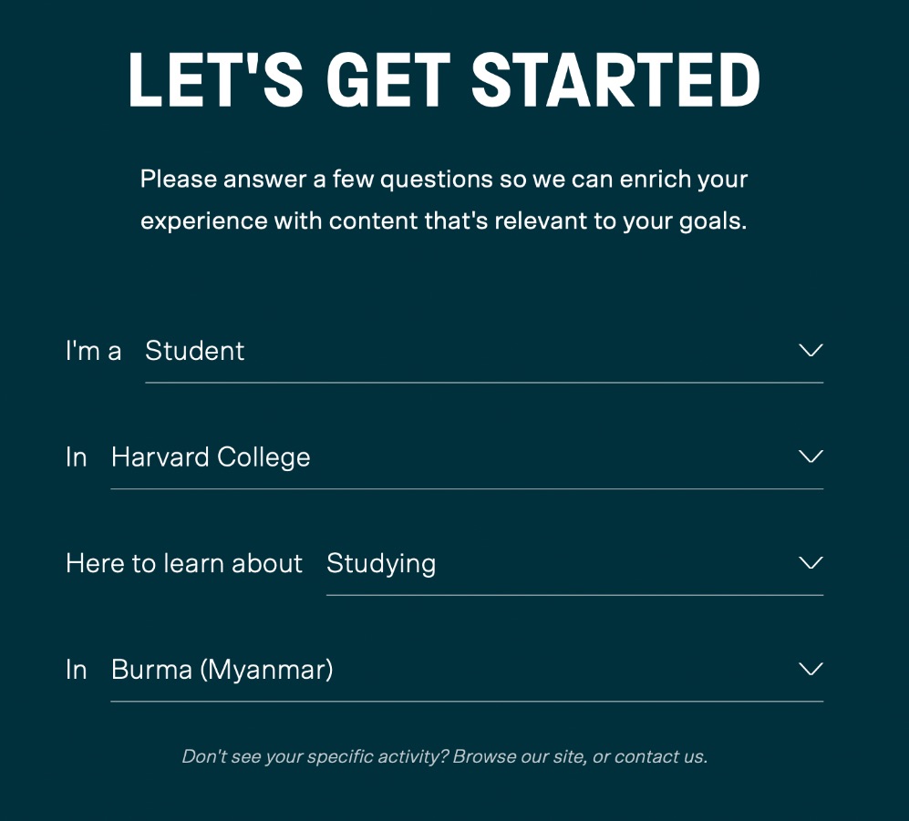
It took me to a list of requirements and approvals I would need in order to travel, such as school policies, travel documents needed, forms I need to fill out, and additional resources specific to my choices.
Interactive tools that act as a virtual salesperson and provide the prospect with a touchless experience are incredible choices for increasing lead generation and revenue. You’re empowering people to navigate that process and make a purchase on their own — freeing up your sales team in the process.
Learn more about how to do this on your website with our free course, Self Selection and the Touchless Buying Experience.
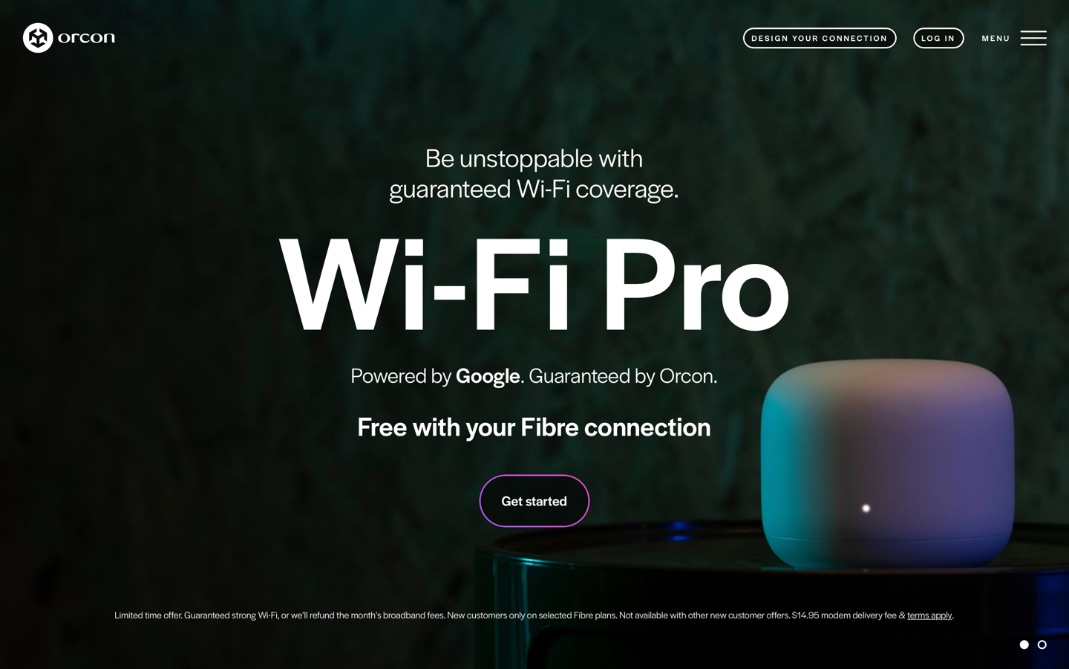
3. Orcon
 Imagine your business’s perfect-fit lead landed on two websites. One is yours, and the other is your competition’s. One of the website’s homepages is all about the company: where it’s located, how wonderful its products are, information about its awards, etc. The second website is all about the prospect. It takes its time explaining how they understand the prospect’s needs and how to solve them. It touches on the customer’s pain points and offers a solution, along with information about why that solution works, and how the company can help.
Which do you think the prospect will trust and appreciate more? The business that talked about itself? Or the one that still talked about its products and services, but in terms of how it helps the customer?
If there is a perfect website to show how to do this, it's Orcon.
Why this website works:
- It explains the major challenges their products solve, but in terms of how it helps the customer.
- References “we” about one time for every ten times it references “you,” taking the focus off the company and placing it on the prospect.
- It hits the major pain points in clear, concise language:
- “Revolutionise the way you work, play, and innovate online.”
- “Customisable solutions that make you unstoppable.”
- “Make your life simpler, easier and faster.”
Prospects don’t find value in learning about your company. They want to know that your business will solve their problems. If you want your website to turn prospects into customers, you need to make it about how your business can meet their needs.
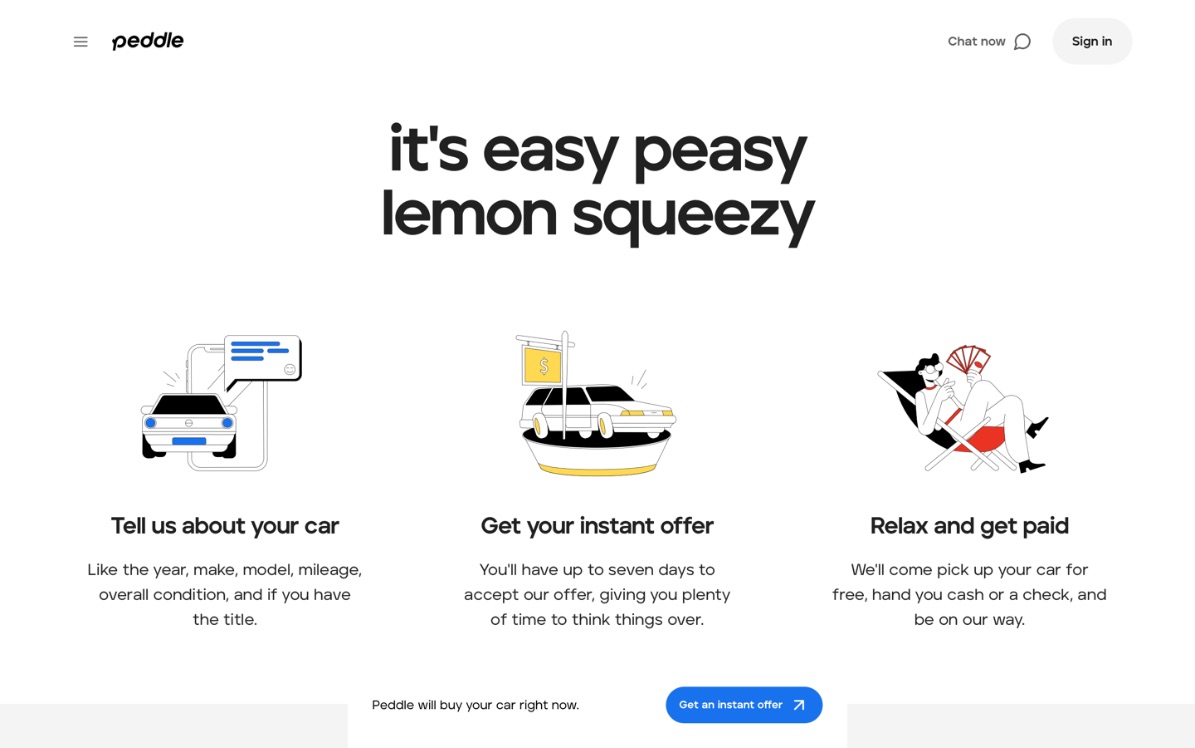
4. Peddle
When you lay out a simplified version of the steps your prospects need to take to buy from you, it clarifies what they need to do and makes working with you seem easy.
Peddle’s site spells out exactly how prospects benefit from initiating the process and shows three easy steps they can take to get there. When people see that engaging with your business only takes a few simple steps, chances are they’ll feel more comfortable taking further steps. When the process isn’t laid out or is confusing, most prospects will leave.
Why this website works:
- The first thing you see is a broken-out process that shows how easy it is to work with them.
- Eases prospects’ fears and builds trust by answering big questions off the bat.
The bottom line is, if people think that working with you is going to be a long-winded, complex process, they’ll be hesitant to work with you. But if you can break down your process in a way that allows the prospect yo think, “That sounds easy. I can do that,” more people will be willing to engage.
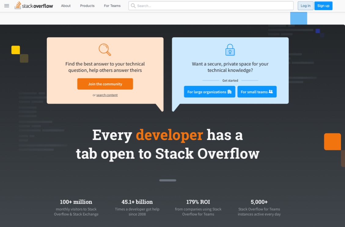
5. Stack Overflow
Although cost and pricing is something most businesses shy away from talking about openly, these articles have the power to generate millions in revenue.
Most businesses don’t talk about cost — at least prominently — on their websites. But if you think like your consumer, one of the first questions you have before you make a large purchase is, “How much does it cost?” If we go to a business’s website and can’t find this information immediately, we leave, frustrated and looking for a business that will provide the information we’re searching for.
Most businesses avoid having cost and pricing on our websites because we either think our pricing is too custom or we might scare business away.
Why this website works:
- Clearly laid out pricing and packages, including lots of “what you’ll get” details.
- It provides a button you can toggle to see pricing with and without an annual discount so that you know how much it will cost you monthly versus investing in the entire year.
- Customer-centric messaging focuses more on the prospect than boasting about its business. (More “you” language.)
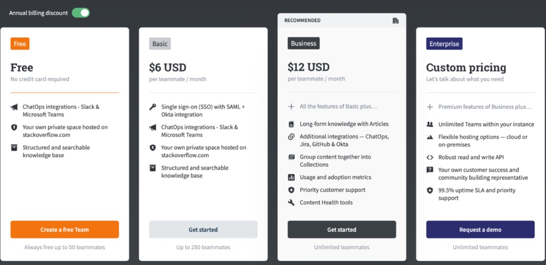
The website offers a quick snapshot, so you can see exactly what you can buy and how much it will cost you. There is no guessing, and no “Talk to us, and then we’ll tell you” language, which raises red flags and makes prospects trust you less.
If you want to build trust with your prospects (hint: you do), hiding pricing from the people who want to buy from you is one of the worst things you can do. If you’re more expensive than your competition, say so, but explain why. Your buyers can only buy from you if they know how much you cost.
6. The A-Z of AI
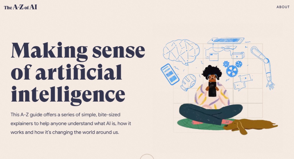
If people are going to buy from you, they need to trust you — and one of the most effective ways to build trust with your business is with content. It has the power to educate your prospects on what you do and how you can help, and it can also help your business move the needle in terms of sales and revenue.
The A-Z of AI website is the perfect example of how to educate prospects in the right way.
Why this website works:
- It answers tons of questions about AI and serves as an encyclopedia of sorts.
- It breaks the information down in a simple and bite-sized way, which encourages people to read.
- It explains the reason for putting the information together. (It’s “designed to help anyone get their bearings with a complex topic.” Again, transparency builds trust.)
- It eases fears by addressing them head-on and providing solutions, such as how to identify deepfake images and what the ethics are surrounding AI.
When you become the No. 1 teacher in your industry and continue to answer all your prospects’ questions, you’re continually building that trust (and nudging them toward a sale).
Take our free course How To Write “The Big 5” and learn how we teach our clients to best educate their prospects with content that builds trust and increases revenue.
7. Zillow
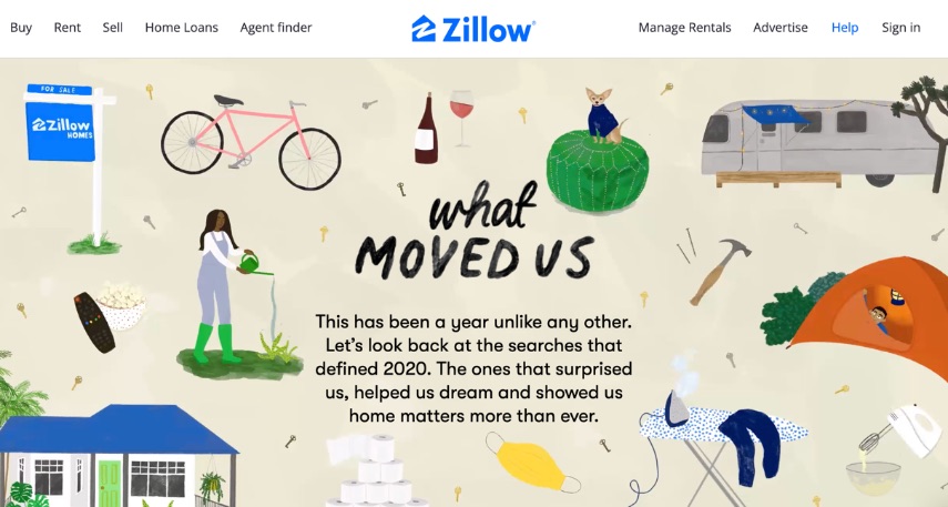
If you were to state the primary goal for your website’s homepage, what would you say?
Most businesses might say something along the lines of, “Explain what we do” or “Provide company information.”
In reality, the main goal for your homepage should be to get your visitor to the second page. This is because, if someone lands on your website, all you know is that they found you. But when they navigate to your pricing, products, or services pages, you know much more about what they’re looking for, and your sales team will have a better idea of their needs.
Zillow’s “What Moved Us” website is a great example for a few reasons.
Why this website works:
- It gets people to click on their subject of interest by using stats to introduce each call-to-action. (The stat about home refinance takes the user to a page about loans and other relevant information, for example.)
- It uses language that tells a clear story and sparks an emotional connection.
- Its fun images and concise text make the tool feel accessible and easy to use.
This website clearly and easily leads prospects down the buyer’s journey, while educating and empowering them to make a buying decision along the way.
Other website designs we love
Though these websites are not technically award winners from established institutions, they’re certainly worthy of accolades in our eyes. They have been expertly designed by our clients, and they’re model examples of the They Ask, You Answer principles we teach here at IMPACT.
Berry Insurance
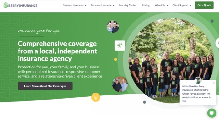
If you combine clear messaging, lots of customer-centric language, and a dog-themed chatbot, you get the website for Berry Insurance.
For prospects who want to ask questions on your website without the hassle of searching for your phone number or email address and waiting for a reply, chatbots, live chat, and other conversational tools are the way to go.
IMPACT client Berry Insurance has had incredible success with their fun and unique chatbot featuring the company mascot, “Shredder.”
Since Berry Insurance is a regional business, the bot first asks you where you’re located. If you choose one of their regions, it leads you further down the pipeline. If you select “other,” as we did below, the chatbot automatically weeds you out of the sales pipeline while helping you find information about their services.
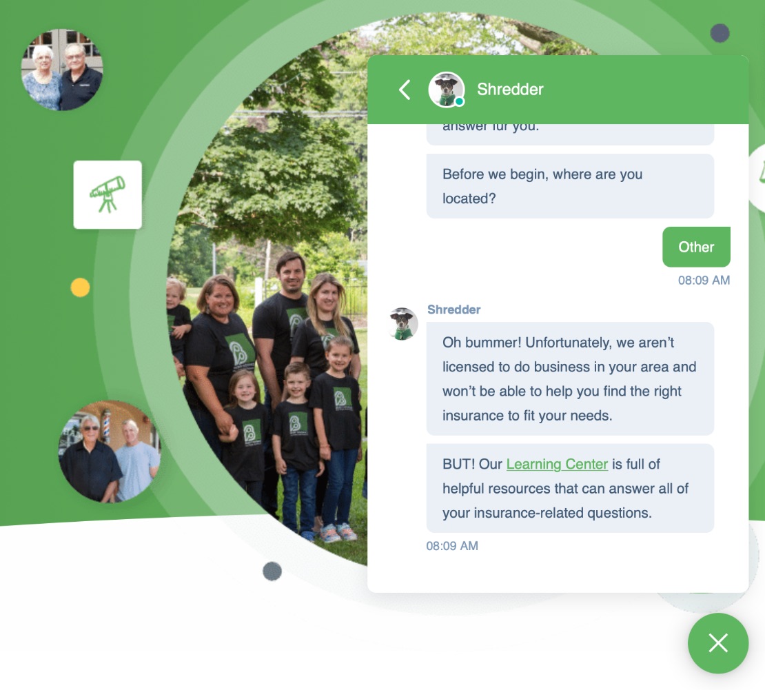
This is a great example of how to kindly turn away bad-fit leads while also being a helpful, trustworthy business in the process.
Pricefx

IMPACT client Pricefx is another company whose website is a homerun when it comes to writing mostly about customers on the homepage. With clear navigation and short, informational bursts of text, it’s easy for users to navigate and find the information they need.
They also lead with an explainer video that walks the prospect through their pain points and how the company helps. These explainer videos are embedded on several of their products and services pages, too, which is a great way to quickly relay information and build rapport and trust with prospects.
Learn more about which videos drive the sales needle the most in our free course Crafting “Selling 7” Videos That Convert.
IMPACK
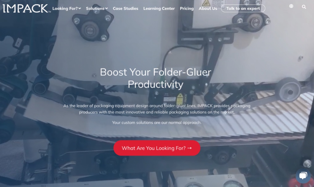
Here at IMPACT, one of the most valuable things we teach our clients is how to create the right content that can enhance search engine optimization and be used in the sales process to shorten the sales cycle. We know firsthand that educated prospects become happy, better customers.
One of the ways we teach our clients to educate their prospects is to build a learning center, where they answer all the questions prospects ask.
IMPACK’s learning center is an example of how They Ask, You Answer businesses teach prospects about solving their biggest problems. For example, in the learning center, they’ve enabled users to sort content based on their needs. (I need to: increase productivity, find packaging equipment, or source a specific product.)
Considering a website redesign?
All of these tips come from our award-winning inbound marketing framework They Ask, You Answer, which you can learn more about on our website design and development page, or you can take our free Elements of a Great They Ask, You Answer Website course.
This approach to website design will have your prospects reaching out to you and getting excited about your products and services like no other.
To learn more about how a customer-targeted website design can work for you, visit our They Ask, You Answer Video Resource Library to explore a large collection of free videos on creating a more effective website.
Also, set up a time to talk to one of our advisors who can help answer any of your questions.
The best part? You can implement these tips on your own today — and be well on your way toward creating a website that becomes your best sales tool.
Free: Assessment
/Assets/Icon%20Library/x%20corp.svg)
/Assets/Icon%20Library/whatsapp%20logo.svg)
/Assets/Icon%20Library/Email.svg)
/Assets/Icon%20Library/Arrows/Grey%20Arrow%20-%20Prev.svg)
/Assets/Icon%20Library/Arrows/Grey%20Arrow%20-%20Next.svg)