

I don’t know what it is lately, but I swear it seems like 4 out of 5 companies I talk to are in the midst of redesigning their company website.
But I get it, times are changing fast, and consumer expectations are changing even faster. What was “acceptable” just a few years ago is now viewed as “not enough.”
Because the way consumer’s vet, judge, and decide on companies and products in the information age, the importance of having a GREAT website has never been so high.
And mark my words, this trend isn’t slowing down.
The bar will only continue to be raised.
Search engines and consumers alike will only get smarter.
That’s the world in which we’re all a part of.
That being said, because so many companies are currently in the midst of a digital overhaul, I felt it necessary to discuss 5 website features I feel are a must for success in 2014 and beyond. Here goes:
1. A Home Page with Immediate Answers:
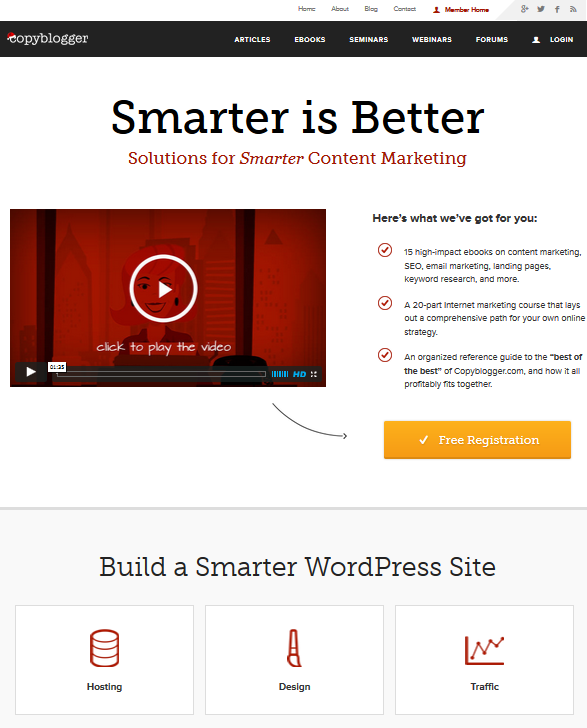 If you're looking for a model homepage that is the essence of intuitive, clear, and user friendly, the Copyblogger homepage is the perfect model.
As many of you know, I speak a lot. And over the past few years, I’ve asked thousands and thousands of people a simple question: What makes you fall in love with a company’s website?
Far and away, the #1 answer (and it’s not even close) looks like this:
“I want to find what I’m looking for, and I want to find it quickly.”
Such a profound statement really, and so telling as to where we’re all headed on the web.
When it comes to a great website, consumers MUST be able to navigate IMMEDIATELY to what they are looking for. More than ever, their impatience is at an all-time low, which means the first 10 seconds of their experience on a homepage is utterly critical—either we give them what they’re looking for or they’re gone.
This means messaging should be clear, simple, and concise. Furthermore, excellent and intuitive navigation is a must. Ask yourself this very simple, 2-part question:
Within 10 seconds of being on my website, could a first time visitor:
- Understand that we (as a company) are able to solve *their* problem?
- Know where to go to get the answer to said problem?
I call this the “10 Second Rule of Homepage Design” and few companies do it very well.
2. An Education Center
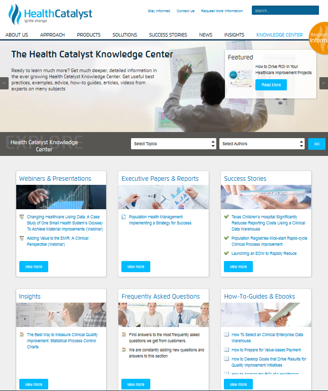 Just having a "blog" won't be enough in 2014 and beyond if your goal is greatness. Health Catalyst (client) realizes this, and has created what they call their "knowledge center," which is literally full of all their education materials in a multiplicity of forms.
For a long time, I’ve been discussing the concept that a “blog” should be thought of as a place where a business embraces the philosophy of “They Ask, You Answer”—and takes each question they get from prospects and customers and answers them in an honest and transparent manner.
As I look ahead to 2014 and beyond, I think the next iteration of a “blog” is the actually transformation of the name (something I’ve never liked anyway) to a more complete and robust educational experience—hence the Education Center.
In an ideal world, an education center is not only wrought with answers following the “They Ask, You Answer” philosophy, but it also is laden with multiple means by which a site visitor can take in the information—be it articles, videos, webinars, live chat, podcasts, utilitarian apps, etc.
Yes, this is a section of the site that doesn’t occur over night, but it certainly is feasible with enough focus, dedication, and commitment to truly being, as I always say, “the best teacher in the world at what you do.”
3. “About Pages 2.0”
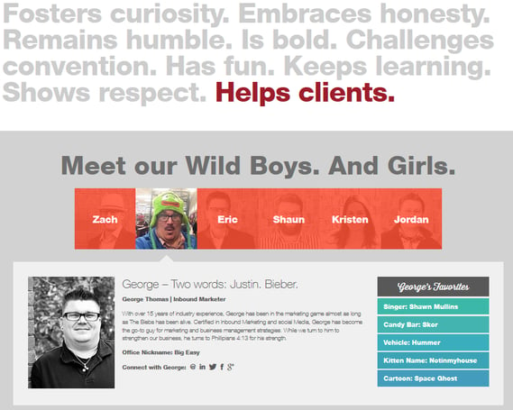 I'm a big fan of the folks at Wild Boy Design. Their website, and their About page, exudes their exceptional personality and marketing zeal-- and tells a story in the process.
Most companies have an “about” page of some type on their website, but the truth is, most about pages do little to let others (consumers) have a real peak into the “soul,” and people, of the business. (props to Wild Boy Design above)
We’ve all heard the phrase: People buy from those they know, like, and trust.
Although this statement may not be true 100% of the time, it sure as heck carries the day in a very large majority of business transactions all over the world, again and again.
This being said, most businesses make a huge mistake when it comes to creating these personal relationships of trust well before the first “contact”—be it face to face, on the phone, etc.
For example, most companies have a sales force (be it 1 person or 1,000). To put it in blunt terms, the basic goal of each one of these sales professionals is to meet with clients and ask them for their money in exchange for a product or service.
This being the case, why would so many organizations essentially “hide” their sales staff from the world (digitally speaking) and wait for the opportunity to build necessary trust needed for said transaction? Wouldn’t it make way more sense to do everything in their power to enhance the “know, like, trust” factor long before first contact?
This is exactly why about pages (on a website) should truly allow others to get a feel for any employee who regularly works with clients and prospects. Just having a picture of the “team” in 2014 isn’t enough. Individual pages with more complete and personal information are critical. Furthermore, a site visitor’s visual senses should be spoken to as well, with photos and videos of the employee as well.
4. The Visual Learner
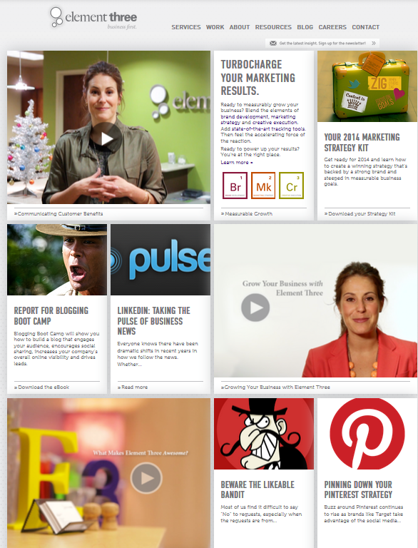 Companies like Element Three understand the power of visual on their website. As you can see from their homepage, they have a great mix of video, photo, and text.
It’s no secret—video is a big deal. (see YouTube)
Photos are kind of big too. (see Pinterest, Instagram, Etc.)
The digital age has also ushered in with it the visual age—a time where more and more people, especially the younger generation, are choosing visual over textual when it comes to their preferred form of learning and communication.
Studies have shown that over 60% of all people are visual learners, and this isn’t a number going down whatsoever. In fact, it’s only going to continue to move in an upward trend.
This is exactly why great websites not only appease the visual learner, but exceed their expectations. It’s also why a company’s ability to excel at “visual teaching” will be a monumentally important part of content marketing success going forward.
5. The Pricing Section(s)
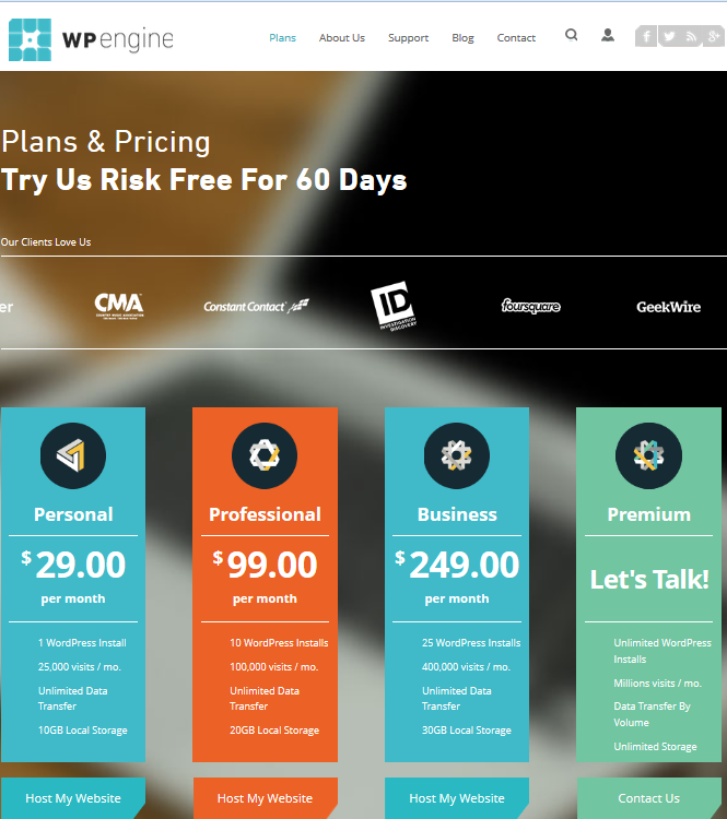 Whether you put your actual prices or not on your website is up to you, but no matter what, the subject must be addressed. In this photo, we see a snippet of the great pricing page from WPEngine.
For 4 solid years I’ve been preaching from the roof-tops the importance of addressing the subject of pricing on your company website. At the time, when I started this movement, many in the marketing world gave me a hard time, making statements like, “The example of River Pools is not comparable to other industries.”
Boy were they wrong. :-)
Fast forward to today and with dozens and dozens of very successful clients under my belt, EVERY SINGLE ONE has embraced this philosophy with—often times—massive results.
Here is the thing: Ask a room of 100 people how they feel when they go to a website and struggle to find cost and price information.
100 out of 100 will use words like:
- Frustrated
- Mad
- Upset
This is exactly why it inexcusable in my opinion to simply ignore a question that every single prospect and client wants to know about.
Does this mean you post all your prices, wages, and margins on your website?
Of course not. Heck, you don’t even have to list a single number if you don’t want to.
But you DO have to address the subject. You DO have to explain to the world why the answer is “it depends.” And ideally, you should do this openly and honestly on a visible and prominent section of your website.
Remember, it’s your choice as to whether or not you address consumer questions, but know this—if you don’t, someone will.
And that someone will earn the trust.
Your Turn:
So there you have it folks. 5 sections every great business website needs in 2014 and beyond. I’d love to know your thoughts on these 5 and would also ask what other suggestions would you add?
Free: Assessment
/Assets/Icon%20Library/x%20corp.svg)
/Assets/Icon%20Library/whatsapp%20logo.svg)
/Assets/Icon%20Library/Email.svg)
/Assets/Icon%20Library/Arrows/Grey%20Arrow%20-%20Prev.svg)
/Assets/Icon%20Library/Arrows/Grey%20Arrow%20-%20Next.svg)