/Assets/arrow-facing-left--black-01.svg)
/Assets/navigation-global--close-symbol-black-01-1.svg)
/Assets/Icon%20Library/social/facebook-logo.svg)
/Assets/Icon%20Library/social/instagram-logo.svg)
/Assets/Icon%20Library/social/youtube-logo.svg)
/Assets/navigation-global--close-symbol-black-01.svg)

Mar 11, 2021
/Assets/Icon%20Library/x%20corp.svg)
/Assets/base/Learning%20Center%20Resource%20Category%20Icons/Facebook_Messenger_logo_black.svg)
/Assets/Icon%20Library/whatsapp%20logo.svg)
/Assets/Icon%20Library/Email.svg)

A great business’ blog is a staple for driving new users to your website who seek knowledge and answers to the questions they have. It’s full of expert insights and information that’s valuable to your audience, which ultimately helps drive sales to grow your business.
Marketers who prioritize blogging efforts are 13 times more likely to see positive ROI, according to HubSpot.
While consistently creating content is a crucial part of making sure you’re educating your audience, simply having the content isn’t enough. You need to make sure you’re making it as easy as possible for users to find and digest your content.
To help shape and optimize the readability of your content, you need it to be facilitated by a blog design that enhances the reading experience and highlights the most important information. It needs to be able to draw customers into headlines, entice interactions, optimize for conversions, and create a lasting impression.
But where do you start? How do you organize everything to increase your blog's subscribers and session duration while also keeping it aesthetically pleasing?
To help guide you, we’ve assembled the most important design components your blog's design should have and how they work individually to help optimize your blog to hit your marketing goals.
Blog layout best practices to remember in 2021
- Make it a cumulative “learning center”
- Include article quick-summary boxes
- Use a blog card layout
- Use large, high-quality featured images
- Narrow grid for your blog content
- Utilize legible typography across all devices
- Use short descriptive subheadings
- Make social sharing is accessible on all devices
- Strategically place your lead magnets
- Highlight your authors
- Include related articles
- Show expected read time
1. Make it a cumulative “learning center”
If you’re like IMPACT and have been creating content for years, chances are you’ve accumulated a lot of varying types of content.
Naturally, you’ve probably done what many other organizations have done and separated the content into a variety of different areas. For example, videos live in a video library, articles on a blog, whitepapers, and ebooks in a resource center — you get the idea.
While this organizes everything nicely from a content type standpoint, your user isn’t always going to want to view only video or only blog content.
Pretend the user is you, and you are on a journey to discover more about a particular topic. Would you rather jump around different parts of the site to see what’s available for that topic, or, would you want you to have one location where you can view everything on that topic, be it blog, video, pillar, or downloadable content?
My guess would be the latter. That’s why we recommend organizing content into a learning center.
Aside from ease, a cumulative learning center approach makes it more likely your user will spend more time on your site since the barrier of finding what they want has been decreased significantly. This will also likely result in an increase of your pages per session, which Google uses as criteria when ranking your site. The higher pages per session, but better your ranking.
So, what should this look like? One way is how Aquila Commercial, an IMPACT client, approaches it.
They have one page with a feed of every possible piece of content they have created.
From there, you can filter by different personas, topics, or content types using the left side menu. Then, using the top right dropdown, you can sort by recent posts, or most popular.
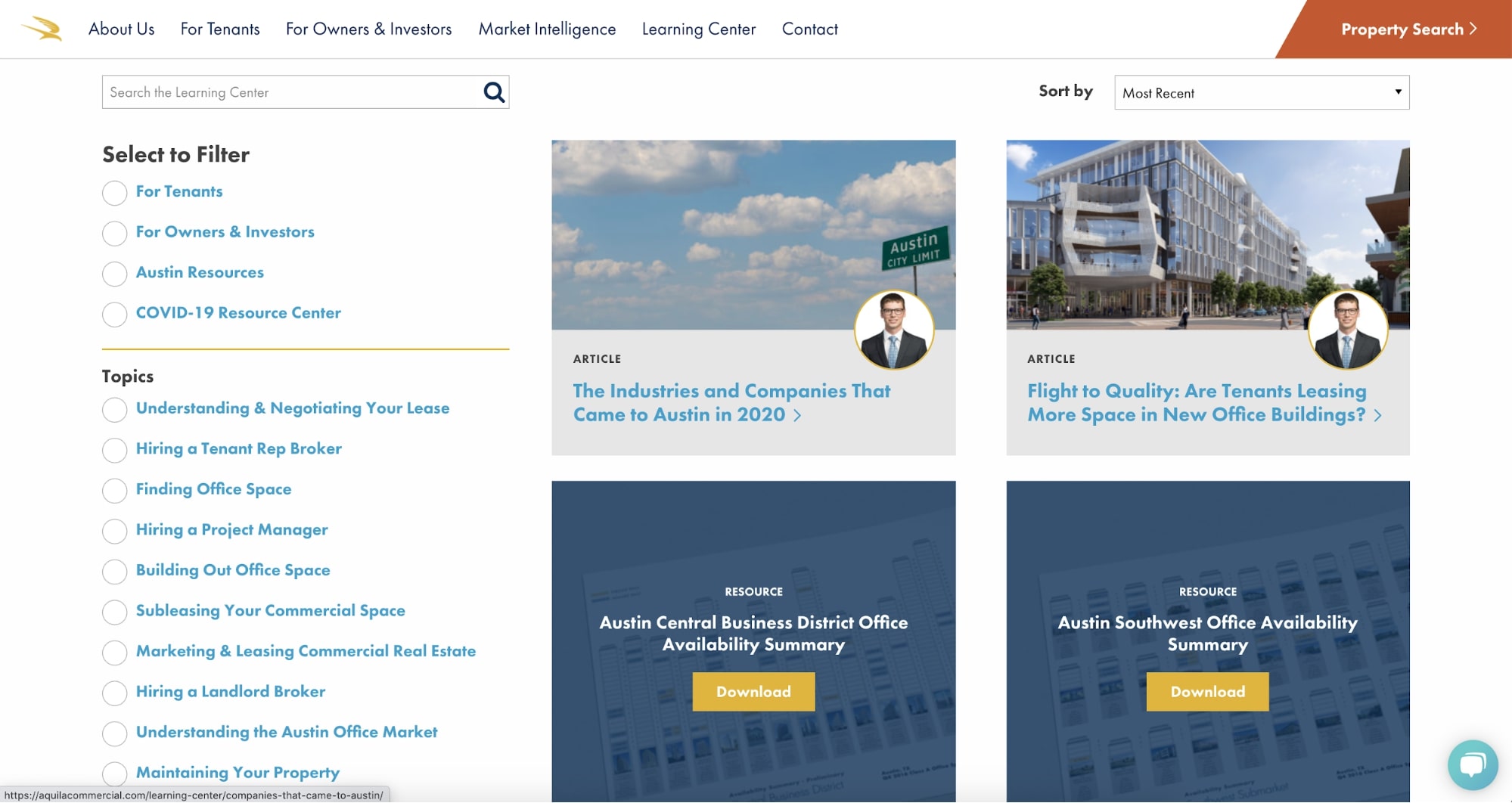
If you still aren’t finding what you want, there is also a search bar.
Another approach is how IMPACT does its own learning center.
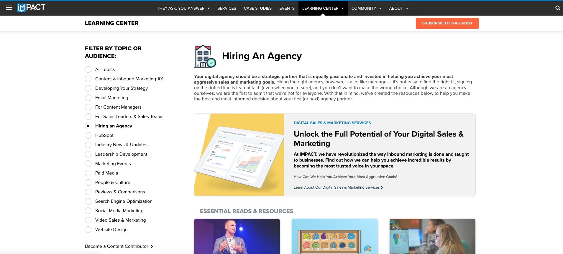
While similar to that of Aquila, IMPACT has specific layouts for each of the inner topic pages.
In this approach, pieces that are the most comprehensive, such as pillar pages, are listed first. Below are recommended pieces — ones that are either the most popular or would be most useful for someone seeking knowledge on that specific topic.
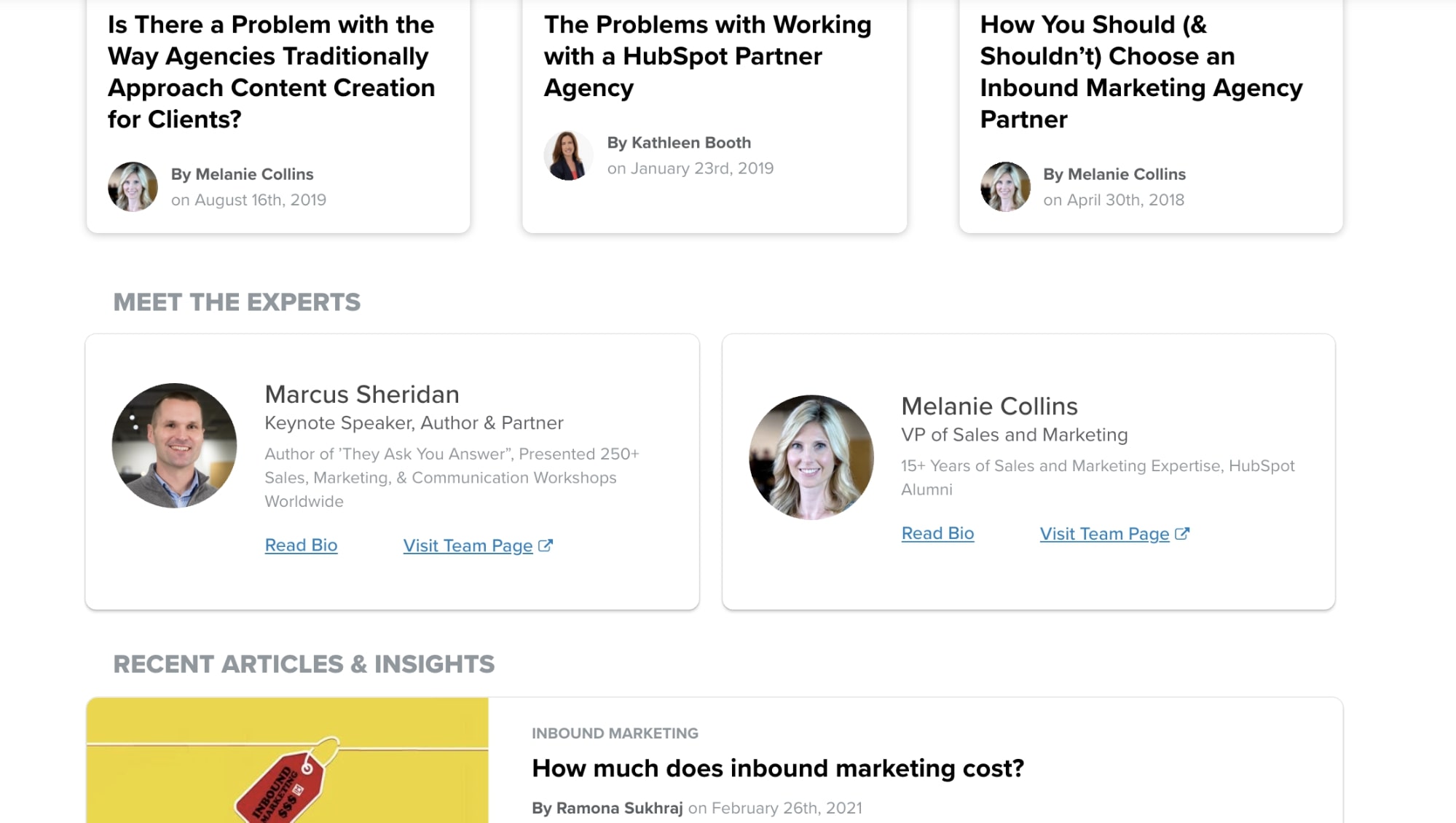
In the next section, IMPACT lists experts on the topic from our team. This helps the user identify individuals they should continue to seek content from, while simultaneously building trust with those authors.
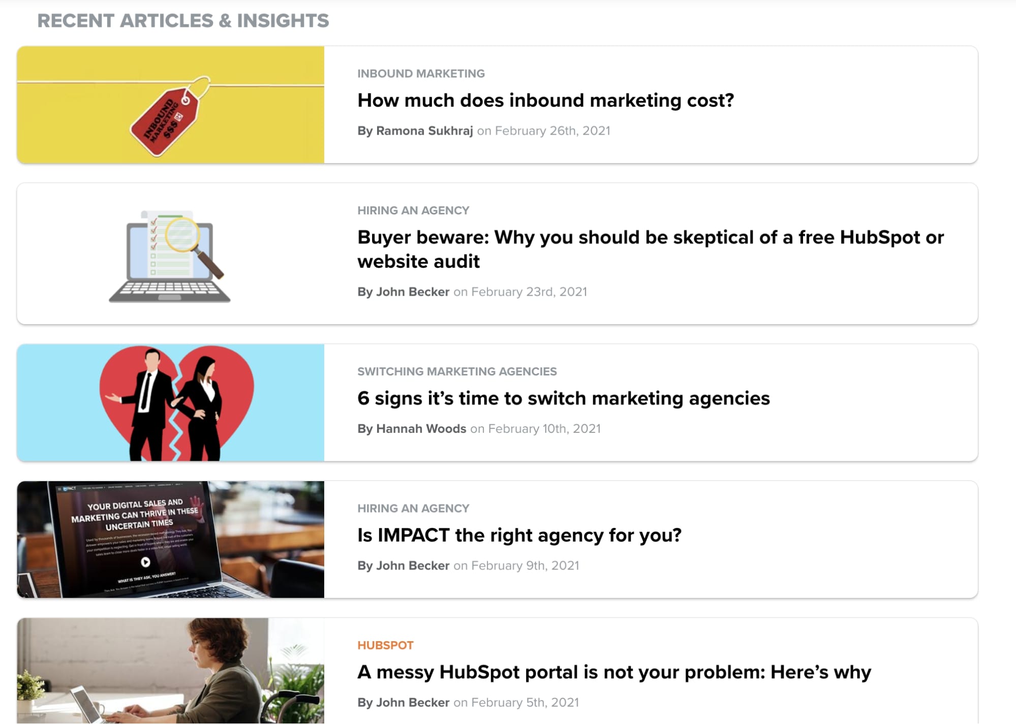
And finally, there is a feed of blog articles and podcasts organized by most recent, which updates automatically as new articles come out.
Overall, both approaches accomplish similar goals — getting your users the most relevant content possible. Depending on how your content is currently organized, and how your website's built, one approach may be better than the other.
So, before jumping into this project, be sure to either talk internally to your dev team, or, if you don’t have one, feel free to reach out to us and chat so we can talk about how to make this a reality on your site.
2. Include article quick-summary boxes
To rank well for competitive keywords and drive traffic to our website, most of the articles we write are around 1500 words.
While writing content to that length is exactly what Google wants you to do, it’s not entirely intuitive for certain questions or for users who are looking for quick answers.
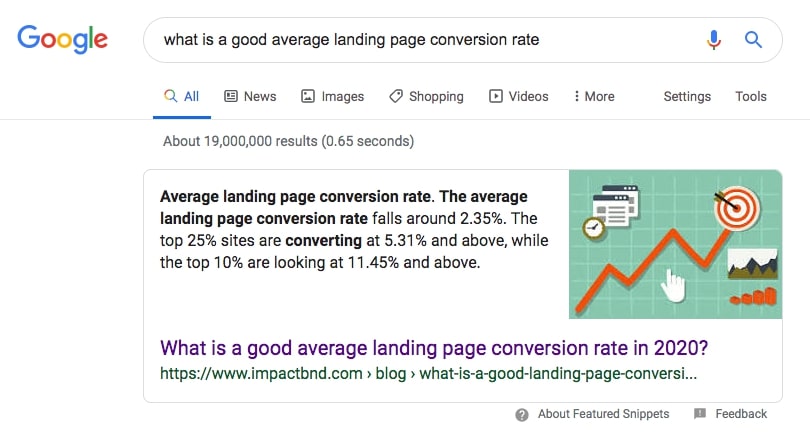
For example, think of the query “what is content marketing?”
Most of the search results associated with this kind of keyphrase are comprehensive guides, giving you everything you would want to know about the topic, but if you’re someone just looking for the definition of content marketing, skimming a 4000-word article might be a little tedious. This is where summary boxes are really handy.
Traditionally placed towards the beginning of a blog article, these boxes are where you can add in short answers to questions your article elaborates on.
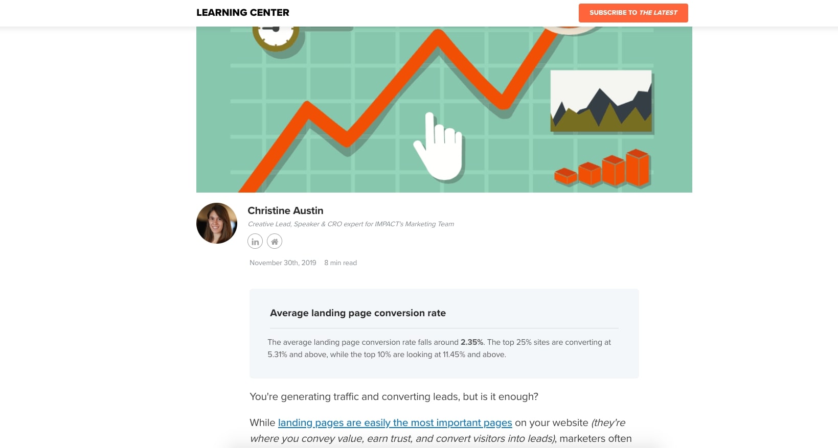
HubSpot and IMPACT do this on their articles, as seen in the example below.
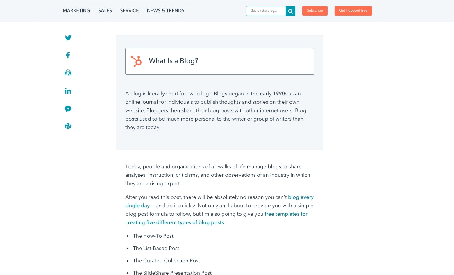
Not only does this make it easier for users to find the info they want, but Google will often use the content in these boxes for featured snippets. This means you show up as the first post on the SERP (search engine results page), setting you up for more click-throughs for your article.
Using this box is not mandatory on all blog articles and will not guarantee a featured snippet either, but experimenting with it to see whether or not it improves your article’s ranking is certainly a tactic worth trying.
3. Use a blog card layout
To maximize your traffic and keep your website fresh, it’s likely you’re pumping out a lot of content.
Depending on your publishing cadence, you could already have up to 600+ blog posts on your website at the end of a year.
With that many posts, how do you best use your website’s real estate to organize those articles so you can display the most at once without hitting visitors with information overload?
One of the most UX-friendly layouts to solve for this is card-based design.
As we know, physical cards (baseball, basketball, Pokemon, etc) have been around for quite some time and serve as easy ways to visually display and organize information.
The architecture of cards helps us easily recognize, recall, and read important information.
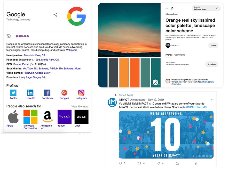
Card design is also now frequently applied throughout the web. Big players like Pinterest, Twitter, and Google have it ingrained in their UX:
Similar to the examples above, it’s important to keep your blog cards simple.
They should have a consistent, repeated structure, but use different image and font sizes to represent the most important to least important elements of the card to make them more legible for those reading them.
Also, make sure to focus on incorporating these elements into the card (the bold are essential):
- Featured image
- Blog title
- Blog author (and image, if there's room)
- Post date
- Category
- Blog excerpt
- Social share links
- Read More button
With this list in mind, let’s use Zenefits’ blog as an example:
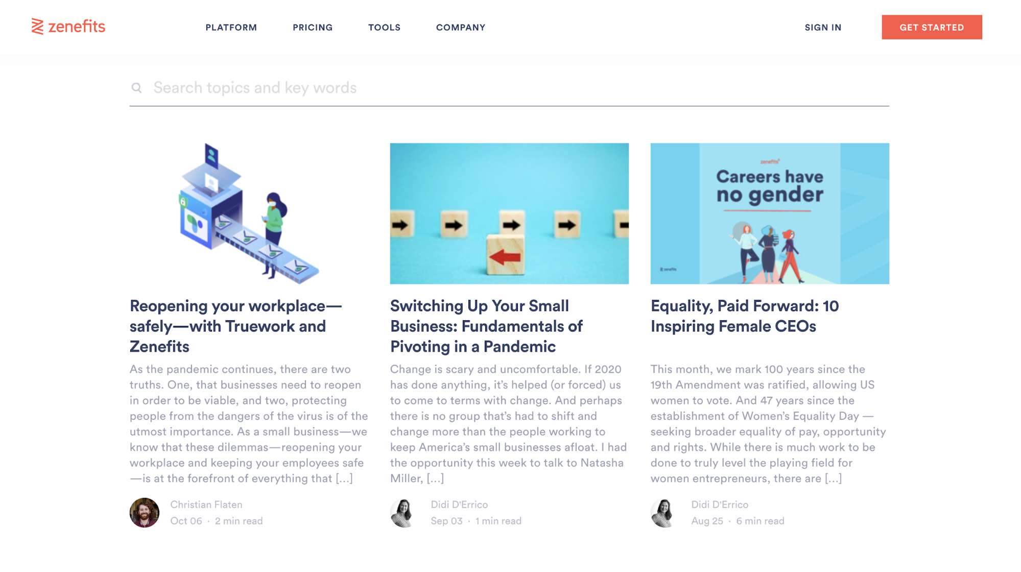
In their card layout, they highlight the featured image and title as the most prominent elements. Then, they also included excerpts, which not only help users decide whether or not the article is right for them, but can entice them to click through if they were on the fence.
They also have dates that allow the user to recognize if the article is new or current, and authors (with pictures) to humanize the brand and establish thought leadership.
Usually, on your articles listing page, we recommend arranging these cards in columns of two or three depending on what information you’re including to maximize how many posts are seen at once.
4. Use large, high-quality featured images
As blogging becomes more prominent and social media becomes more visual, one of the most effective and differentiating things you can do for your blog is incorporating large, non-stocky hero images.
This design choice isn’t one without reason.
Take Intercom’s inner blog template, for example. While their featured image may seem large, so much so that it pushes down the content, it also draws the eye.
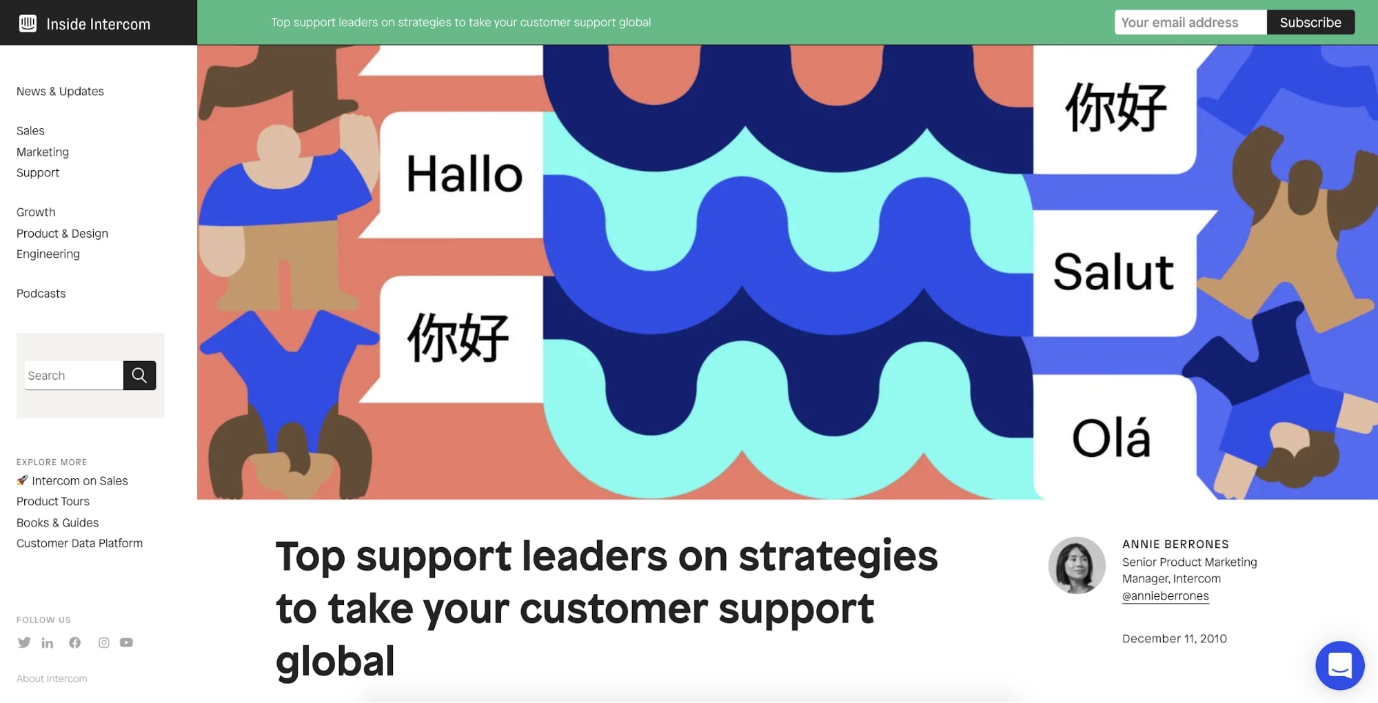
In terms of hierarchy, it also adds a nice anchor to the top of the page, allowing the user to easily recognize where the article begins and re-emphasize the topic at hand.
While it’s not as necessary to go as large as Intercom, it’s important to allow your featured image size to be large enough so it holds enough visual weight to stand out from the elements near it.
Feel free to play around with your layout. While companies like Intercom choose to go full width on their images, others, like Drift, overlap their articles title over half of the hero area, allowing the body text to peek above-the-fold.
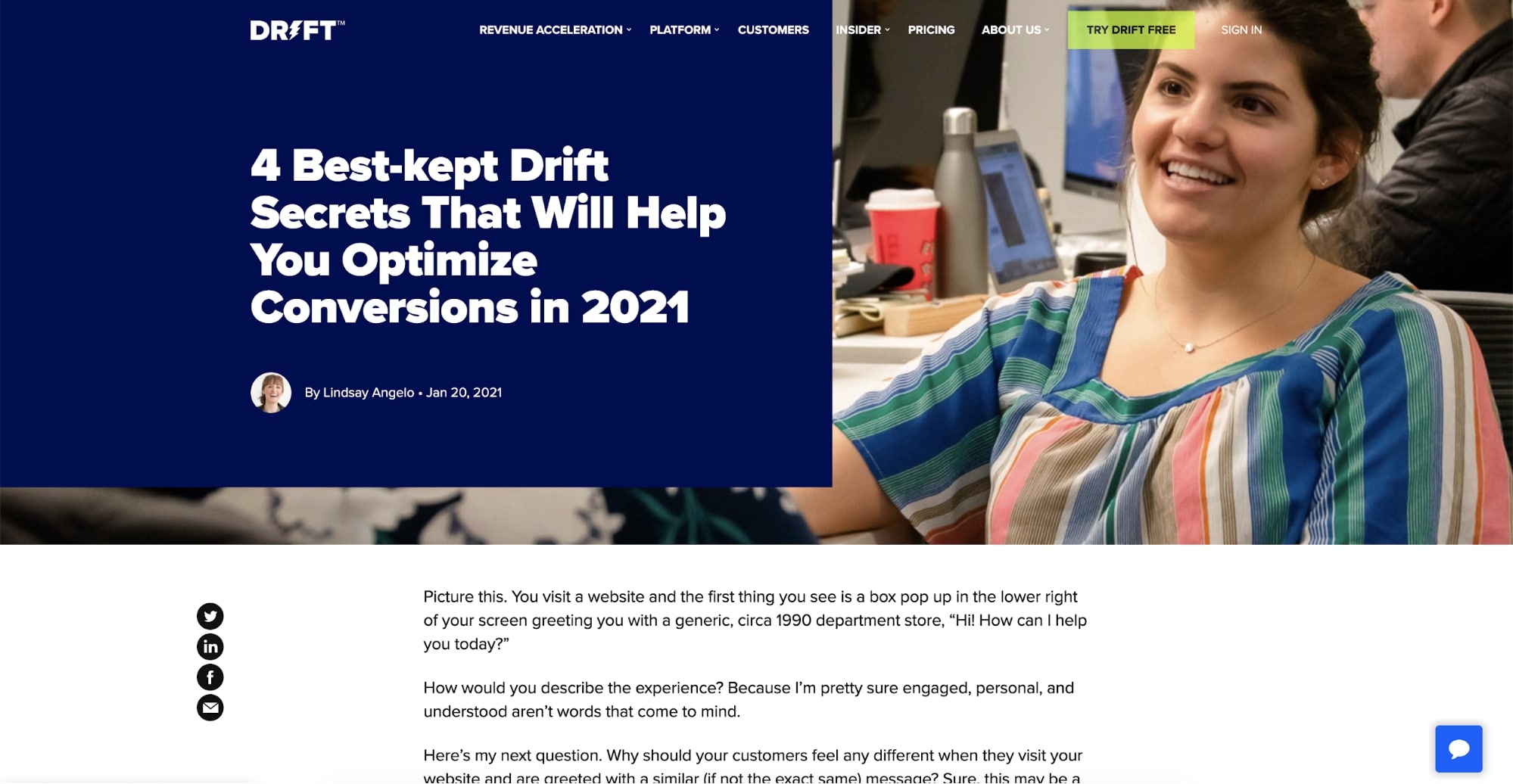
This gives more balanced focus to the hero image and title while making it more convenient for your users to start reading immediately, as opposed to having them scroll first before seeing text.
4. Narrow grid for your blog content
One of the easiest places to start achieving a clean and organized design is by utilizing a grid system. In short, a “grid serves as an armature or framework on which a designer can organize graphic elements in a rational, easy-to-absorb manner,” as explained by Wikipedia.
This technique has been used widely throughout print layouts in newspapers and magazines to improve reading and the absorption of content easier. Grid systems in print mediums can also vary depending on the layout of the medium.
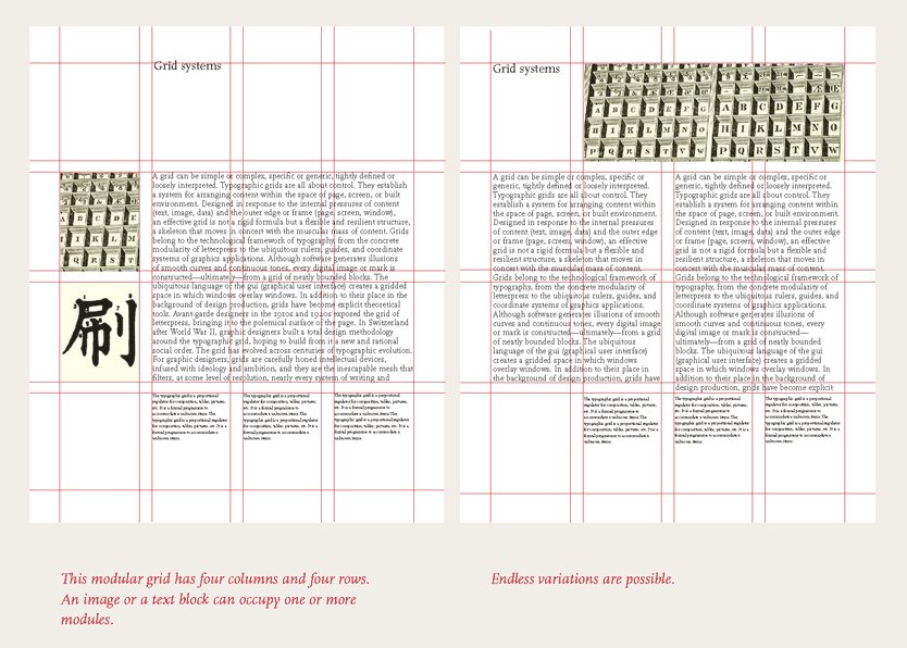
In recent years, this technique has been applied to websites to help with responsive design and provide a consistent experience for users across a variety of screen sizes.
Imagine you have a printed 8.5 by 11-inch paper with a typed essay in front of you. At its current state, it's fairly easy to read, but what would happen if you stretched the paper to 18 inches wide? For most people, it becomes significantly more challenging to go from line to line reading. This is why you see newspapers and magazines employ more narrow column formats.
This idea is also the same for blogs. If your blog’s grid width is too large (especially for users on larger screens) will create readability trouble. It risks them losing their place, while also making your content appear shorter and awkwardly spaced.
Since the vast majority of users are using monitors that are 1300px to 1400px wide (laptop size), your blog’s grid width should range from 900px to 1100px, with 1024px being the ideal.
One company that does this well on their website is Helpscout. Notice how they utilize the grid to keep their blog content contained in the middle of the page. By limiting where the content can go, they avoid you having to scroll side-to-side to read.
This technique also gives you a healthy amount of whitespace throughout your blog. It helps users differentiate elements throughout your blog (sidebars, headers/body text, images, share icons) from one another and guide the eye.
6. Utilize legible typography across all devices
Not all people coming to your website have 20/20 vision, and those who do still don’t want to read your 12pt font. It can cause eye strain, especially on digital screens. I can’t count how many times my parents and friends arrive on blog articles only to find themselves zooming in just to read what’s on the page.
Sounds pretty ridiculous, right?
You want your website's font sizes, especially on your blog, to be the last thing users are complaining about. So now comes the question — what font sizes should I be using?
When it comes to body font, my experience leads me to say somewhere in between 17px to21px, depending on what font you are using (some are naturally larger than others).
For your headings size and a more in-depth analysis as to why this all matters, I suggest checking out this article. It dives further into some of the most common sizes used for header tags, from desktop to mobile.
If you are looking for some examples of websites that have mastered typography and sizes on their site, I suggest checking out these companies:
Wired
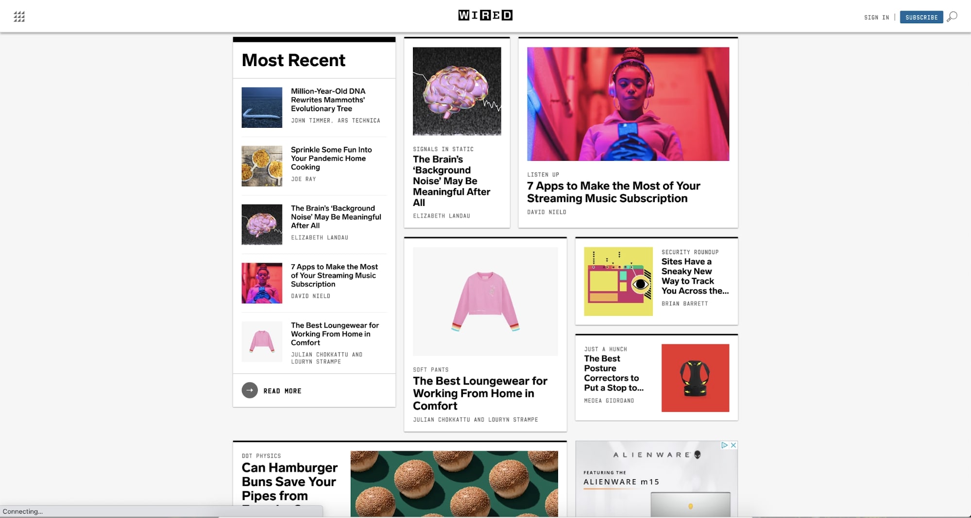
Wired used a variety of different blog card sizes with fonts that scale proportionately to the box they’re contained in. This helps dictate the hierarchy of the cards.
Medium
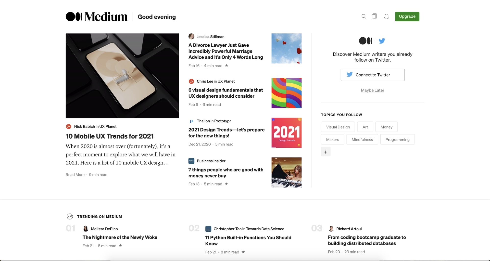
Medium's use of very bold and consistent font sizes, combined with the neat organization of their blog cards, makes it very easy for users to scan the listings available.
The small fact that they also darken the titles, while using a lighter color on the sub-headers/dates, adds to the ease of scalability.
The Economist
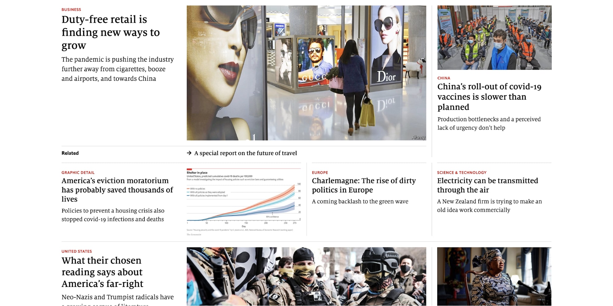
The Economist has a much lighter font-weight that they use throughout their headers, but their size, combined with the red topic that rests above, helps guide the user’s eyes as they scan the article titles.
7. Use short descriptive subheadings
Speaking of looking for quick answers to questions...
Typically, people are coming to blog articles with the intent of skimming them until they find the section(s) that answers their questions or pique their interest.
Your headings should aid this goal by being specific and descriptive.
I’m not talking about “Section 1”, or generic ones like “why” and “how.” You need headings that define exactly what readers will learn about in those grouped paragraphs of your article.
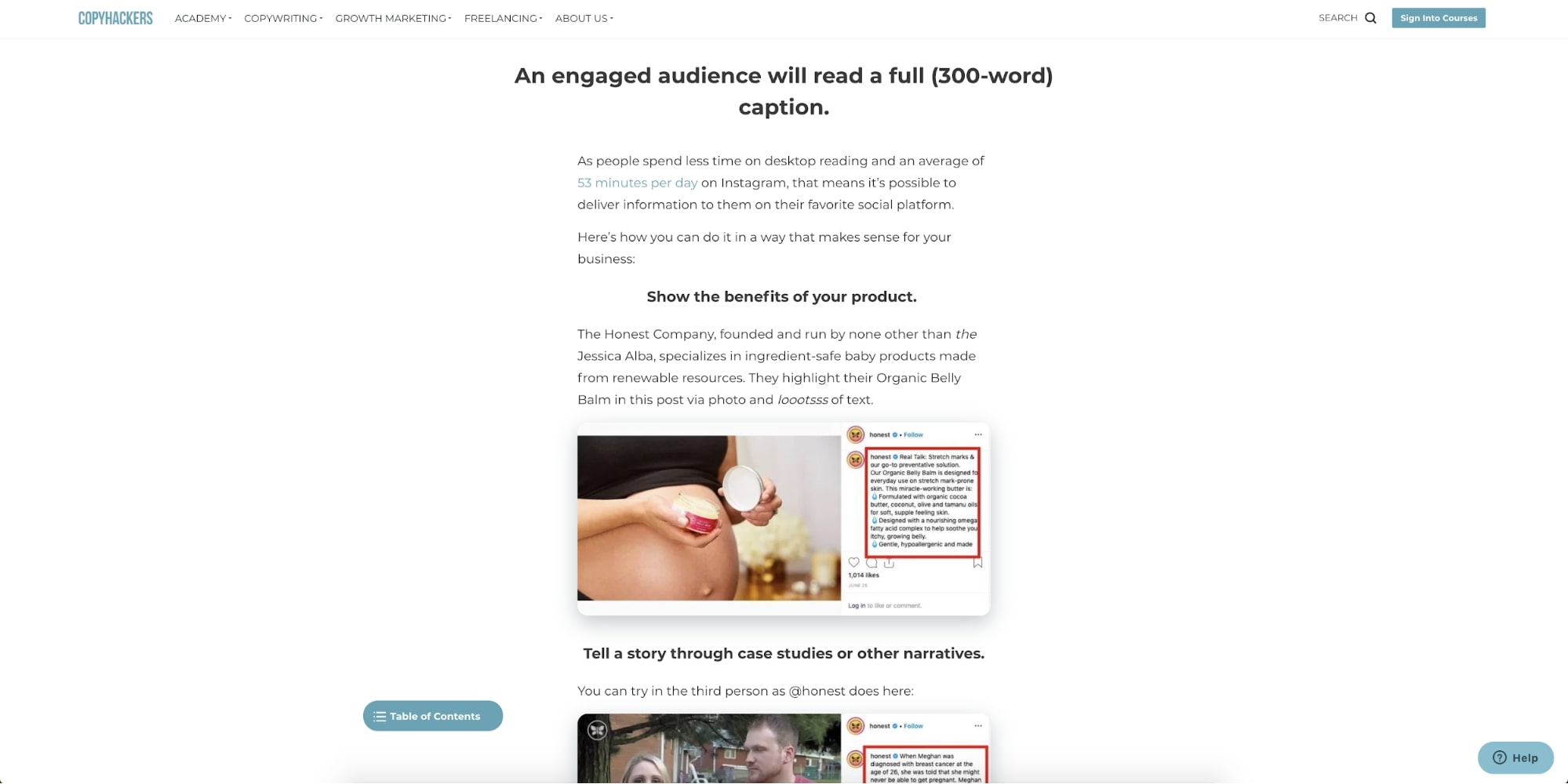
Copyhackers does a phenomenal job at this. In this blog article, titled ‘How to Engage Instagram Followers with Copy So They Love Your Brand and Buy Your Products’, each point has a clear and concise header allowing readers to scan them.
If you feel you can’t do that with your blog articles, I suggest checking out some writing tips here to help get you organized. If you’re looking for some tips on how to write subheadings, or even spice them up a little, use this article by Copyblogger to help guide you.
8. Make social sharing is accessible on all devices
Social sharing links (aka buttons that let people easily post your article to their social media profiles) are one of the easiest ways to encourage people to distribute your content for you, but many sites aren't granting that same experience for tablet and mobile users.
A Pew survey found that 85% of U.S. adults now get their news on a mobile device at least some of the time, including those over the age of 65.
Those same people are also browsing social platforms on their mobile devices, so you can bet they are willing to share content on mobile too (so long as they find it knowledgeable and have an easy means to do so). Make sure you not only have social share links but that they are easy to find and click.
On Mashable’s blog, the social buttons are placed on the right of the navigation and stick with you as you scroll the page, giving users the chance to share whenever.
NBC takes a similar approach by also putting their share options in a fixed top bar that appears once the user scrolls past a certain point on the page.
This placement of your social links can also be easily applied to desktop. Just look at Atlassian’s blog for example.
They place their social sharing links in the top right of their article navigation. The navigation sticks to the top of the page and follows you as you scroll down, meaning the social buttons are always accessible.
If you’re looking for platforms that can create your share buttons easily (with no coding required) check out tools such as AddThis, ShareThis, or Sumo.
Bonus tip: You may notice recently some sites utilizing Facebook Messenger or Slack as additional platforms to share on. This is done to make it easy to get content to users on the platforms and software they are using the most.
If you know your users are hanging out somewhere new, make sure your social links reflect that. Or, if you have a social link to a platform that’s rarely used, maybe it’s time to ditch it. This keeps your experience current and decreases the potential for missed social sharing opportunities in the most popular platforms.
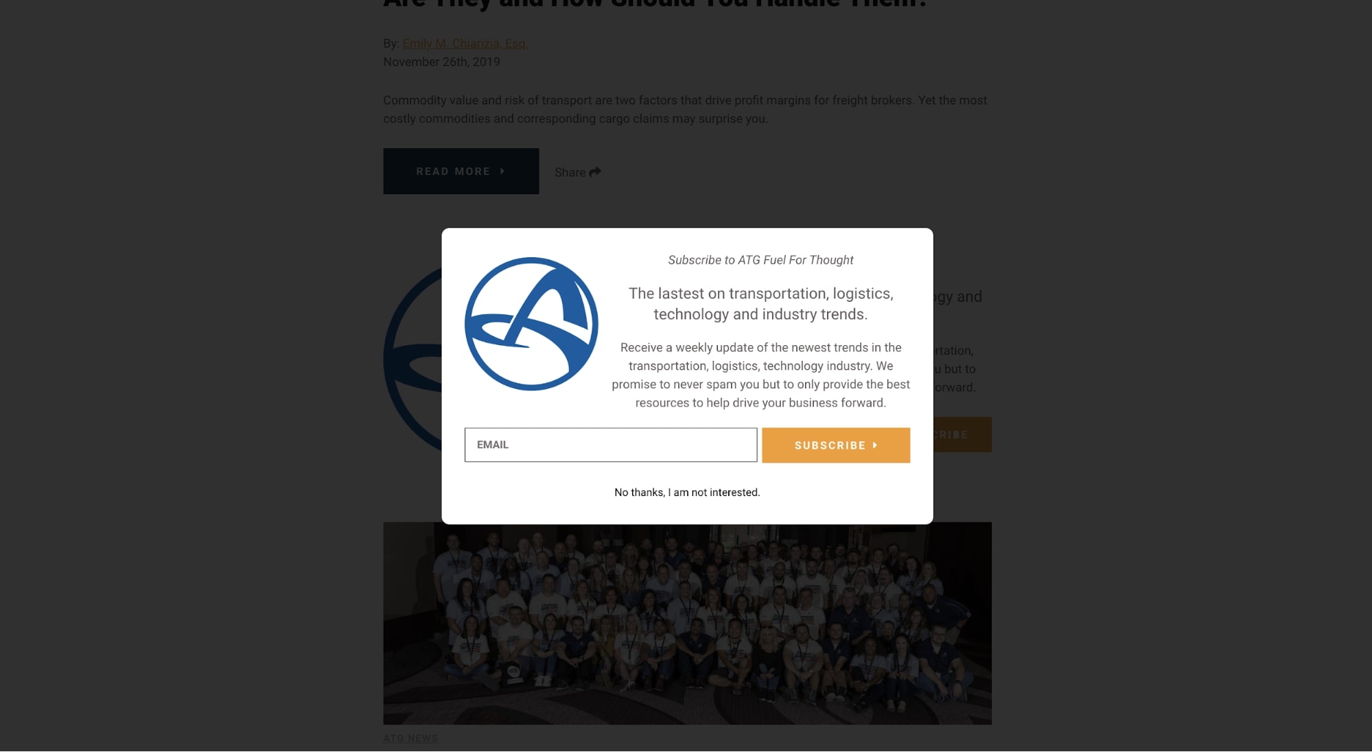
9. Strategically place your lead magnets
Many of us find ourselves with a healthy amount of traffic but struggle to get the number of subscribers or conversions that we want. This is where utilizing an enticing and aesthetically pleasing lead magnet on your blog can be very desirable.
If you’re unfamiliar with the term, a lead magnet is an irresistible offer that users can receive in exchange for specific contact information.
Ideally, you want the lead magnet to be something that resonates with your target audience so you’re attracting qualified leads into your system.
While many people use the lead magnet as a stand-alone offer throughout the blog, a more strategic use is it as an offer that's received when people subscribe to your blog. It incentives the act of subscribing.
Once you figure out what offer works best for your audience, you now need to make it visually appealing.
In IMPACT's client blogs, we’ve approached this two different ways.
The first is on the blog posts page (where your users see all the articles you’ve posted). After a user scrolls past a few of the listed articles, a call-to-action to either download a guide or subscribe can be placed. It should comfortably fit into your listing page while using a different variation of the layout and colors to stand apart from the articles.
Below you can see how this was implemented on Armstrong’s blog, one of IMPACT’s clients.
The second technique is through a popup that appears once daily to users who are not subscribed to the website’s blog. When implementing it, you need to make sure it is easily distinguishable. For example, darkening the background and creating a white container can help emphasize the popup and prevent the users from being distracted by the blog under the black overlay. You can see this carried out in Armstrong’s lead magnet too.
Both instances of the popup and inline lead magnet need the following elements:
- A cover of the offer or image, so users visually see what the offer relates to
- A header that helps the user understand what the offer is
- A subheader helps the user understand why they need the particular offer and what value it is to them
- A button color that stands apart from your site's color palette so it’s very recognizable.
These will ensure a better experience when users encounter them, which will ultimately lead to each performing the best they can.
10. Highlight your authors
Your authors put a lot of time and effort into creating the content for your blog, and you should celebrate that by posting them as the author of their respective articles.
Not only that, but you should also give them short bios that appear at the bottom of articles so your users are able to distinguish who’s written what on your blog. Better yet, have individual author pages that showcase all the posts they’ve written.
Inc keeps their blog pages nice and simple. They start with the author's photo, bio, and social handles. Then, the remainder of the page features a feed of any articles they’ve written.
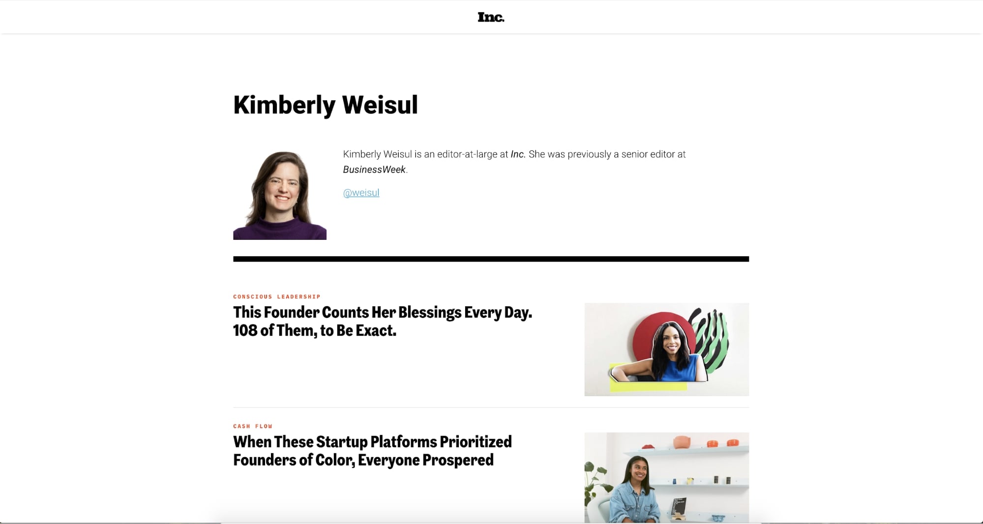
This helps the UX of your blog so users have an easier time searching for articles by authors they like, while also giving your authors a place to showcase all the insights they’ve provided on various subjects.
11. Include related articles
Many of the users who visit your website are on a journey to learn more about a particular topic.
Your website should help them advance in that journey. The best way to do this is by featuring related articles or resources on the same page for them to click into next.
These should ideally be related either by topic or keywords, not random articles you want to force people to visit.
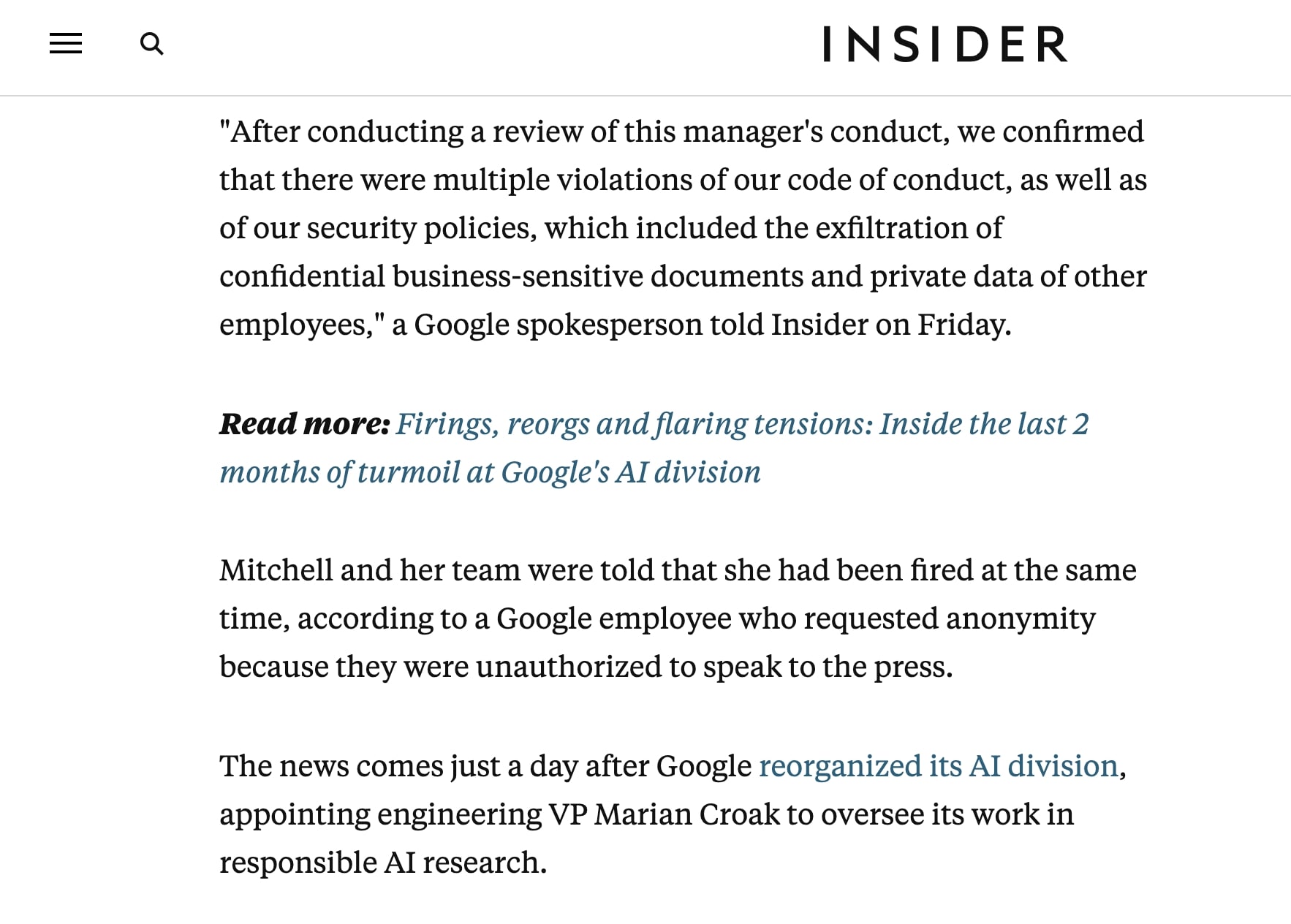
One way to do this in your blog layout is to periodically place individual in-line links throughout an article.
When doing this, you need to use styling that indicates slight separation from the reading flow. In Insider’s case, they preface the article's title with a bolded “Read more:” and a blue italicized title.
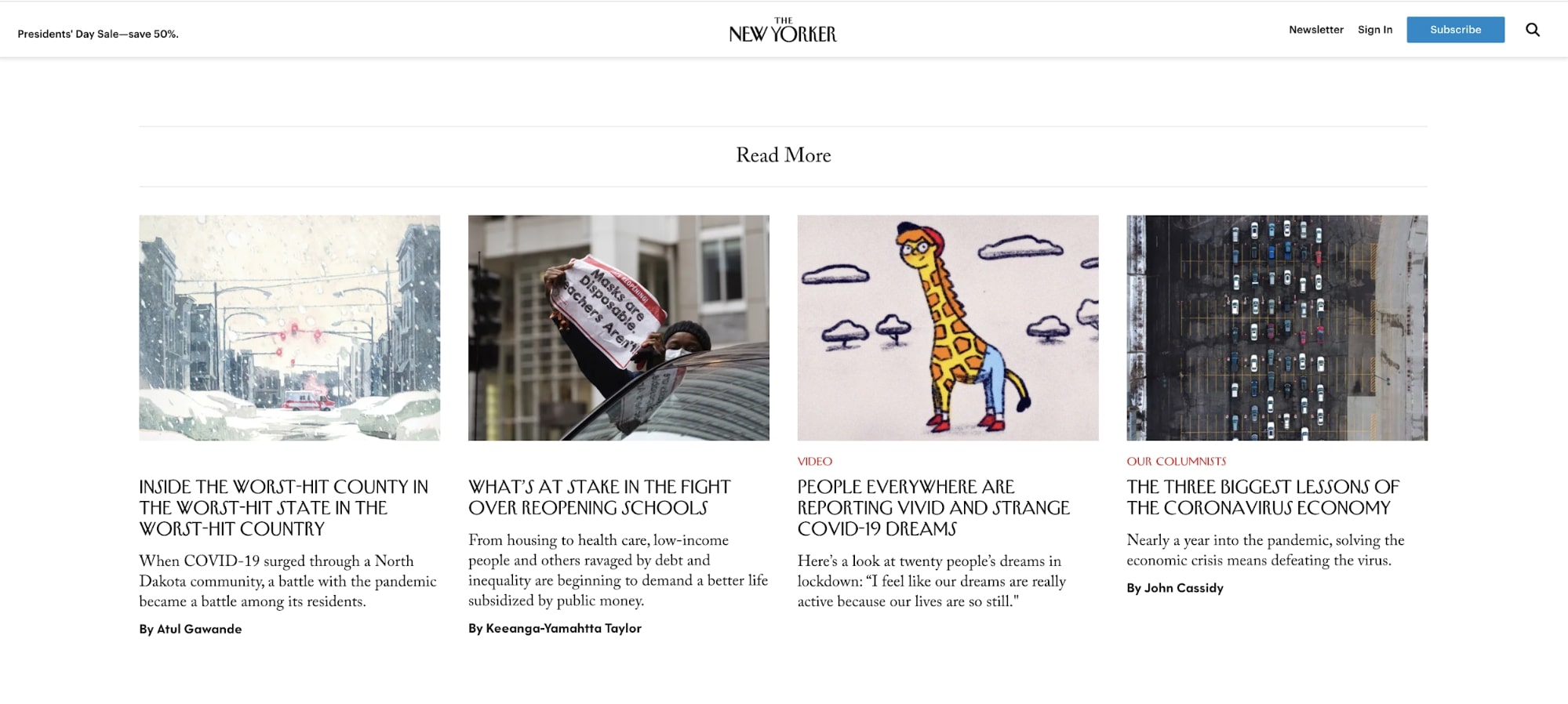
You can also take the approach of adding related articles to the end of an article. This might be more appealing to folks who would prefer to keep people focused on the article they are reading for longer.
The New Yorker has a dedicated section at the end of their articles that highlight four related articles. In this case, the post I clicked on was about COVID, so the related material focuses on that topic.
You also don’t need to take one approach over the other.
Many publishers (like IMPACT) will combine these two methods, or, take it further by including a sidebar of more related articles. It's up to you to determine what's best for your audience and what's technically possible on your website.
12. Show expected read time
Setting expectations up front for how long certain articles will take you to read is a great way to let users know if they will have time to fully dive into the material at hand.
I can’t tell you how many times I find myself on a lunch break looking to squeeze in a few articles, only to find that the one or two I chose might have been unknowingly longer then expected.
Showing some sort of indicator of article length removes this impediment while also letting the user know how in-depth a particular article might go into a particular topic. This is typically done in two subtle ways.
One is with an actual reading time estimate being shown at the beginning of the article.
An alternative approach is to show users how much they have left. This is typically done with a progress bar that grows in length as you scroll down the page like Trello’s blog:
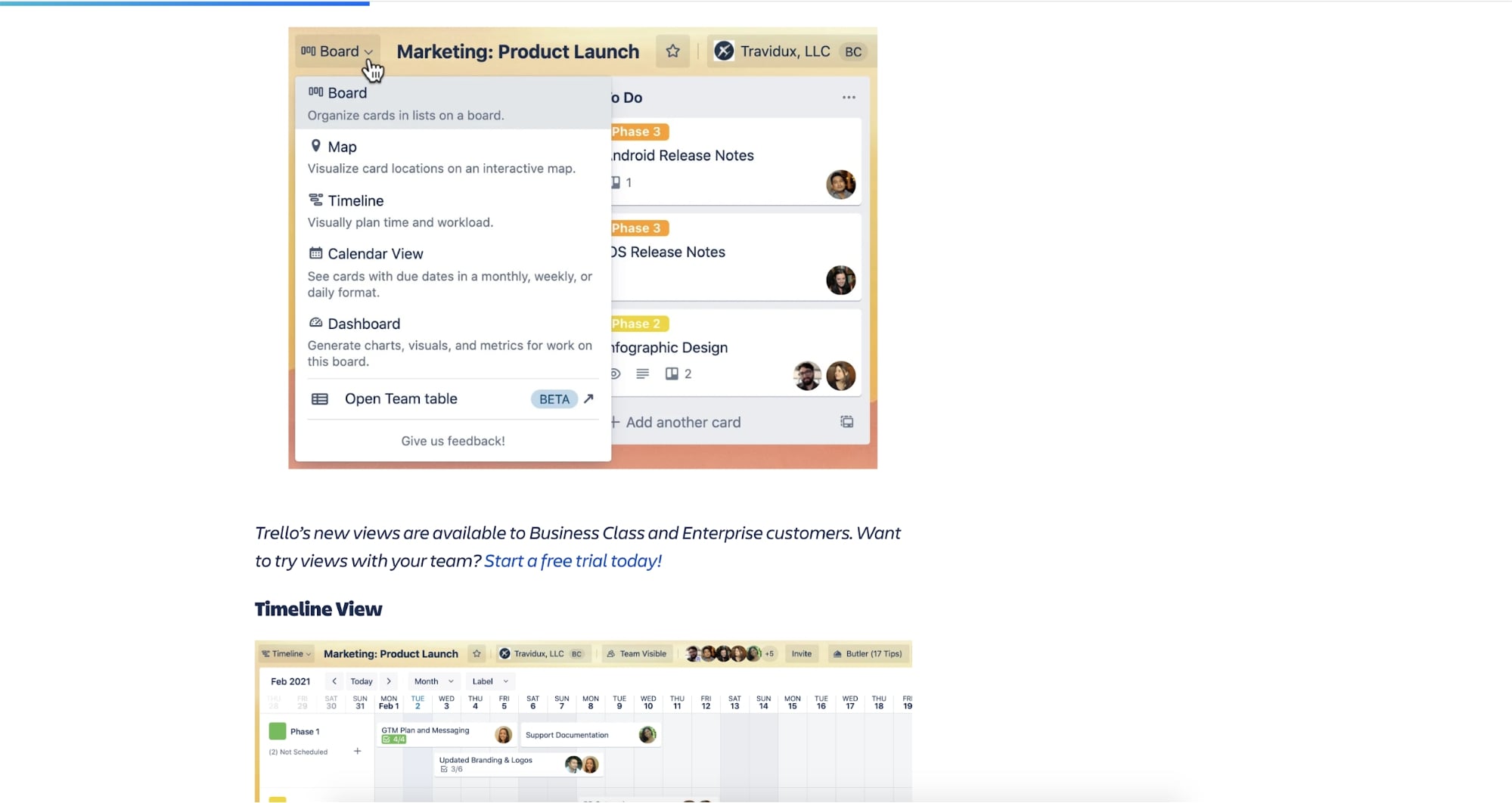
Each option illustrates a non-intrusive way to better help the user understand what they will likely expect before they read.
Next steps
The sooner you can implement these design principles onto your blog, the sooner you will begin seeing more conversions and traffic.
It's time to get going! Work with your team internally to come up with new designs that can tie in some of the items above and test how they do. Combine their work with SEO best practices and watch your traffic increase!
If you think you still need some guidance as to what other areas of your website need improving, consider reaching out and talking to us about IMPACT’s Website Performance Mastery. Our team of website experts will work closely with your in-house team to develop a custom website strategy that fits your goals.
Free: Assessment
/Assets/Icon%20Library/Arrows/Grey%20Arrow%20-%20Prev.svg)
/Assets/Icon%20Library/Arrows/Grey%20Arrow%20-%20Next.svg)