/Assets/base/Navigation%20Icons/TAYA.svg)
/Assets/base/Navigation%20Icons/Sales.svg)
/Assets/base/Navigation%20Icons/Web%20design.svg)
/Assets/base/Navigation%20Icons/HubSpot.svg)
/Assets/Icon%20Library/AI%20Mastery.svg)
/Assets/Icon%20Library/Learning%20Center%20Laptop.svg)


Jan 26, 2023
Landing pages are no ordinary territory.
Like an explorer discovering a new land or planet, a prospect lands there looking to "make contact." They're curious and excited — and yet, despite this excitement, it's easy to end up phoning it in as a marketer.
You have a new offer, grab your go-to landing page template, clone the same form you use again and again...
Where's the sense of adventure? Where's the creative exploration that makes a visitor actually want to convert?
The landing page examples I share below span the lines of B2B, B2C, and a wide range of industries and offerings.
Although many roundups focus just on big brands (and I certainly include them as well), I've also shared impressive landing pages from small and medium-sized businesses that have stricter budgets.
What all of them have in common, however, is they feature unique designs that will get your creative juices flowing — and they use savvy best practices that will supercharge your lead generation efforts.
What should a landing page include?
A landing page exists for the sole purpose of collecting information from a user for a specific offer, usually via a form on the page.
In recent years, it's common to see landing pages opt to put their forms behind a popup or call-to-action button leading to a separate bare bones page. Some brands are designing their product pages to double as landing pages.
Regardless of their approach, truly great landing pages are those that clearly define their value to the audience and focus on getting them to take action.
The most effective way to do this depends on your specific audience, brand, and industry, but many great landing page designs (including several below) incorporate features like:
- Compelling, concise copy focused on the value to the prospect
- An explanation of "what to expect" after the form has been submitted.
- A video further detailing the offer and its value. (This is part of The Selling 7 videos all businesses should have in their strategy.)
- Relatable photos of people to help visitors envision themselves after getting the offer.
- Social proof to back up the brand's claims.
- Answers to frequently asked questions (FAQs) to reduce objections and friction.
Use these examples to give you an even better example of what experiments to add to your to-do list. Remember, the only way to know what will work for you is to test them out for yourself.
Great landing page examples for 2023
1. Daniel Alain: Hair loss solutions company leans into video and reviews to build trust
Editor's Note: Daniel Alain is an IMPACT Client
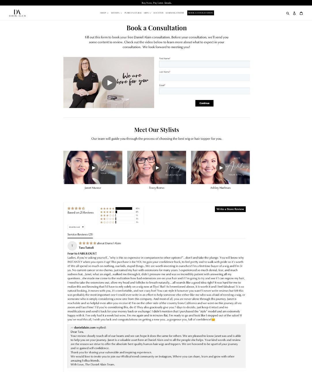
How they got it right:
- Leads with a video discussing a visitor pain points. It also shows a real team member.
- Short, easy-to-find form.
- Includes additional videos introducing team members that the visitor may work with.
- Includes a long list of real customer reviews as social proof of their claims.
2. Amazon: Retailer capitalizes on relatable visuals and benefits supported by real customers
How they got it right:
- Leads with a clear and concise value proposition and call-to-action.
- Let's video do the talking before breaking things down in copy.
- Copy focuses on the value to the user/customer in just a few words.
- Friendly, relatable images show a diverse audience.
- Highlights key features with reviews to support their claims.
- Social proof includes real photos and social media handles to show authenticity.
- Answers frequently asked questions upfront.
3. Uber: Ride share company uses concise, benefit-focused copy to appeal to prospect pain points
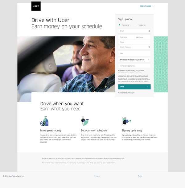
How they got it right:
- Headline included that speaks to a common user pain point – work schedule flexibility.
- Form is placed high up on the page to avoid being missed (which also gives visitors the opportunity to convert right away if they wish).
- Incorporates clear and concise copy.
- Highlights the three biggest reasons to convert.
- Makes use of a big image of a friendly, relatable person. '
4. Bill Ragan Roofing: Roofing company uses video to combat objections
*Editor's Note: Bill Ragan Roofing is an IMPACT Client
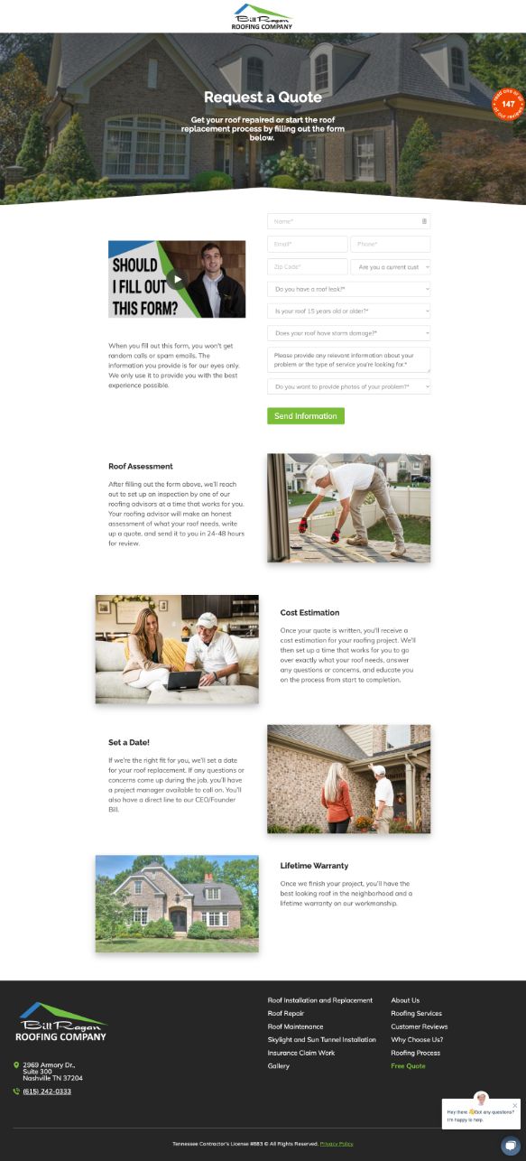
How they got it right:
- Leads with a video showing a real team member. This humanizes the brand and starts building trust with the target audience.
- Sets expectations by explaining exactly what happens after you fill out the form.
- Details each step of the process.
- Incorporates high-quality, relevant imagery with people.
- Includes live chat to answer visitor questions.
5. EF Ultimate Break: Travel company uses humor, social proof, and FAQs to legitimize a unique offer
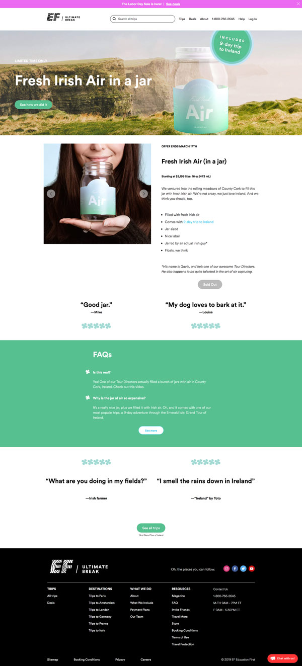
How they got it right:
- Uses enticing, high-quality imagery that aligns perfectly with the offer and messaging.
- Includes social proof which, for such an eyebrow-raising offer, is extremely important for combating objectives or confusion.
- Shows answers to frequently asked questions.
- Creates a sense of urgency by including a time limit.
6. Scribe Media: Media company uses clean and design and copy to guide user
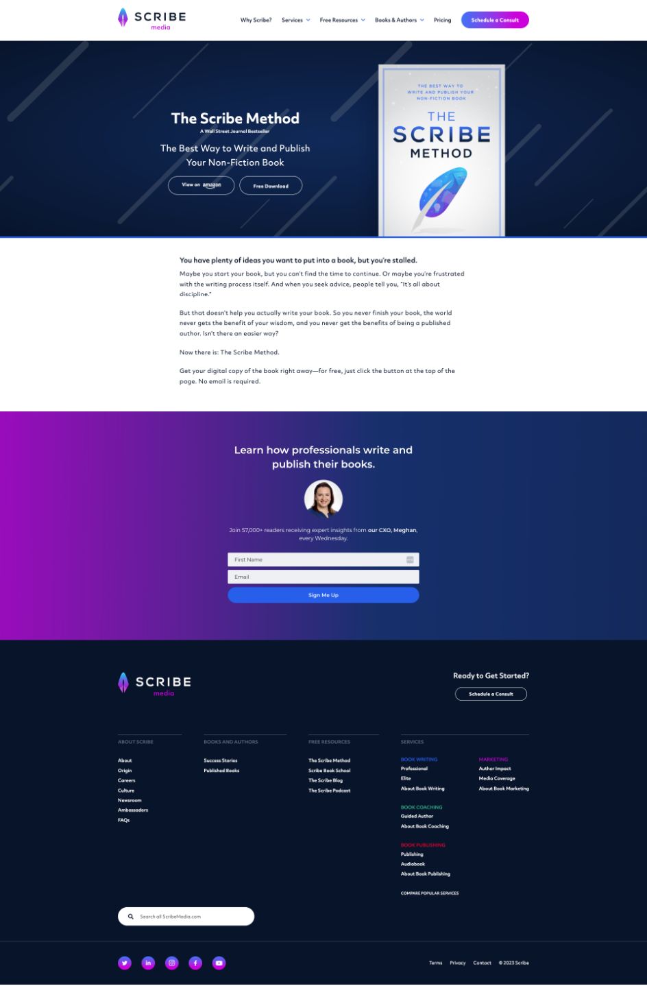 How they got it right:
- Large, vibrant visual of what you'll be getting.
- Has two easy-to-find calls-to-action to get the content.
- Copy is engaging, leading with the pain the visitor is feeling and introducing its offer as the solution.
- Ends with a secondary offer, further down the funnel. This is typically done on a "thank you page," but since the offer here has to be done off-site, incorporating this gives them an opportunity to still capture an email address.
7. Sticker Mule: Printing company uses humor, video, and interactive elements to keep user engaged
How they got it right:
- Uses dynamic animation to catch your eye and guide you down the page.
- Uses playful, on-brand copy to explain the value of the offer.
- Incorporates a call-to-action at eye level when you arrive on the page.
- Landing page features a high-quality, entertaining video that shares more background on the product.
- Includes social proof in the form of buyer reviews. They even include real photos.
- Gives "next steps" in the form of suggested recipes.
8. MasterClass: Training company capitalizes on video, social proof, and offer details
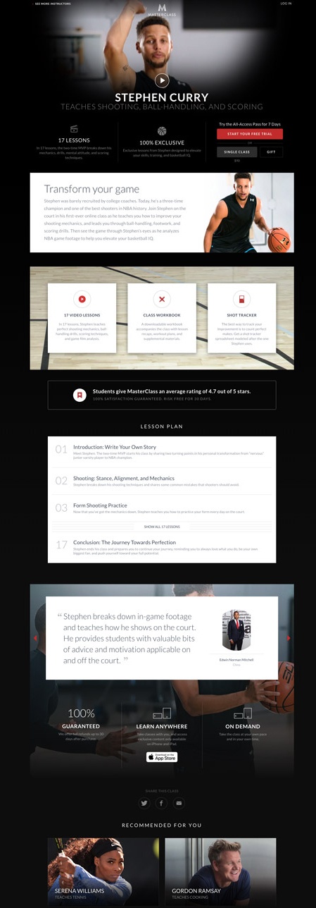
How they got it right:
- Capitalizes on video in the hero section.
- Leads with a clear and concise value proposition so you know exactly what you're getting in just a few words.
- As you scroll, it details what you'll be getting in the course.
- Landing page includes a testimonial with a headshot.
- Includes social share links.
- Recommends additional content.
9. HelloFresh: Meal kit company uses playful design to effectively deliver a lot of information
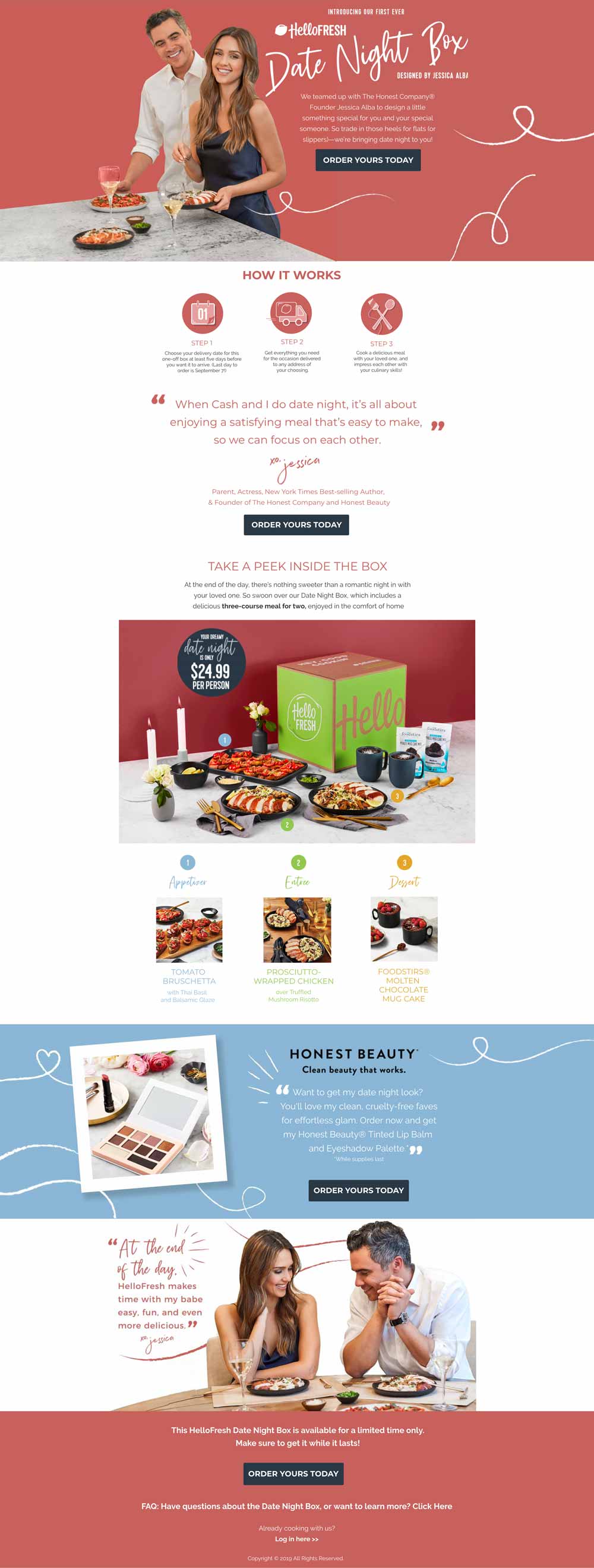
How they got it right:
- Includes a high-contrast call-to-action in the hero section.
- Uses romantic flourishes that align with the "date night" offer to guide your eye down the page.
- Tells you exactly how the process works and what you'll find in the box.
- Uses co-marketing/influencer marketing to its advantage by including photos and quotes from Jessica Alba to urge people to convert.
- Effective uses blocking to separate the important sections of the page and, again, guide your eye.
- Uses real, relatable imagery that aligns perfectly with the messaging.
10. Amazon Prime: Uses video and exclusivity to attract prospects
![landing-page-example-amazon]()
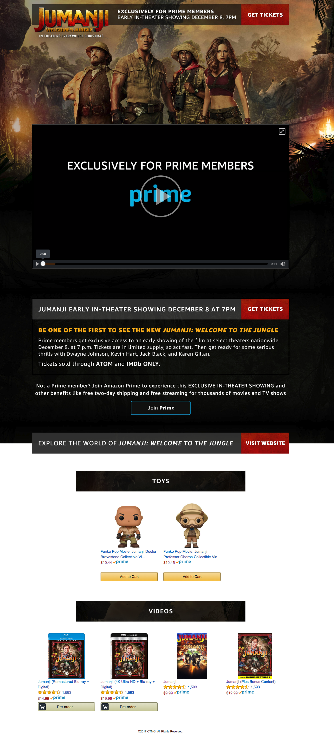
How they got it right:
- Uses video to humanize the offer and explain its value in a more dynamic way (view above).
- Stars of the movie offer a touch of influencer marketing.
- Messaging uses exclusivity and incentives to encourage conversion. It also speaks directly to Prime users.
- Ends by funneling visitors to related products (alternative conversion opportunities).
11. Sheffield Metals International: Roofing company Effectively uses video to combat objections and build trust
Editor's Note: Sheffield Metals International is an IMPACT Client
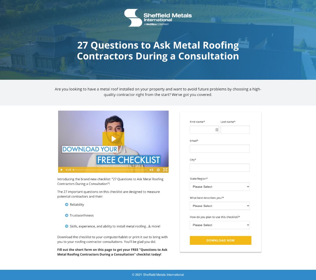
How they got it right:
- Leads with a video showing a real team member.
- Copy is concise and pointed.
- Landing page design removes all distractions, including links and popups.
- Bold call-to-action button stands out on the page and guides the eye.
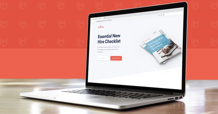
12. Zenefits: HR tool gets detailed about the offer at hand
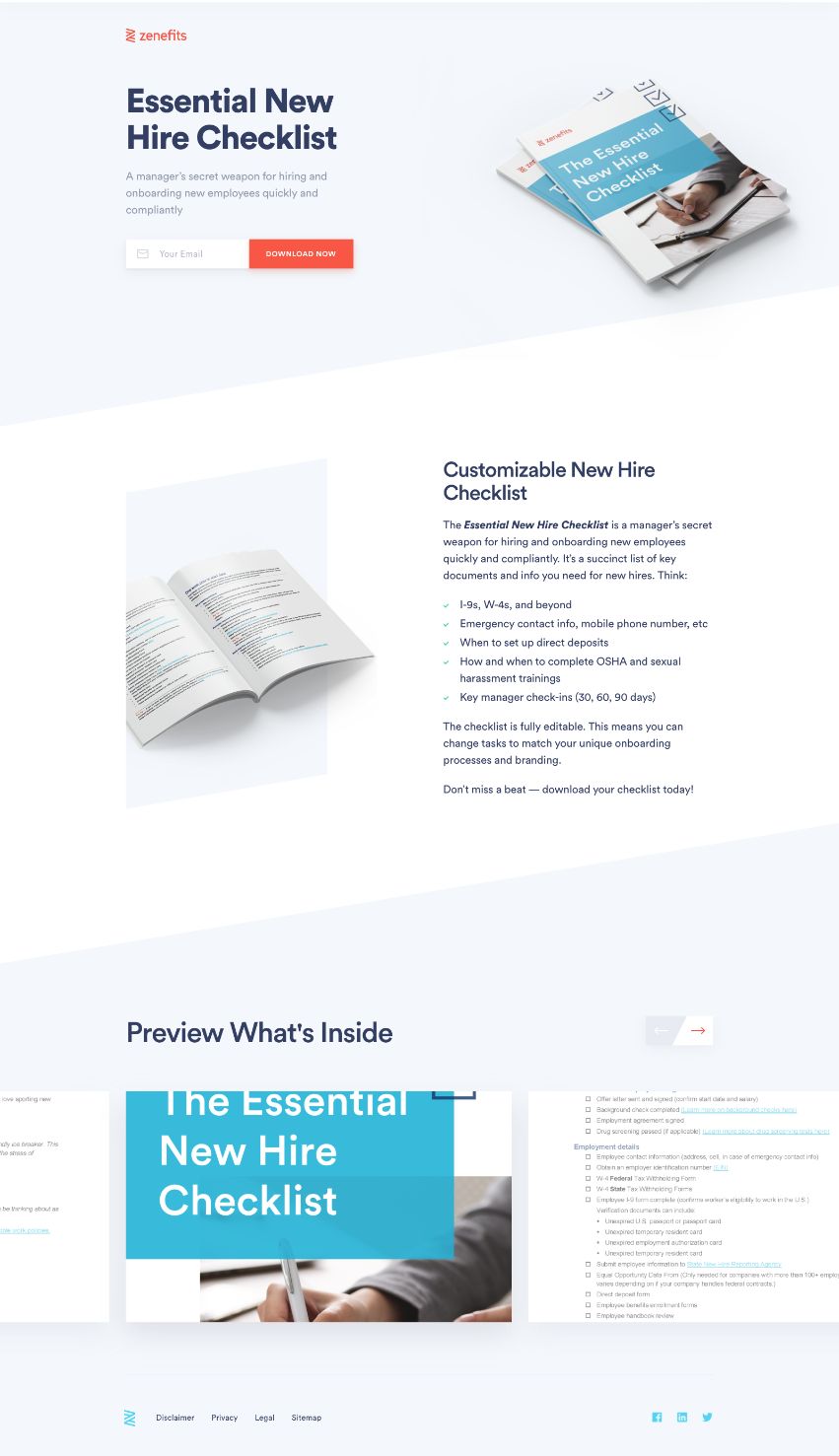
How they got it right:
-
Bold, clear headline telling you exactly what the offer is.
- Single-field form above the fold, making landing page conversion as easy as possible.
- Bulleted list details exactly what the checklist covers.
- Large visuals show you the offer, including several shots of the actual pages.
13. Office Interiors: Furniture company uses video to detail value of the offer
Editor's Note: Office Interiors is an IMPACT Client
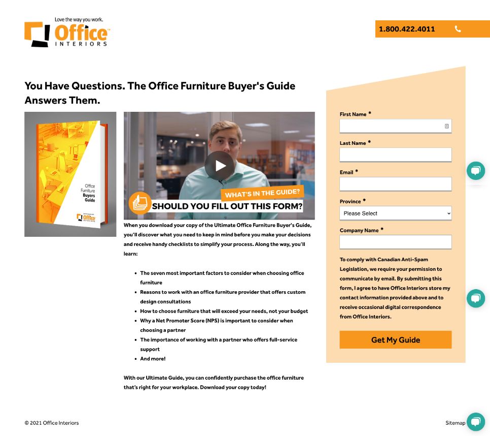
How they got it right:
-
Includes a video featuring a real team member explaining the value of the guide, and what happens after you fill out the form.
- Bulleted list reiterating what is included in the guide.
- Includes a large visual of what the guide looks like.
- Removes all navigation to keep the focus on the offer at hand.
- Includes live chat, so a visitor can reach out immediately should they have additional questions or concerns.
- Uses the brand's orange to give the form contrast against the rest of the page.
14. Slack: Messaging app is concise and focused with its copy
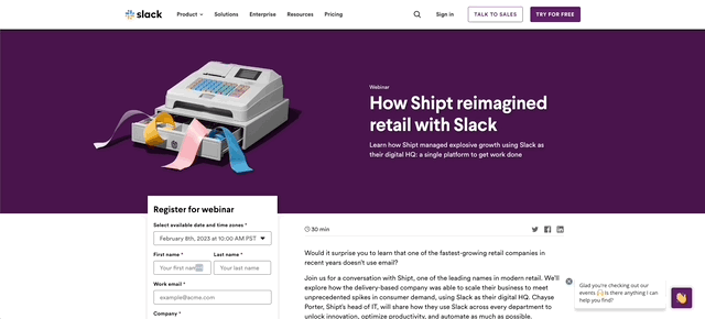
How they got it right:
- Compelling title and on-brand GIF to grab your attention
- Calls out important details of the webinar including main takeaways in a quote box, the length, and the speakers
- Shows the headshots, names, and titles of speakers to humanize them and build credibility
-
Includes live chat should the visitor have additional questions
- Shares related events
15. TBS: Television network uses humorous video to deliver the details of the offer
![landing-page-example-TBS]()
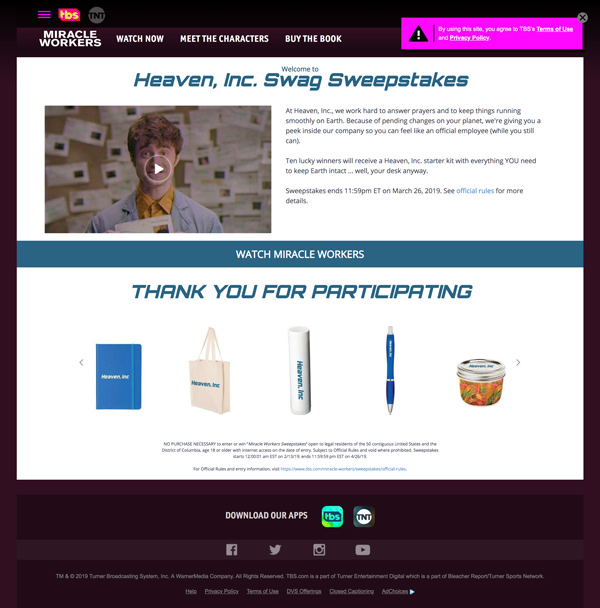
How they got it right:
- Copy is short and sweet, giving you all of the details of the sweepstakes in as few words as possible.
-
Lets video do much of the talking by featuring it in the landing page hero area. It does a great job of humanizing the offer by having a thumbnail of a person. (Lucky for them, this also happens to be a celebrity.)
- Shows you exactly what you will get the chance to win if you fill out the form on the page.
16. Applied Educational Systems: Education tool uses video with real-life team member and social proof to build trust
Editor's Note: Applied Educational Systems is an IMPACT Client
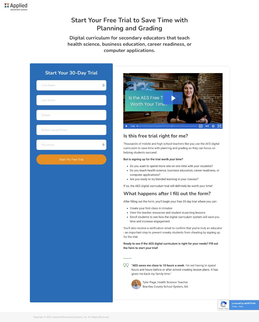
How they got it right:
- Landing page features a clear, direct, action-oriented value proposition.
- Includes a video with a real-life team member.
- Sets expectations by detailing what happens after you fill out the form.
- Addresses common objections and questions upfront.
- Incorporates social proof with a quote, image, and name of a real customer.
17. Berry Insurance: Insurance company leads with friendly video
Editor's Note: Berry Insurance is an IMPACT Client
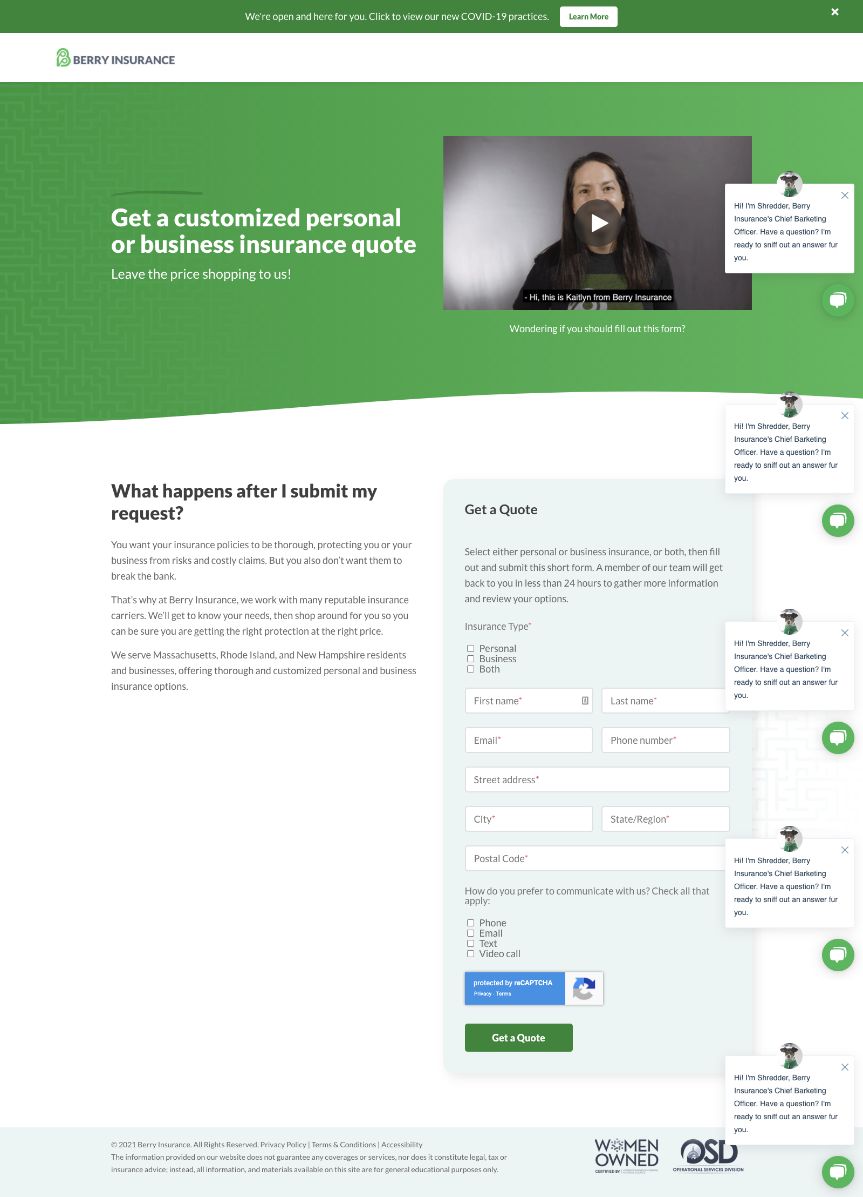
How they got it right:
-
Leads with an action-oriented headline telling you exactly what you get on this landing page.
- Headline contrasts well against an on-brand green hero area.
- Video in the hero area has an animated thumbnail to draw the visitor's eye and encourage them to click.
- Video features a real team member telling you exactly what happens after you fill out the form.
- Copy reiterates the information in the video making, not only driving home the message but making the page more accessible to those with vision or hearing impairments.
- Includes live chat, so a visitor can reach out immediately should they have additional questions or concerns.
18. Calm: Meditation app simplifies a complex offer using comparison chart and FAQs
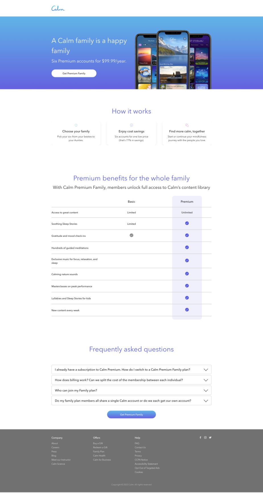
How they got it right:
-
Clean, on-brand design.
- Bold, easy to find call-to-action.
- Explains how the plan/offer works in three concise points.
- Uses a comparison chart to highlight the features of the plan and compare it to the alternative.
- Highlights FAQs.
19. IMPACT: Training company (that's us!) uses friendly video to explain what's ahead
![landing-page-example-IMPACT]()
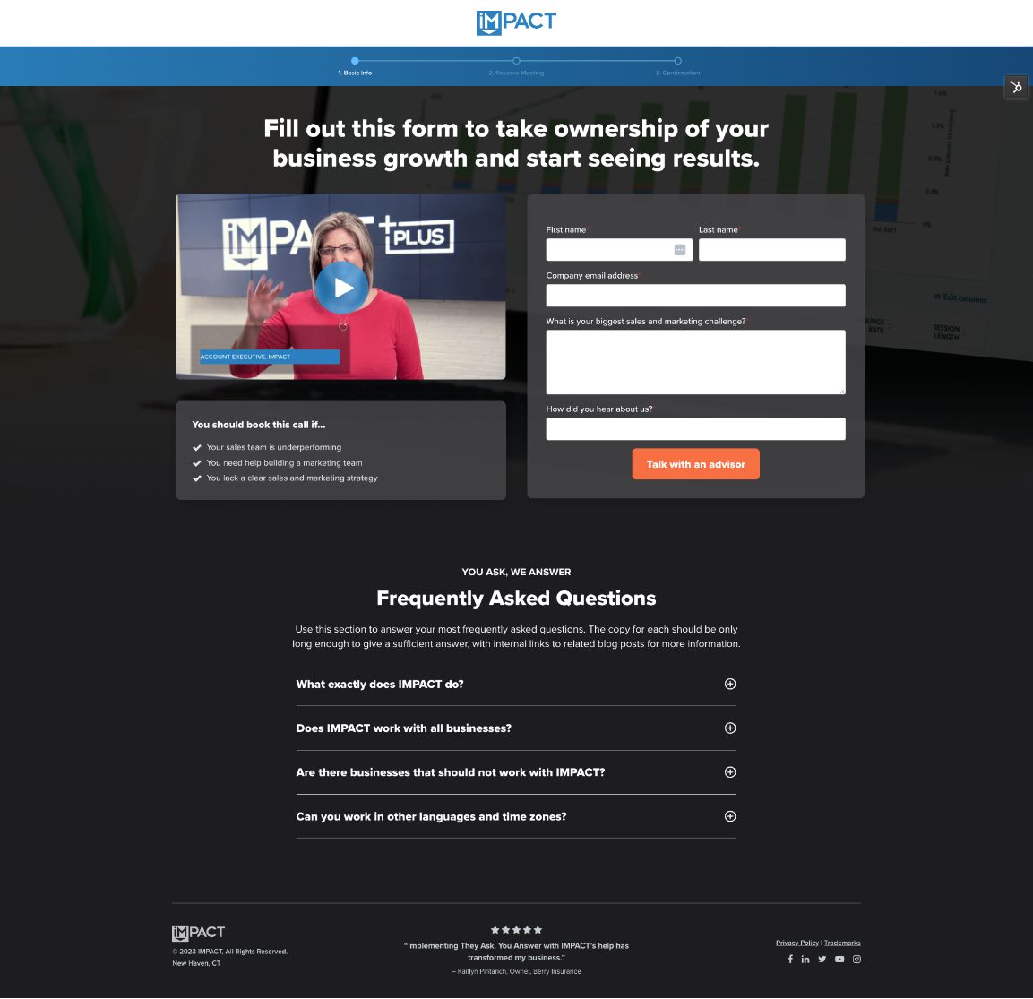
How we got it right:
- Highlights value to visitor in headline.
- Includes a video from a real team member who the visitor may be meeting with after they fill out the form.
- Details who should fill out the form in three simple points.
- Includes FAQs.
20. Semrush: SEO tool uses playful, friendly design to explain how to use it
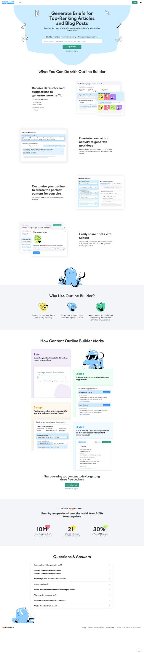
How we got it right:
- Highlights value to visitor in headline.
- Colorful, engaging design and animation as you scroll down the page.
- Desired action included in the header so it can't be missed.
- Explains use cases for the offer/tool.
- Details how the tool works.
- Explains why you should convert/use the tool.
- Shares FAQs.
- Includes social proof.
- Removes navigation and all other distractions.
21. River Pools & Spas: Pool company uses video to explain value of offer
Editor's Note: River Pools & Spas is an IMPACT Client
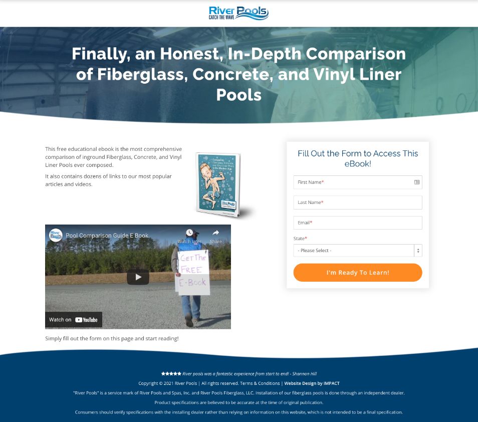
How they got it right:
- High contrasting headline telling exactly what you get from the offer.
- Headline written in a friendly, human voice.
-
Short, concise copy explaining the value of the offer.
- Landing page design includes a video going into greater detail about the value of the offer.
- Call-to-action button is bright orange, drawing the user's eye directly to it and the accompanying copy "I'm ready to learn!"
- Removes navigation and all other distractions
22. The Juggernaut: South Asian blog uses examples and social proof to differentiate itself
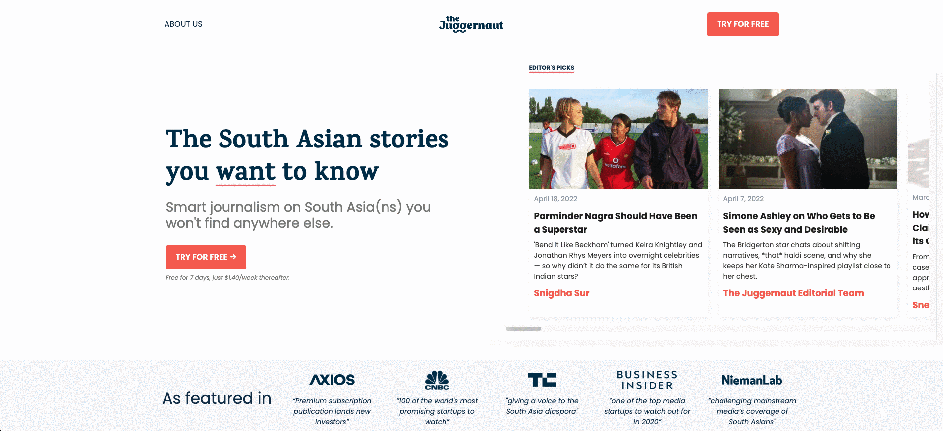
How they got it right:
- Using dynamic text in value proposition to highlight more emotional benefits.
- Includes examples in the header.
- Has bright orange CTA right in the header.
- Includes logos from well-known media outlets as social proof.
- Includes a testimonial from a real subscriber, complete with headshot and name.
- Highlights what makes its content different.
23. Industrial Packaging: Packaging company uses video to explain its offer
Editor's Note: Industrial Packaging is an IMPACT Client
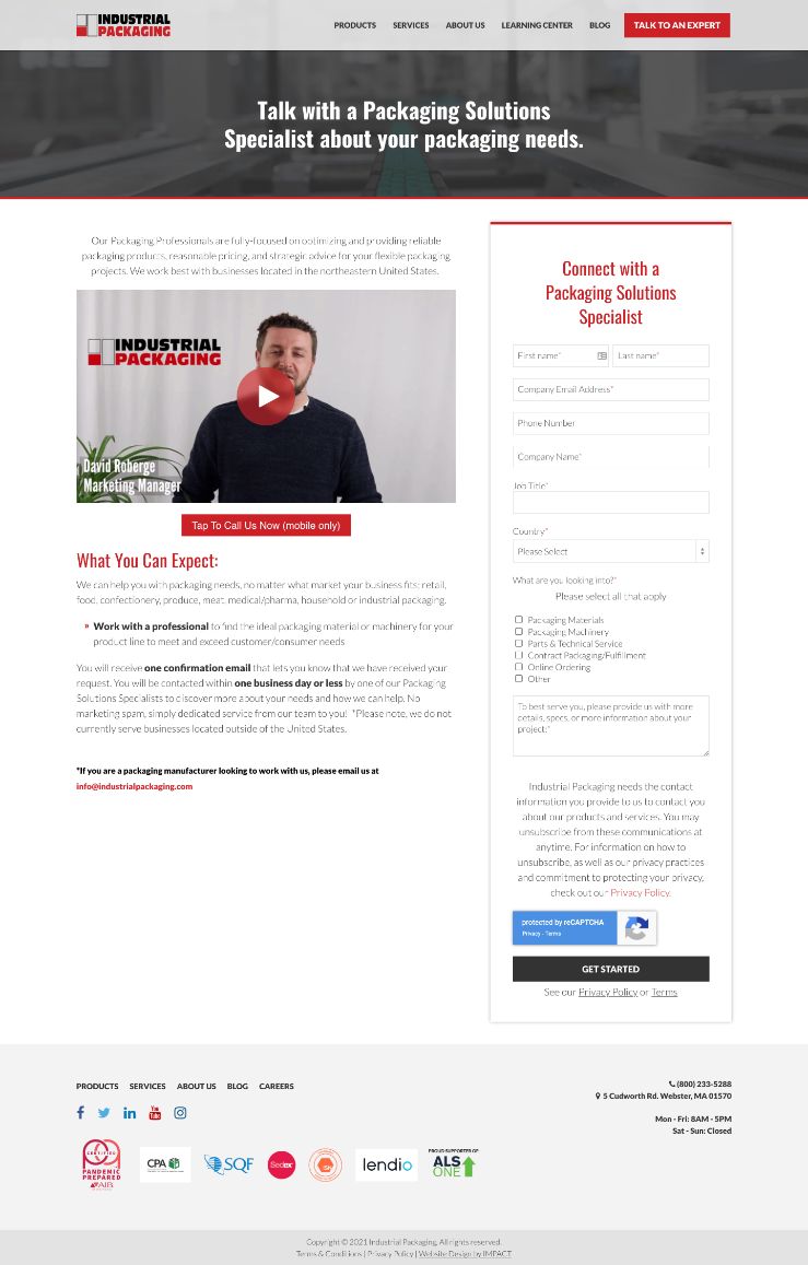
How they got it right:
- Includes a video with a real team member.
-
Bulleted lists and bolding draw your eye to key information in the page's copy.
- Details exactly what to expect after you fill out the landing page form.
- Includes the option to call and speak to a real person with one click of a button if on mobile.
24. Airbnb: Uses friendly imagery and interactive elements to showcase its value
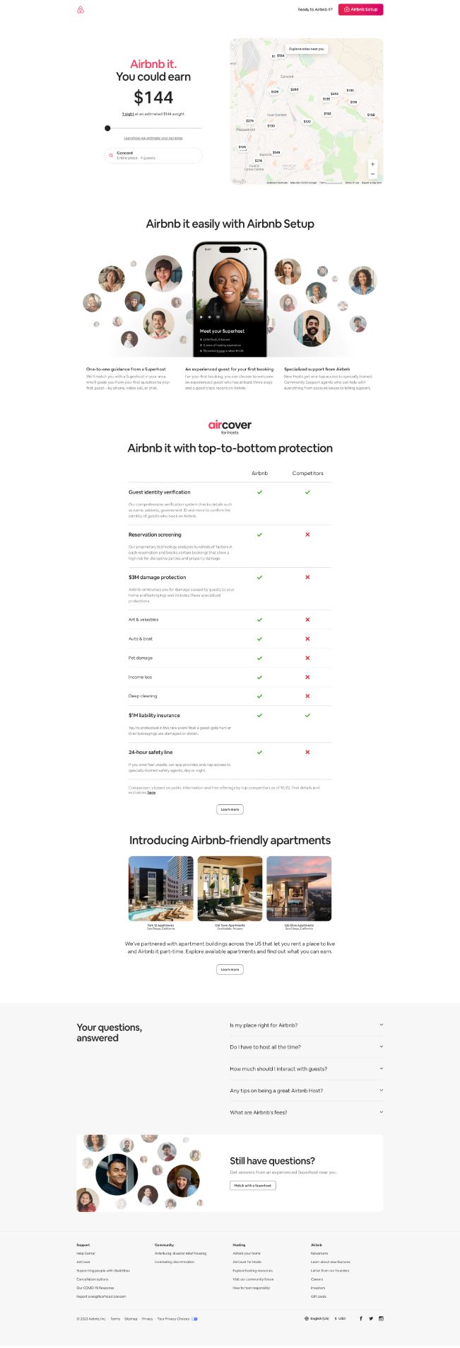
How they got it right:
- Uses an interactive tool (slider) to highlight how much a person could make by taking advantage of the offer (using Airbnb setup to become an Airbnb host).
- Highlights the three major benefits of using Airbnb setup.
- Details how Airbnb protects hosts to ease concerns.
- Shares FAQs.
- Gives visitors an easy way to reach out and talk to a person with more questions.
- Includes friendly, smiling images of people.
25. Airmeet: Minimalist design allows key information to stand out
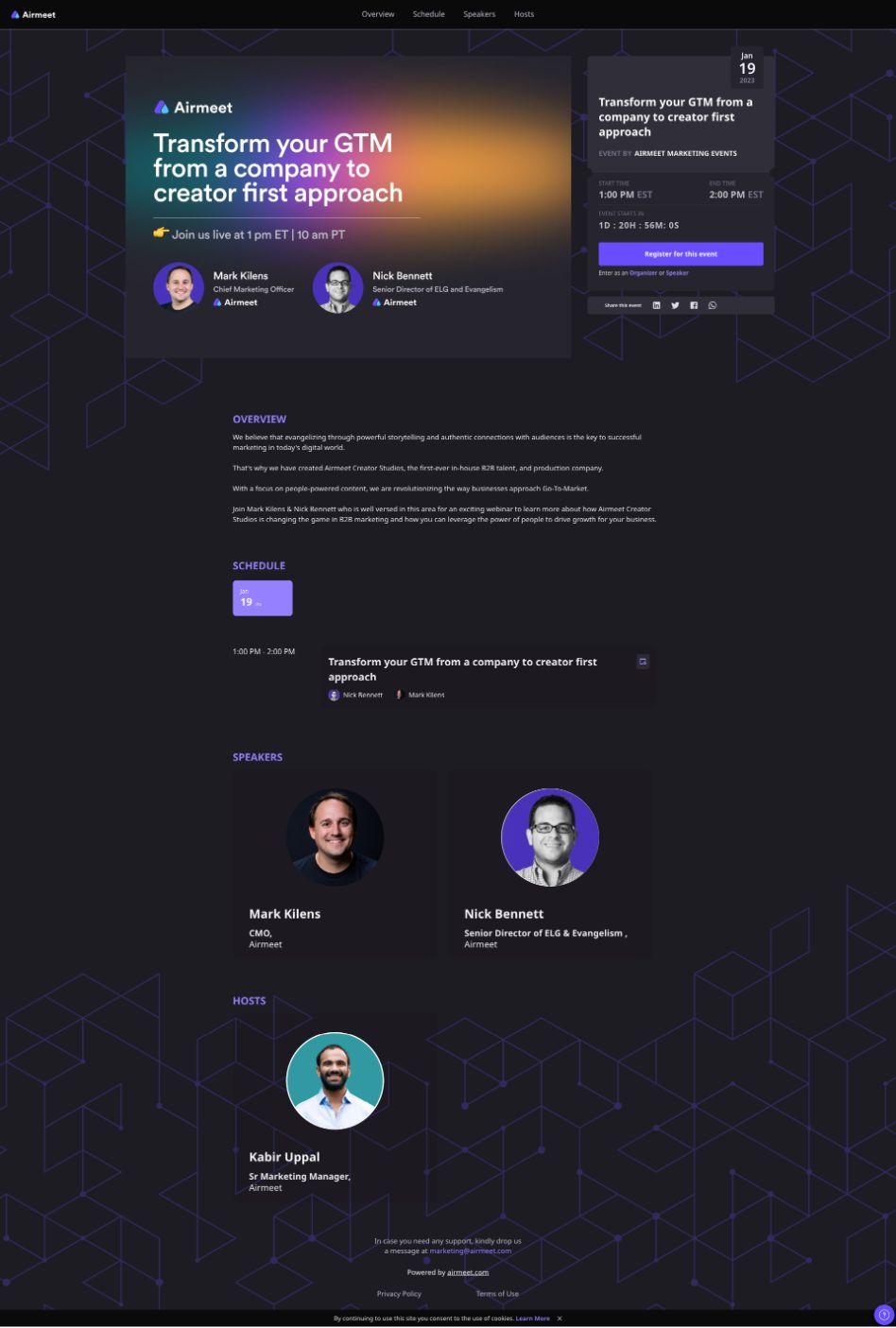
How they got it right:
- Clean, modern design that allows the CTA to stand out.
- Emojis help keep the tone of the page playful, friendly, and relatable.
- Makes use of a live countdown to create a sense of urgency to registering.
- Includes smiling headshots, names, and titles of the speakers.
- Short, but effective, value-focused copy.
26. California Pools & Landscape: Pool company capitalizes on video
Editor's Note: California Pools & Landscape is an IMPACT Client
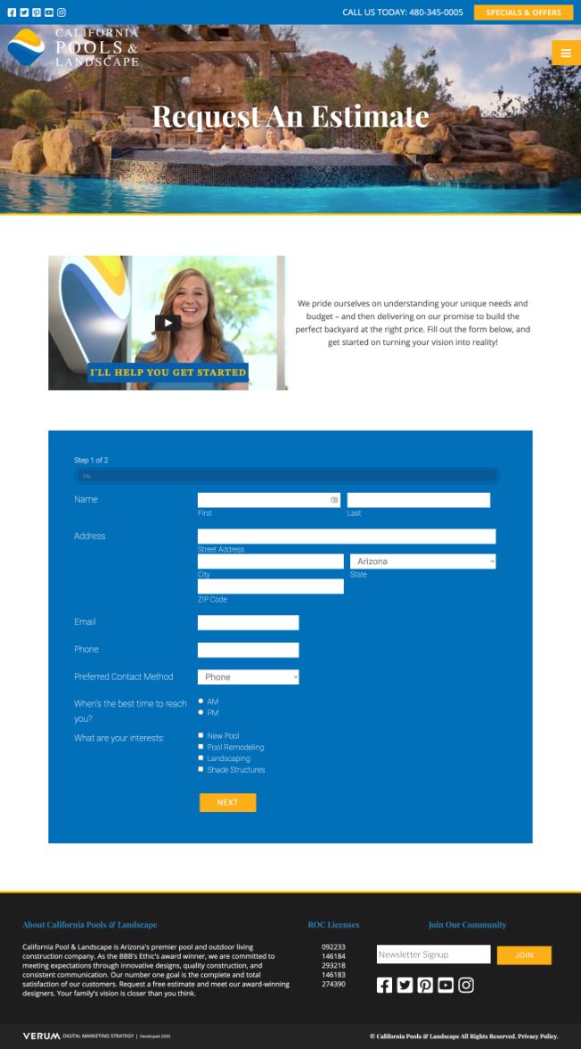
How they got it right:
- Uses eye-catching and aspirational video to grab your attention.
- Hero visual includes people to help the visitor envision themselves in a pool from the company.
- Page design includes a video with a real team member.
- Video details the process that occurs after you fill out the form.
- Removes navigation and all other distractions
27. KissMetrics: Data tool uses social proof to build credibility and support its claims
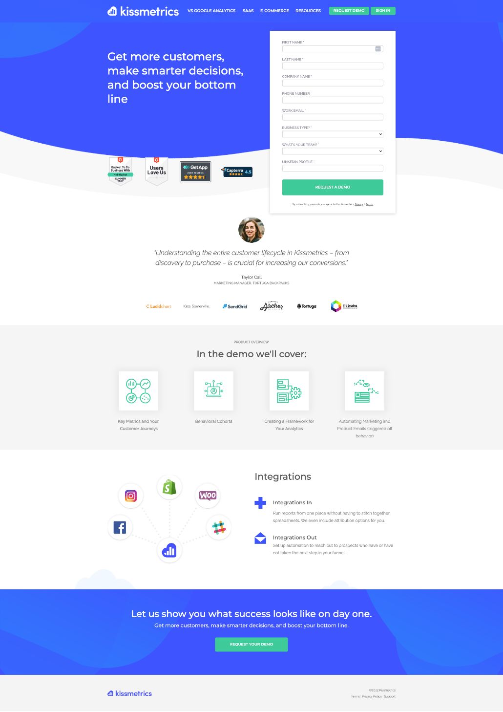
How they got it right:
- Large, value-focused headline.
- Includes social proof in the form of reviews and awards from reputable names in the hero.
- Form included right in the hero of the page.
- Includes testimonial from a real customer, including a headshot, name, and title.
- Highlights logos from other reputable businesses using their tool.
- Details what the demo includes.
28. Drift: Messaging tool lets you preview what you're getting
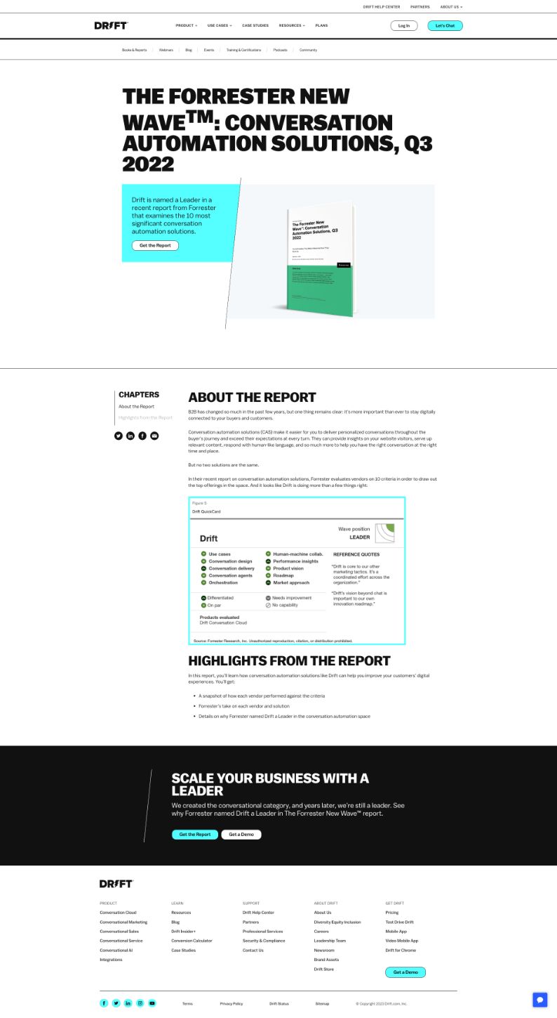
How they got it right:
- Dynamic hero draws your eye to an image of the report.
- Shows an example of a page from the report so you know what it looks like.
- Includes highlights of what's included in the report.
- Begins and ends the page with a call-to-action to convert so it can't be missed.
- Short, focused page design.
29. Netflix: Streaming company makes conversion as easy and risk free as possible
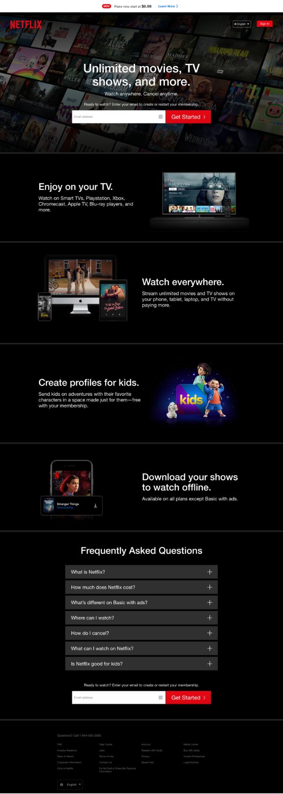
How they got it right:
- Makes converting as easy as possible — one field and one button.
- Draws your eye to convert with a bold red call-to-action button.
- Eases concern by letting you know you can cancel anytime.
- Highlights key benefits and features as you scroll.
- Answers FAQs.
- Shows you what the experience of using Netflix will be like using mockups of different devices and actual titles included with your subscription.
31. LastPass: Password tool uses concise copy to highlight its value
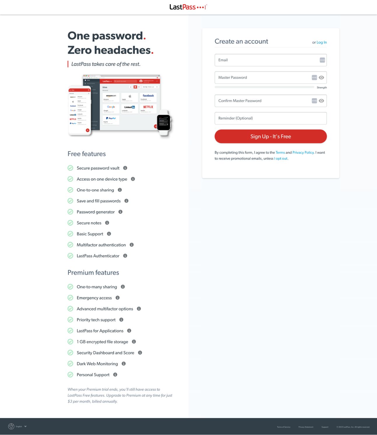
How they got it right:
- Captures experience and value of the tool in a four-word headline. It's easy to understand and powerful.
- Showcases the user experience of the tool in device mockups.
- Highlights the features in a clean, easy to skim list. (Bonus points for emphasizing the length of the list by requiring you to click to view them all.)
- Bright red button guides your eye to the conversion form.
- Removes navigation and all other distractions.
32. Stitch Fix: Clothing service uses image and video to show you what you're getting
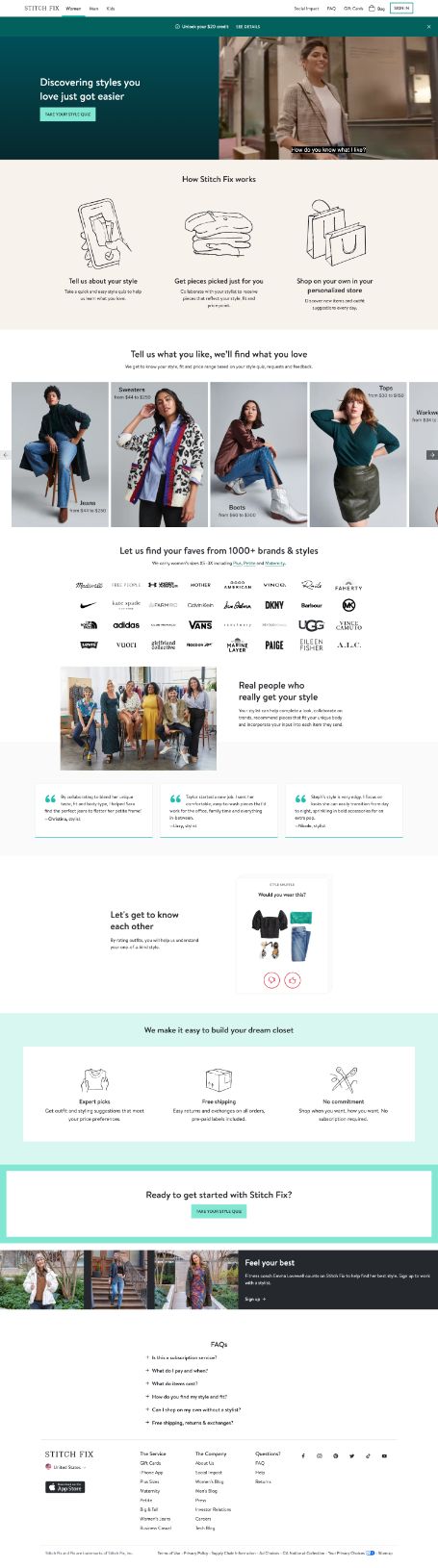
How they got it right:
- Leads with a video to explain the value of converting.
- Explains how the service works in three simple steps with simple visuals.
- Shows examples of the types of outfits a user can receive.
- Highlights diverse user base and includes copy making it clear that Stitch Fix caters to different body types and life stages.
- Includes well-known clothing brand logos they work with to build credibility.
- Highlights key benefits of signing up.
- Includes FAQs.
- Shows pic of real stylists who a user could work with, along with names and stories from them.
33. Yale Appliance: Appliance retailer highlights its step-by-step process
Editor's Note: Yale Appliance is an IMPACT client.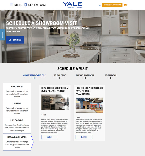
How they got it right:
- Big, beautiful imagery in the landing page design's hero grabs your attention.
- Incorporates a call-to-action button right into the hero.
- Make it easy for the user to self-identify and take the next steps that fit their needs.
34. HubSpot: SaaS company shows you exactly what you in their download
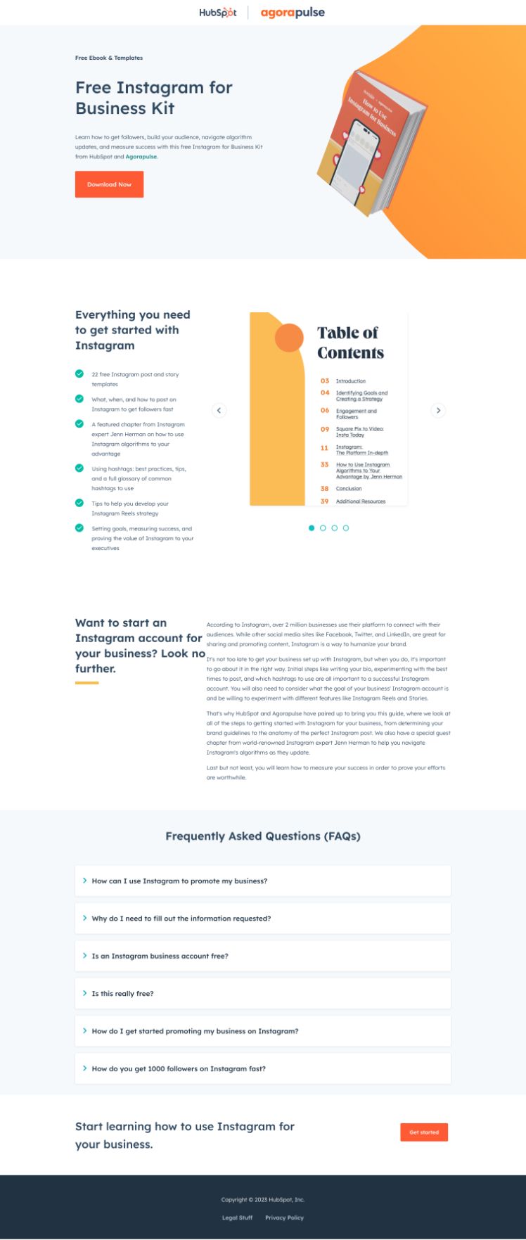
How they got it right:
- Show you what the offer looks like right in the header.
- Uses a bright orange call-to-action to guide you to the conversion point.
- Summarizes the value of converting in short, direct bullet points.
- Includes a preview of what the guide looks like.
- Includes FAQs.
35. Salesforce: SaaS company makes converting quick and easy
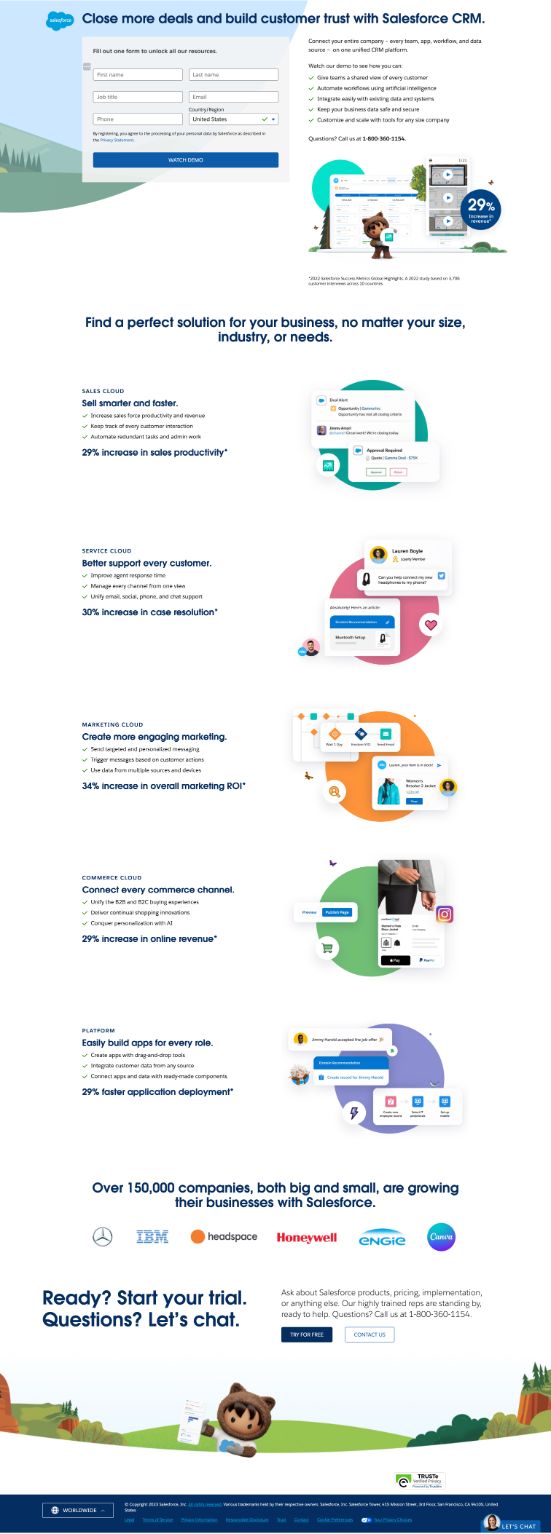
How they got it right:
- Makes it easy to take action without scrolling — form and key value of offer summarized in the hero.
- Offers two ways to get in touch with someone if you have additional questions (live chat and phone call).
- As you scroll, the page highlights each tool the company offers with a value-driven headline and also includes data to support its claim.
- Includes "Over 150,000 companies" and logos of well-known brands as social proof.
Showcase your value, win over leads
While many brands continue to debate gating offers, landing pages are evolving.
However, they remain an essential part of explaining your value to your audience and creating an effective inbound marketing strategy.
Want to learn more about generating more leads? Check out our course "Inbound Lead Generation & Conversion Optimization" in IMPACT+.

May 28, 1pm ET: Live Workshop with Marcus Sheridan
/Assets/Icon%20Library/x%20corp.svg)
/Assets/Icon%20Library/whatsapp%20logo.svg)
/Assets/Icon%20Library/Email.svg)
/Assets/Icon%20Library/Arrows/Grey%20Arrow%20-%20Prev.svg)
/Assets/Icon%20Library/Arrows/Grey%20Arrow%20-%20Next.svg)