Topics:
Lead GenerationSubscribe now and get the latest podcast releases delivered straight to your inbox.
 While I’m not one for routines, every Sunday starts the same way for me.
I wake up, head for breakfast with my friend Justin, order the full stack of blueberry pancakes (because I don’t play), and finally, head to the local bookstore.
I buy a lot of books. Some might say it’s a problem, but other than my complete disregard for the environment – I've tried! I just can't get into books on the iPad – I think it's perfectly normal.
When it comes to buying books, I’m a sucker for signage. I’ll breeze past the same stack of books labeled “Noteworthy Paperbacks” one week, but when they change the sign to read “Books Everyone Must Read” the next, I’m all in.
Same books. Different signage. Different result.
It’s basic psychology, and it’s at work every time your website visitors click – or don’t click – your call-to-action buttons.
But are you giving it enough thought? Can you increase conversions on the “same stack of books” by simply changing up the button text?
We did. Here’s how.
What we did, and why we did it
As a marketing team, we’re adept at changing right at the precise moment when we feel we’ve plateaued. Sometimes even before.
Our flagship offer has long been The Beginner’s Guide to Inbound Marketing. It’s a highly educational guide that helps people both plan and execute a more prospect-driven marketing strategy. It’s always done a great job of converting at a high percentage, but as 2014 began to wear on, it was clear it wasn’t getting any better at doing so.
We’ve always made sure to update the ebook to ensure relevance and quality, however if conversions plateau, these changes don’t impact the overall organizational goals. After all, people only realize the true value of the material only after they’ve converted.
After reviewing the overall performance of the page using HubSpot’s Page Performance tool, it was clear that traffic wasn’t the problem. In fact, over the course of a year, The Beginner's Guide was our second-most visited landing page on our site. (BlogAbout, our super cool blog title generator ranked first.)
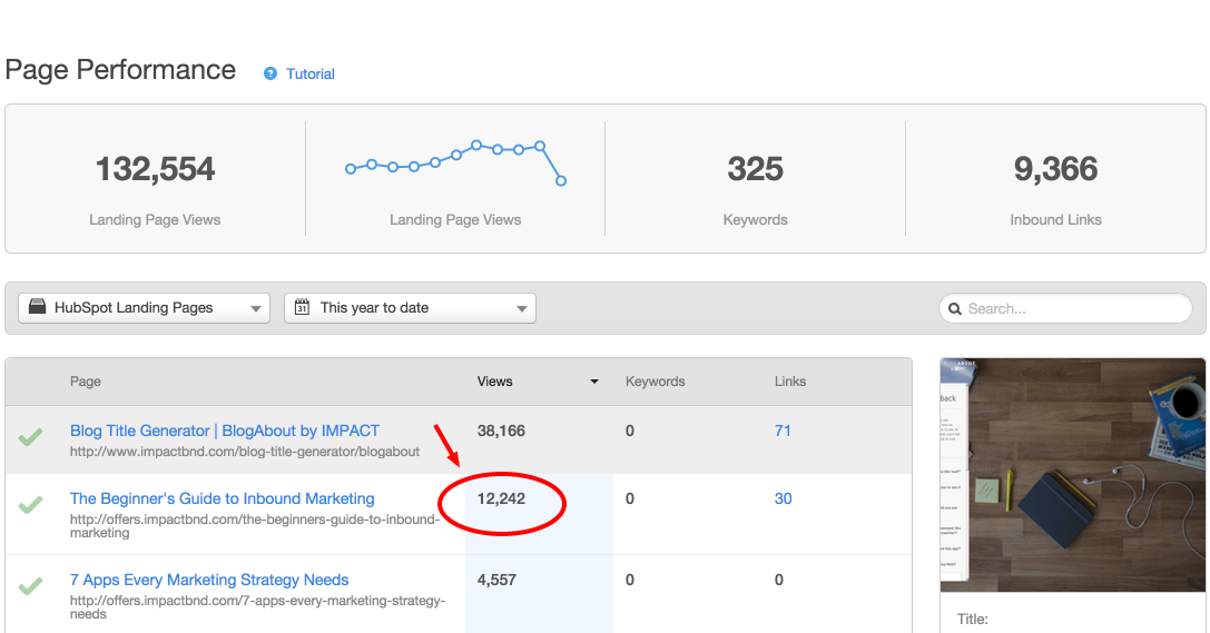
Sure, we could’ve worked to drive more people to the page, but the real opportunity was improving the traffic-to-lead conversion rate. To fully optimize the page for the visitors it was already attracting.
There were a few options for doing this:
- Shorten the lead form – This would only hurt us in the long run, as from a sales standpoint, we already ask the minimal amount of information necessary for us to quality someone as a good lead. This would be counterproductive.
- Rewrite the page – We tried this. It impacted conversions only slightly. The content was good, we simply tried to shake things up. This wasn’t the answer.
- Change the headline text – We tried this as well. We changed the main header from the title of the ebook to the main benefit: Attract and convert more customers on your website right now. Again, no change.
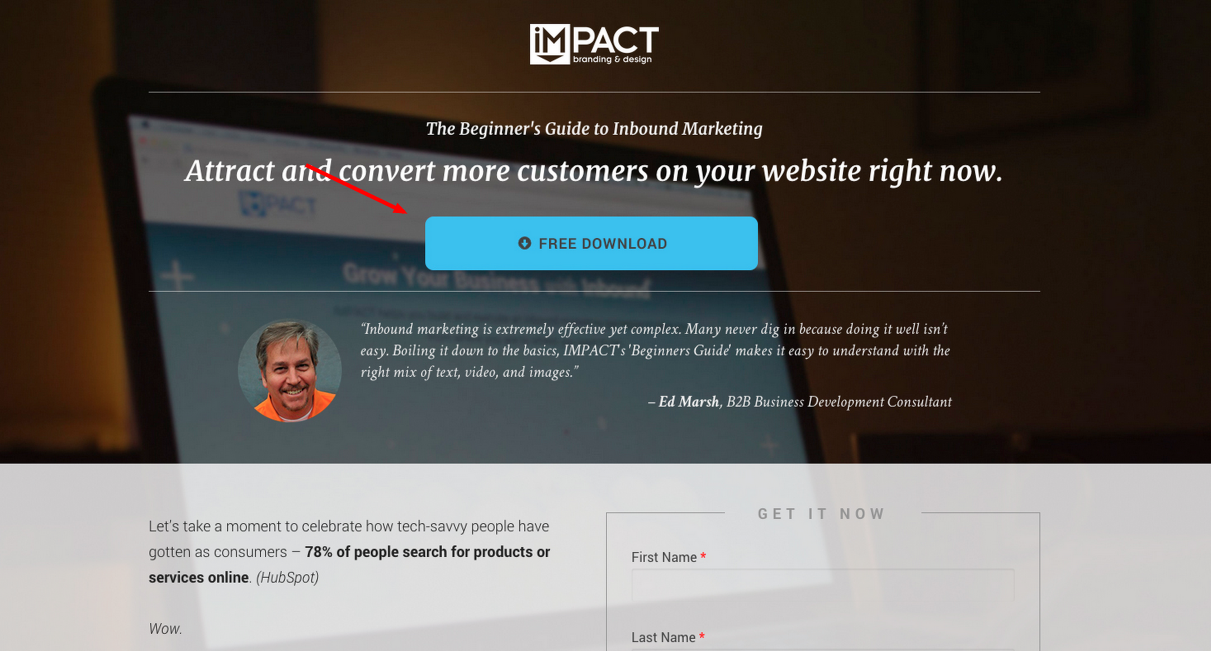
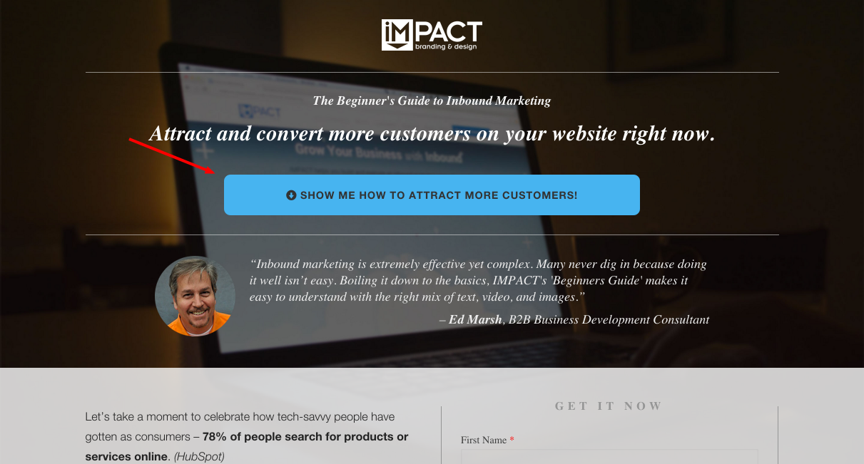
- Change the button text – Finally we figured, what’s the main point of action on the page? It’s the button that visitors click to get to the form. We changed it from the standard “Free Download” text to the more actionable “Show me how to attract more customers.” Bingo!
Here’s what the landing page used to look like:
Here’s the subtle – yet huge – change we made to the button text.
The result, after only one month, was an increase in conversions of 78.5%. (This screenshot was taken in HubSpot on November 3rd, so that's why November looks pretty scary.)
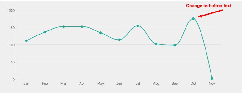
Turns out it was the smallest possible change to the page that delivered the most significant results.
Too many times marketers expend effort and resources trying to dump more traffic on a problem. It’s a lazy approach, as the solution almost always involves doing something more effectively rather than simply doing more of something.
Our thought process
Joanna Wiebe of Copy Hackers has an interesting concept when it comes to writing button text that I’ll detail here.
Put yourself in the visitor’s shoes and ask yourself, I want to [fill in the blank].
On our website, people want to generate more leads, rank higher in search engines, acquire more customers, increase revenue. We know this because we know our audience.
So we changed up the button text to reflect this on the landing page. Rather than "Free Download”, our visitors are thinking, “show me how to attract more customers.”
That small tweak was enough to almost double conversions.
It’s the same reason why I bought books off of a display table that I previously ignored the week prior. The change in verbiage persuaded me to act. It played more accurately to my psyche as a buyer.
“I can’t miss out on these must-read books!”
How you can improve your button text
How about your website? What would your visitors be thinking?
This should be the catalyst for writing impactful button text that drives conversions.
This can change depending on which page or landing page your visitors are viewing, as each ebook or offer has its own unique value proposition.
So as an exercise, go through any of your pages that have CTAs or buttons on them and take Wiebe’s advice: put yourself in the visitor’s shoes.
What action do they want to take?
Start with, “I want to [fill in the blank]” and keep experimenting from there.
You may find that your visitors have been breezing past something of value this whole time.
All they needed was a little change in signage.
Free Assessment:

