/Assets/base/Navigation%20Icons/TAYA.svg)
/Assets/base/Navigation%20Icons/Sales.svg)
/Assets/base/Navigation%20Icons/Web%20design.svg)
/Assets/base/Navigation%20Icons/HubSpot.svg)
/Assets/Icon%20Library/AI%20Mastery.svg)
/Assets/Icon%20Library/Learning%20Center%20Laptop.svg)

Jan 16, 2015

Visitors come to your website looking for answers to their questions. They want to see how you can help provide them the solution they have been looking for, so don't waste their time monologging about yourself or beating around the bush.
But beyond not talking about yourself, what does having one of the best B2B websites look like in practice? Here are six great B2B websites that have nailed it by putting the needs of their audience first.
1. Asana
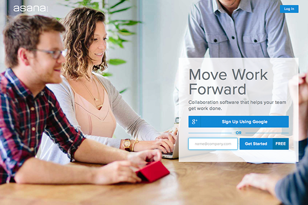
Asana's website smacks you with a huge, in-your-face call-to-action as soon as you land on the home page. No image sliders, no distractions. Just one quick statement on what they offer, accented by an impactful image to illustrate the collaboration and productivity they provide their users.
But wait, there's more! While that huge hero image makes their desired call-to-action pop, the rest of their website backs up why Asana is the product that will solve a company's communication issues.
In short, Asana articulates a key pain point that businesses face, and their website quickly and (most importantly) plainly explains why they are a solution.
Learn what the HubSpot COS is really capable of and how it can influence conversion rates.

2. Dropbox for Business
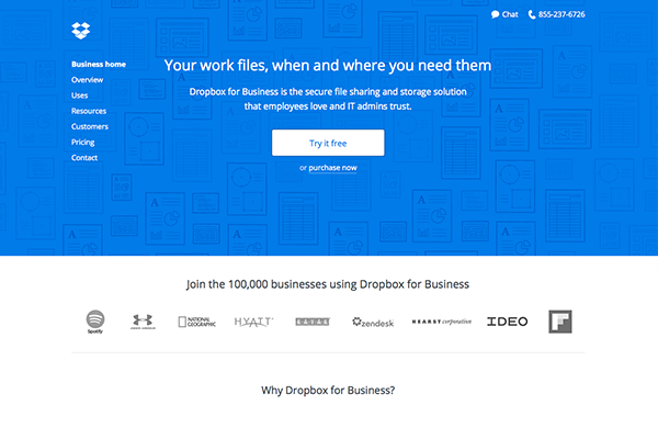 The Dropbox for Business page is a little overwhelming at first – there is a lot to look at and not quite enough hierarchy to keep your eyes focused on their main call-to-action.
However, further down the page they simplify things and get to the point.
Icons and diagrams help to emphasize the benefits they've listed. Both copy and imagery answer the question, "How will Dropbox help my team?" What's more, they directly answer the question, "How will Dropbox make my business more successful?" This is the experience. This is how they promise to go above and beyond their clients' current needs.
They then punctuate this message on each page by providing a quick and easy "Try it free" call-to-action, with the added promise that they will help to "Get your team in sync."
3. Evernote Business
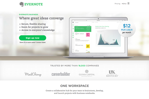
Evernote Business is a single-page website that showcases a concise call-to-action combined with straightforward pricing right in the hero image.
An animation further down the page quickly shows how easy the app is to use and promises simplification for team projects.
The rest of the page is just as clean and to-the-point, making the message and desired user path clear. Aside from the overall site menu and links in the footer, the only other links will simply take you to get signed up or to contact sales.
Small paragraphs of text list the benefits of Evernote for a business, and ample white space allows creates a better hierarchy and more legibility and comprehension of the points made.
4. Hootsuite
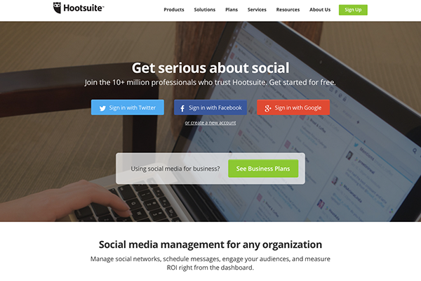
Hootsuite does a great job outlining the overall features, benefits and experience of their product. It's really all their homepage focuses on, as it should.
Right away, they ask visitors to pick the bucket their business falls into - with Pro level for smaller companies and Enterprise for bigger corporations. Interestingly enough, they have another pricing plan aside from those two, but they keep things simple by providing the two ends of their pricing spectrum and giving visitors a quicker way to learn more about the plan that fits them best.
Many of the other pages on the site go into much further detail on all the apps benefits, so it's great that their homepage is kept more simplified at the stages before a visitor has self-selected what they want to learn more about.
5. MailChimp
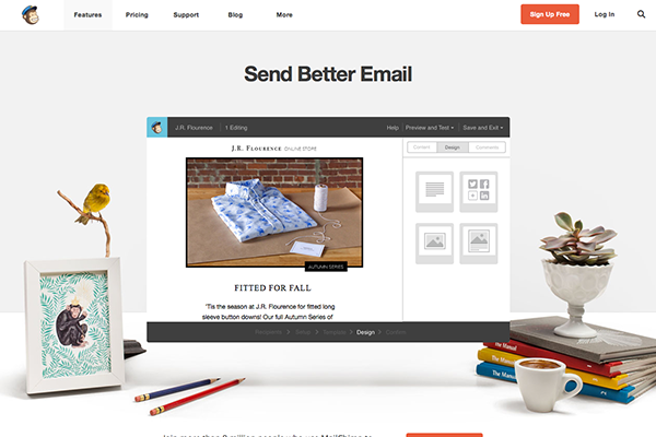
MailChimp's homepage is short and sweet. (Really, the page isn't even over 1,000 pixels high!)
The main call to action boldly promises you to "Send Better Email" through their services. A quick animation shows the ease of using MailChimp. A short line explains how many people currently relyon MailChimp's service.
That's it. But it works.
Other pages go into further depth on the product itself, pricing plans and how they help to optimize the email process for your business. But really, the site is kept clean and simple, reflecting the value proposition that MailChimp is a means to simplifying email for their clients.
6. Trello
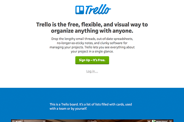
Trello, especially Trello Business Class, gets right to the point by offering to help customers to manage any project with anyone. They show how businesses can benefit from the security and control of the paid subscriptions.
The site is clean and organized, with plenty of white space. Each pricing plan page has a call-to-action for that specific plan, as well as details that follow up on the, "Why Trello?" question.
Whether you are an individual or a team looking for a way to keep better track of project progress, the Trello site communicates they promise to be there to help.
What Can We Learn?
These are just a few examples of B2B companies creating great website copy and a better web presence. But while this short list may not represent the whole of the B2B world, they demonstrate the transition of websites from an inward to an outward focus. B2B clients don’t just want to know all about your business’ accomplishments; they want to know how you will help solve their own company’s problems through your website.
Your website needs to show your audience the benefits you can provide them, whether you do this through short videos, simplified diagrams and images or just quick and straightforward blurbs.
Free: Assessment
/Assets/Icon%20Library/x%20corp.svg)
/Assets/Icon%20Library/whatsapp%20logo.svg)
/Assets/Icon%20Library/Email.svg)
/Assets/Icon%20Library/Arrows/Grey%20Arrow%20-%20Prev.svg)
/Assets/Icon%20Library/Arrows/Grey%20Arrow%20-%20Next.svg)