Topics:
Lead GenerationSubscribe now and get the latest podcast releases delivered straight to your inbox.
So, you have a website and a business to run, but the leads aren’t flowing in like you expected. Chances are you need to optimize your user journey, which may even require a redesign, but you need results fast.
That’s exactly why I compiled these four easy changes you can make to improve website conversions right now.
Implement these tactics into your strategy and you’ll be one step closer to better conversions, plus they’re available for the low, low cost of free.
You can’t beat that. Now let’s get started.
1. Add Better Conversion Points
The first thing you can do seems like a no-brainer, but you’d be surprised how many sites I come across that don’t have calls-to-action in extremely obvious places.
There have been plenty times where I’ve been on a page expecting to find a “Learn More” or “Contact Us” button or link, only to be deflated and confused when I don’t know how to proceed.
Take a step back from time to time and go through your website as if you were a user. Ask yourself a question, and navigate your site as if you didn’t know how to get there. You might be surprised at where you expect to have a link waiting for you, and where that link actually is (or isn’t).
Most users navigate to specific places out of habit to convert. Typical places you’ll want to have a conversion point are:
- Site Header or navigation
- Site Footer
- On product pages after descriptions
- At the end of a blog post
Of course, there are easy ways to see where you should place your conversion points. Implementing heat mapping for example...
2. Install HotJar (or a similar user testing tool)
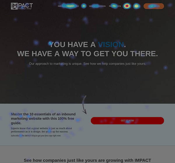
Think of a page on your website. Ready? Good. Now, tell me what the highest clicked section is.
If you don’t have heat mapping on your website, you probably can’t (at least not with absolute accuracy).
By tracking this type of user data, you’ll uncover areas of confusion, sections that completely resonate, and other tidbits that will help improve your user experience and journey.

Recording how users interact with your site pages will enable you to find places that they hoped to find a link, but didn’t, enabling you to put that conversion point in (see how that connected nicely). In other words, it helps you deliver the right content at the right time.
There are some awesome tools out there such as Hotjar and CrazyEgg (both with free and paid versions) that will peel back your site and let you get this information.
With both you can see where people click, scroll to, or stop scrolling on a given page and determine what content they find useful and want to learn more about.
If 75% of users aren’t going below the fold of your page that’s a good sign that they don’t see the value in your content, don’t know that they’re in the right place, or aren’t being guided to keep scrolling.
Knowing this, you can change content and messaging so users don’t get lost or frustrated and can get to their goal easier.
3. Improve Your Forms
One of the most important parts of your user journey is where the form and it’s normally one of the last things people think about. (So much so, I wrote a post about it. Check it out here.)
Make sure that your forms are optimized for conversions. That means only using necessary fields. On the first pass, you may think you need to collect every piece of information at once, but think again. One experiment found that a five-field form outperformed a nine-field form by 34%.
And it makes sense when you think about it. The shorter the form, the less daunting it appears to your users, lowering the friction of converting.
No one really likes filling out a form, so making it as painless and easy of a process as possible, will lead to better website conversions.
4. Use Color Wisely
Color? Really? Absolutely!
Choosing the right color for your calls-to-action can dramatically increase their effectiveness.
Experiment with using different hierarchies of colors in your company’s palette. It’s never a bad idea to A/B two different color CTAs with the same copy and see which performs better.
Two sure-fire (pun definitely intended) colors that draw attention and increased conversions are red and orange.
Basic color theory tells us that the human eye is instinctively drawn to these colors.
While red and orange may not necessarily go with your color palette, they should definitely be an option in your tool belt for boosting conversions and improving the user journey.
Using red or orange on your bottom-of-the-funnel CTAs and form submits do typically lead to increased conversions. (In fact, Performable was able to increase their rate by 21%.) QuickSprout even put together an awesome infographic on How Colors Affect Your Conversion Rates.
There are those who will say colors will never make-or-break your CTAs, and while I tend to agree, after all content is what is going to drive your journey, color does have a huge impact.
If you’re looking for more information on improving your CTAs, and specifically how color can (or can’t) boost conversions, check out this article from ConversionXL on Which Color Converts Best.
Conclusion
There you have it. Four easy things you can do right now to improve your website conversions.
By selecting the right colors and placing CTAs in the right place (you didn’t forget about that heat mapping software we discussed did you?), you’ll get more visitors to your newly optimized forms and see increased conversions in no time.
All that’s left to do is to get started. So, go!
Free Assessment:

