/Assets/base/Navigation%20Icons/TAYA.svg)
/Assets/base/Navigation%20Icons/Sales.svg)
/Assets/base/Navigation%20Icons/Web%20design.svg)
/Assets/base/Navigation%20Icons/HubSpot.svg)
/Assets/Icon%20Library/AI%20Mastery.svg)
/Assets/Icon%20Library/Learning%20Center%20Laptop.svg)


 Quiet on the site! Links, landing page, call to action!
That’s not quite how it goes on a movie set, but the end goal is the same. Just as producers want people to take action and go see their movies, you want your website visitors to take action and convert into leads for your company. In order to do this, you need to make sure that your calls to action are drawing the interest of a blockbuster, rather than a flop.
What your company provides to the customer will ultimately be your feature film, but think of your calls to action as your sneak previews. A well-designed CTA can help push customers deeper into your sales funnel, whereas a boring one may leave your theater empty as potential leads seek out a more engaging website.
To help inspire your next big call to action, check out these 21 examples of companies that have created great CTAs. Browse through them, and see if you can mix and mash some of these 7 great techniques to create your next great conversion tool.
7 Great CTA Techniques:
- On-page contrast
- Use interesting shapes
- Integrate images of your product
- Provide incentive
- Compelling text
- Segmentation
- Include a supporting secondary CTA
21 Examples of Effective CTAs:
1. On-page contrast
Your CTA is the star of your page, so let it shine. Try drawing attention to your call to action by utilizing contrast to give it some extra pop. Make your CTA button a color that provides a strong contrast to your background color. If matching colors isn't your website’s forte, you can also use white space to effectively highlight your CTA.
Check out these companies’ great CTAs for some ideas on how to use contrast effectively:
Dunkin Donuts
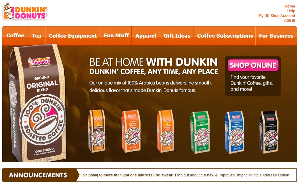
Dunkin Donuts provides a great examples of color contrast on their homepage. The pink button on a brown background makes sure that a viewer's attention goes right to the CTA. As an added bonus, the colors of the entire page match the colors of their company logo, which helps branding efforts.
Taco Bell
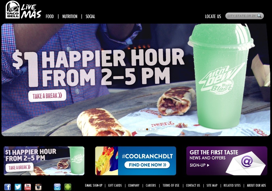
Taco bell also does a great job with using contrasting colors to create a few great CTAs on their homepage. The all black background helps to ensure that the calls to action are easily highlighted. All three are displayed on the bottom of the page, while a larger version of each scrolls across the top. With all of the focus on the CTAs, the odds are in Taco Bell's favor that their potential customers will navigate further into their site.
Birchbox
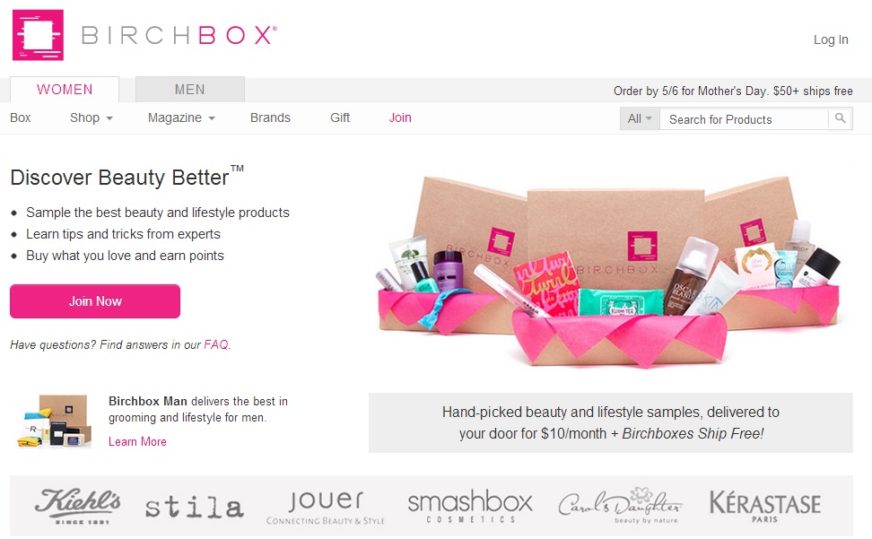
Birchbox proves that you do not need a lot of color to accentuate your CTA button. They effectively used white space to draw the focus to the pink call to action button on their page. Much like Dunkin, Birchbox used the colors of their corporate logo to increase visual appeal and brand consistency.
2. Use interesting shapes
Nobody likes seeing the same thing over and over again. Stand out from the crowd and make the button for your CTA something that will really stand out. Don’t make it so obscure that it destroys the appearance of your webpage, but have some fun with it. An unexpected shape will draw your readers’ attention to the call to action, and could help provide your visitor with the extra push needed to take action.
Here are some companies that have had some fun with the shapes of their CTA buttons:
Sonic
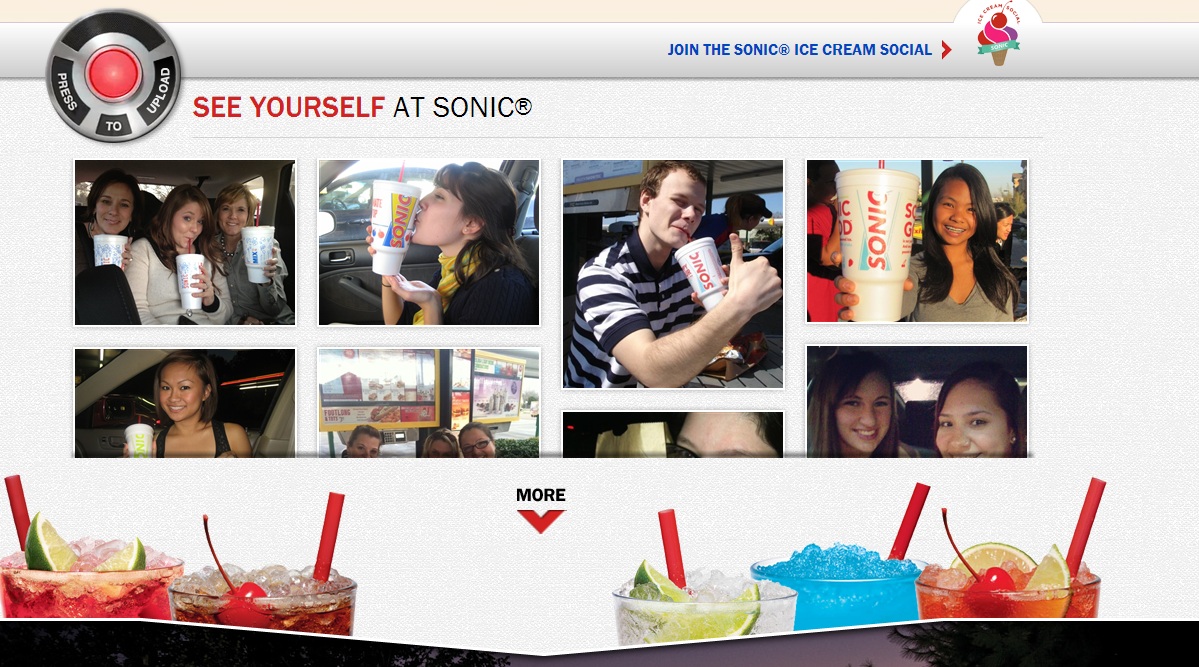
A lot of restaurants encourage customers to upload photos, but how many have a button like Sonic? People familiar with Sonic are very used to their "Push to Order" button, making this "Push to Upload" button that much more effective. This CTA encourages customers to upload valuable graphic testimonials of their experiences at sonic, and really stands out from other upload CTAs.
Baker & Hill
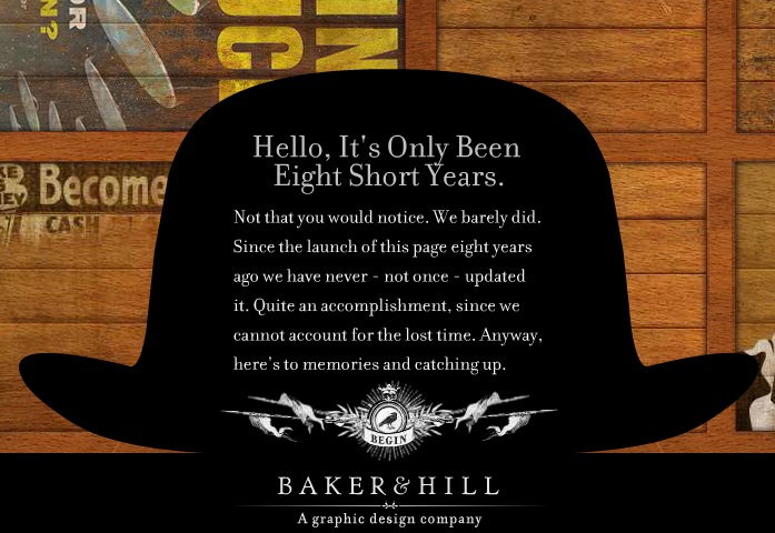
Baker & Hill take an interesting approach, and presents their website as a virtual tour. As part of the show, Baker & Hill asks the customer to click a button to begin. It starts as a simple animated circle, but quickly expands into what you see here. For a graphic design company, this opening CTA really gives those seeking a graphic designer a reason to proceed further.
Maybelline
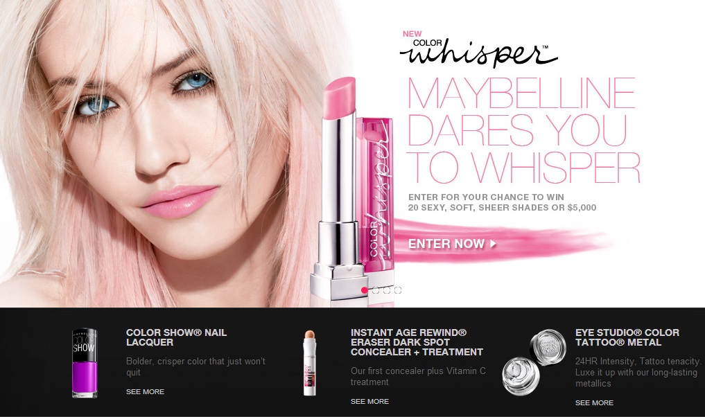
Maybelline also takes a fun approach to their contest CTA button on their new product page. The lipstick smear is consistent with the product being advertised, but is also more eye catching than any standard shape would be.
3. Integrate images of your product
People like to know where a call to action is taking them, so try letting them know visually. Work your products into your CTAs so that your customers know that what they see is what they’ll get. Showcase your product, and entice the customer to click your button to learn more about what they see.
These CTAs use some great visuals to encourage customers to navigate further into the site:
HubSpot

HubSpot always has great CTAs, but their homepage is a great example of product integration in a CTA. HubSpot shows their software in action on compatible devices and, when hovered over, tells the customer exactly where the link will be taking them. The use of a video to explain the company and software is also a great touch to make visitors take action.
Cape Cod Potato Chips
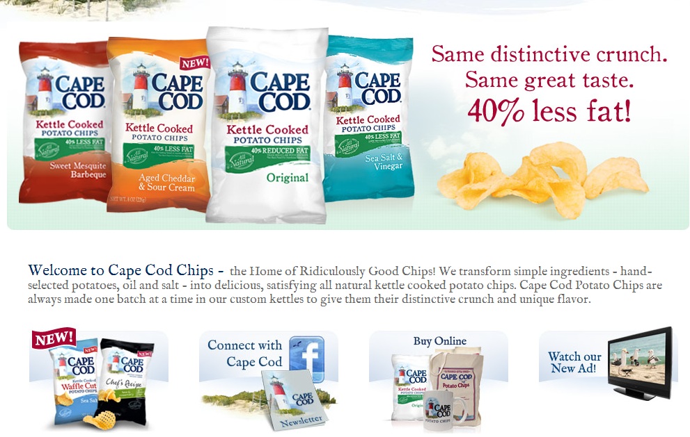
Cape Cod Potato Chips has a very attractive web page in general, but do a great job incorporating their products with their CTAs as well. The three CTAs here all tell the user exactly what they are being asked to do, and matches them with appropriate images to provide a little extra incentive to click.
Ben & Jerry's
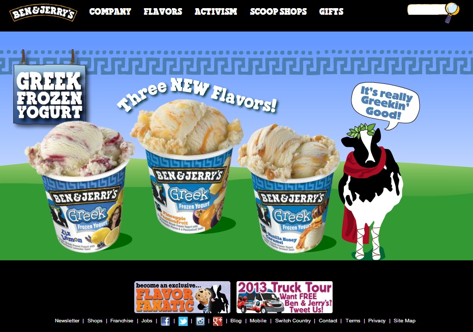
Ben & Jerry's takes the approach of creating a CTA that is strictly images of their ice cream. A visitor should easily be able to realize the implied action is to learn about these new ice cream flavors. The use of such an appetizing image with just the right amount of curiosity is a great way to get some clicks on this CTA.
4. Provide incentive
What benefit will the customer receive by clicking on your call to action? If people are unsure of how they will benefit from your CTA, they will probably just avoid it. To give your visitors an extra push, include a few words that will entice them to act on your offer.
Here are a few companies that know what their potential customers want to hear:
Parse
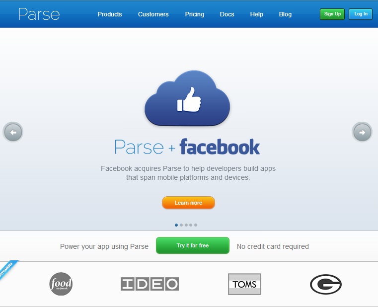
Free is always better. Parse does a great job highlighting the fact that app developers can try their services for free. As an added incentive, Parse mentions that no credit card is required. Even though this might be the case for many companies, it is always better to make it known to calm any nerves about the personal information that is required.
Resume Baking
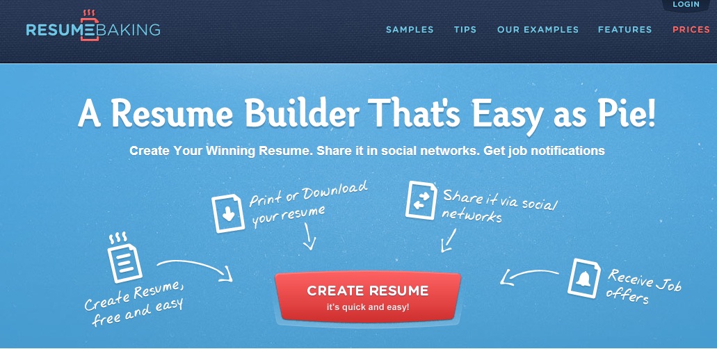
Nobody wants to spend any more time than needed creating their resume when searching for a new job. Resume Baking lets potential customers know that their service is free, easy to use, and, best of all, quick! The subtitle on this CTA seems so simple, but it provides some added value that could push the viewer to click it.
Netflix
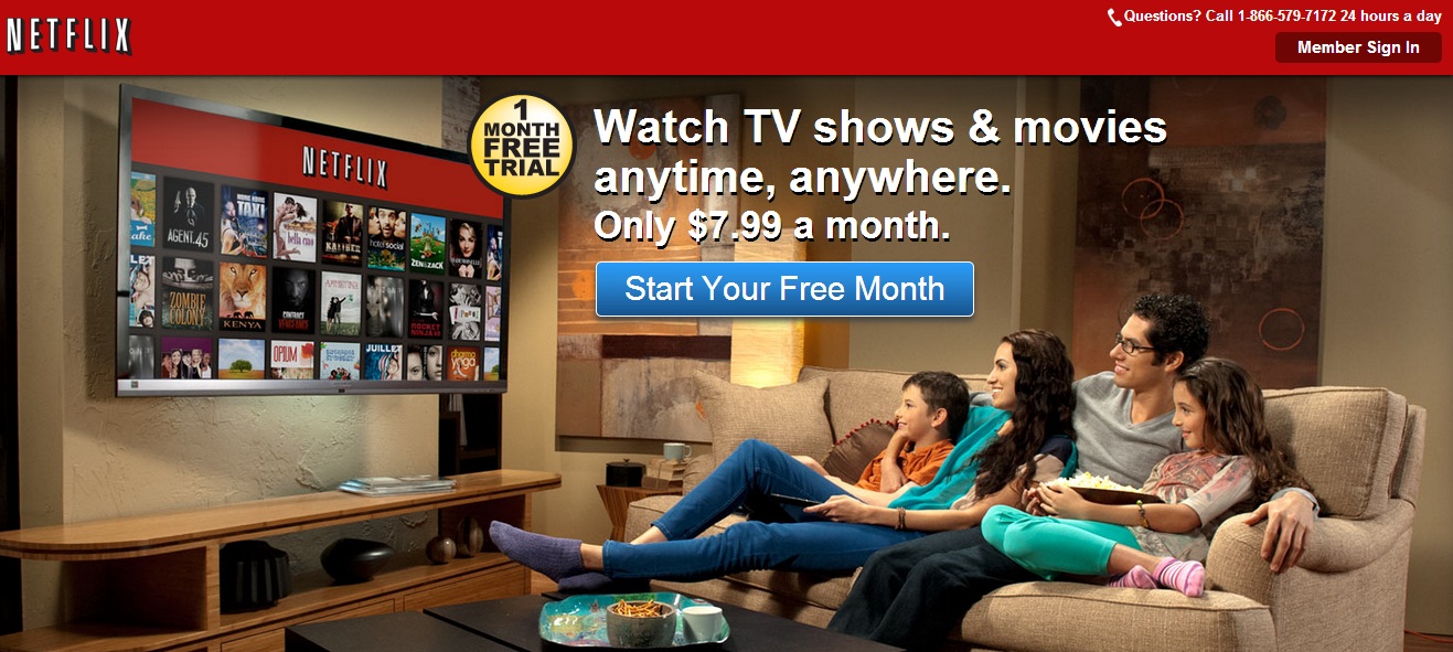
Everybody knows about Netflix, and everybody knows it comes with a monthly membership fee. But if somebody told you that you could get a free month, would you try it? The odds are yes, and Netflix does a great job conveying this important message in their CTA.
5. Compelling text
Very similar to providing incentive, well-written text can drastically improve a CTA. If you are using text on your CTAs it should be very clear and direct. Encourage customers to do what you want them to do by using concise, action-oriented language.
Check out how these companies have developed CTAs to make customers take the next step:
Buffalo Wild Wings
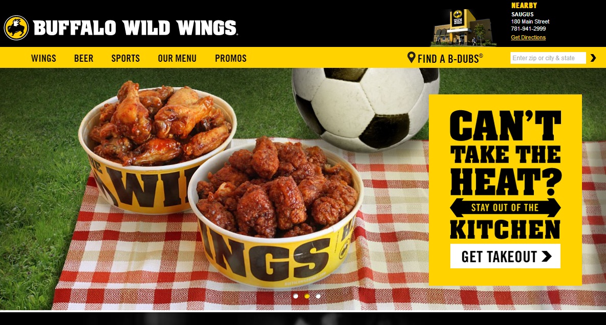
Buffalo Wild Wings does a great job with many design elements that were already mentioned, but more than anything else they have great text. The clever tagline around the CTA button is a great way to engage the viewer, and the words "Get Takeout" are very clear and action oriented. No gimmicks, just wings.
Dollar Shave Club
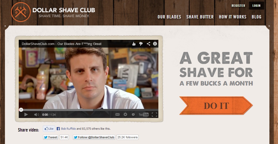
Dollar Shave Club could have been used as an example for any of the first four techniques, but we love their CTA button. "Do it." It is short and to the point, and it quite literally tells you what to do. It is also worth noting that their introductory video is hilarious, and really adds value to their CTA.
Old Spice
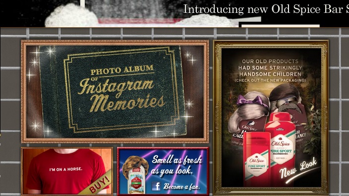
Old Spice is pretty well known for clever, slightly out of the box advertising. Their CTA for their new packaging does a great job staying consistent with their style. The intro text is more for comedic value than anything, but the "Check out the new packaging," tells you exactly what the CTA is asking of you without any context. If you removed every other word on this page, you would still know what the CTA was from those words in parentheses.
6. Segmentation
CTAs are not always a one size fits all solution. If your company deals with a variety of clients, try funneling each type of potential customer to the content that will be most applicable to their needs. Segmenting your CTAs is a great way to appease all of your customers without making your pages too busy.
Below are some great examples of companies using segmentation in different ways:
Zynga
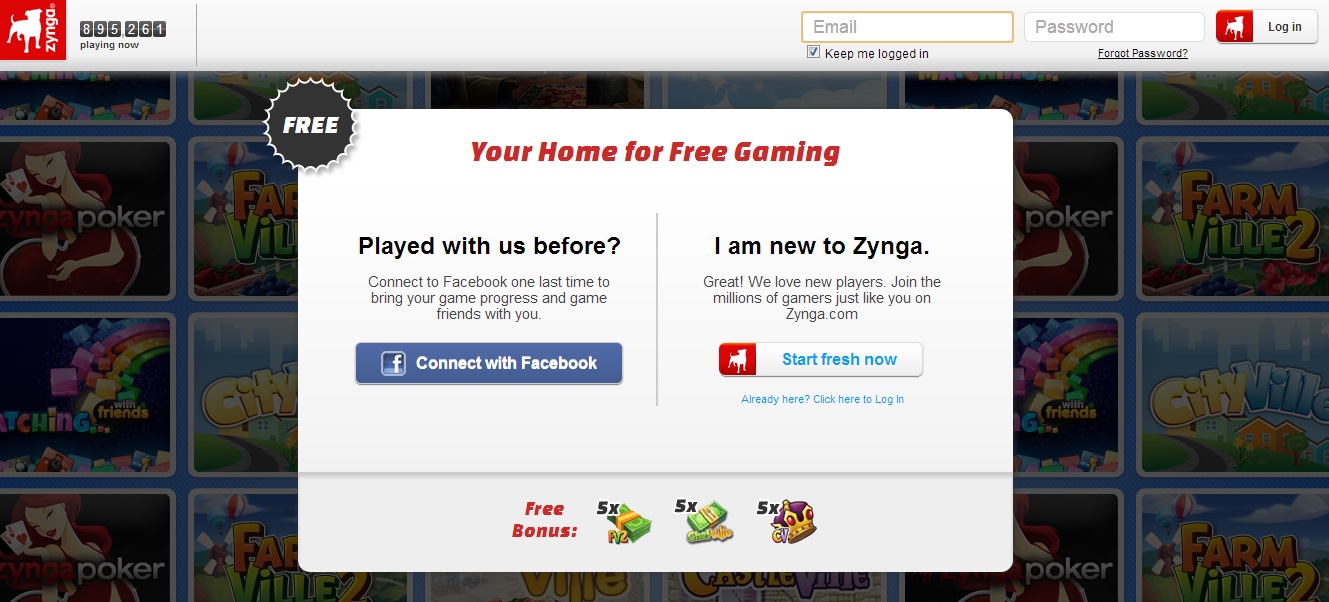
Immediately upon entering Zynga's site you are asked to sign up. Rather than a standard form that may cause people to shy away, Zynga gives you options. Connecting with Facebook has become very popular, so Zynga incorporated that segment to allow you to take the same action in two different ways.
Spotify
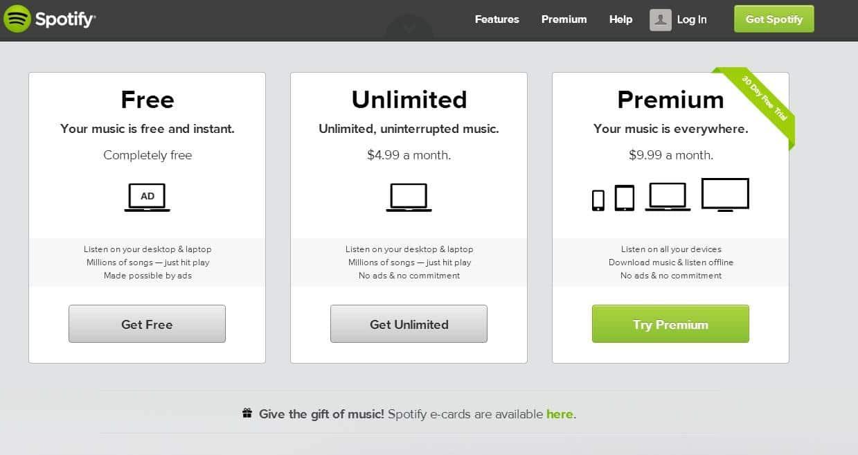
Spotify provides a great example of a CTA that allows users to take three different actions based on their preferences. The use of color to highlight their desired choice is a nice touch, but they did a great job of including a little something for everybody's budget.
Travelers
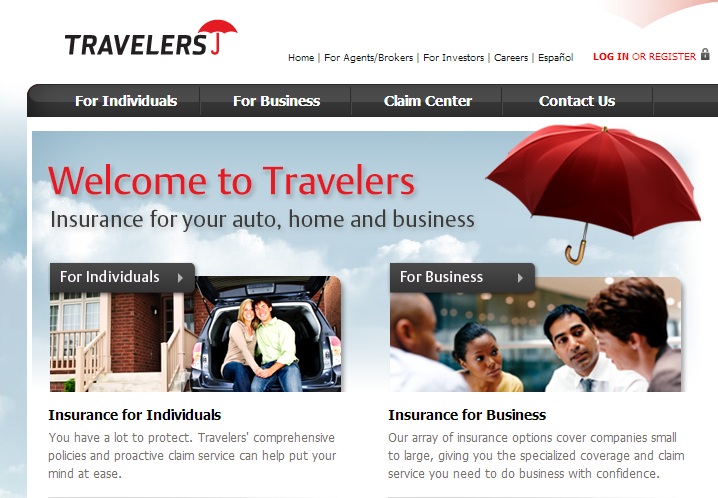
Travelers has to deal with a unique situation where they serve both individuals and businesses. It is good to see that Travelers understands that individuals do not have the same needs as businesses, and tries to funnel each group to appropriate offers. Surprisingly, many other insurance companies do not display these options as prominently, so Travelers has a small leg up on its competition.
7. Include a supporting secondary CTA
Don’t be afraid to throw in a backup plan. Maybe the people viewing your page are not ready to act on your feature CTA at the moment. Include a secondary CTA that will support your biggest call to action, such as a demo or trial.
For some ideas on how to use secondary CTAs to benefit your primary CTA, give these a look…
Nike
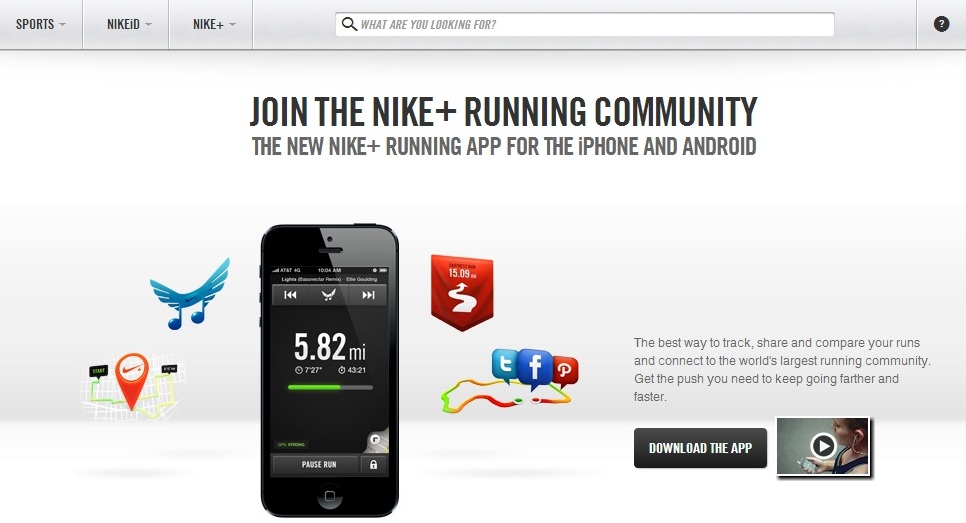
Download the app. Just do it (pun very much intended). Not very convincing, huh? Well Nike understands that people may want a little more information about their app, so they provide a secondary CTA in the form of an explanatory video. This secondary CTA is there strictly to support their primary CTA, and helps entice people to take action and download the app.
Dropbox
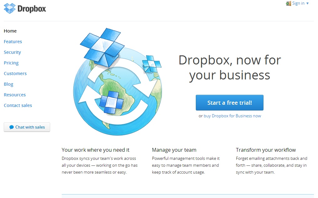
Dropbox actually takes the opposite route, and includes their primary goal as a secondary CTA. While this may seem like an interesting strategy, Dropbox understands that people are much more likely to purchase their services if they are able to try them first. The primary CTA is much more likely to generate immediate action, but it still supports the main objective of triggering a purchase.
Skype
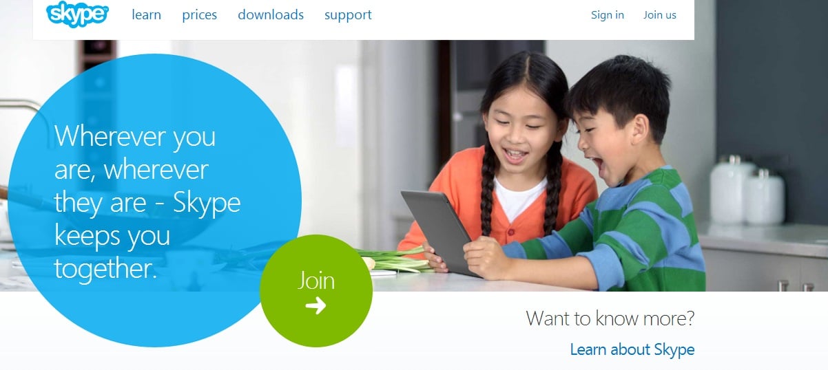
Skype provides the most straightforward example of a secondary CTA supporting a primary CTA. The secondary CTA that encourages visitors to learn about Skype directly supports the primary CTA of joining Skype. This is the most black and white way to utilize secondary CTAs, but it is still very effective.
Free Assessment:
/Assets/Icon%20Library/x%20corp.svg)
/Assets/Icon%20Library/whatsapp%20logo.svg)
/Assets/Icon%20Library/Email.svg)
/Assets/Icon%20Library/Arrows/Grey%20Arrow%20-%20Prev.svg)
/Assets/Icon%20Library/Arrows/Grey%20Arrow%20-%20Next.svg)