/Assets/base/Navigation%20Icons/TAYA.svg)
/Assets/base/Navigation%20Icons/Sales.svg)
/Assets/base/Navigation%20Icons/Web%20design.svg)
/Assets/base/Navigation%20Icons/HubSpot.svg)
/Assets/Icon%20Library/AI%20Mastery.svg)
/Assets/Icon%20Library/Learning%20Center%20Laptop.svg)

Apr 25, 2019
Fact: The vast majority of paid search traffic doesn't convert.
According to WordStream, about 96.25% arrive on landing pages and promptly abandon them.
And It’s not because “that’s just the way it is.”
High-performing ads in 2019 can generate conversion rates over 10%. So, if nearly all your traffic is leaving without claiming your offer, it’s a sign of disconnect in your campaign.
What’s worse, that disconnect could be hiding in plain sight: beyond your ad, in the post-click stage.
What Is the Post-click Stage?
Even if you don’t know it by name, it’s very likely you’re familiar with the post-click stage. No digital advertising campaign is complete without it.
To understand what it encompasses requires looking at the modern campaign as two stages separated by an event. Those are: pre-click and post-click.
The pre-click stage
This is everything that impacts whether a user clicks your advertisement. It includes but isn’t limited to targeting, the platform your ads are run on, the design of your ads, your offer, etc.
If you’re successful here, you generate a click-through (which is the event that separates the pre- and post-click stages).
The post-click stage
Everything from that click to the dedicated post-click landing page to the “thank you” page after the conversion, is considered the post-click stage. That includes trust signals, message consistency, page load speed, an optimized conversion ratio, etc.
Thus far, the marketing and advertising industries has focused much of its efforts on the pre-click stage.
Agencies, technology, professional development -- the majority are still geared toward ad creation and optimization. However, in the last several years, the post-click stage has become a greater area of focus for many businesses.
Today, the most successful advertisers don’t prioritize the pre-click stage.
They create equally balanced campaigns by spreading their resources from targeting to conversion and investing in post-click optimization.
What is Post-click Optimization?
Post-click optimization (PCO) is a relatively new process that incorporates three components:
- Scalable creation: Every promotion needs its own post-click landing page. Whether it’s with an in-house team, an advertising agency, or a dedicated platform, you need to be able to create at least one landing page per campaign.
- Personalization (or Segmentation): Within each promotion there are likely a number of segments you’re targeting. Each of your landing pages should be catered to each segment.
- Optimization: You wouldn’t just set and forget an ad group. You would collect data and optimize based on it. That’s the idea of optimization, only transferred to the post-click experience. With methods like A/B testing, post-click optimizers gather data to improve conversion rate of their landing pages.
When it comes to advancing the customer relationship, about three-quarters of marketers agree that message consistency has a “strong” or “extreme” impact.
Unfortunately, many of those marketers only pay attention to this in one half of any given campaign.
It’s at the click-through they start to run into problems.
And that’s probably due to the confusion surrounding landing pages.
Contrary to popular belief, a landing page is not just a page you “land on” after clicking an ad. A landing page is a web page created for the sole purpose of generating a conversion (sign up, download, buy, etc).
Landing pages are built with very specific elements (which we’ll get to soon) designed to persuade visitors to act.
If you create a targeted ad to a specific audience, for a specific offer, with a very specific design, and you send users to your homepage after they click it, you’re making them hunt for your offer through the navigation menu.
The same goes for any landing page that’s not tailored to the ad it comes from. Don’t make users work through your navigation. Don’t confuse them with multiple offers on a single page. Deliver exactly what you promised in the pre-click stage.
At a high level, this is the beginning of any good post-click optimization strategy. But what about a closer look?
5 Must-have Elements For An Optimized Post-click Experience
A successful post-click experience requires a combination of elements most web pages don’t feature.
As adoption of post-click optimization progresses, it’s becoming evident that high-converting ad landing pages have many things in common:
1. Quick Load Times
You know page load speeds are important for great user experience, but, do you know just how much they affect conversion rate? Do you know where user patience and average load time stand?
Widely circulated research claims over 50% of visitors will abandon a web page if it takes longer than three seconds to load.
Consider the implications of that on conversion rate.
If your ad generates 1,000 clicks to a landing page which takes longer than three seconds to load, fewer than 500 visitors are even going to see it.
But the odds get worse from here, according to Research from Google.
The report discovered that the average mobile landing page loads in a scary-sluggish 15 seconds.
With a load time like that, you’d be lucky to have one visitor stick around to see the page load.
Luckily, there are some simple ways to improve your load time.
Slim the Page Down
Pages can be measured in “weight,” or data size.
The more a page weighs, the longer it takes to load.
During their investigation of mobile landing pages, Google found that the biggest contributor to page weight was unnecessary images.
So, look at your landing page. Are all the images really adding value? If they are, can you compress them? Or save them as a different file type (JPG is smallest)?
Cut down on the number of images your page uses to greatly speed its load time.
Clean Up the Code
A page can look simple, but still be very complicated if it relies on lots of JavaScript.
On the back end of a web page, JavaScript enables all kinds of software, trackers, interactive features on the front end. It’s the powerhouse of page engagement, but at the same time, too much of it can really slow a page down.
A lot of pages contain too much -- but not because it’s actually needed. It’s because administrators neglect to remove old script that’s no longer usable.
Whether it belongs to an outdated analytics tool or targeting software from Facebook, every time new JS is added on top of the old unused stuff, it slows the page down.
With tools like Google Tag Manager, it’s easy to purge a web page of old and frivolous JavaScript, thereby speeding its page load time.
Switch to AMP
If you want to offer the fastest experience possible, switching to AMP may be the answer.
The Accelerated Mobile Pages project started a few years ago with the goal of speeding the mobile web through a framework that relies on stripped-down versions of common coding languages.
While, initially, it couldn’t support much more than static blog posts, today AMP has evolved to a framework capable of supporting progressive web apps and entire websites that load at near-instant speed.
That includes the creation of accelerated mobile landing pages, which load in a fraction of the time that traditional landing pages do.
The reason is that they’re built for speed, with a stripped-down version of traditional HTML. They’re also stored in Google’s AMP Cache, which allows for the delivery of a page as fast as possible, without too many server requests.
2. Message Consistency
Many of us take the trust instilled by simple design elements for granted.
For example, would you trust a scholarly article written in Comic Sans? How about a healthcare website with a rainbow color scheme?
Both would probably raise some red flags.
The same happens when your visitors arrive on a landing page that doesn’t appear to belong with the ad clicked on.
If the page features a different headline, color scheme, offer, logo than the referring ad, it’s going to create some confusion.
Confusion is the last thing you want people to be feeling when they get to your landing page especially since you’re requesting personal information: Name, email, address, credit card number even.
They have to trust you with all that and if you’re not consistent with what you’re offering them in ad, this won’t help your case.
Advertisers, on the whole, don’t have a reputation for treating personal information with care (selling, losing, sharing, etc). In fact, it’s very likely your visitor has been burned before.
Whether it was their fault or not (due to entering information on the wrong page or wrong form), they’ve likely been pestered with phone calls, drowned in spam emails. If you’re not a brand they recognize, they’re questioning your motives.
That’s why message match, at the very least, is crucial for establishing trust.
It creates a seamless, consistent experience.
It says to your prospect: You’re in the right place. You haven’t been redirected; you’ve advanced to the next step.
We made you a promise in our ad, and we’re fulfilling it here on the landing page.
Here’s an example of a Terminus display ad that goes to its respective landing page:

The ad headline and landing page headline are identical so people that click-through from the ad will know they arrived at the correct place.
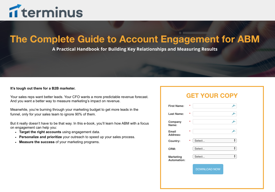
This is important since the headline is the first and biggest element recognized on each asset.
Next, the Terminus name and logo are both present on the ad and page to reinforce the source of the ABM guide.
Finally, the ad’s sub-headline “engage the right people and measure success” is very similar to the landing page sub-headline, “building key relationships and measuring results.”
All of these similarities are essential to connecting with your audience and delivering on the promises made in your ad.
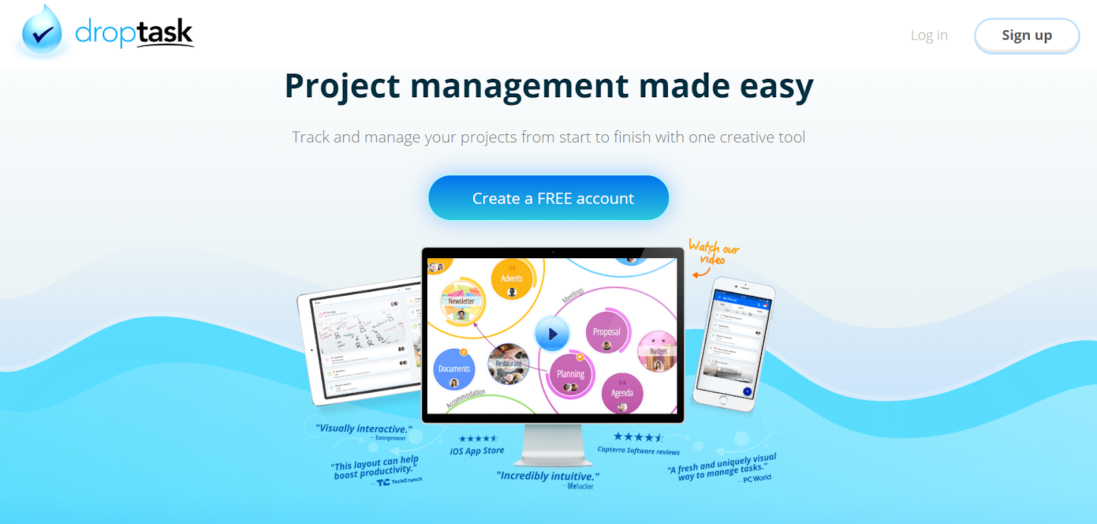
3. 1:1 Conversion Ratio
The term conversion ratio refers to the number of outbound links to conversion goals. In other words, how many opportunities the page has for people to click off of the landing page, rather than staying and converting.
On a landing page, the ideal conversion ratio is 1:1, meaning there should be only one action to take: convert.
While homepages and other website pages might have links to products, pricing, “contact us” in the footer. An optimized landing page does not. It’s sole focus is to get someone to convert on the offer at hand. This is landing page best practices 101.
When your prospects are likely switching between countless tabs, checking their phone, scrolling through social media, this is a way to keep them focused when they’re on your page.
On a page with a 1:1 conversion ratio, there’s nowhere else for them to go but through the call-to-action (CTA) or to bounce completely -- but that’s out of your control.
Here’s a great example of a 1:1 conversion ratio from Droptask:
4. White Space
Like an optimized conversion ratio, white space keeps visitors focused on conversion by eliminating on-page distractions.
Attention is hard to earn, but it’s even harder to keep.
So, when you have a visitor on your page, you have to make it as easy as possible for them to digest what you want in the short time you have them.
White space helps by giving elements room to breathe, and the brain, less to process.
This doesn’t mean your page should be largely empty; It means that a great page is designed like a great form in that it features only what’s necessary to earn the conversion.
Not only that, but white space is also one of those subtle elements that conveys authority and trustworthiness by making design appear clean and professional.
Clutter makes your page appear the online equivalent of a garage sale with goods strewn about, piled on top of each other.
White space gives the appearance of the layout at a jewelry store: calculated with room to highlight each element.
Don’t take our word for it. Have a look for yourself: Among these two screenshots, which do you find easier to consume?
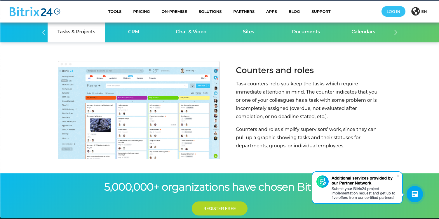
The first example contains white space, but is it enough?
We see a main navigation, navigation below that, then an image and paragraph which cover about 80% page width.
That chat module obscures some of the paragraph, and below that, copy creeps above the fold. The great majority of this page is covered, and all its content together creates an overwhelming pull of attention in several different directions.
The second example, however, directs our attention to an image of the UI next to some easily digestible text. There’s only one navigation menu and it’s not cluttered with links -- only two.
This page does not pull the eye in countless different directions, but drives us to the most important content by featuring front and center, with room to breathe.
5. Contrasting CTA button
Even with a 1:1 conversion ratio, you need white space to help guide attention to each element on-page. And even with both those elements, your efforts to direct attention could still fail.
That’s why it’s important to ensure your visitor knows where they need to click to convert.
This is why a contrasting CTA button is so valuable.
The theory behind this element traces all the way back to the origins of Gestalt psychology, which found that people don’t perceive their surroundings equally.
You’ll recognize the phrase “The whole is other than the sum of its parts,” meaning, perceptively, we prioritize based on importance.
Along with size, location, and proximity, contrast is one of the signals our brains use to determine what’s important.
High contrast means high importance. If it stands out, it will grab our attention.
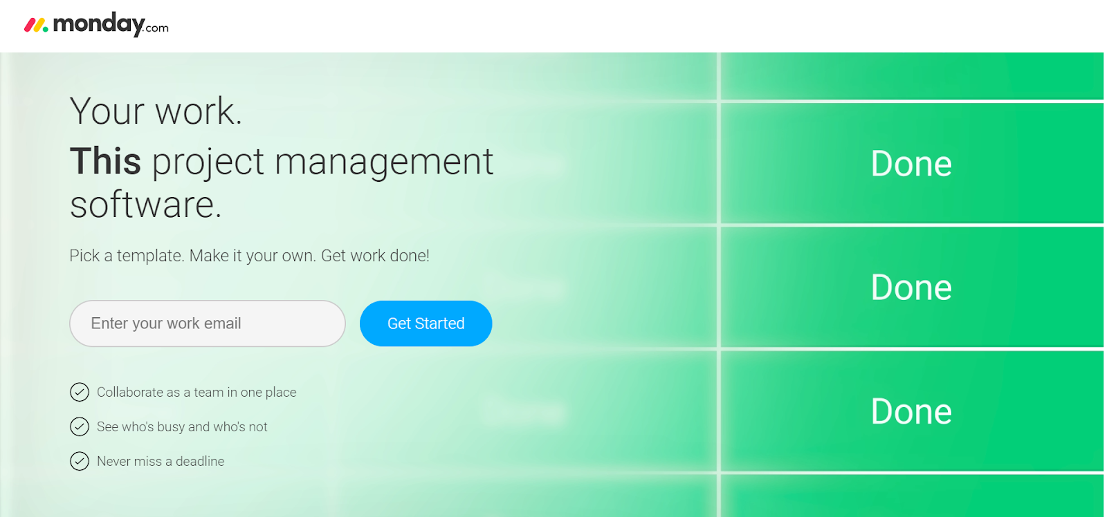
Knowing this, you can reverse engineer a button that will grab prospect attention by following the 60-30-10 rule.
- 60: Devote 60% of your color to the background. This will be a lighter color, likely white.
- 30: Devote 30% of your color scheme to the base. This base will help distinguish between the background and foreground, on elements like your form.
- 10: Devote 10% of your color scheme to the accent. This is your CTA button, and used sparingly elsewhere on the page.
When used like this, color can communicate importance very effectively. There’s no question, on this Monday landing page, where the visitor needs to click to convert:
Bridge the Optimization Gap
Optimization is necessary and a powerful tool for advancing customer relationships, but only if it’s used throughout the campaign.
Remember: Every dollar spent on the pre-click stage is wasted if the post-click stage doesn’t eventually convert. There has to be a balance.
Knowing the three pillars of PCO, and a few landing page best practices, you’re off to a great start. Now, go review your pre-click strategies and ensure you customize the post-click stage of those ads, emails, social posts, etc. with post-click optimization. Your conversion rates and bottom line will thank you.
Free Assessment:
/Assets/Icon%20Library/x%20corp.svg)
/Assets/Icon%20Library/whatsapp%20logo.svg)
/Assets/Icon%20Library/Email.svg)
/Assets/Icon%20Library/Arrows/Grey%20Arrow%20-%20Prev.svg)
/Assets/Icon%20Library/Arrows/Grey%20Arrow%20-%20Next.svg)