/Assets/base/Close.svg)
 ]
]
/Assets/arrow-facing-left--black-01.svg)
/Assets/base/Navigation%20Icons/TAYA.svg)
/Assets/base/Navigation%20Icons/navigation%20arrow%20-%20facing%20right-01.svg)
/Assets/base/Navigation%20Icons/Sales.svg)
/Assets/base/Navigation%20Icons/Web%20design.svg)
/Assets/base/Navigation%20Icons/HubSpot.svg)
/Assets/Icon%20Library/AI%20Mastery.svg)
/Assets/Icon%20Library/Gear%20icon.svg)
/Assets/Icon%20Library/Learning%20Center%20Laptop.svg)
/Assets/Icon%20Library/Click.svg)
/Assets/Icon%20Library/Link.svg)
/Assets/navigation-global--close-symbol-black-01-1.svg)
/Assets/navigation-global--close-symbol-black-01.svg)

/Assets/Icon%20Library/x%20corp.svg)
/Assets/base/Learning%20Center%20Resource%20Category%20Icons/Facebook_Messenger_logo_black.svg)
/Assets/Icon%20Library/whatsapp%20logo.svg)
/Assets/Icon%20Library/Email.svg)


So you’ve optimized your homepage perfectly for your desktop users. It has a lean layout, creative and clean content, precise SEO, and is complete with all the bells and whistles.
Excellent, you’ve successfully optimized your website for 50% of your users, but what about that other half?
Google found that between June and November of 2014, 48% of its users came from a mobile device, imagine the impact if they had chosen not to optimize their site for these users.
But it can be hard to figure out how to change your layout in order to optimize it for your users. How do you know what’s best for them? What isn’t necessary to show on mobile? What can be condensed?
To help spark some inspiration and creativity into your mobile website design, here’s a list of ten companies who got their mobile experience right for their users.
RetailMeNot
RetailMeNot specializes in organizing promo codes, coupons, and sales events for a variety of stores and companies both online and off.
RetailMeNot manages to keep their mobile website fairly similar to its desktop version, making the website much easier to figure out for those who are frequent users of their site.
If you look at the mobile website alone, you can see how they managed to condense the dual menu they had so it only displays their two highest priority buttons (coupons and halloween) while hiding everything else in the hamburger menu.

As you scroll down, the website still keeps it’s most popular deals towards the top with vibrant images to draw attention to them, while trending deals are smaller and less elaborate.
Other popular deals are lower down on the page and are easily accessible if the user wants to look through them. Otherwise, they can always search for specific deals on their own via the search bar.
Bloomberg Business
If your home page is plagued with a lot of content and sections it can be incredibly difficult to decide how to rearrange everything and determine what content to hide.
But don’t let your websites complexity intimidate you, instead, take a look at Bloomberg Business website for some insight on how to handle it.

Bloomberg Business’s desktop website has a heavy navbar, a few sidebars, and several sections leading to different blog articles and blog topics.
On mobile, they manage to condense the navbar into specific sections with related subsections, remove their sidebars, and display only today’s top articles first with a continuation of other current articles separated below them.
They also manage to give an appropriate amount of spacing between each section and the items within it, making each element more legible and digestible for the user overall.
Treehouse
Treehouse is a website that focuses on teaching people how to code in a variety of different languages. While you probably wouldn’t be taking these courses on a mobile device, that doesn’t stop them from developing a responsive layout for those viewing their website on this platform.
Treehouse’s layout is already fairly lean and flows nicely, so their transition to a mobile site has stayed consistent with their desktop websites style, but with some added functionality on mobile.
One area you can see this is with their mobile menu which slides in from the right side, moving the rest of the website with it so you can focus on the navigation.
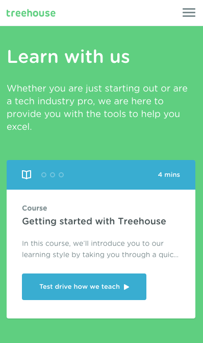
Another area of functionality is the “track”, “project”, and “topic” tabs under the “Choose how you want to learn” section.
On desktop, the content will simply change depending on what you click on, but on mobile, the page will scroll down to the area after you click one of the tabs to indicate where the updated content is. This is an excellent way to draw attention to sections that may change dynamically based on the user's actions, allowing them to see content that they may not initially see on a smaller device.
Reddit is currently in beta for their new mobile website which they hope will offer a better experience for those on mobile devices.
In comparison to the desktop site, their new mobile version manages to clean up their entire navigation so that everything is condensed under four icons.
Another interesting feature they currently have is the option to toggle between displaying the posts in list or compact view. Giving users this option not only enables them to choose what works best for their device, but also what resonates better with them.

Toyota
Toyota is a model website when it comes to choosing what content you do and don't need to display to your mobile users and how to recreate the layout based upon what’s remaining.
Besides the navigation, the first time you notice a change is above the fold; the subheader disappears to add more focus on the value propositions and buttons.
As you continue scrolling, you come to the “What’s happening in Toyota” section, which was also condensed to three posts with a ‘view more’ button from the eleven they had on the desktop page.

Toyota even choose to get rid their footer, most likely due to the fact that it makes the page unnecessarily long on a smaller device.
Riverbed Technology's
As a booming tech company, it’s no surprise that Riverbed has created an ideal experience for its users browsing their website on mobile.
First, their sidebar navigation on desktop transforms into a clean mobile menu which you can always access via the sticky navbar regardless of where you scroll.

Riverbed also does a clean job of optimizing the contents font sizes, clearly taking into account the length of content when choosing the new sizes.
Despite also displaying on the desktop site, the arrow in the bottom right hand corner that appears as you scroll, can bring you back up to the top of the page. This is a nice touch to get users to return to the top of the page quickly and efficiently.
Download The Complete Website Redesign Guide
Fill out the form below for tips on how to design a website that generates results

Free: Assessment
/Assets/Icon%20Library/Arrows/Grey%20Arrow%20-%20Prev.svg)
/Assets/Icon%20Library/Arrows/Grey%20Arrow%20-%20Next.svg)