/Assets/base/Navigation%20Icons/TAYA.svg)
/Assets/base/Navigation%20Icons/Sales.svg)
/Assets/base/Navigation%20Icons/Web%20design.svg)
/Assets/base/Navigation%20Icons/HubSpot.svg)
/Assets/Icon%20Library/AI%20Mastery.svg)
/Assets/Icon%20Library/Learning%20Center%20Laptop.svg)

Nov 17, 2019
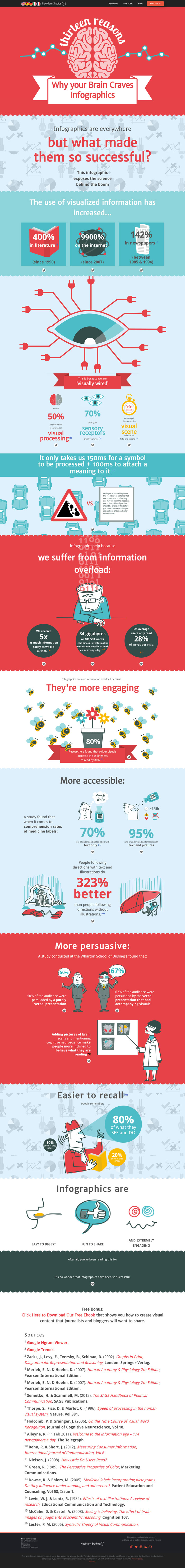
![13 reasons your brain still craves infographics [Infographic]](https://www.impactplus.com/hs-fs/hubfs/CB%20Podcast/Blog%20Images/inforaphic-group.jpg?width=768&height=400&name=inforaphic-group.jpg)
Infographics have a long history; so long, in fact, they predate the internet — and pretty much everything else for that matter.
One can argue that the first infographics were cave paintings created 30,000 years ago.
Those, and the infographics found today on Pinterest, all serve one purpose — to provide a visual representation of information in an organized manner.
Infographics have come a long way from being drawn on stone to today’s data-heavy, digitally designed, often interactive visualizations, but they are just as effective as always.
What is it about infographics that makes this true?
NeoMan’s interactive infographic, 13 Scientific Reasons Why Your Brain Craves Infographics, explores just that.
It's not just graphics
Imagery was widely-used before to convey information before printmaking made its debut in the 1400s.
In fact, only recently has imagery come back as an effective and preferred way to communicate information and data.
As the infographic illustrates, visualized information on the internet, such as photos, gifs, and other interactive elements, has increased 9900% since 2007, and graphical illustrations in books have increased 400% since the 1990s.
But why?
It’s how we are wired
The massive increase of visual information isn’t just a behavior evolution of how we prefer information; there are scientific reasons for this as well.
Humans are visually wired, with 70% of our sensory receptors in our eyes — which makes us very adept in processing visual information.
From infancy, humans learn to process information through visual patterns and cues. Only after developing a strong ability to process information visually do we begin to communicate verbally.
This is one reason why we find visual information more digestible than text.
We process visuals faster than text
On a daily basis, we process millions, if not hundreds of millions, of visual stimuli.
Some of these visuals are symbols or logos, which we recognize and identify in an average of 150 milliseconds. Following a symbol’s identification, it only takes an additional 100 milliseconds to process its meaning.
There is a reason why imagery is primarily used to convey important information for activities such as driving: the human brain process visual information 60,000 times faster than text.
Information overload is a real thing
The amount of exposure we have to information is astounding compared to recent history. Today our daily exposure to information is five times higher than our exposure in 1986!
This increase isn’t due longer hours in the office either. In 2008, it was estimated that Americans consumed 1.8 trillion hours of information outside of work!
That’s a lot to take in. It’s no wonder why we are more apt to skim information in text format.
With attention spans exhausted, the resurgence of infographics has helped break up the information overload with a more engaging, visual approach.
The engagement of visual information
When text and imagery are used together, reader comprehension is at its highest.
Color helps us pay attention and stay engaged, and when symbols are used, we are able to comprehend information at a rate of 95% — as opposed to 75% when only text is used.
This strategy of combining symbols and text is now used on medicine labels where we see symbols used to indicate storage guidelines or the correct time between doses.
Not only do we have a higher rate of comprehension when text and imagery are used together — we also find the information more convincing.
A Wharton School of Business study found that 67% of an audience was persuaded by a verbal presentation that included visuals in comparison to 50% when no visuals were used.
Infographics are evolving
Based on the data above, the use of infographics to convey information will continue to be a relevant practice across many uses and industries.
As technology has developed, we are able to make them a more interactive, dynamic experience.
This infographic on why infographics work is an example.
The information and imagery could have been presented as a static image, but with the enhancement of animation, the designers and brand are able to engage the reader in a more memorable way.
While the creation of interactive content may not always be a cost effective option, it is important to understand the effectiveness of presenting information visually.
In the meantime, you can start with these infographic design tips to start creating great, static designs, or use the tips and apply the concepts to your website pages!
Check out the full infographic from NeoMan's for more insight into why infographics work or click the image to see it in all its interactive glory:
Free: Assessment
/Assets/Icon%20Library/x%20corp.svg)
/Assets/Icon%20Library/whatsapp%20logo.svg)
/Assets/Icon%20Library/Email.svg)
/Assets/Icon%20Library/Arrows/Grey%20Arrow%20-%20Prev.svg)
/Assets/Icon%20Library/Arrows/Grey%20Arrow%20-%20Next.svg)