/Assets/base/Navigation%20Icons/TAYA.svg)
/Assets/base/Navigation%20Icons/Sales.svg)
/Assets/base/Navigation%20Icons/Web%20design.svg)
/Assets/base/Navigation%20Icons/HubSpot.svg)
/Assets/Icon%20Library/AI%20Mastery.svg)
/Assets/Icon%20Library/Learning%20Center%20Laptop.svg)

/Assets/Icon%20Library/x%20corp.svg)
/Assets/Icon%20Library/whatsapp%20logo.svg)
/Assets/Icon%20Library/Email.svg)

 Let's say you're walking down the street and you spot someone sporting a 1970's disco suit, a chain wallet, and a Von Dutch trucker hat.
You'd probably think to yourself, "Has this guy been living under a rock or what?"
So what's stopping people from saying the same about your website?
After all, that Word Art-inspired header you've been relying on since 1996 is just about the online equivalent to a dusty, old disco suit....
But you're not a designer, how are you supposed to know what's right and what's wrong?
To get a better grip on which trends should stay and which ones should go, I did some research. I coupled insights from one of IMPACT's finest designers, Donny Wilson, with my online findings, and came up with a list of design trends to avoid like the plague. Check it out.
1. Bevel and emboss
Want to send your website in a time machine back to the 90's? I have three words for you: bevel and emboss.
For non-designers, "bevel and emboss" is a Photoshop effect that can be used to create a 3-dimensional appearance, like this:
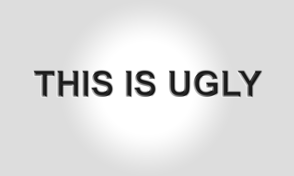
"As a whole the design community will generally agree that the bevel and emboss tool should remain where we slowly put it - in Photoshop's tool graveyard," explains IMPACT graphic designer, Donny Wilson.
While some would argue that the bevel and emboss tool works to create standout headlines, we'd argue that it does nothing more than draw attention to your need for a redesign.
Wilson goes on to explain, "In the past, adding a grotesque amount of effects on your elements and typefaces seemed like a good idea. Then again, that bowl cut your mom gave you seemed like a good idea at the time too."
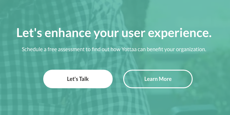
If you're looking to draw attention to a particular bit of text, focus on creating contrast without the extra effects, like Yottaa did here:
2. Carousel sliders
While certainly trendy, carousel sliders aren't all that they've cracked up to be. In fact, many designers will encourage you to stay away from the feature, as it has proven to be a poor way of conveying information.
How so?
According to research from usability analyst, Craig Tomlin, the average length of a visit for a majority of website visitors is under 10 seconds. With that said, if you're hiding valuable information on the 5th slider, you can bet that your visitors won't be around long enough to see it.
Not to mention, hundreds of website audits have revealed that the average click through rate for carousel slider images is less than .1%. (Source: Useful Usability)
If people aren't sticking around long enough to view them, let alone click them, there's really no reason to employ them. If you want visitors to pay attention and react, consider using one powerful hero image with a carefully crafted value proposition that explains exactly what it is that your business does.
3. Unrealistic stock photos
We feel the same way about stock photos as we do public restrooms - we'll use them, but only if we have to.
Unfortunately, a lot of businesses don't share a similar mentality, and as a result, their websites are littered with cheesy, unrealistic images of "happy salespeople talking on headsets" and "successful men in business attire."
The trouble with these images is that your visitors have seen them time and time again, which results in blurred lines and little to no differentiation between you and your competitors.
Not to mention, these types of monotonous images do very little in terms of establishing trust, as visitors aren't blind to the fact that these aren't the real faces behind your company.
"Users have learned what cheesy stock photography looks like. Don’t give them the opportunity to crack some jokes on your behalf," urges Wilson.
If you want to create an honest portrayal of your company, make the investment in professional photographs. If your budget won't allow for this type of investment, follow these instructions to uncover better stock photography options for your business:
4. Skeuomorphic design
When I was little, I felt like my parents went to great lengths to embarrass me. Quite notably I remember their decision to purchase a Buick Estate Wagon equipped with "wood" paneling feeling like a personal attack on my social life.
What I didn't realize at the time was that very station wagon would come in handy when attempting to explain skeuomorphic design to marketers nearly twenty years later...
According to Techopedia, "skeuomorphism refers to a design principle in which design cues are taken from the physical world." The "wood" paneling on my parent's station wagon is the perfect example of just that.
While the feature was designed to look like wood, it wasn't, in fact, made from wood. Get it?
A modern day example of skeuomorphism would be the pre-iOS 7 Apple icons:
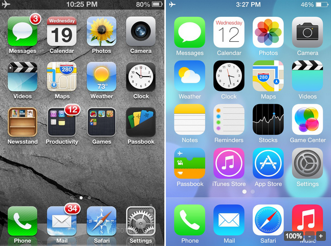
(Image source: Phonearena)
While skeuomorphism employs familiar elements from the physical world to help users better identify online elements like icons and buttons, Apple designer, Jony Ive, found that as consumers continued to adapt, the need to specify began to diminish.
“When we sat down last November (to work on iOS 7), we understood that people had already become comfortable with touching glass, they didn’t need physical buttons, they understood the benefits,” he explained.
“There was an incredible liberty in not having to reference the physical world so literally. We were trying to create an environment that was less specific. It got design out of the way.” (Source: USA Today)
Point being, if your website currently employs skeuomorphic design elements, they may no longer be entirely necessary. In fact, they could be dating your website.
5. Sidebars
Click this!
Download that!
Fill out this form!
More than often, sidebars serve no purpose than to create noise and distract the visitors from the end goal. While many marketers see the sidebar as an opportunity to promote offers, collect email addresses, and highlight other pages, if nobody is looking there in the first place, none of this is being accomplished.
Last year, we made the decision to get rid of the sidebar on our blog after heat map insight revealed that it wasn't getting any action. As a result, we were able to create contrast between the written content and the colorful CTA at the bottom of the post. This resulted in more eyeballs on our CTAs, which turned into a 71% increase in conversions. (For more on this process, check out this article.)

Register for IMPACT Live in Hartford CT, October 14-16!
/Assets/Icon%20Library/Arrows/Grey%20Arrow%20-%20Prev.svg)
/Assets/Icon%20Library/Arrows/Grey%20Arrow%20-%20Next.svg)