Subscribe now and get the latest podcast releases delivered straight to your inbox.
6 No-Word Persuasive Strategies to Keep People on Your Website [+ Examples]

Mar 8, 2018
![6 No-Word Persuasive Strategies to Keep People on Your Website [+ Examples]](https://www.impactplus.com/hs-fs/hubfs/blog-files/shutterstock_654405619-min.jpg?width=768&height=400&name=shutterstock_654405619-min.jpg)
Many feel the best user experience is one that naturally nurtures and converts users through content and design.
We look for a balance that guides users to the places and actions we want, but once they are there, how do you persuade them to actually convert (without, ya know..stating the obvious)?
Understanding how to convince users to take a desired action is a struggle companies always face. We try tactics based upon feelings, guesses, and in the best cases, fragmented qualitative data, but all too often, these changes don’t give us the results we want.
Surprisingly, studies have found that users don’t spend time deliberately thinking about and analyzing everything they see and read. In actuality, they operate mostly on auto-pilot, making decisions based on the subconscious and the emotions they feel in the moment.
In other words, if people are mindlessly browsing, you will traditionally have a harder time persuading them, but if they are in desperate need of something, chances are it will be easier.
With users all across the emotional and cognitive spectrum visiting your site, what are the best ways to increase conversions -- especially if users aren't actually reading your content?
In this article, I’ll go over six no-word persuasive design strategies (and examples) you can implement to subconsciously guide users to the right places on your site and get them to convert.
1. Using Framing and Visual Cues
Framing, simply put, is the way someone positions objects around a particular subject to provide focus. The most obvious real-world example is a photo in a wood frame. This creates a clear divide between anything outside the frame while creating boundaries for the image itself and drawing attention to it.
This principle comes in handy when presenting a user with options, when in reality, you want them to take one path in particular.
Strategically distinguishing that option from the others helps users zero in on it (and ideally focus on just action you want).
Depending on the design nuances you use (i.e. shadows, borders, bright colors), you can make it seem like one option is actually more appealing.
Brands That Got It Right
BubbleWits
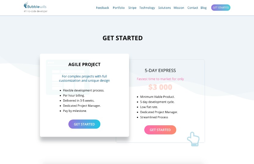
At the bottom of the homepage, BubbleWits has two pricing tiers, but strategically puts emphasis on the one on the left by using a white backdrop with a faded image and bold drop shadow.
While BubbleWits clearly wants you to take notice of the one on the left first, it doesn't want you to forget about its other plan altogether.
To prevent this, they added a small ‘pointing hand’ widget that moves up and down every couple seconds. This instinctively draws the eye to consider the other plan, but only after considering the one on the left.
Drift
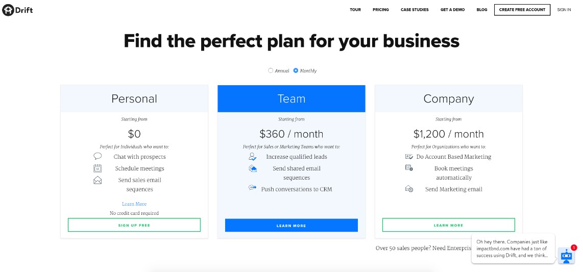
Colors can sometimes be all you need to emphasize a particular pricing plan.
In this example, using the traditional 3 tier structure (also dubbed the Goldilocks Effect) Drift helps the user quickly identify the pricing structure that feels the most ‘right.’
From a design standpoint, they do this by using a strong blue on the banner and button with white text, making it significantly more prominent than the other two options.
2. Reducing Visual Friction
Visual friction occurs when a user is confronted with an interface they expect to interact with one way, but ultimately behaves in another.
These outcomes can result in user confusion and frustration, deterring them from the path you want them to take.
Friction also manifests itself in inconsistencies, distractive actions, and unfamiliar features.
With that in mind, one of the tactics designers use to kill friction is creating recognizable patterns. Every new design or experience a user needs to learn is a point of friction.
Using layouts and design elements users have seen before, and laying them out clearly, helps prevent users from second-guessing what they are doing.
Brands That Got It Right
UXPin
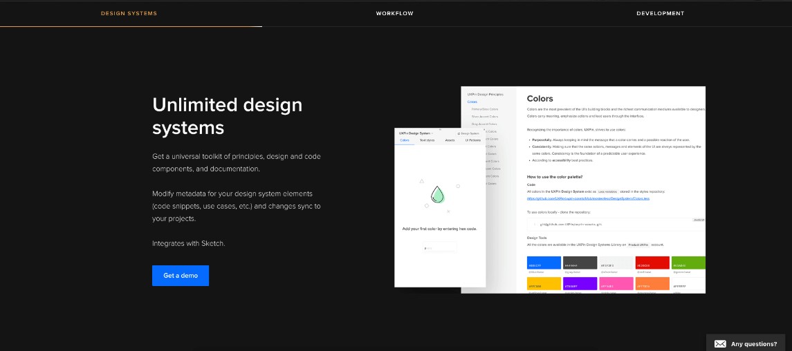
UXPin does an excellent job ‘chunking’ out some of the key features and benefits on their enterprise-level product page to help eliminate friction.
After scrolling past the hero, the bar below their logo section sticks to the top of the window and highlights each section that you scroll into so you know each one's purpose.
Each section of the page very carefully uses whitespace to provide adequate separation from one another. The sections themselves repeat the same design through the entire page, but with different images and copy.
It also uses a bright blue “Get a Demo” button which makes it obvious what next step they want you to take.
This consistency makes understanding what you’re looking at a lot easier, therefore creating a less jarring conversion experience.
UberHealth
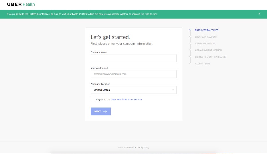
For those of us with long conversion paths, it can be unnerving to visitors if the steps that need to be taken aren’t clear.
UberHealth made sure this wasn’t the case by providing a step-by-step list aside its form so the user understands exactly what the conversion process looks like. The step you’re on is highlighted in blue.
Also, as you complete the form, any errors or missed fields turn red immediately to get your attention. Correctly filled fields turn green, and if all are correct, the blue ‘Next’ button fades into a darker blue, cueing the user to continue to the next step.
3. Have One Clear Action
With the variety of pages on your site, it’s easy to end up with too many places for your users to go. Although this gives the user options, it deters them from converting on the things you really want them to.
The solution to this goes back to considering the page, its purpose, and what the logical next step for users should be.
That step should be the call-to-action that's throughout the page and the only call-to-action on the page. You also need to optimize for it by providing a “clear message, visual hierarchy, and drawing attention to that one action.”
Brands That Got It Right
Kable
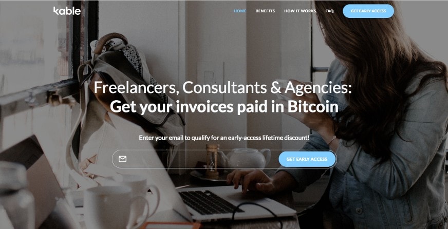
Kable is a company that converts invoice payments into Bitcoin. Since the company is new, the action they want people to take is to sign up for early access to the program.
This action is clear the second you visit their homepage through the large blue navigation button and form in the hero.
The form is also repeated at the bottom of the page for those who decide to convert after reading the homepage content.
Zapier
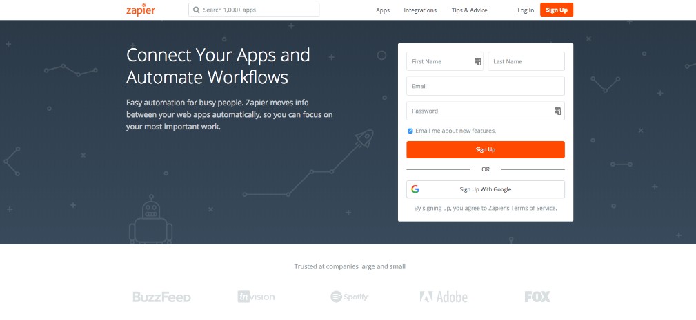
Zapier uses a deep orange for their main ‘sign up’ call-to-action which is carried throughout the homepage.
This consistency and reintroducing the button again in different sections helps make it easy for the user to convert when they are ready later on down the page.
4. Designing for the Gut and Head
The human brain makes decisions in complex ways. This is largely due to the drivers that inhibit that decision making - two mental models acting in parallel.
The two modes are called Gut and Head, terms coined in Daniel Gardner book The Science of Fear.
“Gut processing is sophisticated, intuitive, and quick” and typically uses more emotions. “Head processing, on the other hand, is analytical, slow, and rational” and requires the user to take a more educated approach.
So when you are showing a user data to affirm a choice they may make, it’s not enough to think that alone will gain their approval. If the Gut feel it does not have a strong enough emotional impact, that may be the reason a user does not convert.
This means it’s important to consider both these modes in the design process. Learning what elements, imagery, or layouts that help satisfy both the analytical and emotional modes is key to a high converting page.
Brands That Got It Right
WIX
Sign up pages are usually filled with a variety of options to get you on the platform, but they inadvertently end up busy and cause too much thinking.
WIX made its sign up options very clear by separating the standard form on the left, but highlighting the more convenient ones on the right via bright button colors and icons.
This approach entices users to choose the easier conversion paths options filling out the form.
Red Cross

There is no better way to tap into human emotion than with real imagery that triggers stories or memories.
In this homepage from The Red Cross, users are presented with a worker embracing another person while a fire truck looms clearly behind them.
It immediately makes you wonder what happened, evoking concern for the scene. Without having to read any words, you get the idea that The Red Cross is the hero. This helps encourage trust subconsciously in the mission of the organization and lets you know they really do help.
5. Using Contextual Imagery
Nothing makes users angrier than talking about ‘the thing’ without showing them what it actually is.
Users need to know that any points made about a product are actually accurate, otherwise, they’ll start losing trust.
“Maybe the product doesn’t really do that.” “The product probably looks really old.” “That thing is probably in beta.”
These concerns can be easily fixed by displaying some examples and screenshots that relate accurately to the content.
For users who don't actually read what's on the page, these images give a face and feeling to the product providing an initial assurance that the product does exist to being with.
Brands That Got It Right
Kayako
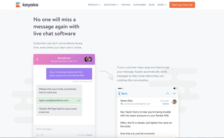
One of the most prominent features of Kayako’s live chat is its ability to follow up with users when real people aren’t around to help.
Rather than using content alone to explain that, Kayako uses images of the step-by-step process.
Placing the images close but with enough ‘breathing room’ helps keep the main idea together. The arrows pointing to each screen also encourages scrolling so users understand everything that the bot does.
Chargebee
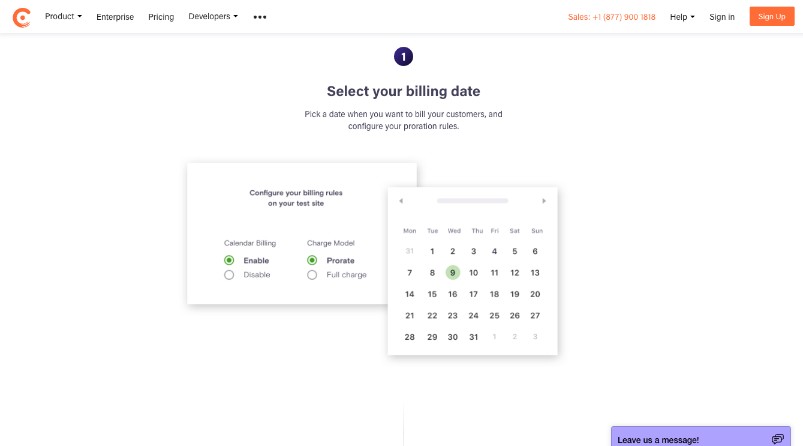
Chargebee does a really nice job of explaining how their software works using numbers and images of the product.
The sections themselves are void of colors, minus the images of software, so they ultimately hold a lot of visual weight over the written content.
6. Taking Advantage of Seducible Moments
Get your brain out of the gutter.
There are specific times during a user’s journey when they are naturally more likely to take a certain action or do a particular task. It is during these moments, that you should make sure that they can complete them easily.
One of the best examples of this principle is when users have just added something to their cart.
At this point, they have committed to purchasing a product, but still haven't made it past the finish line.
Showcasing particular deals on that item, or showing a coupon code, can be strategic ways to persuade users towards checkout (or even to shop for more products).
Brands That Got It Right
MOO
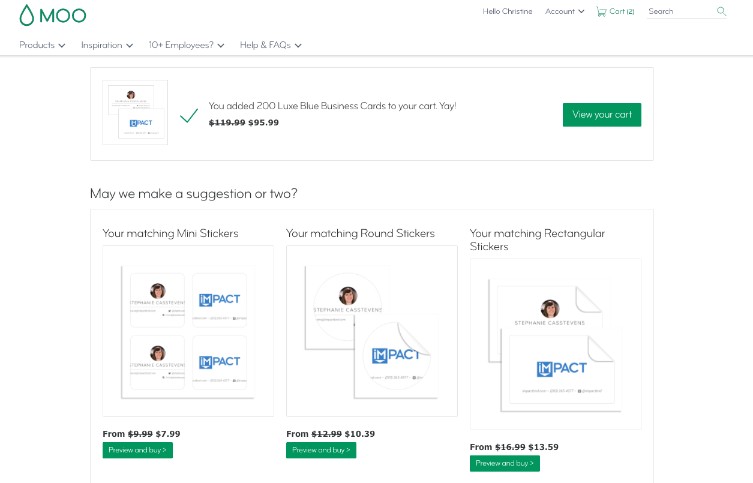
For a custom print company like MOO, there are a variety of other products customers may be interested in, but might not know about.
To present these other products, MOO waits until you’ve completed your design and added it to your cart before suggesting some other options you may also want (and with discounted prices too).
At this point, if the design looks appropriate on the product, its super easy to add it to your cart.
Amazon
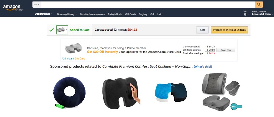
Amazon uses seducible moments in a couple of ways after adding a product to your cart.
For instance, below the ‘cart’ box, they first present you with a deal for Prime members to take an additional $20 off your purchase for signing up for a credit card.
For large purchases, presenting this deal right before checkout encourages users to sign up for it to save that much more. The colored text showcasing the discount and small equation really make the offer that much more appealing and real.
The section below that also shows more products similar to the one you added to the cart. This could help users identify a better product if they aren’t confident of the one they added to the cart.
Looking for more keys to boost online conversions?
Drawing from the latest research on neuro-web design and the results of numerous tests, Peep Laja of CXL has unlocked the secret to designing your website to be a lead-generating machine.
Want to learn the secret for for yourself?
Join us on March 13th at 11AM ET for a live 60-minute webinar with Peep where you will learn:
-
Practical insights on what makes online visitors tick
-
Principles of hierarchy and creating a visual user experience
-
How to incorporate these into your design to increase conversions
-
And much more!
Space is limited, so save your seat now!
Free: Assessment