/Assets/base/Navigation%20Icons/TAYA.svg)
/Assets/base/Navigation%20Icons/Sales.svg)
/Assets/base/Navigation%20Icons/Web%20design.svg)
/Assets/base/Navigation%20Icons/HubSpot.svg)
/Assets/Icon%20Library/AI%20Mastery.svg)
/Assets/Icon%20Library/Learning%20Center%20Laptop.svg)


Web animation; A technique that may remind you of early 2000 flash websites and GIFs.
I mean who didn’t love looking at pages like the one below?
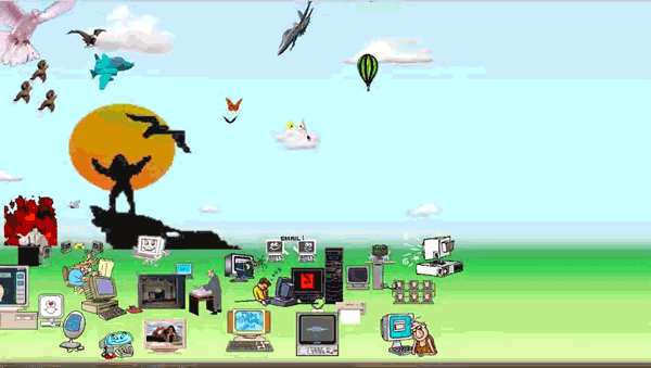
Fortunately, we’ve come quite far from those days. Today, we use animation more strategically; as a way to draw attention, cue, or delight depending on the experience we’re trying to achieve.
The key to getting it right, however, is recognizing the right situations to use it, and of course, only in moderation.
For example, subtle animations can draw the eye to key focus areas of your pages, while more robust and complex animations can create entirely new experiences or tell stories.
While adding web animations isn’t a priority, and normally shouldn’t be, understanding pages and points where it can be used effectively can help improve your user experience and increase conversions. The key word here is effectively; They must serve a purpose and they should never distract from your overall message.
Incorporating web animations can be somewhat difficult to strategize, especially if you just don’t know where to utilize them. So, to help you identify these areas, here are six ways you can incorporate animation into your website without distracting or driving your users crazy.
1. Directional Arrows/Cues
Using web animation to communicate how to use your website can sometimes aid in introducing new experiences or guiding your users to other areas of the page or site. It can also help highlight conversion points that some users may otherwise ignore.
While static elements can direct users or draw attention as well, this can sometimes be confusing. Users might struggle to understand whether or not these unanimated elements are actually part of the content or represent decoration. For instance, if you have a image with dots on certain areas that you want users to hover over, a subtle pulse will help them recognize they have action to them.
Web animation in these cues can make the world of difference, notifying the user of an action they should perform.
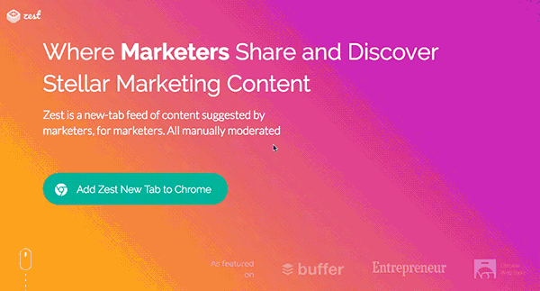
For example, Zest uses a small mouse icon with a moving scroll wheel to show the content continues below the hero area. This way users don’t think the page has ended before it’s even begun.
Directional cues can also be used to highlight calls-to-action. While the example below is another way to demonstrate and initiate scrolling, it could also be repurposed and used as a cue, pointing to a button to draw further attention.
![]()
2. Text Animations
With the overload of content we tend to put in front of our users’ faces, it’s no wonder they skip over some value propositions or ignore critical content.
While it can be overwhelming to animate every bit of text, there are ways to bring attention to specific sentences, or even paragraphs as a whole.
For instance, consider animating your value proposition. One technique I’ve come across many sites implementing is “fill-in-the-blank” web animation, where one word of the header is typed in, deleted, and changed to a different word.
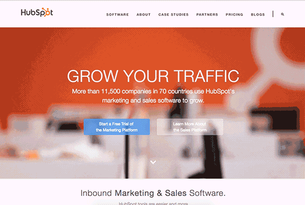
This not only brings more visual hierarchy to your value prop, but also makes it dynamic, fitting more content it otherwise couldn’t. HubSpot used to have this functionality on their website back in 2015.
If you are looking to use animation throughout your page, fade-in effects on content sections can add a delicate visual cue.
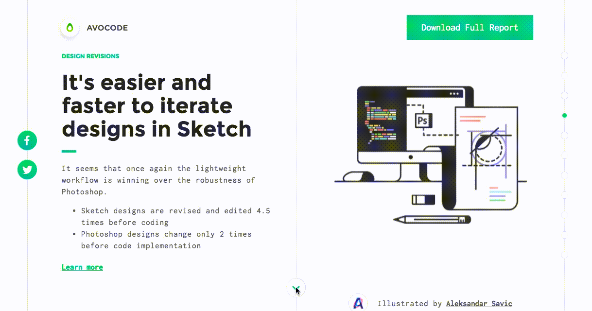
For example, check out how Avocode used this on their 2017 design report to bring attention to the content first before fading in the image. This makes it clear that the content is more important than the image and is the first thing you should look at when arriving at the section.
3. Cinematography Backgrounds
In recent years, many companies have rushed to use background videos on their sites as a way to bring life to their pages. Unfortunately, many reviews claim it actually can distract users from reading the content and act as a barrier that hinders conversions.
One of the newest techniques to come out of this discovery is cinemagraphs; A visual thats a photo with incredibly subtle movement to it. They tend to act more as eye-candy and help bring life to the website without overwhelming it.
Glendevon's hero area below utilizes it to give the appearance of the car driving while also drawing visitor’s eyes straight to the page’s value proposition.
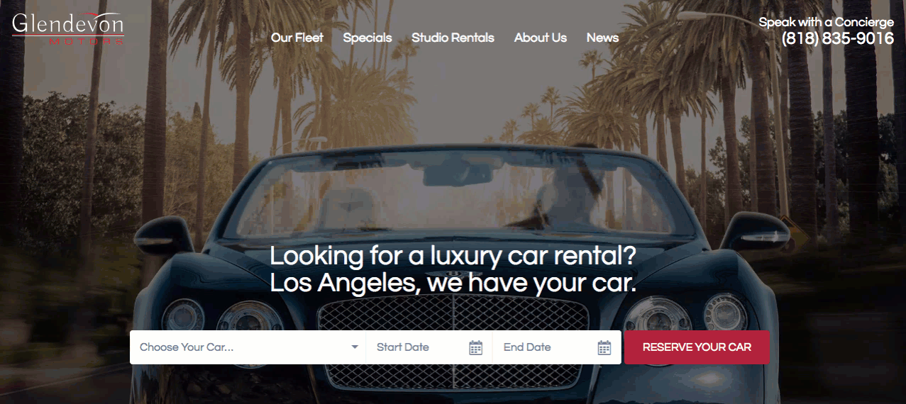
Another fantastic benefit to using a cinemagraph over a video is its smaller file size. These files can normally be exported as GIFs and are much shorter, saving your website's load time overall.
4. Form Cues
A well-designed and optimized form can make the difference between your user converting or bouncing off the page, and many of us tend to forget this.
In some cases, slight animations can act as signals to make the submissions process more delightful or indicate something needs attention.
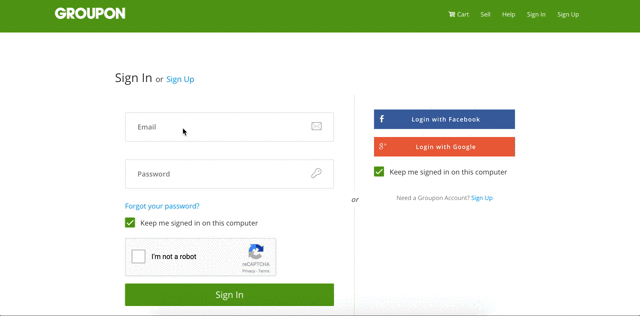
On Groupon's registration form, the company animates the placeholder text by transforming them into small labels that sit higher up in the text field. This reminds users of the content that needs to go into the boxes while conserving page space that might have been lost if regular labels were used.
Animations can also be excellent warning signals for those who are entering information incorrectly into certain fields. This shake animation, for example, is similar to the one that’s used when logging into Apple computers with an incorrect password and helps users realize their mistake.
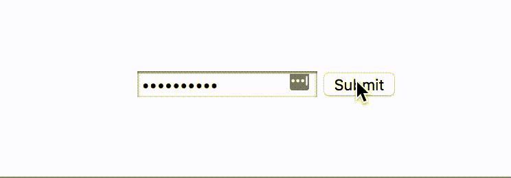
This animation tends to get recognized quicker than red error text since it more in-you-face and acts as a more immediate response.
5. Graphic Animations
One of the most time consuming, but noteworthy, types of web animation many of us tend to gravitate towards are animated graphics. They can be a huge win in the delight category or act as fantastic ways to explain images and processes.
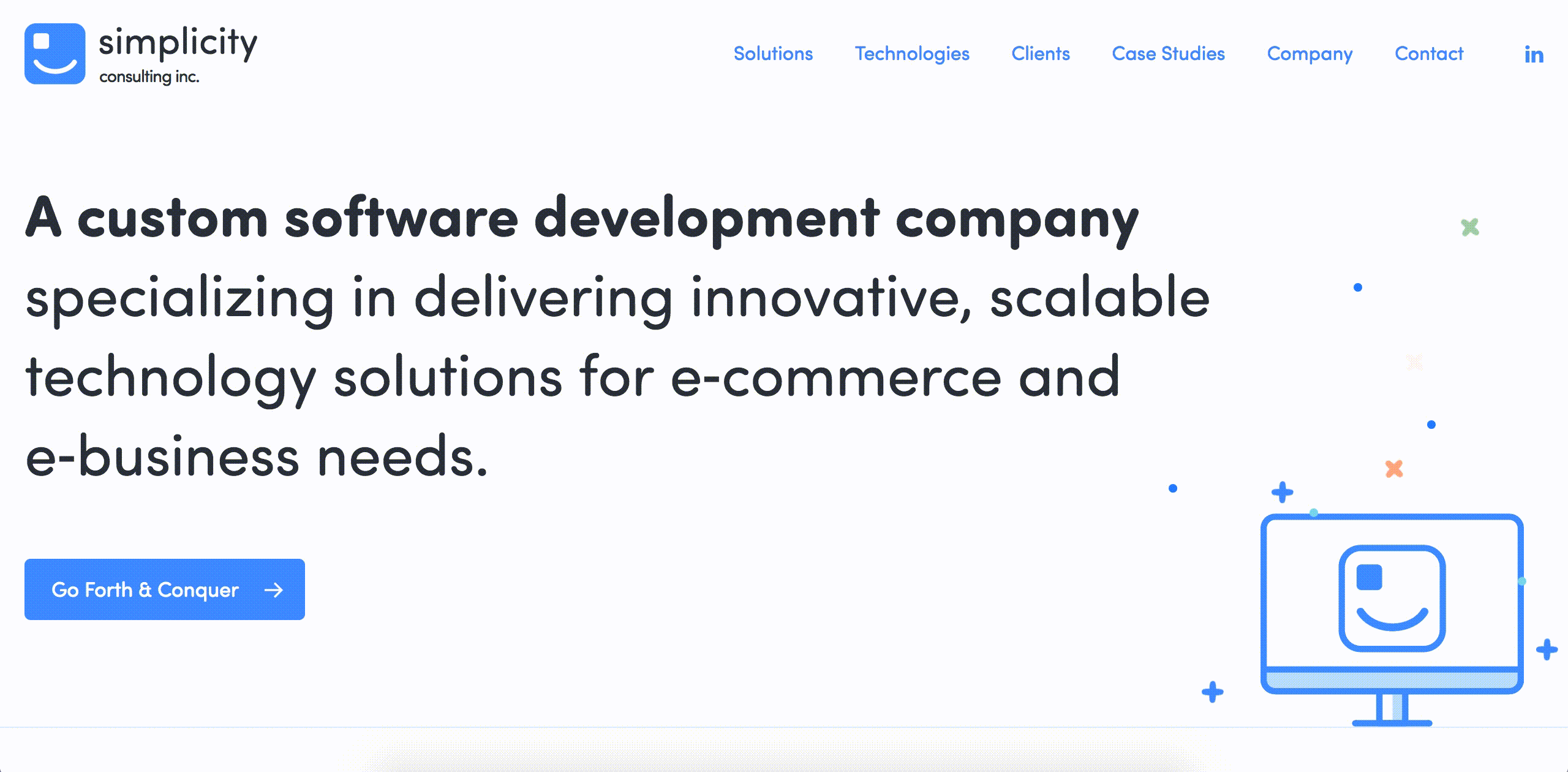
Take Simpliciy’s site, for example. They incorporate a simple animation on their small hero graphic to act as a way to entertain the eye, similar to that of the cinemagraph.
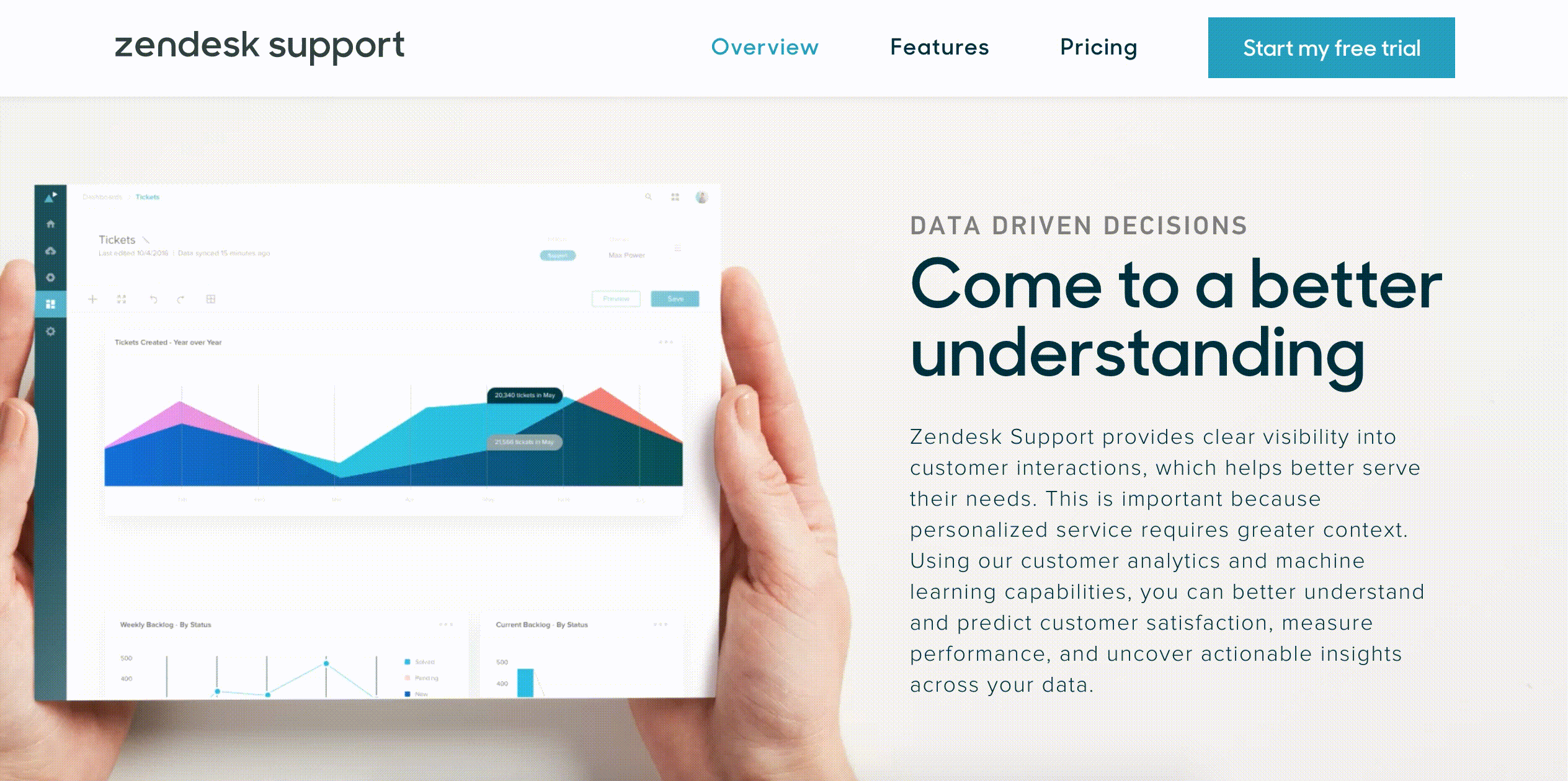
Zendesk took graphic animation a step further, using it to showcase how their software looks. Also, the scrolling effect helps bring that much more realism to the look and functionality of the product.
Unfortunately, graphic animations tend to be the one that people abuse the most and lack a reason to use.
Don’t fall into this trap.
Before using animated images, always ask yourself what purpose it serves, how it will impact the user's journey, and what negative effects it may possibly propose before working on one.
6. Button Animations
(No, this does not mean animating all buttons to change into every color within the rainbow.)
Like form animations, button animations can also give users visual feedback based on an action they are about to or have already completed. This verification helps users subconsciously understand what they can expect to happen, without the use of additional text.
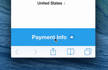
Stripe uses button animations on their payment submit button so users are able to visually understand if their payments have been accepted. This cue would otherwise need to be delivered in a text response, which only adds more content the user needs to read.
In another example below from CodeDrops, the buttons trigger two different types of animations.
The left uses color cues, indicating whether or not the notifications are on or disabled, while the right button triggers a form to appear, removing multi-page friction barriers and creating a more seamless step-by-step signup experience.

Key Takeaways
Web animations are an incredible way to add character to your website, distinguish its experience from your competitors, and add personality to your website, but depending on the scale, they can take a significant amount of time to incorporate and may not be worth it if the ROI isn’t there.
The next time you consider adding effects such as the ones above, make sure that your ideas align with your user's journey and either helps or delights them along the way to the task you want them to complete.
Free: Assessment
/Assets/Icon%20Library/x%20corp.svg)
/Assets/Icon%20Library/whatsapp%20logo.svg)
/Assets/Icon%20Library/Email.svg)
/Assets/Icon%20Library/Arrows/Grey%20Arrow%20-%20Prev.svg)
/Assets/Icon%20Library/Arrows/Grey%20Arrow%20-%20Next.svg)