/Assets/base/Navigation%20Icons/TAYA.svg)
/Assets/base/Navigation%20Icons/Sales.svg)
/Assets/base/Navigation%20Icons/Web%20design.svg)
/Assets/base/Navigation%20Icons/HubSpot.svg)
/Assets/Icon%20Library/AI%20Mastery.svg)
/Assets/Icon%20Library/Learning%20Center%20Laptop.svg)

Jan 17, 2019

I have always been an artist… but I have also always been a realist.
I never wanted to pursue the life of a struggling artist, nor did I want to be a teacher.
This left little in the way of a career path for me as an artist. Enter graphic design.
Graphic design is a perfect marriage of art and creativity with function and purpose.
This remains one of the big reasons I am in love with designing websites.
I get to create something that people enjoy looking at AND interacting with. Cool, right?
A big part of my job is research and browsing sites all across the world wide web and let me tell you, the things people are doing with web design is WILD.
Myself and the rest of our creative team (developers included) are always thinking of ways that we can push our own limitations and incorporate new things we see crop up in the web design community.
However, the conversation always comes back to one question: What value does that provide?
It’s Not All About Looking Pretty
Some things look pretty or work super cool, but wouldn’t provide our clients any value.
A site can be super “sexy” and not yield any value at all (I’ve recently rambled about this in length on Creator’s Block), but for us, as an agency built on turning results, it's important to build a site that lives at the intersection of beautiful design AND peak performance.
Here’s a great analogy from MentorMate that might help you wrap your head around that.
“Have you ever gone to a restaurant expecting big things? You’d walked by a million times and liked each and every new dish posted on Instagram. Rough-hewn walnut floors. Colorful entrées that seem to sing in their variety. Breathtaking.
Then you get there. And — it takes 20 minutes to be seated. Not that there was a wait. The host was simply nowhere to be found. You order, and the first bites are…mediocre. Sure, they were plated nicely, but that’s about it. All-in-all the experience was lackluster, and chances are you won’t be going back.”
As designers, it’s not that we don’t want to design the heck out of your website (trust me, we’d love to), but like any good partner, we care about you so much, we put your needs first, even if you don’t realize it’s what you really need.
The good news is you can still have a really, really nice looking website, that looks and functions great.
The key is knowing what will truly add value versus what is just a fancy, unnecessary add on.
Function Comes First
When we start any website project we always think about function first.
What problems does the website have to solve for? What functionality do we need to make the website serve its purpose?
Ultimately, if you have a page that looks beautiful, but it confuses your users and they leave after 10 seconds without filling out a form or buying something (whatever your goal may be), that page is a failure.
This is why we wireframe first.
You don’t start decorating a house until the foundation is set and stable, right?
When we wireframe, we account for the basic form and function of a page. This is to ensure that it’s all working the way we want it to before we even start thinking about how the design will look.
I’m going to say it again because this is super important: Web design isn’t just about looking sexy.
A well-thought-out design should be results driven and solve challenges.
Often my challenge as a designer is knowing that something that doesn’t look good works well and figuring out how to take those parts and make them look sexy as hell.
Here are some sites I think are doing a great job at this.
Curology
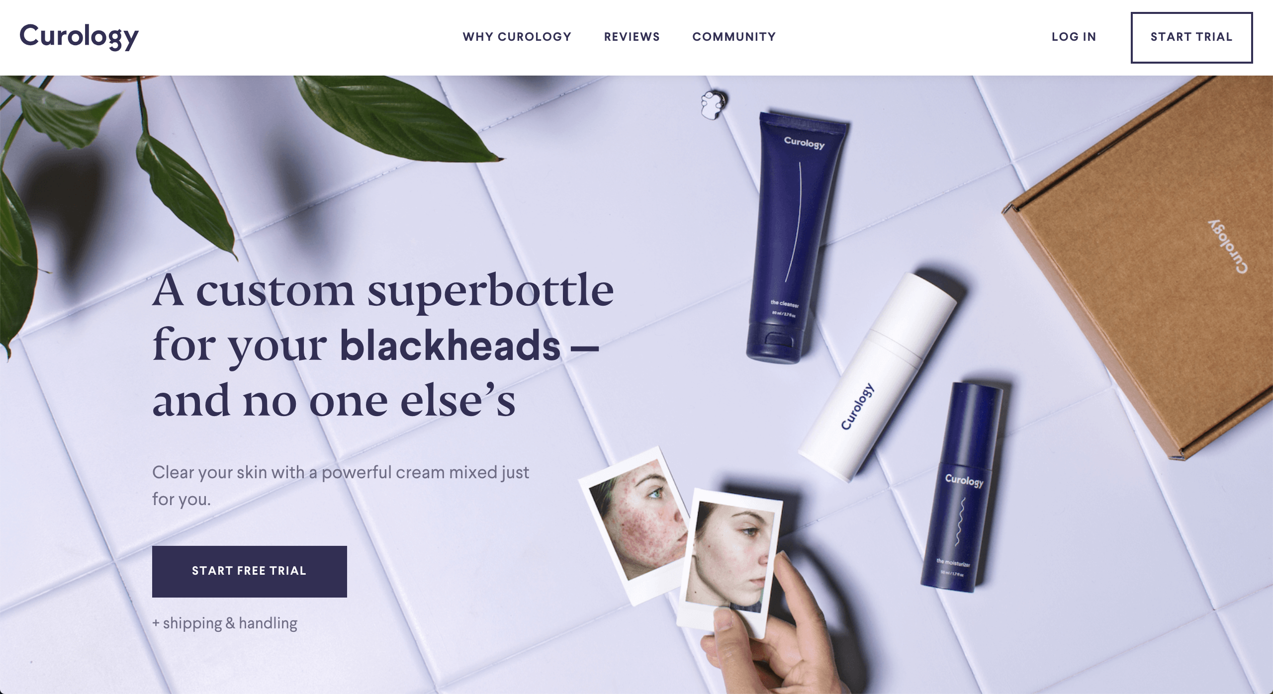
The overall design of this page is very clean and modern. Where I think they really win is in the animation of the hero value prop and the micro-interactions in the testimonial sections. This helps guide the user’s focus to the value prop (that, bonus: helps the user solve for their problems) and the user testimonial photos which show how the product really works.
Kontainer
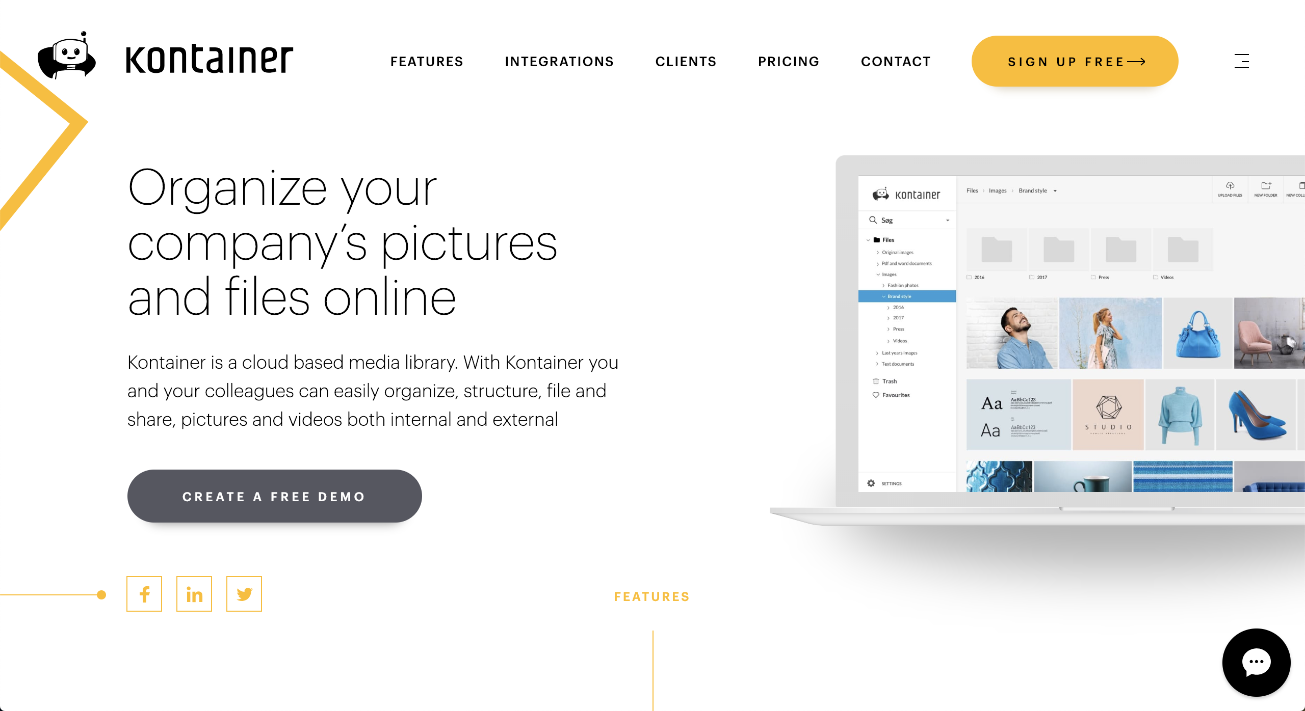
What struck me most about Kontainer’s site is that every section has animations and interactions, each one purposeful in guiding the user and supporting the content. Most noticeable are the arrows coming from the left or right margin of the page.
Notice how they move slightly as you scroll down the page and “magically” line up with strategic CTAs.
The parallax of the images also helps move the user through the page as they push the images into focus and pull them out of focus so the user focuses on the next block of content quicker.
Lobster
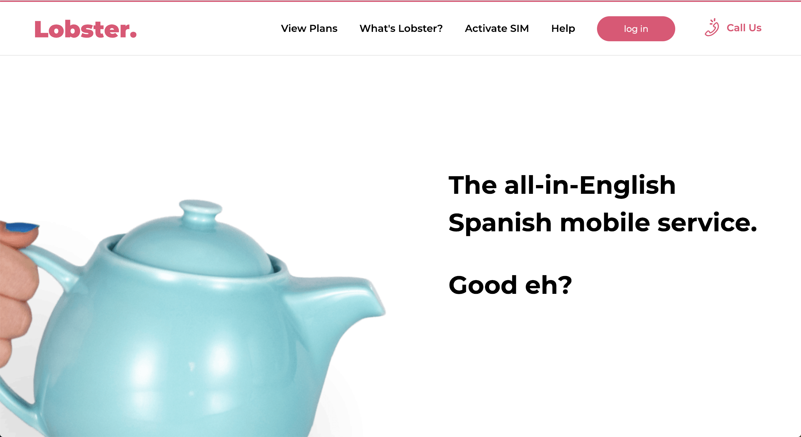
This is another page that is chock-full of animations, but each one is purposeful, supports the content, and gently nudges the user down the page. You can’t help but follow the whimsical lines down the page to see what happens next.
Each section has a line or highlight that pulls the user down through the section, emphasizes a key bit of information, and then leads the user to the next section.
It also uses the line animation to highlight the pricing plans, one by one, so the user focuses on each individually.
Factors That Should Influence Your Design Choices
Okay, so I’ve been harping on “purpose” like a broken record. Now let’s take a look at some of the influences that really determine the purpose and direction of our page design.
The User
You’ve heard “the customer is always right” before. Well, when it comes to web design, it’s “the user is always right.”
Your website isn’t for you; it’s for your audience/user.
So, the user should influence EVERYTHING. Tone, color palette, font choices, image choices, placement, spacing, white space, page length, I could go on forever.
Think of it this way, if your user doesn’t understand (or LIKE it) and it deters them from your site, then it doesn’t work for you either.
Budget
What you are actually paying for when you hire a team to design and develop your site, is the time it takes for that team to create everything from strategies, wireframes, mockups, and finally functional pages, right?
Well, things like custom illustrations or custom functionality easily add more time to a project and quickly inflate the scope of a project.
Consider whether the price you will pay for additional “sexiness” will return as much value in results from your site.
Devices or Browsers
Okay, so this really ties in with the user as well, but it’s so important, we’re going to treat it as its own point.
Before considering adding any sort of wild new design elements to your site, you should know where/how the bulk of your users are viewing your site.
If the majority of your users are using IE or Internet Explorer (don’t get me started) or are strictly mobile, this should limit the bounds of what can and should be done.
Some functionality breaks, when run through IE or site elements, will shift dramatically when viewed on a mobile device.
So, you typically should focus on the medium (and that medium’s limitation) that the majority of your visitors are using.
This is really important because you need to focus on your user’s experience in whatever medium they are most likely using.
Creating a beautiful desktop site that barely functions on mobile, when most of your users are visiting your site via mobile is not only wasted effort but also will leave your users not wanting to return to your site.
Competitors
Sometimes, it’s important to incorporate a user experience similar to your competitors to make it easiest for your target audience.
Often, users flip back and forth between similar sites when looking for solutions to their problems.
If your direct competitors are doing something, it’s likely your audience is familiar with the experience, creating less friction when it comes to understanding and navigating your website.
So, if your competitors are all using similar functionality that seems to be working well and makes sense, don’t feel obligated to do something different.
Doing something different may actually DETER users because they have to learn something new on top of the issue they are trying to solve for.
Users often come to your site with assumptions. Work with them, not against them.
Brand/Brand Recognition
After your user, you must remember your brand.
Everything you add to your website is a reflection of your established brand.
Consider whether that watercolor illustration or page transition animation speaks to your brand’s tone and style.
If it doesn’t fit than its existence is more confusing to your audience and a detriment to your brand awareness.
Page Load Speed
Intense animations and functionality can bog down your page load speed, plain and simple. While it may look cool, if it takes a dramatic toll on your site speed (and ultimately its rank), it’s not worth it.
Common "Sexy" Elements That Undermine A Website's Effectiveness
I often have to be the bearer of bad news with clients who have come across something that looks new and interesting they want to implement on their site but isn’t the best move functionally.
Here are some common elements that usually do more harm than good, and some better alternatives.
Buzy Heroes or Hero Videos
Unless a hero video is showing and explaining a product, these are mostly a distraction that adds little value and can really slow down the load time of your page.
What are alternatives?
Instead of a soundless video playing without much explanation in the background, have your hero’s call-to-action be to play the full video to give the user the most value from it.
If you still are looking to add a little fun to your hero image consider a well-planned cinemagraph.
Lots of (Purposeless) Animations
Animation can be both costly to create and slow down the speed of your site a heck-of-a-lot.
What are alternatives?
Micro-interactions like small animations on icons or buttons can help confirm actions and guide the user through the user journey.
Lots of (Purposeless) Illustration
Custom illustration isn’t cheap. This can suck your budget very quickly.
What are alternatives?
Sites like Shutterstock offer tons of premade illustrations and illustration packs that can be modified to give you a custom feel without breaking the bank.
Confusing User Interactions and Hover Effects
These can not only can confuse the user but can become un-usable across mobile devices or older browsers.
What are alternatives?
Don’t reinvent the wheel. Only push for a new way of doing things if you think it will truly benefit your users. Keep the interactions simple and familiar, but change small things like the button animations I mentioned above to keep things looking fresh and modern.
When You SHOULD Choose Artistry Over Functionality
Like with any rule, there are some exceptions to putting functionality first.
Up to this point, I’ve pled my case as to why you basically should steer clear of unnecessary design elements, but I’m not a tyrant and I do think there are some practical use cases for getting a bit more fancy with things.
You should consider extra flourishment for:
Stand-Alone Pages
If you are designing a stand-alone page that is simply a “delight” factor for your audience, you can consider adding some sexy elements.
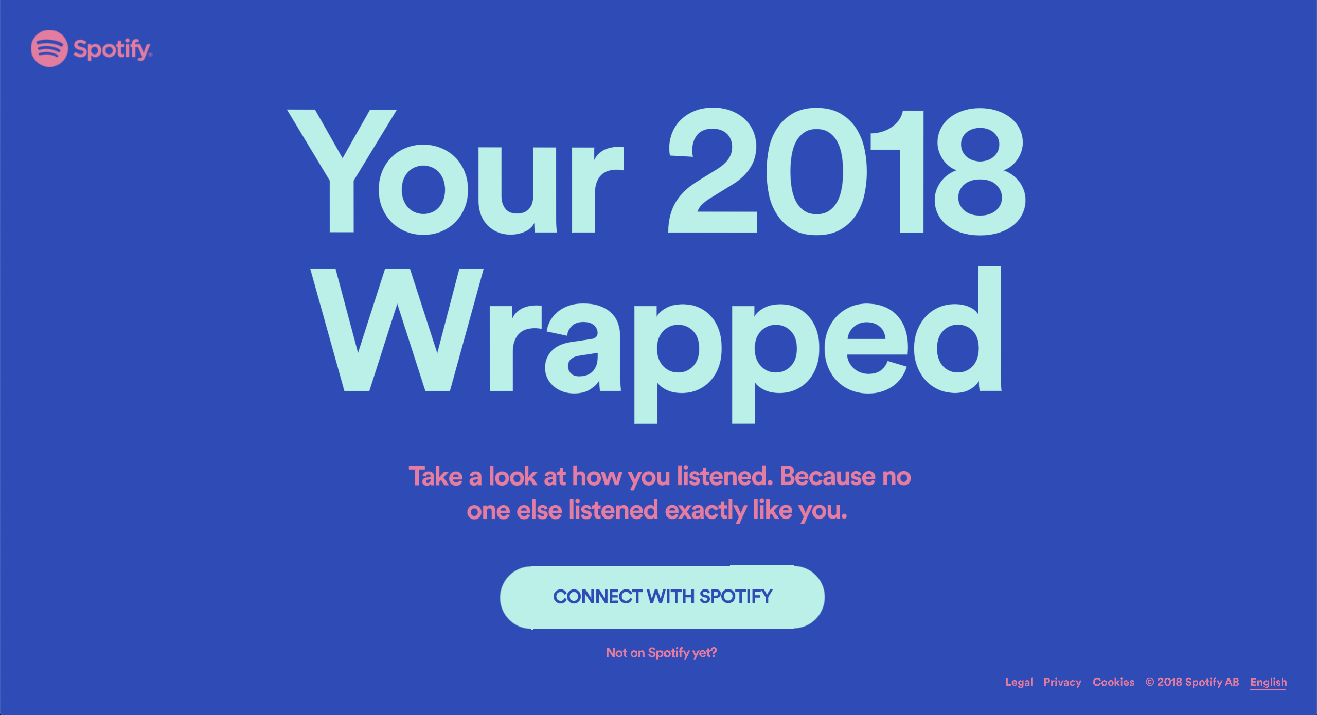
Check out the Spotify Wrapped page for a great example. The page only exists to please pre-existing customers and for shareability and includes a lot of impressive animations and custom elements.
It’s a Set Standard
You should invest in design if your audience is already used to a certain standard of artistry and is already up-to-speed with interacting with sites that use unique functionality.
It’s also important to consider the level of artistry that’s associated with your brand.
Take, for example, Apple. They could put out a simple specs page for their new products, but they have become known for their clean, modern, and cutting-edge approach to showcasing their new products.
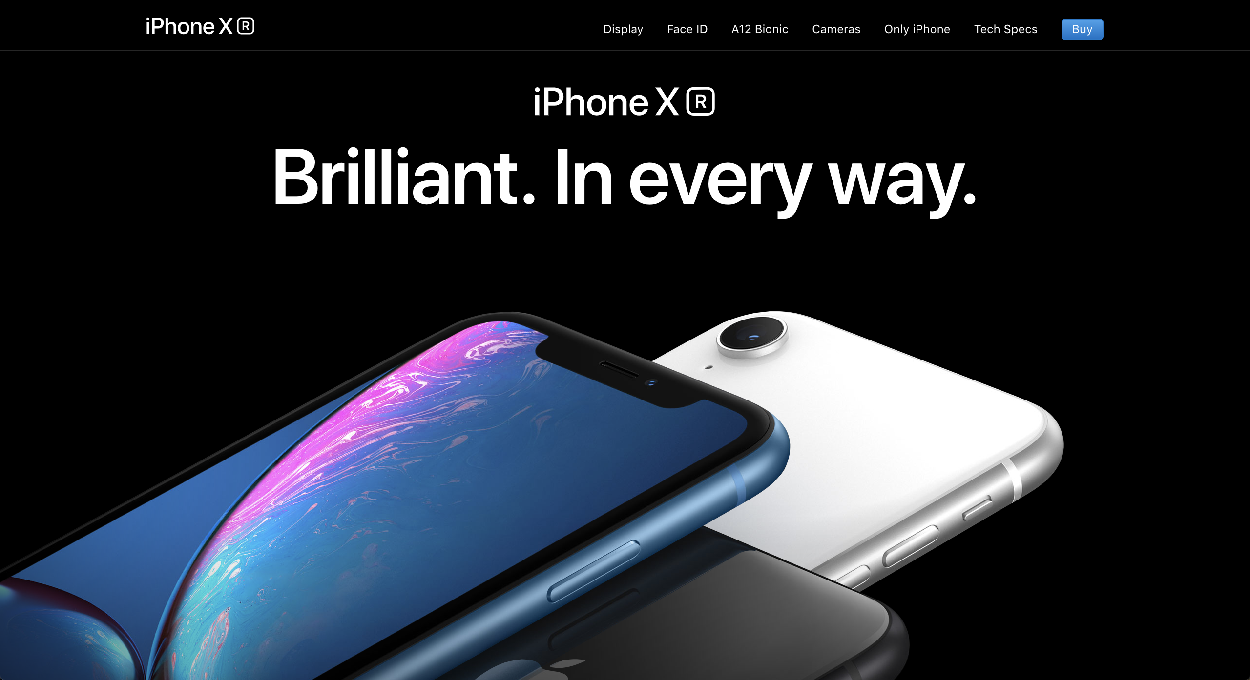
Look at their iPhone XR page and you’ll see what I mean.
This page is very different from the majority of their pages which include less intricate coding and unique layouts, but this really helps to highlight their new product and its many awesome features.
You’re Not Concerned About Lead Generation
Last, but not least, if you are not worried about leads, revenue, or some other kind of result coming from your website, you can consider more extensive design.
When you're trying to get people to fill out a form on your website, this should be the focus and extravagant design can distract from it. However, if this is not the goal of your website, you can feel freer to experiment.
Thank you for coming to my TED Talk.
Just kidding.
But seriously, I cannot stress enough the importance of a strong marriage between making a site that looks beautiful AND works beautifully. In order to have a truly great website, both things have to be in play.
You’re probably tired of my ramblings at this point. So, I’ll leave you with the three most important questions you should ask yourself when you are considering pushing a “creative” design:
-
Does it add value?
-
Does it serve a purpose?
-
Will it serve my audience?
Free: Assessment
/Assets/Icon%20Library/x%20corp.svg)
/Assets/Icon%20Library/whatsapp%20logo.svg)
/Assets/Icon%20Library/Email.svg)
/Assets/Icon%20Library/Arrows/Grey%20Arrow%20-%20Prev.svg)
/Assets/Icon%20Library/Arrows/Grey%20Arrow%20-%20Next.svg)