Subscribe now and get the latest podcast releases delivered straight to your inbox.
Expert tips on designing for color blindness — from a color-blind designer [Infographic]

By Joe Rinaldi
Oct 11, 2020
![Expert tips on designing for color blindness — from a color-blind designer [Infographic]](https://www.impactplus.com/hs-fs/hubfs/Designing-for-Color-Blindness.jpg?width=768&height=400&name=Designing-for-Color-Blindness.jpg)
I have a confession to make.
It’s something I never openly admitted until recently, but I’m a walking oxymoron. I’m a color blind graphic designer.
Weird, right?
I remember being in my kindergarten art class and constantly asking my friends if I was using a blue or purple crayon. I couldn’t figure out why my friends could see the difference and I couldn’t.
It wasn’t until middle school that I found out it was because I had deuteranopia color blindness. That’s a fancy word for I can’t always distinguish the differences between blues and purples.
As I moved into a career in design, I hid my color blindness. I viewed it as a weakness, something that would just hold me back.
Who would hire a designer who can’t see colors properly?
That all changed a few years ago when I started to learn more about the importance of designing for accessibility and creating an equal web experience for everyone.
I started to look at being color blind as a superpower. While it’s not nearly as cool as super strength or the ability to fly, it’s actually really powerful in the UX/UI world.
I learned I’m able to easily spot problematic color combinations and areas that lack enough contrast, which a lot of other designers may overlook.
It’s also helped me approach web design from a more inclusive perspective. I understand first-hand the pain points and challenges people with accessibility issues face while viewing a website.
Understanding how to design for color blindness can be a difficult task for those who aren’t colorblind themselves. Luckily, you don’t need to run out and find yourself a colorblind designer.
We’re awesome, but I’m pretty sure we’re a small pool of people.
Rather, there are a lot of useful guides and resources out there to educate you on the topic and help you deliver a better experience to your users.
The team over at IMI, a full-service digital marketing agency, put together this insightful infographic that gives people a crash course in designing for color blindness.
The infographic covers topics like the different forms of color blindness, how to design for them, and even includes some tools to help you test your websites color palette.
The three main forms of color blindness
Before you can start to design for color blindness you need to understand the different forms of it. Your company’s branding might have a color combination that only affects a certain type of color blindness, so it’s important to know who to consider.
1. Protanopia
Protans have difficulties distinguishing the differences between blue and green colors and also red and green colors.
2. Deuteranopia
Deuteranopia is the most common type of color blindness that affects about 6% of the male population. Deuteranopia is also known as “Red-Green Color Blindness,” but the name is slightly misleading. People with Deuteranopia have trouble distinguishing the differences between a number of different colors; not just reds and greens.
3. Tritanopia
People affected by tritan color blindness confuse blue with green and yellow with violet.
UI tips for designing for color blindness
The infographic highlights some simple tips that you can start implementing right away in your designs. Some of the more notable tips include:
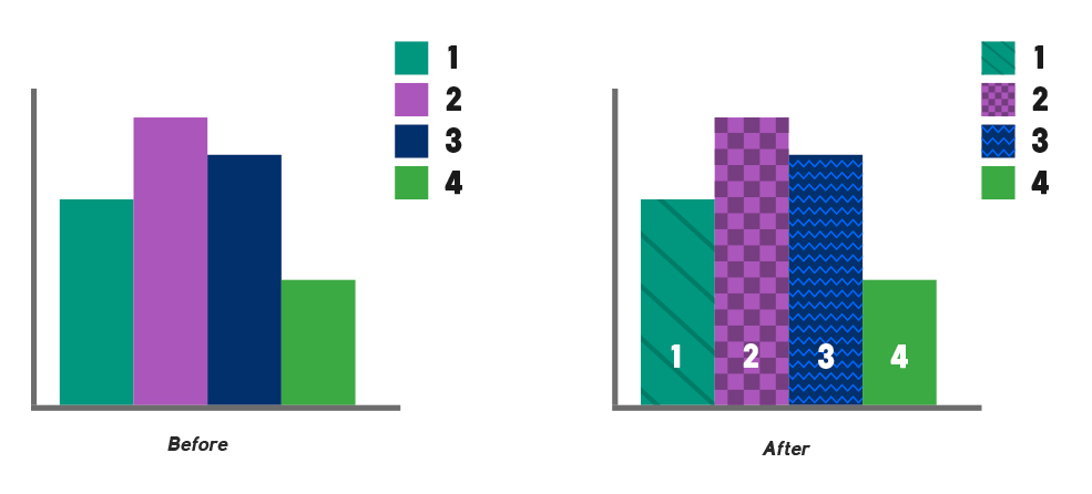
Use textures and patterns for contrast
Relying solely on color to differentiate data on graphs and charts may make it hard for colorblind users to decipher. You can use subtle patterns on top of a color to make this data easier to digest.

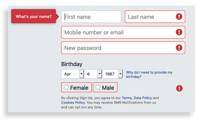
Use colors AND symbols
When it comes to your forms, people with a certain type of color blindness can have problems seeing red error messages. One way to combat this is to use both colors and symbols where the user's attention is needed.

To see all of the tips and tools you can use to design for color blindness check out the infographic below:
Free: Assessment
