Topics:
Web DesignSubscribe now and get the latest podcast releases delivered straight to your inbox.
Color is very powerful. I am enjoying many colors in my garden as I write today. I choose the colors in my garden carefully.
Pops of red, fuschia, yellow, and purple against various shades of green. Light greens, dark greens, even variegated greens. All of these colors combine to evoke feelings of relaxation, peace, and harmony.
I recall a young man walking past one afternoon who stopped and told me how he enjoyed my garden because it, “Filled his soul with joy.” Wow -- that is the power of color!

How Do Colors Work in Marketing?
Marketers can take advantage of the emotions evoked by color. The use of colors can help people decide to buy from you. According to our friends at SmallBizTrends:
“Color has been known to have a powerful psychological impact on people’s behavior and decisions. And this knowledge has been harnessed all too well in marketing psychology by designers and marketers alike. Color can often be the sole reason someone purchases a product. In a survey, 93 percent of buyers said they focus on visual appearance, and close to 85 percent claim color is a primary reason when they make a purchase!”
Let’s Talk About Green
Green is a color that can evoke powerful emotions. It is a dominant color in nature that makes you think of growth. Think of nature and see the incredible variety of shades of green expressing renewal and life. Green evokes a feeling of abundance and is associated with refreshment and peace, rest and security.
Green helps people feel rested and secure. People are invited to wait in the “green room” before going on camera to relax. Many doctors even use green in their offices to put patients at ease. Green encourages a balance in your brain that leads to decisiveness. However, green may also be perceived negatively when associated with materialism, envy, and possessiveness.
Green is a mixture of the two primary colors blue and yellow. Blue is often used to create a sense of security and trust in a brand. (Check out this article to learn more about the color blue in marketing). The color yellow represents optimism and youthfulness, and is often used to grab attention. Blue and yellow are somewhat opposite in the emotions they evoke. Green is the color that combines them in various shades to create even more variations of emotion.
Lighter greens that lean more to the yellow end of the spectrum are associated more closely with freshness: think of the first leaves of spring. Darker greens are more closely associated with stability and growth: think of the more mature green leaves of summer. Green comes in many shades and variations:

The color green can be associated with the word “go” as in, “We have the green light to go ahead.”
Green can also be associated with environmental initiatives: “We’re going green.”
It’s hard to go wrong with green. With so many hues, green is an extremely flexible color. The color green brings to mind different associations.
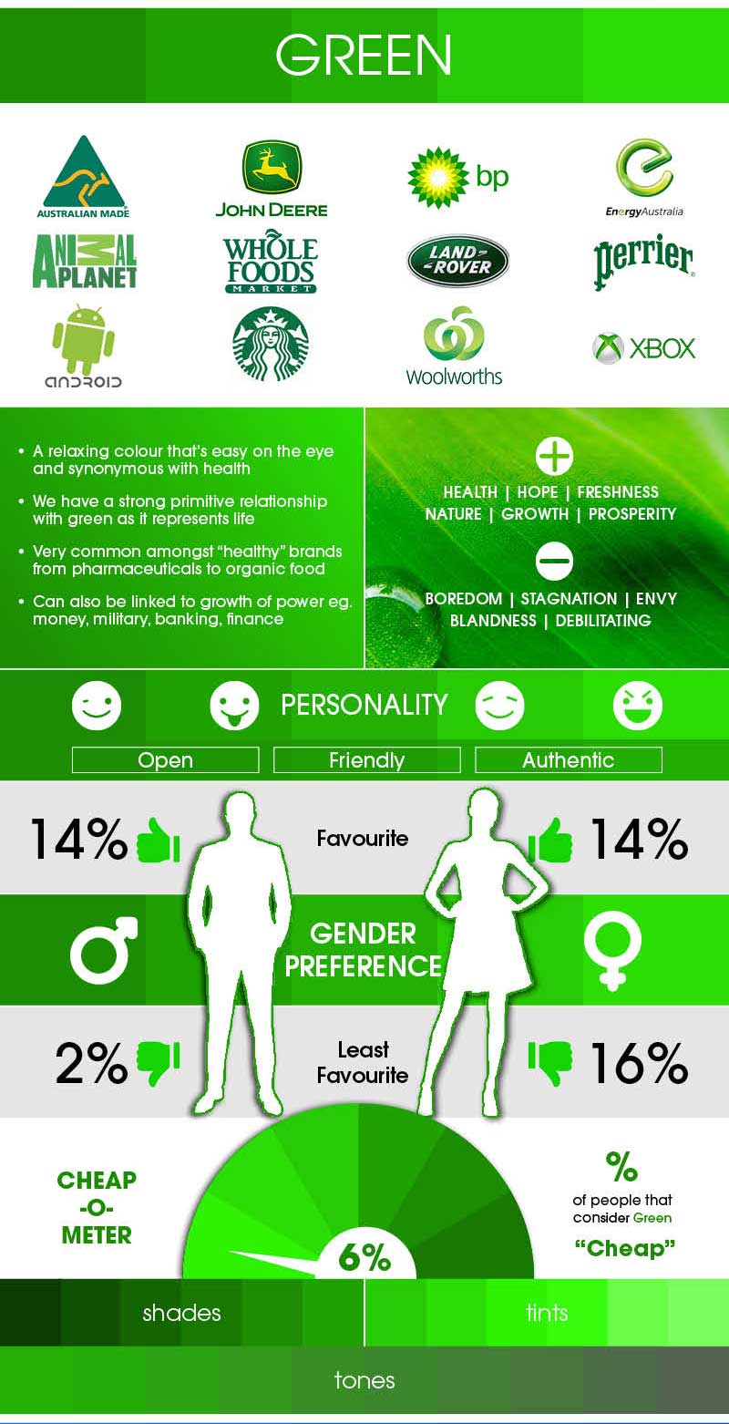
Source: Iconic Fox
The Use of Green in Branding
Starbucks

The green color palate of Starbucks was introduced so as to represent growth, freshness, uniqueness, and prosperity. Not only does Starbucks use green in its logo, it also uses the same color predominantly in its stores to promote relaxation.
John Deere

The green colors in the John Deere logo remind us of fresh cut grass. The yellow puts one in mind of a harvest-ready field of corn. One theory for use of green in the John Deere color palate is that it is the opposite of the color used for its competitor, International Harvester, which is red (read more about the color red in design here).
British Petroleum (BP)
According to the creator of the latest BP logo, the design includes a “stylized sunflower symbolizing the sun’s energy, while the color green reflects the brand’s environmental sensitivity.”
GoDaddy

GoDaddy recently updated their logo to create a feeling of newness. The color of green used in the newest iteration of their logo is bright and fresh and may also bring to mind a green light, meaning “to go,” as in GoDaddy.
Calls-to-Action
Green can also be used in design to bring attention to calls to action. Some examples here include:
Evernote
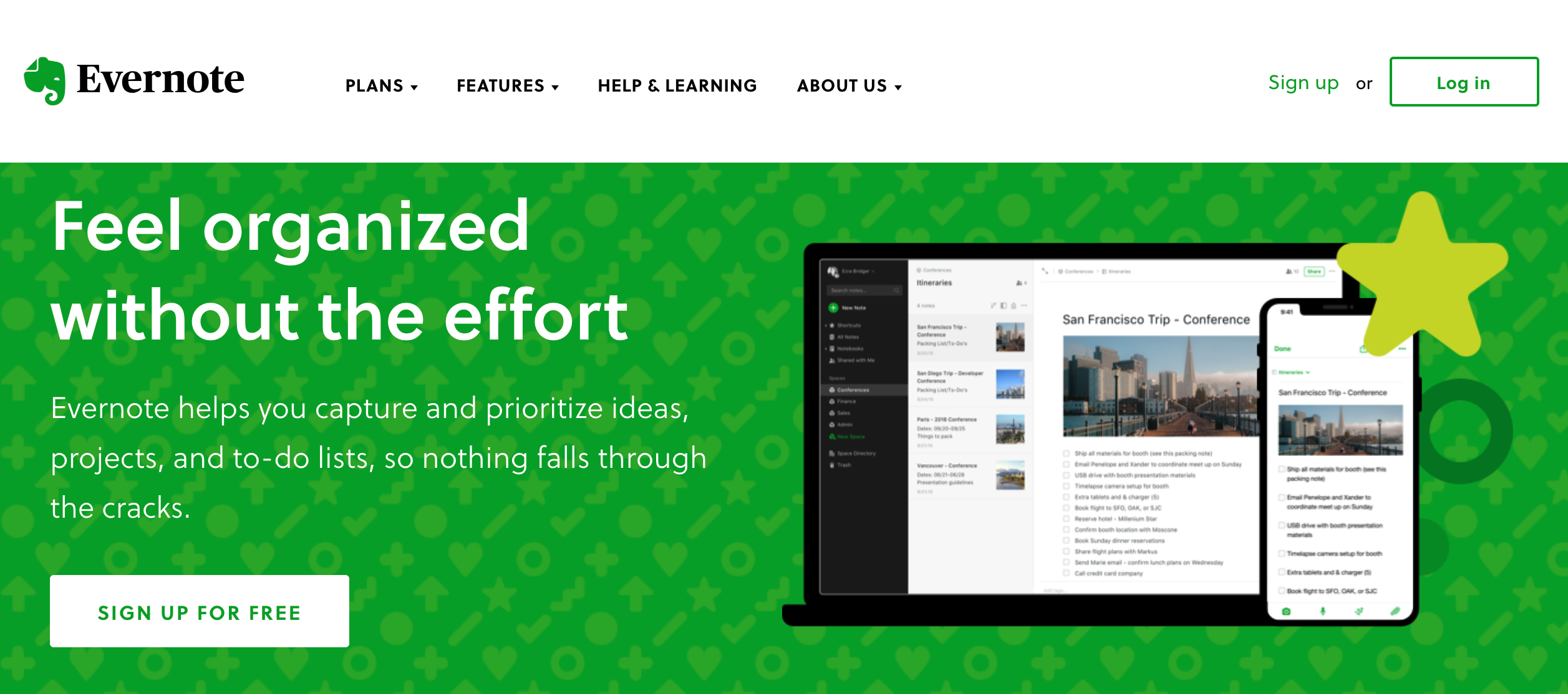
The use of green on the Evernote site is bright and rich. The color matches the green in the Evernote logo. Evernote also uses green in the design of the page. The feelings evoked are of freshness and youth. The use of the green letters against the white background highlights the CTA to “sign up for free.”
Treehouse

As in the Evernote example, Treehouse uses the same color in their logo as their CTA. This time, it is white letters against a green background. The use of green in this example makes one feel that they are saving money (also green) when they choose to “start your free trial.”
OptinMonster
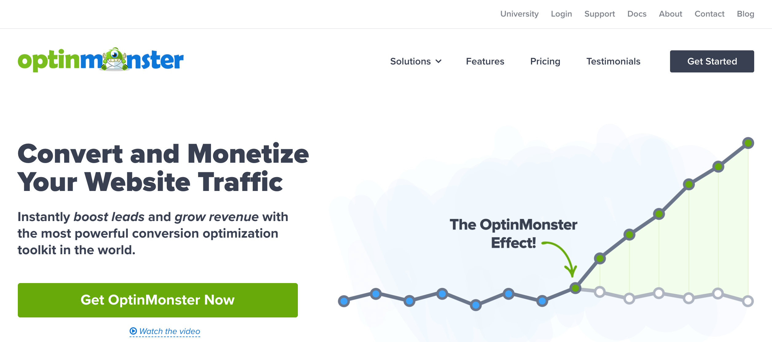
OptinMonster uses green consistently for all of their primary call-to-action buttons. This way it is perfectly clear what the user should do: click the “Get OptinMoster Now” button.
Spotify
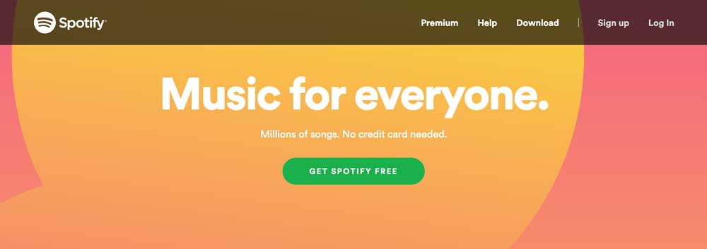
What catches your eye in this example? The use of green in this CTA is a calming green against the brightly colored red and orange background. The green really pops out in this example. Spotify is using color very effectively to get your attention and give you a sense of ease to get started with their product.
TD Ameritrade

When you are talking about investments, you may want your audience to think about green as in money, or green as in growth. TD Ameritrade uses green effectively to steer users in that direction with their use of green in their CTAs, logo, and headers. The shade of green they use is from the middle of the spectrum with a good balance of yellow and blue. The green pops on the white background.
Green Considerations
As you can see, there are many cases of green being a great choice in design. However, there are some things to keep in mind when using green.
Different shades of green words on a green or green-patterned background can be very hard to read. Adding more contrast makes it easier for the reader to see.
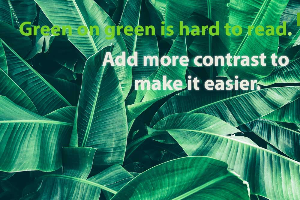
Some neon shades of green can be eye-catching. Others can be irritating and quickly tire the eyes.
Green used with other colors such as red can remind people of holidays.

It’s Easy Being Green
When it comes to color, the deliberate, well-thought-out use of various shades can significantly impact your market. Use the versatile color of green on a CTA to give people the “green light” to sign up or subscribe. Post something green on social media to help your followers relax or to understand your commitment to “being green.”
How have you seen green used successfully in design? Let us see how you use color in design at IMPACT Elite. I’ll be here in my garden, surrounded by green, watching for your comments.
Free: Assessment

