/Assets/base/Navigation%20Icons/TAYA.svg)
/Assets/base/Navigation%20Icons/Sales.svg)
/Assets/base/Navigation%20Icons/Web%20design.svg)
/Assets/base/Navigation%20Icons/HubSpot.svg)
/Assets/Icon%20Library/AI%20Mastery.svg)
/Assets/Icon%20Library/Learning%20Center%20Laptop.svg)

Mar 19, 2019
Little known fact: I am a performance poet.
I love getting on stage, grabbing everyone’s attention, and controlling their minds for five or 30 minutes. There’s something really rewarding about being able to tap in and change the emotions of a crowd with a few well-timed words. Sometimes it feels like a superpower.
As marketers, we all want to tap into that superpower so we can convince wanderers of the world wide web that our product is the best, most trustworthy option for them.
And while I wish we lived in a world where mere words could do the trick, strategically using color in our online designs gets us wayyyy further than using words alone.
Which is why we find such great success when we embrace color psychology.
“Color psychology is the study of how color affects our emotions and behaviors. Depending on your upbringing, cultural background, and personal preference, certain colors can make you feel a certain way.” - Will Erstad
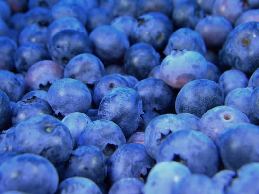
Let’s take blue for example.
Feeling the Blues
The color blue spans all kinds of emotional triggers:
-
The balloon that floats up at your cousin’s gender reveal party.
-
The spring sky promising warmer temperatures are on their way.
-
The fuzzy, sluggish sadness that wraps around your shoulders like an unwanted scarf.
-
The political party.
-
The ocean that you dream of kicking back on the sand and dipping a toe into someday.
Because of these emotional connections, we see blue everywhere in the marketing space.
Our good friends Facebook, Twitter, and LinkedIn embrace blue. As well as trusty tools like Salesforce, Constant Contact, and Zoom. Even your favorite newsletter, THE LATEST.
Outside of our marketing bubble, we have IBM, Samsung, Ford, Chase, Lowes, GE, Visa, and PayPal all choosing blue for their brands.
But why so blue?
Our friends over at CoSchedule sum it up nicely:
“Blue is known for its trust and dependability. It's reliable, responsible, and mentally soothing. For that reason alone, it's one of the most-liked colors across the entire world.”
Colors in the cool category, like blue, typically evoke emotions of professionalism, authority, and trust.
(If blue is alright but you’re really red’s biggest fan, feel free to bail on blue and check out our exploration of the color red.)
So How Do You Make Blue Work For You?
First, understand what the color blue means for your audience.
Remember that the shade chosen matters.
There’s a big difference between teal and “corporate blue” and baby blue, which means that there’s a big difference between the emotions that each of those shades is going to make your customers feel.
To illustrate, check out this great infographic from CoSchedule’s Color Psychology in Marketing Guide:
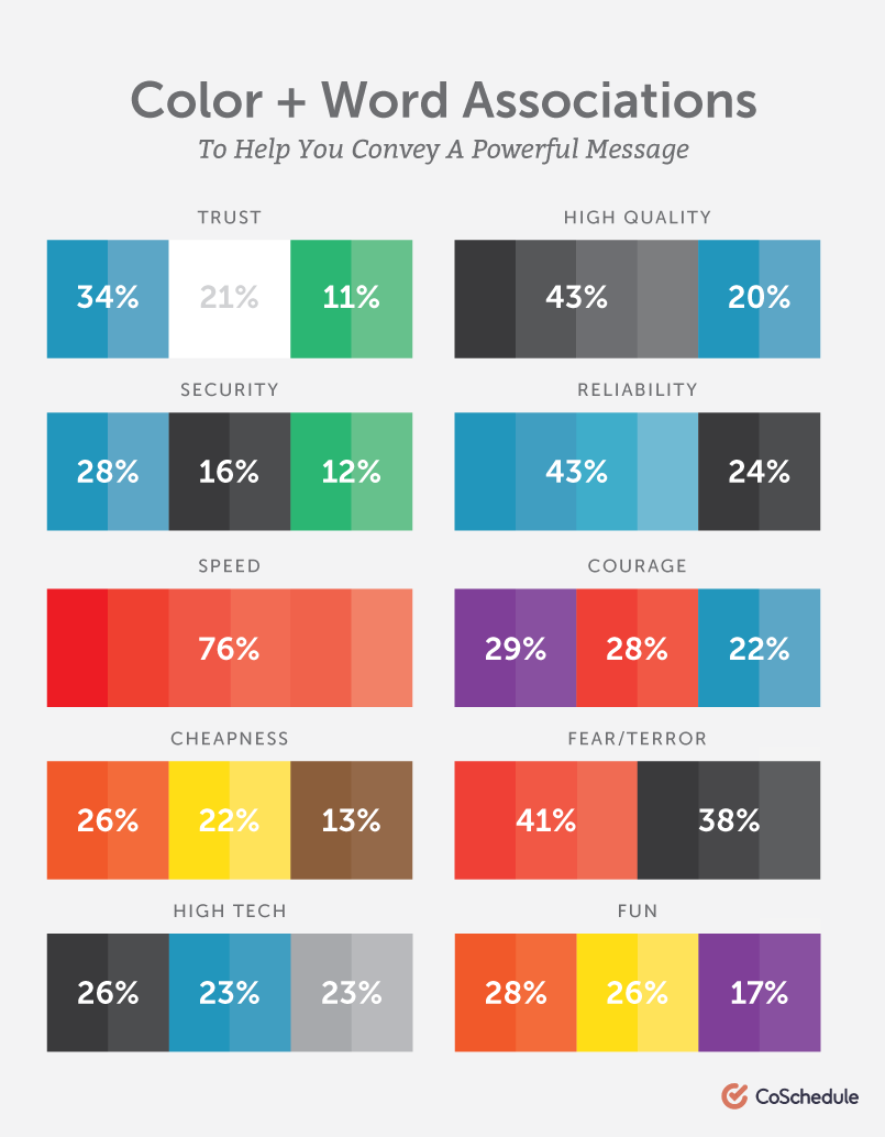
Color plays a key role in directing users’ attention. In fact, when HubSpot A/B tested call-to-action (CTA) colors, they “...increased conversion rate without changing anything about the page except for the color of the CTA.”
Strategically using blue on your website will help tell visitors how to feel about the information being presented.
A dark blue background can give a page visual weight and set a serious scene for any content on the page.
A striking bright blue against a lighter colored background, on the other hand, will help your CTA stand out against the rest of the content on the page.
For an example of this working well in the wild, check out ecommerce platform Shopify using periwinkle buttons over a tan background:
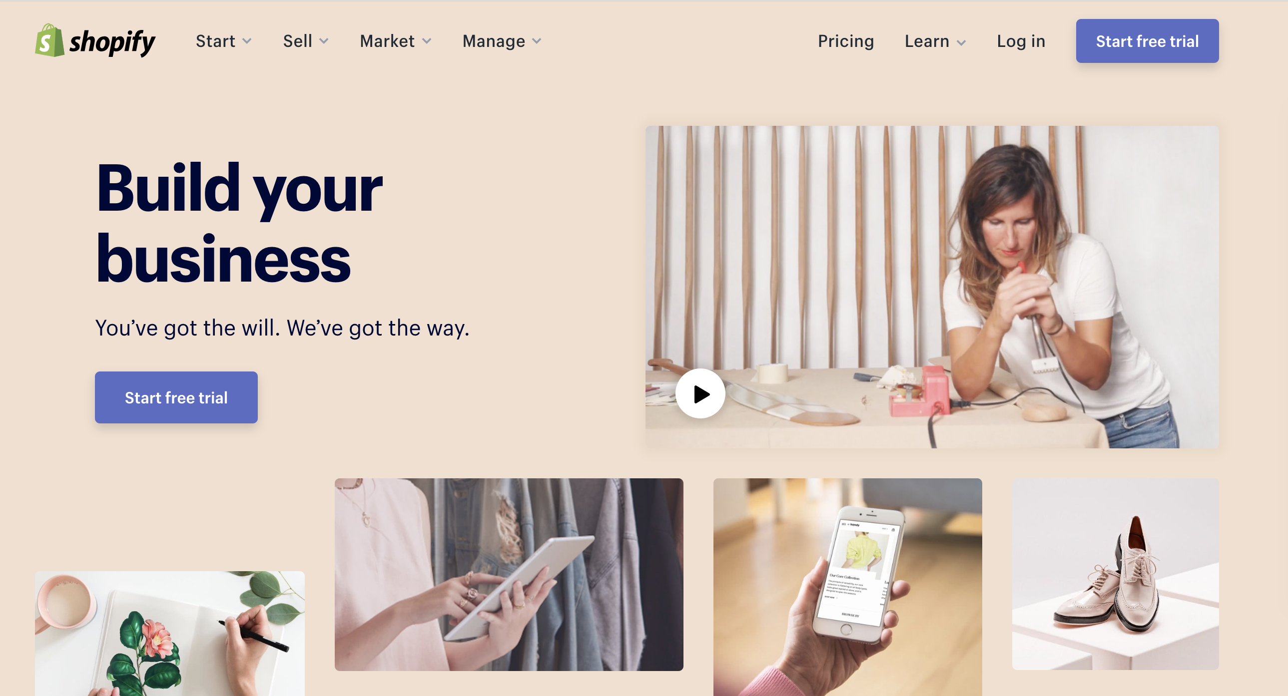
What was your eye drawn to first?
The contrast of the blue helps the CTAs jump out at the viewer from a sea of tan, pastel, and otherwise warm, gentle colors.
Also, note the action that the buttons are asking the user to take - Start free trial.
We all know what’s on the other side of that click - a form asking you to give away personal and professional information so that you can get your test account set up. Which is to say: a form asking for your trust.
How best to subtly prepare website visitors for that sort of an ask? Make the button our favorite trustworthy color - blue!
While we’re talking trust, let’s cover car loans.
Chase Auto’s website uses a trustworthy shade of blue in a graphic that aims to ease the fear of going through an auto loan process.
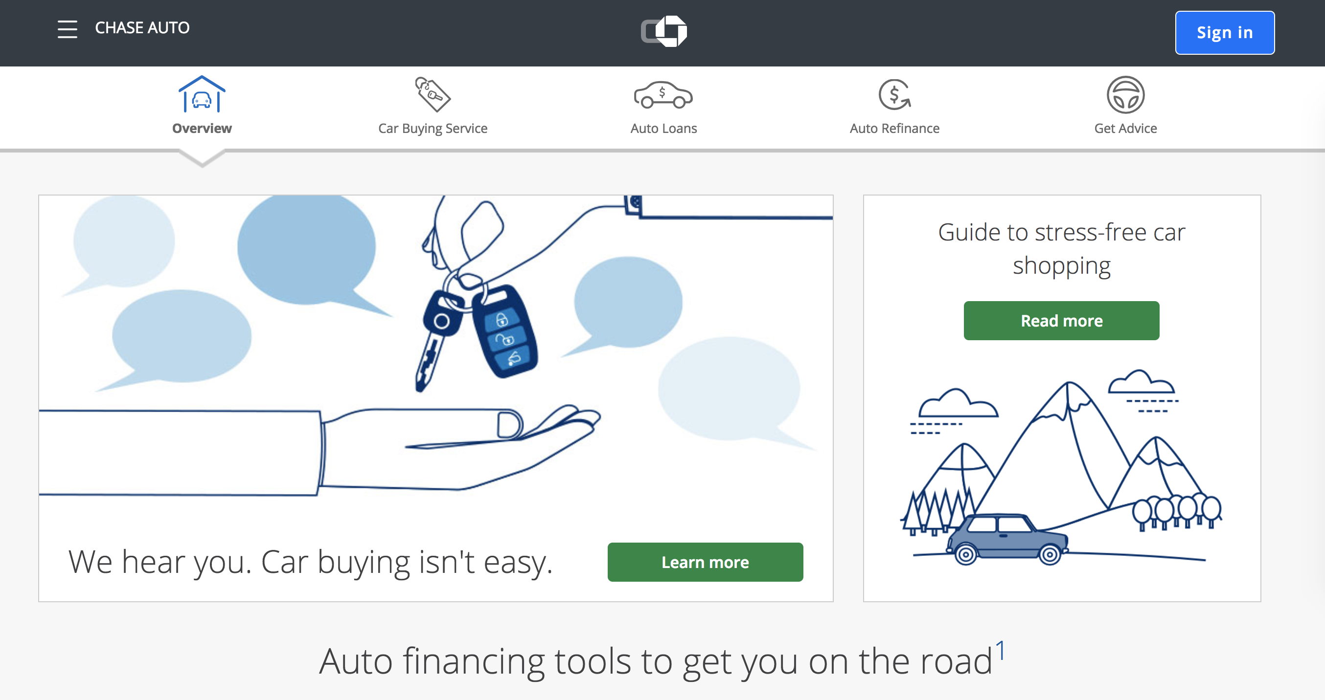
What catches your eye?
In a grey, white and blue color palette, the green buttons pop and pull the eye first.
But check out the different shades of blue and simple, easy-to-understand illustrations that are waiting to help you feel safe before clicking that money-green button.
Combined with phrases like “we hear you” and “stress-free,” blue is working hard to give site visitors a sense of ease.
When Should You Not Use Blue?
Because blue is so well-liked and suggests trust and stability to the viewer, it’s difficult to use it the wrong way, but it is possible.
Always remember to use it strategically when using it with a contrasting color, for instance.
Using blue and orange in equal amounts and equal saturation will create a lot of visual “noise” that can cause the viewer to become distracted or overwhelmed.
Similarly, if you’re determined to create a calm or serene feeling by using different shades of blue, make sure the contrast is high enough that everything remains legible.
You can see this in action in the example below:
Overall, Blue is Your Friend.
With the power of color in your marketing, you can choose exactly how to make your audience feel.
This is especially true with the versatile color of blue.
Excite your email subscribers about a sale. Post a social image that helps followers feel just a bit cooler on a roasting summer day. Send an email with a formal business update that subscribers can trust.
However you do it, keep it creative. Let us know how it works for you and your brand in IMPACT Elite.
Free: Assessment
/Assets/Icon%20Library/x%20corp.svg)
/Assets/Icon%20Library/whatsapp%20logo.svg)
/Assets/Icon%20Library/Email.svg)
/Assets/Icon%20Library/Arrows/Grey%20Arrow%20-%20Prev.svg)
/Assets/Icon%20Library/Arrows/Grey%20Arrow%20-%20Next.svg)