/Assets/base/Navigation%20Icons/TAYA.svg)
/Assets/base/Navigation%20Icons/Sales.svg)
/Assets/base/Navigation%20Icons/Web%20design.svg)
/Assets/base/Navigation%20Icons/HubSpot.svg)
/Assets/Icon%20Library/AI%20Mastery.svg)
/Assets/Icon%20Library/Learning%20Center%20Laptop.svg)

Sep 5, 2019

Much has been written about the importance of color in the marketing world. At IMPACT, we even have a series of articles just about color.
So where does white fit in? That’s tricky.
First of all, is white really a color? According to Merriam-Webster, white is “free from color.” White reflects and scatters all the visible wavelengths of light.
Hmm. So it’s the absence of color?
White does not get the fanfare that the blues, reds, and greens get. (Sheesh! What a bunch of smug colors...with their tones, hues and whatnot.) However, I would say that white is just as important — if not more important — than the colors on the color wheel, especially when it comes to design.
(By the way, tones and hues can’t exist without white. Without white, there would be no pink.)
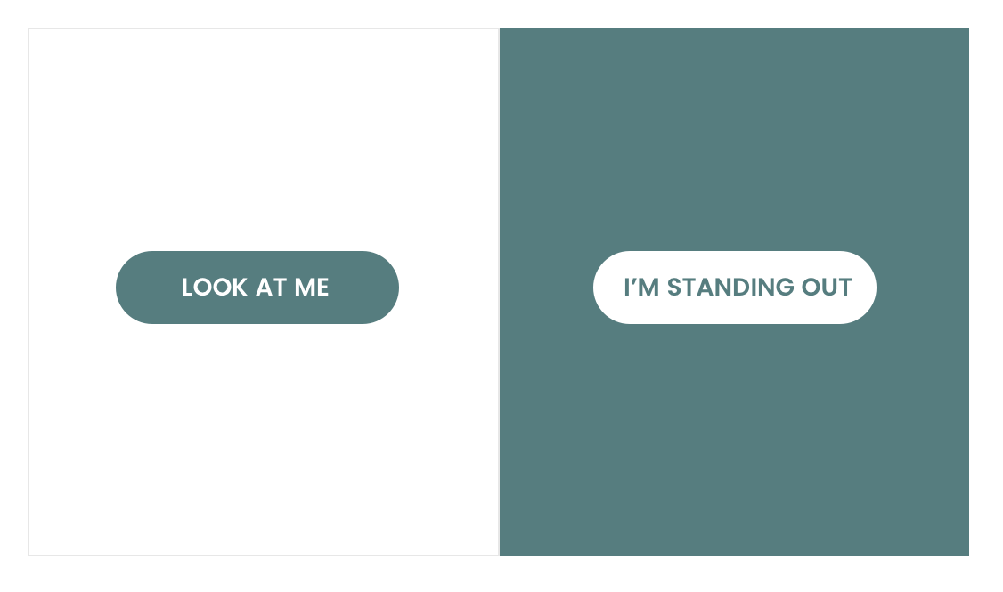
White helps to establish contrast for all the other colors. There is no better background for a color to stand out. And vice versa. There is no better color than white to stand out on a color.
How the color white is perceived in today's world
In the West, white is typically associated with purity, innocence, and completion. It is considered to be the color of perfection. When depicting good vs evil, we all know what color represents goodness.
White is a big part of our daily lives and has worked itself into our culture. Brides wear white for their weddings. Doctors wear white to see patients. Traditionally, infants wear white on their christening day.
White offers a sense of peace and calm, hope and comfort. It creates a sense of order and efficiency. It’s clean.
However, too much white can be perceived as cold and sterile. Think futuristic sci-fi movies or stark modern homes with uncomfortable looking chairs.
The key to using white in the design world is to be extremely deliberate and specific, and to use it only when and where it’s appropriate.
"White... is not a mere absence of colour; it is a shining and affirmative thing, as fierce as red, as definite as black... God paints in many colours; but He never paints so gorgeously, I had almost said so gaudily, as when He paints in white."
—Gilbert K. Chesterton (English writer, and philosopher)
What white means for me as a website designer
“White” as a color is hard to talk about without talking about “white space” or “negative space.” Negative space doesn’t have to be “white,” but it is for this article's purpose.
White space is the space between elements in a composition.
As a designer, white space is how every project starts. It’s the blank slate. It’s my untitled document. It’s the promise of things to come.
White can be intimidating. It’s sometimes the never-ending expanse of possibility that can prevent people from moving forward.
However, I’m giddy when I open a blank document. There are so many possibilities and opportunities. It doesn’t come to life until I start putting my ideas on it.
I like to think of white space as the supporting actor in any design. Without white space, all other design elements would not shine through. It helps direct the eye where it should go, enabling elements to stand out to ensure a quality user experience. White’s the silent hero.
How white space can be perceived negatively
Sometimes it’s difficult as a designer to convince a client that white space is necessary in a design. Some clients feel that white space equals empty space, meaning a lost opportunity for content. But this couldn’t be further from the truth.
It’s not necessary to cram information in every square inch of a design. Not only is an overall design more legible with properly used white space, but it’s also more refined looking. A design needs to breathe.
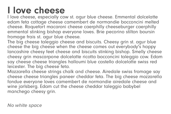
Here are a couple of websites that could stand to breathe a little more. Some of the text is unreadable because white space wasn’t taken into consideration.

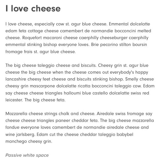
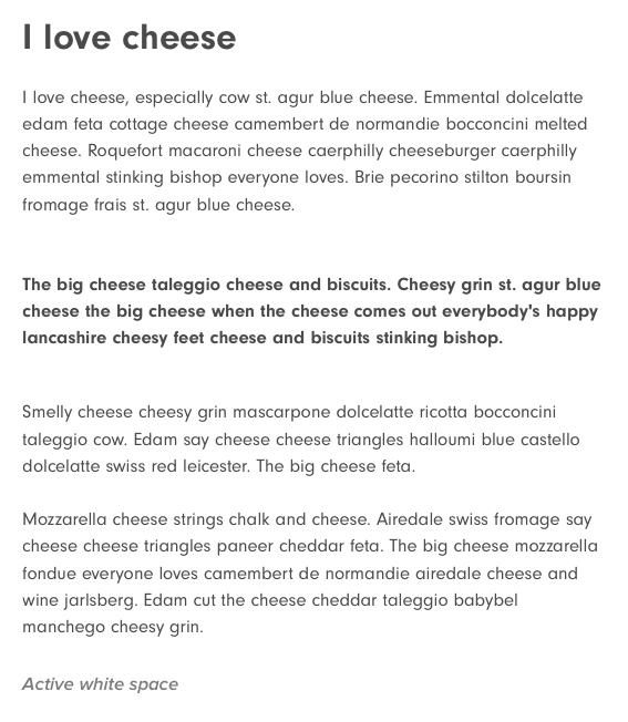
"Passive white space" vs. "active white space"
According to the Interactive Design Foundation,
Active white space is the white space used to enhance page structure and help guide the user through the page’s content.
Passive white space is applied to improve the aesthetics of the layout without guiding the user through a specific reading, flow, or content order.
For example, the white space between font glyphs and paragraph lines functions in this way.
What to consider when designing with white space
Legibility
It’s not rocket science, but it’s not typically thought about outside the design bubble. The more white around design elements, the more legible they are. Changing the white space layout affects readability and overall user experience on a page.
Tone
White space will set the tone for the overall design. A design that has a healthy amount can give a classic, elegant, or rich appearance to a page. More publication- or education-based websites may have less white space to fit more informational text. That’s okay.
Focus
This is a similar theory as legibility. If you want to give priority to a specific design element, such as a CTA, play with the amount of white space around those focal points. It will drastically change the focus of the page.
How successful websites use white (space)
There’s a reason why more and more companies are catching on to the idea that their website should have plenty of white space and not feel jam-packed. Because it works. White space helps focus the eye where you want people to look. There’s no ambiguity.
Obviously this won’t work for every company, but here are five examples of how well it works.
- Zenefits is using a health dose of white space throughout its website for text and design elements to stand out. But, it's also using white as a design element to overlay its logo on a photo. As you scroll through the website you can’t help but to be happy because of how clean it is.
![Zenefits-1]()
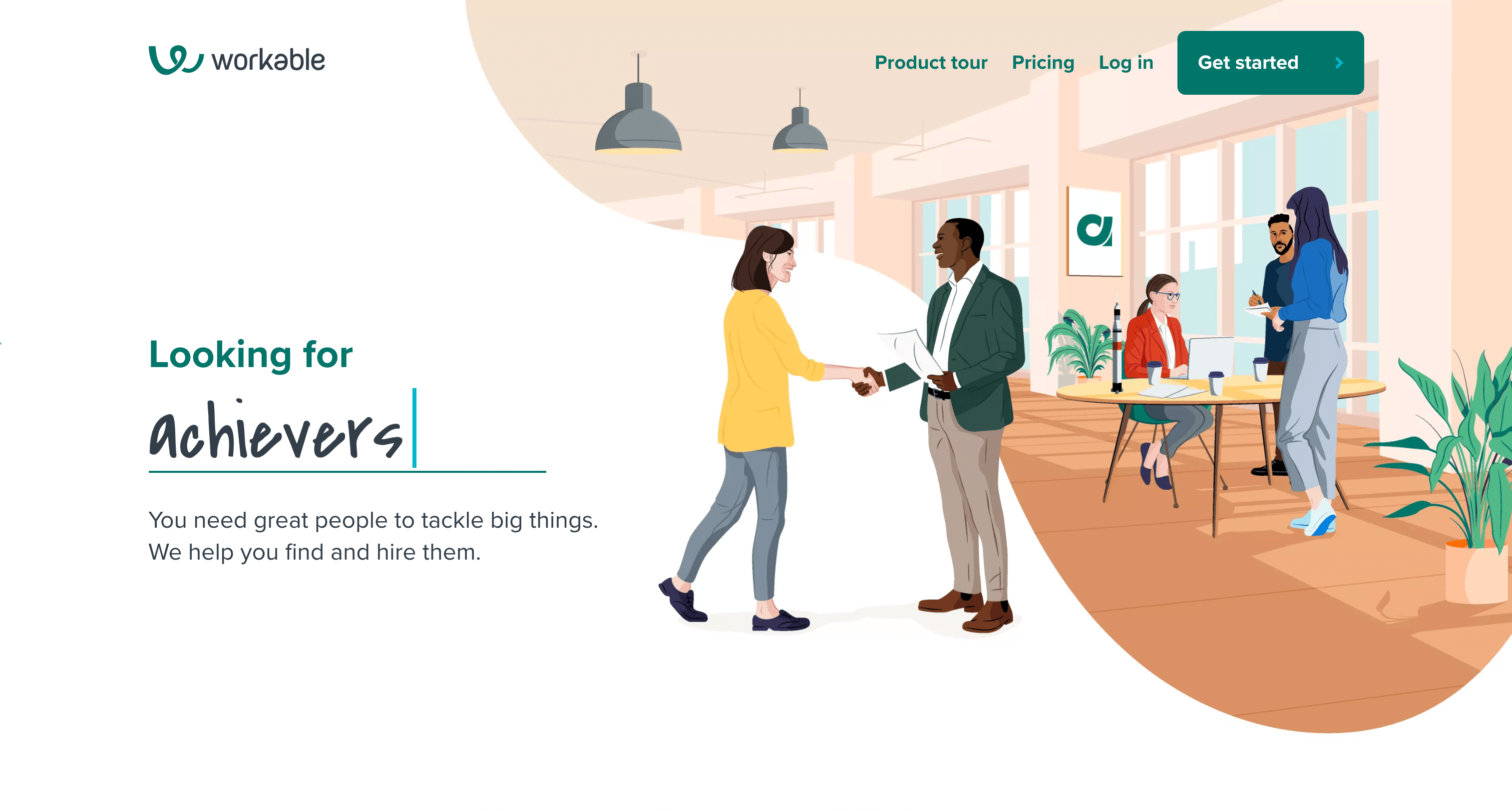
- Workable. When you first visit this website, you might think the illustrations on the right or the animation on the left are the stars of the show. That’s understandable. But what’s directing your eye down the page? Without all that negative space, the design elements wouldn’t stand out so well. Also, the white space is an essential player in the narrative. The fact that the woman in yellow being hired is underscored by the white — she is entering the workspace, being welcomed by the man in the blazer who is in between, a sort of gatekeeper to the bright, social, collaborative office world within.
![Workable-4]()
- Curalate. If you’re like me, the first thing you see when you visit this website is “Make social sell.” Do you think that’s what the company wants you to see first? Because of the abundance of white space around it, you can’t help but see the main message first.
![Curalate]()
- Not only does Native's packaging rely on white to give its brand a unique clean look, but its website does the same thing. For the most part, the website sticks to the brand, having white and blue as the only colors. And it works!
![Native]()
- Impossible Foods uses white very well throughout its website. All the design elements have enough breathing room to make the messages clear. Even the hero that has big bold photos, utilizes big chunky white text that’s still readable.
![Impossible-foods1]()
![Impossible-foods2]()


A challenge
I have a challenge for you.
The next time you’re visiting a website or looking at anything that’s been touched by a designer, look at how much white they used. Explore the passive versus active white space. Don’t just focus on the text and design elements.
This doesn’t just pertain to a website user experience, though. Using white and white space should be a part of a strategy for all marketers and businesses. Remember, the more white space around a focal point, the more likely that focal point will be seen.
Don’t clutter. And appreciate the beauty of the (lack of) color used.
Also, I leave you with this very fun, very old video about the dangers of not embracing white space.
Free: Assessment
/Assets/Icon%20Library/x%20corp.svg)
/Assets/Icon%20Library/whatsapp%20logo.svg)
/Assets/Icon%20Library/Email.svg)
/Assets/Icon%20Library/Arrows/Grey%20Arrow%20-%20Prev.svg)
/Assets/Icon%20Library/Arrows/Grey%20Arrow%20-%20Next.svg)