Join 40,000+ sales and marketing pros who receive our weekly newsletter.
Get the most relevant, actionable digital sales and marketing insights you need to make smarter decisions faster... all in under five minutes.
10 Cyber Monday/Black Friday Landing & Pricing Page Critiques

Nov 24, 2016

Holiday shopping season; you can already see memories of the lines forming around the corners of department stores and people camping outside coming into your head.
If you’re like many, you take to the web to research those special deals before you step into any line unknowingly. Or, for those to choose to avoid the lines, you’ll take to your desk and ready yourself for the online deals.
With so many retailers and companies taking advantage of this time of year, I figured it would be an excellent time to see how they're doing it and who's hitting the mark.
So I scoured the web and pulled out several companies who were promoting Black Friday and Cyber Monday sales, put their landing and pricing pages under a microscope, and compiled my findings throughout in this article.
Some companies managed to create a fantastic experience for their users and make sure they emphasize their sale clearly, while others could have improved in a few places.
Have a holiday sale you're planning on advertising, or looking for ways to improve the one you’re currently running? Check out these 11 pricing pages & landing pages to see the strategies they chose, the tips and tricks you can use to improve your own, and what you need to avoid.
(Want more help? We have an article dedicated just to examples of pricing pages we love.)
1. Adorama
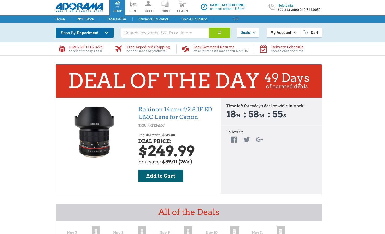
To promote their specials, Adorama has taken the 12 days of Christmas and transformed it into 49 days of amazing specials on a specific item each day.
I love the large banner, it immediately gets the point across that there will be a new special each day, enticing you to return to the site to see what it is. And if that wasn’t enough, the countdown timer next to the item adds further urgency, letting you know is expiration is near.
Increasing the font size on the deal price and putting the saving directly below is also a fantastic way to bring the user's eye immediately to the savings.
My only comment on this page would be to condense the “All of the deals” section below. While users can clearly see what have already passed, it seems to add unnecessary length to the page.
My advice would be to condense it and only showing the past 3 deals with a link to a page showing all of them. As for the future deals, I’d consider adding in a form where people can sign up to be reminded when the next deal is live. This helps you build your contacts while also keeping users continuously returning to your site.
2. BullGuard
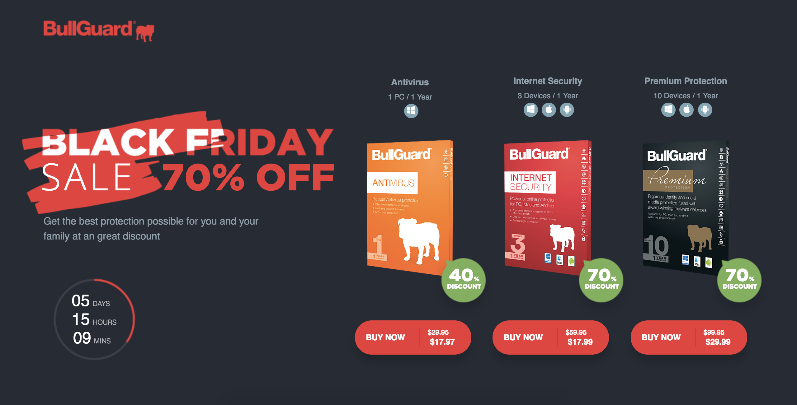
BullGuard is utilizing black Friday to advertise three pieces of their software at varying discounts.
Their hero area layout and content managed to strategically fit a strong headline with an impressive discount, a countdown timer for urgency, three different products and their specific discounts and prices. Pretty impressive.
Immediately, there desktop users are able to absorb all the most important information about their sale, a technique not even the most basic of landing pages even manage to fulfill.
The rest of the page contains content to further explain the benefits of their product, comparisons, reviews, awards, and companies they’ve been featured on.
While this page has all the right elements that show social proof and product explanations, there is a lot for the user to read.
The information under the “features” tab could use some condensing. One option is to list only the most important items that you see throughout all the products. Features only utilized in one or two products can be identified in the pricing table at the bottom of the page.
You could also move the tech specs in a FAQ below the pricing table to push the table up higher and move the review below the features so people can see what people think if your product. You don’t want people missing it because it’s hidden in a tab users may not click!
3. Adobe
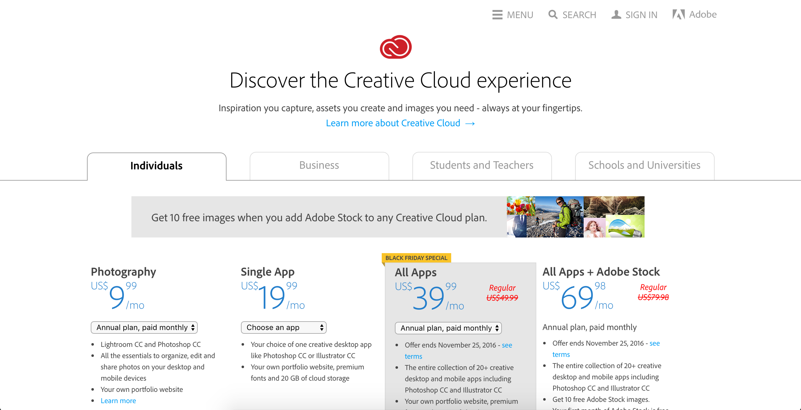
Although a more subtle approach, Adobe has updated their pricing page to advertise their black Friday special on a couple of their plans. This saves them the time from creating an entirely separate landing page advertising the specific deals and keeps the information together for their users.
Despite the changes being so minor, the gray background and yellow banner are all the page needs to immediately direct the user's attention right to the highlighted deal. The red text showing the original price lets users know exactly how much they are saving without having to search around in the pricing information for it.
My only suggestion here would be to change the button color of the plan within the gray box, possibly to the yellow used in the banner, further distinguish the highlighted plan from the others.
A countdown timer may also add a little more urgency, but ultimately may not be necessary for Adobe’s audience.
4. Parallels
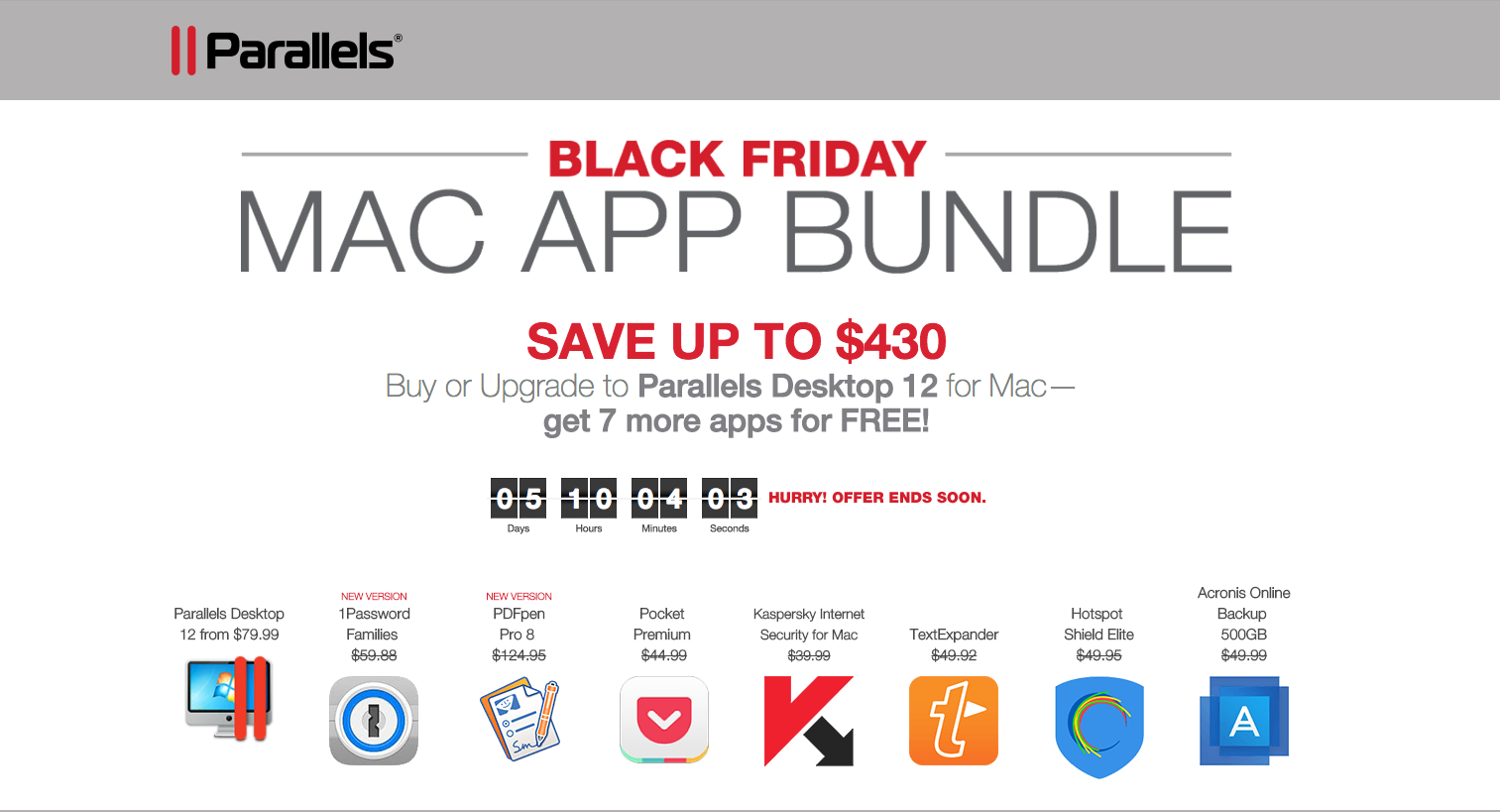
Like BullGuard, Parallels used the hero to clearly spell out their deal and all the assets you’d receive in the sale. They even found the room to stick in a countdown. So without scrolling, you know exactly what the sale is, what you’d get, and how much time is left.
Kudos to hitting all the right points!
There are a few improvement opportunities outside of the hero.
The buttons directly below the hero are both stand out equally. Choosing a more subtle color, such as a gray, for the “upgrade” option will help better distinguish its purpose from full purchase.
The explanations of each of the apps below is a good way to let users know exactly what they are getting with each application, while keeping them on the landing page in the process.
5. Apple
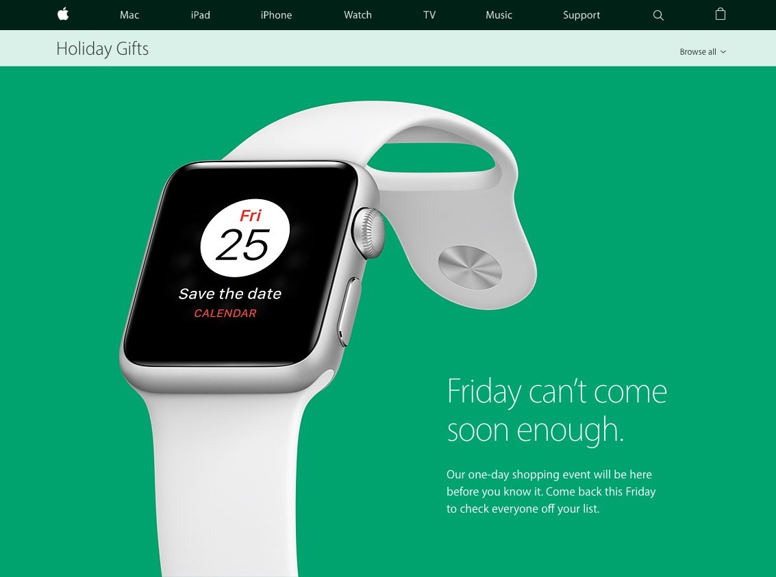
In perfect fashion, Apple kept their black Friday landing page clean and appealing.
Rather than highlighting all the sales they’re offering, they keep it hush and advertise to visit back when the date has finally hit.
The rest of the page details where you’ll be able to take advantage of these deals and what product categories the sales will pertain to.
There may not be a countdown timer or any loud header, but their hero still reminds me of one of those “don’t open til Xmas” tags on a gift, making it that much more attractive. They’ve even got me curious!
6. Namecheap
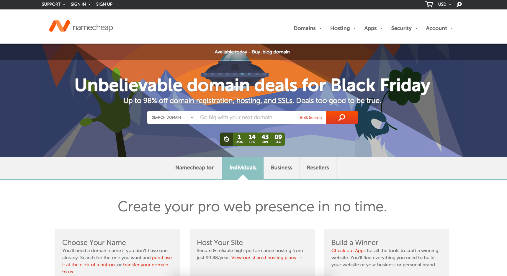
Although not exactly a landing page, Namecheap instead redesigned their homepage hero to advertise their black Friday deal and incorporated a little countdown timer to top it off.
For Namecheap to offer up to 98% off some of these deals is pretty incredible! With that being said, they should take the opportunity to highlight that number, whether it be through bolding, italicizing, underlining, or a combination of the three.
If you click through the “domain registration, hosting, and SSLs” link, you’re lead to another page with the same headline.
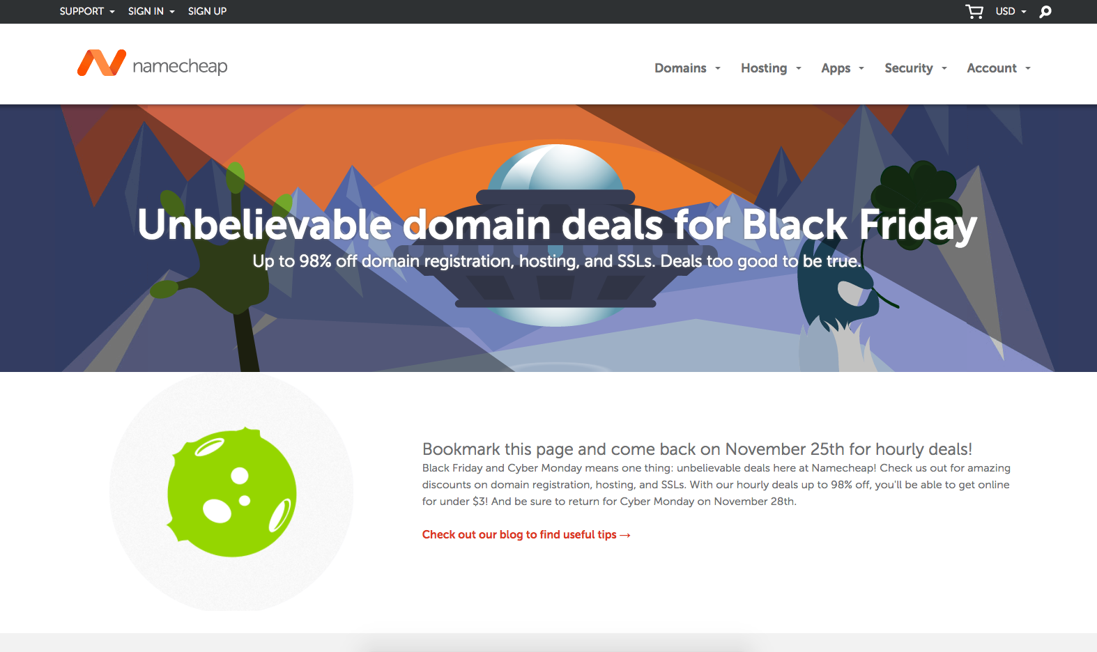
A little repetitive for users who just came from the homepage, so you may want to change the content up.
One suggestion is to let users know in the subheader that nothing is currently on the page at the moment, but to bookmark it for later (or better yet, have them enter an email address to remind them when the sale starts).
In the section below, try highlighting more prominently what exactly they can expect. This will help make the page all the more enticing so users will be interested in returning to it later.
7. ftrack
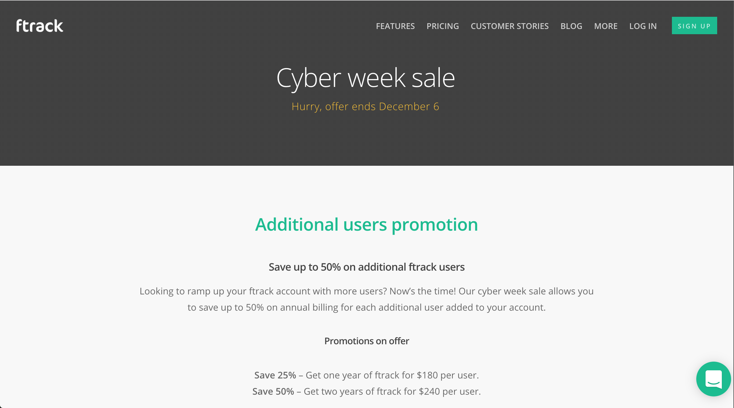
Ftrack has a beautiful site with an amazing product that allows creative to set up projects and track their progress in a collaborative workspace. Although this page keeps to their styles and branding, it seems to miss the urgency that a traditional black Friday/cyber Monday page would have.
Like BullGuard and Parallels, trying to better highlight the promotion in the hero area in a very prominent way will let users better identify how amazing your sale is immediately and why they should take advantage of it now.
Aside from that, the FAQ section below was an excellent way to account for information most users would want to know without having to direct them to support to get the answers they want.
8. Filmconvert
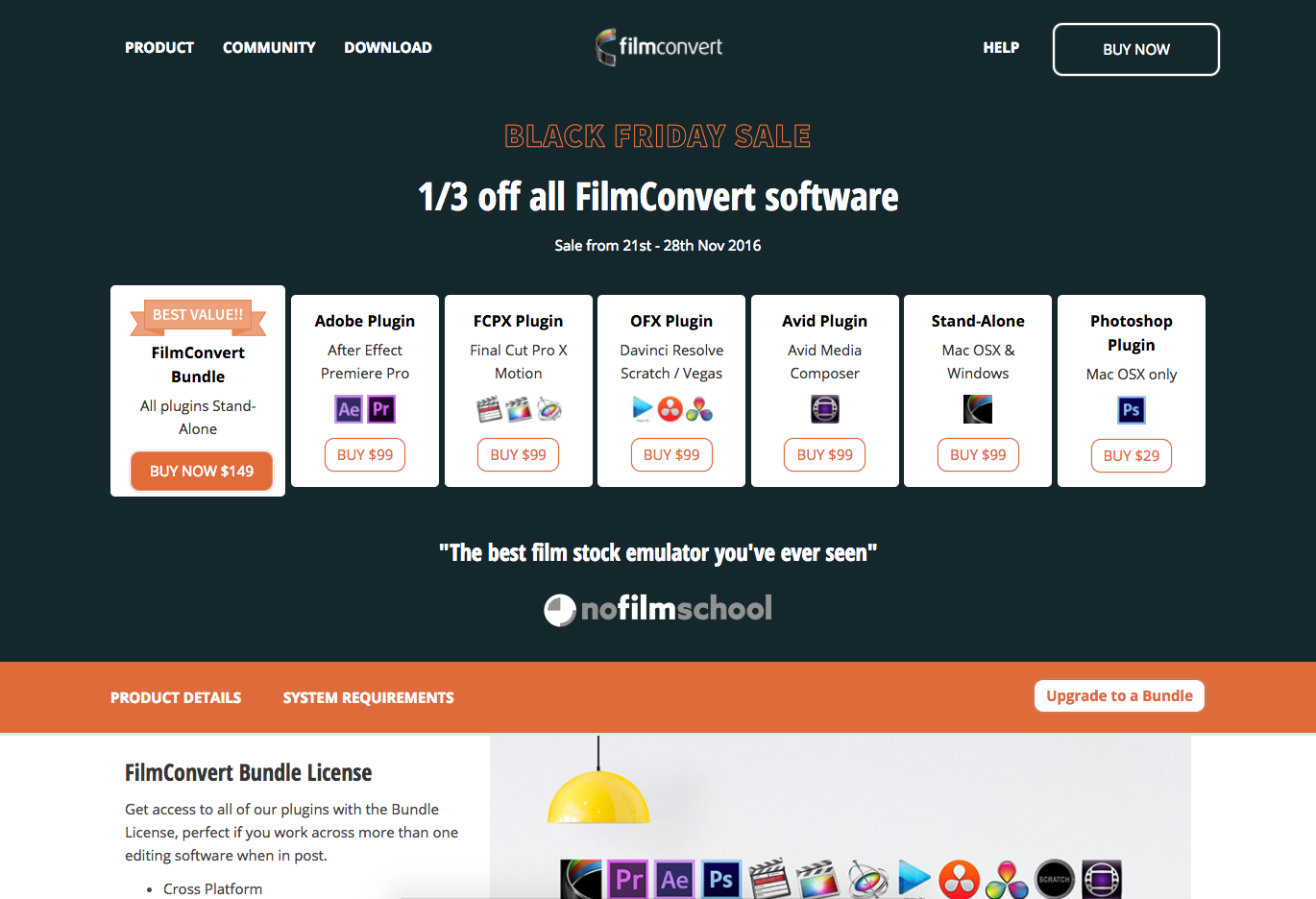
Filmconvert updated their pricing page to highlight their special and avoid the work of setting up a separate page to advertise the deal.
The company also has a lot of products, and I’m impressed that they were able to fit all of the options within the hero area so users don’t need to scroll forever to find out what the software is.
Although, there are still some small improvement opportunities within the hero.
First off, using the term “⅓” off reads a little weird, so keeping it to 33% would be a bit more appealing.
I’m also not entirely sure if the prices within the hero area have the discount already applied, or if I need a promo code during the purchase. If it's already applied, show the price cut there with a ‘regular price’, the number, and a slash across it, so users see the price difference. If this is a promo code, show it! That way your users aren’t confused about the deal.
9. Samsung

Samsung, similar to Apple, stuck to their branding and kept any crazy headlines or sales in the hero out of the picture.
The company instead utilized this page to take the opportunity to feed in all of their deals. This lets users choose whether to scroll infinitely down the page to look at all of them, add deals to their wishlist/cart, or click into one to view more information
I thought it was interesting that Samsung chose an ‘add to cart’ over a ‘view details’ button. This directs users to add products to their shopping carts quicker, rather than clicking into each and every page to learn about the product first.
My only suggestion would be to add a small ‘view details’ button that's visible when the user hovers over the item. That way if they do want more information, they don’t feel the only option is to add it to the cart.
10. Microsoft
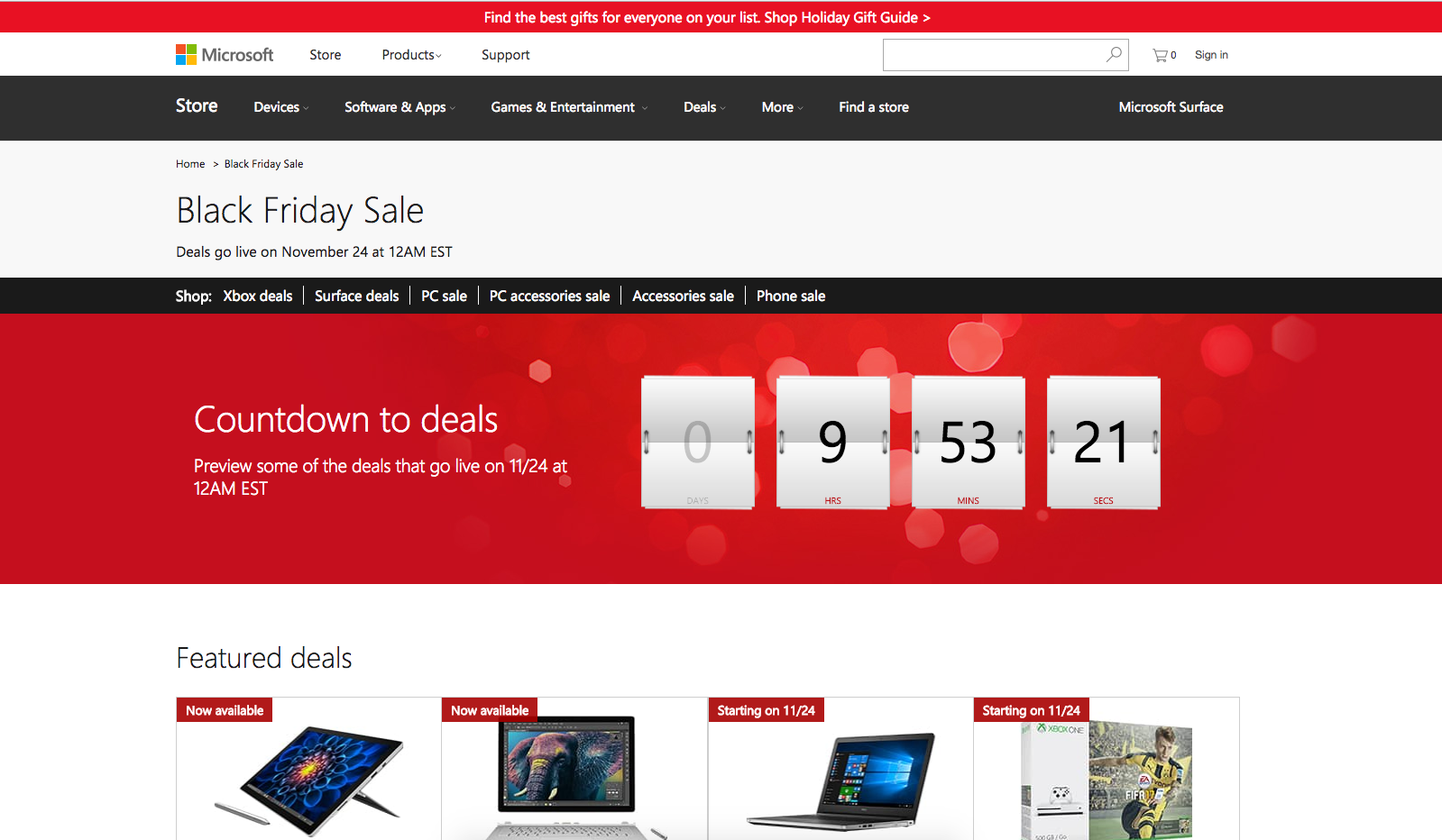
I really love the enticing nature of this page.
The first thing users see is the large timer counting down ticking down to the start of the deals, which is further confirmed by the header to the left of it.
Below, you can see some of the current deals that are available, and the beginning of some of the future deals. This lets users mark off the items they are interested in now so they are prepared to return knowing exactly what they want.
Like Samsung had, it may be useful to add an “add to wishlist” option. This adds convenience so your users don’t need to click into the page to add the item to their list.
Free: Assessment