/Assets/base/Navigation%20Icons/TAYA.svg)
/Assets/base/Navigation%20Icons/Sales.svg)
/Assets/base/Navigation%20Icons/Web%20design.svg)
/Assets/base/Navigation%20Icons/HubSpot.svg)
/Assets/Icon%20Library/AI%20Mastery.svg)
/Assets/Icon%20Library/Learning%20Center%20Laptop.svg)

Sep 23, 2019

The website design process is a huge undertaking, no matter how big or small the website. There are many moving parts, and feedback is essential in nearly every step of the redesign process. As the client, you might not have the expertise of developers and designers, but it’s your business and your website, so your feedback is crucial.
In most cases the average website redesign progresses in the following order: Strategizing, Wireframing, Designing, Developing, Writing Content, Testing, and Launching.
While this article focuses on giving feedback on a design mockup, I encourage you to revisit a previous Design Feedback 101 article, How to Give Feedback on a Wireframe.
The truth is the more constructive the feedback given in the wireframe stage, the easier it is to focus on more design-centric feedback in the design phase. With that in mind, here's how to provide effective feedback on a design mockup.
3 steps to design mockup feedback
The thought of reviewing designs in a step by step process may make you cringe, but I assure you by following these steps you will be able to provide the most constructive feedback to your designer.
1. 5-second scan
Why five seconds? Well, that is just about the amount of time it takes a user to decide whether or not the page contains the information they are looking for and/or if it is visually pleasing enough to take the time to take a deeper look.
So, how is this done?
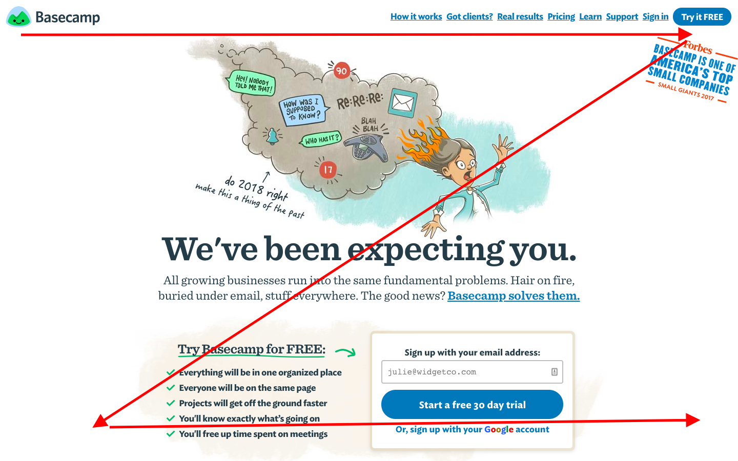
The first step is to glance at the page design, top to bottom, for roughly five seconds. To do this most effectively the designer should provide little to no information about their design choices. This will allow you to be in the mindset of a first time visitor to the site.
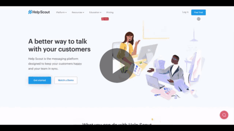
Here is an example:
After those five seconds, ask yourself the following questions:
- What is the main purpose of the page?
- Do any elements stand out as an area of importance?
- Does your eye flow down the page?
- How does the design make you feel?
If you are unable to identify the main purpose of the page or you become distracted partway down the page, then it is time to re-evaluate the strategy-design relationship of the page.
2. Dig deeper into the elements
With the information gathered from the five-second scan, you can now take a close look at the all of the elements that make up the design. In general, you want to look at each element listed below with the intention to understand its importance to the overall message on the page and how it may fit into the strategy of the website.
Hierarchy refers to the font size of the text as well as the colors of the call-to-action buttons or links on the page.
Larger fonts should be used for headings to draw the user’s eye, while the paragraph font should be smaller yet very legible and scannable. Users tend to scan websites in search of answers to their questions, and a big block of small paragraph font can deter readers.
An excellent layout for organizing content in a “scannable” format is to design in an “F” shape pattern, which has been found to be the most consistent engagement pattern among readers.
For color, the more vibrant shades tend to trigger action for users, which is why they are frequently used for CTAs or areas of a website that require the user to pay attention and take action.
Questions to consider when reviewing for hierarchy are:
- Can you easily identify the most important aspects of the page?
- Do the colors make sense and draw attention to strategic areas?
- Which area(s) of the page do you identify as actionable?
Whitespace. When executed well, the right amount of whitespace can make your design easy to digest and elegant.
The following questions can help you to evaluate whitespace of a design:
- Is there enough “breathing room” from one section to the next?
- Are the different sections of the page clearly defined?
- Do any elements feel as though they are “floating” on a page, or do they feel anchored enough to draw you into the text?
Evaluating whitespace can be a little bit tricky as it can be a matter of preference. The best approach is to answer the questions above as you are going through the design and point out specific areas where the whitespace works for you and where it doesn’t.
More often than not, the final result will be somewhat of a compromise between you and your designer.
Alignment. There are design elements that, when applied to a website design, can affect the perception of alignment. Although much of the copy and section alignment is established while wireframing, pay attention to the design elements that have been added and confirm that the page remains balanced.
Some elements, such as offset shapes or gradients, can cause the illusion of misalignment among the text of a page.
Here is an example of how shapes and gradients are used to complement the copy while maintaining alignment:
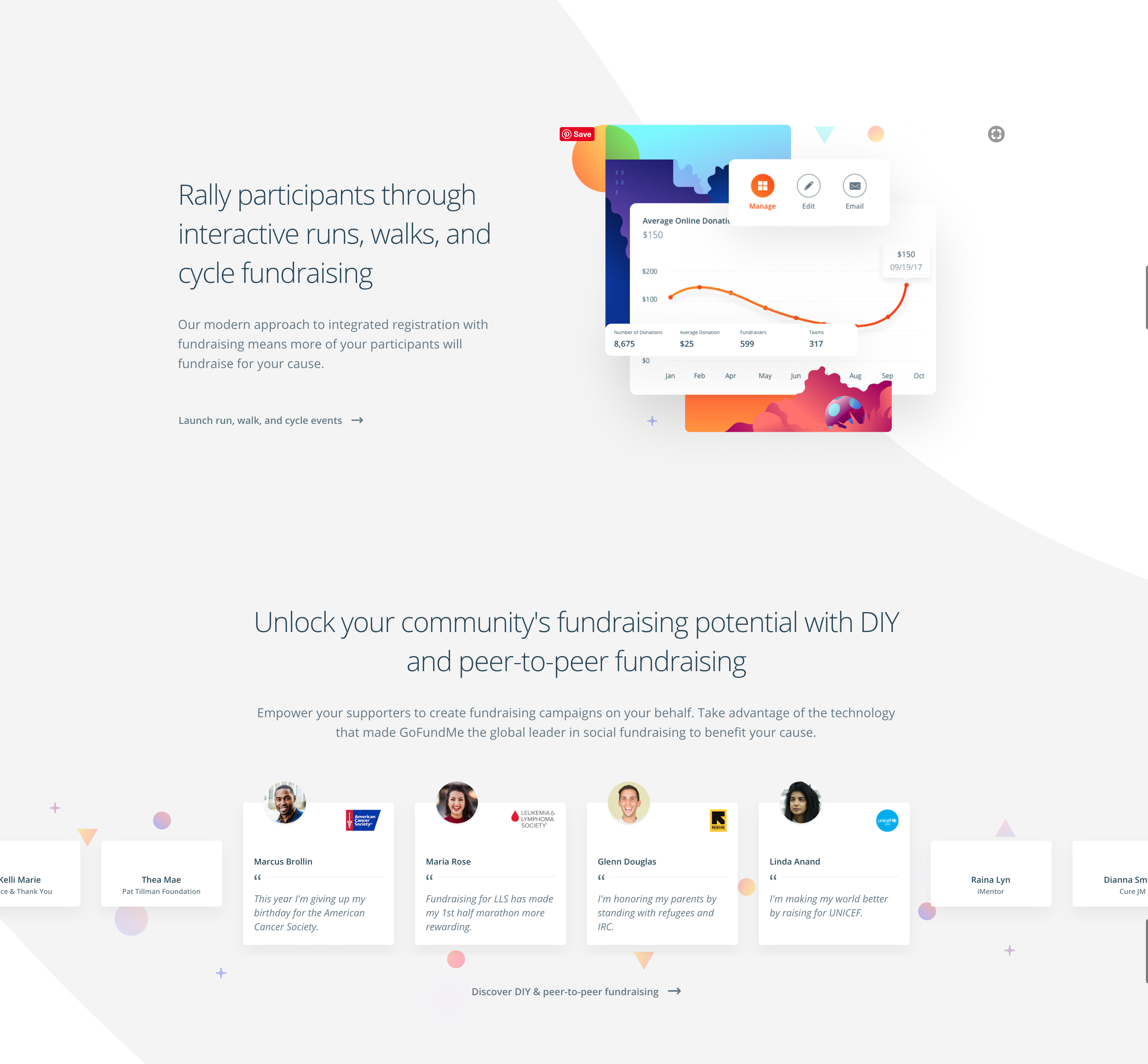
(Source: crowdrise.com)
Generally, you want to look for an established flow of the sections as a user's eyes move down the web page.
Here is an example from webflow.com’s Page Layout 101 article:
From there, provide answers to the following questions about the page's alignment:
- Do all of the elements follow the established grid?
- Does the text/copy alignment contribute to scanability (or hinder it)?
3. Review imagery

(source: constructconnect.com)
Whether illustration or photography, images are an essential element in your page design. Imagery on a website is meant to draw the user into the content as well as support the overall strategy of the page.
Establishing imagery in the design phase helps to provide a clear picture of the goal on the page.
It’s easy to fall into evaluating imagery in a design based on personal opinion or association rather than staying focused on the overall purpose of the page and whether or not the image supports it. Pretty doesn’t always mean effective.
Ask these questions to evaluate the imagery of a design:
- Do the images complement the content and help the user better understand the message?
- How do the images make you feel? Is your feeling in line with the intention of the page?
When providing direction and feedback for your imagery, it is most effective to use words that are descriptive to help the designer select the most appropriate images for your industry.
Here are some of the best types of words to use when providing feedback on imagery:
- Descriptive words (modern, industrial, comforting, energetic, shows movement)
- Detail words/phrases (men in their 30s-40s in a meeting)
- Specifics (machinery relating to industry, settings such as office, outside, etc.)
Design is collaborative; feedback is essential
The steps above will help you and the key stakeholders provide quality, concise feedback to the designer. In summary, use the bullet points below as tips to use in the review process to will help you and your team get the most value.
- Use the questions provided in each of the steps above as a guide to ensure the key stakeholders of the design project provide clearly-defined and actionable feedback.
- Understand the overall strategy of the page design and website before reviewing a design. This will allow you to maintain focus when providing feedback rather than getting lost in the nuances of opinion.
- Be specific. Take a look at the word/phrase suggestions in step number 3. Adapt them so they can be used when reviewing all elements of a design.
The key to providing quality constructive feedback is to review designs with the user in mind and keep focus on the overall strategy of the page.
Free: Assessment
/Assets/Icon%20Library/x%20corp.svg)
/Assets/Icon%20Library/whatsapp%20logo.svg)
/Assets/Icon%20Library/Email.svg)
/Assets/Icon%20Library/Arrows/Grey%20Arrow%20-%20Prev.svg)
/Assets/Icon%20Library/Arrows/Grey%20Arrow%20-%20Next.svg)