/Assets/base/Navigation%20Icons/TAYA.svg)
/Assets/base/Navigation%20Icons/Sales.svg)
/Assets/base/Navigation%20Icons/Web%20design.svg)
/Assets/base/Navigation%20Icons/HubSpot.svg)
/Assets/Icon%20Library/AI%20Mastery.svg)
/Assets/Icon%20Library/Learning%20Center%20Laptop.svg)

Mar 22, 2021
So many founders (myself included!) stress over the naming and branding of their concept. We do whiteboard sessions, creative brainstorms, and endless Google searching to find a name with the right tone and available web addresses, social accounts, and SEO opportunities.
But I learned first-hand, you can't expect the brand you start your business with to be the one you end with. Your brand must evolve and grow alongside your business, and that begins with a brand MVP.
Starting with a brand MVP
We hear time and time again how important it is to focus on launching your product MVP (minimum viable product) to save on costs and determine what ultimately resonates strongest with your target market. We should see brands the same way.
When it came to my brand, Below the Fold (formerly Acciyo) I didn’t, and in retrospect, it exhausted unnecessary calories.
Five years ago, I started working on an idea called Smart News. The name came naturally from the final line of a 90-second pitch I crafted for the MIT 100K Pitch Competition: News as smart as you.

Unfortunately, when I later looked it up, there was already a mobile app successfully operating with that name.
Eventually, I landed upon Acciyo. It took me months to finalize, brainstorming with peers, and trying different exercises. I had a few Urdu words for news I loved, but knew would be too difficult for English speakers to pronounce. I ultimately turned to Google and searched “List of Harry Potter Spells.”
At the top of that list was “accio,” the spell to summon. Given our product at the time was summoning news articles using AI (aka magic) it immediately clicked.
I added the “y” for SEO differentiation and style. I thought I struck gold: a simple, short name; a cute naming story; a whimsical brand inspired by the wizarding world. The “i” in our logo was even a magical wand.
What I didn’t realize is that this wasn’t our ultimate brand. It was merely our brand MVP — something that had enough weight to allow us to pitch, market, and get somewhere — but the key voice in deciding our ultimate brand was still missing: insight from our actual audience.
The missing brand link
In December 2019, we decided to employ a stronger content strategy to engage our Acciyo product users. We started a newsletter called Below the Fold, named after the old newspaper term for stories published below the literal fold in the physical publication. In it, every week, we’d help users learn about news that isn’t covered on the front page.
Flash forward half a year, and the newsletter was costing us 3x less than operating our Acciyo product while growing 10x faster.
The promise of our technology was being met with content in an easier-to-approach format, and the engagement was unlike anything we had seen in our business so far. Through a series of discussions and brainstorming over the course of a few months, we determined that we need to focus our business energy on the strongest part of our business.
The newsletter was growing organically, without our full-time attention. It cost half our monthly burn to operate, pulled on more of my own professional experiences as a journalist and growth marketer, and, above all, we were making money doing it! Something we hadn’t seen in the history of our pre-seed startup.
While all this made it clear we needed to pivot to a focus on the newsletter, we still had to determine what to do with our brand. We had a few issues.
- Pronunciation complications: First, no one could pronounce Acciyo (ah-key-oh). We heard achio, axio, and so many others. We wanted our name to be easy to process, speak, and simply understand.
- Brand disconnect: Second, the connect between Acciyo and Below the Fold was getting increasingly muddled. While Below the Fold was “brought to you by Acciyo,” we had more and more people who had no idea what Acciyo was since Below the Fold was growing faster. This was translating into confusion as people shared our content on social media, not knowing which name to use.
- Audience connection: Our initial whimsical brand wasn’t resonating with our growing Below the Fold audience. Readers didn’t understand the owl we had as our logo (outside of it being cute) or terms we used such as “muggles” tying us back to our Acciyo genesis.
All three of these made it clear how important testing a brand with an audience is. Talking about the Acciyo name garnered a reaction because of its ties to Harry Potter, but not our business. Talking about Below the Fold, people had a more real, positive reaction to what we actually do, and that’s what matters. So, it was time to explore rebranding!
How to rebrand your startup
Building off our learnings, we set off to meaningfully relaunch our business focused on our newsletter. Do we rename the newsletter to The Acciyo Newsletter? Do we go with Below the Fold? Do we think of something else altogether?
If you read my bio or skimmed the images you likely already know we ended up with Below the Fold, but we handled this rebrand with great care.
We didn’t just go with the name, we did a whole refresh of the brand guide from logo to colors to values. For a sneak peek, here’s a 15-second version of the full lessons below:
The brand we ended up with today has not only proven how important a brand is but more so how important it is for your startup to evolve with your audience. With that, let’s get specific with the seven lessons I personally learned from this experience.
Lesson 1: Learn from your audience
First, as learned from the issues aforementioned, we needed to hear from our audience. We sent a survey and got them involved in our identity, helping navigate a brand that they felt a part of and engaged with.
The first logo was hacked together in PowerPoint with an icon from Noun Project. The primary color was just a darker version of our main Acciyo color (the darker color felt better for readability). The color palette itself ended there — and also resembled the brand of other news products we felt differentiated from.

With this pivot, we had an opportunity to give the audience something that would truly resonate with them. So, we sent surveys to our readers at every milestone.
Beyond monitoring reader NPS, we focused the questions around the design and structure of the newsletter. We knew we had a grasp on the content itself, but we wanted to hear about the packaging and format.
When conducting a rebrand, always take into account audience feedback. Like your website or any marketing material, it’s most important that your audience ultimately likes your brand.
CASE STUDY: Trio → Finch
One example of this is the (now) Finch team, who had quite the journey evolving their visual identity.
Their initial brand, Trio, came to life before they had a clear understanding of who their target customer was. This happens to startups often, further emphasizing the need for a brand MVP.
But after gaining clarity from their target customer, the team made the decision to rebrand to Finch to help them better connect. The team shared how they wanted to thoughtfully build a brand that breaks through the noise in the industry and reflect their unique values.

Lesson 2: Embrace the values that emerge organically
Ultimately, we heard how readers didn’t understand our whimsical Harry Potter references such as what “muggles” meant.
Instead, the survey revealed:
- They loved the multiple sources we used to paint a complete picture of each story
- Felt refreshed after reading stories that moved away from other mainstream breaking headlines
- They were learning news they simply weren’t hearing anywhere else
This was what our audience valued the most.
We took this feedback and added it to our ultimate list of notes, including thoughts from previous reflections on the space we’re in and campaigns we ran to help provide better wellbeing for readers while staying informed.
This led us to two brand values that we ended up using every step of the design process:
- Controlled context: We write stories using multiple, reputable sources to bring context and, when appropriate, actionable next steps.
- News wellness: A term we coined, we prioritize “healthful” news reading experiences, whether that's how we write, organize, or design. In other words, we want our readers to be informed while still balancing their mental wellbeing.
For example, our old palette employed similar colors as competitors that made information quick, but also overwhelming and sometimes overly negative.
We wanted our colors to instead evoke the warm side of news and how we’re here to give you a balanced diet (aka not all negative stories) and make it easy to understand everything going on without having to open endless new tabs.
In simplest terms, those values translated into a brand that made readers feel complete, refreshed, and truly informed. One reader even said, “You know, for the first time, I not only love the product, I get the product.”
We heard others mention how the logo evoked the same refreshing feeling they felt after reading our unique news offering. Overall, it all lined up with exactly what we wanted our brand to look, feel, and sound like.
CASE STUDY: Get Schooled → Changeletter → Soapbox Project
A great example here is that of (now) Soapbox Project. First conceptualized in 2018, the company sought out to be the Gimlet of social impact podcasts. What started as the Get Schooled Podcast, a show on American education and its myriad challenges, evolved during a massive rebrand between 2019-2020.
The first phase of the rebrand happened in fall 2019 as the team worked to get a clear understanding on Soapbox's role in an increasingly crowded media space. They first pivoted from the Get Schooled podcast to their climate change newsletter, Changeletter, with a new take on a similar mission: making social impact easy for busy people.
By 2020, they relaunched completely to Soapbox Project with their Changeletter newsletter at the core to support changing priorities and have been working hard at it ever since, meeting the true value of what they set out to do: Make climate change easy and actionable.

Lesson 3: Establish your key brand assets
When we first pivoted our tech business into a newsletter one, I found all my usual brand assets were essentially useless. The square logo didn’t fit in the newsletter and our main brand color was incredibly limiting when it came to text (whether font color or highlighting).
Going through those issues and making up rules on the fly left to a chaotic feel — which while manageable as our brand MVP, allowed us to learn what we needed for this polished rebrand.
That being said, before working with a graphic designer, make sure you know what you even need.
As a newsletter business, we had a few different needs from a traditional brand guide, including:
- A horizontal banner for the top of the newsletter, as opposed to a square-optimized logo.
- An email-friendly font, which limited the scope of our font exploration
- Specific color needs. Given our newsletter had topic tags, hyperlinks, and call-to-action buttons, each needed its own color considerations
CASE STUDY: Aavia
I love this example because it shows how you can evolve the look and feel of your brand. Aavia updated their brand strategy, identity, and voice but kept the same name. The name “Aavia” itself comes from Avian, meaning sky’s the limit or free to soar, hence the nod to with an upward slanting in the latest logo.

While Aavia has always been a hormone health brand, they launched a new product that solidified that — an app that is open to anyone with ovaries and guides you on your lifelong hormone health journey — so they expanded their identity to guide people on their lifelong hormone journey.
Since these topics have long been taboo or come with a stigma, the brand wanted to embody that "hormonal is human."
Under-scoring our first lesson, Aavia also did a ton of research with members and target audience to ensure the company’s brand values matched the final visuals.

Lesson 4: Use mood boards to collect your thoughts
We used the brand values discussed in lesson two to have a lengthy discussion with our outsourced brand designer, painting a picture of what matters to our readers and to our mission of helping them discover news stories they weren’t hearing anywhere else.
We explained, at a high level, how we wanted to stand out from other, similar news brands out there.
At first, we didn’t make mood boards ourselves, and instead let our designer take full reigns. While he was amazing, no amount of audio-explaining can help visualize what you want your brand to be. The first batch of concepts we got felt mismatched from our brand values, so helping guide our designer with actual visuals versus just us ranting thoughts greatly improved our progress.
So, both my co-founder and I contributed mood boards to help communicate our thoughts.
Below is a screenshot of mine, created in Milanote.

In this board, I thought about what Below the Fold meant to me. It was a place of news clarity, thorough stories, that wove together various sources and research to give you comprehensive coverage. I included visuals, words, and links that helped capture the ideas in my brain as something a designer could navigate and get inspiration from.
And this turned out to be quite valuable.
Lesson 5: Take time to process your initial designs
Our designer first let his imagination run wild, sending dozens of variations our way. He even included ones we’d likely never consider, but helped us see the possibilities and reinforce our conviction in the direction we actually wanted to go.

We highly recommend having a conversation with your designer after you’ve had time to process the designs they present to you.
Hopping on a call helped us understand the designer’s thinking behind the concepts, which allowed us to push him towards the ideals we felt most resonated with our mission and ultimately enabled us to narrow down our options
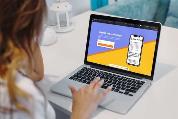
Lesson 6: See the brand in action to help determine final direction
What will your brand look like in the wild? On swag? On your website? For us, the most important factor was how it appeared in our newsletter.
Our colors are tied to specific sections or actions in our content. So, our designer ensured his Figma mockups gave us a taste of different forms this could take, as shown below:

For me, this was an invaluable exercise.
With our previous brand, a friend was kind enough to whip up some logo assets for us. While they were great, I didn’t get a chance to start making brand assets with it… and once I did, I struggled. A lot.
I didn’t know what colors to add to the palette, which I should use for the call-to-action button, or if I needed more optionality (which later, I did).
By seeing the design in action — especially for us as a newsletter business — gave me a real taste of what would or wouldn’t work outside of just being a nice logo. I also played with some mockup social posts to see how the colors would play together for our other branding needs.
In the past, I’ve found myself struggling with content creation due to a limited color palette or unclear direction for what each color would signify. By involving our designer in this through the mockups of our core product, it allowed us to actually match each one of our colors to a specific meaning. For example, our Safety Orange color represents call-to-action buttons.
Lesson 7: Iterate
If you saw our sneak peek before the lessons, you already know which direction we went in. We said goodbye to any clear owl visual from our initial Harry Potter inspiration and went abstract.
The new icons remind us of our old owl while evoking a sunrise or sunset. We appreciated this warmth when it came to our mission of offering a healthful news experience. For some, it even looks like a “B.”
But we weren’t perfectly satisfied just yet. We went back and forth on every minor detail such as...
- What should the exact weight of the logo font be? We even previewed every type in mobile and desktop email views to understand how it’d come off.
- What width should the yellow bar me? What’s too thick? Too thin?
Ultimately, these questions were helping us compare how the design appeared on different screens. Sometimes a perfect font-weight on desktop was basically illegible on mobile. We wanted our logo to be easily understood no matter device it’s being processed from.
Upon launching the final redesign, we were met with wildly positive feedback. Readers felt a true connection to the Below the Fold name (specifically citing their love for it over Acciyo), felt calmer with the new colors, and overall felt excited to be a part of our brand evolution. Now we have readers who get to say “We were readers even back when their logo was…”

Here’s one final example from value in iteration as well.
CASE STUDY: Spring Beauty Bar → Atolla Skin Lab → Atolla
What is now referred to as Atolla is a brand that has gone through some major strides. The company started their brand through the lens of beauty, then science, and now a mixture of both.
The goal throughout was to align with their best customers (women over 30), speaking lesson number one. To get to this final destination, they simplified and refined their branding to make it reflect the value propositions these customers cared about (speaking to lesson number two), such as complimenting an existing skincare routine while making skin less complex.
While science is a core to the unique solution Atolla offers, they wanted that science to be more accessible, so dropped the “skin lab” along the way.

Ultimately, these lessons all come together to prove: You can’t accomplish this all at day 0. The most important of your early-stage startup is finding product-market fit and working on your minimal viable product — not building out the perfect brand.
One of the main lessons I learned at MIT was to test products through black and white prototypes to avoid having people flock to your visual appearance versus the actual functionality.
Well, why not think similarly with your brand? It’s not going to be a final product right away, but by accepting a brand MVP and learning from your audience as you go, you can end up in the best place for long-term success.
Free: Assessment
/Assets/Icon%20Library/x%20corp.svg)
/Assets/Icon%20Library/whatsapp%20logo.svg)
/Assets/Icon%20Library/Email.svg)
/Assets/Icon%20Library/Arrows/Grey%20Arrow%20-%20Prev.svg)
/Assets/Icon%20Library/Arrows/Grey%20Arrow%20-%20Next.svg)