Subscribe now and get the latest podcast releases delivered straight to your inbox.
How to Use Psychology in UX to Entice Leads & Increase Sales

Jan 5, 2016


Your users are filled with choices across the web.
For every product they find, there are a variety of websites carrying the exact same one; some at different prices or others that are slightly “better.”
With such competitive waters, the ultimate challenge becomes trying to figure out how to separate yourself from the group. How do you get users to bring their business to you?
If you understand how the human mind works, or better yet, how your user’s mind works, you can optimize your site and persuade them to make a purchase.
In order words, Integrating psychological triggers into your design can help convince your users (whether they know it or not) to do business with you.
Let’s look at several improvements you can make in your UX to increase conversions and sales across your site.
1. Reciprocation
Have you ever been to a store and seen a demo taking place for a product that you promises a free gift?
This is essentially the principle of reciprocation at work; re-paying someone if they do something kind for us (or in their eyes, offering an incentive).
Giving users a chapter of a full book, a demo of a product, etc. are all techniques used in hope users will feel committed to offer something in return or perform a certain action.
The ‘something in return’ doesn't necessarily need to be a purchase of some sort. Instead, it could be as simple as a form fill, sharing something on social media, or a comment on a blog article. Although, this doesn’t mean these examples won’t eventually lead to an exchange which asks for a purchase to be made in the future.
Examples:
Depending on what you’re trying to achieve, incentives/reciprocation can be implemented a number of ways across your site.
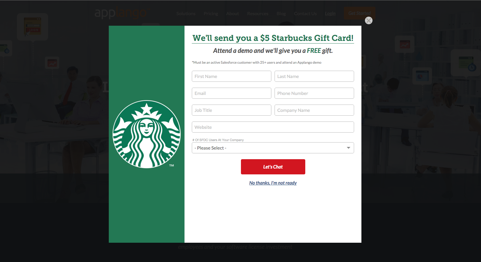
For example, one of IMPACT’s clients, Applango, currently has a pop-up offer running that gives users a free gift card if they fill out the form and attend a demo.
IMPACT also recently used this technique in our marketing must-reads book giveaway.
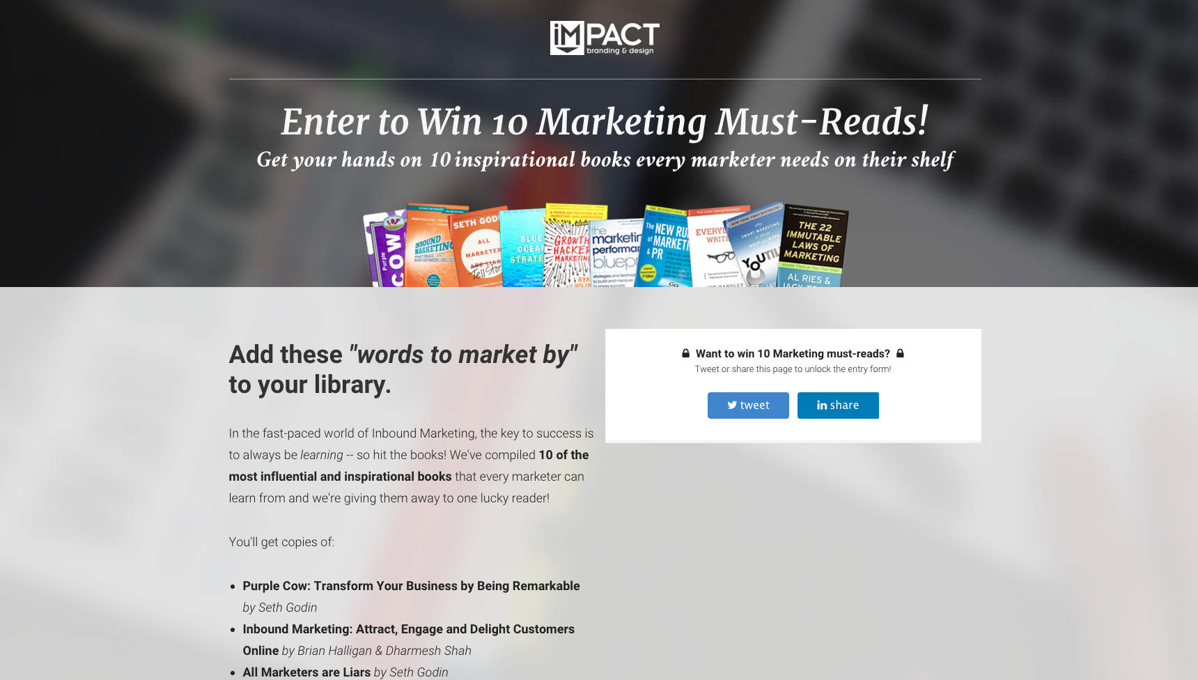
As long as users shared the page on Twitter or LinkedIn and subscribed to the IMPACT blog, they would be entered into sweepstakes to receive 10 marketing books for free.
2. Adding in Social Proof
This principle of social proof basically tells us that people are heavily influenced by other people.
One age old example of this can be seen with Sylvan Goldman, a grocery store owner who wanted to figure out how to get customers to buy more groceries in his store.
He noticed that customers would only buy enough items that would fit comfortably in their shopping baskets, do he created the shopping cart (a shopping trolley at the time that held 2 baskets).
To his surprise, however, no one used the cart despite setting it up at key locations around the store.
To encourage use, Sylvan set up fake shoppers around the store using the cart to shop. Soon after, the real shoppers began slowly using the carts themselves.
Some common examples of this on the web are reviews on items, “other people who viewed this item also viewed” sections, or testimonials.
Incorporating social proof also helps users feel greater comfort purchasing a product or putting their trust into your company. It authenticates you as a business and lets users know you are credible.
Examples:
It can be difficult to get people to subscribe to blog, but if you have a decent size following you can use that to your advantage in your content.
MarketingProfs, for instance, mentions how its community is made up of 600,000 members (how could 600,000 people be subscribed to the wrong thing?)

I’d also like to point out how they incorporated security banners at the top to assure users that if they sign-up they can trust their information will be safe.
You can also add in a bar with company logos you’ve worked with, testimonials, or a combination of the two like Salesforce Desk did on there site.
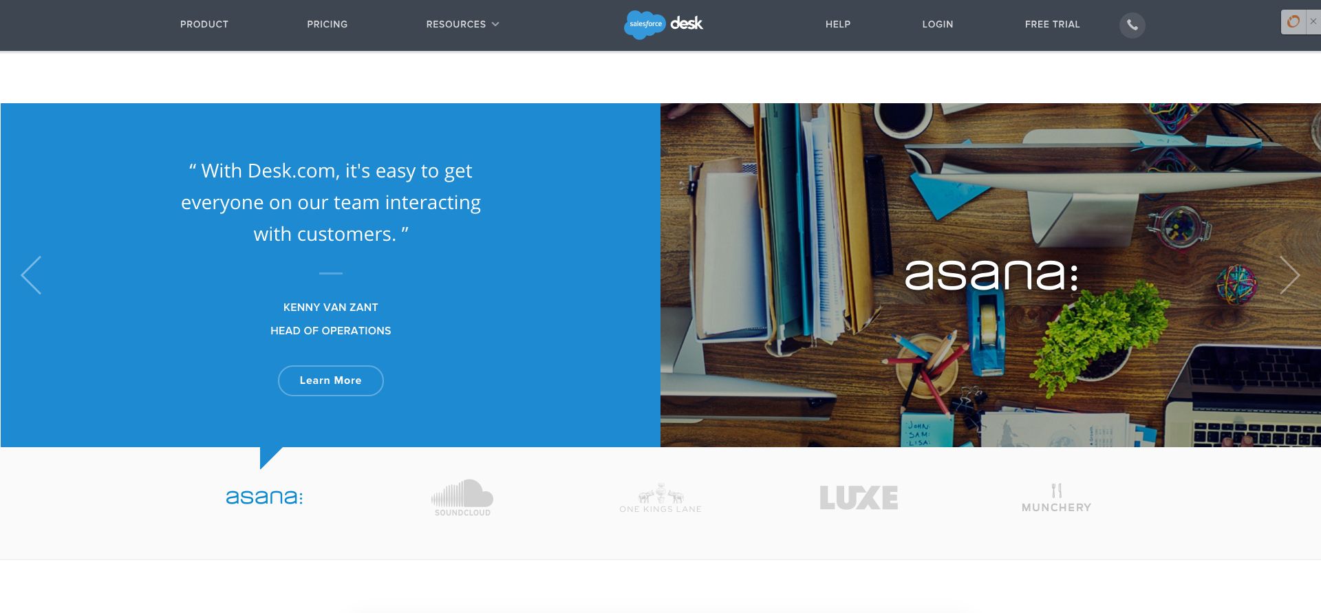
If you do choose to use testimonials, make sure they are believable and real. This means avoid using stock photos if you don’t have images, or making up testimonials for your customers. Your users are smart and will be able to tell if they are being faked making you lose credibility.
3. Chunking
The average person typically only has the ability to store four to seven different items in our short-term memory (that’s why phone numbers are usually seven-digits).
Fortunately for us, one of the ways to get past this is by a technique called chunking.
Chunking is a mnemonic trick that states that the organization of content in a certain way will help people remember what they just read.
In a study done by psychologist, Gordon H. Bower, disorganized and organized material was shown to two separate groups. When he asked participants to recall some of the words in it, he found Recall was 2-3 times better with the organized presentation.
This effect works well in the web world. Breaking information into different sections (or even different pages) can be the difference between users remembering the services you offer or not.
Don’t use chunking purely for your layout though - think of it as a way to improve your user's ability to recall your products, service offerings, or resources at a later time.
Examples:
First, you need to figure out the talking points on your page. Only pick your best content, then separate it into headers, short paragraphs, and an appropriate image or icon (if applicable).
Each of these sections will be viewed as individual chunks.
Atlassian used this technique on their ‘Try’ page; showing their products separated into specific categories. Each item also has a ‘try for free’ link.

This technique is also vital to use on ‘about’ pages so customers can easily read and recall who you are.
Infusionsoft separated their ‘about’ page into easily digestible sections showing exactly what the company does, as well as testimonials, resources, and events.
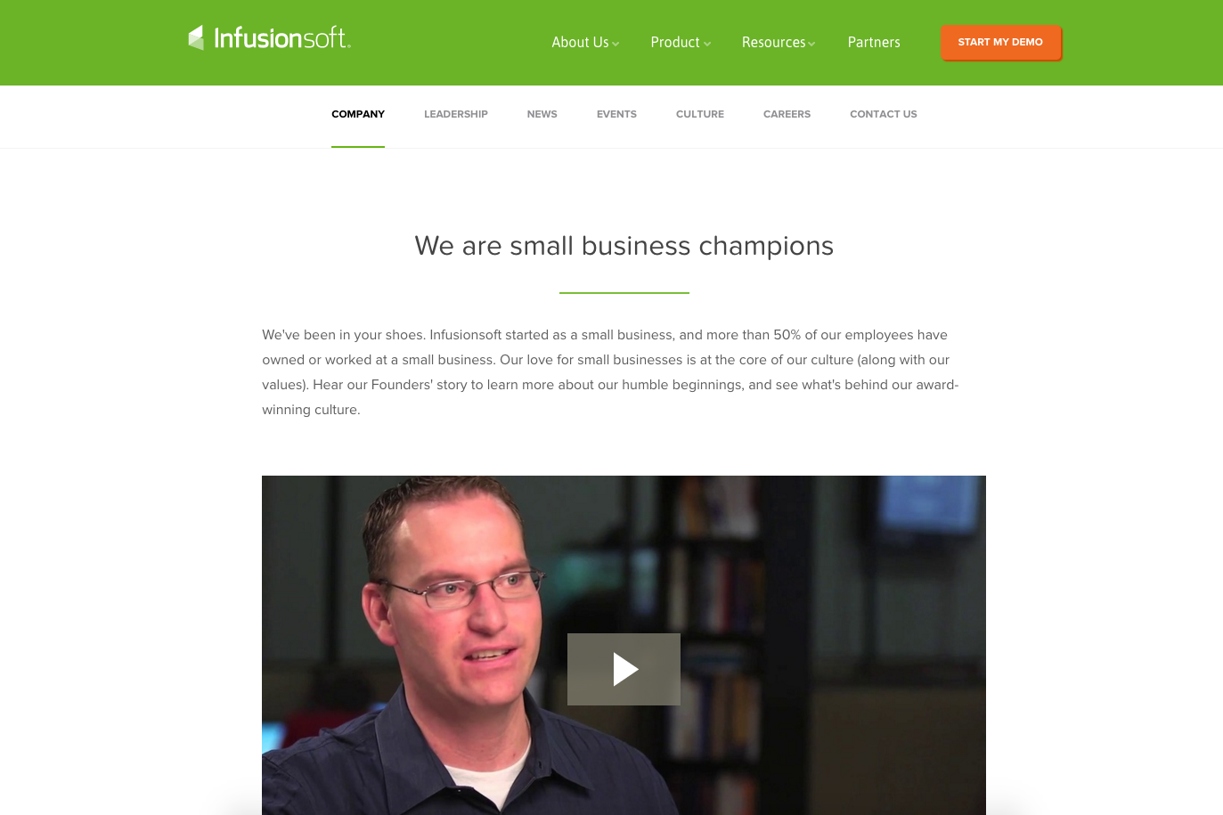
Like the examples shown above, make sure to keep your spacing is balanced as to not confuse the groupings on information.
This same idea can be said about the size of the fonts - establishing a consistent pattern in font sizes assures users on what they can expect to see on the page.
4. Framing & Contrast
This principle says that people react to choices in different ways depending on how they are presented.
Depending on specific visual cues, people will be able to decide whether something is a gain or a loss.
For example, how you frame a question can often influence what answer they end up choosing.
One classic example of this involves 600 people being offered two alternative solutions for a hypothetical deadly disease:
- Option A saves 200 people’s lives
- Option B has a 1/3 chance of saving all 600 people and a 2/3 possibility of saving no one
72% of participants chose option A.
They offered the same scenario to another group of participants, but worded it differently:
- If option C is taken, 400 people die
- If option D is taken, then there is a 1/3 chance that no people will die and a 2/3 probability that all 600 will die
In this group, 78% of participants chose option D (equivalent to option B)
So clearly how you phrase the way your product works can have an impact on how users choose to perceive it.
Examples:
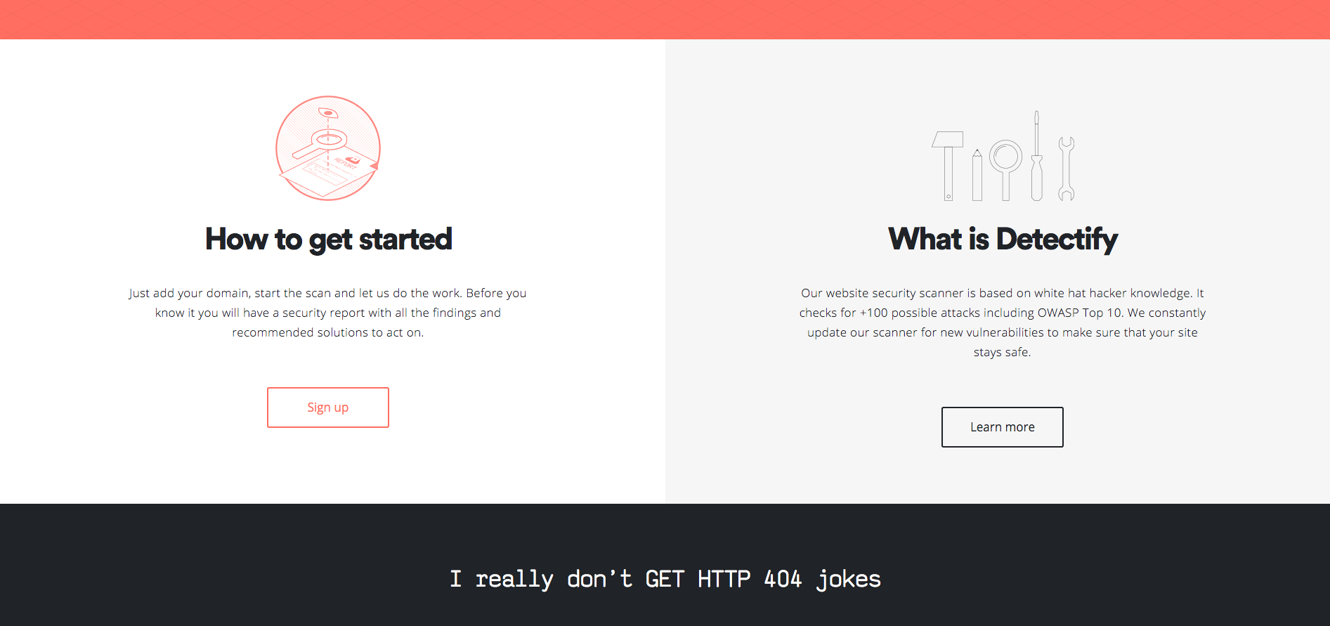
Framing can be used in a variety of ways on your site to draw attention to specific areas.
One easy way to do this is using a more dominant color in the section like Detectify did on their homepage.
Most will, however, find the technique most useful on their pricing page, where you can use the “Goldilock” pricing technique.
This is where you provide the user with three or more choices. However, two of those offers are decoys; one being a base model with minimal features and another being a overpriced, enterprise-level model.
Your users will be most likely to pick out the third, choice - the mid-ranged option that seems to fit your user ‘just right’.
Dropbox Business used this technique to highlight their business plan which seems to be the best option for the majority of small to mid-sized companies
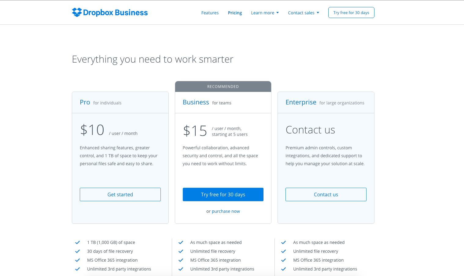
Using simple design techniques such as different colors, ‘recommended’ tabs, drop shadows, and small font size differences can draw attention to this mid-ranged options. Just make sure that the option you choose to highlight one that the majority of users you are targeting will actually use.
Free: Assessment