Subscribe now and get the latest podcast releases delivered straight to your inbox.
6 logo design trends you can't ignore in 2021 (and 3 you should)

Jan 5, 2021
Logo design trends in 2021
Dos
- Geometric shapes
- Deconstructed letters
- Static motion
- Analogous color palettes
- Minimalism
- Gradients
Don’ts
- Actual motion
- Metallic textures
- Overly ornate imagery
New year, new you… new logo? With the new year comes the inevitable feeling that with the change of the calendar year we should also for some reason reinvent ourselves.
Looking back at some of our goals going into 2020 I have to laugh to keep from crying.
Travel more. Be more social. Order out less. ...Obviously 2020 had different plans.
After the year we’ve all had who could blame you for wanting to reinvent yourself or maybe even reinvent your brand.
If you are having one such itch about redesigning your logo, never fear, I am here with a round up of the hottest tips (and some things to avoid) for logo trends to help guide your 2021 logo redesign.
Dos:
- Geometric shapes
- Deconstructed letters
- Static motion
- Analogous color palettes
- Minimalism
- Gradients
Don’ts:
- Actual motion
- Metallic textures
- Overly ornate imagery
Design trends to pay attention to
Logo design is a tricky game, of course. Balancing trends with creating a timeless emblem of your brand is no easy task. You don’t want to do anything too trendy so that you are quickly looking at a rebrand in a year or two. On the other hand, you don’t want to be so safe that your logo is entirely forgettable.
Overall, I think this year’s trends are a solid foundation that will help you do just that.
1. Geometric shapes
Use of clean and simple shapes will be the hero of logos in 2021. Even though it is a minimal style, there is so much that can be done with a variety of colorful geometric shapes. From stacking and creating unique compositions to overlapping shapes and creating the illusion of dimension, there are endless striking forms to be made here.
Using simple but strong geometric shapes can create a memorable logo that is quickly recognizable by users, can easily be translated into many sizes and mediums, and can even incorporate classic symbols in a modern way.

PicnicHealth is a great example of all of the above. Their logo mark (the graphic emblematic part) makes use of squares and circles to create a modern visual of a cross (which is a timeless symbol for healthcare) as well as creating a P for PicnicHealth.
2. Deconstructed letters
Breaking up letter forms or using them unconventionally will be one way we see a lot of companies keeping simple logos interesting.
This technique can be employed in many different ways, either by playing with the whitespace of letterforms, manipulating the shapes of letters to create other form, or entirely replacing letterforms with shapes or other imagery.
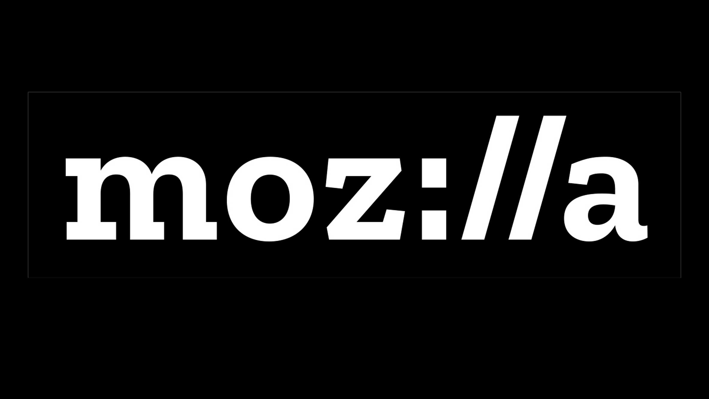
Mozilla Corporation (creator of the open source web browser Firefox) cleverly achieves the later by replacing the “ill” in its logo for a colon and two backslashes, which most of us are now familiar with as part of the opening sequence of a URL.
3. Static motion
Okay, I know that static motion sounds like an oxymoron, but I promise you I’m not trying to play games here. This simple means that although a logo is actually static the visuals imply motion, giving the logo a dynamic look.
This is great for brands that want to convey that they create upward results, are fast paced, or if they are tied into something requiring literal movement such as exercise.

Wealthfront, an online wealth management tool, uses three stacked pillar shapes in a curve as an abstract “W” and an homage to an upward trending bar graph, creating a sense of growth that hopefully will be seen in the money you entrust to them.
4. Simplification
This is one we are already seeing frequently, and I anticipate it will continue. Many companies fear that a total rebrand will hurt their brand recognition, and in some cases it can. The solution? Don’t change the logo entirely, but give it more of a logo facelift.
The idea is to keep any main concepts or visuals but pair them down a bit. This allows you to revise, modernize, and simplify your logo to a cleaner, more minimal version of what already exists — and your audience can still recognize you for those original elements.

The original Tripadvisor logo was starting to look a bit outdated in its font and colors, and it was a very wise choice to update their iconic owl to a sleeker, more sophisticated version. They’ve also updated their font, which now better matches the line weights in the logo mark.
5. Analogous color palettes
Analogous colors are those that lay next to each other on the color wheel. We most commonly see pairing of complementary colors, which are colors that are directly opposite each other on the color wheel, since these pairings provide the highest contrast and are by nature aesthetically pleasing. Here are a few examples you might be familiar with...
Unlike complimentary colors, palettes of analogous colors are more muted in nature since they are similar color tones, but over the next year we will see a big rise in muted colors and color combos in both logos and website design, creating less visual discord and more calming effects.
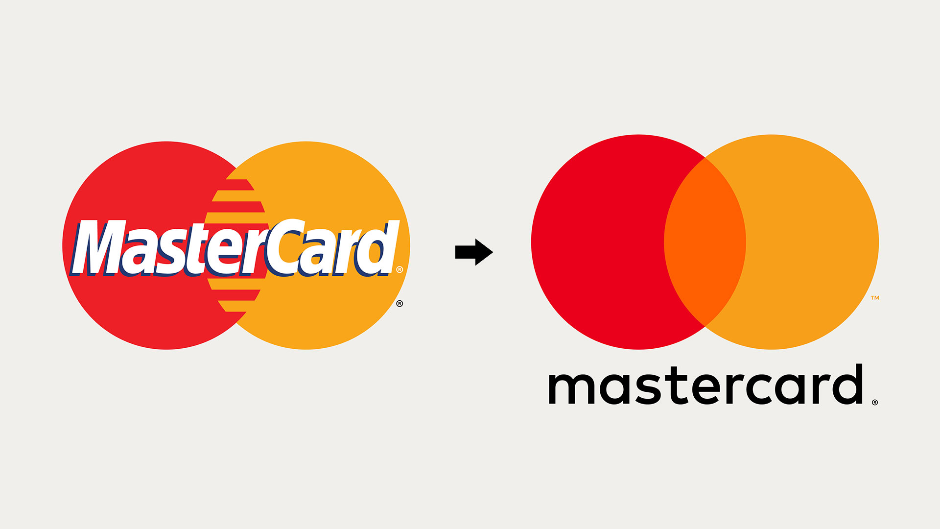
Mastercard is a classic example of using analogous colors with their original logo, but with their latest “logo facelift” they’ve expanded the concept further by adding in a third tone combining the original red and orange shades.
6. Gradients
This trend isn’t exactly new, but is one that will continue to trend upwards reflecting other similar web design trends like bold colors and dimensional designs.
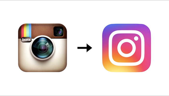
I’m sure you all remember the Instagram logo redesign of 2016. Though this redesign wasn’t exactly well-received when it originally dropped, it seems to be an update that was ahead of its time.
Gradients offer a bit of dimension in an otherwise flat design, and in 2021 users will gravitate towards designs that feel real and tangible. This includes logos.
Productivity app ClickUp makes use of two gradients within its logo (also using these throughout its site). The logo gradients are bright and fun, making the company itself seem approachable. The blending of color is also a nice nod to the spectrum of problems ClickUp solves for its clients and users.
Designs to avoid
With our lovely list of dos I feel the need to warn you of a few styles you will want to avoid. Keep a keen eye on these ones so you don’t succumb to a logo redesign failure.
1. Actual motion
While static motion will be hot this year, actual motion in logos should not be. While there are some specific use cases where it is acceptable (think YouTube intros or app loading screens) animated logos should generally be avoided on websites.
The reason is this: Even if motion makes your logo fun, it can actually be quite distracting on your website. With all the time, effort, and budget you put into your site, you don’t want an over-eager logo to pull the users’ focus away from the important stuff.
2. Metallic textures
Though metallic textures could *technically* fall under the gradients category, they should mostly be avoided in 2021. The metallic look is very hard to pull off and often ends up looking instantly dated and vaguely reminiscent of Microsoft Word clipart. (Yeah, you know exactly what I’m talking about).
3. Overly ornate imagery
This is another one that is very tricky to do well. It takes a lot of effort to get an illustrative logo to fully capture the tone and message a brand wants to portray — and the ornate look is rarely evergreen.
Instead of trying to cram intricate imagery into your logo, try incorporating illustration throughout your website. This way you can change it up as often as you need without the same involvement a logo redesign requires. You should be changing up your website content every once in a while anyway!
Don’t ever forget your users
I’m eagerly looking forward to see how all of these trends come into play this year, from simplified versions of iconic logos to new and interesting geometric compositions.
If you're getting ready for a rebrand, keep these trends in mind.
With all that being said, no one knows your audience better than you, so always to bring any big brand changes back to how it will affect your user. Don’t make logo decisions solely based on what you or what someone on your team likes. These kinds of changes should be for the betterment of our users.
Free: Assessment
