/Assets/base/Navigation%20Icons/TAYA.svg)
/Assets/base/Navigation%20Icons/Sales.svg)
/Assets/base/Navigation%20Icons/Web%20design.svg)
/Assets/base/Navigation%20Icons/HubSpot.svg)
/Assets/Icon%20Library/AI%20Mastery.svg)
/Assets/Icon%20Library/Learning%20Center%20Laptop.svg)

It’s that time again! We’ve barely crossed the threshold into fall, but are entering what inevitably feels like the full speed sprint through the holidays and into the new year.
Don’t get me wrong; I don’t want it to fly by.
Unfortunately, we all know that as much as we try to hold on to each warm moment and new memory, with everything going on in our personal lives and wrapping up all of our end-of-year OKRs, it will be 2021 before we even have time to blink.
But I’m going to try to slow things down today (even if just for a few minutes) to talk about the top website design trends you can expect to see on the horizon.
With these trends, we are not going to go over what the popular color choices are or any avant-garde type handling. This list is going to be a practical, logical mix of UI and UX for those who believe function should come before form.
The trends are going to look a little different this year. Like everything else in our lives, our websites are being shaped by the COVID-19 pandemic.
With many people socially distancing, spending more time than ever online, your business website is more so than ever your #1 sales rep 24/7, 365 days a year, even on holidays.
So whether you are looking to get ahead of your competition, do a complete overhaul of your website, or just do a little optimizing to make sure you hit those pesky KPIs we talked about, this list of 11 business website design trends for 2021 should give you some ideas on how to get there.
From simple image treatment upgrades to bringing a bit more peace to your user’s day-to-day, this list will help give you some ideas you can bring home to your site.
1. Organic/abstract shapes
With most clients I have these days, there seems to be a call to appear friendly, but professional. Since we have much less face-to-face interaction these days, we have to work smarter to make our digital presence set the tone for what our sales experience and our employees are like.
Incorporating organic shapes, such as curved lines or amoeba-like shapes can be an easy way to achieve that balance. Abstract shapes exude a softness that is more welcoming and comforting than hard sharp edges.
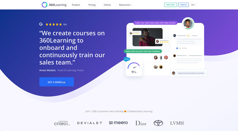
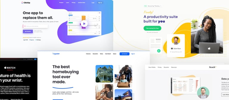
360Learning uses organic wavy lines to break up the backgrounds of different sections on their page, taking advantage of the directional focus of the line to draw the user’s attention to key elements like the demo button in the hero.
They also use soft lines that create directional pull (simply put: the eye will follow the line or direction a line is indicating) to draw the user’s focus to the next sections and step in their journey through the content.
Expect to see abstract shapes used in place of straight or diagonal separation of backgrounds as well as paired with software screenshots or imagery. Which brings me to our next trend...
2. Custom image treatments
Custom image treatments are style elements elevate photography. It involves a variety of techniques like masking photos in unique shapes, layering with other elements such as textures, icons, shapes, and even other imagery, or adding brand colors as an overlay or other shape elements and repeating this throughout your site as either focal visuals, hero images, or any other place you may include supporting imagery.
They are a super-easy way for those of us who rely on stock photography to get a branded, unique feel on our site, that is easy to recreate (even without photoshop).
Adding elements like lines, textures, outlines, and yes abstract shapes, in a layered style behind stock photography or software screenshots not only allows you to customize something that may otherwise be seen over and over again on the web but it also allows you to infuse your personality as well.
Looking to appear more professional, technical, or analytical? Stick with more sharp shapes like squares, triangles, straight or diagonally lines. To appear more friendly, approachable, or playful infuse soft wavy textures, freeform abstract shapes, and dots.
Unique image treatments is not only a great way to convey the tone of your brand but to easily elevate the overall design of your website to look more polished and thoughtful.
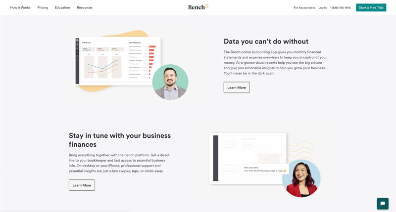
Bench.io uses this sort of treatment in their hero as well as throughout the content to combine photos of people, software, shapes, and textures. This helps them achieve a more human approach without avoiding showing the software entirely. It also allows them to call out certain focal points in the software by pulling those to the foreground.
3. Self-selection
Modern users want to find what they need quickly and painlessly when they arrive on your website.
Allowing the user to self-select or to guide them through a self-selection tool takes the guesswork out of the journey for them and allows you to give them tailored buyer support based on their specific needs.
There are many routes you can go with this on your website, but the main two are interactive or static.
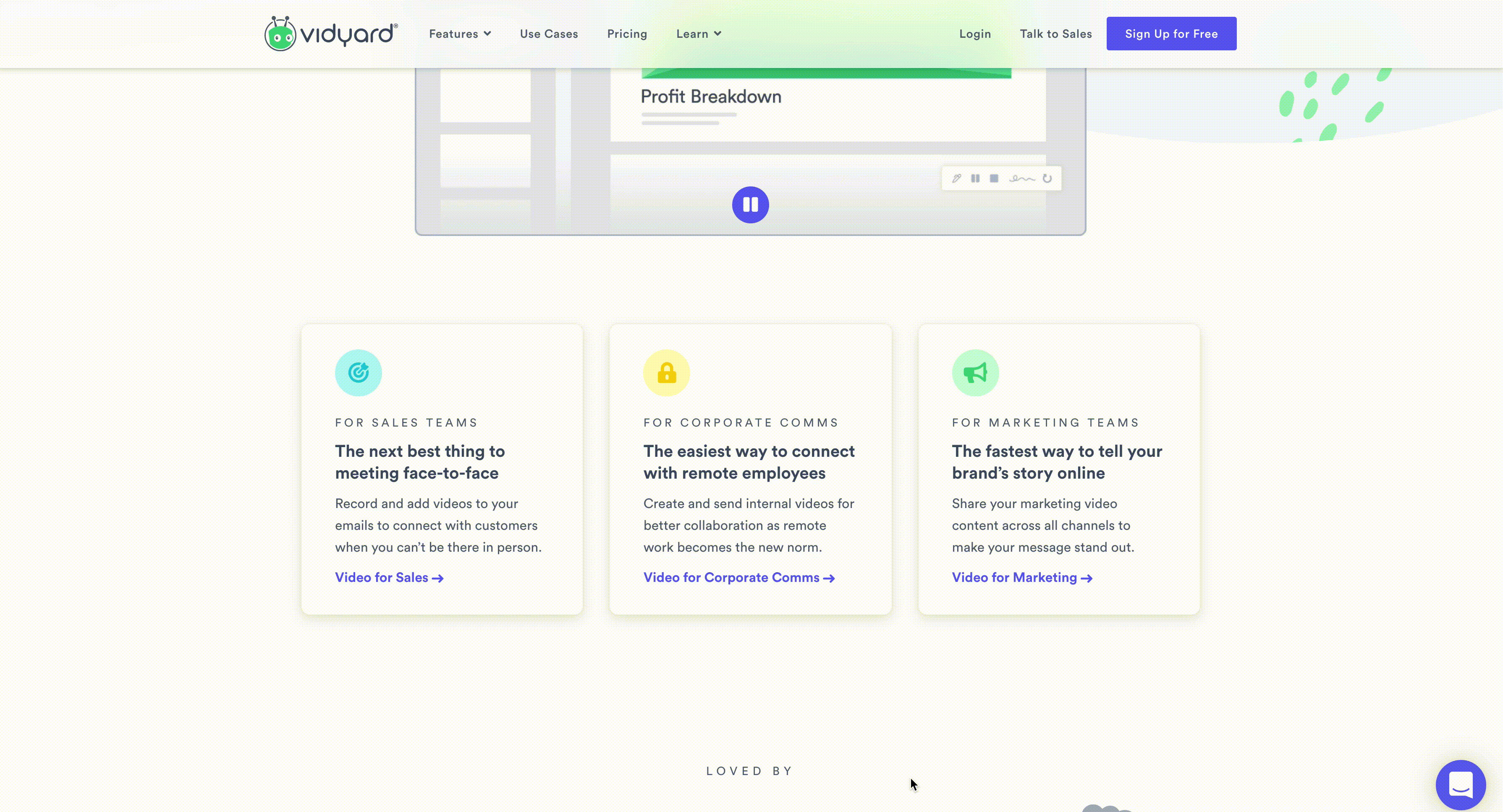
Vidyard is a great static example.
They directly address their three verticals just below the hero in separate boxes that give users a quick overview of where they fit, directly addressing how the user may identify at their job and the pain points they are facing.
They end each box with a call-to-action further directed to that specific user’s journey (even in the specificity of the content “Video for Sales”), making it super easy for the user to continue on a journey tailored to their needs. This is a pretty straight forward way of having a user self identify that typically doesn’t require a lot of dev, since it is not an interactive tool.
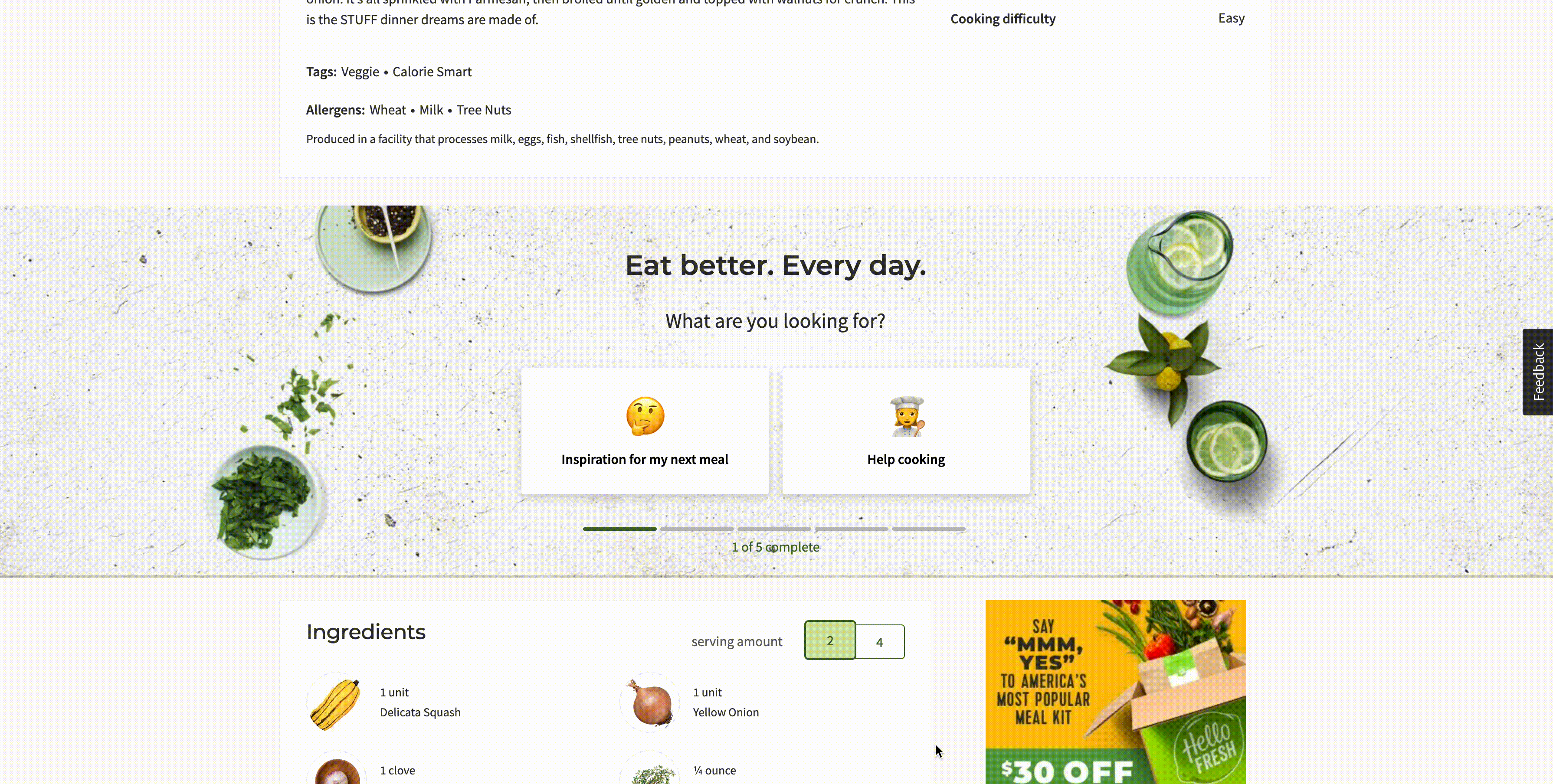
On the other hand, HelloFresh has an awesome interactive self-selection tool as the call-to-action on their recipe pages.
The content is short, sweet, and to the point and it tells you up-front that it is only five questions, letting the user know what to expect when they start clicking through. HelloFresh uses emojis as visual queues but images or GIFs might be subbed to support your specific content as well.
4. Accessibility
Okay, so, this one is honestly not a trend, but it is a long-overdue shift in mindset that will continue trending upward.
For many years, accessibility was looked at as something that you would have to sacrifice good design for. With added boundaries like having elements be high enough contrast, or relying on more than color to relay information, the belief was this would ultimately hold back the final product. But that couldn’t be further from the truth.
If a website is not accessible by all users then it is simply not doing its job well.
Accessibility is not just about protecting your own back from lawsuits, but ensuring that you are inclusive to all audiences with impairments that range from permanent to temporary to situational as seen in this graphic from Microsoft’s Inclusive Design Toolkit.
From a business perspective if you are not paying close attention to your accessibility that means you are closing yourself from broad segments of customers. Take for example the 8.1 million Americans with a vision impairment. This is over 8 million people who could be buying from you.
Compliance often is something that happens behind the scenes and is not typically seen upfront, but there are some visibility checklist items to look for upfront like, making sure your text is large enough and has enough contrast and not relying on color cues alone to relay information.
accessiBle is not only a solution that helps other people make their sites accessible, but it is a great example of a beautifully designed site that is compliant as well.
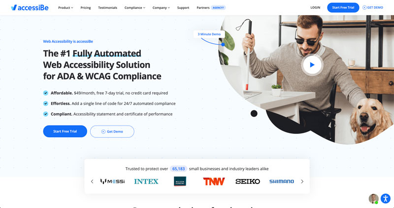
Their site from a front-end perspective is high contrast and well-calibrated (read: good font sizes, weights, and colors) for legibility.
They also avoid directly layering content on imagery as it interferes with legibility as well (yes even with a slight overlay), instead opting for putting their text in white boxes that overlap with images when they want the content and imagery to be physically connected.
5. Depth and dimension
With so many people having more online experiences than physical experiences during the COVID-19 pandemic, having things feel a bit more “touchable” can help fill that void.
Soft shadows, layers, and floating elements will be used a lot to create dimension and a more tangible feel on pages.ClickUp uses many of these elements as well as subtle textures to achieve this look.
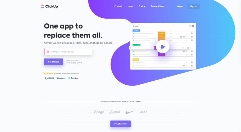
Their entire homepage feels multi-dimensional, through the clever use of layering shapes, multiple levels of shadows, and textures. They play heavily with layered planes (think foreground vs. background) to draw the user’s focus, often leading them to one of their bright purple CTAs.
6. Strong fonts
Bold or strong fonts (especially when paired with short, direct content) promote hierarchy (read: the order in which we want users to see things).
Bold font weights, particularly in header styles, draw the eye of even the most seasoned skimmer.
Heavy fonts automatically create high contrast areas that at their base level, are just shapes of dark color if you squint a little. This helps you with minimal effort guide your user’s journey to read or view your site elements in the order you set for them (typically headline first).
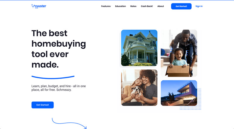
Ruuster uses strong fonts flawlessly. Even though their headers are no more than six words, they give the user an instant intro to the supporting copy.
Their bold headers grab your attention first, leading the user to the body copy and supporting image that gives the user more context by combining photography and screenshots in what do you know… a custom image treatment.
Also, as you scroll through the homepage, the first things you see in each section are the bold black headers, successfully guiding the user’s focus.
7. Simplified “calm” design
Amber Case’s book Calm Technology posits that new technologies should be focused on positive interactions to put the users in a state of tranquility and concentration.
In all the chaos this year has brought (and continues to bring), users are looking for calm, comfort, and reliability anyway they can get it. This includes on the web.
Minimal, clean, and a new term called “calm” design will be talked about more and more.
This could mean a lot of things.
It could refer to more clean and simplistic designs, less mental friction, and distractions from the overall goal of the page. The style of minimalism often refers to a return to the bare essentials. In web this often means stripping a site of anything that does not serve an individual purpose so ironically things like custom image treatments.
It could also be the simplification of content. Shorter user journeys through high-level pages, directing the user quickly and easily to the content they need.
This could also be in the overall tone of the page, using more muted colors and tones, more whitespace, even in slight animations that create a sense of peace.
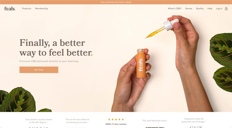
As a CBD company, it’s only fitting that Feals would be a great example of this.
Almost all elements of their site work to create a sense of calm. From the warm peachy tones used throughout backgrounds and images and medium brown font colors they opted for (different from the dark greys and black we usually see) to the subtle fade-in of the content as the user scrolls into each new content block, each piece adds to a sense of tranquility. I’m feeling calmer already.
8. Dark themes or Dark mode
Now, this is one trend that seems to have split popularity based on who you talk to, but when done correctly, there is no denying the dramatic look it creates (and I’m always in for a little hint of the dramatic).
This can be valuable in setting the tone for a specific product page. Even if you have one page with the dark mode style, it can work really nicely to set the stage for something new you want to put on a pedestal by setting it apart from the rest of your site.
Dark mode or dark-themed pages or sites instantly create a technological, professional look. Just look at Apple’s page for the new iPhone 12.
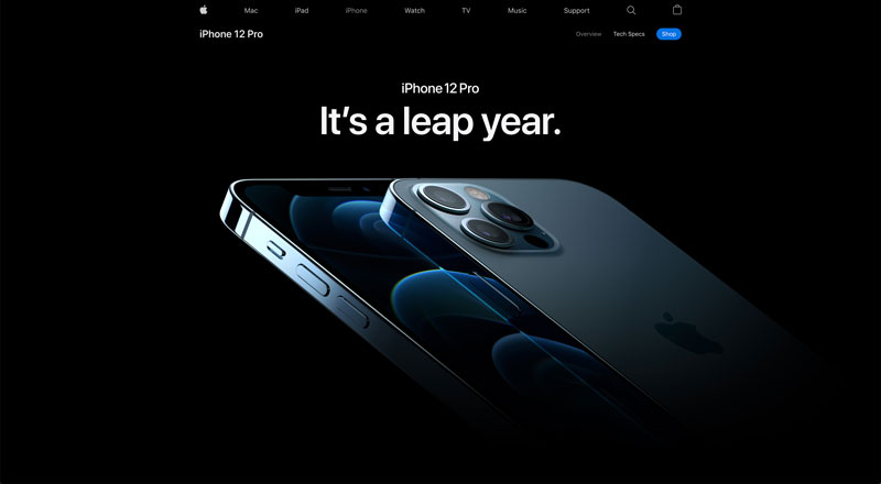
In this example, Apple creates a stunningly dramatic look that idolizes the new iPhone 12. Their use of white text and bright elements on a dark background creates a sense of allure and makes the product look almost mysterious. As if there needed more hype around their new lines right?!
There are other benefits to dark mode as well. Dark mode creates easier reading conditions for low light conditions (think users that are up late, burning the midnight oil) and it can even save battery life for some screens like OLED/AMOLED.
9. Micro-animations/interactions
Micro-animations or interactions are small movements of elements on a page (like hover effects) that could be interactive or triggered by some other means. They enhance your user experience and guide website visitors through the user journey and ultimately to take action.
These can take shape in many different ways such as small icons or shapes that move slightly, guiding the user to progress down the page to small visual feedback on buttons and CTAs that going beyond the standard color change.
When used well these can curate and subtly guide the user through a specific user journey.
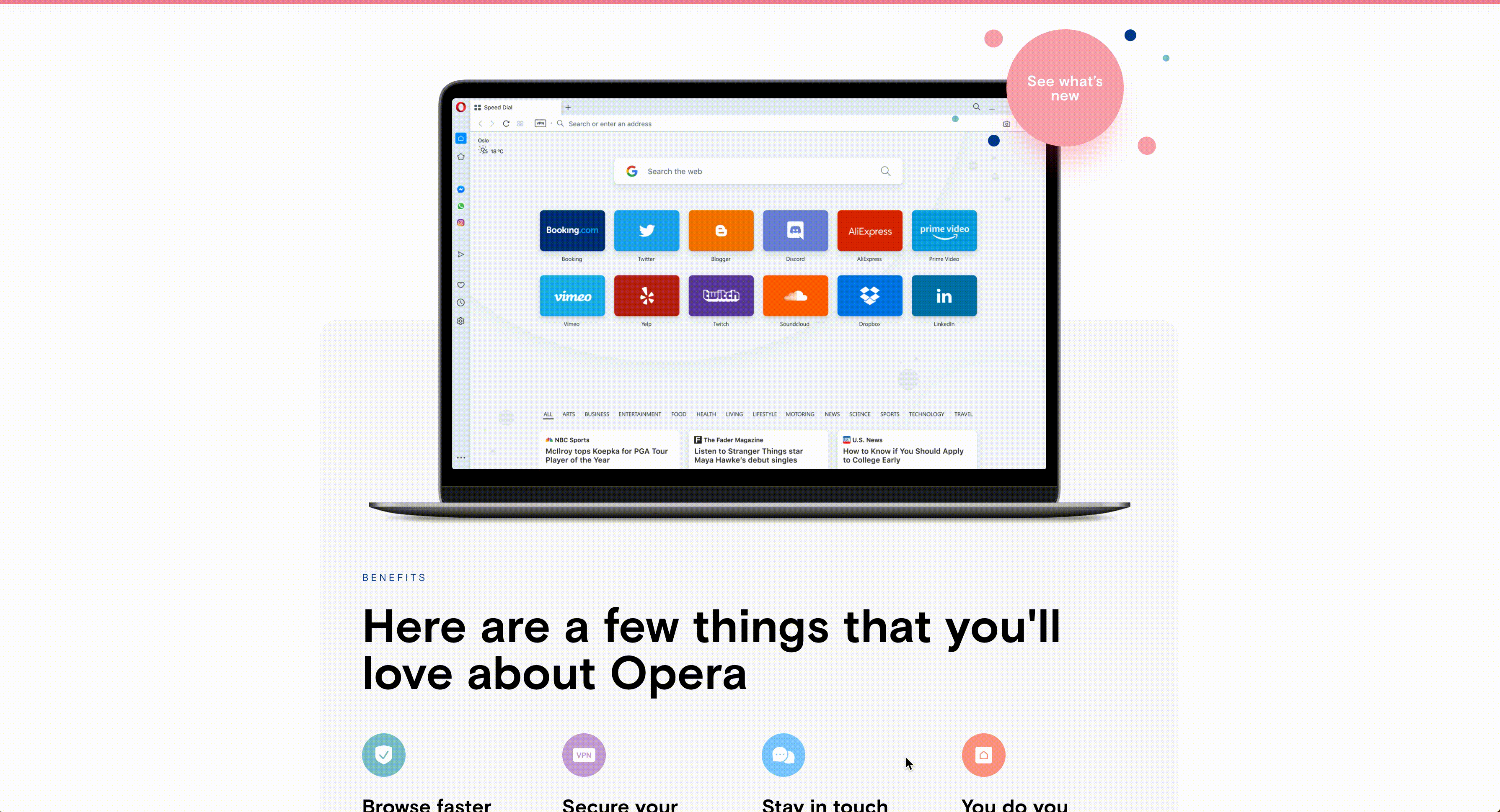
Opera takes advantage of micro-animation in several ways throughout their homepage. They work so naturally and seamlessly, you probably wouldn’t even think twice about them as a user.
For example, the bubbles that move slightly as the user scrolls; these delight the user and reward them for scrolling, while the “see what’s new” button pulses just a little bit to grab your eye and encourage you to click.
Hovering on any of the CTAs or the card-style layout will also trigger a response with some movement or dimensional change in turn, like a subtly shadow lift or with an arrow moving slightly.
Micro-animations will also support your accessibility journey in giving more options for hover state indicators than just color change, which may not be visible to all users.
10. Bold colors
Many business sites shy away from strong brand colors, opting for mainly neutrals and perhaps a blue, green, or orange as these colors relate to feelings like trust, reliability, and quality.
However, creating your own unique branded cast of color can help to create strong brand recognition and help you stand out from the sea of business blue.
Playing with color allows you the advantage of exploring color psychology and creating the right emotional response for your brand and product, like relaying to users that you are adventurous, or intense, or even just dang chill.
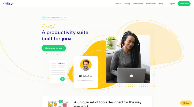
I love Tispr’s site because they incorporate four bold colors successfully without coming off as too playful, which can often be the case.
Their brand colors are used gorgeously throughout for illustrations, iconography, guiding text, and CTAs. My favorite part of their branding, however, is the warm, almost retro neutrals they chose for the background colors which are very soft and inviting, and stand out from the stark white backgrounds we are used to seeing.
This all is very effective in creating an inviting atmosphere, where you get the feeling they are a laid back company that gets the job done without being too stuffy.
11. Storytelling for products and services
For those of you who have read Simon Sinek’s Start With Why —which I assume is most of you, and if you haven’t what are you waiting for?! — you already understand the power of storytelling.
But it can be tricky to shift this mindset especially in a SaaS-y world where we are often very focused on shiny new features.
That’s not what the user cares about really. They care about how X will solve their problem, or make their job easier, or change their life.
Tell the why of a product not the how; they want to know the value to them.
Okay, I know I already used Apple as an example, but, come on, they are the G.O.A.T. when it comes to design, products, and storytelling. They’re even in Start With Why. That being said, if this isn’t amazing product storytelling then I really don’t know what is.
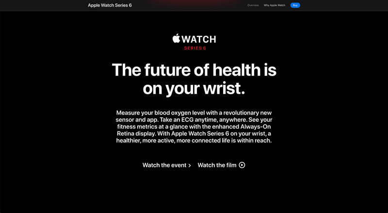
Although they do dive into specific features (this is a product page after all), Apple starts you off with “The future of health is on your wrist” and continues with that narrative. It explains how the Apple Watch uniquely solves for health challenges the user faces and then once you’re bought in on that they explain how it works. TLDR; put the “why” before the “how”.
No website is evergreen
Listen, I’m in the thick of it.
As a web designer, I am constantly researching (read: looking at what the collective internet is doing) and not a lot stays the same. This isn’t a bad thing. Things change, design changes, web strategy changes, because humans are complex.
We grow, evolve, and change our behaviors and interactions with how we use the internet quickly and the only way to keep up is to make sure your site is doing the same. The easiest way to drive your customers to your competitors is to neglect your website.
Remember, your site is an extension of your sales team, and maybe one of the most important part (sorry sales reps) because it is always working for you.
I’m not telling you to take everything on this list and implement it immediately. Actually please don’t — it would look god awful —, but start thinking about maybe one or two things you think will improve your user’s experience, offer a more seamless or controlled user journey, or simply put make your user’s lives a little bit better.
Free: Assessment
/Assets/Icon%20Library/x%20corp.svg)
/Assets/Icon%20Library/whatsapp%20logo.svg)
/Assets/Icon%20Library/Email.svg)
/Assets/Icon%20Library/Arrows/Grey%20Arrow%20-%20Prev.svg)
/Assets/Icon%20Library/Arrows/Grey%20Arrow%20-%20Next.svg)