/Assets/base/Navigation%20Icons/TAYA.svg)
/Assets/base/Navigation%20Icons/Sales.svg)
/Assets/base/Navigation%20Icons/Web%20design.svg)
/Assets/base/Navigation%20Icons/HubSpot.svg)
/Assets/Icon%20Library/AI%20Mastery.svg)
/Assets/Icon%20Library/Learning%20Center%20Laptop.svg)

Aug 29, 2020
![True colors: What color choices say about your brand [Infographic]](https://www.impactplus.com/hs-fs/hubfs/color-explosion.png?width=768&height=400&name=color-explosion.png)
If you’re like me, you’ve often wondered how the biggest brands go about deciding what logo and overall brand color scheme their identity should follow.
Do they go based off of a designer’s whim? Does the CEO’s daughter get to pick the color? Do they pull colors out of a hat? What research do they conduct before they lock it down? Does it really even matter?
You might be surprised, like I was, to find out that “studies have shown that a product’s color influences 60% to 80% of a customer’s purchasing decision…”
Wait, what?!
That’s a huge percentage and suggests that the majority of the decision is purely visceral.
This newfound knowledge makes the decision companies face when outlining their brand colors so much more important.
What will their color choices say about their company and/or their product and how will customers feel about it just by looking at it?
Though a few years old, the following infographic, created by Marketo, beautifully illustrates what some research says.
Here are a some figures that stood out to me based on a study of the world’s top 100 brand logos (based on brand value):
- 95% of brands only use one or two colors in their logo
- 41% use text only in their logos while 9% were bold enough to not even feature the company name at all
- Essentially, all color schemes can be broken down into two main categories: warm or cold.
Cold: our beloved blue
Turns out IMPACT is not alone. 33% of companies use some form of blue because of its correlation to trustworthiness, dependability, security, and responsibility. It’s said to put people at ease due to its reminiscence with the sky and the ocean; not a bad association for a brand.
This isn’t anything new, by the way. As early as the 1920s, studies were uncovering this seemingly universal preference.
According to Karen Schloss in an interview by Abigail Cain, "It turns out, if you look at all of the things that are associated with blue, they're mostly positive. It's really hard to think of negative blue things."
Some of the biggest brands in the world use it: American Express, Ford, IBM, HP, GM, General Electric, PayPal, etc.
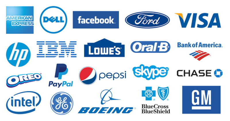
For a super interesting article on the subject check out Abigail Cain’s Why Blue is the World’s Favorite Color.
Warm: ravenous red
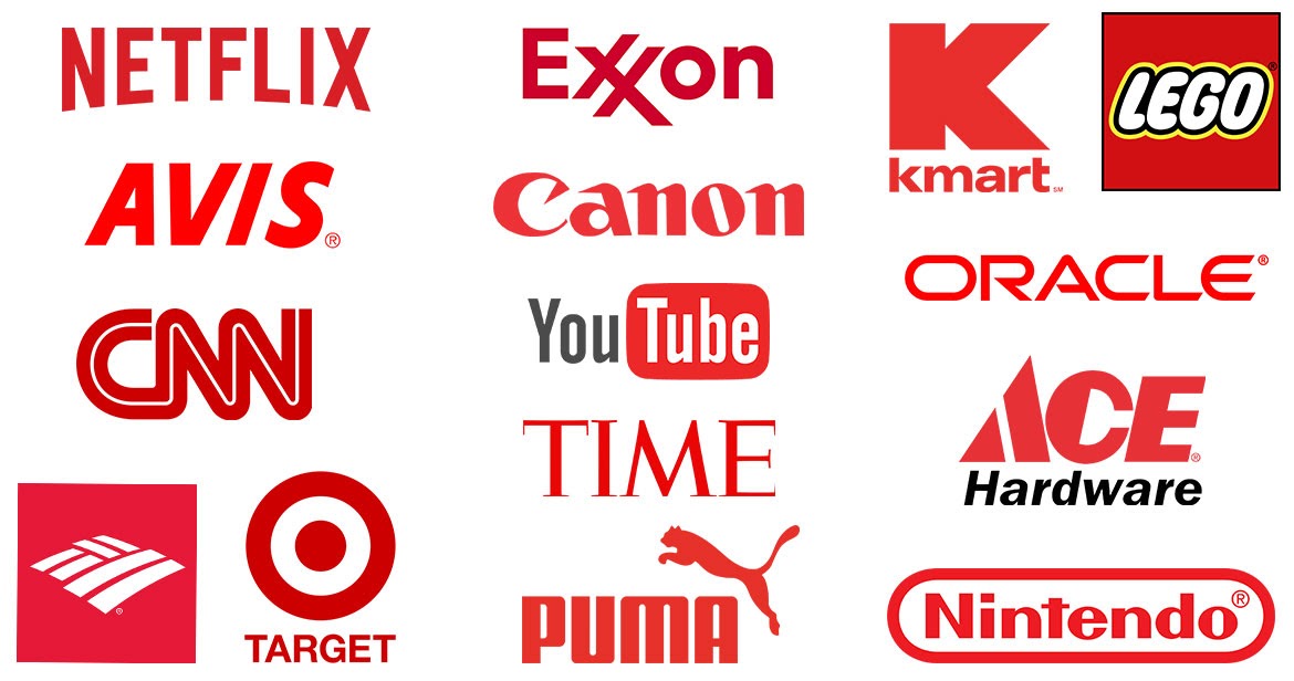
Second place, at 29%, goes to red due to its association with energy, provocativeness, and its sheer attention-grabbing nature.
Brands like Netflix, Exxon, CNN, Target, TIME, Oracle rely on it to get your blood pumping before you even know it.
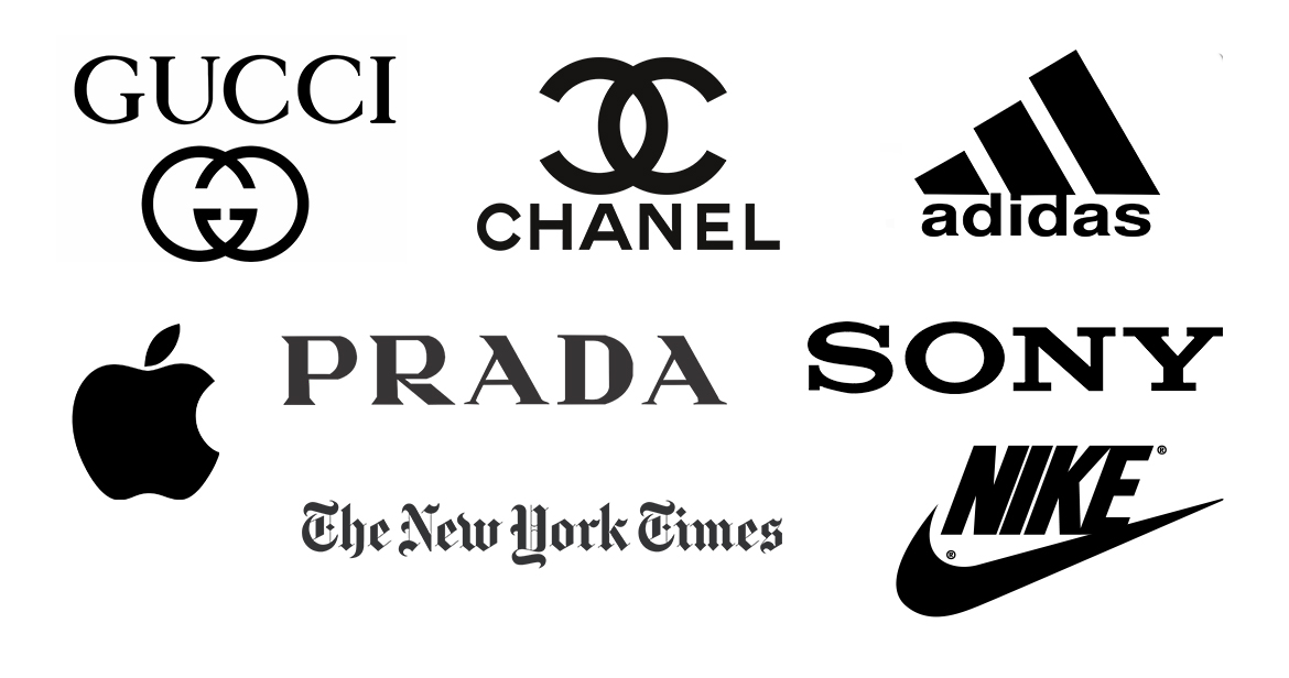
Warm: sophisticated black
Other companies, around 28% of them, use plain ol’ black or grayscale to communicate a sense of prestige, value, sophistication, and overall timelessness.
It’s pretty impressive when you think about HUGE brands like Apple, Prada, Nike, Chanel, The New York Times all hanging their hats on a color also associated with death.
Warm: sunny yellow
Now, yellow is associated with the sun and communicates hope and optimism. It’s said to stimulate creativity and energy and its brightness is especially helpful to draw attention and motivate. It is especially popular in the food industry.
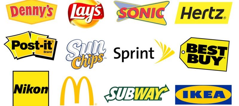
Now I see your tricks and evil ways, McDonald’s!. Well, at least I don’t have to feel bad about my lack of self control when I see those big yellow arches screaming at me from the distance: “Come have some delicious all white meat chicken nuuuggeeets...”
Ahem. I digress.
Seriously, some of the most exciting brands use yellow like Lays, Denny’s, Best Buy, Subway, IKEA and yes, McDonald’s (or as I like to call them, the evil ones).
Find out more about the full spectrum of colors and what they mean
To read a little more on the subject and check out the original infographic visit the Marketo blog.

Free: Assessment
/Assets/Icon%20Library/x%20corp.svg)
/Assets/Icon%20Library/whatsapp%20logo.svg)
/Assets/Icon%20Library/Email.svg)
/Assets/Icon%20Library/Arrows/Grey%20Arrow%20-%20Prev.svg)
/Assets/Icon%20Library/Arrows/Grey%20Arrow%20-%20Next.svg)