/Assets/base/Navigation%20Icons/TAYA.svg)
/Assets/base/Navigation%20Icons/Sales.svg)
/Assets/base/Navigation%20Icons/Web%20design.svg)
/Assets/base/Navigation%20Icons/HubSpot.svg)
/Assets/Icon%20Library/AI%20Mastery.svg)
/Assets/Icon%20Library/Learning%20Center%20Laptop.svg)

Feb 15, 2017
Most Recognized Brands
- IBM
- Walmart
- Visa
- eBay
- FedEx
- 3M
- Coca-Cola
- Nike
- Olympics
- Disney
- UPS
- GAP
- World Wildlife Fund
- Apple
- McDonald's
- Pepsi
- Target
- Microsoft
- Shell
- Starbucks
Research suggests that the average person is exposed to upwards of 5,000 brand messages per day.
Through all of that clutter, there are still some companies who stand out.
For whatever the reason, these 21 companies’ logos have solidified a spot in all of our minds.
We know them like theback of our own hands and can identify them even if half of the image was missing (Logos Quiz wasn’t a top app for no reason).
The following 21 logos share one of three mutual characteristics, besides the fact that they are everywhere. These logos are all unmistakable, consistent, or extremely simple.
Unmistakability
Your logo is the face of your business, so why not make your business the face of your logo? There is no better way of getting people to associate your logo with your company than to use the actual name of your company as your logo. The following businesses have done this well, and now have their names recognized as one of the most iconic brands in the world.
1. Google
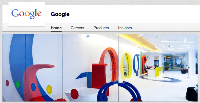
Millions of people see this logo on their computer screen every single day. This is the centerpiece of a website that handles over 100 billion visits per month, it’s got to look good. Google is known as being a fun company, and their colorful logo certainly reflects that; a law firm definitely couldn’t pull off font like that.
2. IBM
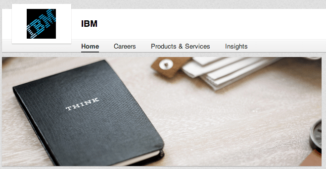
The eight-bar IBM logo was designed by legend Paul Rand to replace his preexisting logo of the letters IBM bolded in black. The change was supposed to reflect the change of emphasis from stability to speed.
3. Walmart
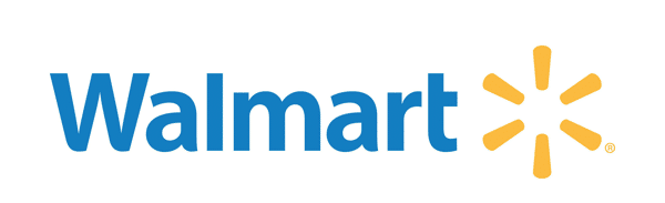
Walmart is the defending champion of the Fortune 500 list and raked in over $450 BILLION in revenue its last fiscal year. In 2008 the Walmart logo underwent reconstructive surgery. The star used to break the “Wal” and the “Mart” was removed, and the logo was made more colorful. A lighter blue was used for the font and a yellow spark was added to the right of the text to make it more appealing.
4. Visa
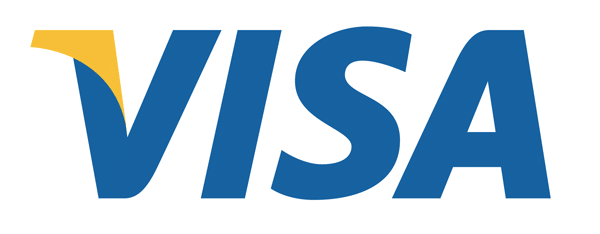
Visa; it’s everywhere you want to be. So is this logo. This simple “Visa” emblem is constantly seen on TV, at restaurant windows, and on those little pieces of plastic we hate so much yet bring with us everywhere. This logo was introduced in 2006 and gave a more modernized feel to its boxy blue and yellow predecessor.
5. eBay
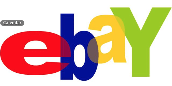
The online auction giant released this new logo in 2012, replacing the old logo that was used since the company (at the time called “Auction Web”) changed its name to eBay in September of 1997. The new logo uses elements such as zigzagged letters (known as a “baseline shift”) and fun colors to convey a sense of energy and dynamicity. The overlapping letters also signify the great sense of community among eBay users.
6. FedEx
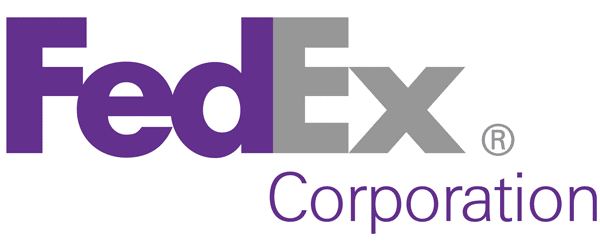
FedEx, the company formally known as Federal Express, is perhaps the best example of in-your-face subliminal advertising. If you look closely at the white space between the upper case E and the x, you will see an arrow. While the average consumer may not pick this up at first, it gives a message of speedy service and delivery. FedEx is also clever with the coloration of its logos. The “Fed” portion is always purple, but the “Ex” changes colors based on the company’s subdivision. As seen above, it is gray when referring to the corporation, orange when used in FedEx Express, red in FedEx Freight, blue in FedEx Kinko’s, yellow in FedEx Trade Networks, and green in FedEx Ground.
7. 3M
3M; two simple characters in big, red font. It doesn’t get much more in your face than that. Despite looking like it took approximately seventeen seconds to design, this logo has managed to become renowned in its own right since its 1978 debut. The official 3M emblem started as a circle containing the company’s full name (Minnesota Mining and Mfg. Co.) and headquarters location wrapped around a diamond with the words “3 M Co.” imprinted both vertically and horizontally, but has undergone multiple revisions since 1906, becoming simpler and simpler with each one.
Consistency
Some logos are simply built to last. When people know and love your company, there is no need to rebrand yourself. These businesses have been around for decades and still use logos nearly identical to their founding days.
8. Coca-Cola
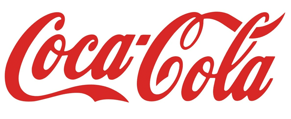
According to Brandirectory, Coca-Cola is the world’s eighth most valuable Brand with a worth of over $31 billion. This success did not happen overnight, Coca-Cola has been as much of a staple in American minds as the bald eagle since the 1800s; and so has its logo. The company name has been written in a similar Spencerian script since 1887. While it has been tweaked since then, the changes have been very minor and the consistent imagery from generation to generation has given Coke a deserved sense of stability and tradition.
9. Nike
Complex magazine rated the Nike swoosh as the most iconic brand logo of all time. This simple shape is associated worldwide with the shoe company and high quality athletic apparel. The swoosh was originally designed by one of Nike founder Phil Knight’s students, a girl named Carolyn Davis. Knight paid a grand total of $35 for the logo and was quoted as saying, “I don’t love it, but it’ll grow on me.” Way to tough it out, Phil.
10. Olympics
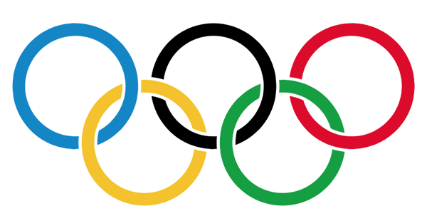
As a sports enthusiast, I personally have a soft spot for the Olympics. Over two hundred countries around the world putting aside their political and economical differences and sending forth their best athletes to challenge themselves and each other purely for the love of sports and competition; it just brings a tear to my eye. These rings are recognized around the world and have been used to represent the Olympics since 1912. The five interlocking circles represent the joining of five continents (the Americas, Asia, Africa, Europe, and Oceania) and the colors represent the flags of participating countries. Every country that participates’ flag includes red, blue, yellow, green, or black.
11. Disney
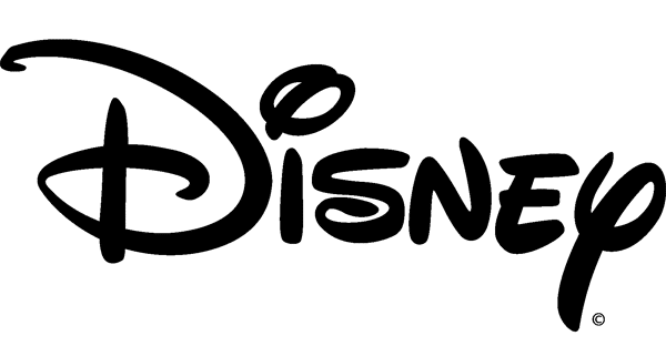
Many people do not realize the full size of Walt Disney Company. A true conglomerate, some of their subsidiaries include ABC, ESPN, Pixar, Marvel, the History Channel, and most recently, Lucasfilm. This logo, the actual signature of Disney cofounder and animation legend Walt Disney, has appeared on the opening credits of Disney movies as well as on countless pieces of Disney memorabilia for decades.
12. UPS
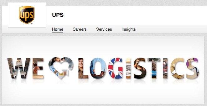
The United Parcel Service of America, Inc. has been in existence for over one hundred years, and delivers fifteen million packages to customers in 220 countries every day. UPS has used four logos in its history, three of them containing the letters “UPS” inside of a shield. The first of these was introduced in 1937 and was most recently changed in 2003 as part of the company’s worldwide rebranding initiative.
13. GAP
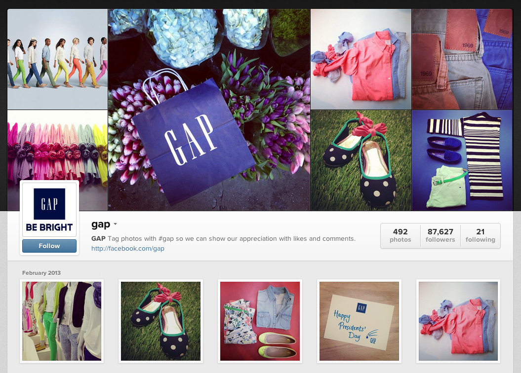
GAP is an American clothing company founded in 1969 by Donald and Doris Fisher. The original logo was composed of the words “the gap” written in simple text, but was switched to the blue box logo shown above in 1984. During a rebranding initiative in 2010 Gap attempted to modernize and “sexify” its logo, but customer outrage via social media quickly compelled Gap to revert its changes.
14. World Wildlife Fund

The World Wildlife Fund is a nonprofit organization that establishes and supports projects aimed to conserve and restore wild animals and the environment. WWF was founded in 1961 and has used a panda in a similar stance since its inception. Minor changes have been made to the logo to modernize it and make it more aesthetically appealing, but it has remained recognizable throughout the years.
Simplicity
K.I.S. Keep it simple. What a classic saying, especially in the world of marketing. Sometimes there’s no need to spruce anything up, and minimalist designs just look the best. Here are some prime examples.
15. Apple
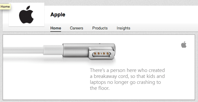
Apple is the most innovative consumer electronics company in the world and has a cult-like following of loyal customers. Founded by the late, great Steve Jobs in 1976, the Apple logo has since become a worldwide icon. Take out the fancy glosses and gradients and the apple with a bite missing still looks beautiful as a black silhouette on a white background. No need to be elaborate here.
16. McDonald's

Over the years, the golden arches that make up the McDonald’s “M” have become synonymous with fast, convenient food. This symbol can be spotted from a mile away on a sign-cluttered turnpike and draws in over sixty million people per day. McDonald’s has undergone a few redesigns since their 1940 inception, but has really made things clean with their 2003 revision. According to Business Insider, these arches are recognized by more people worldwide than the cross.
17. Pepsi

Not many colors look better together than red, white, and blue; and Pepsi does a fantastic job of using these colors to create a clean, visually pleasing logo. All it takes is a couple of circles with two curved lines running through it to create a modernized look of an already classic brand.
18. Target
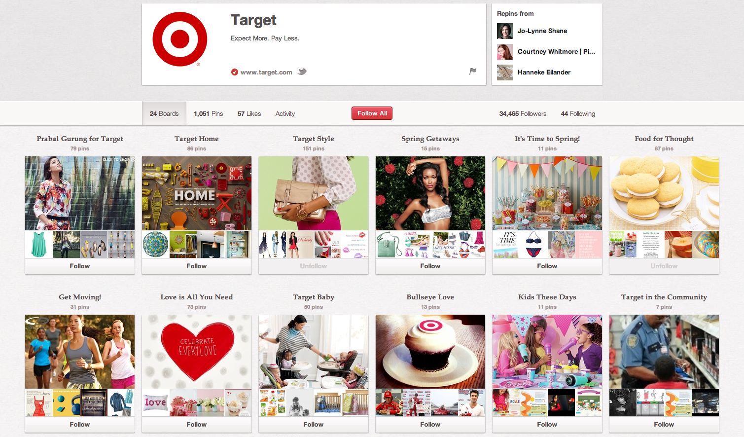
Target is one of many examples of a company cleaning up its logo as it grew in size. Target’s logo was always a simple one that focused on a bull’s eye, but it usually was accompanied by the company’s name. In 2007, they scrapped the “Target” text because the logo was so well known by itself.
19. Microsoft

Microsoft really took the K.I.S. approach seriously in their 2012 rebranding. You can’t get much simpler than four matte squares aligned in the shape a bigger square. Microsoft has been using the multicolored four-paned window look for its computer software since 1992, but just recently made it the official company logo in 2012.
20. Shell

Gas isn’t cheap. Despite its premium pricing, Shell is still the most profitable corporation in the entire world according to CNN’s Global 500. The company insignia has been a shell since the logo was first designed in 1900, with each redesign making it less and less realistic. The red and yellow color scheme was first used in 1948, and the design hasn’t changed much since then; with the biggest change being the removal of the word “Shell” in 1999.
21. Starbucks
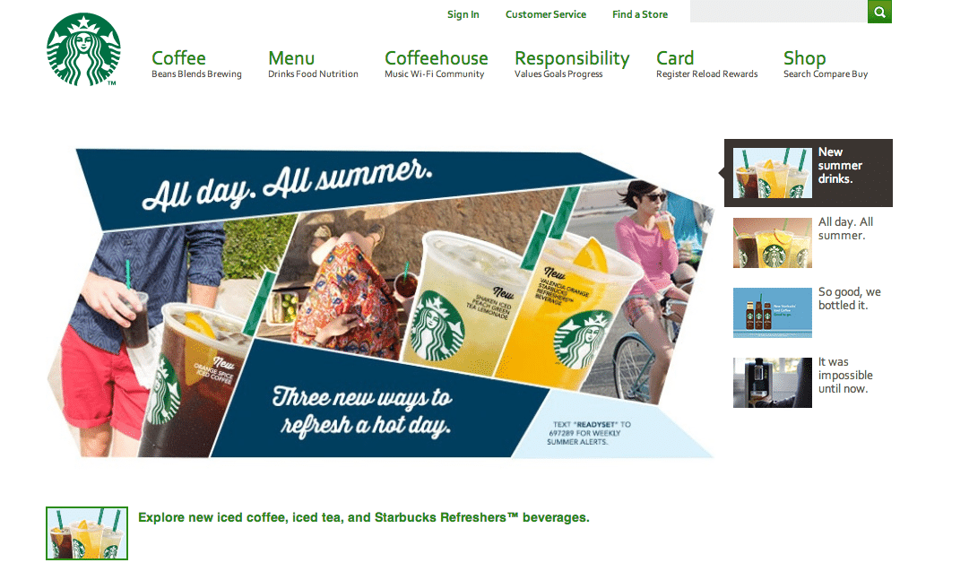
In 2011, Starbucks removed the outer circle of the logo with the words “Starbucks Coffee” printed inside of it. They also changed the background of the smiling two-tailed mermaid (in case you were wondering, the mysteriously smirking woman is, in fact, not a human) from black to green. This redesign really cleaned up the look of the logo and was made possible by over 20 years of brand development.
Free: Assessment
/Assets/Icon%20Library/x%20corp.svg)
/Assets/Icon%20Library/whatsapp%20logo.svg)
/Assets/Icon%20Library/Email.svg)
/Assets/Icon%20Library/Arrows/Grey%20Arrow%20-%20Prev.svg)
/Assets/Icon%20Library/Arrows/Grey%20Arrow%20-%20Next.svg)