/Assets/base/Navigation%20Icons/TAYA.svg)
/Assets/base/Navigation%20Icons/Sales.svg)
/Assets/base/Navigation%20Icons/Web%20design.svg)
/Assets/base/Navigation%20Icons/HubSpot.svg)
/Assets/Icon%20Library/AI%20Mastery.svg)
/Assets/Icon%20Library/Learning%20Center%20Laptop.svg)

Jul 18, 2020
![What Netflix can teach us about font psychology and branding [Infographic]](https://www.impactplus.com/hs-fs/hubfs/Netflix-Lessons.jpg?width=768&height=400&name=Netflix-Lessons.jpg)
Streaming services, such as Netflix, are one of the main things keeping me sane during the COVID-19 pandemic.
And I know I’m not the only one.
In fact, the average weekly usage of Netflix has risen almost 72% since the pandemic began.
That’s a lot of hours of streaming!
Luckily, there’s no shortage of shows to choose from on Netflix.
Whether you’re in the mood to educate yourself with a documentary, laugh with a comedy special, or sit on the edge of your seat while watching a thriller; Netflix has something for you.
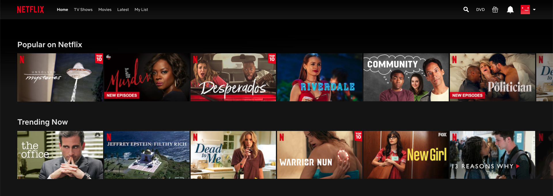
So when you’re scrolling through the endless number of Netflix-curated lists, what makes a show stand out to you?
More often than not, it’s the show’s thumbnail that grabs our attention.
And that’s not by coincidence.
Netflix is very intentional about every detail included in a show's thumbnail design. The thumbnails are designed to evoke specific emotions when people see them and they even change to highlight different things based on your interests.
A big part of those designs is the fonts used on each thumbnail.
Fonts are a detail in graphic design and UI design that might seem small and simple, but can completely change the tone and effectiveness of a design.
Every font has its own characteristics that can reflect a certain mood or personality trait.
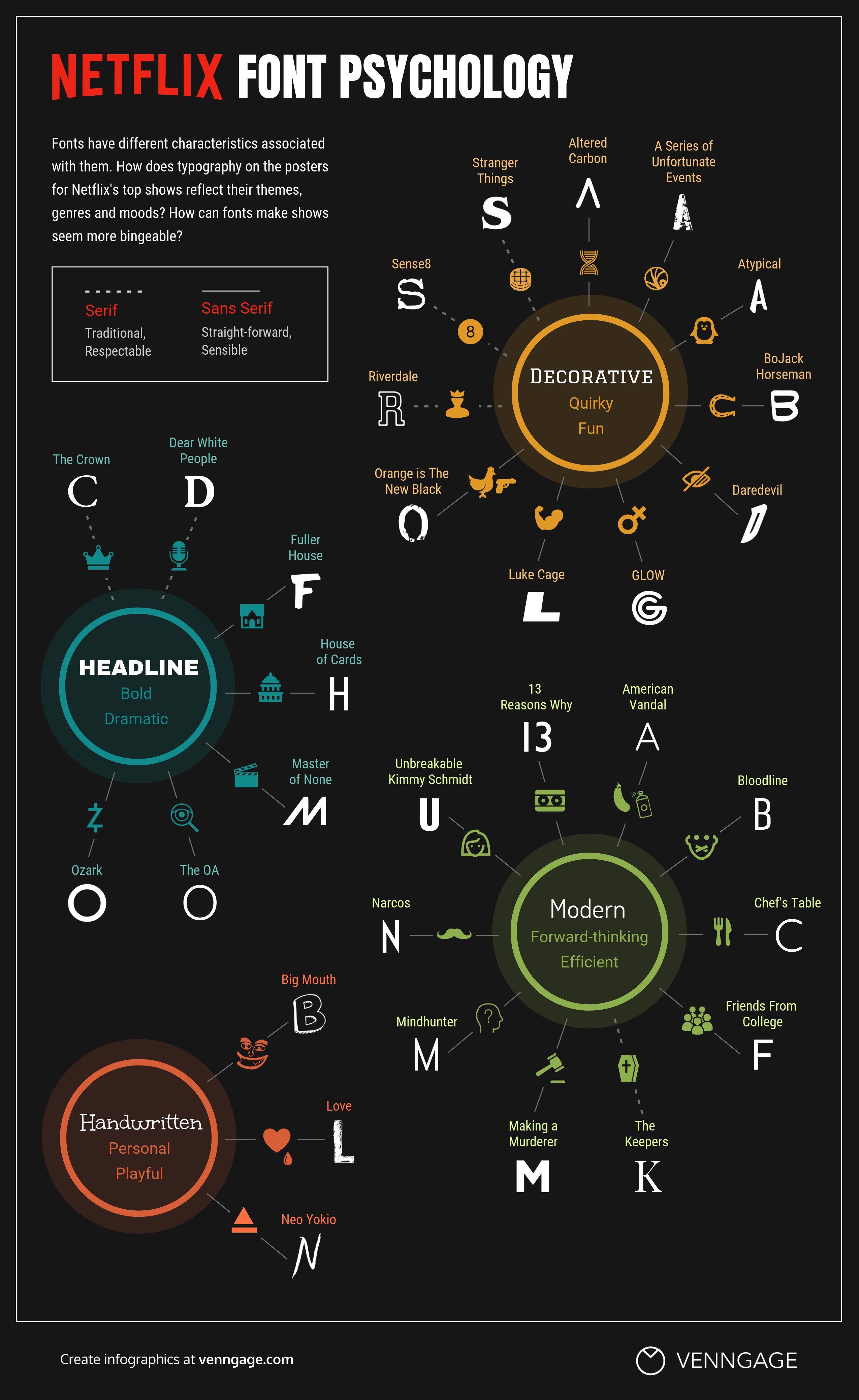
The folks over at Venngage, an infographic design tool, decided to dive a little deeper into this idea by analyzing the fonts used on 50 of Netflix’s most popular shows (most of which I have binged) and breaking down how the style of each font may affect our perception of the show.
They compiled this data into a super informative infographic that groups each font into one of six main types of fonts:
Serif fonts
It can be easy to mix up serif and sans serif fonts. The simplest way to describe a serif font is any font that has little embellishments (or feet as some people like to call them). Think fonts like Times New Roman or Georgia.
Serifs tend to feel more traditional, respectable, and regal.
The Crown, for example, is a thumbnail that made use of a serif font. The show is a period piece that chronicles the life of Queen Elizabeth II so using a serif font helps reinforce the feeling of royalty and high class.
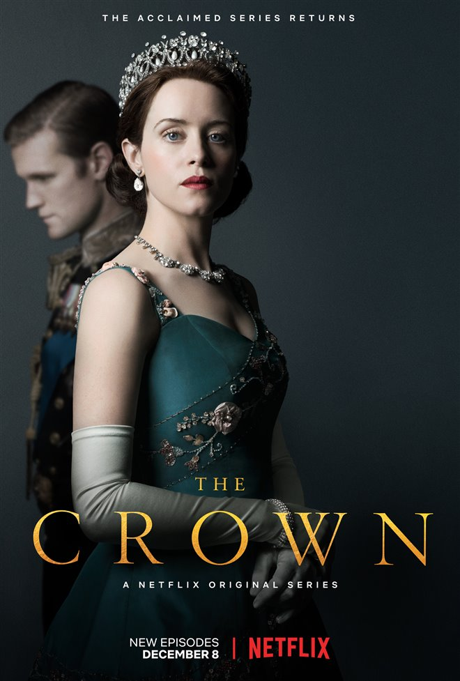
This usually makes them a good fit for companies who want to appear more reputable, established, and serious.
Professional businesses such as law practices, editorials, and insurance companies are all examples of companies that a serif font would be a good choice for.
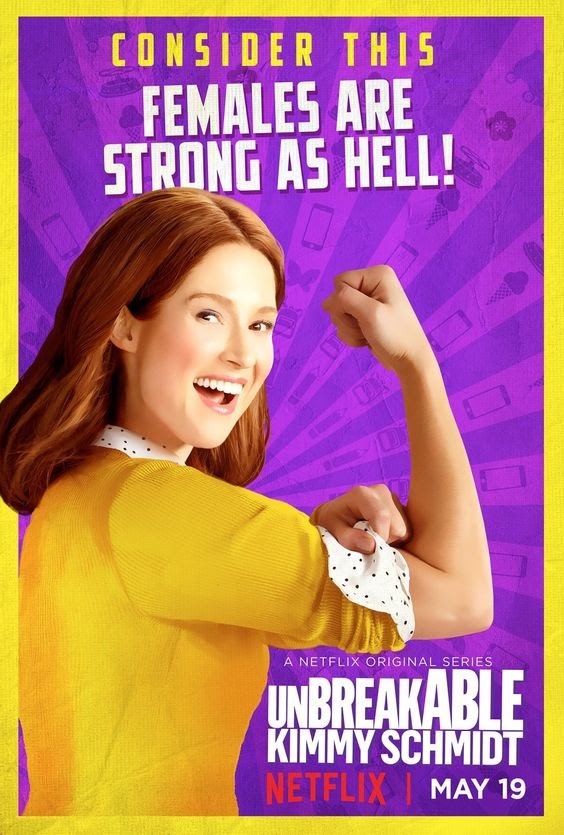
Sans serif fonts
Sans serif fonts include any fonts that don’t include any small embellishments or feet (hence the “sans”). Simple, right?
While Sans serif fonts are more minimalist and straightforward, it doesn’t mean they lack personality.
Depending on the font-weight used, a sans serif font can be subtle or it can be bold and attention-grabbing.
Generally, these fonts give people the feeling of being more modern, approachable, and clean.
The thumbnail for Kimmy Schmidt uses a bold, rounded sans serif font to convey strength and confidence.
Headline fonts
Headline fonts are typically very bold and heavy-styled fonts that really grab attention. They tend to be more dramatic and impactful. Many of Netflix’s dramas tend to use headline fonts.
For instance, the Luke Cage thumbnail uses a headline to incorporate the personality and powers of the show’s protagonist.
The bold and rock-like style reflects Luke Cage’s bullet-proof superpowers and tough guy personality.
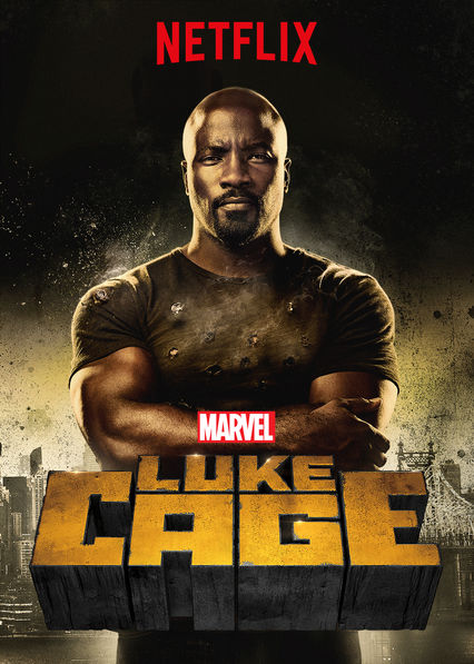
Because of its ability to make content look prominent and important, brands may want to use this headline font on both their print materials and website to draw the eye.
It can also be used for brands trying to exude a “tough” or industrial mood like a construction or fitness company.
Modern fonts
Modern fonts tend to be more clean and geometric. They can be used in a variety of ways but when people see modern fonts they get the feeling of being more forward-thinking and efficient.
Chef’s Table uses a modern font to capture the essence of the show which is all about highlighting the most innovative chefs in the world and their unique styles that are pushing the culinary industry forward.
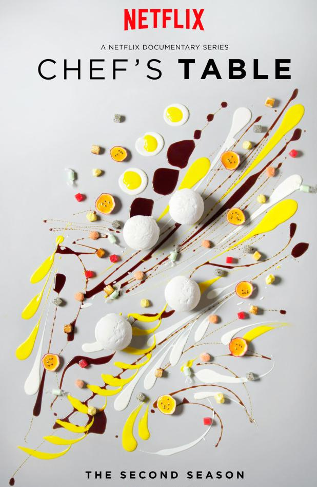
Similar to headline fonts, this style of font works best for short headlines. The elegant and futuristic look of modern fonts makes them a great fit for startup and tech companies.
Handwritten fonts
Handwritten fonts are pretty straightforward. They’re fonts that look like they were well, written by hand.
Some handwritten fonts can give a design a personal, quirky feel while others with a more calligraphic-style can add a touch of elegance.
Love, an offbeat dramedy with loveable relatable characters, uses a handwritten font to capture the loveable and human aspect of this show.
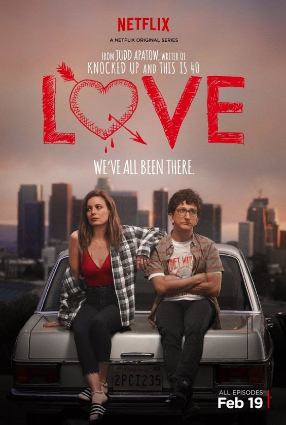
Due to their more imperfect nature, brands will likely want to use these fonts more sparingly in elements such as illustrations or short testimonials, where they won’t distract from other messaging, but add to it.
In the example below from the eMyth website, they use a handwritten font to make their testimonials feel more personal and human.

Decorative fonts
Decorative fonts are bold and often custom fonts designed for a specific use-case.
These fonts are made to stand out but their playful nature makes them not as legible as other fonts. That’s why they’re not great for any type of body copy.
The thumbnail for Glow is a perfect example of a decorative font.
It was designed specifically for the show to give the title the feeling of a neon sign. It does a great job of showcasing the loud, high-energy feeling that you can expect while watching the show.
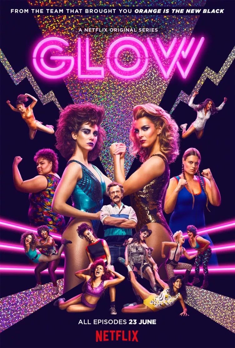
Brands may want to reserve decorative fonts for logos or on promotional artwork for events as they are more effective at attracting the eye than delivering important content.
Wrapping up
Seeing the different types of fonts Netflix uses to influence how we perceive different shows can serve a useful roadmap for when it comes to selecting a font for your brand’s designs
Whether it’s a bigger project like a website redesign or something small like a Google Ad, your font selection shouldn’t be a detail you overlook.
It’s important to make sure you’re choosing a font that will not only resonate with your target audience but also evoke the right emotions.
You can check out the full breakdown of shows and their font types in the infographic below.
The folks over at Venngage also included a link to their datasheet which includes similar fonts to the ones used in the thumbnails for anyone looking to capture a similar effect.
Free: Assessment
/Assets/Icon%20Library/x%20corp.svg)
/Assets/Icon%20Library/whatsapp%20logo.svg)
/Assets/Icon%20Library/Email.svg)
/Assets/Icon%20Library/Arrows/Grey%20Arrow%20-%20Prev.svg)
/Assets/Icon%20Library/Arrows/Grey%20Arrow%20-%20Next.svg)