They says trends always come back around. If you’re a hoarder of old tech, you’re in luck. The Palm Pilot is making a comeback.
Now, before you go digging into the back of your massive tech closet to unearth the device that started it all, let’s take a look at the new Palm.
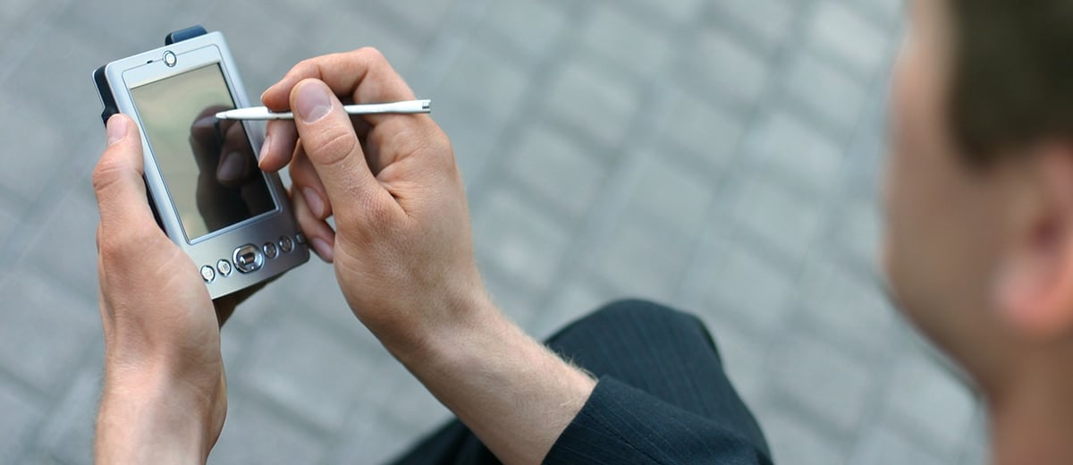
It’s small, in fact it’s adorably cute.
But, there is a method to the tiny madness. Palm has set out to create an “ultra-mobile” product that takes the focus off of your tech and puts it onto your life.
Bold. Very bold.
The new Palm, with its tiny size, is more of a companion device (similar to how an Apple Watch works with an iPhone). It’s only available on Verizon, and yes, you do have to pay an additional fee and get an additional phone number.
All in all, it’s a very unnecessary, albeit cool gadget (although Steph Curry would disagree).
Seriously, the features are pretty amazing.
What Does This Mean For Marketers?
Before you race out the door to grab this adorable device you never thought you needed, let’s dive into what the release of the new Palm actually means.
The way we consume information is constantly changing -- it may be the medium or, in many cases, it’s the device.
In a world where phones and mobile devices (like tablets) keep getting bigger and bigger, Palm is taking a “life first” approach. The company's goal is for your device to be an extension of what is going on around you.
As a marketer or content creator, how should you respond to Palm’s move into the tiny device market?
By adapting.
Given the incredible growth in web traffic from mobile devices, in 2018, taking a mobile-first approach to web design is a must. While many designers are already optimizing their websites and content for mobile devices, the majority of them are focused on creating pages that render well on larger iPhones and tablets.
With the launch of the new Palm coming on the heels of other tiny devices such as the Apple Watch, its worth considering how website content will render on smaller mobile devices where information is consumed that much quicker.
Optimizing Web Content For The New Palm
In many ways, the same best practices that marketers and web designers follow when taking a mobile-first approach will apply here as well.
When designing for tiny mobile devices, less is more.
Make sure website copy is clear, concise and to the point. Superfluous copy will overwhelm users on wearable devices, and is even more unwelcome on a device that is actually encouraging you to pay attention to the world around you.
Think about how someone interacts with a wearable, or smaller device. Your button sizes need to fit the overwhelming majority of fingertips and your copy needs to be large enough for the user to actually read.
Function trumps form here.
When designing, keep your contrast high. Gradients and white text are having a moment in the design world but may not work as well on smaller devices. Why? If you can’t read copy at a quick glance (think about how quickly you turn your wrist), your message simply won’t be seen.
Most of all, don’t fret.
Palm-sized devices aren’t going to be overtaking the world tomorrow, but it’s good practice to reevaluate your site’s mobile experience in light of the emergence of these tiny new devices.
Challenge yourself. How can you optimize for the smaller devices of the world?
Header image via Palm.
/Assets/base/Close.svg)
 ]
]
/Assets/arrow-facing-left--black-01.svg)
/Assets/base/Navigation%20Icons/TAYA.svg)
/Assets/base/Navigation%20Icons/navigation%20arrow%20-%20facing%20right-01.svg)
/Assets/base/Navigation%20Icons/Sales.svg)
/Assets/base/Navigation%20Icons/Web%20design.svg)
/Assets/base/Navigation%20Icons/HubSpot.svg)
/Assets/Icon%20Library/AI%20Mastery.svg)
/Assets/Icon%20Library/Gear%20icon.svg)
/Assets/Icon%20Library/Learning%20Center%20Laptop.svg)
/Assets/Icon%20Library/Click.svg)
/Assets/Icon%20Library/Link.svg)
/Assets/navigation-global--close-symbol-black-01-1.svg)
/Assets/navigation-global--close-symbol-black-01.svg)

/Assets/Icon%20Library/x%20corp.svg)
/Assets/base/Learning%20Center%20Resource%20Category%20Icons/Facebook_Messenger_logo_black.svg)
/Assets/Icon%20Library/whatsapp%20logo.svg)
/Assets/Icon%20Library/Email.svg)
/Assets/Icon%20Library/Arrows/Grey%20Arrow%20-%20Prev.svg)
/Assets/Icon%20Library/Arrows/Grey%20Arrow%20-%20Next.svg)