/Assets/base/Navigation%20Icons/TAYA.svg)
/Assets/base/Navigation%20Icons/Sales.svg)
/Assets/base/Navigation%20Icons/Web%20design.svg)
/Assets/base/Navigation%20Icons/HubSpot.svg)
/Assets/Icon%20Library/AI%20Mastery.svg)
/Assets/Icon%20Library/Learning%20Center%20Laptop.svg)


I’ll always remember my grandmother’s pink nail polish.
Every few visits, my mom would touch it up as Nani (the Hindi word for maternal grandmother) recounted how every nurse complimented her on her nails and how every other woman in the senior home was jealous.
They always had to be done and they always had to be pink.
Even as we found her unexpectedly in hospice a year ago, we made sure her nails were always at their pink, pearly best.
They were a thing of pride for her, a status symbol; one I’ve emulated whenever I paint my own nails since she passed away.
But in general, I’ve always been drawn to the color pink. Perhaps I got that from her.
While most females can say they went through pink phases growing up, I never stopped seeing the world through rose-colored glasses.
Unfortunately, however, the color of bubblegum, flamingos, and rosé, isn’t beloved by all.
For some, pink is just too girly.
It’s seen as sweet and innocent and in turn, “childish,” while for others, especially in the month of October (National Breast Cancer Awareness Month in the United States), it is symbolic of strength and endurance.
It is these polarizing perceptions of the color that make it so important to understand how it can and should be used effectively in branding, design, and marketing.
Connotations and emotions of the color pink
Pink is often defined as simply “a lighter shade of red,” but it has a unique power all its own.
Baker-Miller Pink has even been scientifically proven to calm and sometimes weaken individuals after prolonged exposure, but that’s an extreme situation.
Pink, like its primary cousin, red, is considered a warm color and, depending on the shade you use, can evoke a wide range of emotions.
Pair it with white or go bold and bright and pink exudes youth, fun, energy, edge, and confidence, like designer Betsey Johnson below:

Go soft and subdued or alongside black with a traditional font, and it’s seductive, sophisticated, and calming, more like Victoria’s Secret:

Regardless of the shade, however, one theme seems consistent in the western world (and with the brands mentioned above): femininity.
Pink is for girls and blue is for boys, so they say.
Before American First Lady Mamie Eisenhower declared it her favorite color in the 1950s, pink was actually more commonly worn by young boys, but today, it screams girlhood to most.
This also means it’s taken on many of the characteristics conventionally associated with women and young girls like innocence, romance, tenderness, affection, sweetness, safety, and playfulness.
People think pink and they think cotton candy, baby girls, and flowers, and while all “nice” associations, they aren’t always taken positively.
When I asked some of IMPACT female coworkers about how they felt about the color, most said they disliked it because it made them feel and look like a little girl, who, unfortunately, can be quite vulnerable.
Because of these “girly” associations, pink can also be seen as delicate, harmless, or even weak. It is not seen as powerful or domineering.
This is part of the reason why it is not a very popular color for men and also why the Iowa Hawkeyes football team painted the visiting team locker room at Kinnick Stadium pink; to mock their opposing team.
For obvious reasons, this perspective is troubling. Things associated with women or girls should not be so automatically perceived as weak or meek.
Fortunately, there are many people and organizations trying to break this trend.
Take the color’s use in Breast Cancer Awareness campaigns:

Yes, pink highlights the fact that women are most heavily impacted by the disease, but it also combats the idea that the color is weak by making it one for fighters and survivors.
It is worn and displayed as a symbol of strength, unity, and support of those who face the relentless disease, and this is certainly not a feat for the weak.
Because of its “safe” connotations, pink can also be used as a color of defiance, rebellion, and innovation, especially when aligned with a more masculine brand or cutting edge offering.
How can such a “dainty” color achieve so many different emotions and messages?
Now that we know what pink can communicate, let’s take a look at how it has been used successfully by brands to reach different consumers and deliver different emotions.
Successful uses of pink in marketing and branding
Logos
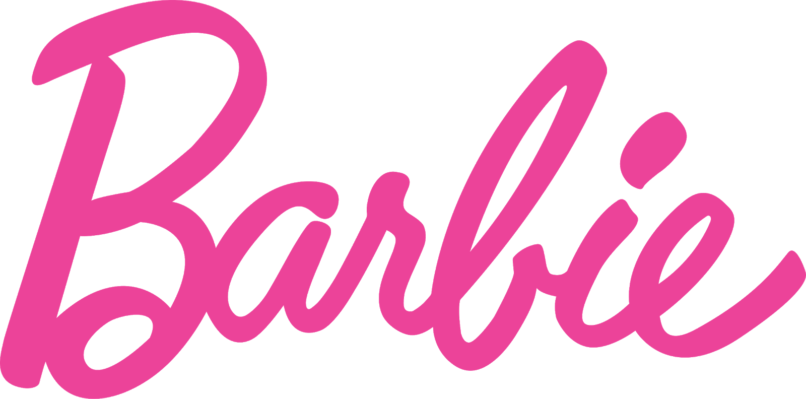
1. Barbie: In one of the most iconic uses of pink by a brand, Mattel’s Barbie logo captures the youth and fun needed to appeal to its audience, but also the bold visual impact needed to show that Barbie is a strong female role model.
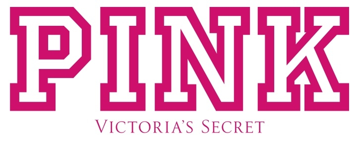
2. Victoria’s Secret PINK: We discussed Victoria’s Secret earlier, but its PINK line is also worth mentioning if the name didn’t already make that clear.
As a lingerie and intimate apparel brand for young, usually college-aged, women, the brand’s use of pink aligns perfectly with its target audience and also reflects its focus on playful and flirty products.
3. T-Mobile: T-Mobile is one of the world’s most prominent mobile communications companies. It captures this esteem by using a formal, serif font in its logo, but also attempts to show that it is innovative and forward-thinking by adding an unexpected splash of bright pink.
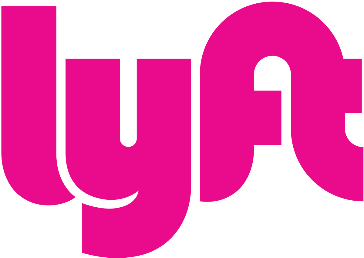
 4. Lyft: Lyft has risen to fame in recent years by challenging traditional cab and taxi companies, offering job flexibility and independence, and overall transforming the public transportation industry, which has been unchanged for decades.
The company’s use of pink and a freeform font in its logo draws the eye and aligns well with this image of being contemporary and unconventional.
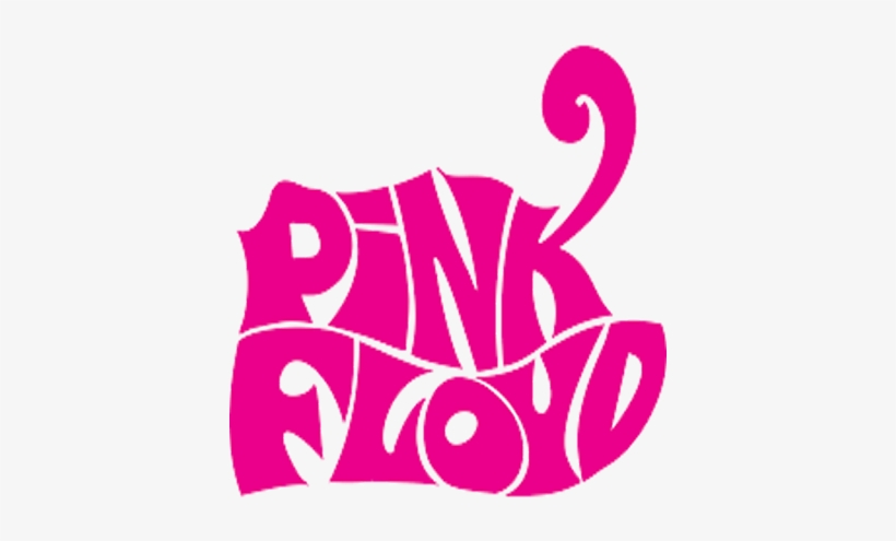
5. Pink Floyd: In a similar fashion, rock band Pink Floyd’s use of the color in its name and logo has come to reflect its trademark psychedelic sound as well as its reputation for being musically progressive.
6. Dribbble: A platform focused on providing and showcasing high-quality design inspiration, Dribbble uses a bold pink basketball to evoke a sense of creativity.

Websites
Now, even if a brand has chosen pink to be a major part of its identity like those mentioned, using it on a website can be rather tricky.
Again, depending on the shade, if you use too much, it can be overwhelming. Use it sparingly, however, and it can provide the contrast and hierarchy you need to guide your users effectively.
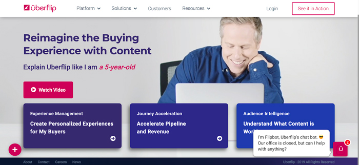
Uberflip
Our friends at content marketing platform Uberflip have a rich magenta-pink logo that is hard to ignore and, as a brand, they’ve always embraced this.
In fact, a few years ago at INBOUND, they wore bright “Real Marketers Wear Pink” shirts that, to this day, I’m still upset that I never got my hands on.
Despite this ownership, however, the company opts to use pink as a highlight on its website rather than a base.
As you can see here, they use the color to draw your eye to important calls-to-action and engagement points such as live chat, watching their homepage video, and scheduling a demo.
While not the focus of the design, pink is used to emphasize the most important elements on the page and tell the user where to go at a glance:
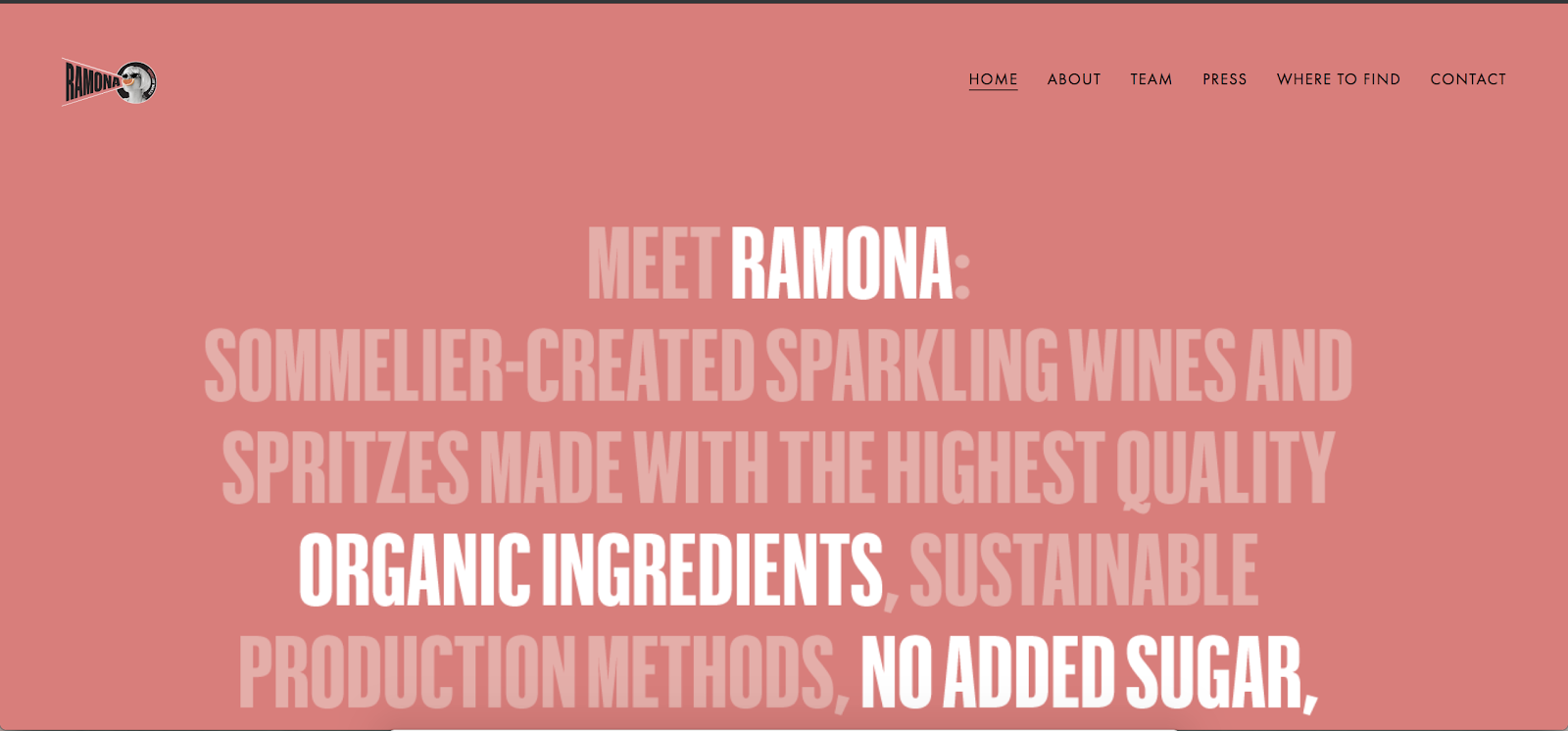
RAMONA
Call me a narcissist, but I had to include this one.
RAMONA is a canned wine company that’s brand palette includes bright pink, orange, and yellow highlighting its refreshing fruit flavors and home state of California.
Unlike Uberflip, the company uses a solid pink background on its homepage.
You may think this may be a bit jarring, but they make it work by toning down their signature shade and using white and a minimalist design to still guide the user’s eye to key information:
Thinking pink
Possibly more so than any other color, succeeding or failing with pink comes down to the message you’re trying to convey and your audience.
In the western world, especially the United States, the color is likely to be met with the emotions I described, but in other parts of the world, the connotations are far less prominent.
Looking at these brands and many others, it’s clear that pink is powerful and versatile. However, with such strong social connotations to some, you need to be strategic.
At the end of the day, you must know who you’re talking to and choose the right messaging to get everyone thinking pink.
Free: Assessment
/Assets/Icon%20Library/x%20corp.svg)
/Assets/Icon%20Library/whatsapp%20logo.svg)
/Assets/Icon%20Library/Email.svg)
/Assets/Icon%20Library/Arrows/Grey%20Arrow%20-%20Prev.svg)
/Assets/Icon%20Library/Arrows/Grey%20Arrow%20-%20Next.svg)