/Assets/base/Navigation%20Icons/TAYA.svg)
/Assets/base/Navigation%20Icons/Sales.svg)
/Assets/base/Navigation%20Icons/Web%20design.svg)
/Assets/base/Navigation%20Icons/HubSpot.svg)
/Assets/Icon%20Library/AI%20Mastery.svg)
/Assets/Icon%20Library/Learning%20Center%20Laptop.svg)

Nov 27, 2018

Note: This article was previously published on November 1st, 2017, but has been updated to reflect the new updates we’ve made across IMPACT’s site.
If you’re a regular on IMPACT's website, you’ll notice we rolled out some major changes over the past year.
As IMPACT continues its shift from being just another inbound marketing agency with a blog to an industry resource that helps as many as it can through articles, events, a sense of community, and agency services for those interested, these redesigns are another evolution to help support each of those goals.
You see, our purpose is to help people and their organizations succeed, but when we tell people we’re an agency, it’s like tacking on a footnote that says “as long as you have $5 to $10K a month to spend with us.”
That’s not what IMPACT is or who our people are.
We want to help businesses, regardless if they are a client or someone who’s just been reading our articles or listening to our podcasts religiously for years.
The quality of our content is strong and can undoubtedly get us there eventually, but to speed up the process, we needed to have strong technical SEO and get our website performing like a well-oiled machine.
Let me walk you through some of the changes you’ll encounter and why they were made.
The New Homepage
With the homepage we launched in January 2018, we created the framework for users to easily dive into our articles and get a glimpse at the other facets that made up who IMPACT is (IMPACT Elite, Agency Services, etc.).
Unfortunately, we found the design was busy, and the hero gave users many options up front which distracted from the main message -- we were you're number 1 source.
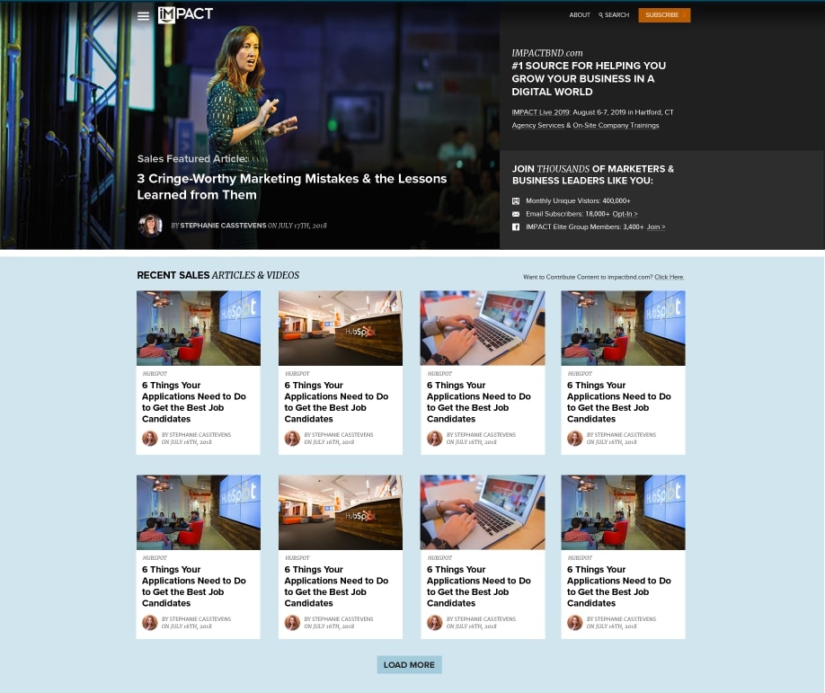
Solving for this issue fueled the new IMPACT homepage design, launched a few weeks ago:
When you first arrive on it, you’ll find most real estate is now taken up by our articles.
Rather than distracting the user with general information about our company, we made our content shine first.
From a positioning standpoint, this was a must if we wanted to be known for our thought leadership first.
First impressions are lasting impressions, so, if we want to be seen as a resource, those resources needed to be the first thing people see.
With this in mind, above-the-fold, users have a couple options.
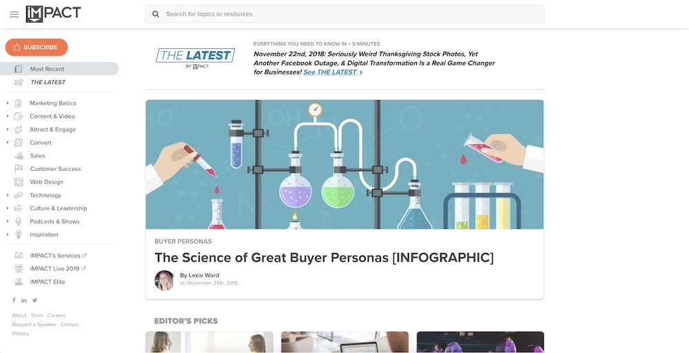
They could either click through The Latest, a curation of the most important content marketers need to read to stay up to date, curated 3 times a week (more on this later), or view the most recent article posts, shown as the largest article card on the page.
After this section, we knew we wanted an area to showcase some of our most valuable articles for our audience from the past month. With that, we added in a section titled ‘Editor’s Picks.’
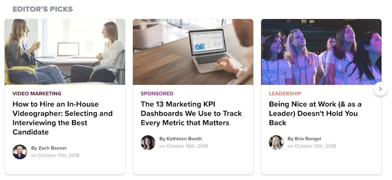
These articles are hand-selected and circle around new research, marketing strategies to consider, industry shifts, and even opinions.
This way, you're served the topics that you need to see most, while also gaining transparency into what knowledge IMPACT is keeping its eyes on.
Beyond that, we have a feed of our most recent articles and podcasts, making it easy for you to catch up with what’s been happening in the marketing landscape.
The ever-changing nature of the articles on our homepage also gives us a technical SEO advantage.
Google’s algorithm favors fresh content, and by housing a new batch of articles every day, our homepage will be crawled more frequently.
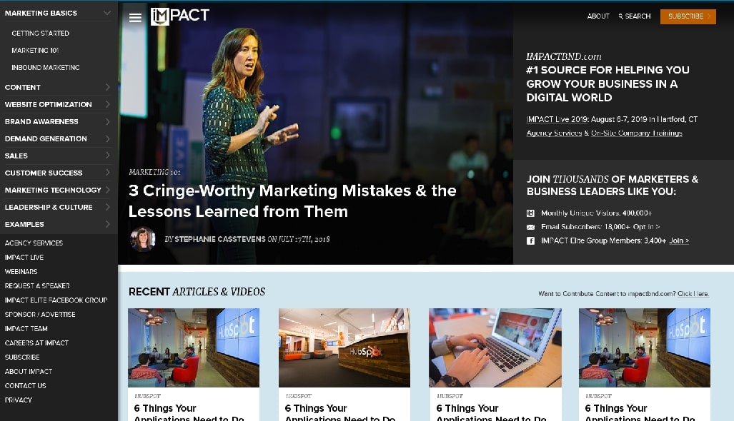
The New Navigation
Early this year, a change to our navigation introduced users to our content broken down into the categories we knew mattered most to modern marketers. This was designed to give them the opportunity to dive into a specific topic quickly.
Unfortunately, although this iteration was a giant step in evolving the design for improved topic navigation, the menu still needed improvements.
This was entirely hidden behind the hamburger, regardless of what page the users visited and over time, we hypothesized new users who came to the site though IMPACT ’s articles would be more likely to bounce once they got the information they wanted, rather than clicking the hamburger to explore.
This lead to the development of our current navigation.
Inspired by the simplicity of YouTube sidebar menu, our new sidebar navigation follows the typical journey someone experiences with us, from discovering one of our most recent articles or learning a little about who IMPACT is, to engaging with the categories we primarily write about and hiring us for services.
We also added a touch of personalization.
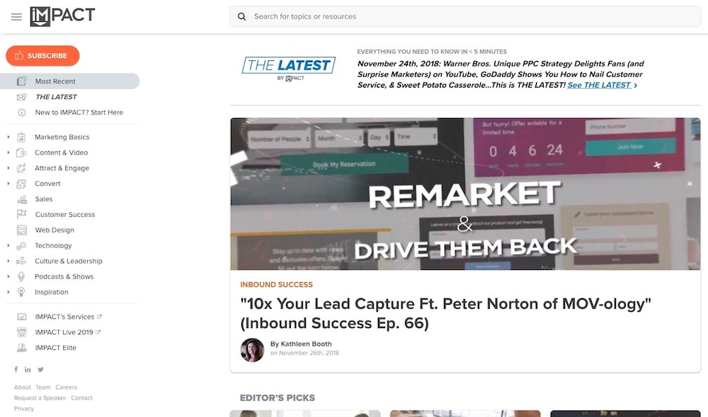
If you're new to IMPACT and have yet to subscribe to our content, you’ll notice in the sidebar, a link that says ‘New to IMPACT? Start Here.’ If you click this, you'll be taken to our about us page where you can discover who we are and what we offer.
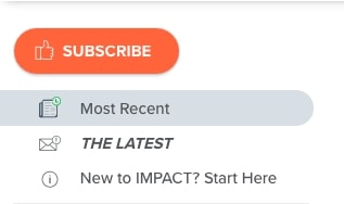
If you’ve subscribed, however, the subscribe button in the sidebar and ‘New to IMPACT’ link are removed and replaced with a personalized greeting:
We’ve also made the conscious decision to leave the sidebar open on a variety of pages we believe new visitors will enter through (blog articles, homepage, podcasts, category pages).
This way, they can immediately see what other areas we cover and services we offer. We hypothesize this will help guide new users to click through more pages during their session and increase awareness of our offerings.
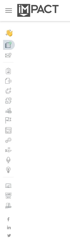
We also made it so the pages with the sidebar open had a different experience when users went to close it.
Rather than fully hiding the menu when you close it, we used UI inspiration from desktop apps (such as Gmail) and leave the icons visible.
People can also hover over the area to reveal the menu again or click on the hamburger to expand it.
We also understand not all pages need to have the open sidebar, so, certain pages on the site (such as the ‘Contact Us’ or ‘Careers’) have a standard collapsed hamburger that opens or closes when users click the menu icon.
From a technical SEO standpoint, we knew the number of icons in the navigation could greatly impact the number of requests the pages load (each icon would normally equal one request).
The more requests, the slower the page, so Google wants to see that this number is kept as low as possible.
To achieve this, we made all colored icons into a CSS image sprite (a single image containing all the icons) and each greyscale icon comes from a custom font family (similar to Font Awesome). Now, each page makes 2 requests for the navigation, rather than a potential 20+.
Overall, with this new navigation, we’ve seen our pages per session increase from 1.23 to 1.27, with average session duration also slightly increasing (49s to 55s). We’ve also seen click-throughs on navigation items double!
The Rich New Search Experience
Continuing with inspiration from Google, we’ve also enhanced our search experience.
Since our last search iteration, we’ve been using Cludo to provide the best site search experience through the over 3000 articles and pages we have indexed, but rather than forcing you to visit the results pages, we’re now using the tool to serve up potential results for the search before you even press enter.
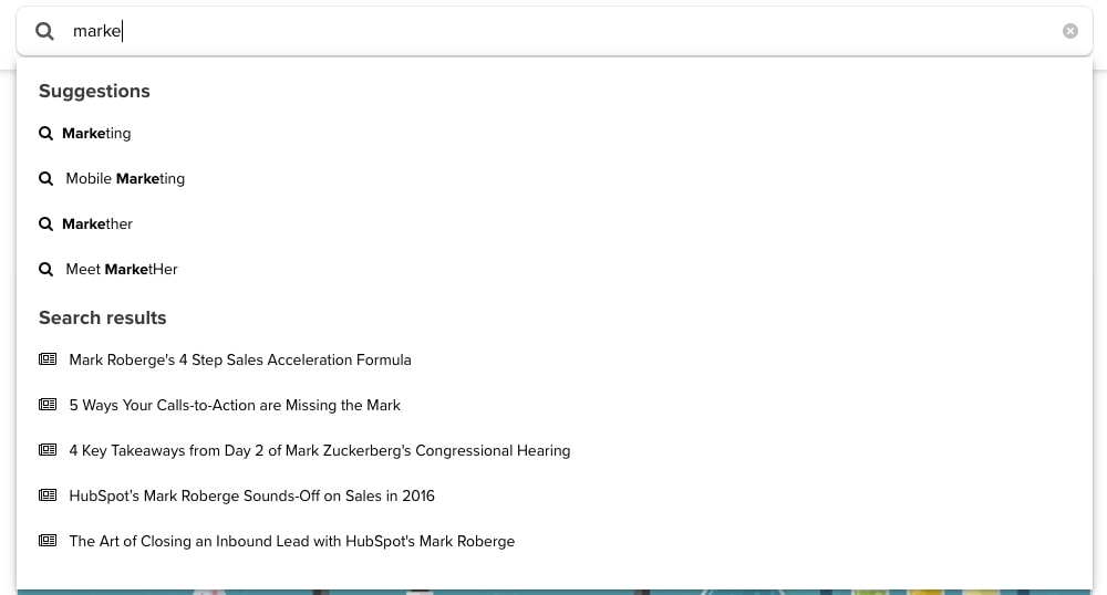
This autocomplete feature is segmented in two sections: suggestions (more complete keywords) or search results (pages you might be looking to visit with the search phrase).
Now, users are offered a shortcut to get to the pages they may be looking for. Users are still able to enter their keyword and visit the normal results page to find something more specific.
The Launch of The Latest
For as long as I can remember, we’ve been serving up our article emails as either instant, daily, or weekly updates. Although these formats gave people the option to choose the number emails they received, they had a couple of issues.
For one thing, we knew these emails were automated and didn’t offer any special experience. Most publishers produce emails like this, and we knew ours didn’t differentiate enough from the others.
Our audience's time is valuable and we knew they weren't opening or clicking every email.
So, how could we make it so these article emails were delivering content they should really care about?
Enter The Latest, a hand-curated collection of the most important articles, along with several important dates, shows, and offers that you need to know, created three times a week.
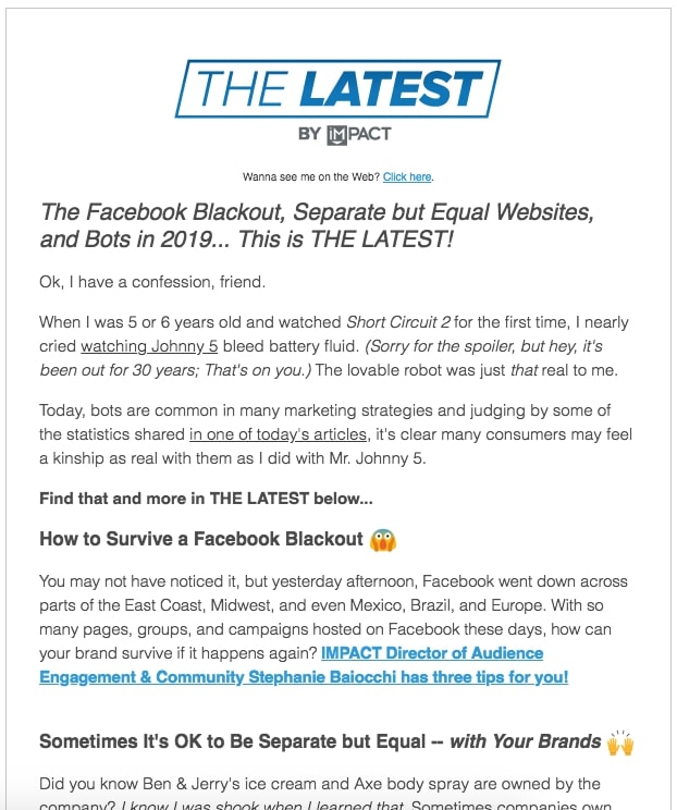
Now, users can be assured they are receiving emails that deliver the information they actually need with a unique personal touch.
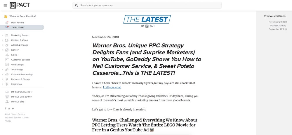
These emails can also be found as web pages on the website (similar to Ann Handley’s Newsletter ’ Total Annarchy’) so those who have missed previous emails don’t need to sift through their inbox to catch up.
Improved Way to Subscribe
In addition to the launch of The Latest, we pivoted user subscriptions from the automated daily digest emails to receiving The Latest emails instead.
With this, however, came discussion about how to change the subscription process.
Previously, we had a lead magnet you would receive after subscribing to IMPACT’s article digest.
While this worked, we wanted to pivot from making users feel like they had to subscribe to get a piece of content they wanted.
With that, we ditched the lead magnet strategy and went with a new multi-step popup subscription approach.
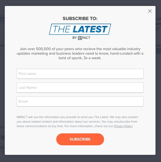
This solved two issues.
First, we now know users are subscribing so they can receive content they believe will be valuable to them, not so they can receive an eBook and soon unsubscribe.
Second, the multi-step portion also gives new users the option up-front to let us know what they are interested in so we can better curate content for them.
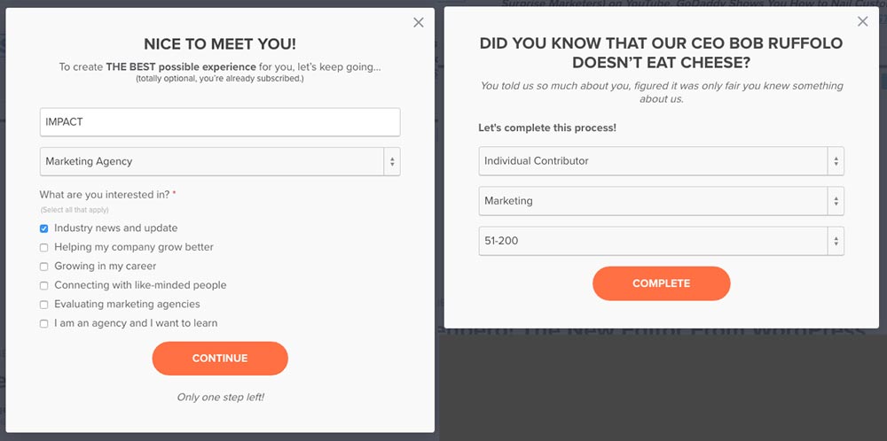
All steps are optional, so users can simply click outside or close the popup if they don’t want to complete the process.
This also ties into why we made this a pop-up and not separate pages. Users who don’t complete the process can go right back to where they left off, rather than pressing the back button 10 times to resume there session.
Our hope is to create a more delightful user experience with this conversion path and help provide unmatched value with our content.
Continued Investment (& Improvement)
With these updates in place, our work has just begun.
We’re monitoring the new homepage, The Latest, and the sidebar navigation performance closely; analyzing traffic, bounce rate, and conversion rates among other things and gauging it against our historical data.
Using this, we’ll continue to fine tune our website’s performance to aid our traffic and conversion goals and also create the ideal experience for our visitors and readers like you.
Which brings me back to why we’re going through these website changes; to help people and their organizations succeed.
Our website is just one small piece of even more amazing things to come and we can’t wait to share them all with you.
In the meantime, let us know what you think! Start a conversation in IMPACT Elite and tell us what you love and what you’d improve. I’d love to hear from you!
Free: Assessment
/Assets/Icon%20Library/x%20corp.svg)
/Assets/Icon%20Library/whatsapp%20logo.svg)
/Assets/Icon%20Library/Email.svg)
/Assets/Icon%20Library/Arrows/Grey%20Arrow%20-%20Prev.svg)
/Assets/Icon%20Library/Arrows/Grey%20Arrow%20-%20Next.svg)