Topics:
Web DesignJoin 40,000+ sales and marketing pros who receive our weekly newsletter.
Get the most relevant, actionable digital sales and marketing insights you need to make smarter decisions faster... all in under five minutes.
 You know that feeling you get when you achieve the perfect milk to cereal ratio in the morning? What about the one when you see the last shirt on the rack and it just happens to be your size?
You feel satisfied and accomplished (even if you didn’t do anything) and there are not many other things that can top that.
As marketers, that’s exactly how we aim to make our website visitors feel.
We do this by researching and evaluating the latest design patterns and trends to work into our site’s UX. Unfortunately, from time to time those trends can lead us into the wrong functional direction.
I’ve been guilty on a few occasions of designing something based on visual aesthetics rather than usability. When I would start to see a site’s bounce rate increase or conversions drop, a sobering moment always followed.
Luckily I’ve learned from those mistakes and have compiled a list of the 4 most dangerous UX traps to avoid on your own site. Check out the list below to save yourself future headaches and stay in your users’ good graces.
1. Frustrating Forms
The initial feeling a person has when encountering a form on any site is skepticism.
Thoughts that race through someone's mind range from “why do they need my information?”and “am I going to be slammed with spam now?” to “what am I going to eat for dinner?” (Ok, maybe not the last one.)
Those thoughts are typically followed by the user debating if the form is REALLY worth their time, energy, and personal information.
As marketers (and designers) we should always be on the lookout for ways to optimize our forms and make the submission process simple and painless. When setting up a form be sure to:
Provide Examples of How Text Should Be Formatted
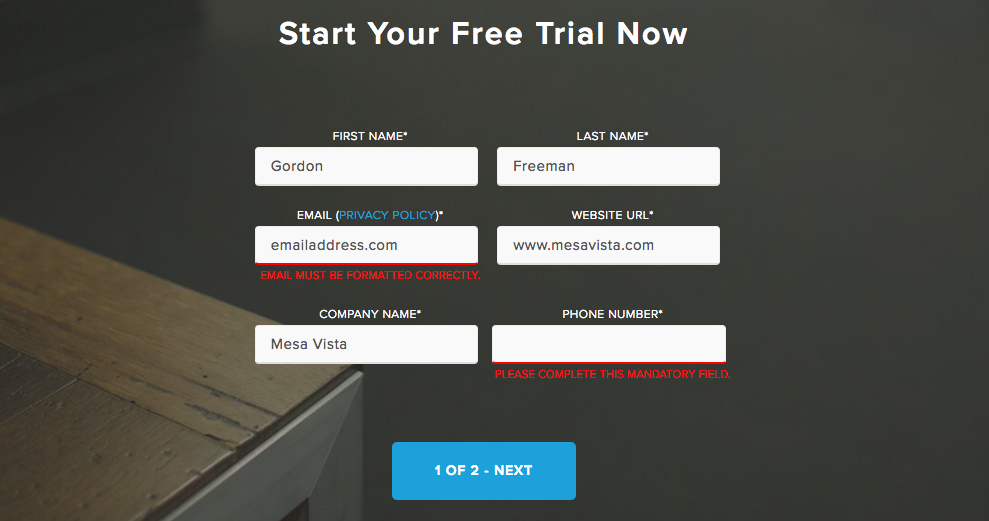
Nothing is more frustrating than receiving an error message while submitting a form because a piece of information wasn’t formatted properly. If you require a special format for something such as a date, time, or phone number show the user with an example.

You can also take this one step further by setting up your forms to auto-format this type of information.
Be Specific with Your Error Messages

Speaking of error messages: if a user does fill out a field incorrectly, make sure yours are direct and specific. Nobody wants to spend time guessing where the issue is. Making it easy to find and solve the first time around will lead to higher engagement and happy users.
Ask for the Right Amount of Information
Deciding how much information to gather can be tricky. The more information you gather, the better you can tailor any future content or interaction, but if you ask too much, you may start to feel like a celebrity stalker.
I think Ted Ammon of HubSpot put it best in his “4 Secrets to Contact Forms that Convert” blog post.
He suggests treating forms like dates. He quips “Did you pry for every ounce of information the first time you took a girl (or guy—we’re feminists, too) to dinner? Did you ask her age? If you did, you probably never had a second date.”
Aside from being solid dating advice, it sums up how to approach forms. Start with just the basics, then ask for a little more on the next date, and over time you’ll have enough information to give your date a great marketing experience.
The amount of information you ask should also make sense for the offer at hand. For example, if someone’s subscribing to your blog, you shouldn’t be asking for their phone number or address. Why would you need that for a blog subscription?
2. Oversized Fixed Headers

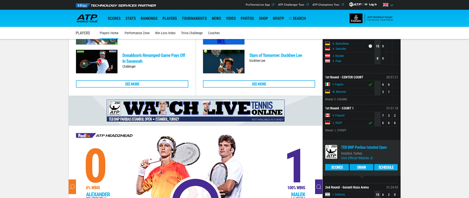
A large, fixed header is a design trend that is becoming more prevalent across The Web. These headers come from good intentions (making it easy for people to jump to a page from anywhere on a site), but when not executed properly, they can end up doing more harm than good.
Imagine yourself sitting in a movie theatre with Shaq sitting directly in front of you. You lean left, he moves left, you lean right, he moves right. Frustrating right? This is the similar feeling users get when a fixed header is too large. -- But don’t go giving all fixed headers a bad rep just yet.
Just like any other element on a website, they need to be done with reason and in moderation, but Smashing Magazine also actually found that fixed headers help people find what they were looking for 22% faster.
If you’ve made the decision to implement a fixed header on your site keep the following in mind:
- The size of the header.
A good rule of thumb is to try and keep your header under 100px tall, anything larger than that can start to hide valuable information. - Your Mobile Approach.
A fixed header on a desktop will require a different treatment on mobile. You can’t afford to waste 100px of real estate on a smartphone! Consider removing the fixed functionality on mobile and switching over to minimal hamburger-style menu. - Experiment with different background opacities.
Lowering the opacity on your fixed header is a good tactic to make sure your header doesn’t take up too much focus on a page. Remember, a fixed header should always be a secondary element to a pages content.
3. Conversion Crushing Carousels
Chances are you have all come across a carousel slider (also known as an image slider or rotating offers) at some point during your internet travels. A few years ago, these were all the rage but now, just like that pair of acid-washed jeans you still own, it’s time to retire this fad.
If you’ve currently got a site with a slider, I’m going to be blunt - Kill off that conversion crushing carousel! (how’s that for an alliteration?)
In case you’re still on the fence about your carousel, take the following into consideration:
Banner Blindness:
Carousels are notorious for creating “banner blindness”. This means over time people have learned to tune out and ignore carousels when visiting a page. In fact, a study done by Erik Runyon found that of the 3 million visitors that came to the Notre Dame website, only 1.07% actually interacted with their carousel. This is a huge waste of real estate and conversion opportunities.
Taking Control Away From the User:
Carousels also break many of today’s basic UX rules. They often scroll too quickly, have buttons that are too small or non-existent, and worst of all, they take away control from the user.
According to the Principles of UI Design, people naturally feel most comfortable when they are in control. Elements like these take that comfort away and leave a bad impression.
Diluted Messages:
Many companies take the route of using a carousel slider when different departments can’t agree on one unified message. The result is a barrage of different messages which end up leaving the user confused.
People need to time to read, digest, and form an opinion on something before they take action. It’s common for carousels to rotate too quickly and end up cutting this process short.
4. Poor Mobile Optimization
Stats from IDC, a research firm, say that more users will access the internet using mobile devices than desktop computers this year.
This means that simply having a “responsive website” isn’t enough anymore. Responsive design can make a website look good on mobile, but may not address the specific needs of a mobile user. When it comes to optimizing your site for mobile conversions, keep the following in mind:
- Have a “mobile first” mindset. In other words, prioritize mobile context when creating user experiences.
- Make it easy for users to get in and get out. Smartphone users are typically on-the-go so they need to be able to take action quickly and easily on your site. Give them a clear call-to-action right on your homepage hero section.
- Design for touch. Optimize your form fields and buttons to be used by fingers of different shapes and sizes. This may mean increasing a button's height or the spacing between form fields.
Key Takeaways
This may seem like a lot of work up front, but I promise you taking these action items and applying them to your own sites will save you and your users a load of frustration. Just remember the following:
- Keep your forms simple with clear and direct instructions
- Keep fixed headers minimal and unobtrusive
- Retire those old conversion killing carousels
- Lastly don’t just make your site mobile responsive, mobile OPTIMIZE it
Free: Assessment

