/Assets/base/Navigation%20Icons/TAYA.svg)
/Assets/base/Navigation%20Icons/Sales.svg)
/Assets/base/Navigation%20Icons/Web%20design.svg)
/Assets/base/Navigation%20Icons/HubSpot.svg)
/Assets/Icon%20Library/AI%20Mastery.svg)
/Assets/Icon%20Library/Learning%20Center%20Laptop.svg)

Apr 1, 2019

When I watched the remake of The Jungle Book for the first time in theater, I was blown away.
It took a movie I already loved and made me fall in love with the Disney brand all over again.
Disney seems to have found a winning formula in remaking classic animated films into live-action formats (because the success of its Pixar movies, Marvel franchise, and recent Lucasfilms purchase weren’t enough).
Re-creating these classics using the voices of today's biggest stars and modern day technology has given new life to these movies.
It marks an evolution in the right direction for the company’s brand that can be supported by new generations and older fans who grew up with it. That excitement and increased brand loyalty spurred from these films is similar to that when a company you love successfully rebrands.
When done right, a rebrand can inspire new prospects and increase sales. It’s praised.
However, when a rebrand misses the mark it can do more harm than good, having people talk about your company for the wrong reasons.
Over the past few years, I’ve seen a lot of rebrands that have fallen into both categories.
These rebrands have come in many different shapes and sizes.
Sometimes it’s in the form of a small refresh where a company tweaked their current logo or changed fonts. Other times it was a major overhaul where a company created an entirely new personality or established themselves in a different market.
Here are seven of my favorite rebrand stories (both big and small) and the biggest takeaways I learned from them.
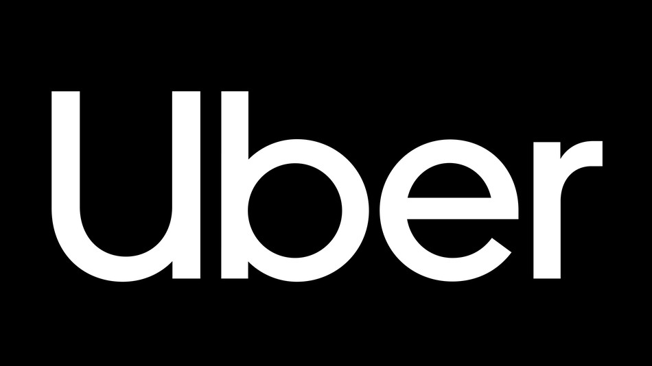
1. Uber
In 2017, Uber found themselves in the midst of many scandals including claims of sexual harassment, a “macho” office culture, and multiple senior executives resigning from the company.
But they’ve since focused on taking the proper steps to rebuild their reputation.
They hired new CEO Dara Khosrowshahi, put a major focus on passenger safety, and more recently, went through a major rebrand to show the world this is a new and improved Uber.
Ready for a fresh start, Uber teamed up with global brand consultancy Wolff Olins to create a logo and brand that aligned with the company’s new direction and core values.
They wanted to show people they weren’t just a tech startup anymore, but a global mobility platform.
The rebrand began by spending over a 1000 hours interviewing people all over the globe to see how their brand was perceived in different markets.
These interviews helped shine a light on where the disconnect was between users and the brand.
They used this information to build a brand that would be able to scale globally and communicate Uber’s new core value of safety for passengers. The rebrand included a new simplified logo, an updated color palette, new custom typeface, and an improved in-app experience.
My Takeaway:
I love this rebrand because it shows us the importance of having a brand that connects with your users and embodies who you are as a company.
Take a page out of Uber’s playbook by collecting user feedback on how your company is perceived and then use that information to build a visual brand and a brand messaging strategy.
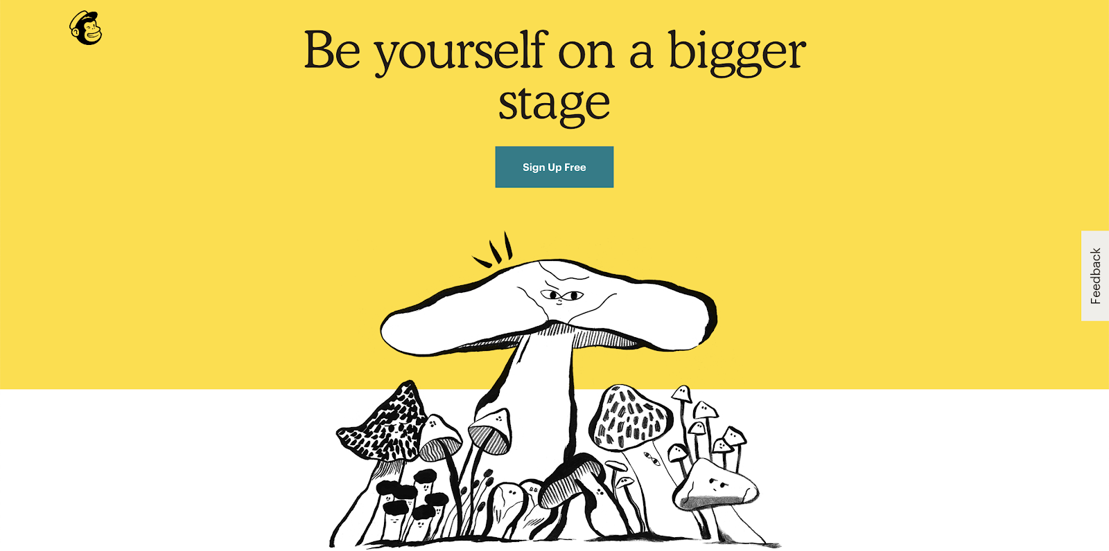
2. Mail Chimp
Ever since Mailchimp was founded in 2001, it's been a pioneer of the quirky, friendly, and humorous design style we see in so many tech startups nowadays.
I’ve always loved their brand and connected with their laid back and user-friendly vibe that was a perfect reflection of the product itself.
I remember listening to the “Serial” podcast and hearing the now infamous Mailchimp commercials where they poked fun at their own name.
Their humor and quirkiness was something that separated them from other tech giants. You’d never see a company like Apple or Google mock its own name like that.
When I heard Mailchimp went through a full rebrand, I feared they had gone in the “Apple-esque” direction that many other startups have tended to as they grow and mature.
Fortunately, I quickly went to their site and found the complete opposite. They were doubling down on their quirk.
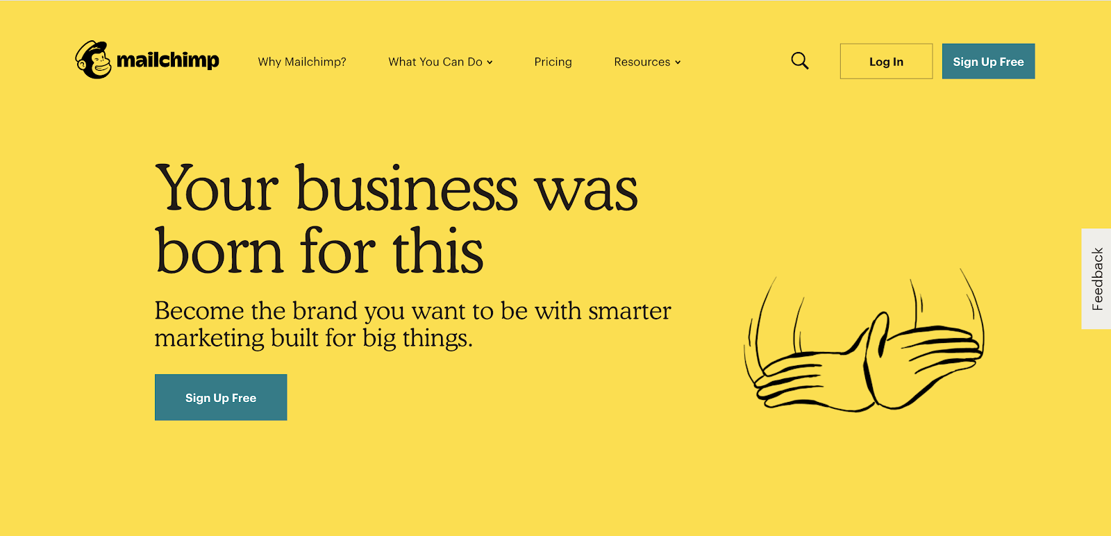
Freddie, the Mailchimp mascot, received a slight update, but more noticeable was the newly implemented serif typeface from the 1920s and a whole new series of illustrations that appeared almost childlike.
Initially I thought these were just weird for the sake of being weird, but I soon noticed that every illustration symbolized a piece of Mailchimp’s business; they just chose to portray it in their own quirky way.
They wanted their brand to send a message to growing companies that “success doesn’t mean erasing your peculiarities and idiosyncrasies. It’s about amplifying them. That’s how you stand out and connect with everyone.”
My Takeaway:
The Mailchimp redesign took me a little while to warm up to. The illustrations and typography were like something I had never seen before, but that’s what I think makes this brand so special.
Mailchimp teaches us to not be scared to be different from the other companies in our industry and their new imagery reflects that.
We should never make marketing decisions solely based on what other companies are doing, we should instead stay true to your own brand and focus on what our prospects and customers need. MailChimp leaned into that idea with its rebrand.
3. Zendesk
If you’re familiar with Zendesk, one of the first things that comes to mind is the Buddha character known as “The Mentor” that used to be the face of the customer service software’s brand.
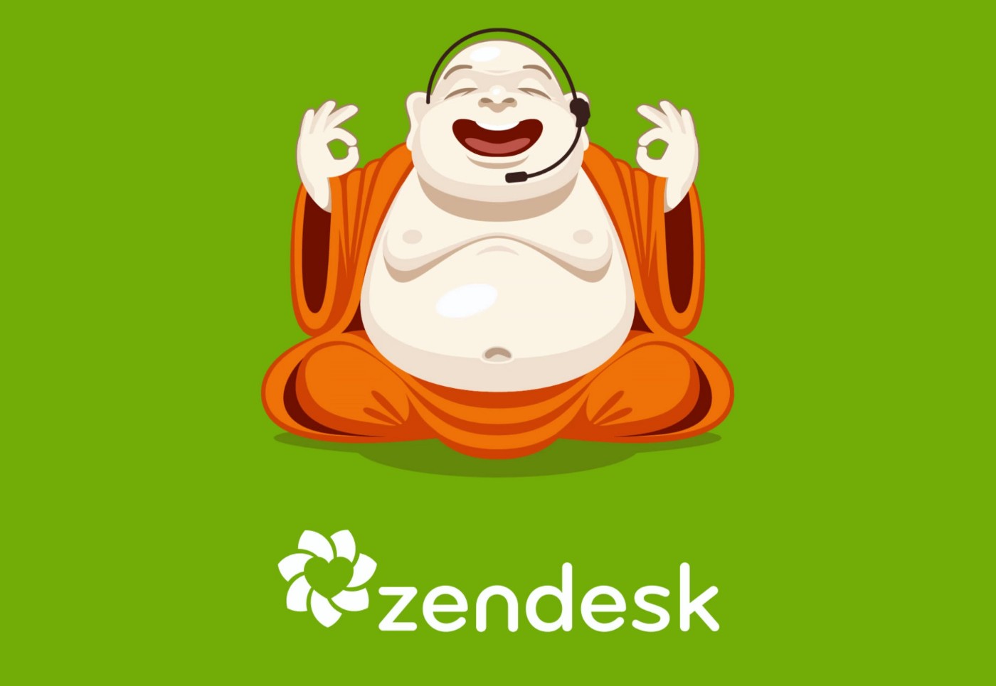
In the earlier years, the Buddha worked perfectly for what the company was trying to communicate. Toke Nygaard, chief creative officer at ZenDesk, says “he represented a breath of fresh air in an otherwise stale, corporate, and sad on-premise customer service industry.”
However, as time went on and Zendesk began to compete with bigger companies, such as Oracle and Salesforce, it became more clear that it was time for a rebrand.
They realized their brand wasn’t scalable. Their “zen” theme led to them getting confused with spa and wellness brands and concerns of cultural appropriation were raised.
So, in 2015, Zendesk finally made the tough decision to rebrand and move away from the beloved Buddha.
The final product included an entirely new brand that included new messaging, a fresh logo, a new color palette, and most importantly allowed for the addition of new product sub-brands.
The redesign marks a new chapter for the company and its future growth.
My Takeaway:
While I love the cheekiness and fun appearance of The Mentor, I’m more of a fan of the new direction Zendesk is going in.
They’re a company that recognizes the importance of stepping back and evaluating evolution of your brand and company goals.
As your company grows and changes, it’s vital that you take the time to stop, reassess your companies goals, and make sure your brand aligns with those goals.
While reflecting on the Zendesk rebrand Toke Nygaard says “A redesign is not cosmetic: it’s a culture revolution from within. It resets and rebuilds. It’s a rallying cry. It galvanizes.”
4. Dropbox
When Dropbox rebranded in 2017, it was a hot topic for debate amongst designers.
Dropbox has one of the most talented design teams in the world and their previous branding was a constant source of inspiration for many designers, myself included.
Their previous visual brand was the definition of “doing more with less.”
Their site utilized a ton of whitespace, but it never felt empty. They made use of clean monochromatic illustrations and short, punchy blocks of text that made the site easy to navigate and digest information.
Over the years, Dropbox would make subtle changes to their products and find new ways to simplify their brand, however, when their new rebrand was announced, it was a huge step away from what the one we all loved. 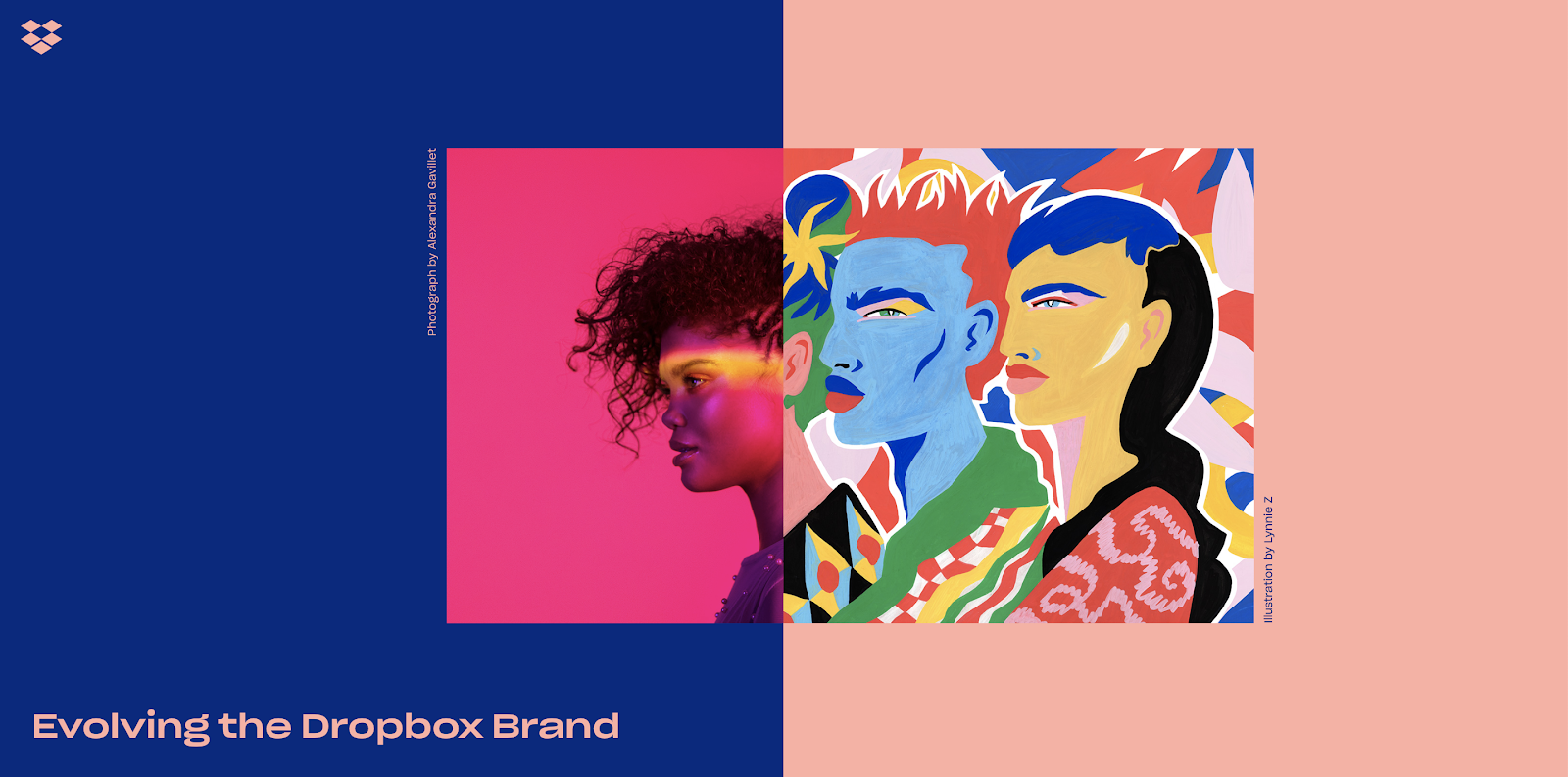
The new brand included a number of new color combinations, different fonts, and complex juxtaposed images and it was clear the company was heading in a new direction.
Dropbox released the following comment on the rebrand:
“As our mission has evolved from keeping files in sync to helping keep teams in sync, we realized our brand needs to change, too. Our new brand system shows that Dropbox isn’t just a place to store your files—it’s a living workspace that brings teams and ideas together.”
One of the most interesting insights to come out of the rebrand was the story of their newly redesigned pricing page shared by former Dropbox designer Arlen McCluskey.
McCluskey says they noticed a dip in their key metrics on their pricing pages following the launch.
The Dropbox team immediately reverted the page back to its previous state and got to work on studying the numbers to find a cause for the dip.
Once they came up with a few hypotheses, they redesigned and relaunched the page using a combination of the previous and new branding. The new page outperformed both the pre-branded and rebranded pricing pages.
My Takeaway
I’m not in love with the new direction of Dropbox’s brand. I don’t think colors showcase them as the well-organized and easy-to-use software they are.
However, I respect their decision to take a chance and try something out of the norm.
Making major changes to your brand can be scary, especially if it’s a brand your customers love. You’re never sure how people are going to react, but sometimes those changes are necessary in order to grow.
I also think they went about their rebrand in the right way by making changes and testing them. They showed how crucial it is to measure and track your website statistics so you can iterate when needed.
5. Dunkin Donuts
I’ve been on a casual first name basis with Dunkin’ Donuts for a while now so it didn’t come as a surprise when the chain decided to drop the “Donuts” from their name and go with just Dunkin’.
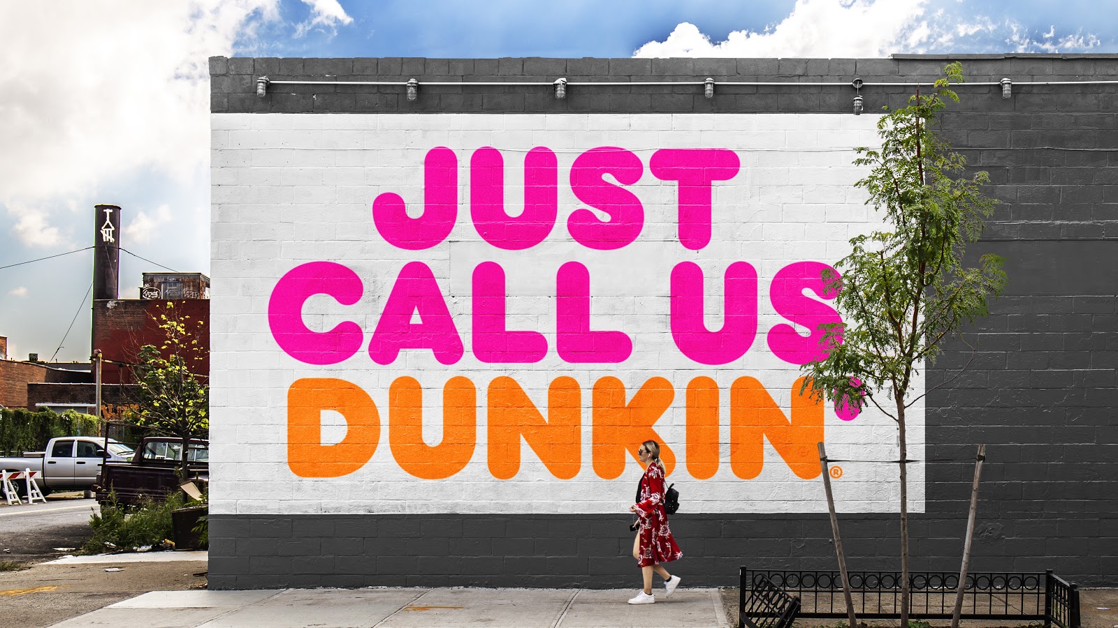
The name change not only aligns the company with their timeless slogan of “America Runs on Dunkin’,” it also comes as a part of a bigger rebrand to bigger to position themselves of being the go-to “beverage-led, on-the-go brand,” rather than a donut destination.
However, Dunkin’ understood that building towards this vision would require more than just a simple name change.
They needed to create an entire experience around the idea.
That’s why they’ve also invested $100 million in a newly redesigned store concept and new equipment to aid the on-the-go beverage strategy as well.
My Takeaway
Dunkin’ shows that rebrand isn’t something to be taken lightly.
A rebrand is about more than just choosing a new name or changing the colors you use; If you’re rebranding, you need to make sure you’re doing it with purpose, and the final product is something that builds towards your future goals and vision.
6. Slack
You probably haven’t heard, but Slack recently released a new logo.
Yes, that was a bit of sarcasm.
Slack’s new logo has been a hot topic of debate amongst its users over the last couple months.
In case you’re out of the loop, in January, Slack unveiled a new logo that moved away from the fun and vibrant “octothorpe” we’ve all grown to love to a more professional toned down logo.
This new logo was a major piece in a bigger rebrand effort for the collaboration platform. They set out to create a brand that was built for longevity, established brand consistency all while maintaining its original brand identity.
While they had good intentions, many people were less than thrilled.
Slack posted a press release explaining the reasoning behind the rebrand, stating that while they loved their original logo and brand, it was time to evolve.
One of the main issues with the old logo was the complicated visual guidelines.
The hashtag was distinctive but its intricate color palette made it easy to get wrong. Placed anywhere other than a white background led to it looking terrible.
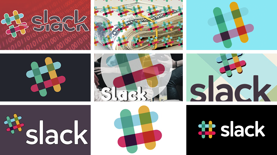
According to Slack, the new logo “uses a simpler color palette and, we believe, is more refined, but still contains the spirit of the original. It’s an evolution, and one that can scale easily, and work better, in many more places.”
Despite its logical motivations, Slack’s new logo was met with a lot of disapproval and even social controversy.
My Takeaway
Deciding whether not I like Slack’s new logos a tough question. I do miss the hashtag and bright playful color palette. I always thought the use of it was a powerful way to connect the brand with the product, however, I also understand the reasoning behind the change.
They had a set of requirements that their old logo wasn’t fulfilling so they needed to make a change in order to help grow their brand.
Love it or hate it, there's some valuable lessons to be learned from the Slack redesign.
-
Always have a reason for a redesign. Slack had very clear reasons for why the redesign was needed.
-
Always keep your audience in mind. While rebranding is project focused around you as a company, try to consider how certain colors and imagery will be perceived by the people using your product.
7. Toys ‘R’ Us
In June of 2018 we had to say goodbye to one of favorite childhood places -- Toys ‘R’ Us.
The company filed for bankruptcy in late 2017 due to fierce competition from online retailers and left thousands of former employees facing uncertain futures after hundreds of stores closed.
However, in a last ditch effort to save the company, Toys ‘R’ Us decided to cancel its auction and wanted to bring the company back with a major rebrand that included a whole new look and direction.
Image Credit: Lippincott
They announced the rebrand by having Geoffrey the Giraffe make a surprise appearance the company's Twitter account.
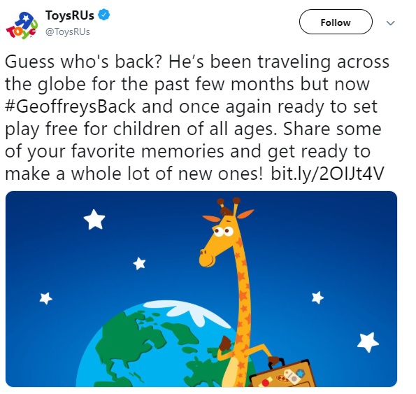
Paired with an image of Geoffrey holding a suitcase, the company tweeted that Geoffrey was simply on a vacation but was back and ready to play.
The messaging comparing going bankrupt to a vacation left former employees outraged. One former employee said “They’re saying Geoffrey went on vacation. We certainly did not go on vacation.”
Others felt like Geoffrey’s reemergence was a PR stunt meant to just boost the brand name in case Toys ‘R’ Us wanted to reopen their stores as the holiday season got underway.
Unfortunately, it became clear that the business’ outlook wasn’t going to give them enough time and rebrand was scrapped.
My Takeaway
While Toys ‘R’ Us may not have officially rebranded, I think there’s still an important lesson to be learned from this story.
When it’s time to unveil a rebrand, consider how you’re going to announce it to your audience. You need to clearly voice your reasons for the rebrand and think about how your audience will perceive the announcement.
For Toys ‘R’ Us, their tweet announcing the rebrand was a case of “too soon.”
Taking a humorous approach to announce their rebrand during a time that was difficult for the many employees who were laid off led to a huge backlash that really took the excitement out of the company’s announcement.
Perhaps if they had waited some time or taken a more sensitive approach, this could have been avoided.
Think Before You Rebrand
Rebranding isn’t a simple task, and can’t be done on a whim.
Making the decision to do it requires you to deep dive into your company and really assess what your goals are and what’s not working currently.
These companies may not have all hit the mark on their rebrands but they all have one thing in common - They saw something stopping them from growing, so they decided to make a change.
Take some of the lessons from these companies stories and apply them to your next rebrand.
Free: Assessment
/Assets/Icon%20Library/x%20corp.svg)
/Assets/Icon%20Library/whatsapp%20logo.svg)
/Assets/Icon%20Library/Email.svg)
/Assets/Icon%20Library/Arrows/Grey%20Arrow%20-%20Prev.svg)
/Assets/Icon%20Library/Arrows/Grey%20Arrow%20-%20Next.svg)