Subscribe now and get the latest podcast releases delivered straight to your inbox.
What a Website Should and Should Not Include

Feb 19, 2016

Running into a brick wall when it comes to designing/laying out your website? You are not alone; it happens to the best of us.
With all the inspiration that's around us on the web, it can be hard to figure out what parts are most vital for your website.
Without knowing what should be on your site, you can easily end up with a useless one that doesn't represent what your company is about or achieve your goals.
If you don’t have a properly designed website, many of your users will end up as customers at a competitor. However, when you design with the right assets, you can create an amazing tool to help strategically market your product(s).
From layout spacing and imagery to clear calls-to-action and about us pages, below are a few components you should and should not be including on your website.
What You Should Include on Your Website
White Space
White space, in web design terms, is “the space between graphics, columns, images, text, margins and other elements.” It’s one of the most important design tools because it dictates how a page flows and reads.
Despite its name, it’s important to note that white space is not always actually white -- it's simply empty. The space on a website could easily be filled with a background color or simple texture, but if it has no elements on it, it is still white space.
Teamwork has a fantastic example of a site that effectively uses white space to its highest capabilities.

The margins between the header and blocks of content make the two easily distinguishable from one another. The images that accompany the content on either side also have appropriate spacing to indicate what areas they belong to without interfering with readability.
When used properly, users should be able to subconsciously skim through your pages and absorb the information in the correct order.
Simple Navigation
Your website’s navigation is a lot like a road map; it shows your users the directory of all your pages and where to find certain information.
If you don't have an accurate or clear road map, how can a potential customer learn about your software or services? How can they know where to find what they need?
Your navigation does not need to be complicated, it should be easy-to-use and identify. If you can, keep it lean and make sure the information within it is organized correctly so users can seamlessly maneuver in it.
Wistia has a nicely organized navigation that neatly packages their most frequented pages under specific tabs. Those same pages, as well as a few others, are kept under their main hamburger navigation so users can still see all the pages at once if need be.

About Us
The about us page is one of the top 5 must-have pages for a website. You only have a few short moments to win your users over, and an enticing about us page is one of the best ways to do it.
IMPACT’s content marketing manager, Ramona Sukhraj, said it best, “there isn't an exact formula that you have to follow -- you simply want your about us page to be interesting, informative, and personable. You want to give your prospects a reason to fall in love with your brand.”
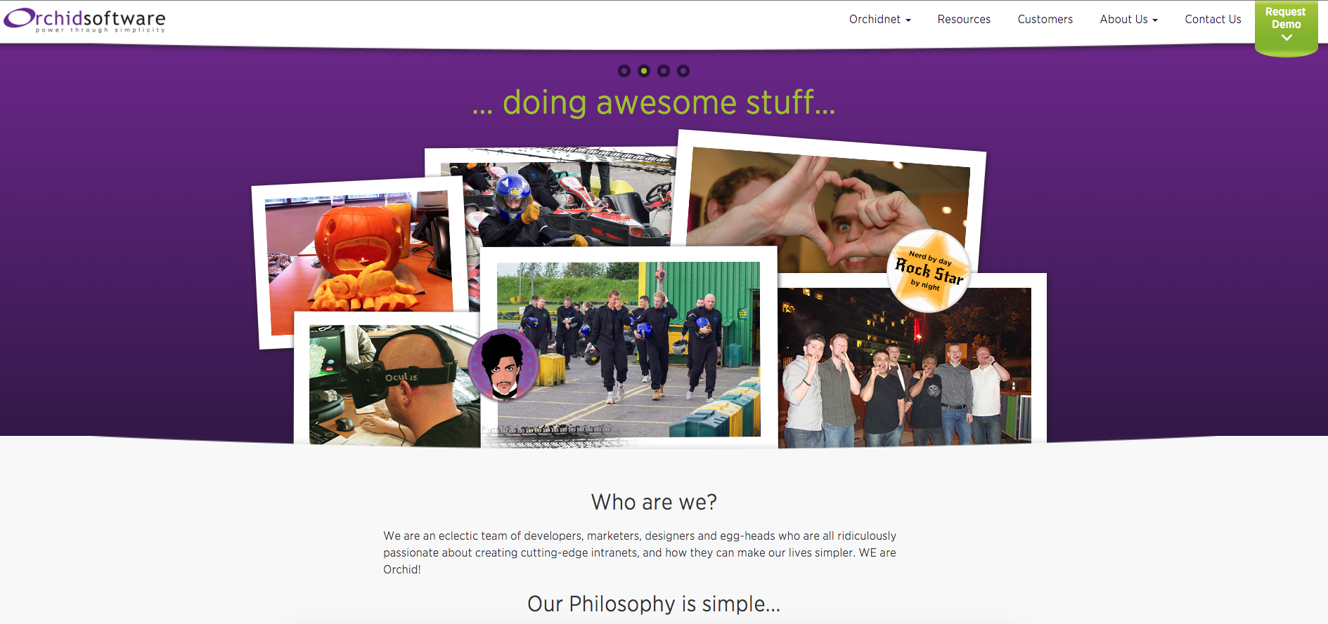
Orchid Software’s about page has a variety of friendly and inviting images that adds a nice touch of personality to what could otherwise be bland and uninteresting.
Incorporating sections discussing their philosophy and culture helps add transparency to the company. It also lets potential customers know it cares about its team.
Calls-to-Action (CTA)
Calls-to-action are meant to prompt your visitor to take an action, whether it be to download an eBook, sign-up for a webinar, attend an event, etc.
A CTA can be placed anywhere on your website (i.e. resource or at the end of a blog article). However, your need to make sure its content and placement are relevant to the content on the page, otherwise, users may not feel any desire to click it.
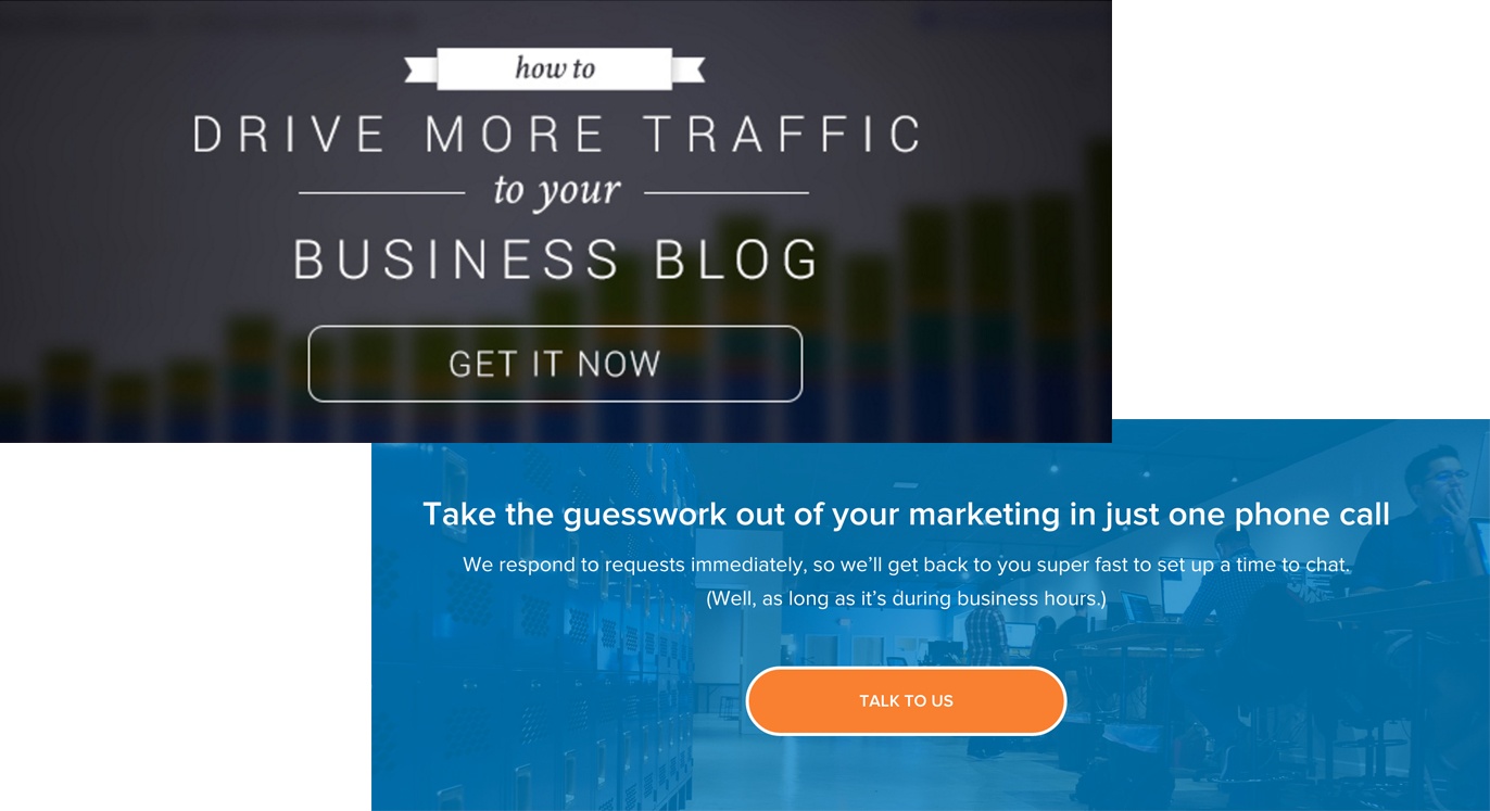
You can have complex ones containing an image and form, or simple ones, that are no more than a line of text and button.
At IMPACT, we use a variety of CTAs on our site. You may be most familiar with the ones we incorporate at the end of our blog articles or main site pages.
As long as they are used properly, your users will be the bread and butter of increasing your leads and gaining new customers.
Great, High-Quality Visuals
Visuals can be a powerful element to any website if used in the right away. Any designer understands the power they have on your brand and how they can help visualize your products, services, and benefits.
For a destination site like Homeaway, proper imagery means everything. The background video on their homepage hero section helps set the tone for vacations you may want to have.
The images of rental properties below that have a similar effect as well. They show images ideal for the variety of property types users may be looking for.
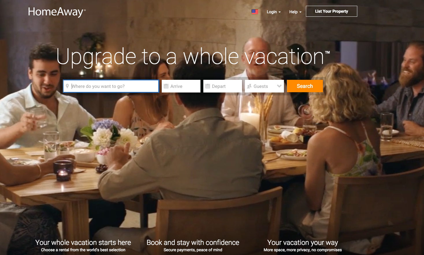
While this video does provide a lot of amazing images, you need to be careful when using one on your site. They tend to take a long time to load and usually distract the user from the content. So, make sure a background video is the most ideal solution for your site before implementing it.
Value Proposition
Your value proposition is the first element that a potential customer sees when visiting your homepage. It often determines whether or not they will continue checking your site out before hitting the back button and heading over to a competitor.
It should explain how your product solves your customer’s problems, improves their situation, deliver specific benefits, and tell the ideal customer why they should pick you over anyone else.
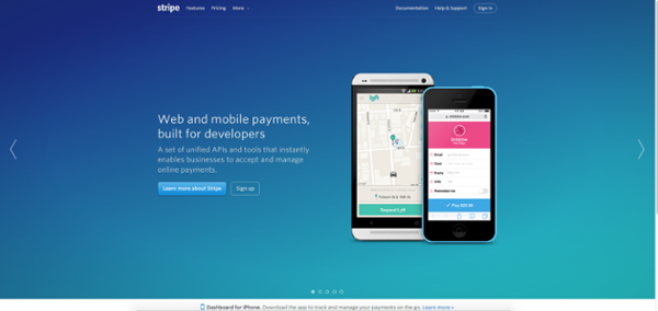
Stripe has their value proposition positioned so that users can come to their site and immediately understand what kind of company they are.
Customer Testimonials
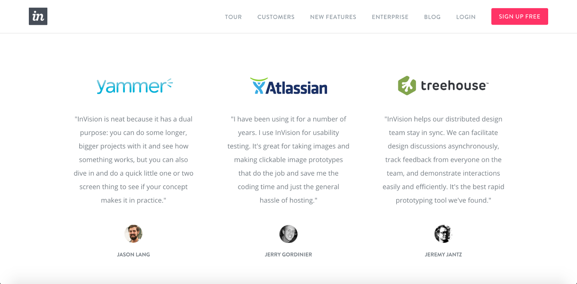
How do you prove your product or service really works? The best way to do that is to include testimonials from satisfied customers that explain how your product or service has helped them.
When designing out how your testimonial section, keep in mind that including a photo of the customer will help personalize the testimonial and add credibility to the accompanied statement.
Invision did just that on their customers page. They even go the extra step and add in the company's logo right before the quote.
This can be a smart tactic to draw attention to the testimonials as long as the company is reputable and one people can recognize.
What You Should Avoid
There are always those few elements that you should not include on your website. These can take value away from your site and may even annoy the user.
Here are a couple of those elements you should try to avoid when redesigning your site.
Flash
You may or may not remember, but at one point, many websites were designed using Adobe Flash. This was due mainly to the program's ease-of-use and ability to add a variety of animations. -- but the days of Flash are long gone.
The websites built using the software load slowly, are poorly optimized for search engines, don’t work on all mobile devices (specifically Apple), and usually aren’t responsive.
Flash also requires you to download and install the software -- and the last thing you want is to complicate the process of viewing your site.
For those who want seamless animations and transitions, try checking out other methods rather than bogging your site down using flash.
Stock Photos
Everyone’s used a stock photo in their lifetime. The key to using them is to avoid incorporating ones that look fake or ones that are constantly seen on many other sites.
If you can, don’t use stock photos at all. Try hosting a photoshoot to take exciting, original images of your actual team or office.
Real photos of your company and employees help paint a more genuine picture of your culture and environment. Your users will also have a much easier time trusting your brand when they know there are real faces behind the product they see across the site.
Free: Assessment