/Assets/base/Navigation%20Icons/TAYA.svg)
/Assets/base/Navigation%20Icons/Sales.svg)
/Assets/base/Navigation%20Icons/Web%20design.svg)
/Assets/base/Navigation%20Icons/HubSpot.svg)
/Assets/Icon%20Library/AI%20Mastery.svg)
/Assets/Icon%20Library/Learning%20Center%20Laptop.svg)

Sep 18, 2017
There’s one page that usually draws most of the attention from stakeholders during a redesign -- your homepage, but what if I told you, you should put most of your focus on another area?
Think about it, landing pages are the real heavy lifters on your website, if your landing pages aren’t attractive, optimized for experience and conversion, and user-focused, you’ll have a really hard time generating qualified leads from your website.
What does superb landing page design look like?
We all know what constitutes a landing page (hopefully), but just in case, let me do a quick review of everything you need for one that is truly superb! :)
Every great landing page has:
Value-focused Content
The cornerstone of a high-converting landing page, like most inbound marketing, is content that conveys the value you’re delivering to the user.
Ensuring your content is keyword-optimized (so users can actually find your page) and focused on why the user should actually care about the offer you’re pushing is key to a strong landing page. But that’s not enough! The copy you generate needs to be engaging and tell the user a story. Without this element, it’ll come off as flat, disingenuous, and ultimately may hurt your conversions.
It’s extremely important to ensure that the content you’re promoting gives enough value to match what type of information you’re asking for on the form...
An Appropriate Form
The form is what makes a landing page a landing page.
Creating a high-converting form is a little bit of a science, as you need to match the value of your offer to the amount of information you’re asking for. For instance, if you’re offering a simple checklist, you probably shouldn’t have 10 form fields since the return is so small.
Typically you want to keep your forms to 3-5 fields. If you’re a HubSpot user, you can utilize Smart Fields to collect more data once they’ve filled out a given field, which helps to collect better information to improve your marketing to the user.
Video/Imagery
No one likes a wall of text on a web page, which is why it’s so important to provide some sort of visual aid to engage the user. Images or video are a great way to do this.
If you have a content download landing page, it’s usually a great idea to give a preview of the offer or even show the cover.
For more important landing pages, however, such as your request a demo or consultation page, video is much more powerful than a boring static image.
On “bottom of the funnel” pages, take the time to talk to the user as a human. Tell them exactly what to expect after the fill out the form, and what awesome value they’ll get in return.
Video is definitely an underutilized resource for landing pages, so take the opportunity to 1-up your competitors!
A Kickass Testimonial
One often-forgotten element of superb landing page design is social proof.
Adding in a user testimonial provides evidence that everything you claim on the page is actually true. That makes filling out that sometimes daunting form just a little less scary (and sometimes that’s all it takes).
Other forms of social proof are valuable as well, including download numbers, awards, or even reviews.
Social Share Links
So you created this amazing offer, and a user finds it on your website and thinks his or her colleagues would enjoy it as well, what next?
Enter your social share links.
This very small and simple element can help boost the reach and effectiveness of your downloadable content by letting it be posted to social media, or even sent via text message, with the click of a button.
At the foundational level, that’s a landing page. But there’s so much more you can do to make it more engaging, trusted, and lead generating.
Let’s get to the examples!
1. Unbounce
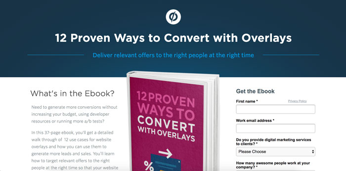
What I think they’re doing really well:
- The headline and subhead convey the value in 3 seconds
- The visual of the eBook is engaging and guides the eye to the form
- Tons of social proof!
- The utilization of 4 takeaways, summarizing the value for the user
Things I’d want to A/B test:
- How a smaller image or interior page image affects the conversion rate
- If moving the form below the 4 takeaways improves conversions so the user gets all of the information before the can convert.
2. UBER
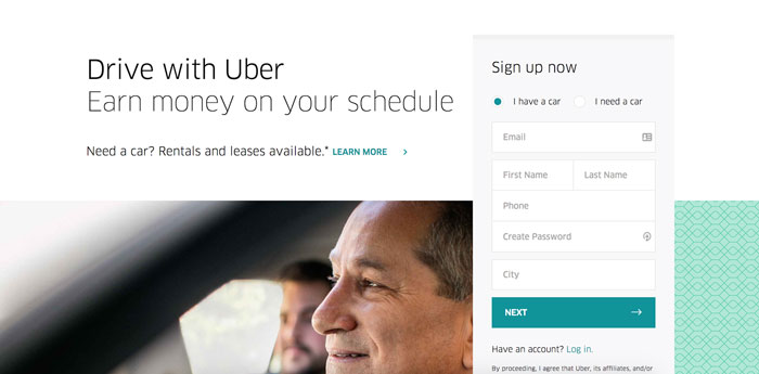
What I think they’re doing really well:
- Also telling the user exactly what they’re here for in less than 3 seconds
- Using icons to complement the 3 column content, instead of making them the focal point.
Things I’d want to A/B test:
- Bringing more content above the fold so the user doesn’t need to search for it.
- How a video testimonial from a driver affects conversion rates.
3. Moz
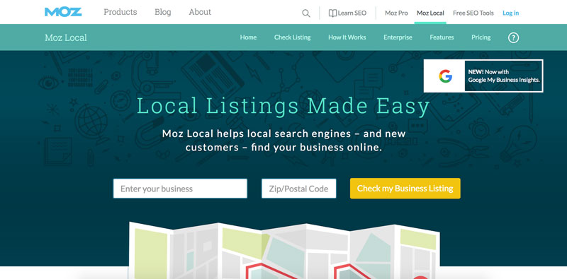
What I think they’re doing really well:
- Keeping the value clean and clear, with an extremely simple form for the user to convert on.
- The user testimonials on the page are really strong, even though they’re at the bottom.
- Moz is giving you all of the information you need on this product landing page (or linking out to it).
Things I’d want to A/B test:
- Adding a small features chart to this page, instead of linking to a separate page.
- Moving the social proof up, so it doesn’t feel like the testimonials are hidden (and trying video out instead of written testimonials).
- Updating the form so it scrolls with you as you move down the page.
4. HubSpot
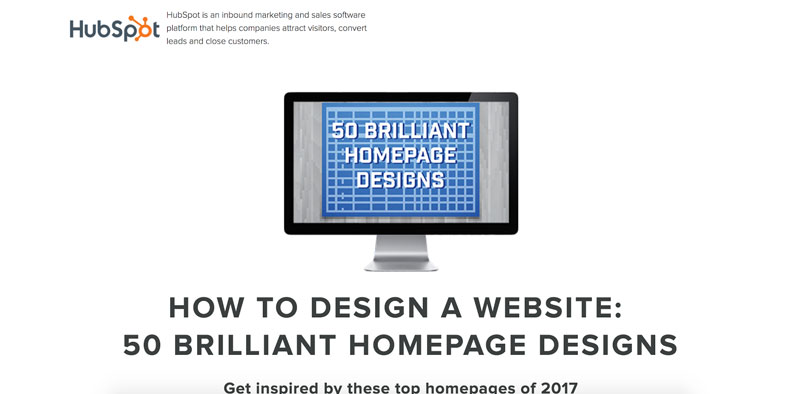
What I think they’re doing really well:
- Very clean and minimal; the content is king here.
- Providing some preview screens of what you’ll download, so you can really see the value you’ll get.
- Keeping the form short for a top-of-the-funnel offer.
Things I’d want to A/B test:
- Adding testimonials and social proof to the page.
- Moving the small FAQ section below the conversion point, so it’s higher on the page.
5. Salesforce
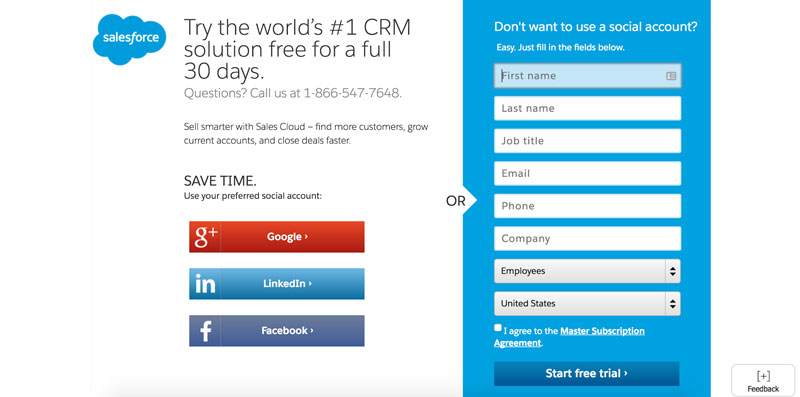
What I think they’re doing really well:
- Keeping the page extremely simple. Seriously, it’s basic...
- Giving the option to convert with a social profile! Really unique.
- Utilizing a short and sweet value proposition.
- Showing trust badges never hurts
Things I’d want to A/B test:
- Reducing the size of the form. (Do you really need all of that right now?)
- Adding social proof from previous users.
6. UserTesting
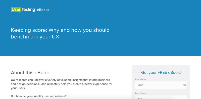
What I think they’re doing really well:
- Simple layout, the standard landing page design.
- Utilization of a visual of the offer (even though it’s a tad small)
- Calling out the 3 most important pieces of value in the offer.
- Not over-complicating the landing page design
Things I’d want to A/B test:
- Moving more content above the fold; the header is too big without enough value.
- Reducing the number of form fields to 3 and how that affects conversions.
- If you remove the blue heading section and truncate the page do more users convert?
- Making the visual more prominent
7. BankJoy
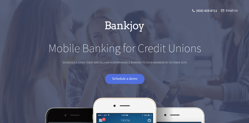
What I think they’re doing really well:
- Delivering an experience that drives the user down to the conversion point.
- Utilizing high-quality imagery to compliment the beautifully written copy.
- Giving context to the situation in their subheadline - “Deliver to your users by October 15th.”
Things I’d want to A/B test:
- How adding testimonials or an FAQ section affects the stats of the page.
- While the page is short, I’d be curious if quick links that scroll you to the form in each of the content section would help.
Key Takeaway
There’s a lot of great landing pages out there to learn from, but every audience is slightly different. It’s extremely important that you test yours to find out the best combination for your users. Keep the foundational elements of a strong landing page in mind and fine tune. You’ll start seeing results in no time!
Free: Assessment
/Assets/Icon%20Library/x%20corp.svg)
/Assets/Icon%20Library/whatsapp%20logo.svg)
/Assets/Icon%20Library/Email.svg)
/Assets/Icon%20Library/Arrows/Grey%20Arrow%20-%20Prev.svg)
/Assets/Icon%20Library/Arrows/Grey%20Arrow%20-%20Next.svg)