Join 40,000+ sales and marketing pros who receive our weekly newsletter.
Get the most relevant, actionable digital sales and marketing insights you need to make smarter decisions faster... all in under five minutes.
4 UX Hacks for Reducing Visual Friction On Your Homepage

Jun 9, 2015

All of us are constantly faced with elements of visual friction whether we choose to acknowledge them or not.
Even when sites are internally tested and revised in an effort to remove friction, some areas remain overlooked or invisible to its creators.
When it comes to designing and developing out your homepage, it’s important to first understand how your users will most likely behave on it. This will help you better understand how it’s layout, design, and interactivity should look and function.And even when you think you have your users all figured out, your design may open up entirely new areas of friction you failed to see until your users started interacting with it.
To understand how to design or clean up your homepage, here are four insightful tips to help create a more seamless and lean user experience.
Create Visual Balance
Visual elements exist in many ways such as images, colors, typography, and graphics.
When using them properly, you have the power to direct the user's cognitive interpretation of your web page and attract their attention to proper areas in a certain order.

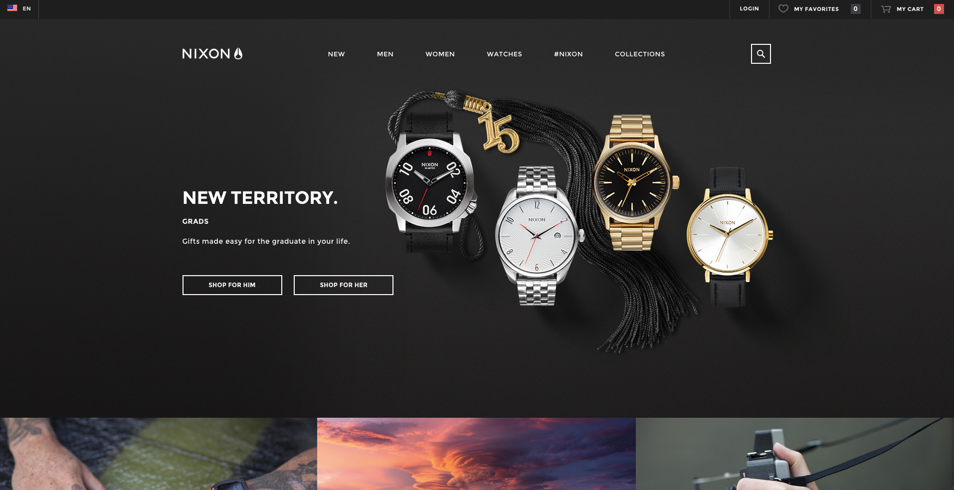
Look at the ecommerce website Nixon who chooses to avoid overwhelming the user with multiple products on their homepage. Instead, they use a hero section with button linking visitors to a more robust list of products. The section below the hero only highlights a few specific products.
In terms of design, Nixon uses large visually stimulating background images set in a gridded structure to separate sections. Even the content in the hero section is carefully placed in an open area of the background image away from the watches to avoid creating a visual disturbance.
By simplifying your layout and using similar design elements throughout your page, your website will feel unified. From here, you can leave it to small visual cues to pick out specific areas you want your users to pay attention to.
Keep Layout and Branding Consistent, but Interesting
As your homepage is being designed, it can be tempting to make your designers stray away from your branding guide to try bringing attention to certain buttons, headers, content, or images.
While you don’t want every button to be the same color and each background image to be a group of people in suits pointing at things, too many visual inconsistencies could end up confusing the user, rather than helping them.
Instead, you need to keep the rhythm of your website interesting to avoid losing the visitors’ attention and keep them on the visual flow you have created.

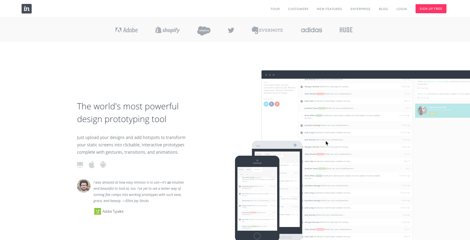
Take a look at Invision’s home page. Despite the grey and black color pallette and similar section layout throughout the page, they use large, animated images with specific accent colors to show their product in action before you even use it.
Another welcoming element is the use of people's’ images and testimonials. Rather than spending time and space telling you how awesome they think their product is, they tell you what people who are using it think. Adding their users’ photos to the quotes also provides a human element and transparency, helping your users gain more trust in the product you may be selling.
The trust these types of images and graphics build will automatically ease users initial uncertainty about a product, and will create a desire for them to learn more about it. This will drive them to further explore your homepage and the rest of your site.
Section it Out
Just like chapters in a book, your visitors will need your information put into sections so they understand what content is where and have an easy time digesting the page.
You need to look at the information you want to display and choose how to properly section it off based upon what makes sense together and in what order. After you figure out that, you can let the layout and design do the rest of the job to bring proper visual hierarchy within each section.

Hudl separates each section with a unique layout and design that fits the needs of the content. Each section has a different colored background to easily visually separate them before reading anything. The content in the sections are also chunked into smaller bits and are occasionally accompanied by icons to add a visual stimulation and differentiate each part further
Sectioning off content like this also increases the likeliness that they will want to engage with the content. As long as it’s chunked properly, users will also be able to retain the information more easily.
Keep The Page Short
We all have a lot of information we want our visitors to absorb but we can’t expect users to always read all the content we want to put on our homepage.
The battle is trying to decide what content is the most important to your users and eliminate or move what isn’t needed. Afterwards, you then simplify those sections so that visuals and content are condensed the most they can be, without losing quality.

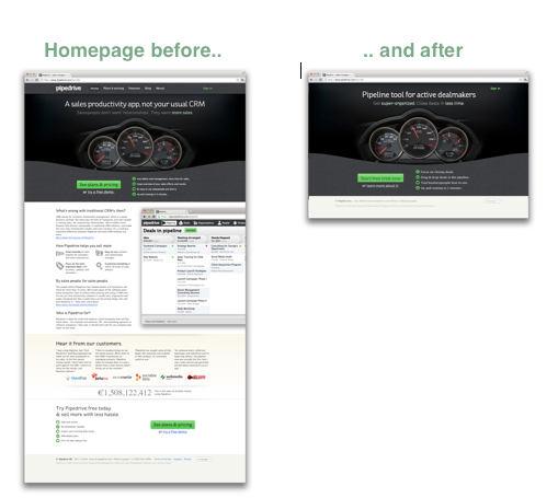
Pipedrive's old home page contained large amounts of content, multiple calls to actions, and other places of friction along the user’s journey down the page.
Through many rounds of testing, Pipedrive realized that the most suitable option would be to remove a lot of the dense content, and put a CTA for a free trial with quick bullets about the product near the top of the page. There are also testimonials below which allow users a chance to read about how others liked the product if they are unsure about trying it.
Key Takeaway
Friction comes in many different forms and it can be hard to figure out where it is occurring on your own page.
Before you go jumping in and change a bunch of items blindly, try creating different prototypes of your site and implement usability tests. This will allow you to rethink the flow of your site and allow you to gain a deeper understanding of your potential customers and how to develop the proper usability for them.
Free: Assessment