/Assets/base/Navigation%20Icons/TAYA.svg)
/Assets/base/Navigation%20Icons/Sales.svg)
/Assets/base/Navigation%20Icons/Web%20design.svg)
/Assets/base/Navigation%20Icons/HubSpot.svg)
/Assets/Icon%20Library/AI%20Mastery.svg)
/Assets/Icon%20Library/Learning%20Center%20Laptop.svg)

Apr 13, 2021
In marketing, you’ve likely heard it time and time again: It doesn’t matter how great your content is if no one reads it.
Well, similarly it doesn’t matter how great your website, app, or tool is if no one ever uses it — or worse, if someone can’t use it or experience it as you intended.
A few months back, I learned this first hand.
You see, it all started when a fellow IMPACTer shared a cool tool with the team in Slack. It was an AI web app called AI Gahaku that generates a realistic renaissance painting of you based on an image you upload.
Of course, the results were hilarious so we had a good laugh and a bunch of us flocked to see what our portrait would look like, but when I got my result, my laughter turned a bit awkward when I saw I was made more than a few skin tones lighter.
Now, to be fair (no skin pun intended), I partially laughed because — let’s be real — this was probably historically accurate. I mean, how many Indian girls were really roaming around Europe during the renaissance, right?
But regardless, I also realized in that moment that I couldn’t experience the tool the same as my teammates could. The result and value I got out of it was inherently different.
While I’m sure not consciously, the user experience of the app was not entirely inclusive and it opened my eyes to the fact this is likely something many people go through every day in different ways.
What is inclusive UX?
Inclusive UX or inclusive user experience is exactly what it sounds like — user experiences that cater to all the different ways people may engage with a website, app, or digital platform.
But we’re not talking about simply showing a “diverse” image here. Inclusive UX focuses on functionality, ensuring the largest audience possible can effectively use and find value in their digital experiences with a brand.
This means experiences are designed to offer the most effective user or customer journeys regardless of your race, religion, location, mental or physical capabilities, age, and gender, among other things.
It’s both an accessibility and diversity, equity, and inclusivity (DEI) effort as well as one in personalization, and for marketers, it can mean the difference between winning over a customer or losing them for good.
🔎 Related: Inclusive design: 11 ways to make your website more accessible in 2021
In 2018, research from Epsilon found 80% of consumers are more likely to make a purchase when brands offer personalized experiences.
Often, we look at data like this and decide to simply personalize based on past behaviors we have tracked or information we’ve collected like name and birthday, but with brands with the highest diversity scores seeing an 83% higher consumer preference, expanding our approaches to incorporate more than this in 2021 is a powerful strategic play.
Now is the time to rethink how people from unique backgrounds may use or interact with your digital experiences differently.
What would make a website or process more enjoyable for someone with a visual impairment? What additional information might someone who’s non-binary want to see on a form?
Put yourself in the shoes of potential prospects outside of your assumptions and brainstorm how to integrate them into your UX. Not sure what this can look like? Here are 11 examples from brands that are currently setting the bar for inclusive UX.
1. Twitter: Languages
For almost a year now, Twitter has allowed users to identify the languages they speak, then also choose languages that they’d like to see tweets in.

Now, this doesn’t translate the messages, but rather allows you to view tweets, trends, and find users who’s content was originally published in those languages.
 |
 |
This not only improves the UX of the network by not only recognizing that English is not everyone’s first language and allowing users to personalize the content the want to see, but also expanding the potential audience of tweets and trends to individuals outside of areas where those languages are commonly spoken.
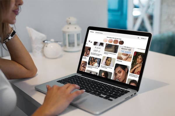
2. Pinterest: Skin tone selector
Now, we have a great example of racially inclusive UX (and full disclosure, what made me want to write this article).
For anyone not familiar with it, Pinterest is a social network designed as “virtual pinboard,” where many turn for creative inspiration including recipes, outfits, interior decorating, home hacks, and, in this example, makeup looks.
Recognizing this common use of its platform, Pinterest added a “skin tone range” selector at the top of related queries to help users filter looks that best suited their needs:

While most of the results are still predominantly for lighter skin tones, this feature dramatically helps improve the browsing experience for individuals outside of these groups by cutting down on search time.
Never again do they have to sit and mindlessly scroll through endless looks that don’t work for them; they can just hit their range and immediately see what’s available.
It’s a small, but brilliant change not only for diversity and inclusion, but overall usability.
3. Microsoft 365: Inclusive Language Checker
In this unique example, Microsoft 365 makes its UX more inclusive by enabling users themselves to be more inclusive.
In an update to its tool last summer, Microsoft introduced a feature that allows users to identify gender bias, age bias, and more in their documents, just as they would grammatical or spelling errors.
While turned off by default, How-To Geek details how users can enable the feature here.
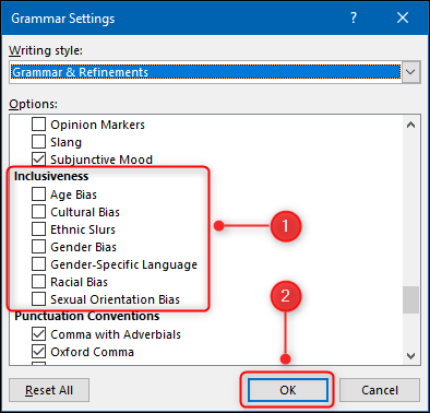
Image Source: How-to Geek
4. Duolingo: Inclusive exercises
Duolingo is all about bringing people together through language, and their inclusivity doesn't stop there.
Go through any of the app's learning exercises and you will be met with a variety of diverse characters — some men, some women, some Asian, some Black, some young, some old, some some with purple hair, some short, even some that aren't human.
 |
 |
 |
 |
You'll also find great inclusivity in the conversations used to teach in the app. Check out this example from the German course:
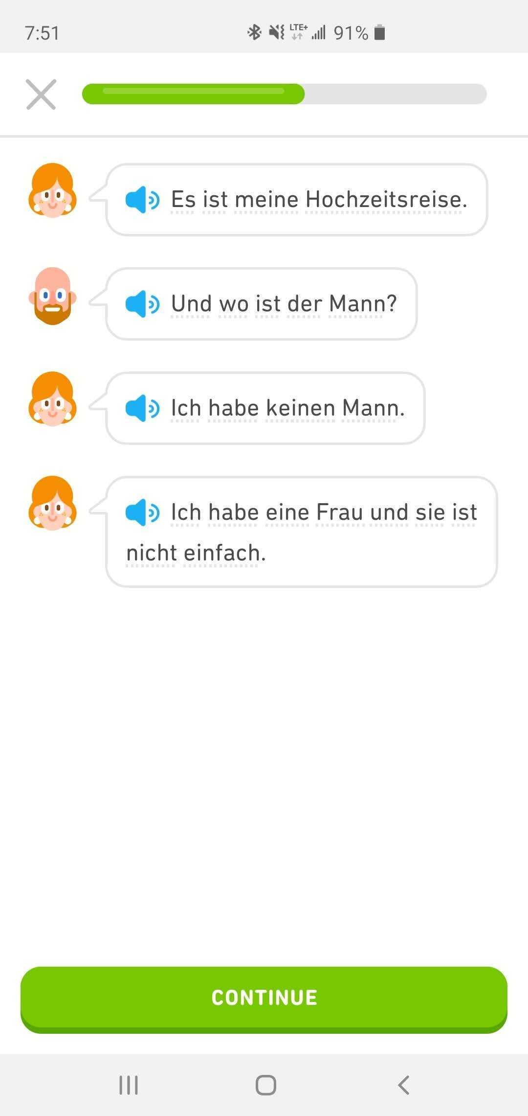
Loosely translated, the first speaker (presumably a woman) says that she is on her honeymoon. Speaker two (presumably a man) responds "where is your husband?" to which speaker one says "I don't have a husband, I have a wife."
Duolingo's use of diverse imagery and experiences in its learning exercises not only align with its greater goal of united people from all walks of life, but also does a brilliant job of making users of all backgrounds see a part of themselves reflected as they learn.
5. Twitter: Accessibility panel
I’m not usually one to include a brand twice on an example list, but Twitter deserves all the love.
In addition to its language options, the social network also has an entire panel dedicated to accessibility in user account settings. There are even different options for both mobile and desktop as the way we interact with these devices are very different.
In the mobile version of the panel, you’ll see the user can turn on different gestures to make the app easier for them to use and even enable voiceovers to read tweets. We especially love the little branded option of pronouncing the # as “hashtag” rather than “pound sign.”

You also can reduce the motion of in-app graphics and transitions, and increase color contrast. Then, on desktop, you find similar options minus the voice over options.

All of these options make it easier for individuals with disabilities to more easily use the app and also consume content if they have visual or auditory impairments.
6. White House: Pronouns form field
In another small, but meaningful move, upon the start of the Biden administration in January, the White House relaunched its website including the addition of a form field to its “Contact Us” page requesting a visitor’s preferred pronouns.

This change was a significant act of acceptance and respect to the LGBTQ+ community, and let them know that who ever followed up with them would be equipped to communicate with them more effectively.
7. Noom: Wakeup time and meal reminders
DEI isn’t just about race, gender, age, or religion. It also encompasses different occupations and how they can affect lifestyles.
For example, take first responders.
Especially during the COVID-19 pandemic, many first responders including police officers and EMTs are working unconventional hours. Recognizing that not everyone may run on the same schedule, health app Noom allows users to adjust their wake up time then subsequently adjusts the time meal reminders are sent out.

For someone who doesn’t follow a conventional nine-to-five schedule, the app may have been significantly less effective or useful without this option.
8. Metronome: Color settings
Next up we have Metronome. In this example, the company alignment software allows users to indicate they have a “color vision deficiency” in their account settings:

If checked off, any time the colored indicators (seen to the right of the label) appeared in the app, a letter would be shown within them to differentiate it from the others for individuals who couldn’t see the color variations.
|
|
 Metronome platform with accessibility option enabled |

This letter makes it possible with impaired color vision to still make use of the priority trackers in the app, however, as huge fans of Metronome at IMPACT, I’ve gotta say, we’d love to see this feature extended to the colors in the pie charts as well. ;)
9. Google: Black-owned businesses tag
Similar move to Microsoft, in this example, Google in turn enables its users to be more inclusive.
In February of this year, Black History Month in the United States, Google announced that merchants in the country can now identify themselves as a "Black-owned business" on their Google Business Profiles.
Upon doing this, searchers can see that a business is Black-owned in the general search results, Google Shopping, and Google Maps.
 |
This update not only enables proud Black business owners to highlight another part of themselves and their establishments, but also shows support to the Black community in the United States, and enables consumers to do the same.
Google details how to add the label to your Business profile here.
10. Clue: Non-gender specific language
Clue is a popular mobile app used to track a biological female’s monthly cycle.
Recognizing that many of its users many not necessarily identify as a girl or woman, Clue has made a very conscious effort to free its platform and copy of gender-specific language.
For example, in the screenshot below of a user’s cycle analysis, you’ll see the app says “people are less likely to ovulate...” rather than saying “women or girls are less likely to ovulate…”.

This is a unique example on our list as that it reflects that UX isn’t just about the features and functionality that you include, but also the words you use to enhance these things.
11. Instagram: Holiday stories
Last, but not least, we have Instagram.
The social media giant is no stranger to inclusivity efforts. In one of its most recent, it introduced a sticker for the Lunar New Year (commonly referred to as Chinese New Year). Upon using this sticker in an Instagram Story, user posts would be added to a cumulative community story centered around the celebration that could be viewed alongside those of friends and brands.
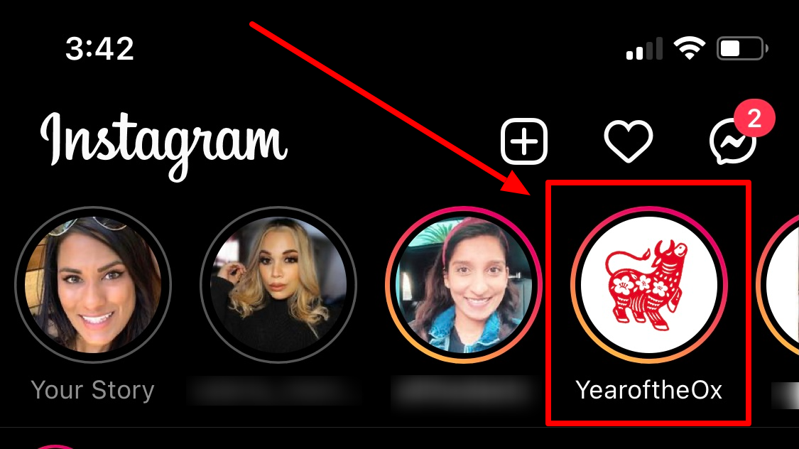
While not the first time Instagram has done something like this (they have used these stickers frequently for large public events such as elections and global holidays), it was an admirable nod to a holiday and community not frequently highlighted in the United States and gave general users an opportunity to educate themselves on how it is celebrated.
Make your brand an all-inclusive experience
With a new year in full swing, now is the time to start rethinking the experiences your brand is creating.
Is your journey as inclusive as it could be? What are you overlooking? What little tweaks like a new form field or more thoughtful color choices could you make on your website, app, etc to make the experience easier and more effective for potential customers?
Use the examples above as a jumping off point for experimentation and create the all-inclusive experiences modern consumers demand.
Free Assessment:
/Assets/Icon%20Library/x%20corp.svg)
/Assets/Icon%20Library/whatsapp%20logo.svg)
/Assets/Icon%20Library/Email.svg)
/Assets/Icon%20Library/Arrows/Grey%20Arrow%20-%20Prev.svg)
/Assets/Icon%20Library/Arrows/Grey%20Arrow%20-%20Next.svg)