/Assets/base/Navigation%20Icons/TAYA.svg)
/Assets/base/Navigation%20Icons/Sales.svg)
/Assets/base/Navigation%20Icons/Web%20design.svg)
/Assets/base/Navigation%20Icons/HubSpot.svg)
/Assets/Icon%20Library/AI%20Mastery.svg)
/Assets/Icon%20Library/Learning%20Center%20Laptop.svg)

Feb 3, 2020

Editor's Note
As the content director for IMPACT, I am proud of how we go out of our way to encourage radically honest and vulnerable storytelling from our contributors — both internal and external — as a means to humanize some of today's most pressing digital sales and marketing challenges for our audience. This piece is no exception to that, and we are humbled that one of our very own (IMPACT Director of Client Success Dia Vavruska) was willing to tell such a raw and personal story that we can all learn from. That being said, due to the sensitive nature of the contextualized subject matter discussed, we want to acknowledge that what follows may be difficult for some to read. Should you have any questions, concerns, or feedback on this piece, please do not hesitate to contact me directly at lmoorehead@impactbnd.com. The voices of our readers are just as important as the voices of our own, and my door is always open to you all. — Liz Moorehead, IMPACT Content Director
I can’t even remember when I first opened the pregnancy apps to change my settings.
Maybe I received a push notification that first afternoon while I sat crying on my couch, or maybe I opened it as part of my new nightly research routine before I realized what I was doing.
I don’t think the “when” or “how” really matters; pretty much everything over the next few hours, days, and weeks was a blur.
What does matter, though, is how the user experience (UX) in these apps felt and the lasting impression they left on me.
But let’s start from the beginning
The beginning of my journey was unexpected and not how I dreamed it would be.
I was alone and barefoot in the guest bathroom of my dad’s downtown Nashville apartment when I took the test. This put me roughly 520 miles away from my home in Cleveland and my husband, Mike.
I was only four days into a 10-day trip working remotely from Nashville, enjoying live music with my dad at night and attending a friend’s bachelorette party the following weekend.
Now, I found myself staring down at a piece of plastic resting on the edge of the granite countertop and a very new reality sinking in.
Those two bright blue lines unmistakably exclaimed, “You’re pregnant!”
I called Mike in an unfiltered panic: “Should I leave?!” “What am I going to tell everyone if I go home early?” “How am I going to hide this all week?”
I was terrified, confused, and excited — all at once — but after a quick and practical conversation, we agreed that I would stay for the remainder of my trip and wait to share the news.
We wanted to heed the advice of countless friends and loved ones who always encouraged us to wait until you’re “in the clear” before planning and sharing the news publicly. So, we made a pact that we’d do just that.
Zero to 60 — then back again
For me, not telling anyone or starting to plan was great in theory, but impossible in practice.
While poised with the best of intentions, I’m also an a-type personality who wants to research, organize, and plan for everything.
So, I immediately dove into baby-planning mode in the only way I know how to do anything — at 150%.
I made my first doctor’s appointment, downloaded a half-dozen books and apps, looked into baby registry options, and started reading anything and everything I could.
It was thrilling and educational.
I loved pouring over the information and getting daily notifications on what size fruit or vegetable baby was.
I did hours of research on individual registry products and actually went to buybuy BABY the day before our 12-week appointment to narrow down a few items I wanted to touch in-person.
And then life came to a screeching halt.
At our 12-week appointment, Mike and I found out that we’d lost the baby.
The space where unimaginable happiness had lived just moments earlier was now replaced with piercing grief, confusion, and physical pain.
My pregnancy was over and my world was shattered.
If you’ve ever suffered the loss of a pregnancy, then you may know this same feeling and I am so sorry we share that in common.
If you haven’t, I pray that you never do. It was one of the worst experiences of my life.
I haven’t shared my loss publicly before, but I feel compelled to do so for a very specific reason.
While I could vent to you about issues in my medical treatment or insensitive conversations with family and friends, I’m not an expert in those areas and won’t pretend to be.
What I do know, however, is marketing and UX.
I want to shed light on the drastically different experiences I had when attempting to update the settings on my pregnancy apps and baby registries following the loss of my pregnancy.
Navigating through the apps had a significant impact on my already fragile emotional state, as well as my perceptions of the brands I interacted with.
My hope is that by sharing my story, I can be a catalyst for change and improve the experience for another parent-to-be.
In my opinion, considerations for pregnancy loss of any kind are imperative to a positive UX in an industry this universal.
Current Status: “Loss”
I spent the first day of my miscarriage coordinating next steps in my medical care, sharing the unbearably sad news with our family and friends, and not really knowing what to do with myself.
Then, I found myself in front of the pregnancy apps. Those very same apps that had, overnight, transformed into a reminder of a future that no longer existed — or at least not right now.
Even seven months later, I’m still shocked and upset at how wildly different the process of changing my status from “pregnant” to “not pregnant” was.
Where baby registries went wrong
One smartphone essential during my pregnancy was the baby registry.
There are plenty of options available, but I decided to select two — one that offered a mobile-centric platform (for every millennial friend that would appreciate the convenience of shopping through the click of a button), as well as a brick-and-mortar option (for family members who may want to drive to a store and purchase the product in-store).
So, I landed on Amazon and buybuy BABY.
Overall, I found baby registries to be very involved and a laborious user experience. That’s to be expected though, since they require you to actively engage with and manage your selections.
They were a flashback to building our wedding registry just a few years earlier, but on a new level of devotion and scrutiny of detail because these products would be used for a tiny human.
While the apps offer helpful checklists and suggested purchases to try to make it easier, there are hundreds (if not thousands) of products to comb through.
If you’re like me, you could spend countless hours researching and comparing product safety, consumer reviews, and videos to select what you feel is the best option for your future child.
When I miscarried, the last thing I wanted was more to think about or take on. Unfortunately, updating my status on these registries proved just as labor-intensive as putting them together.
Please note: The descriptions and videos offered below were created specifically for this article to ensure they represent the most up-to-date settings and UX of each app.
Amazon Baby Registry
As I mentioned earlier, I selected the quintessential millennial shopping platform for baby registry #1. Amazon is the Mecca of online shopping and fits seamlessly into our household shopping habits.
Within the baby registry portion of the Amazon app, you scroll over several swipes to access “Settings.” Under this screen, there isn’t an option to note a pregnancy loss.
You can either push back your “Expected arrival date,” make your registry “Private” (which mine already was) or “Delete your Registry” entirely.
You can imagine my confusion (which quickly turned to anger and more tears) when I struggled to find a way to update my settings to better reflect my current status and needs.
This has to be a mistake. I’m emotional and not thinking clearly. There has to be another option here for someone like me. It has to be right here in front of me.
Nope.
Even if you change your expected arrival date, the app suggests, “If you don’t know the arrival date yet, make your best guess. You can change the date at any time.”
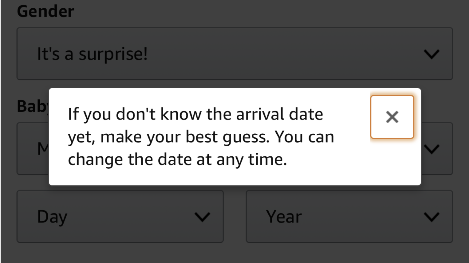
I couldn’t believe what I was reading. Was that a serious suggestion?
No parent-to-be, let alone someone who has experienced a loss makes their “best guess” as to when they’ll be able to conceive again or adopt.
Accordingly to Amazon, however, I should pick a random date for bringing a new life into this world, and then if I’m not pregnant at that time, I can just bump it back and deal with the emotional torture that it’s not happening (yet again).
If you opted to delete your registry, the app informed you that, “...you cannot retrieve it after it has been deleted.”
Considering the countless hours I spent researching and building the perfect list, that was not an option I was willing to select.
So, with no other option available, I opted to bump back my due date and retain access to my registry.
As I mentioned earlier, my miscarriage was seven months ago.
My “best guess” date has moved several times, but at least I’m not starting over from scratch when that day finally comes.
buybuy BABY
Baby registry #2 was another industry staple — buybuy BABY.
Owned by parent company Bed Bath & Beyond (which we also used for our wedding registry), this retail chain offers both an in-person and digital option for consumers.
buybuy BABY also worked well for me, as I wanted to see some of the products myself before making my final selection.
But when it came to editing my registry settings in the app, this brand fell massively short of my expectations.
To edit your profile settings, you click the ellipsis in the top, right-hand corner under the “Registry” tab of the app. Similar to Amazon, you can move your “Expected Arrival Date” back, make your registry “Private,” or “Deactivate.”
But here is where their marketing really missed the mark.
Under the option to deactivate your registry, the app notes:
“We understand that sometimes, things happen. If you need to deactivate your registry, please click on the link below. You will have 30 days from the time of deactivation to reinstate your registry.”
“...Sometimes, things happen” is one of the most vague and insensitive statements I could imagine receiving in response to a loss.
How was that language ever approved by a marketing or product development team in the creation of this app? I’m still baffled.
Also, I don’t think it requires a medical degree or experience as a parent to know that in most cases it would be physically impossible for someone to conceive again within 30 days. So the 30-day re-activation window is basically useless to someone in my shoes.
Needless to say, the experience I had when updating my registries was less than ideal.
These apps didn’t offer me a single option that reflected my actual circumstances and the language was cold and alienating as a consumer.
What’s more, because they don’t offer an option to indicate a loss that would automatically remove me from their lists, I continued to receive weekly (and sometimes daily) emails with coupons and offers.
I can’t be sure which platform sold my information, but because I had been placed on a marketing list for expecting mothers, I even received a package of baby formula samples and coupons several weeks prior to my due date.
This was the least expected (or wanted) holiday package I could have received and it resurfaced my grief all over again.
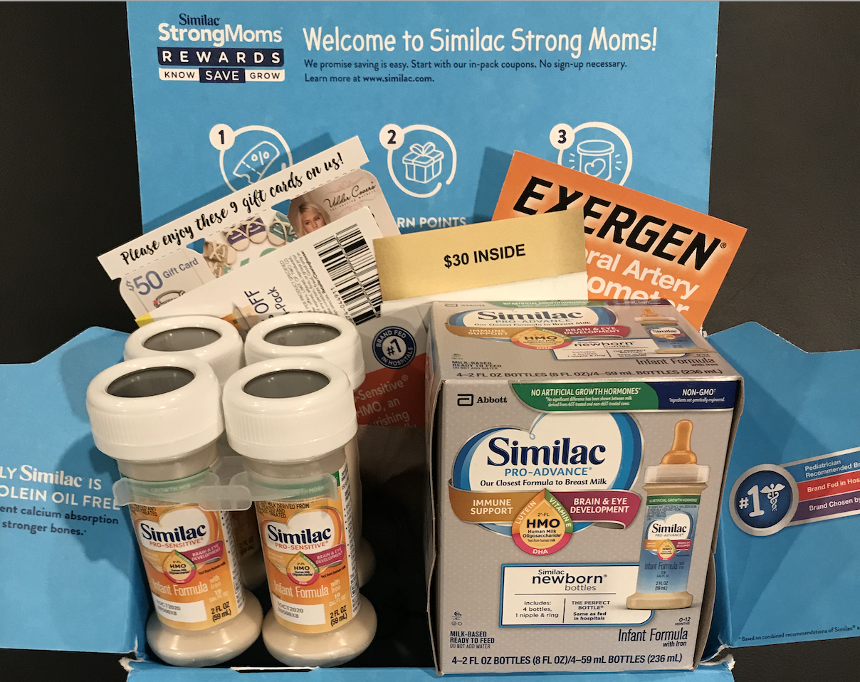
To stop these, I had to take another step to unsubscribe from their emails.
All of this was painful and annoying, but yet I still feel tied to these registries and stores.
Why? Because they’re the standard option, and I don’t want to lose the hours of effort I put into building them and have to start over again when my time comes.
But don’t lose all hope yet — things got better
My journey went on to unveil a truly incredible UX that I still rave about to friends, family, and colleagues, and it's ultimately the reason why I wrote this article.
I want to recognize and congratulate the incredible ease of use and support I received from the baby registry’s counterpart, the pregnancy app.
I think it’s important to start by explaining what a pregnancy app is and how a consumer would interact with one.
There are dozens of options in the marketplace, and while they all differ slightly, the average pregnancy app offers a few key benefits or resources to parents-to-be.
These can include:
- Daily or weekly updates on the progress of your pregnancy (e.g. baby’s estimated size, how it’s developing, a checklist of major milestones, common symptoms for mom, etc.).
- Articles, guides, and videos to educate you on pregnancy nutrition, health, and wellness, planning with your partner, preparing for birth, and more.
- FAQs, communities, and forums for engaging with other parents-to-be.
Almost all of them require basic personal data like your name, email, expected due date, and gender of the baby, while others are more robust, allowing you to upload belly pictures or document your personal journey as well.
Overall, you can consume a ton of content from a pregnancy app in a fairly passive way. It requires very little effort on your part, unless you decide to actively participate in one of the community forums.
Below are the three apps I was using at the time and even still today.
I’d recommend any of these to a mother-to-be, and even more so to someone who suffers a loss — and here’s why.
A reminder: The following videos were recently recorded to ensure the accuracy of the current UX.
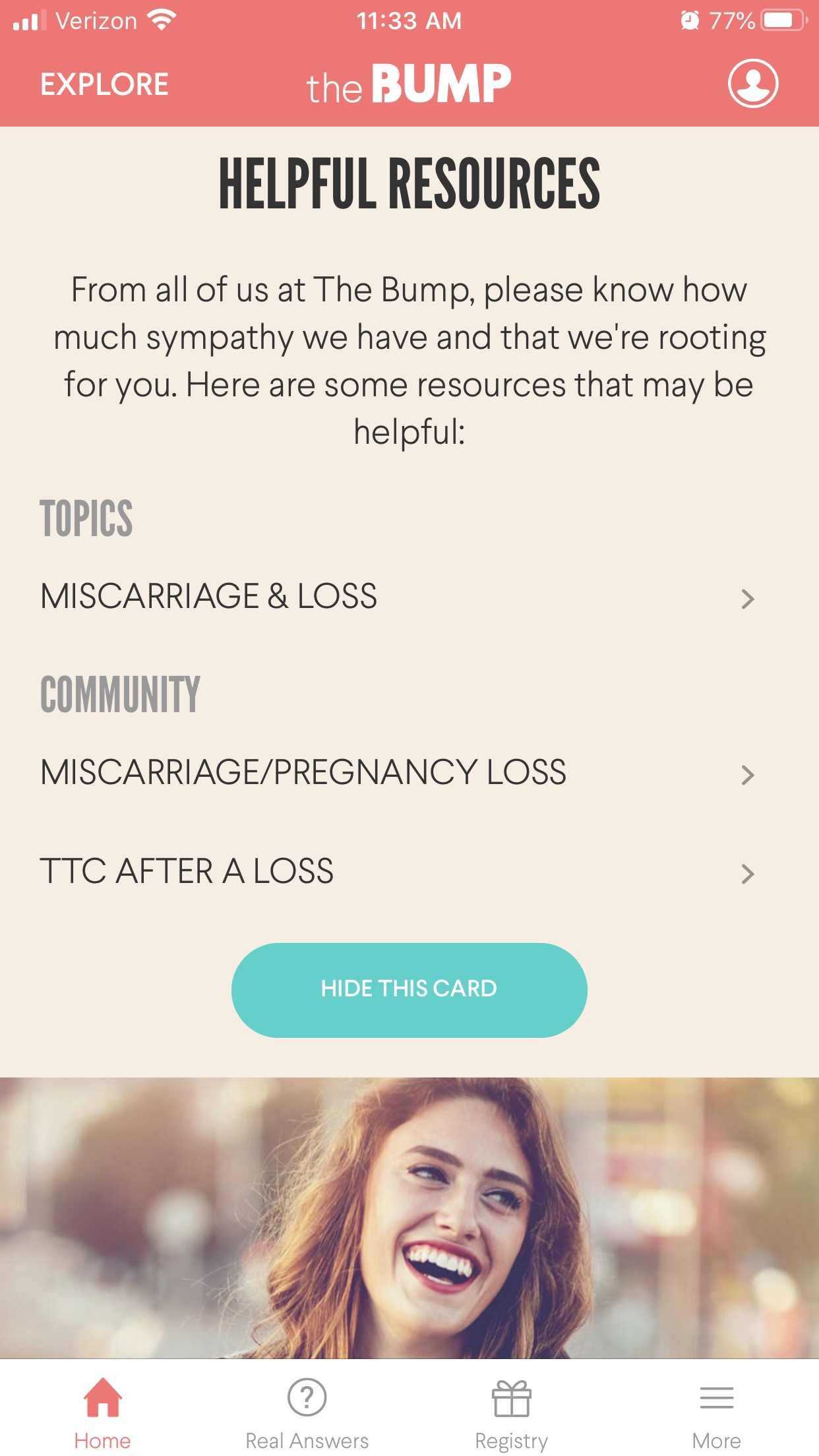
The Bump
First on my list was The Bump, which was developed by the creators of The Knot and The Nest.
It offers an app, desktop and mobile experience, and is oftentimes one of the go-to-resources you’ll find when online searching a question about fertility, pregnancy, or parenthood.
They lived up to this reputation from day one and well beyond the date of my miscarriage.
In the app, the status options to select from include: “I have given birth,” “Edit my continuing pregnancy,” or “I have experienced a loss.”
If you select, “I have experienced a loss” a new screen appears that reads:
“From all of us at The Bump, please know how much sympathy we have and that we’re rooting for you. We will remove this profile, and you won’t receive any more emails or notifications related to it. What content and community would you like to see in your home feed when you return?”
They then allow you to choose from “Trying to conceive after a loss” or “Nothing for now.”
Let’s pause for a moment.
Not only did The Bump give me the option to indicate a loss, but they also assured me that I would no longer receive emails or push notifications related to my pregnancy.
What a relief!
This meant that I didn’t have to take an additional step to unsubscribe or update my notification settings. They already thought of everything for me.
What’s more, they’re also prepared to customize my experience and content based on what I want and need to see next.
Wow. It was such a contrast from what I went through with the baby registries.
When I moved back over to the home screen of the app, I was stunned again.
At the top of this screen, The Bump reiterated its sympathies and support to me on the next steps of my journey. And much like before, there were dozens of articles and community resources to pull through, specifically related to this next chapter I was embarking on.
Every “Helpful Resource” now pertained to miscarriage and loss.
I felt heard, understood, and supported.
That may sound dramatic, but it’s true. I couldn’t believe the depth of consideration they put into the UX. They didn’t dish out cold, robotic messages or put me on a timeline for maintaining ties.
They actually showed they cared about me as a human being and expectant parent, not just a customer.
Pregnancy+
Pregnancy+ was one of the most interesting pregnancy apps I used.
In partnership with Philips AVENT, they’ve taken the “what does baby look this week” to a new level, offering a 3D interactive tool that offers a panoramic view and touch-to-activate motion.
Much like The Bump, your profile settings can be updated by clicking on the profile icon at the top, right-hand corner of the app home screen.
From there, you scroll down to the “Pregnancy” section of your profile and move the slider over next to either “Pregnancy Loss?” or “Baby Already Born?”
This one wasn’t as obvious upon first attempt, but I was able to figure it out quickly.
Once you move the slider over, a pop-up screen appears with the following message:
“We’re sorry to hear about your loss. Wishing you all the strength and support you deserve in this difficult time. Please confirm that you want to reset your data.”
Yet again, a pregnancy app offered to proactively clear my data post-loss, without putting more work on me.
Once I selected “Yes,” I was redirected back to a new home screen that now featured all-new resources and imagery pertaining to loss like The Bump.
Resources now featured in my app cover topics ranging from learning about what a miscarriage is, to stillbirth, recovery and treatments, and pregnancy after loss. I was impressed and thankful.
What to Expect
Last, but not least, I used What to Expect.
This time, the app gave the options to “Recalculate Your Due Date,” “Report a Birth” or “Report a Loss.”
When you report a loss, you get the message:
“We’re sorry for your loss. What to Expect offers healing mode where you can find support and continue using the app.”
I opted into “Continue to Healing Mode” and again, the app notified me that I would l no longer receive emails or notifications, with no additional work required on my part.
Overall, these apps that required so little of my personal effort to engage with made the process for updating my status from “pregnant” to “not pregnant” or “suffered a loss” easy and pain-free.
In fact, they actually brought me comfort and support in my time of grief — something I was NOT anticipating from an app clearly designed for the purpose of pregnancy.
I was blown away with the extent of resources they offered beyond their initial intended purpose. And I was, and still am, incredibly grateful for the thoughtfulness they’ve woven into their customer experience.
Regardless of your business or industry, UX always matters.
While my experience through miscarriage was painful, there were moments of comfort and support that pulled me through — including those I had with The Bump, Pregnancy+, and What to Expect.
I have a deep appreciation for the amount of thought, time, and work those brands put into the “what if” alternate scenarios.
They thought through the multiple customer journeys that may come in pregnancy and the possible pain points — even for those that don’t end in a full-term birth — and made sure they had solutions.
They showed a human side and deep understanding of their audience’s emotions by offering help even when I was no longer in their market.
Their attention to detail and experience not only made it easy for me to return as a customer in the future, but “delighted” me and made me want to use them again when the time comes.
And when it comes to the baby registries, I’m not sure what the right solution would be in their cases exactly. All I know is that my personal experience with them left a bad taste in my mouth.
As marketers, this is the lesson I hope you take away from my experience.
When 73% of consumers say a good experience is key in influencing their brand loyalties, it’s clear that brands cannot ignore this.
It is imperative that you think through every interaction a customer or prospect may have with your website, app, social media profiles, or whatever the medium may be. Dive into each possible circumstance or outcome, and be prepared to offer them a solution that meets their needs.
Create resources that answer your buyers questions, messages that address their concerns, and next steps even if they are not with you at this time.
At the end of the day, people are motivated by good and bad UX. Not only are they more likely to tell others about a poor consumer experience they had with a brand than a good one, but they’re also more likely to buy from you if you treat them right.
So, marketers must invest in their customer experience — every step along the buyer's journey.
A small edit to the UX I experienced with baby registries and their marketing language could mean a monumental difference to someone navigating the unfortunate loss of a pregnancy.
Free Assessment:
/Assets/Icon%20Library/x%20corp.svg)
/Assets/Icon%20Library/whatsapp%20logo.svg)
/Assets/Icon%20Library/Email.svg)
/Assets/Icon%20Library/Arrows/Grey%20Arrow%20-%20Prev.svg)
/Assets/Icon%20Library/Arrows/Grey%20Arrow%20-%20Next.svg)