
/Assets/arrow-facing-left--black-01.svg)
/Assets/navigation-global--close-symbol-black-01-1.svg)

/Assets/Icon%20Library/social/facebook-logo.svg)

/Assets/Icon%20Library/social/instagram-logo.svg)
/Assets/Icon%20Library/social/youtube-logo.svg)





/Assets/navigation-global--close-symbol-black-01.svg)

Jul 17, 2023
/Assets/Icon%20Library/x%20corp.svg)
/Assets/base/Learning%20Center%20Resource%20Category%20Icons/Facebook_Messenger_logo_black.svg)
/Assets/Icon%20Library/whatsapp%20logo.svg)
/Assets/Icon%20Library/Email.svg)

*updated July 2026
The internet is full of some amazing and inspiring websites for businesses of every size.
The best-designed websites are the ones that find innovative ways to utilize every possible design and technological boundary to their advantage to create experiences that many organizations wish they had.
Finding these diamonds in the rough can be an incredible challenge, but it's helpful — especially if you're planning a website redesign and are unsure of where to start.
Fortunately, organizations like CSS Awards, Awwwards, and Webby Awards exist to help highlight the sites we should be inspired by.
To help showcase some of these award-winning sites, I've chosen 14 to illustrate beautiful, functional examples of modern design, UX, UI, information architecture, conversion rate optimization, video marketing, and other tactics.
When looking at each site, it’s important to understand that these should not be seen as templates you should ask your website designer to attempt to copy.
Instead, analyze them and find the parts of them that utilize strategies that could be repurposed and revised into something that fits your audience.
With that being said, enjoy these 14 killer examples of award-winning website designs done right.
1. Audemars Piguet
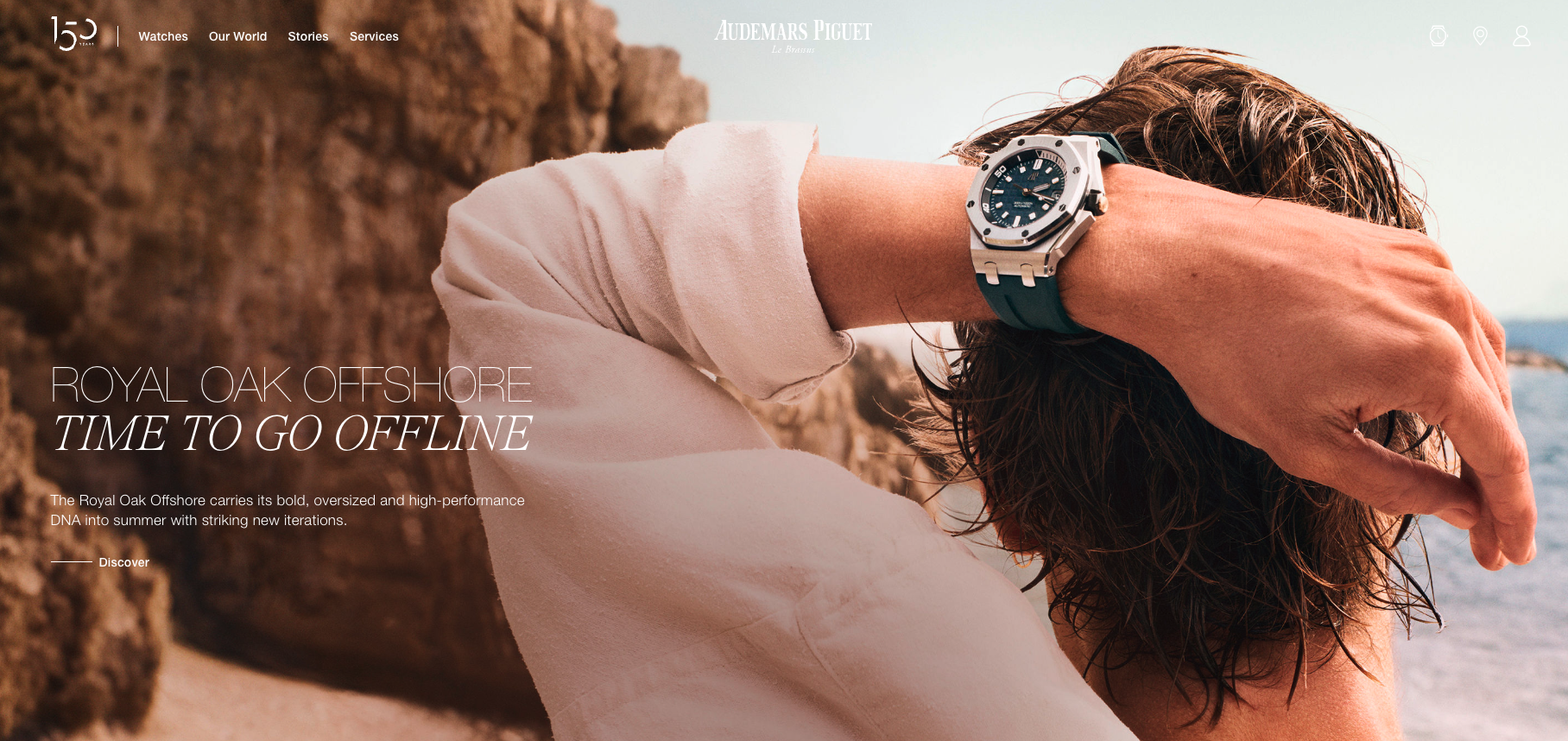
This stunning site was featured on CSS Awards for its immersive scrolling experience that's visually striking without feeling overwhelming.
For those in the market for a luxury watch, the details matter, and this design offers a peek inside the craftsmanship that makes the watch tick. You'll see animations, videos, text, and more.
2. National Council on Aging
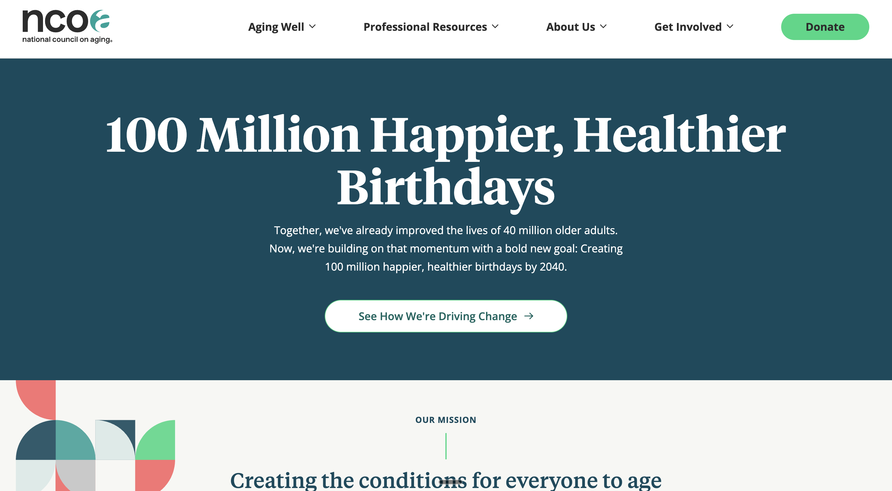
Even though this site is beautiful, it stands out for something else entirely. The website for the National Council on Aging was appropriately nominated for Accessible Technology. The website was rebuilt to ensure faster loading speeds, easy-to-read pages, and an overall simplified UX that doesn't sacrifice design.
Accessibility can be a missed step during some redesign projects, and it's great to see a site setting the bar high.
3. ClickUp
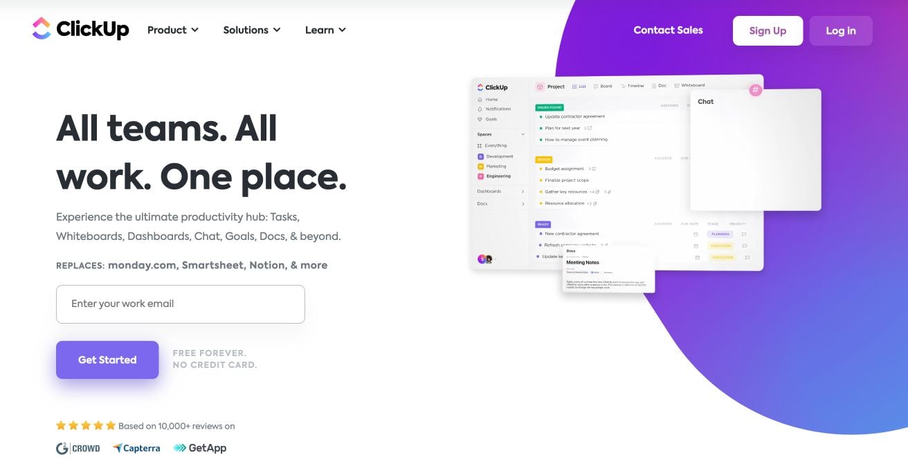
The animation on ClickUp's homepage draws the user's attention immediately upon arrival. This style of imagery is carried throughout the remaining sections with simple groups of content boxes directly next to each.
For a project management tool that promises to keep things simple, its website must lead the charge, and ClickUp's does just that.
4. Ocean Health Index
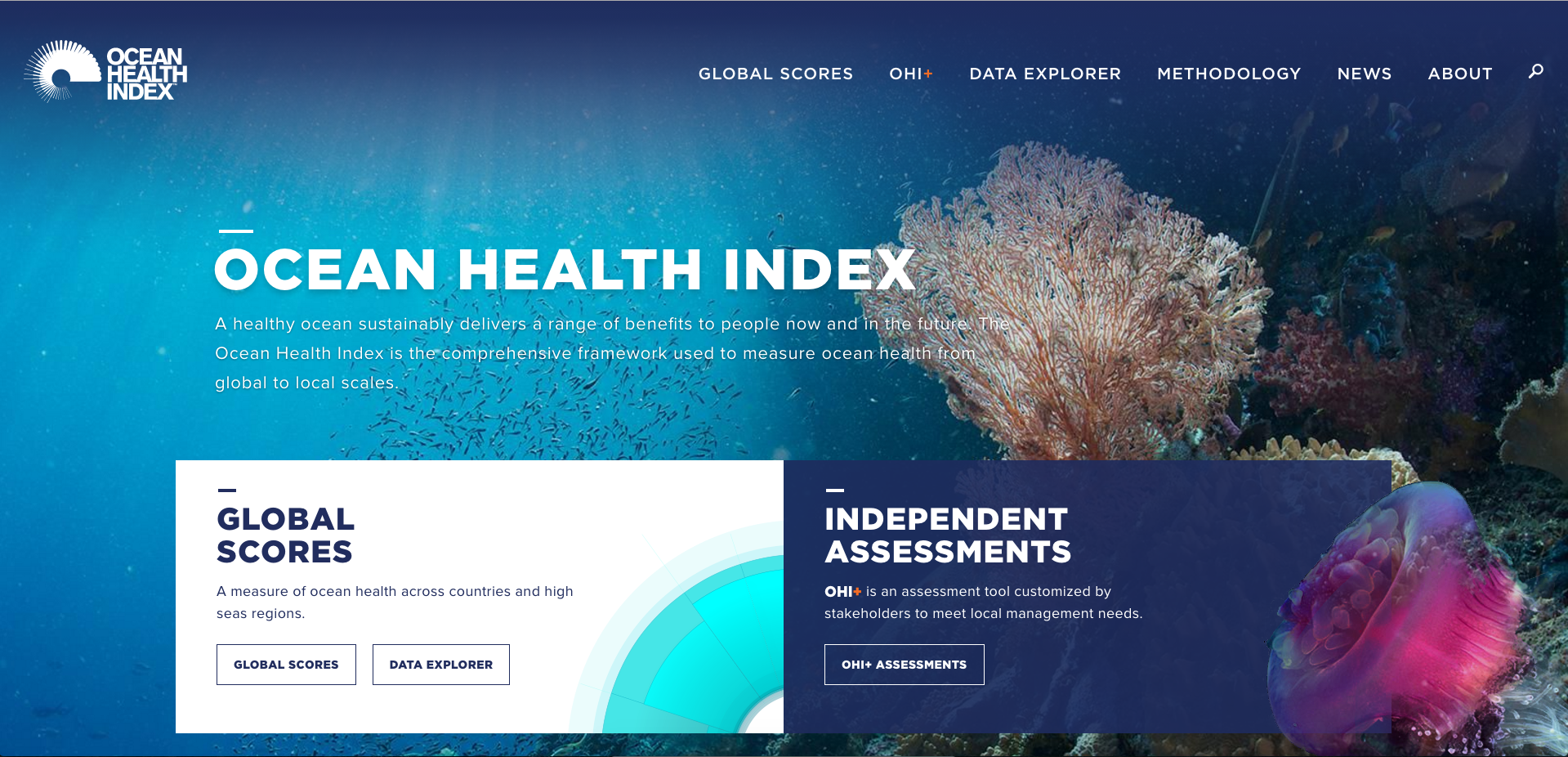
Ocean Health Index is a non-profit working for sustainability. What better way to show the value of our oceans than with stunning photography that speaks for itself? The site includes an intuitive layout with a cool tone color palette.
The large fonts across the website also help keep it easy to read and professional, and a draggable globe shows visitors a composite of local ocean health data.
5. Mixbook
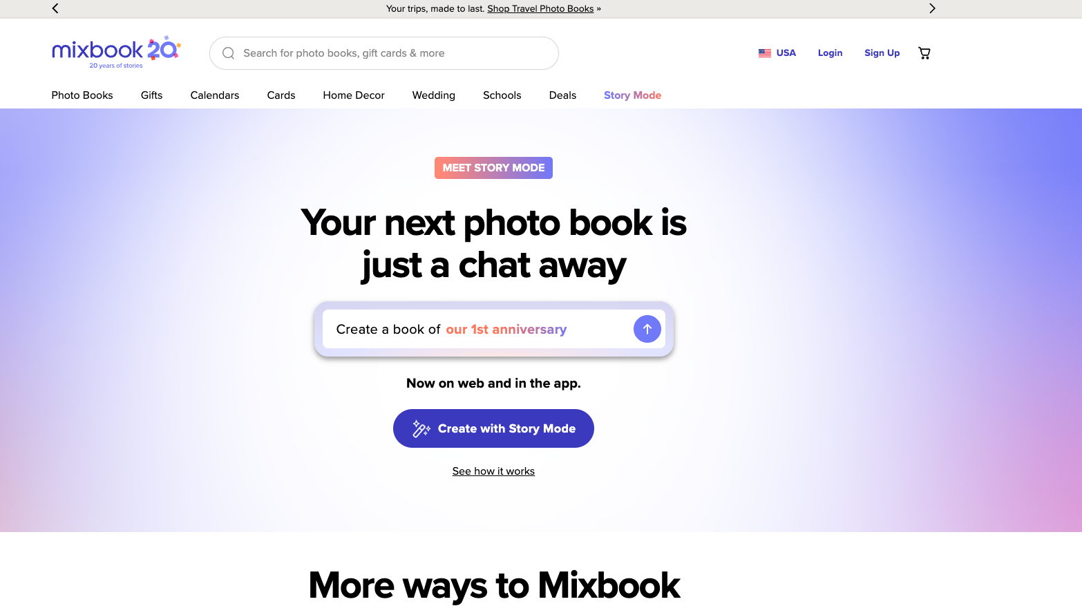
Mixbook takes showing off its product to the next level with this easy-to-maneuver homepage that clearly outlines what its product is, how it looks, product quality, and testimonials.
The site is an excellent example of how brands are using AI to inspire site visitors to jumpstart their experience and start visualizing the results of working with them.
6. Wozber
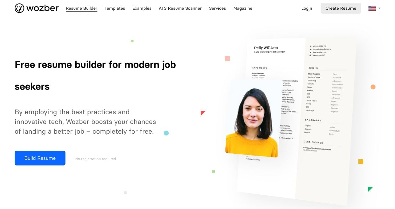
Wozber did a killer job breaking down the step-by-step process it takes to make sure your resume is perfect for that dream job you are looking for. Its homepage clearly outlines the steps up front, which are then further explained in individual sections below.
The site even has examples of some of the resumes they’ve made, making it easy for you to see exactly what the finished product could look like before you decide to sign up.
7. Cisco + Webex
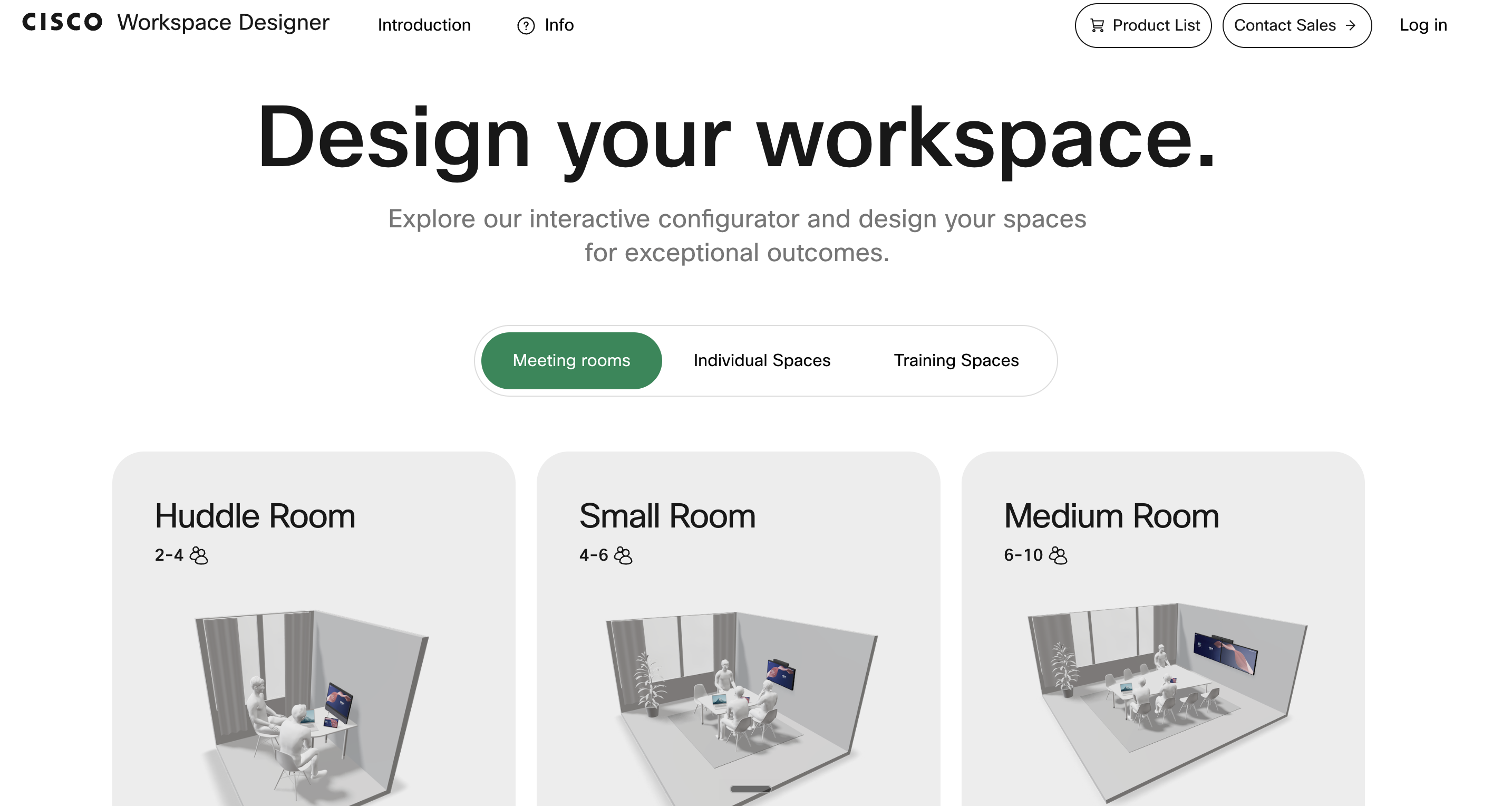
Webex's interactive tool built for Cisco lets buyers configure a meeting space based on room dimensions and needs, then visualize equipment coverage and recommendations. It helps buyers understand a complicated solution before talking to sales. It was a 2025 Webby nominee for Best User Experience.
We love the use of interactive tools to help buyers understand, configure, and gain confidence in a complex purchase.
8. Opus Grows
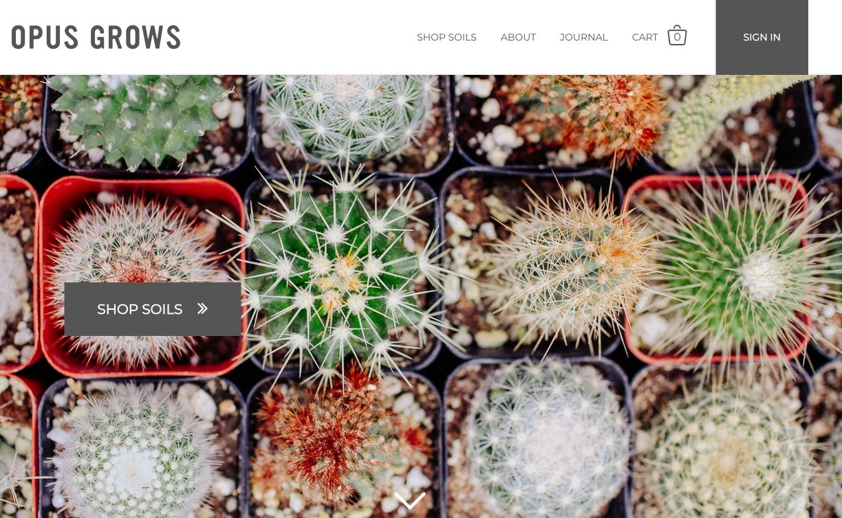
Opus drives home the organic, natural, and health benefits of its soil by adding the beautiful abstraction of cacti to its homepage hero image.
With so many different options for potting soils out there, it can be hard to decide which one is the healthiest for your plants or garden. Opus provides details without overwhelming visitors.
I was also very pleased to see they publish articles and occasionally mix in more delightful posts to help reach wider audiences, such as this one.
9. WealthSimple
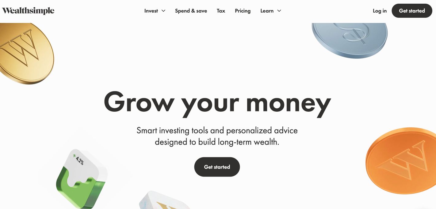
The use of space on Wealthsimple makes it incredibly easy to segment each section of its pages. The beautiful GIFs throughout the page also make for an exciting experience, especially since they don’t relate directly to investing.
The site makes investing seem fun. Rather than showcasing spreadsheets, stacks of cash, and tacky language, they make sure they differentiate the WealthSimple brand so it doesn't seem like every other investment software or service.
10. SeaStreak
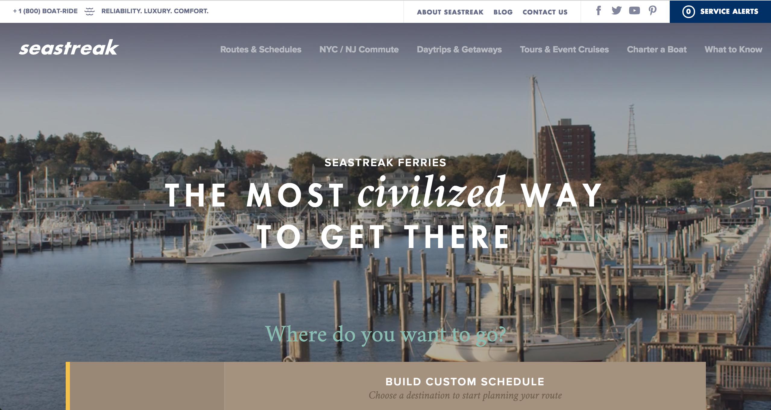
Looking to travel by ferry but not sure where to go? SeaStreak’s got you in good hands.
The site's UI is organized so you’re able to quickly build a ferry schedule that works for you. I also find the navigation extremely interesting. The routes and schedules menu drops down to show you all the available options, and the day trips and getaways menu is already segmented for users who are on the site looking for exactly that.
These elements help create convenience for the user so they aren't left in a dark hole of the site trying to figure out how to search for what they want.
11. The Wildlife Society
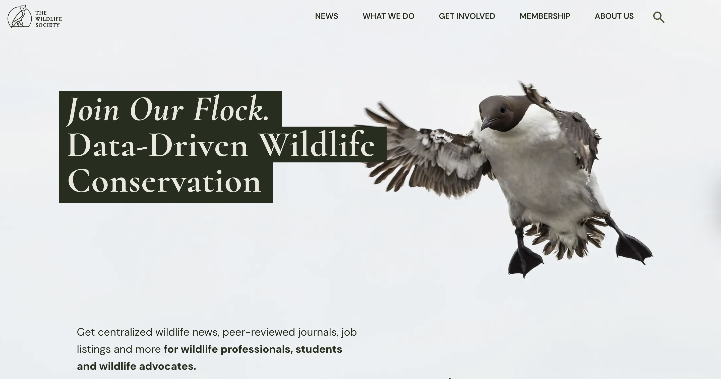
This website is a fun scroll. Winner of the 2026 People's Voice Award for Websites & Mobile Sites, as well as Best User Experience. The Wildlife Society brings movement and nature to the screen with their website design. It brings life and energy to their cause and raises awareness quickly and clearly.
12. The Economist
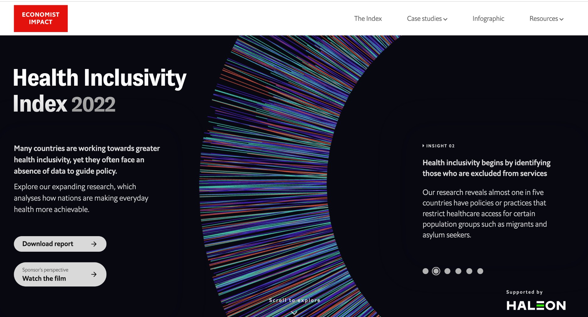
When companies can tell stories with their data, they win. In this case, renowned publication The Economist put together data visualization tools for its Impact project, focusing specifically on health inclusivity.
The data is stunning and, at times, terrifying, but the use of organic shapes that suggest body parts (like the human eye), keeps us aware of the real-world implications of any of the numbers we're looking at.
13. OpenAI - ChatGPT
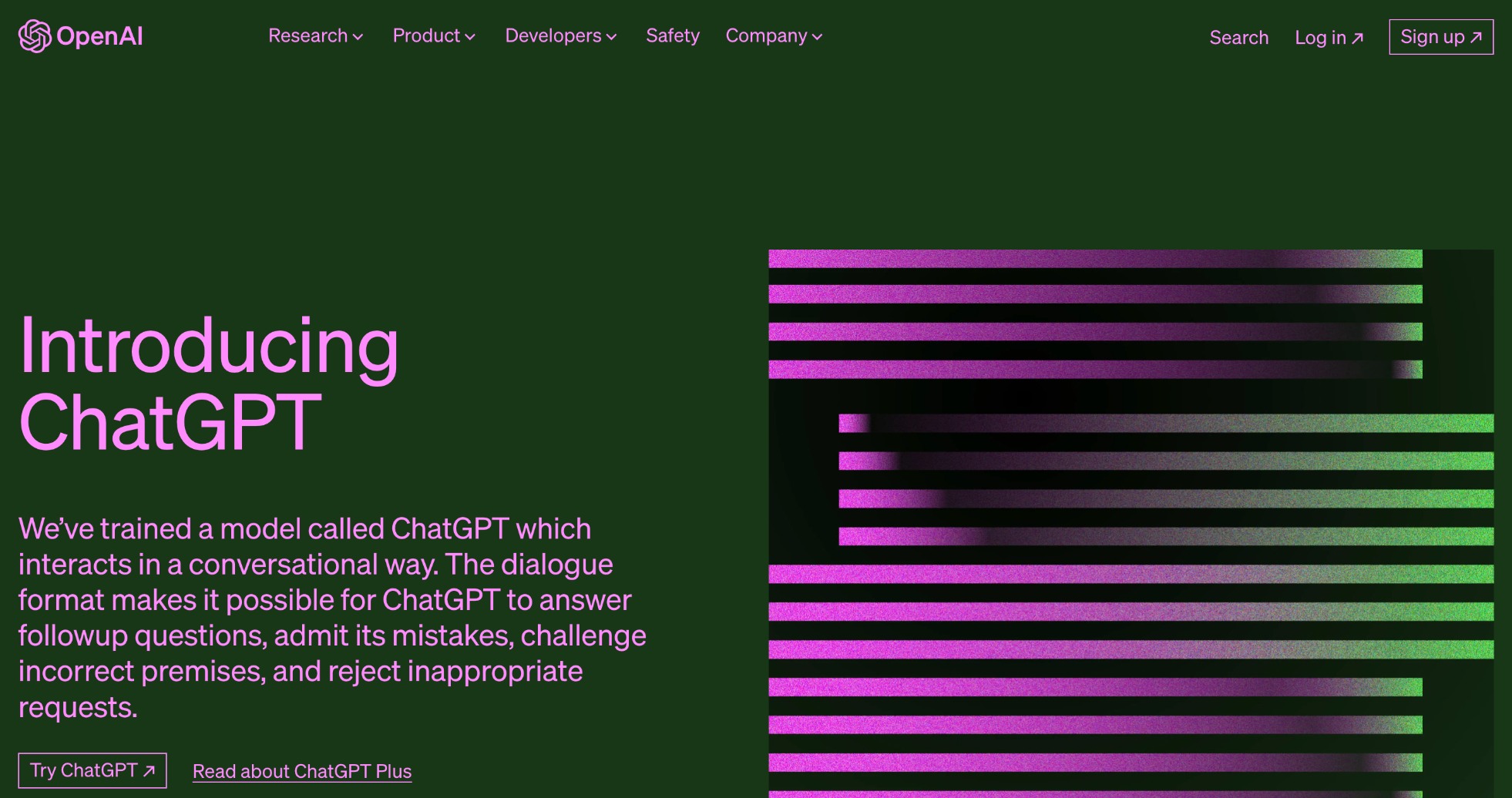
Considering how monumental and disruptive ChatGPT has been since its release in 2022, the website itself is a triumph as well. Note the heavy focus on abstract graphical elements, the no-nonsense sub-header, and the dark-mode style decor.
From the homepage, you can access ChatGPT and DALL.E2 as well as clear information about pricing. The OpenAI team is upfront about the limitations of its technology, which it spells out clearly for the sake of transparency.
14. Leica
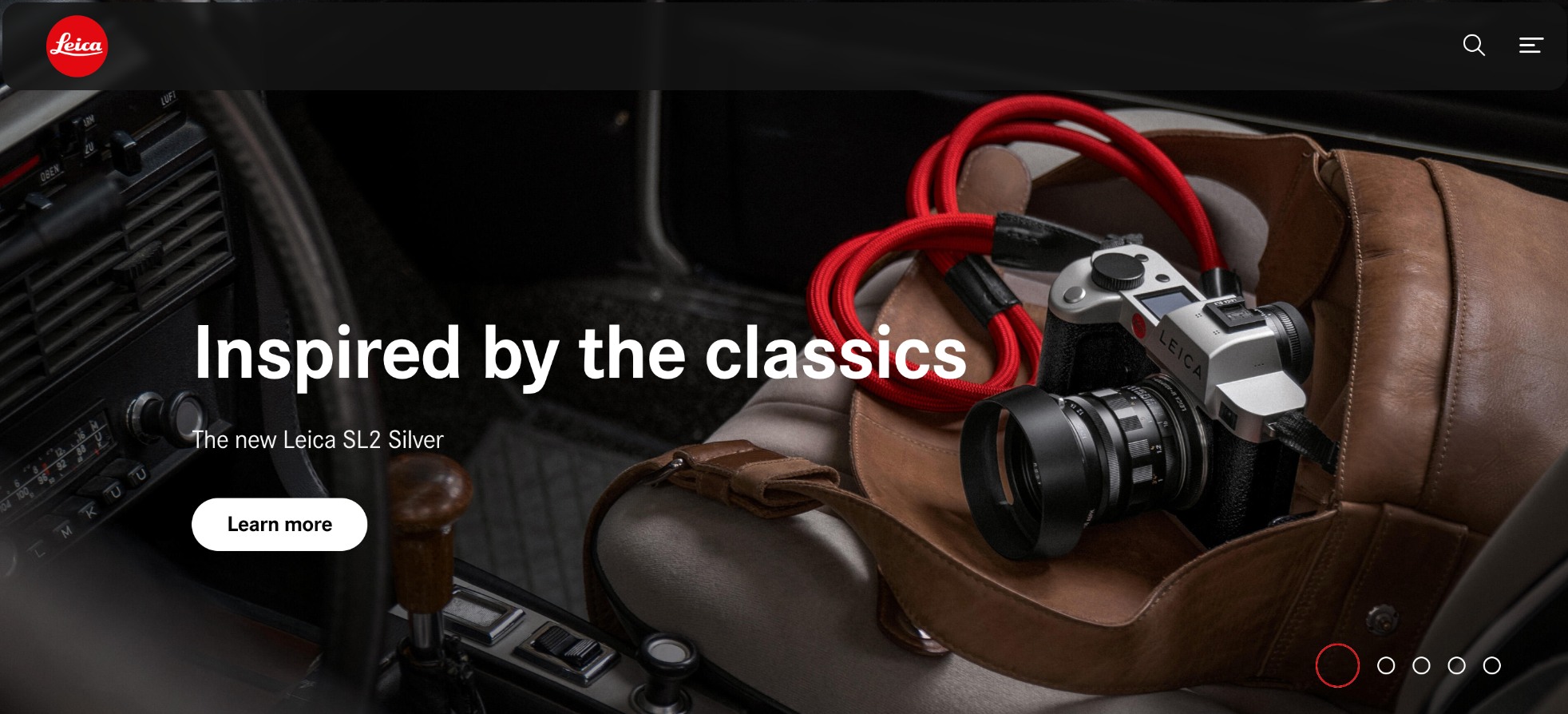
German camera maker Leica leans heavily into nostalgia in its website — while still pointing out cutting-edge features and functions. Leica is a brand with a deep and esteemed pedigree, but photography is not an industry that rests on its laurels. While the new cameras are made to look like 1970s throwbacks, the technology inside is anything but.
As you'd expect from a camera company, the site is filled with stunning imagery and a compelling product line.
But like all savvy businesses, Leica makes the site about the user, not the company. Specs and features are just tools to help you tell your story.
Looking for your own website redesign?
Your website is meant to be the face of your online presence and a way to represent your brand.
But marketing has changed over recent years. The modern website is not just a digital billboard that is found like it used to be. Once buyers do find your site, it must educate your potential buyers and streamline the sales process.
If you're tired of your website holding you back, talk to an IMPACT coach about the simple changes you can make to have your website become a revenue driver.
We help you create a site that is functional, fast, helpful, and perfectly suited to your customers' needs.
Order Your Copy of Marcus Sheridan's New Book — Endless Customers!
/Assets/Icon%20Library/Arrows/Grey%20Arrow%20-%20Prev.svg)
/Assets/Icon%20Library/Arrows/Grey%20Arrow%20-%20Next.svg)